
CSS Art – shape() Function & Gradients: Build an Isometric Snare Drum - Part 2
Think beyond rectangles! Discover how the shape() function can turn ordinary elements into rounded shapes with depth and style.


Introduction
Web elements are naturally rectangular, but with the right CSS techniques, they don't have to stay that way. By combining multiple CSS properties you can transform simple rectangular blocks into smooth ellipses, curved surfaces, and convincing isometric shapes.
In this three-part series, you'll build a CSS isometric snare drum from the ground up. By the end of the series, you'll have created a detailed snare drum illustration using nothing but HTML and CSS.
- In Part 1, you focused on constructing the drum's foundation by creating the tripod stand, including the tripod base center column, support braces (connectors), and three legs that hold the drum in place.
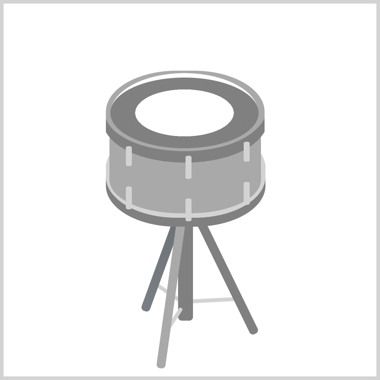
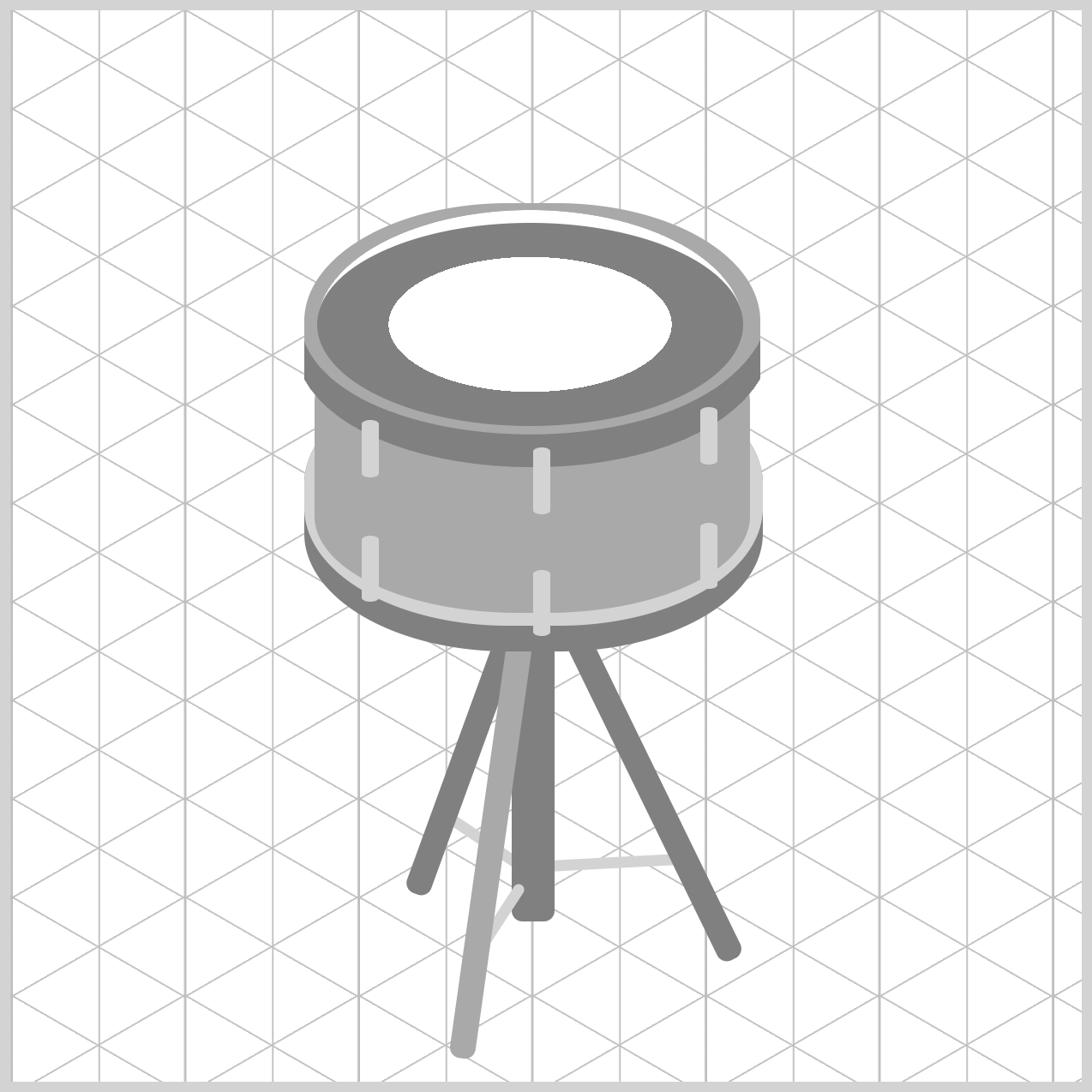
- In Part 2, this article, you'll build the remaining drum components, including the bottom rim, top rim, drum body, tension rods, and drum head. These elements will come together to form the complete structure of the snare drum.
- In Part 3, you'll bring your illustration to life using CSS Custom Properties (variables) and CSS gradients. These techniques will add realistic metallic finishes, subtle highlights, shadows, and depth, transforming the basic shapes into a polished and visually appealing snare drum.
CSS functions and properties you’ll be exploring in this article:
shape()radial-gradient()border-radiusborder-top
Preview
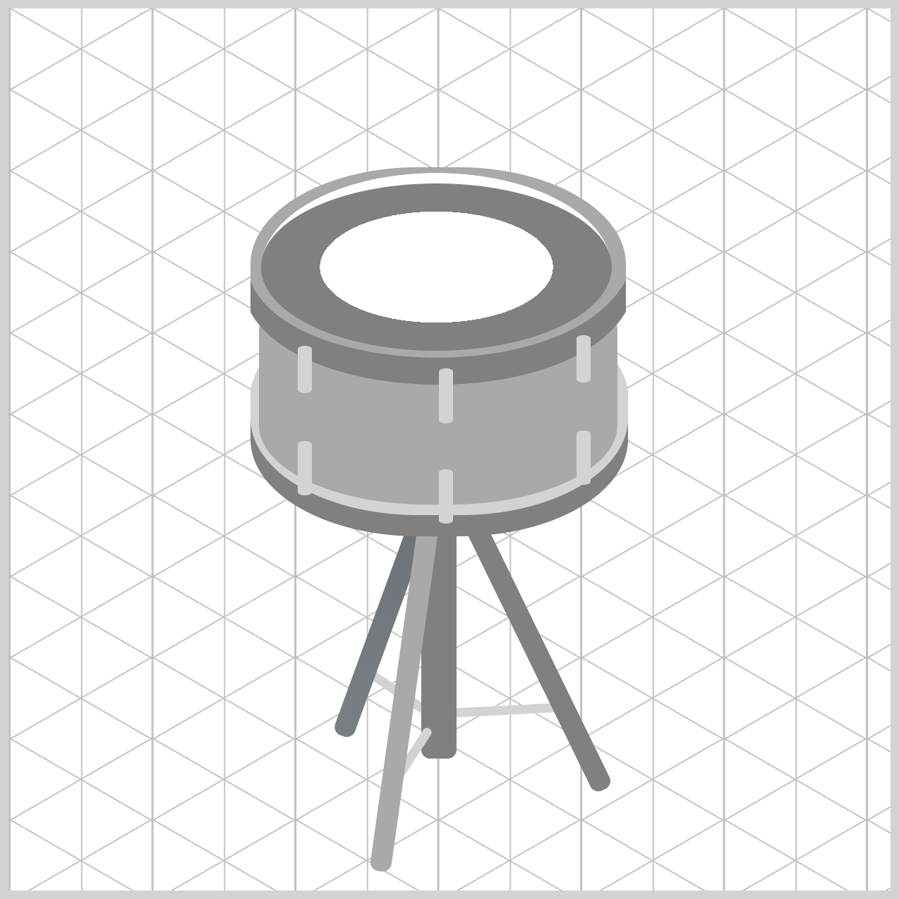
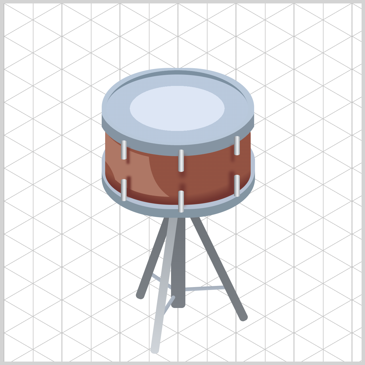
A quick preview of the snare drum illustration you’ll learn to create in this article series.
Before you dive in, we highly recommend checking out the following two articles. They provide a solid introduction to the CSS shape() function and will help you understand the concepts covered in this tutorial more easily.
 Pyxofy
 Pyxofy
Prerequisites
Essential CSS and HTML knowledge will help you understand the concepts and techniques introduced in this article. Jump over to this article if you require an HTML and CSS primer.
We assume you have configured tools to modify CSS. If not, this article will guide you through the setup process.
HTML Structure
<div class="container">
  <!-- Stand -->
  <div class="first-leg-connector"></div>
  <div class="second-leg-connector"></div>
  <div class="stand-tripod-base"></div>
  <div class="third-leg-connector"></div>
  <div class="stand-first-leg"></div>
  <div class="stand-second-leg"></div>
  <div class="stand-third-leg"></div>

  <!-- Bottom Rim -->
  <div class="bottom-rim"></div>

  <!-- Drum Body -->
  <div class="drum-body"></div>

  <!-- Top Rim -->
  <div class="top-rim"></div>

  <!-- Tension Rods -->
  <div class="rod rod-1"></div>
  <div class="rod rod-2"></div>
  <div class="rod rod-3"></div>
  <div class="rod rod-4"></div>
  <div class="rod rod-5"></div>
  <div class="rod rod-6"></div>

  <!-- Drum Head -->
  <div class="drum-head"></div>
</div>
container is the outermost enclosure. It enables the content to be centered and draws a light gray border. The rest of the <div>s represent each image component.
Keep the HTML structure as is for the image to display correctly.
Body and Container <div> CSS
CSS code for the body and container <div>.
/* Body and Container Settings */
/* Center shapes */
body {
  margin: 0;
  padding: 0;
  height: 100vh;
  display: flex;
  justify-content: center;
  align-items: center;
  flex-wrap: wrap;
}

/* Set background and border color */
.container {
  width: 500px;
  height: 500px;
  border: 5px solid lightgray;
  background: transparent;
  position: relative;
  margin: 5px;
  display: flex;
  justify-content: center;
  align-items: center;
}
Let’s start working on the Bottom Rim component in the next section.
Bottom Rim
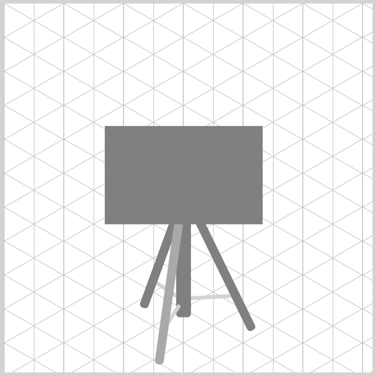
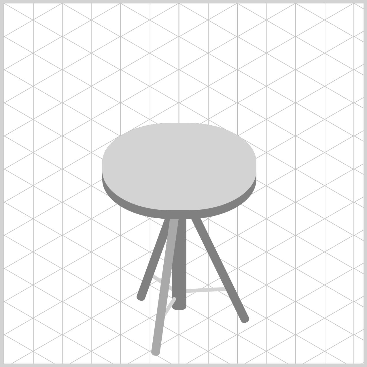
The Bottom Rim component is composed of two elements. The .bottom-rim element serves as the main outer rim. Its size and position help define the lower edge of the drum body. The .bottom-rim::after pseudo-element adds a second layer inside the main rim.
Together, the parent element and its pseudo-element work to simulate a realistic metal rim, making the drum appear more three-dimensional and visually appealing.
/* Bottom Rim */
.bottom-rim {
  width: 214px;
  height: 133px;
  left: 137px;
  top: 166px;
  background: gray;
}
The .bottom-rim element has a width of 214px and a height of 133px, creating the outer shape of the drum's lower rim. It is positioned 137px from the left edge and 166px from the top of the container, with a gray background that helps represent the metallic surface.
.bottom-rim {
  border-radius: 95px/55px;
}
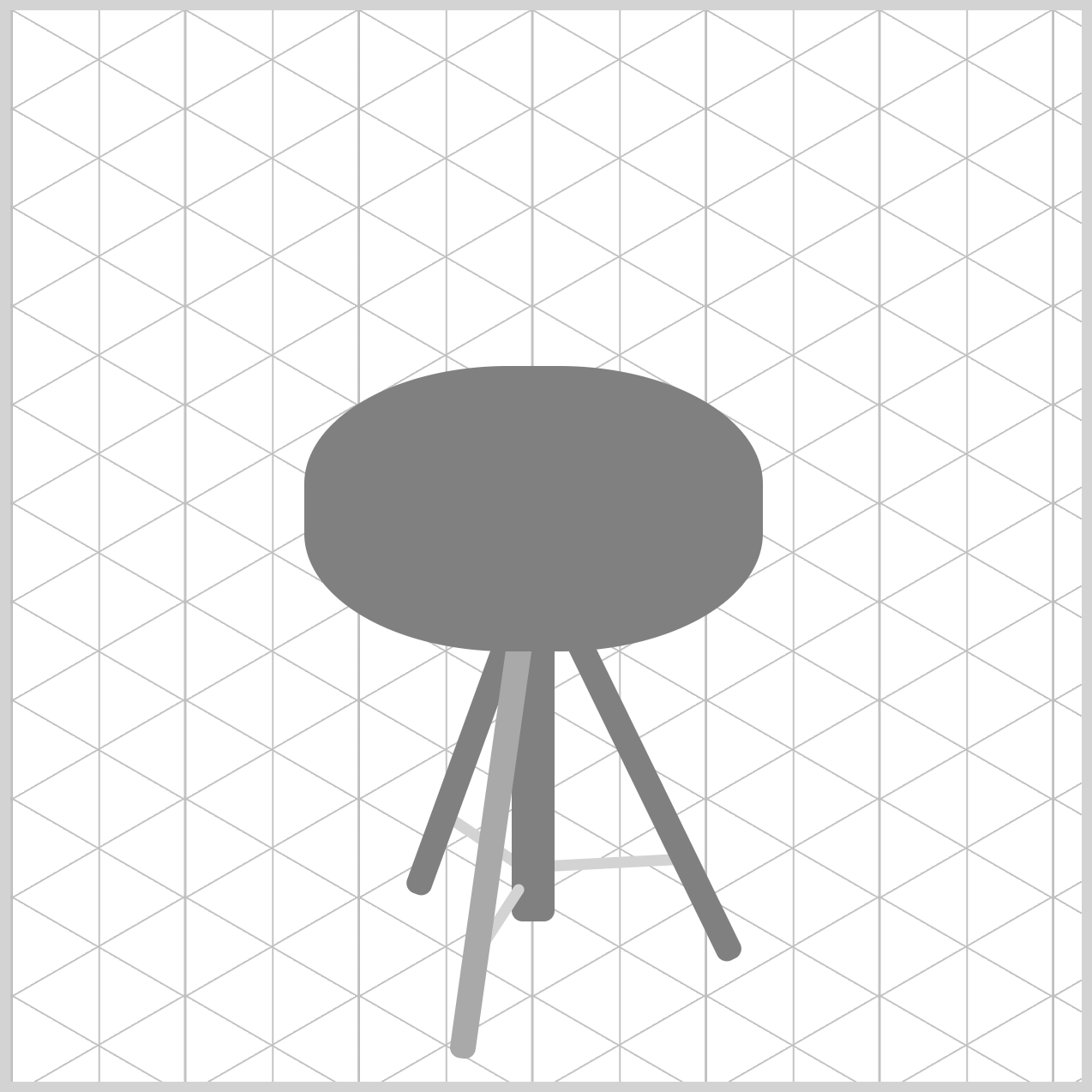
border-radius: 95px/55px property gives the element an elliptical shape, allowing it to match the snare drum's isometric perspective.
.bottom-rim::after {
  content: "";
  width: 214px;
  height: 121px;
  left: 0px;
  top: 0px;
  background: lightgray;
}
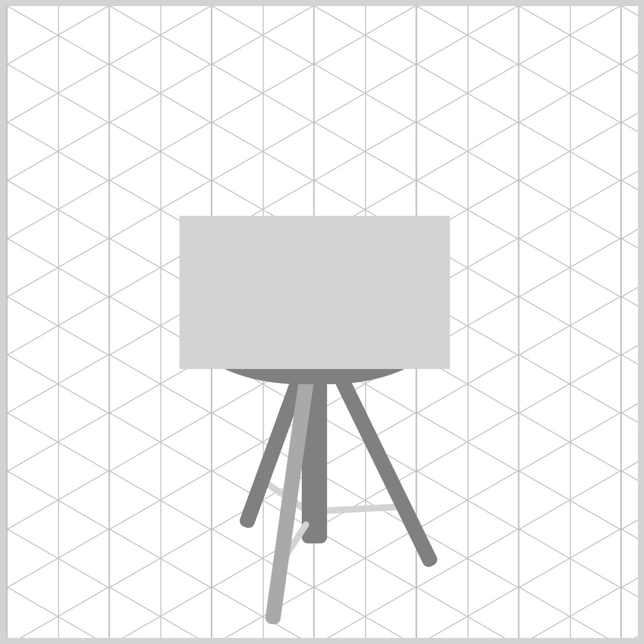
The pseudo-element .bottom-rim::after is slightly smaller compared to its parent with a height of 121px. Its location is flush to the parent at left: 0px and top: 0px. The background color is set to lightgray.
.bottom-rim::after {
  border-radius: 95px/55px;
}
Similar to the parent element, the pseudo-element uses border-radius: 95px/55px to create the same elliptical shape. This ensures both elements align perfectly, helping maintain the snare drum's isometric perspective and giving the bottom rim a smooth, realistic appearance.
Next up, let’s create the Drum Body.
Drum Body
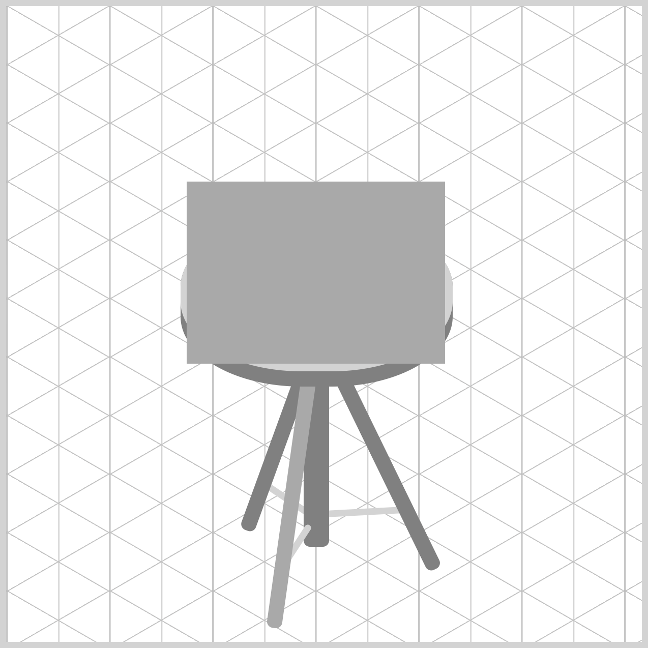
The Drum Body forms the main shell of the snare drum and gives the instrument its distinctive cylindrical appearance. By carefully adjusting its size, position, color, and rounded shape, you'll create the foundation that connects the top rim and bottom rim, helping the drum look more realistic and three-dimensional.
/* Drum Body */
.drum-body {
  width: 203px;
  height: 143px;
  left: 142px;
  top: 138px;
  background: darkgray;
}
The Drum Body is slight narrower than the bottom rim with a width of 203px and a height of 143px, allowing the metal rims to overhand the shell naturally on either side. It’s positioned using left: 142px and top: 138px, overlapping the lower rim. The background: darkgray serves as a neutral blocking tone.
.drum-body {
  border-radius: 95px/45px;
}
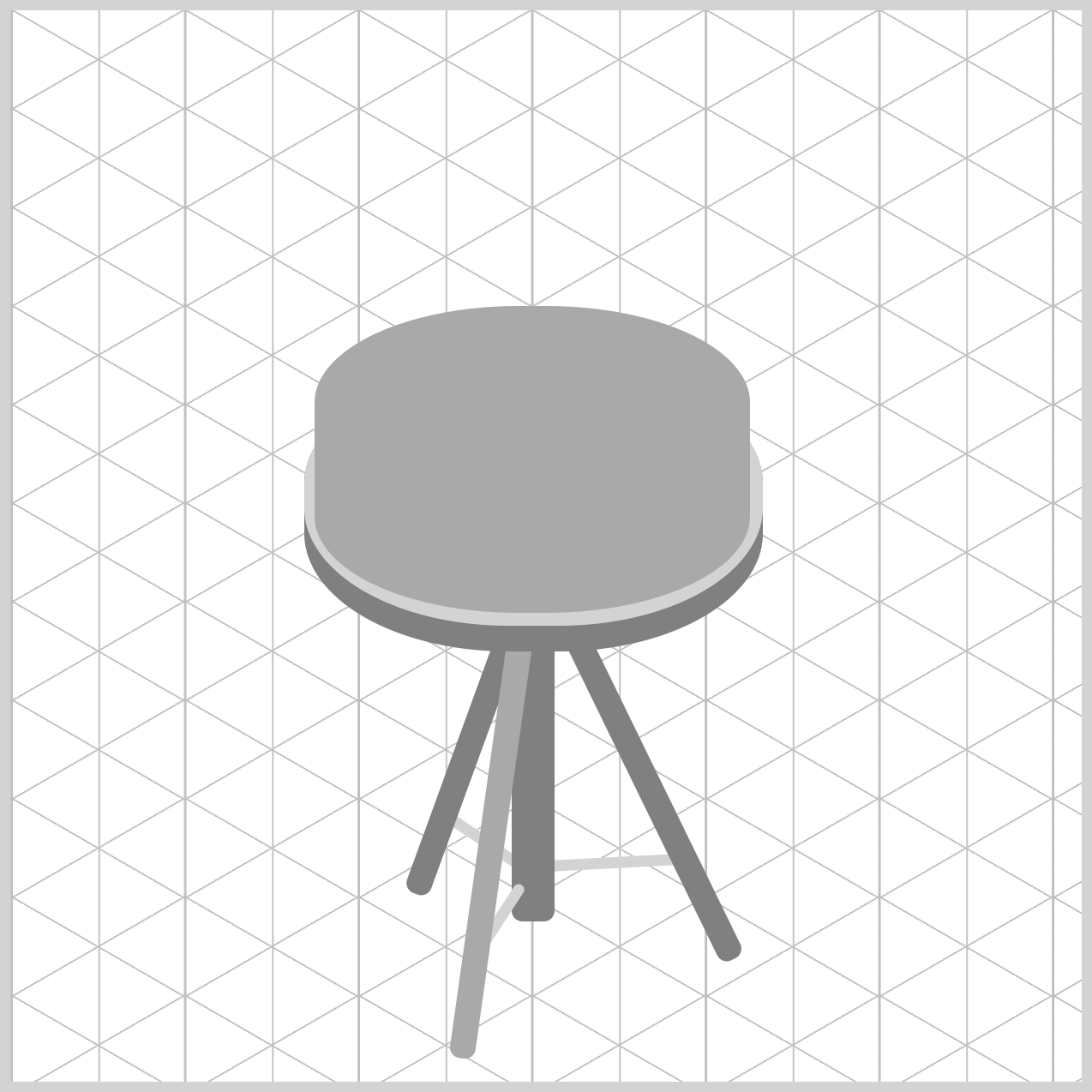
The border-radius property rounds the corners of the Drum Body rectangle, transforming it into an oval shape that better matches the snare drum's isometric perspective. The value before the slash, 95px, controls the horizontal radius, while the value after the slash, 45px, defines the vertical radius. Together, these values create a smooth elliptical shape that helps the drum body appear more natural and three-dimensional.
In the next section, let’s work on the Tension Rods.
Tension Rods
The Tension Rods are small but important components to connect the top rim and bottom rim, helping secure the drum head in place. By carefully positioning each rod around the drum body, you'll add extra detail and realism, making the snare drum look more complete and visually accurate.
The .rod class serves as the shared foundation for all six tension rods, defining common properties such as the width, background color, and rounded edges. This approach helps keep the code organized and avoids repeating the same styles multiple times.
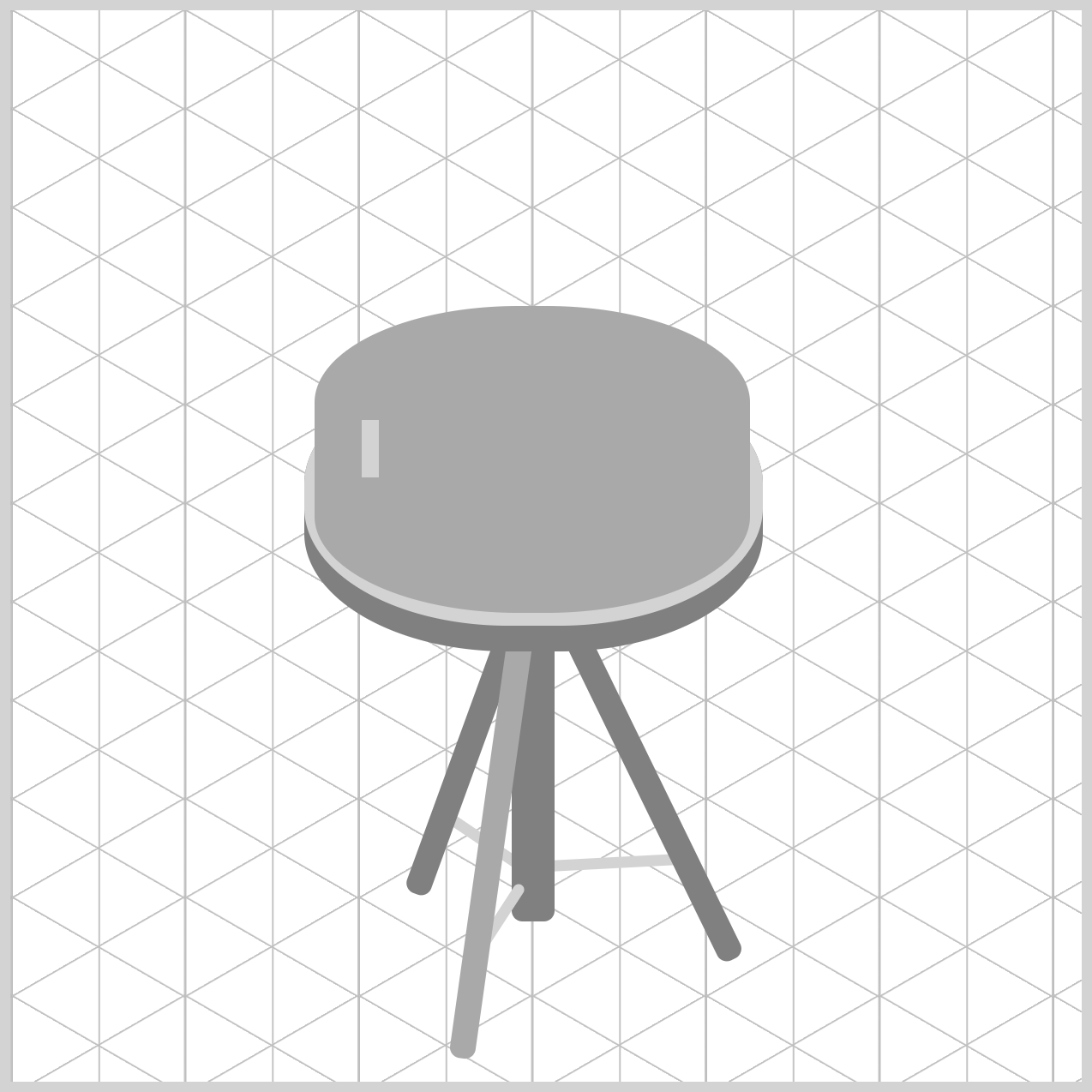
The individual classes, .rod-1 through .rod-6, control the height and position of each tension rod. By assigning unique left, top, and height values, each rod can be placed precisely around the drum body, helping create a balanced and realistic snare drum design.
/* Tension Rod */
.rod {
  width: 8px;
  background: lightgray;
}
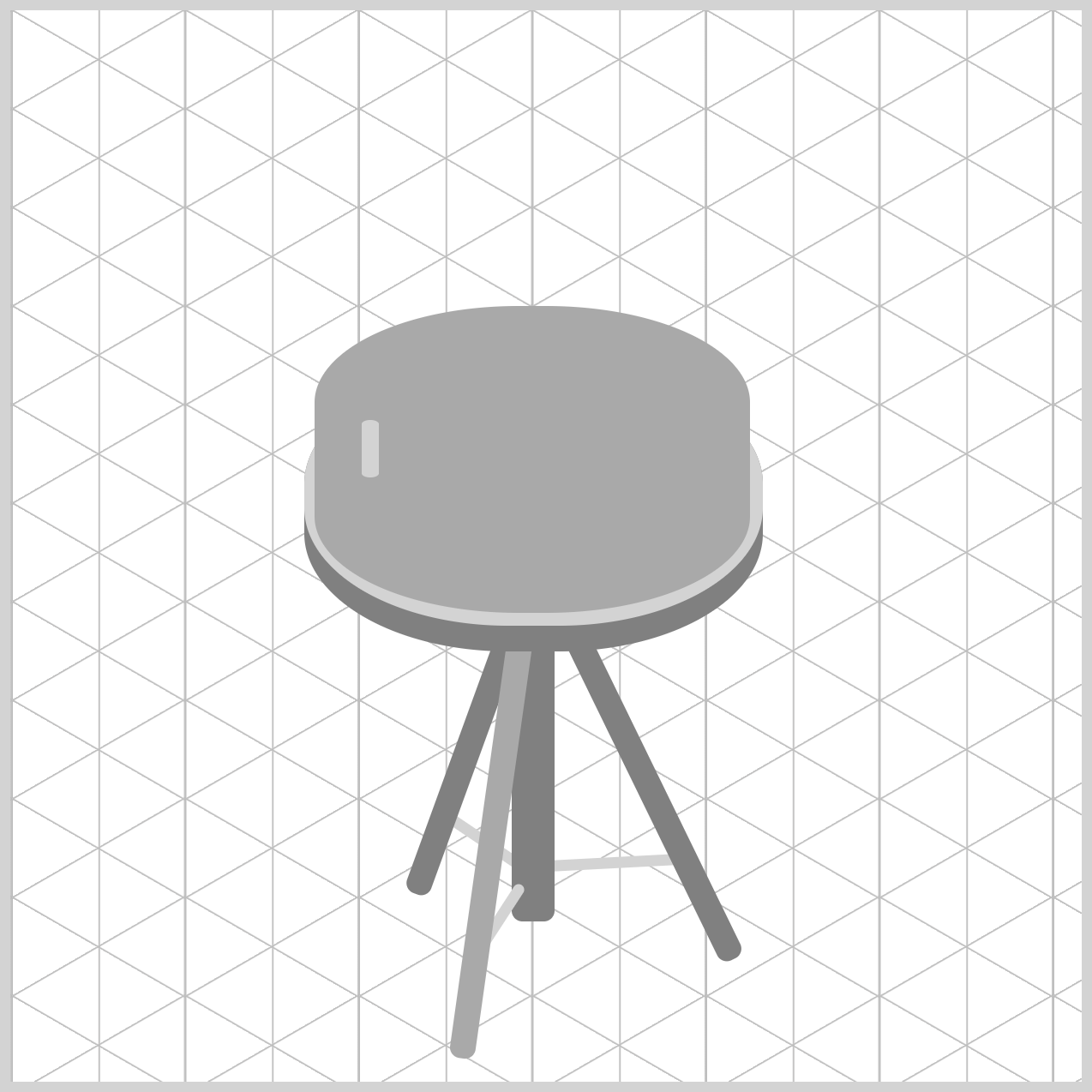
To create a sleek hardware appearance, the .rod element is given a width of 8px, resulting in a slim, vertical profile that resembles a real snare drum tension rod. A lightgray background color is applied to represent the rod's metallic surface, helping it stand out against the darker drum components while maintaining a clean and realistic look.
.rod {
  border-radius: 95px/45px;
}
The corners of the rectangular .rod element are softened with border-radius: 95px/45px. This border-radius value transforms the rectangle into a smooth, rounded shape, helping each tension rod appear more like a real metal drum component while maintaining its slim profile.
Next, each tension rod is styled using its respective class, from .rod-1 through .rod-6. These classes assign individual height values of 27px or 31px and define unique left and top positions. By adjusting these measurements, each rod is placed precisely around the Drum Body, creating a balanced arrangement that closely resembles the hardware found on a real snare drum.
.rod-1 {
  left: 164px;
  top: 191px;
  height: 27px;
}

.rod-2 {
  left: 244px;
  top: 204px;
  height: 31px;
}

.rod-3 {
  left: 322px;
  top: 185px;
  height: 27px;
}
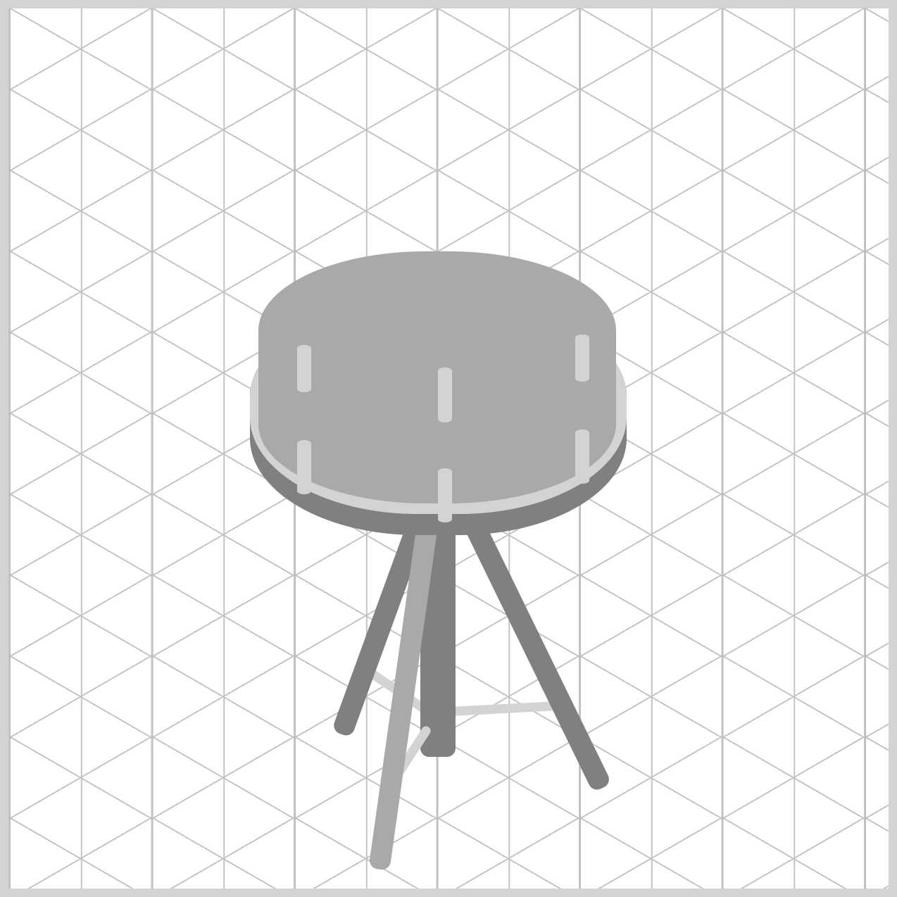
.rod-4 {
  left: 322px;
  top: 239px;
  height: 31px;
}

.rod-5 {
  left: 244px;
  top: 261px;
  height: 31px;
}

.rod-6 {
  left: 164px;
  top: 245px;
  height: 31px;
}
Now that the tension rods are complete, let's move on to the Top Rim.
Top Rim
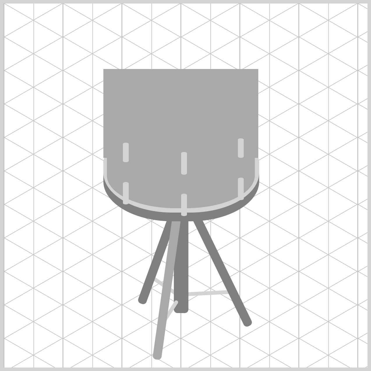
The Top Rim component forms the upper edge of the snare drum and helps frame the Drum Head. Using a combination of the main element, .top-rim and pseudo-elements, .top-rim::before, you'll create a layered structure that adds depth, curvature, and a polished metallic appearance, bringing even more realism to the overall drum design.
/* Top Rim */
.top-rim {
  width: 213px;
  height: 122px;
  left: 137px;
  top: 90px;
  background: darkgray;
}
The .top-rim constructs the upper hoop of the snare drum. width: 213px and height: 122px establish the wide elliptical collar capping the drum shell. Positioned at left: 137px and top: 90px, aligning its left boundary flush with .bottom-rim (left: 137px) while elevating it to form the top boundary of the drum assembly. A darkgray background color is applied to represent the rim's metallic surface and establish the base appearance before additional details are added with pseudo-elements.
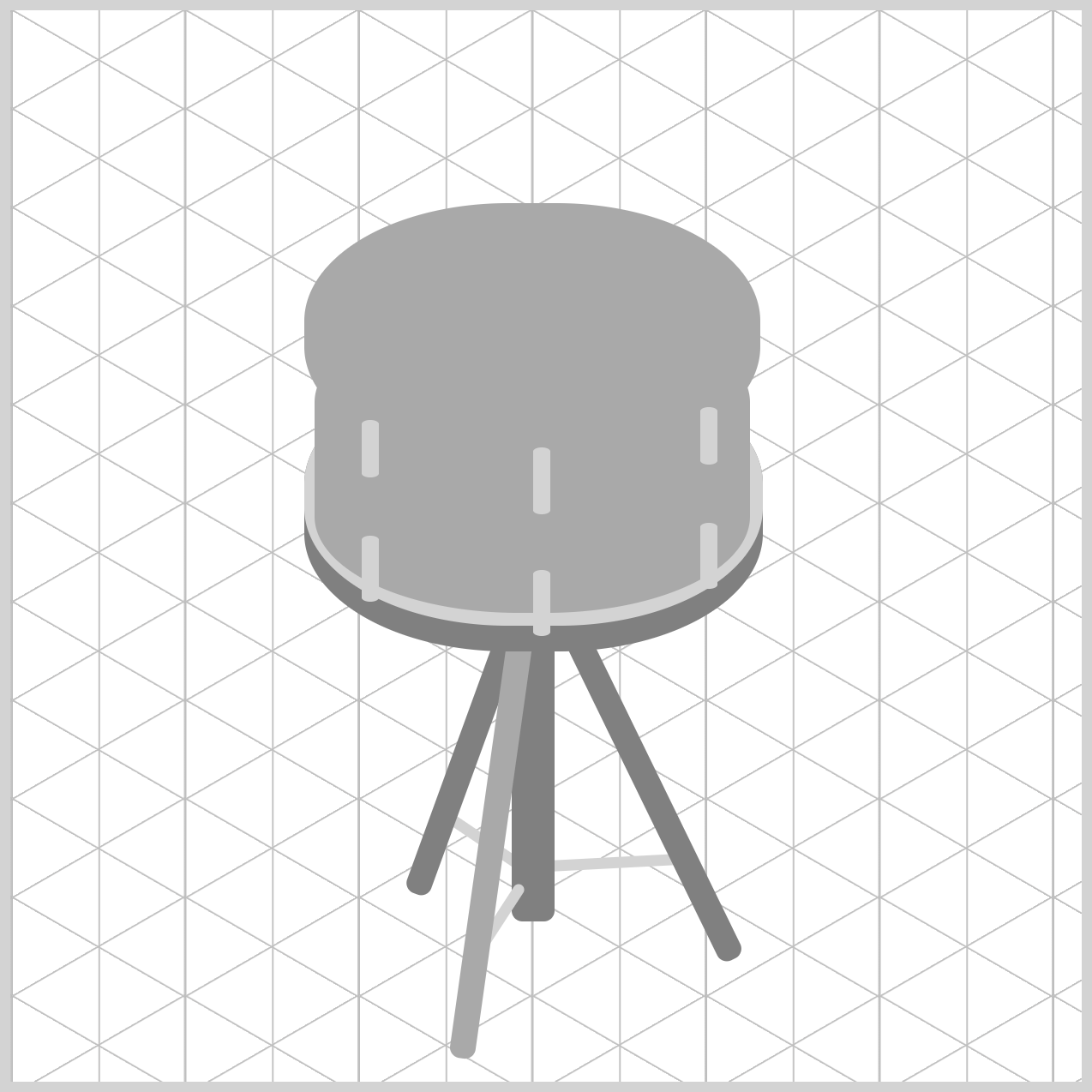
.top-rim {
  border-radius: 95px/55px;
}
The border-radius: 95px/55px property gives the .top-rim its elliptical shape by applying different corner radii to the horizontal and vertical axes. The 95px value controls the horizontal curvature, while 55px defines the vertical curvature. This combination subtly flattens the shape, helping the top rim match the snare drum's isometric perspective and creating a more realistic appearance.
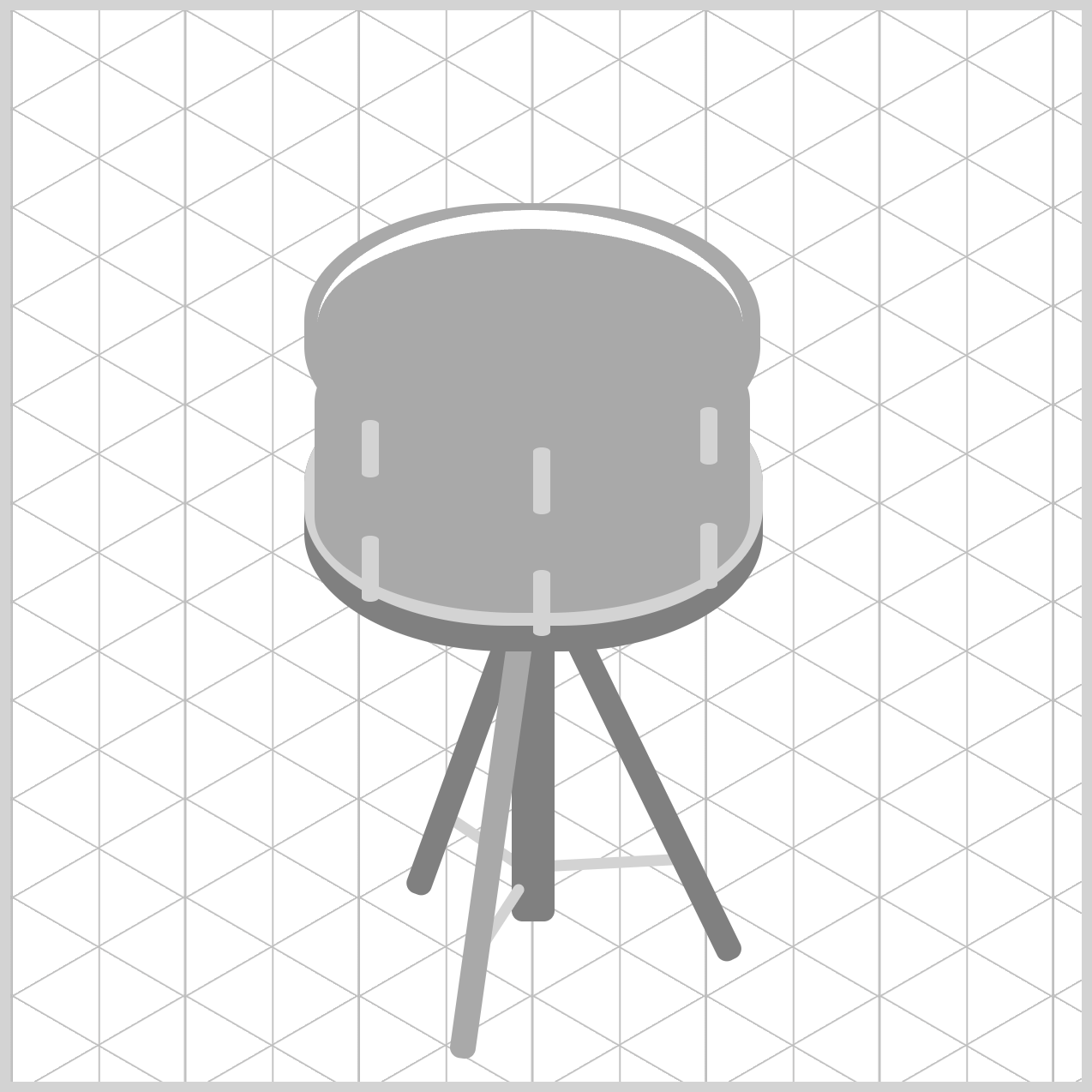
.top-rim::before {
  content: "";
  width: 199px;
  height: 100px;
  left: 6px;
  top: 3px;
  border-top: solid 9px white;
  border-radius: 50%;
  /* Take care of Webkit border-radius bug */
  -webkit-mask-image: -webkit-radial-gradient(white, black);
}
The .top-rim::before pseudo-element adds an inner layer to the top rim without requiring an additional HTML element. Created with content: "", it is positioned inside the .top-rim and acts as a decorative detail that helps define the rim's inner edge.
With a width of 199px, a height of 100px, and offsets of left: 6px and top: 3px, the pseudo-element fits neatly within the parent rim. Its width also matches the .drum-head element, ensuring the drum head sits comfortably inside the rim and maintains consistent alignment throughout the design.
The visual highlight is created using border-top: solid 9px white together with border-radius: 50%. This combination produces a curved highlight along the upper portion of the rim, helping simulate light reflecting off a metallic surface and adding depth to the illustration.
Finally, -webkit-mask-image: -webkit-radial-gradient(white, black) helps smooth the curved edges in WebKit-based browsers, reducing jagged rendering artifacts and creating a cleaner, more polished appearance.
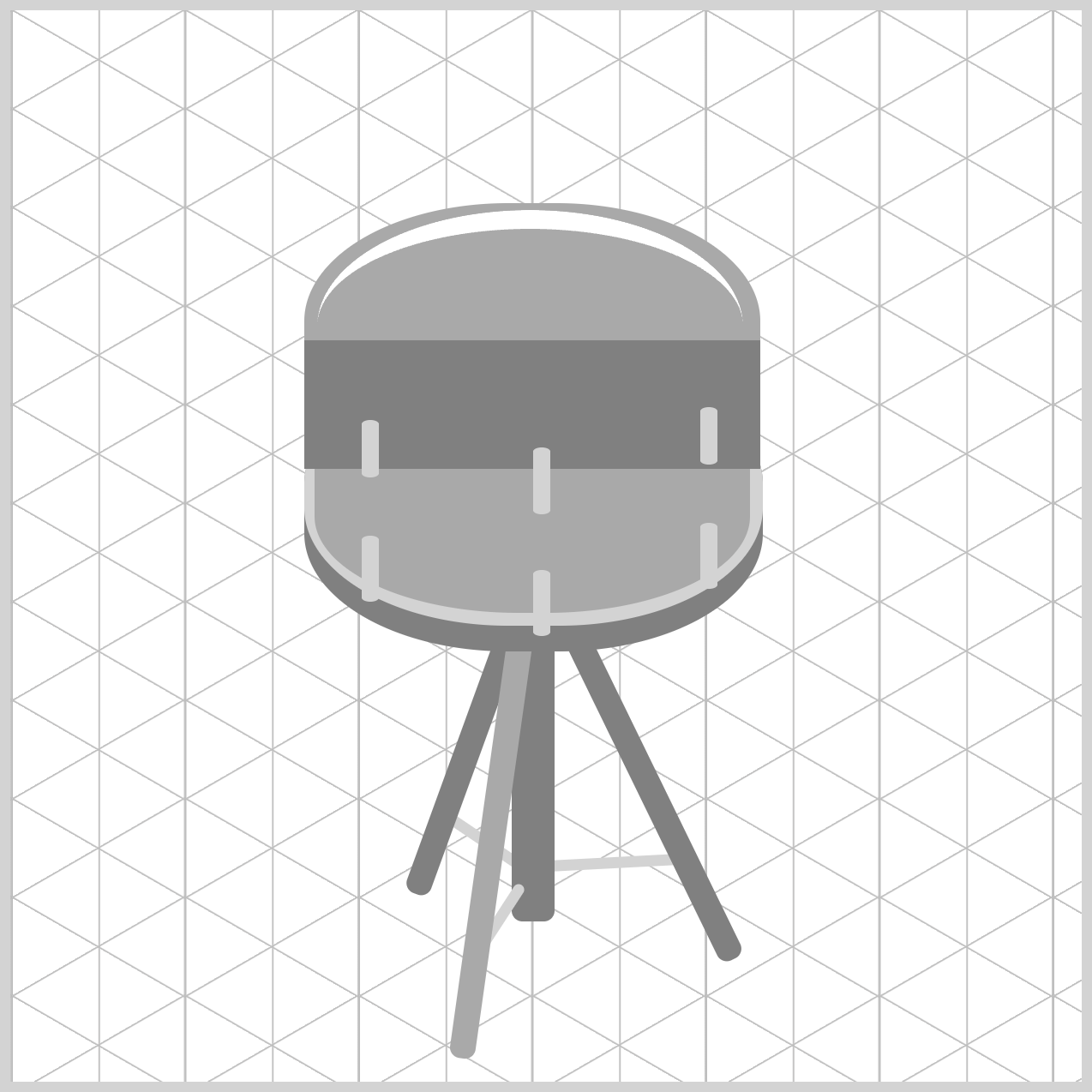
.top-rim::after {
  content: "";
  width: 213px;
  height: 60px;
  left: 0px;
  top: 64px;
  background: gray;
}
The .top-rim::after pseudo-element adds the lower section of the snare drum's top hoop without requiring any extra HTML. Created with content: "", it serves as an additional styling layer that helps give the rim more depth and dimension.
Its width: 213px matches the full width of the .top-rim element, ensuring both components align perfectly. The height: 60px value provides enough space to create the visible lower band of the hoop. Positioned with left: 0px and top: 64px, the pseudo-element sits along the lower half of the rim, helping bridge the transition between the top hoop and the Drum Body.
A gray background is used as the base fill, making it easy to visualize the shape during development.
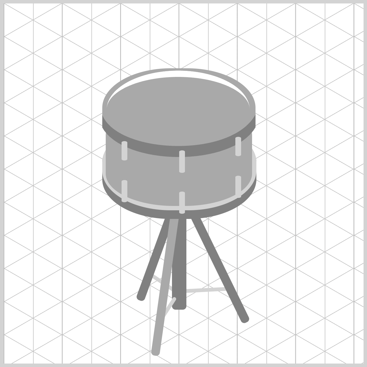
.top-rim::after {
  clip-path: shape(
    from 0px 18px,
    line to 0px 0px,
    curve to 213px 0px with 20px 55px / 180px 62px,
    line to 213px 18px,
    curve to 0px 18px with 180px 74px / 30px 72px,
    close
  );
}
Unlike border-radius, which only rounds an element's outer corners, clip-path: shape() provides much greater control over the element's silhouette.
In this design, it allows both the top and bottom edges of the shape to curve downward in the same direction, creating a contour that closely resembles the profile of a hollow metal cylinder viewed at an angle. This transforms what would otherwise be a simple rectangular element into a more realistic drum rim flange, helping the Top Rim blend naturally with the drum's isometric perspective.
Let’s break down the shape() commands and parameters step-by-step.
from 0px 18px: Drops the virtual pen on the left boundary edge, exactly18pxdown from the top of the60pxpseudo-element canvas.line to 0px 0px: Draws a vertical stroke straight up to the top-left origin, establishing the18pxouter rim height on the left flank.curve to 213px 0px with 20px 55px / 180px 62px: Carves a cubic Bézier curve spanning the entire213pxwidth to the top-right corner. The two control points (20px 55pxand180px 62px) pull the path downward, creating the smooth elliptical sag required by the overhead isometric perspective.line to 213px 18px: Drops straight down by18pxalong the right boundary, mirroring the left edge's vertical dimension to preserve geometric symmetry.curve to 0px 18px with 180px 74px / 30px 72px: Sweeps back from right to left across the bottom. Setting the control points slightly lower (180px 74pxand30px 72px) maintains an18pxvertical band height across the entire sweep while hugging the curvature of.drum-bodyunderneath.close: Snaps the path directly back to0px 18px, sealing a seamless, four-sided curved metal collar.
Now that the Top Rim component is finished let’s move to the last article section and create the Drum Head.
Drum Head
The Drum Head component represents the playable surface of the snare drum and sits neatly within the Top Rim. By combining a circular shape with a carefully positioned gradient, you'll create a subtle sense of depth and curvature, giving the drum head a clean, realistic appearance that enhances the overall design.
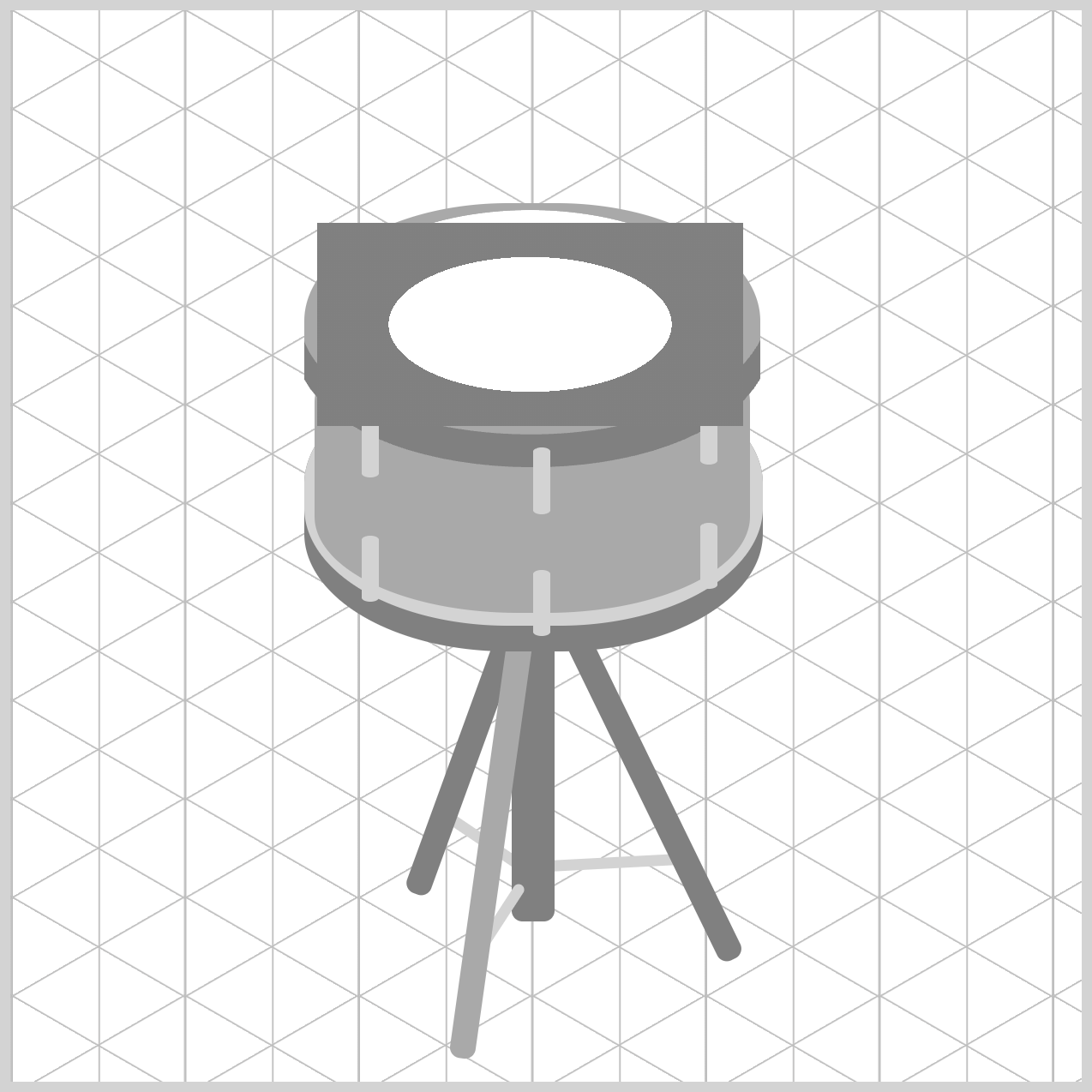
.drum-head {
  width: 199px;
  height: 95px;
  left: 143px;
  top: 99px;
  background: radial-gradient(at 50% 50%, white 0% 47%, gray 47% 100%);
}
With a size of 199px by 95px, the Drum Head matches the inner width of .top-rim::before, allowing it to sit snugly within the rim. Its left: 143px and top: 99px values position it slightly inward from the rim's outer edges, helping the drum head appear centered and properly seated within the recessed opening.
The surface detail is created with radial-gradient(at 50% 50%, white 0% 47%, gray 47% 100%). Centering the gradient at 50% 50% causes the colors to radiate outward from the middle of the drum head. Using the same 47% stop for both the white and gray colors creates a sharp transition instead of a gradual blend, producing a distinct ring that separates the central striking area from the outer edge and adds visual definition to the design.
.drum-head {
  border-radius: 50%;
}
To create the drum head's elliptical shape, border-radius: 50% is applied. Because the element is wider than it is tall, the rounded corners automatically form an ellipse rather than a perfect circle. This simple technique helps simulate the foreshortened appearance of a circular surface viewed from an isometric angle.
You can see and play with the complete code on Pyxofy’s CodePen page.
See the Pen CSS Art – shape() Function & Gradients: Build an Isometric Snare Drum by Pyxofy (@pyxofy) on CodePen.
Conclusion
Building on the snare drum tripod stand from Part 1, you've now learned how to create the remaining drum components, including the Bottom Rim, Top Rim, Drum Body, Tension Rods, and Drum Head using a variety of CSS techniques.
Along the way, you explored how the CSS border-radius property can be used with slash notation to create convincing isometric ellipses. You also learned how combining border-top with border-radius can produce a curved inner lip effect, helping simulate the structure of the Top Rim.
In addition, you discovered how the CSS shape() function can create custom silhouettes that would be difficult or impossible to achieve with border-radius alone. This technique was especially useful for building the Top Rim flange, giving the drum a more realistic three-dimensional appearance.
You also learned how to use the CSS radial-gradient() function to create two elliptical color regions within a single element, simulating a realistic Drum Head. By carefully positioning the gradient and defining precise color stops, you were able to create a distinct center striking area and an outer ring, adding depth, structure, and visual realism to the drum's playing surface.
In Part 3, we'll wrap up the series by applying a custom color palette and realistic shading to the snare drum components, bringing the illustration to life. Until then, keep experimenting, keep practicing, and share your masterpiece with us on LinkedIn, Threads, Bluesky, Mastodon, X (Twitter) @pyxofy, or Facebook.
We hope you liked this article. Kindly share it with your network. We appreciate it.
Related Articles
 Pyxofy
 Pyxofy
 Pyxofy
 Pyxofy