CSS Animation – Changing Size
Make shapes bigger, make them smaller, then move them all around. You’ll learn how to do this, step-by-step, in this article.

Introduction
Grow and Shrink are fundamental animation techniques.
You can use these techniques to draw attention to buttons, alerts, and myriad user interface (UI) elements.
Let’s learn how to use the CSS transform: scale() function. Then let’s combine it with the position property to make our circle shape move in different directions.
Preview
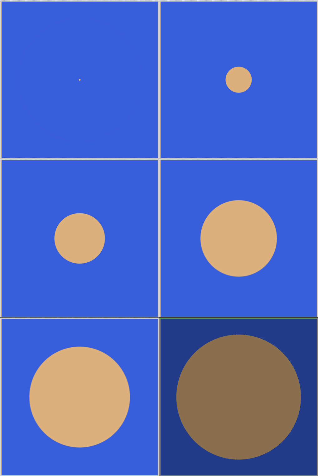
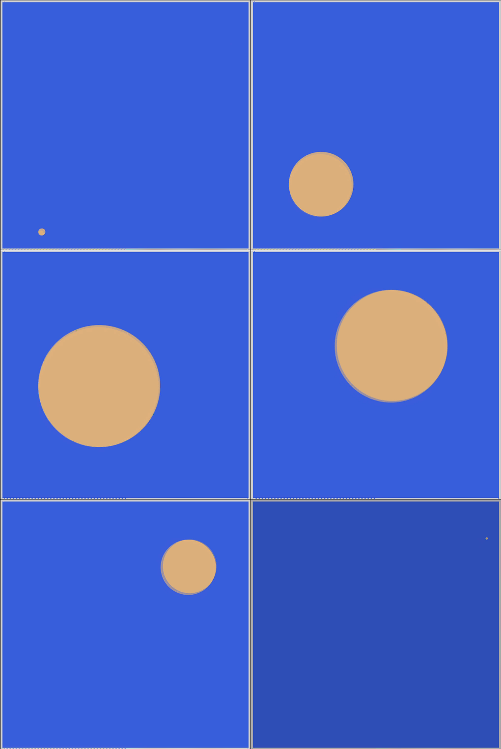
Preview of the animations we’ll make in this article.
Grow

Grow, Move and, Shrink

Prerequisites
We don’t assume prior knowledge of CSS or HTML, but it helps if you have some familiarity with how they work. Jump over to this article if you require an HTML and CSS primer.
We assume that you have set up tools to create CSS animation. If you haven’t, this article will show you how to set them up.
If you’re unfamiliar with CSS animation and @keyframes at-rule property, please read this article.
HTML Structure
<div class="container">
  <div class="circle grow"></div>
</div>
<div class="container">
  <div class="circle shrink"></div>
</div>
<div class="container">
  <div class="circle grow-to-bottom-right"></div>
</div>
<div class="container">
  <div class="circle grow-shrink-to-upper-right"></div>
</div>
container is our outermost enclosure. This enables us to center the content and draw a light gray border. The rest of the divs represent each animation sequence.
It’s important to keep the HTML structure as is for each animation to display properly.
Body and Container Div CSS
CSS code for the body and container div.
/**************************************/
/* Color, Body and Container Settings */
/**************************************/
/* Center shapes */
body {
  margin: 0;
  padding: 0;
  height: 100vh;
  display: flex;
  justify-content: center;
  align-items: center;
  flex-wrap: wrap;
}

/* Set light gray border */
.container {
  width: 500px;
  height: 500px;
  border: 5px solid lightgray;
  background: royalblue;
  position: relative;
  display: flex;
  justify-content: center;
  align-items: center;
  border-radius: 1px;
  margin: 5px;
}
CSS Shape
The circle shape we’ll animate in this article.
/* Shape */
.circle {
  position: absolute;
  width: 150px;
  height: 150px;
  background-color: burlywood;
  border-radius: 50%;
  animation-duration: 3s;
  /* animation-iteration-count: 3; */
  animation-iteration-count: infinite;
  animation-timing-function: linear;
}
Grow
Our first animation will demonstrate how we can make a circle shape grow or enlarge its size. This is a fairly common animation technique.
CSS Code
/* Grow */
.grow {
  animation-name: grow;
}

@keyframes grow {
  from {
    width: 0px;
    height: 0px;
  }

  to {
    width: 400px;
    height: 400px;
  }
}
In the example code above, we change two CSS property values:
widthheight
Both CSS property values have equal values. This keeps the circle shape intact as we transition.
- We start with
0pxin ourfromstate. - The
animation-durationis set to3s, which means it will take 3 seconds for the animation to transition. - The
toor end state for bothwidthandheightis400px. Our circle shape will be400pxin diameter when the animation ends.
Take note that you can create an oval shape by setting different width, height values.
For example, width: 400px, height: 200px will produce a horizontally elongated oval.
Our container dimensions are set to 500px. Any shape that is bigger than 500px will overflow or spill outside the container.
You can use CSS overflow to control the element's appearance when it overflows. For example, overflow: hidden;, will clip portions of the shape if it exceeds 500px.
In the next section, let’s make the shape shrink.
Shrink
Reduction of size or shrinking is another common animation technique. Let’s see how we can simulate this technique in CSS.
CSS Code
/* Shrink */
.shrink {
  animation-name: shrink;
}

@keyframes shrink {
  from {
    transform: scale(3);
  }

  to {
    transform: scale(0);
  }
}
For this example, we’re using the CSS transform scale() function to change the circle’s size.
transform: scale(3);will scale the circle three times its initial dimension of150px. This will be ourfromor beginning state.- The
toor end state we set totransform: scale(0);. This makes our circle shape disappear from the screen.
We use the scale() function in this example because it’s more flexible than hard-coding pixel, px, values.
We can separately control the width and height dimension by using two values like this, scale(sx, sy). The sx value is the shape’s horizontal scaling, sy will be vertical scaling.
Change the from state to transform: scale(3, 2); and see how the shape changes.
Next up, let’s change the shape's size while it’s in motion.
Grow and Move
In this example, let’s learn how to change a shape’s size while it’s moving.
CSS Code
/* Grow while moving to bottom right */
.grow-to-bottom-right {
  animation-name: grow-to-bottom-right;
}

@keyframes grow-to-bottom-right {
  from {
    top: 0;
    left: 0;
    transform: scale(0);
  }

  to {
    top: 350px;
    left: 350px;
    transform: scale(1);
  }
}
We’ll use two CSS properties in this example.
- The
positionproperty transform: scale()function
First, let’s tackle the shape from or start state.
top: 0;puts the shape at the top of the container.left: 0;positions the shape at the left corner of the container.
Setting both to 0, sets the circle shape’s initial position in the top-left corner of the container.
The below code sets the shape’s initial size.
transform: scale(0);
Second, let’s set our to or end state.
top: 350px;sets the shape near the bottom of the container.left: 350px;positions the shape close to the right corner of the container.
Our circle shape’s end state will be in the bottom-right corner of the container.
Let’s use the below code to grow our shape to 150px, it’s initial size.
transform: scale(1);
By combing both position property and scale() function, we transition our circle shape from the upper left-hand corner, while it’s growing, to the lower right-hand corner.
Very neat trick.
Let’s turn things up a notch in the next section.
Grow, Move and, Shrink
For the final example, let’s make the circle grow, then shrink while it’s moving.
We’ll use an in-between state, 50%, to achieve this transition.

