CSS Animation – Horizontal and Vertical Movement
How can we move shapes from left to right, top to bottom on the internet? Let’s find out how in this step-by-step CSS animation article.
Introduction
In this article, we will create a simple circle and make it move using CSS.
We’ll explore CSS animation and @keyframes at-rule, learn how to use them to move our circle horizontally and vertically.
With a single line of code, we’ll create a reversed version of our animation sequence.
Preview
Preview of the animations we’ll make in this article.
Horizontal Animation
Vertical Animation
Prerequisites
We don’t assume prior knowledge of CSS or HTML, but it helps if you have some familiarity with how they work. Jump over to this article if you require an HTML and CSS primer.
We assume that you have set up tools to create CSS animation. If you haven’t, this article will show you how to set them up.
Configuring CSS Animation
We use two CSS properties to configure CSS animation.
animation@keyframes
animation
The CSS animation property and its sub-properties are used to style the element you want to animate. It lets you configure the time timing, duration and other details of the animation sequence.
Here’s a list of animation sub-properties:
animation-delayanimation-directionanimation-durationanimation-fill-modeanimation-iteration-countanimation-nameanimation-play-stateanimation-timing-function
Check this Mozilla Developer Network (MDN) reference for a full description of the above animation sub-properties.
Sample animation code:
h1 {
  animation-duration: 5s;
  animation-name: slidein;
  animation-iteration-count: infinite;
  animation-direction: alternate;
}
You can use the animation shorthand to save space.
h1 {
  animation: 5s infinite alternate slidein;
}
Define Animation Sequence with @keyframes
We use @keyframes at-rule to define the appearance of the animation. @keyframes lets us establish one or multiple keyframes. Each keyframe describes how each animated element should render during the animation sequence.
@keyframes example code:
@keyframes slidein {
  from {
    margin-left: 100%;
    width: 300%;
  }

  to {
    margin-left: 0%;
    width: 100%;
  }
}
Keyframes use a <percentage> to define the timing of the animation.
0% percent indicates the first moment of the animation, 100% will be the final state of the animation.
You can use these special aliases:
0%orfrom100%orto
You can include additional keyframes between the start and end of the animation using percentages.
@keyframes slidein {
  from {
    margin-left: 100%;
    width: 300%;
  }

  45% {
    font-size: 300%;
    margin-left: 25%;
    width: 150%;
  }

  to {
    margin-left: 0%;
    width: 100%;
  }
}
Sample animation and @keyframes combined code.
h1 {
  animation-duration: 5s;
  animation-name: slidein;
}

@keyframes slidein {
  from {
    margin-left: 100%;
    width: 300%;
  }

  45% {
    font-size: 300%;
    margin-left: 25%;
    width: 150%;
  }

  to {
    margin-left: 0%;
    width: 100%;
  }
}
In the next section, let’s make a circle move horizontally. Let’s explore the HTML structure and CSS code we’ll be using.
HTML Structure
Here’s the HTML code for our animation.
<div class="container">
  <div class="circle move-horizontal"></div>
</div>
<div class="container">
  <div class="circle move-horizontal-reverse"></div>
</div>
<div class="container">
  <div class="circle move-vertical"></div>
</div>
<div class="container">
  <div class="circle move-vertical-reverse"></div>
</div>
container is our outermost enclosure. This enables us to center the content and draw a light gray border. The rest of the divs represent each animation sequence.
It’s important to keep the HTML structure as is for each animation to display properly.
Body and Container Div CSS
CSS code for the body and container div.
/**************************************/
/* Color, Body and Container Settings */
/**************************************/
/* Center shapes */
body {
  margin: 0;
  padding: 0;
  height: 100vh;
  display: flex;
  justify-content: center;
  align-items: center;
  flex-wrap: wrap;
}

/* Set light gray border */
.container {
  width: 500px;
  height: 500px;
  border: 5px solid lightgray;
  background: royalblue;
  position: relative;
  display: flex;
  justify-content: center;
  align-items: center;
  border-radius: 1px;
  margin: 5px;
}
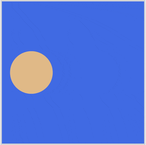
Horizontal Movement
In the following sections, we’ll build our CSS animation sequence step-by-step.
The CSS animation sequence will be divided into two parts.
- CSS Shape
- CSS Animation
We’ll use a simple circle for our CSS shape.
/* Shape */
.circle {
  width: 150px;
  height: 150px;
  background-color: burlywood;
  border-radius: 50%;
  animation-duration: 2s;
  animation-iteration-count: 3;
  animation-timing-function: linear;
}
Let’s break down the CSS code.
widthandheightsets the shape size.background-colorsets the shape color.border-radiuswith a value of50%, rounds our shape to a circle.animation-durationsets the length of time for one cycle of the animation sequence. We set it to2sfor a two-second duration.animation-iteration-countsets the numbers of times the animation sequence repeats before stopping. We set it to3, hence the animation will repeat three times.animation-timing-functionsets how the animation progresses throughout the duration of each animation sequence.linearequates to an even speed animation with no acceleration or deceleration.
Next, let’s explore the animation property.
/* Move Horizontal */
.move-horizontal {
  animation-name: move-horizontal;
}

@keyframes move-horizontal {
  from {
    transform: translateX(-100%);
  }
  to {
    transform: translateX(100%);
  }
}
animation-namewe’ll set tomove-horizontal, same as the CSS class name. We will target this name with@keyframesat-rule.- We use
transform: translateXfor bothfromandtovalues. -100%, ourfromstate, places our shape at the left edge.100%, ourtostate, sets the shape at the right edge of the container.
With the above code, our circle shape will move horizontally, from left to right.
In the next section, let’s reverse the animation.
Horizontal Reverse
Here’s our CSS Code.
/* Move Horizontal - Reverse */
.move-horizontal-reverse {
  animation-name: move-horizontal;
  animation-direction: reverse;
}
.move-horizontal-reverseis the CSS class name.animation-name: move-horizontal;directs the browser to use themove-horizontalanimation sequence we made in the previous section.animation-direction: reverse;will reverse the animation sequence. This means that instead of moving from left to right, CSS class.move-horizontal-reverseresults in the shape moving from right to left.
Let’s explore how we can make our shape move vertically, in the next section.
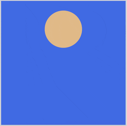
Vertical Movement
In this section, we’ll animate the circle shape to move vertically.
CSS Code
/* Move Vertical */
.move-vertical {
  animation-name: move-vertical;
}

@keyframes move-vertical {
  from {
    transform: translateY(-100%);
  }
  to {
    transform: translateY(100%);
  }
}
The move-vertical code is almost identical to the previous move-horizontal code. Since we want the shape to move vertically, we use transform: translateY instead of transform: translateX. We target the y-axis or vertical axis with transform: translateY.
Similar to the previous example, we use -100% for our from and 100% for our to state to move the shape from the top to the bottom of our shape container.
We can reverse the vertical animation. Let’s proceed to the next section.