CSS Art – shape() Function & Gradients: Build an Isometric Snare Drum - Part 3
Build a realistic 3D snare drum with pure CSS! Master gradients, shadows, and clip-path: shape() to create stunning CSS art


Introduction
Ready to make some noise with pure CSS? Learn how to use CSS Custom Properties, gradients, clip-path, pseudo-elements, and shadows to create detailed drum hardware, polished metal surfaces, and a beautifully shaded wooden shell. Along the way, you'll learn practical CSS illustration techniques that bring flat shapes to life.
In this three-part series, you'll build a CSS isometric snare drum from the ground up. By the end of the series, you'll have created a detailed snare drum illustration using nothing but HTML and CSS.
- In Part 1, you focused on constructing the drum's foundation by creating the tripod stand, including the tripod base center column, support braces (connectors), and three legs that hold the drum in place.
- In Part 2, you'll built the remaining drum components, including the bottom rim, top rim, drum body, tension rods, and drum head. These elements will come together to form the complete structure of the snare drum.
- In Part 3, this article, you'll bring your illustration to life using CSS Custom Properties (variables) and CSS gradients. These techniques will add realistic metallic finishes, subtle highlights, shadows, and depth, transforming the basic shapes into a polished and visually appealing snare drum.
CSS functions and properties you’ll be exploring in this article:
- CSS Custom Properties (variables)
shape()clip-pathlinear-gradient()radial-gradient()box-shadow
Preview
Before diving into the step-by-step sections, here's a quick preview of the isometric snare drum you'll create throughout this three-part article series.
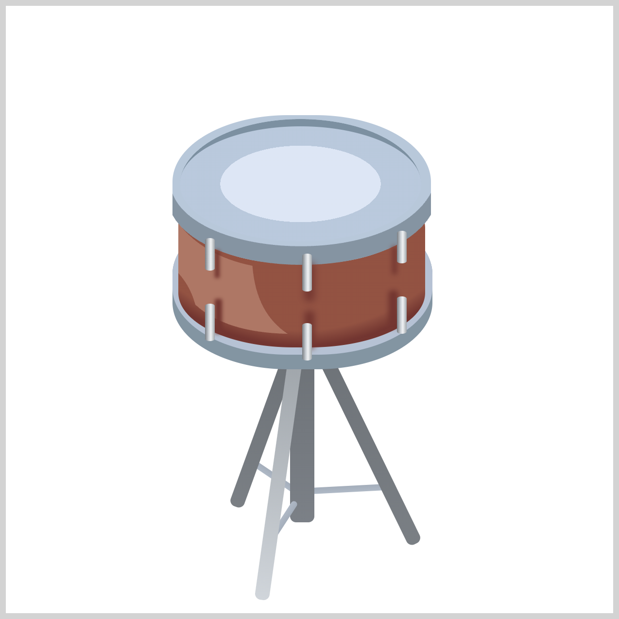
This preview gives you an overview of the final result and the individual parts you'll build one section at a time.
Before you dive in, we highly recommend checking out the following two articles. They provide a solid introduction to the CSS shape() function and will help you understand the concepts covered in this article more easily.
 Pyxofy
 Pyxofy
Prerequisites
Essential CSS and HTML knowledge will help you understand the concepts and techniques introduced in this article. Jump over to this article if you require an HTML and CSS primer.
We assume you have configured tools to modify CSS. If not, this article will guide you through the setup process.
HTML Structure
<div class="container">
  <!-- Stand -->
  <div class="first-leg-connector"></div>
  <div class="second-leg-connector"></div>
  <div class="stand-tripod-base"></div>
  <div class="third-leg-connector"></div>
  <div class="stand-first-leg"></div>
  <div class="stand-second-leg"></div>
  <div class="stand-third-leg"></div>

  <!-- Bottom Rim -->
  <div class="bottom-rim"></div>

  <!-- Drum Body -->
  <div class="drum-body"></div>

  <!-- Top Rim -->
  <div class="top-rim"></div>

  <!-- Tension Rods -->
  <div class="rod rod-1"></div>
  <div class="rod rod-2"></div>
  <div class="rod rod-3"></div>
  <div class="rod rod-4"></div>
  <div class="rod rod-5"></div>
  <div class="rod rod-6"></div>

  <!-- Drum Head -->
  <div class="drum-head"></div>
</div>
container is the outermost enclosure. It enables the content to be centered and draws a light gray border. The rest of the <div>s represent each image component.
Keep the HTML structure as is for the image to display correctly.
Body and Container <div> CSS
CSS code for the body and container <div>.
/* Body and Container Settings */
/* Center shapes */
body {
  margin: 0;
  padding: 0;
  height: 100vh;
  display: flex;
  justify-content: center;
  align-items: center;
  flex-wrap: wrap;
}

/* Set background and border color */
.container {
  width: 500px;
  height: 500px;
  border: 5px solid lightgray;
  background: transparent;
  position: relative;
  margin: 5px;
  display: flex;
  justify-content: center;
  align-items: center;
}
Color Palette
You'll color the isometric snare drum using CSS Custom Properties (variables). Storing your colors inside the :root selector makes your stylesheet cleaner, more organized, and much easier to update. Instead of changing the same color in multiple places, you only need to edit a single variable value.
/* Color Palette */
:root {
  /* Tripod Stand */
  --stand-1: #d0d5da; /* Light Gray */
  --stand-2: #afb9c6; /* Cadet Blue Gray */
  --stand-3: #a4aebb; /* Grayish Blue */
  --stand-4: #a0a6ab; /* Silver Gray */
  --stand-5: #7b8086; /* Battleship Gray */
  --stand-6: #7a7f84; /* Slate Gray */
  --stand-7: #6e7378; /* Charcoal Gray */

  /* Bottom Rim */
  --bottom-rim-1: #8394a2; /* Light Slate Gray */
  --bottom-rim-2: #b5c2d4; /* Light Steel Blue */

  /* Drum Body */
  --drum-body-1: #925242; /* Sienna Brown */
  --drum-body-2: #723530; /* Dark Chestnut Brown */
  --drum-highlight: #ae7665; /* Rosy Brown */

  /* Tension Rods */
  --tension-rod-1: #d5d2d6; /* Platinum */
  --tension-rod-2: #c8cfe2; /* Lavender Gray */
  --tension-rod-3: #b3b5c7; /* Cool Gray */
  --rod-shadow: #723530; /* Dark Chestnut Brown */

  /* Top Rim */
  --top-rim-1: #b8c8d9; /* Light Steel Blue */
  --top-rim-2: #7c8fa1; /* Slate Blue Gray */
  --top-rim-3: #8594a2; /* Blue Gray */

  /* Drum Head */
  --drum-head-1: #dde6f5; /* Alice Blue */
  --drum-head-2: #b9c9dc; /* Powder Blue */
}
Using CSS variables also helps create a design that can grow over time. As you add new details such as handles, decorative trim, badges, or other hardware, your color system will remain consistent and easy to maintain. By building a reusable color palette from the start, you'll create a more scalable and professional CSS art.
Let’s work on the Stand Tripod Base coloring in the next section.
Stand Tripod Base
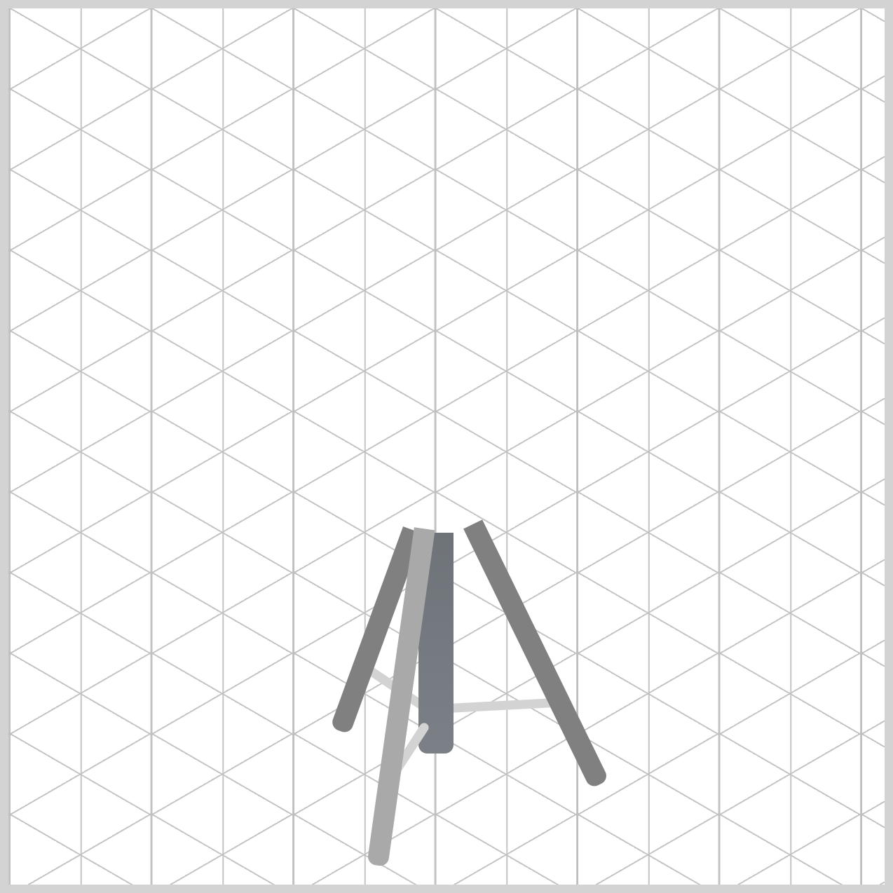
Let's add color to the Stand Tripod Base. This vertical support acts as the central part of the drum stand, connecting the drum to its three legs.
/* Stand Tripod Base */
.stand-tripod-base {
  background: linear-gradient(
    to bottom,
    var(--stand-7) 0%,
    var(--stand-5) 100%
  );
}
To create a realistic metallic appearance, the base uses a linear gradient that transitions from a darker gray, var(--stand-7) 0%, at the top to a slightly lighter gray, var(--stand-5) 100%, at the bottom.
Let’s work on the Leg Connectors next.
Leg Connectors
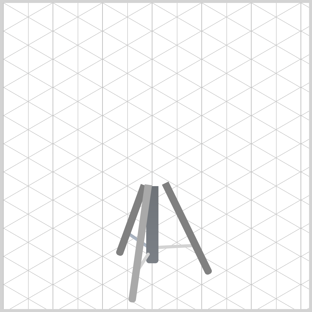
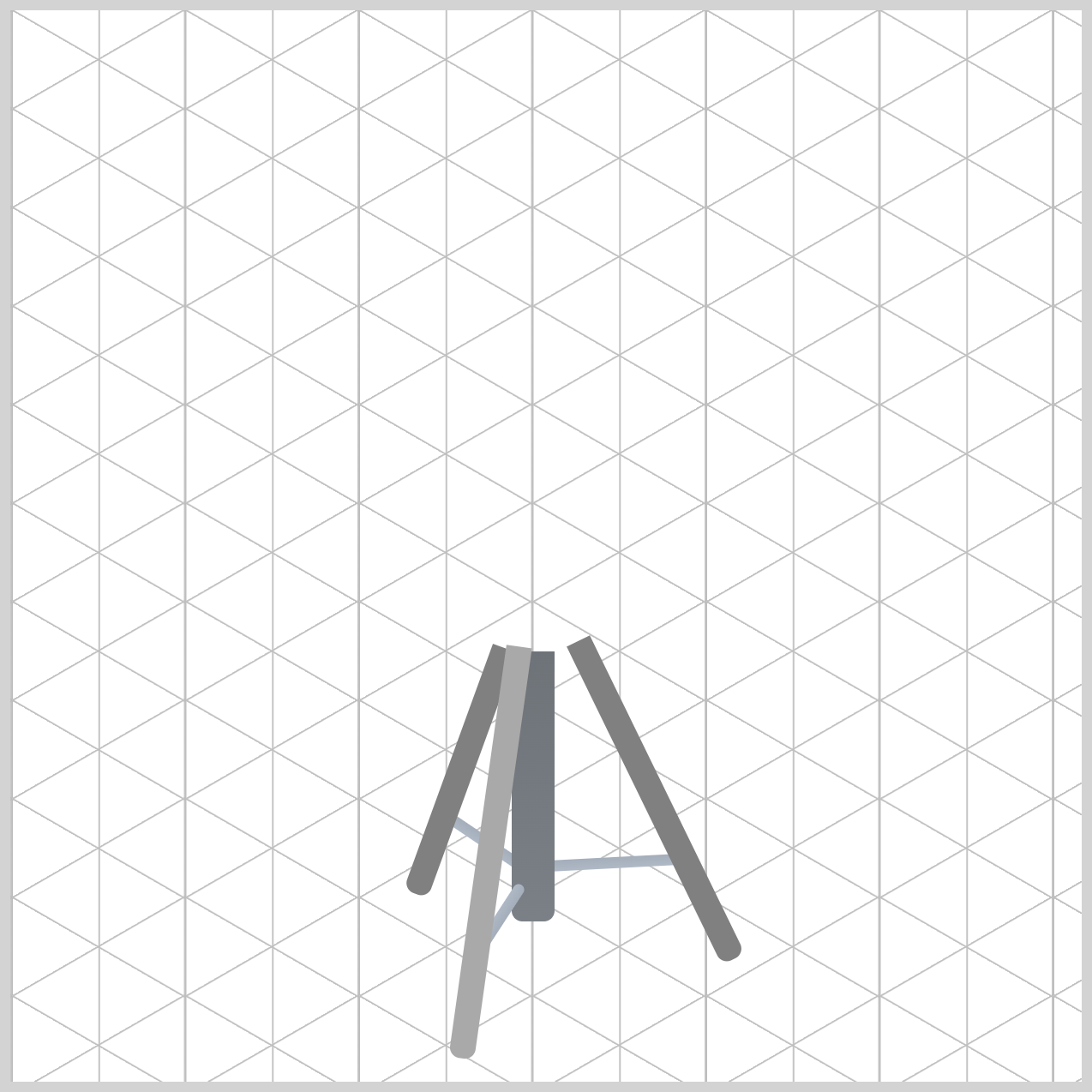
The Leg Connectors are small components that connect the tripod base to each stand leg and help create the overall support structure of the snare drum stand.
/* First Leg Connector */
.first-leg-connector {
  background: linear-gradient(
    to bottom,
    var(--stand-3) 0%,
    var(--stand-2) 100%
  );
}
To give the connectors a realistic metallic finish, you apply a linear gradient that is pointing downwards (to bottom) using the stand color variables. The subtle transition between lighter, var(--stand-3) 0%, and darker gray, var(--stand-2) 100%, tones creates the appearance of reflective metal, helping the connectors blend naturally with the rest of the stand.
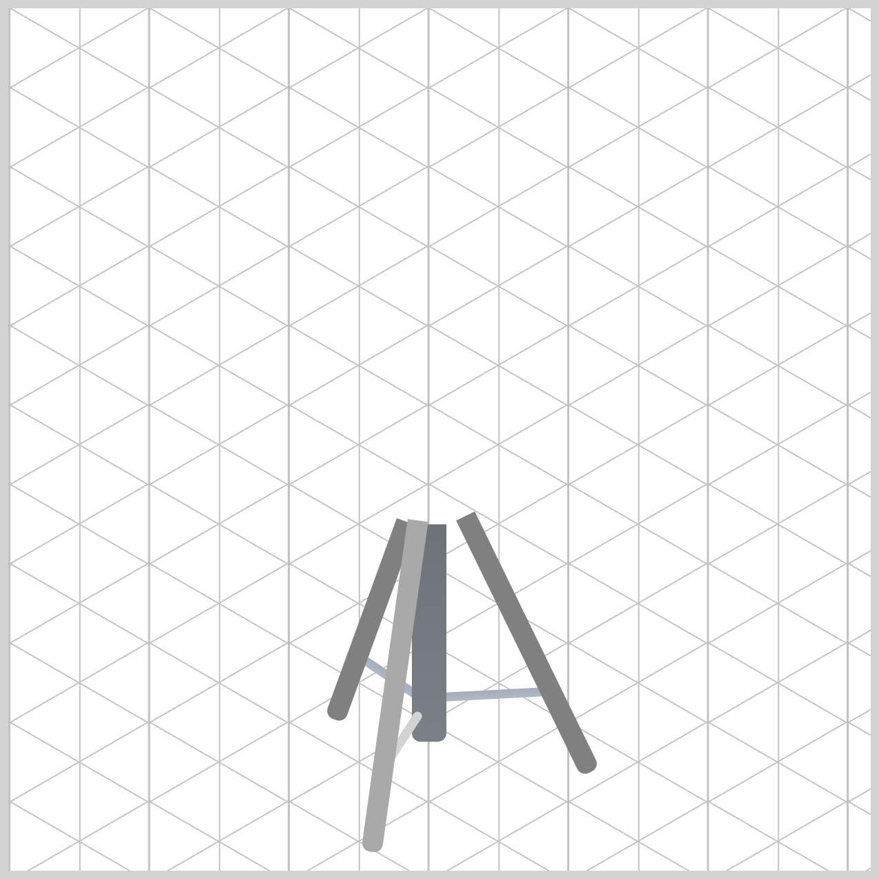
The same coloring technique is applied to the Second and Third Connectors.
/* Second Leg Connector */
.second-leg-connector {
  background: linear-gradient(
    to bottom,
    var(--stand-3) 0%,
    var(--stand-2) 100%
  );
}
/* Third Leg Connector */
.third-leg-connector {
  background: linear-gradient(
    to bottom,
    var(--stand-3) 0%,
    var(--stand-2) 100%
  );
}
In the next section, we’ll work on the Tripod Legs.
Tripod Legs
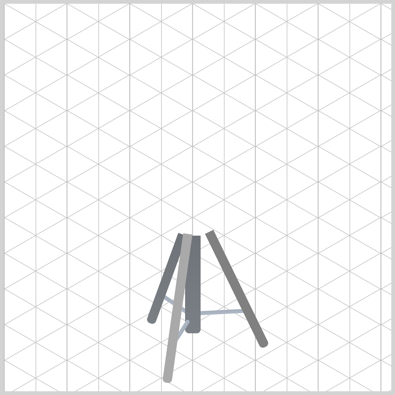
These three legs provide stability for the snare drum stand and help create its realistic tripod structure.
/* First Leg */
.stand-first-leg {
  background: linear-gradient(
    to bottom,
    var(--stand-7) 0%,
    var(--stand-6) 100%
  );
}
To achieve a polished metal appearance, each leg uses a linear gradient that blends multiple shades of gray. The subtle color transition from var(--stand-7) 0% to var(--stand-6) 100% simulate reflected light, giving the stand a more realistic and professional look. Similar to the Leg Connectors, the Tripod Connector’s color direction are all pointing down using the to bottom property value.
/* Second Leg */
.stand-second-leg {
  background: linear-gradient(
    to bottom,
    var(--stand-7) 0%,
    var(--stand-6) 100%
  );
}
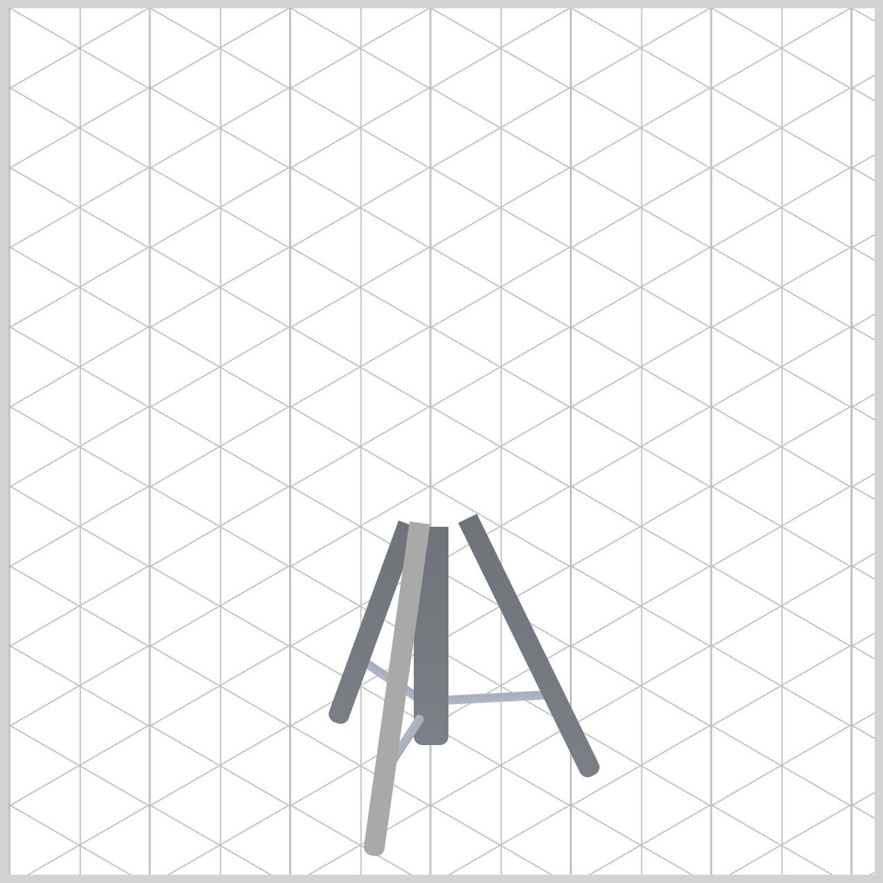
The Second Leg uses the same coloring scheme as the First Leg, helping maintain a consistent metallic appearance throughout the tripod stand. By reusing the same gradient colors, the legs appear to be made from the same material while still relying on positioning and rotation to create the isometric perspective.
/* Third Leg */
.stand-third-leg {
  background: linear-gradient(
    to bottom,
    var(--stand-4) 0%,
    var(--stand-1) 100%
  );
}
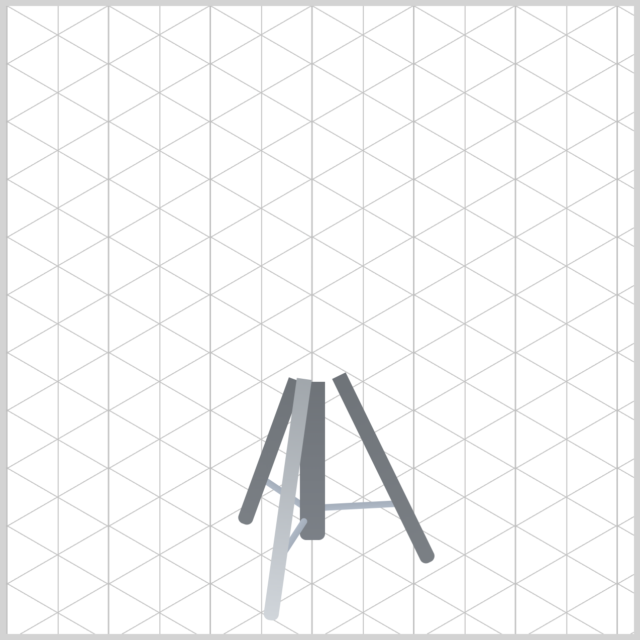
To make the Third Leg appear closer to the viewer, you use a slightly lighter color palette than the other tripod legs. This subtle color adjustment helps create a sense of depth and enhances the overall isometric perspective of the illustration.
You apply a linear-gradient() that flows to bottom, starting with var(--stand-4) at 0% and gradually transitioning to var(--stand-1) at 100%. The lighter tones make the leg stand out visually, giving it the appearance of being positioned in front of the other support legs.
Next up is the Bottom Rim component.
Bottom Rim
Let's add color to the Bottom Rim. This component forms the lower metal edge of the snare drum and helps separate the drum shell from the hardware below. To create a realistic metallic appearance, the rim uses two layers: the main .bottom-rim element and its ::after pseudo-element.
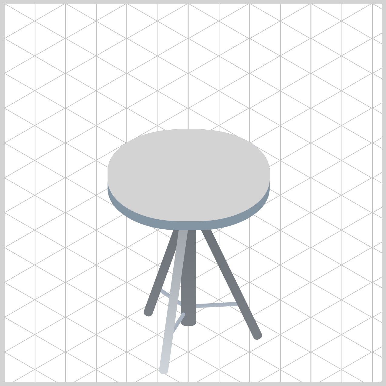
/* Bottom Rim */
.bottom-rim {
  background: var(--bottom-rim-1);
}
The base layer uses var(--bottom-rim-1), a light slate gray shade.
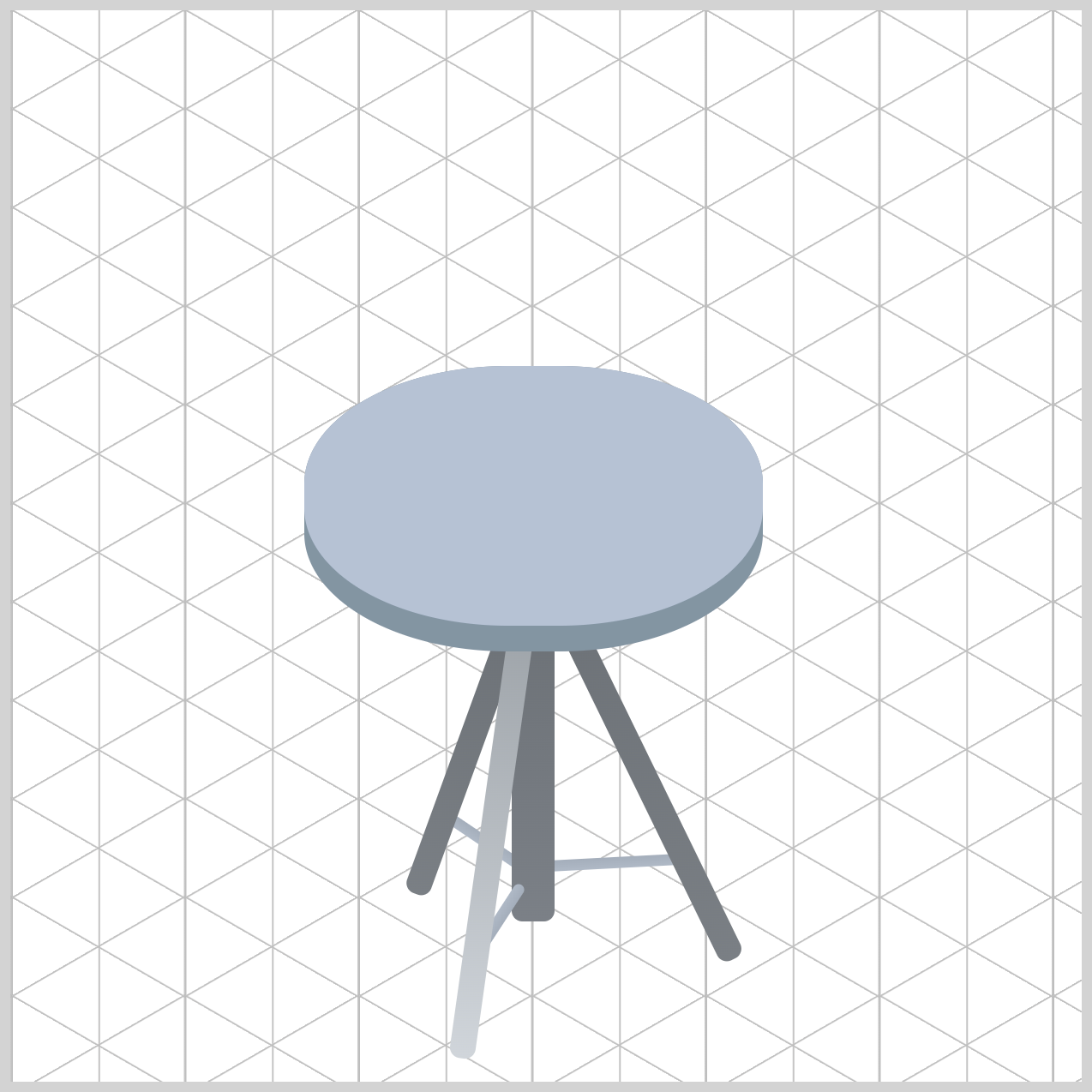
.bottom-rim::after {
  background: var(--bottom-rim-2);
}
The overlay uses a light steel blue hue using var(--bottom-rim-2). Combining these two colors helps create subtle contrast, making the rim appear more dimensional and polished.
Let’s work on the Drum Body in the next section.
Drum Body
To create a realistic wooden finish, you'll use a radial-gradient() that blends lighter and darker brown shades. These gradual color transitions help simulate the curved surface of the drum shell, giving it a more natural and three-dimensional appearance.
You'll also add a subtle highlight using a ::before pseudo-element. This extra layer helps mimic reflected light, making the drum body look polished and adding more visual depth to the illustration.
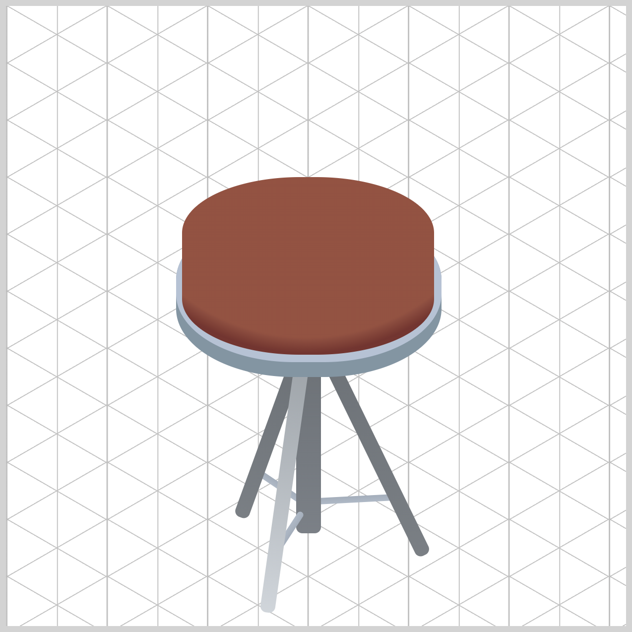
/* Drum Body */
.drum-body {
  background: radial-gradient(
    circle at 101px -35px,
    var(--drum-body-1) 80%,
    var(--drum-body-2) 86%
  );
}
The radial-gradient() creates the main drum shell by simulating a light source positioned above the drum. The circle at 101px -35px setting places the gradient's origin near the horizontal center and slightly outside the top boundary, producing a natural overhead lighting effect across the curved surface.
The gradient uses var(--drum-body-1) 80% for the primary wood tone and quickly transitions to var(--drum-body-2) 86% near the edges. This compressed color blend creates a stronger shadow around the perimeter, helping the shell appear rounded and three-dimensional.
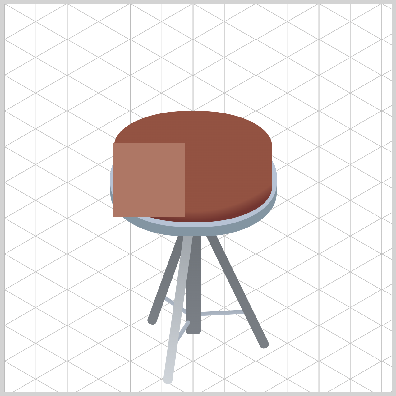
/* Drum Body Highlight */
.drum-body::before {
   background: var(--drum-highlight);
}
The highlight uses var(--drum-highlight) to apply a warm copper tone that complements the drum body's wood colors and simulates light striking the lacquered finish.
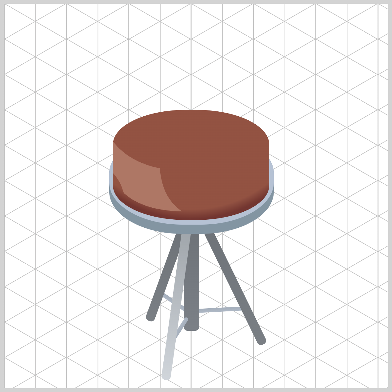
/* Drum Body Highlight */
.drum-body::before {
  clip-path: shape(
    from 1px 41px,
    line to 1px 0px,
    curve to 62px 35px with 22px 27px,
    curve to 91px 91px with 65px 74px,
    curve to 15px 67px with 40px 90px,
    curve to 1px 41px with 11px 52px,
    close
  );
}
The clip-path: shape() function carves the pseudo-element into a custom organic shape without requiring external graphics. A series of lines and curves traces the highlight path, forming a smooth reflective streak that follows the contour of the cylindrical shell.
- The path starts with
from 1px 41px, which places the virtual pen near the left side of the highlight. - It then moves upward with
line to 1px 0px. - The first curve,
curve to 62px 35px with 22px 27px, pulls the shape inward from the top-left corner. This creates the highlight's smooth upper edge and begins the reflective sweep across the drum. - Next,
curve to 91px 91px with 65px 74pxextends the highlight downward and to the right. This point forms the widest part of the reflection, making the highlight appear to wrap around the curved shell. - The third curve,
curve to 15px 67px with 40px 90px, turns the path back toward the left side. This creates the lower boundary of the highlight and gives it a rounded, leaf-like appearance. - Finally,
curve to 1px 41px with 11px 52pxguides the path back toward its starting position. - The
closecommand closes the shape and completes the reflective shape and blends the highlight naturally into the drum body.
Now that the Drum Body is complete, let's move on to coloring the Top Rim component.
Top Rim
The Top Rim forms the upper metal edge of the snare drum and helps frame the drum head while adding definition to the overall design.
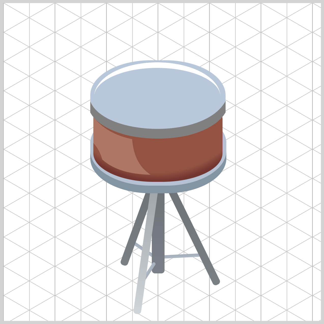
/* Top Rim */
.top-rim {
  background: var(--top-rim-1);
}
The .top-rim element uses var(--top-rim-1) as its base color, creating the main surface of the metal hoop with a cool steel-blue appearance. This serves as the foundation for the rim's lighting and shading.
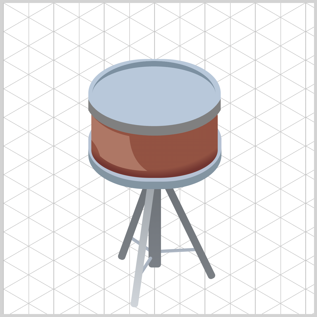
.top-rim::before {
  border-top: solid 9px var(--top-rim-2);
}
The .top-rim::before pseudo-element uses border-top: solid 9px var(--top-rim-2) to create a curved highlight along the upper edge. This darker blue-gray tone helps define the rim's contour and adds a subtle metallic reflection.
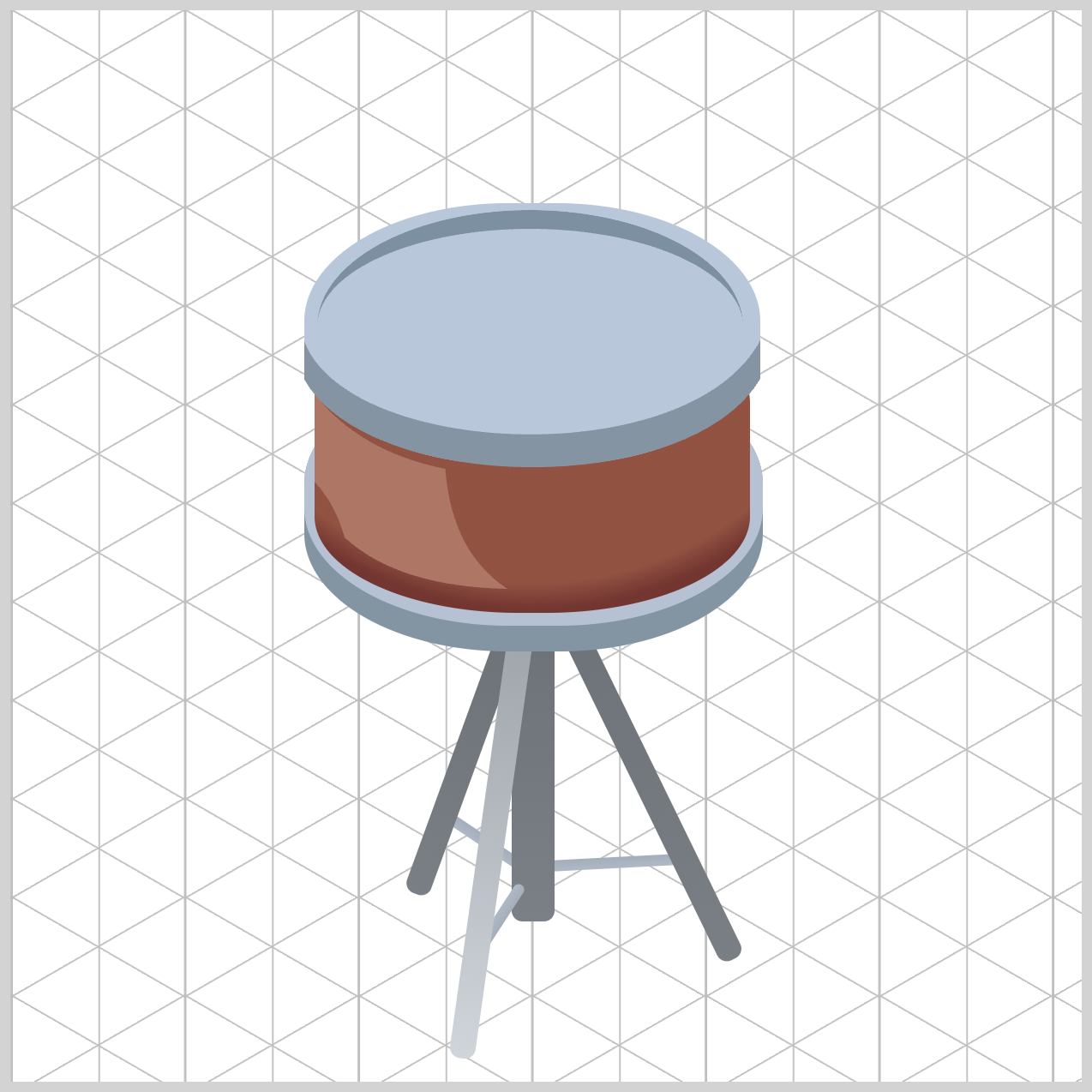
.top-rim::after {
  background: var(--top-rim-3);
}
The .top-rim::after pseudo-element applies var(--top-rim-3) to the lower flange of the hoop. Because this shade is slightly darker than the base color, it creates the illusion of thickness and a gentle shadow underneath the rim.
Up next is the Drum Head.
Drum Head
The Drum Head uses a radial-gradient() to simulate both the base color and the drum's strike zone. The lighter center color represents the area most frequently struck, while the darker outer color adds subtle depth and helps define the drum head's shape.
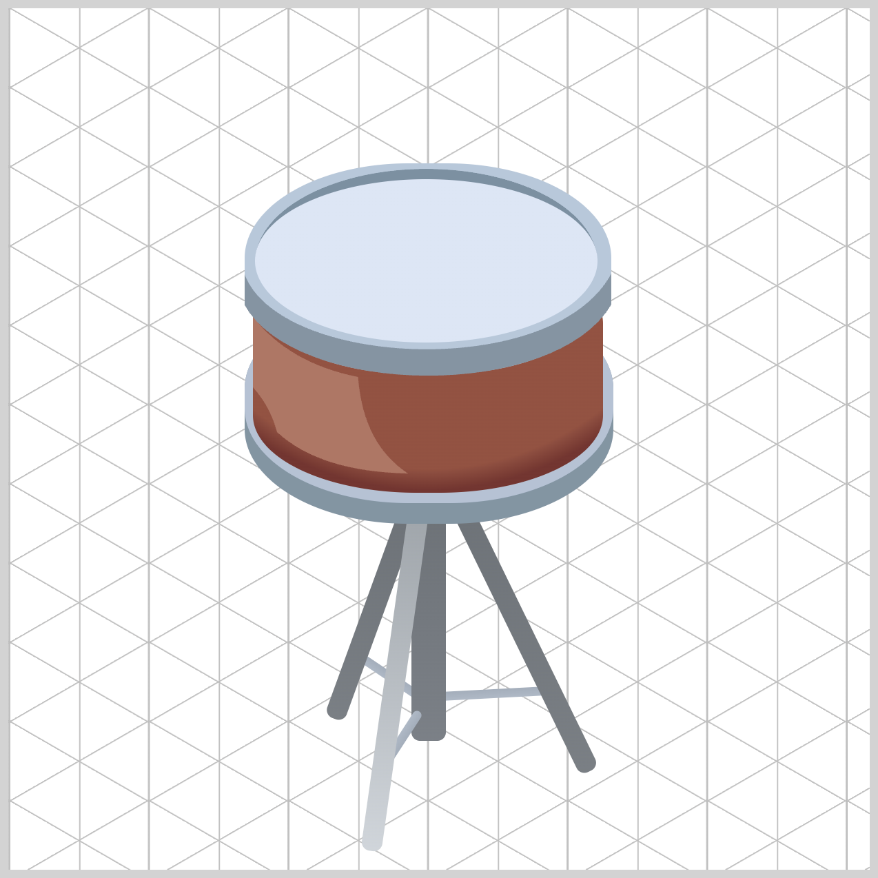
/* Drum Head */
.drum-head {
  background: radial-gradient(
    at 50% 50%,
    var(--drum-head-1) 0% 47%,
  );
}
The radial-gradient() is positioned to begin at the center of the ellipse using at 50% 50%. This places the gradient's focal point directly in the middle of the drum head, allowing the lighter strike-zone color, var(--drum-head-1) 0% 47%, to radiate evenly outward toward the darker outer edge. It starts from the middle at 0% and stops at 47%.
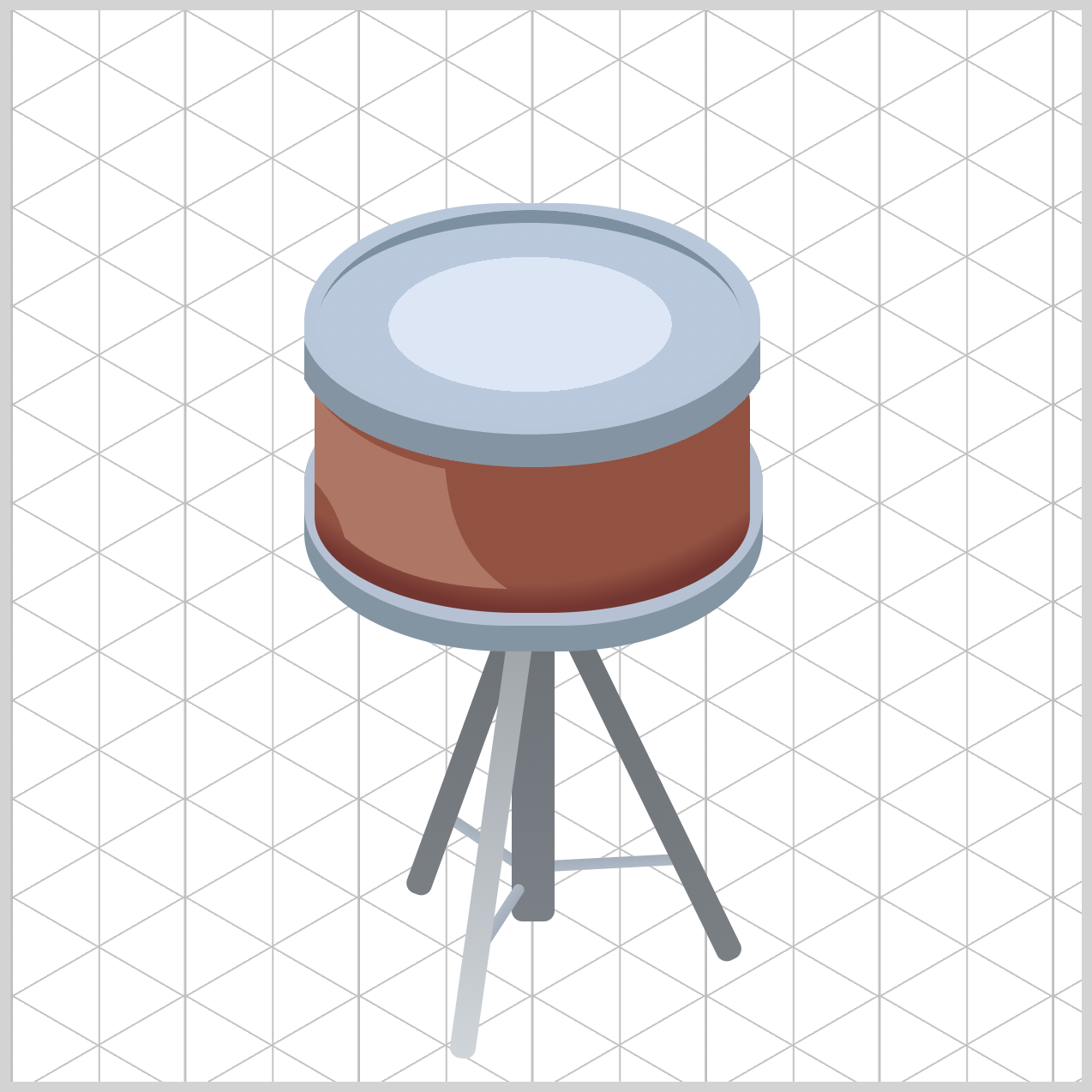
.drum-head {
  background: radial-gradient(
    at 50% 50%,
    var(--drum-head-1) 0% 47%,
    var(--drum-head-2) 47% 100%
  );
}
The value var(--drum-head-2) 47% 100% defines the outer edge color of the drum head. Beginning at 47% and extending to 100%, this darker shade surrounds the lighter center area, creating a subtle contrast that helps emphasize the drum's strike zone.
Let’s move to the last section and finish coloring the Tension Rods.
Tension Rods
The Tension Rods are metal components that run along the side of the snare drum and are responsible for holding the drum head and rims together.
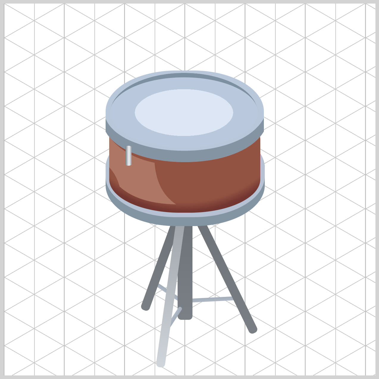
/* Tension Rods */
.rod {
  background: linear-gradient(
    to right,
    #787d82 0%,
    #d0d5da 40%,
    #f0f2f4 60%,
    #a0a6ab 100%
  );
}
The linear-gradient() gives the Tension Rods a polished chrome appearance.
The shared .rod class uses a horizontal linear-gradient() with four color stops to simulate light reflecting across a curved metal surface. The colors flows to the right direction via the to right property value. Darker grays appear along the edges, while a bright silver highlight near the center creates the illusion of polished chrome. Positioning the brightest color at 60% instead of the exact center makes the reflection feel more natural, as though the light source is slightly off to one side.
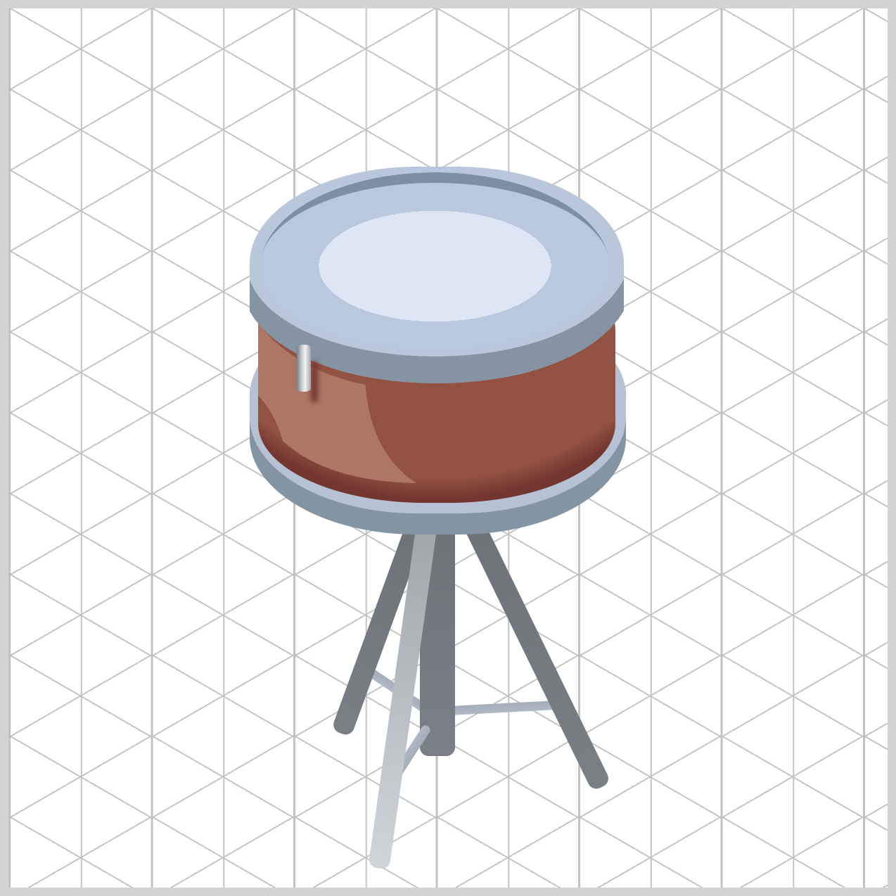
.rod-1 {
  box-shadow: 6px 8px 3px -2px var(--rod-shadow);
}
Each rod also uses var(--rod-shadow) for its box-shadow color. Because this shadow matches the drum shell's darker wood tone, the hardware blends naturally with the body and creates a more realistic contact shadow than a standard black shadow would.
.rod-2 {
  box-shadow: 2px 8px 6px 0px var(--rod-shadow);
}

.rod-3 {
  box-shadow: -6px 11px 4px -2px var(--rod-shadow);
}

.rod-4 {
  box-shadow: -7px -5px 4px 0px var(--rod-shadow);
}

.rod-5 {
  box-shadow: 2px -10px 5px 0px var(--rod-shadow);
}

.rod-6 {
  box-shadow: 7px -5px 3px -1px var(--rod-shadow);
}
The individual .rod-1 through .rod-6 classes fine-tune the shadow direction and blur for each rod. The upper rods cast their shadows downward, while the lower rods cast theirs upward. This opposing shadow pattern reinforces the drum's curved surface and helps emphasize the cylindrical shape of the shell.
By combining metallic gradients, warm contact shadows, and directional lighting, the tension rods become the finishing detail that completes the realistic look of the isometric snare drum.
You can see and play with the complete code on Pyxofy’s CodePen page.
See the Pen CSS Art – shape() Function & Gradients: Build an Isometric Snare Drum by Pyxofy (@pyxofy) on CodePen.
Conclusion
Congratulations! You have successfully completed the three-part Isometric Snare Drum article series.
In Part 1, you learned how to build the drum's tripod stand using carefully positioned shapes and layered components to create a realistic foundation. In Part 2, you expanded the illustration by constructing the remaining snare drum components, including the shell, rims, drum head, and tension rods. In this final installment, Part 3, you brought the entire artwork to life with a custom color palette powered by CSS Custom Properties.
By applying linear-gradient(), radial-gradient(), box-shadow, border-radius, clip-path: shape(), and pseudo-elements, you transformed a collection of simple <div> elements into a polished, three-dimensional CSS illustration complete with realistic lighting, reflections, and depth.
But don't stop here! Use the techniques you've learned in this series to create your own CSS artwork. Experiment with new color palettes, add extra drum hardware, design other musical instruments, or challenge yourself to recreate everyday objects using only HTML and CSS. Keep building, keep experimenting, and most importantly, share your masterpiece with us on LinkedIn, Threads, Bluesky, Mastodon, X (Twitter) @pyxofy, or Facebook.
We hope you liked this article. Kindly share it with your network. We appreciate it.
Related Articles
 Pyxofy


 Pyxofy