CSS Art – Build an Isometric Hi-Hat with Gradients & Rotate - Part 2
From cymbals and rings to the clutch and pull rod, create a stunning hi-hat illustration using only HTML and CSS


Introduction
Ready to turn your code into artwork? Using only HTML and CSS, you can transform simple shapes into an isometric hi-hat cymbals artwork.
In this three-part article series, you'll discover how to transform simple HTML and CSS into a detailed hi-hat cymbals illustration. As you build each component, from the cymbals and concentric rings to the clutch and pull rod, you'll learn how techniques such as positioning, layering, and shape styling work together to create realistic drum hardware.
- In Part 1, you focused on building the hi-hat's foundation by creating the tripod stand. This includes the center support column, adjustment hardware, support braces (connectors), and the three legs that give the stand its stability and structure.
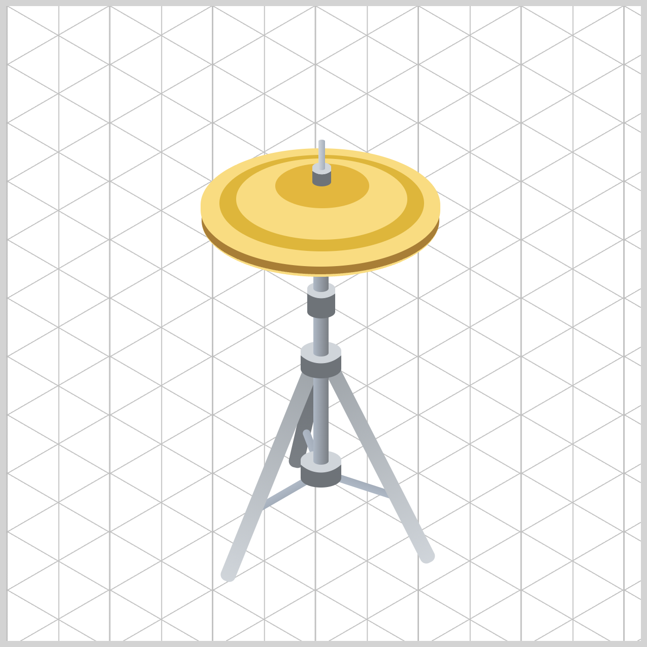
- In Part 2, the article you're reading now, you'll create the remaining hi-hat components, including the Bottom Hat, Top Hat, Top Hat Rings, Clutch, and Pull Rod. These elements will come together to form the complete hi-hat cymbal assembly.
- In Part 3, you'll bring the illustration to life using CSS Custom Properties (variables) and CSS gradients. These techniques will help you add realistic metallic finishes, subtle highlights, shadows, and depth, transforming the basic grayscale shapes into a polished and visually appealing hi-hat cymbal.
CSS properties you’ll be exploring in this article:
::beforeand::afterpseudo-elementsborder-radiuselliptical slash notation
Preview
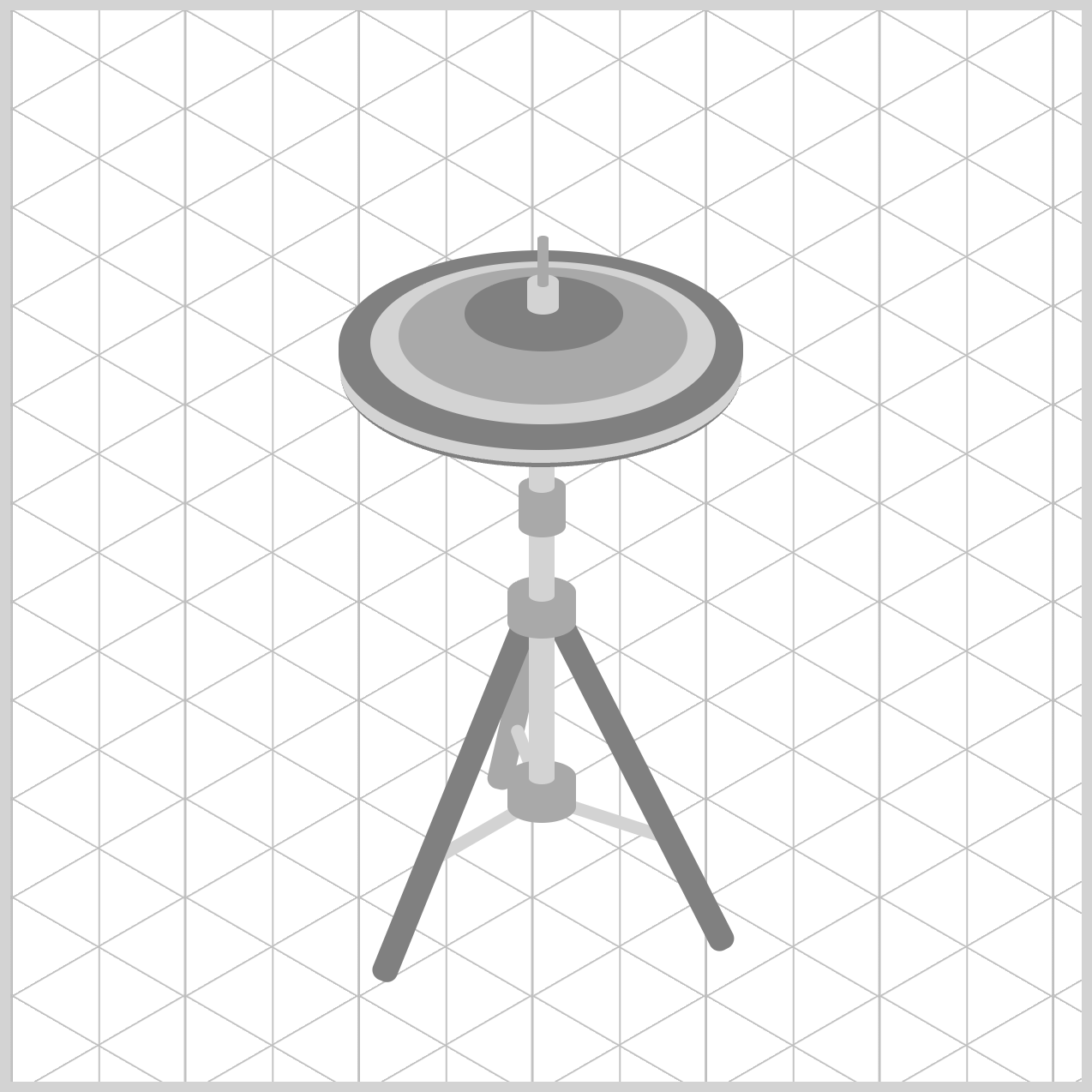
Here's a quick preview of the isometric hi-hat cymbals you'll be creating in this three-part CSS article series. While the finished illustration may look detailed, don't let that intimidate you!

We'll build each component step by step, breaking the design into simple, manageable sections. Along the way, you'll learn how HTML, CSS positioning, layered shapes, and pseudo-elements work together to transform basic elements into realistic drum hardware.
Let's get started and bring this musical illustration to life!
Prerequisites
Essential CSS and HTML knowledge will help you understand the concepts and techniques introduced in this article. Jump over to this article if you require an HTML and CSS primer.
We assume you have configured tools to modify CSS. If not, this article will guide you through the setup process.
HTML Structure
<div class="container">
  <!-- Stand -->
  <div class="stand-third-leg"></div>
  <div class="third-leg-connector"></div>
  <div class="first-leg-connector"></div>
  <div class="second-leg-connector"></div>
  <div class="stand-first-leg"></div>
  <div class="stand-second-leg"></div>
  <div class="joint-assembly joint-1"></div>
  <div class="base-tube"></div>
  <div class="joint-assembly joint-2"></div>
  <div class="middle-tube"></div>
  <div class="tilter"></div>
  <div class="upper-tube"></div>

  <!-- Hi-Hat -->
  <div class="bottom-hat"></div>
  <div class="top-hat"></div>
  <div class="top-hat-rings"></div>
  <div class="clutch"></div>
  <div class="pull-rod"></div>
</div>
container is the outermost enclosure. It enables the content to be centered and draws a light gray border. The rest of the <div>s represent each image component.
Keep the HTML structure as is for the image to display correctly.
Body and Container <div> CSS
CSS code for the body and container <div>.
/* Body and Container Settings */
/* Center shapes */
body {
  margin: 0;
  padding: 0;
  height: 100vh;
  display: flex;
  justify-content: center;
  align-items: center;
  flex-wrap: wrap;
}

/* Set background and border color */
.container {
  width: 500px;
  height: 500px;
  border: 5px solid lightgray;
  background: transparent;
  position: relative;
  margin: 5px;
  display: flex;
  justify-content: center;
  align-items: center;
}
Hi-Hat Assembly
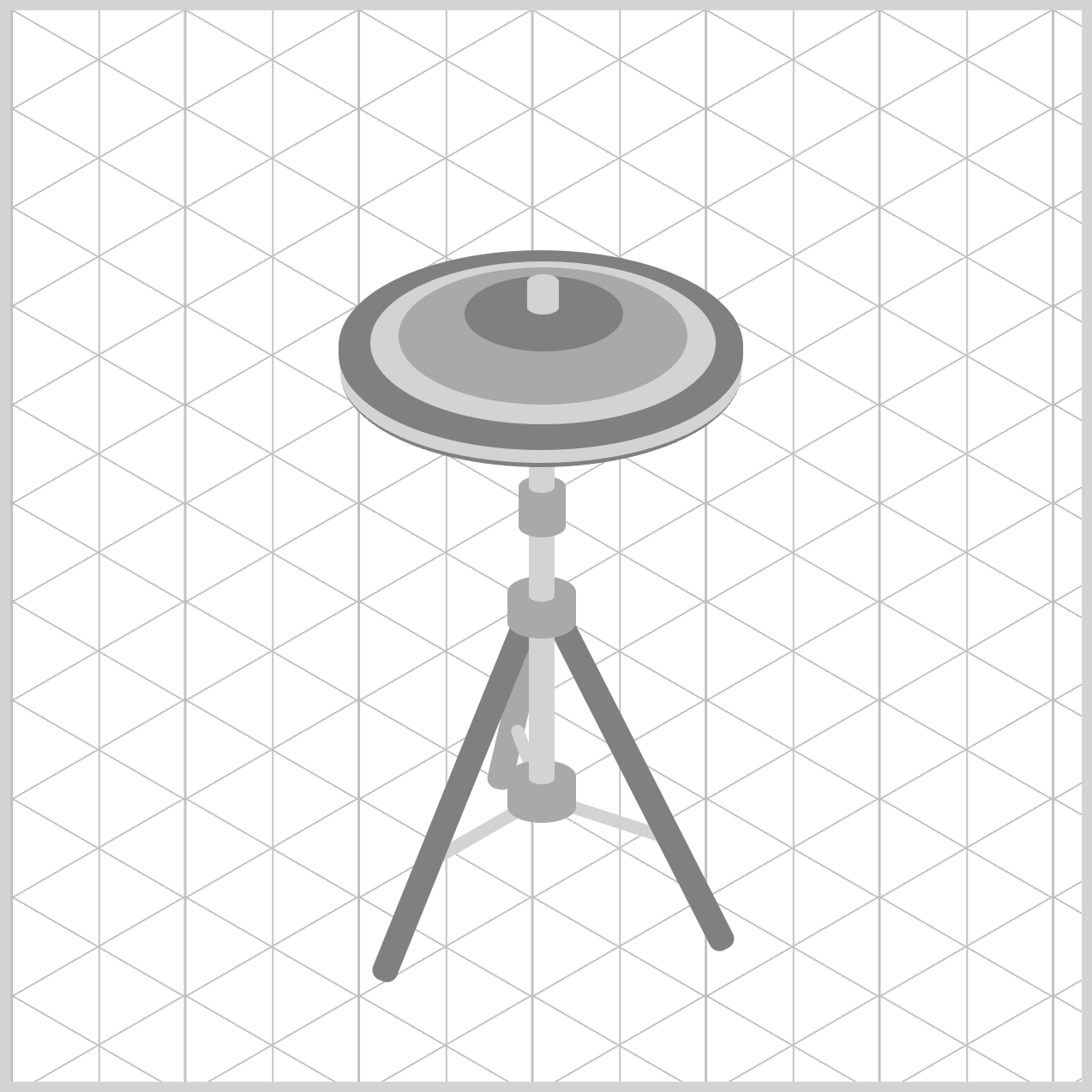
The Hi-Hat Assembly forms the top portion of the stand and consists of the bottom cymbal, top cymbal, cymbal rings, clutch, and pull rod. Together, these elements recreate the appearance of a real hi-hat used in a drum kit.
Bottom Hat
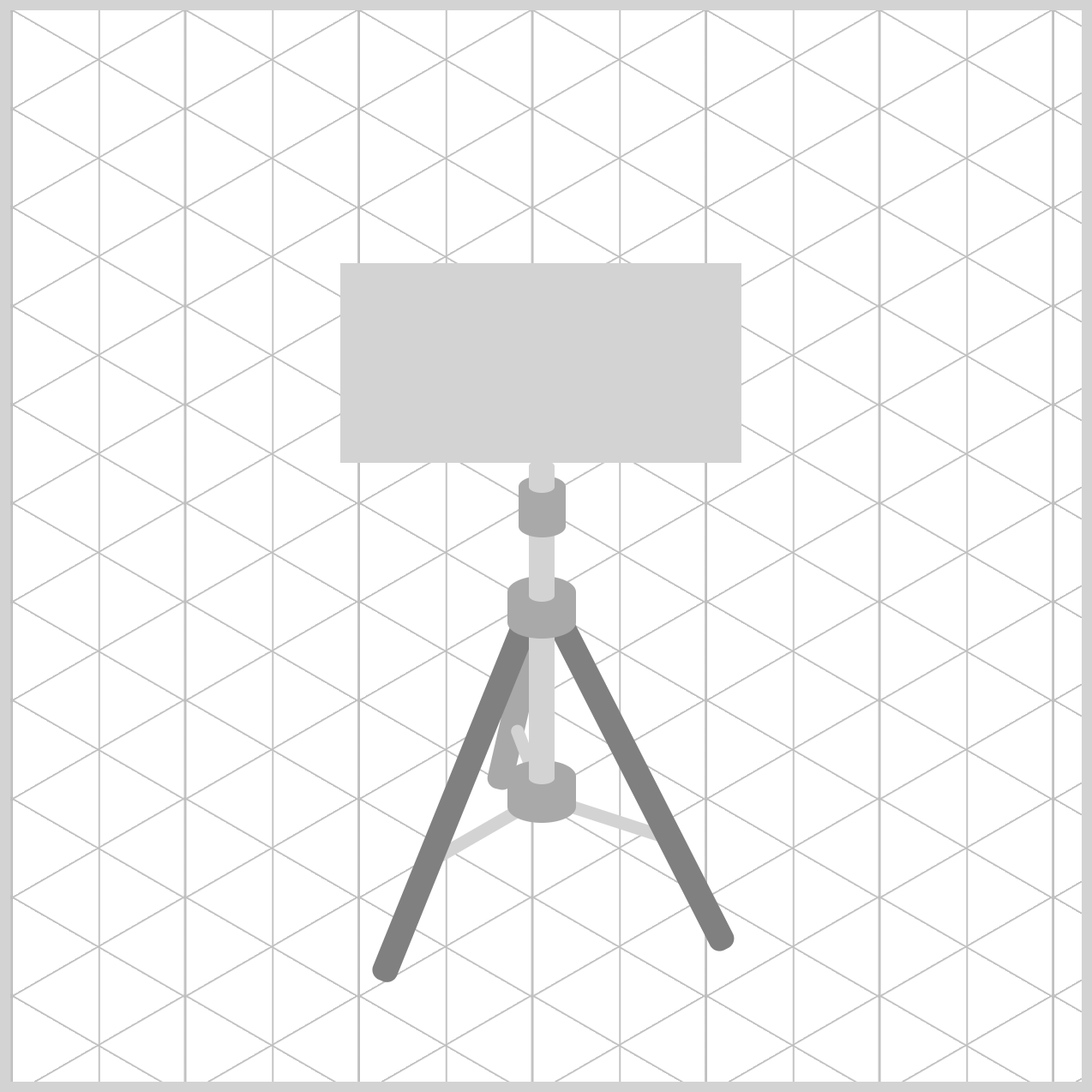
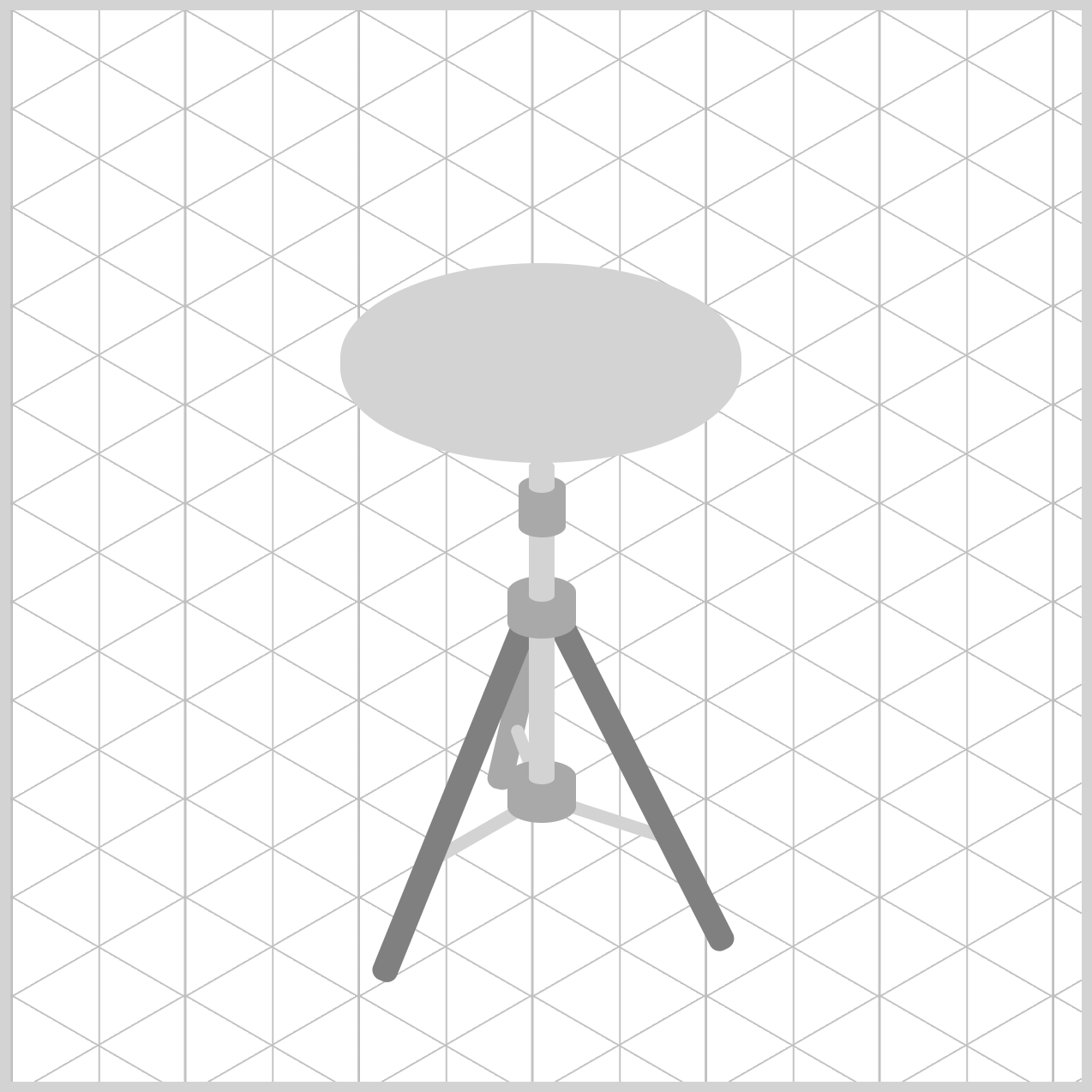
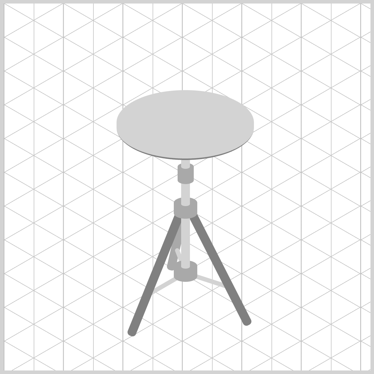
The Bottom Hat (.bottom-hat) represents the stationary lower cymbal of the hi-hat. Its wide elliptical shape and light gray color create the appearance of a metal cymbal viewed at an angle, while the subtle bottom border helps define the cymbal's outer rim and adds a small sense of depth.
/* Bottom Hat */
.bottom-hat {
  width: 187px;
  height: 93px;
  left: 154px;
  top: 118px;
  background: lightgray;
}
The dimensions, width: 187px and height: 93px, give the shape a wide, flattened appearance. This compressed proportion helps simulate perspective, making the cymbal look like a circular metal disc viewed at an angle. The bottom cymbal is also intentionally 2px narrower than the .top-hat, allowing the upper cymbal to overlap it naturally and create a more realistic layered effect.
Using left: 154px and top: 118px places the cymbal in the correct position above the stand. Its horizontal center aligns closely with the stand's main vertical tube, while the slight vertical offset places it 6px lower than the top cymbal, making the separation between the two cymbals visible.
The background: lightgray property applies a simple neutral color that works well during the initial construction phase. This makes it easier to focus on shape and positioning before adding more advanced metallic shading or gradient effects.
.bottom-hat {
  border-radius: 95px/45px;
}
The elliptical shape is created with border-radius: 95px/45px. By defining separate horizontal and vertical radius values, the element becomes an oval rather than a circle, helping recreate the appearance of a foreshortened cymbal.
.bottom-hat {
  border-bottom: solid 2px gray;
}
Finally, border-bottom: solid 2px gray adds a subtle darker edge along the lower rim. This small detail suggests the cymbal's outer lip and introduces a sense of depth, making the flat shape appear more like a solid metal object.
Next, let's focus on the Top Hat component in the next section.
Top Hat
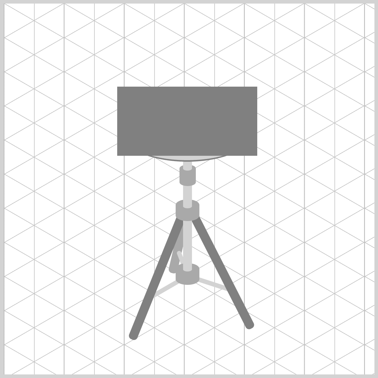
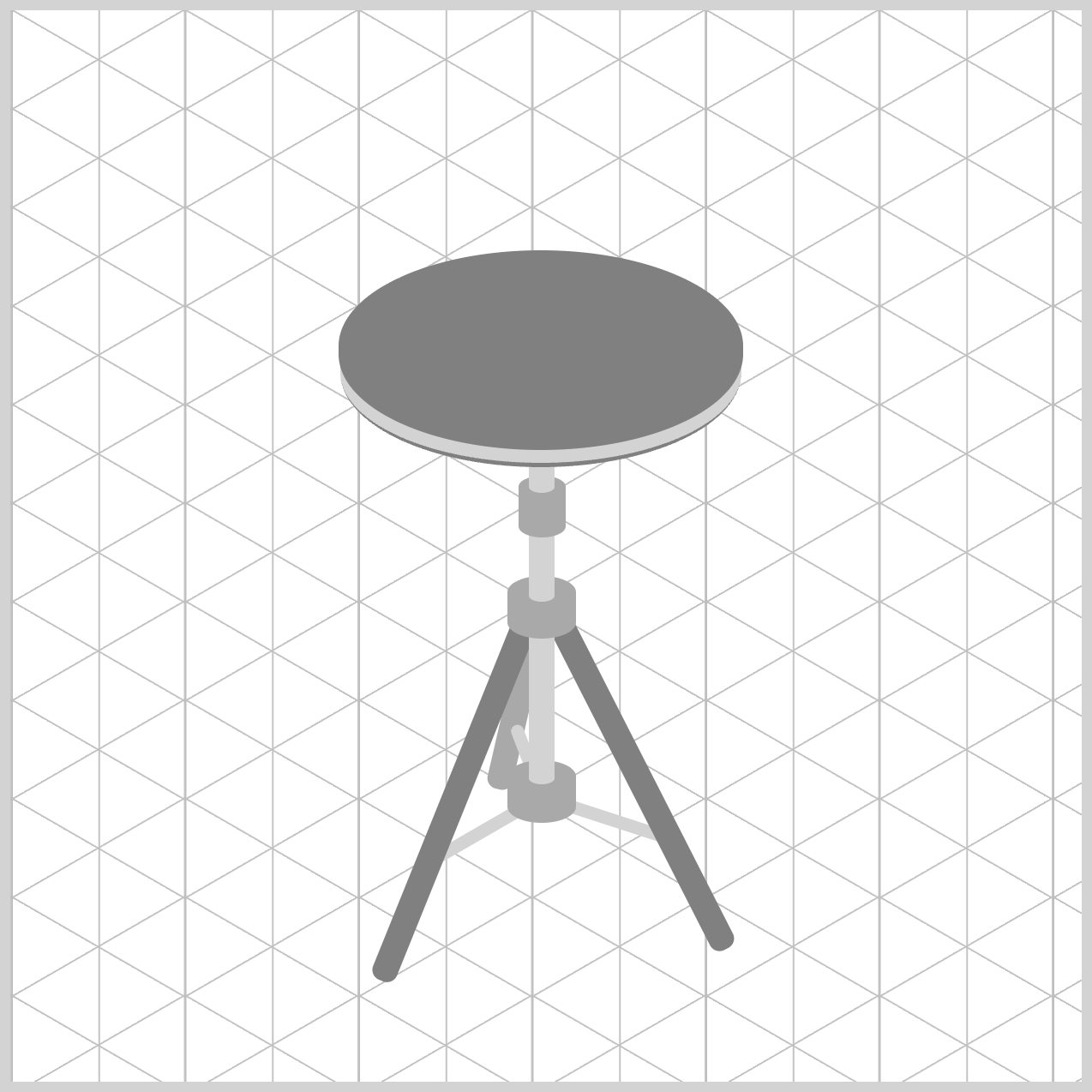
The Top Hat (.top-hat) represents the upper cymbal that sits above the bottom cymbal. It uses a slightly larger size and a darker gray color to stand out, while its higher position creates a visible gap between the two cymbals, giving the hi-hat assembly a realistic layered appearance.
/* Top Hat */
.top-hat {
  width: 189px;
  height: 93px;
  left: 153px;
  top: 112px;
  background: gray;
}
width: 189pxandheight: 93pxproperties give the cymbal a wide, flattened shape that mimics how a circular cymbal appears when viewed from an angle. The top cymbal is also slightly wider than the.bottom-hat, allowing it to extend beyond the lower cymbal and create a more natural layered appearance.- Positioning is handled with
left: 153pxandtop: 112px. These values align the cymbal with the stand's center column while placing it6pxhigher than the bottom cymbal. This small offset helps reveal part of the lower cymbal beneath it, making the two separate metal plates easy to distinguish. - The
background: grayproperty applies a medium-gray fill that serves as a simple placeholder color during the construction phase.
.top-hat {
  border-radius: 95px/45px;
}
To achieve the cymbal's oval profile, the rule uses border-radius: 95px/45px. This elliptical radius compresses the shape vertically while maintaining a smooth curved edge, helping the cymbal appear more realistic and consistent with the isometric perspective used throughout the hi-hat stand illustration.
Now that the Top Hat is complete, let's enhance its appearance by creating the Top Hat Rings.
Top Hat Rings
The Top Hat Rings (.top-hat-rings) uses CSS pseudo-elements to add decorative concentric rings. These layered elliptical shapes add the characteristic circular grooves found on real cymbals, making the hi-hat look more realistic and visually detailed.
You'll use the ::before and ::after pseudo-elements to create the hi-hat's concentric rings and raised center bell without adding extra HTML elements. This technique keeps the markup clean and efficient while allowing multiple layered shapes to be built from a single .top-hat-rings element.
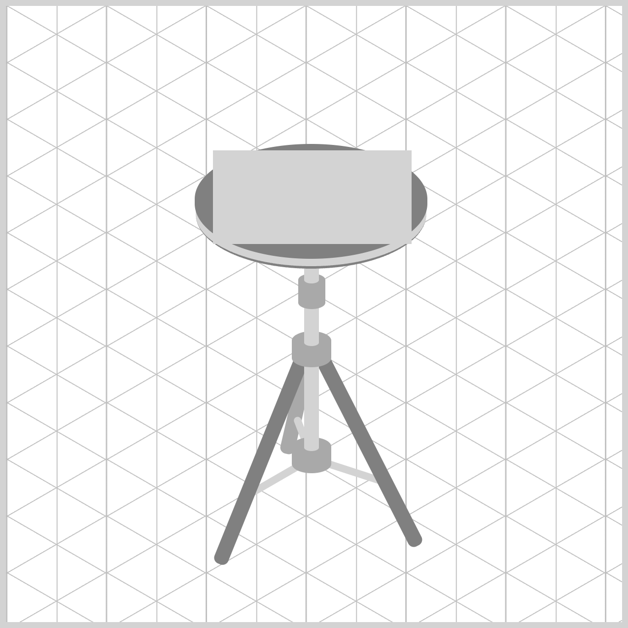
/* Rings */
.top-hat-rings {
  width: 161px;
  height: 76px;
  left: 168px;
  top: 117px;
  background: lightgray;
}
width: 161pxsets the ring's width, making it slightly smaller than the cymbal so the outer edge remains visible.height: 76pxsets the ring's height. Combined with the width, it creates a wide, flattened shape that resembles a cymbal viewed at an angle.left: 168pxmoves the ring horizontally within the container, helping center it on the cymbal.top: 117pxpositions the ring vertically so it sits neatly inside the top cymbal.background: lightgraygives the ring a light gray color, making it stand out from the darker layers that will be added later.
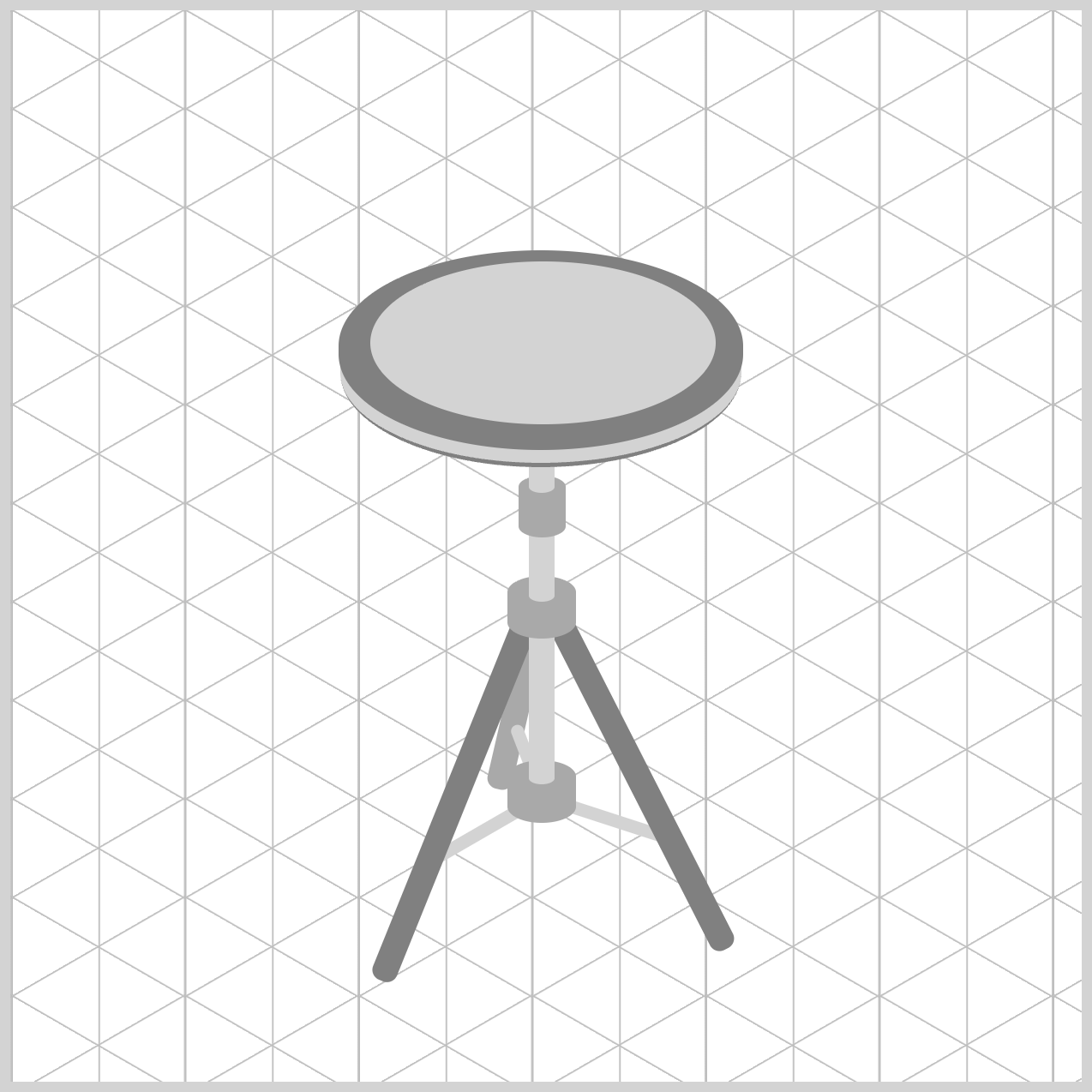
.top-hat-rings {
  border-radius: 50%;
}
border-radius: 50% turns the rectangular element into a smooth ellipse, giving the ring its rounded cymbal shape. This same technique will be used for the remaining rings, ensuring all the layered cymbal details share a consistent shape and appearance.
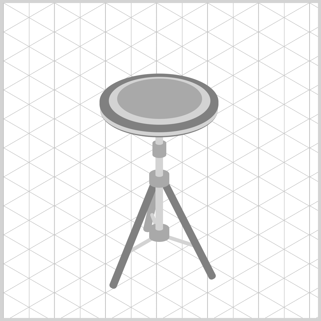
.top-hat-rings::before {
  content: "";
  width: 135px;
  height: 64px;
  left: 13px;
  top: 3px;
  background: darkgray;
  border-radius: 50%;
}
This CSS rule uses the ::before pseudo-element to create the second (middle) ring of the hi-hat. Since it's a pseudo-element, you can add another shape inside .top-hat-rings without writing any extra HTML.
content: ""creates the pseudo-element so it can be displayed on the page.width: 135pxsets the width of the second ring, making it smaller than the first (outer) ring.height: 64pxsets the height of the ring and maintains the same flattened cymbal shape.left: 13pxmoves the ring horizontally inside the parent element so it appears centered.top: 3pxpositions the ring slightly below the top edge of the outer ring.background: darkgraygives the ring a darker color, helping it stand out from the lighter outer ring and creating a sense of depth.
Together, these properties create a smaller, darker ring inside the first ring, adding visual detail and making the cymbal look more realistic.
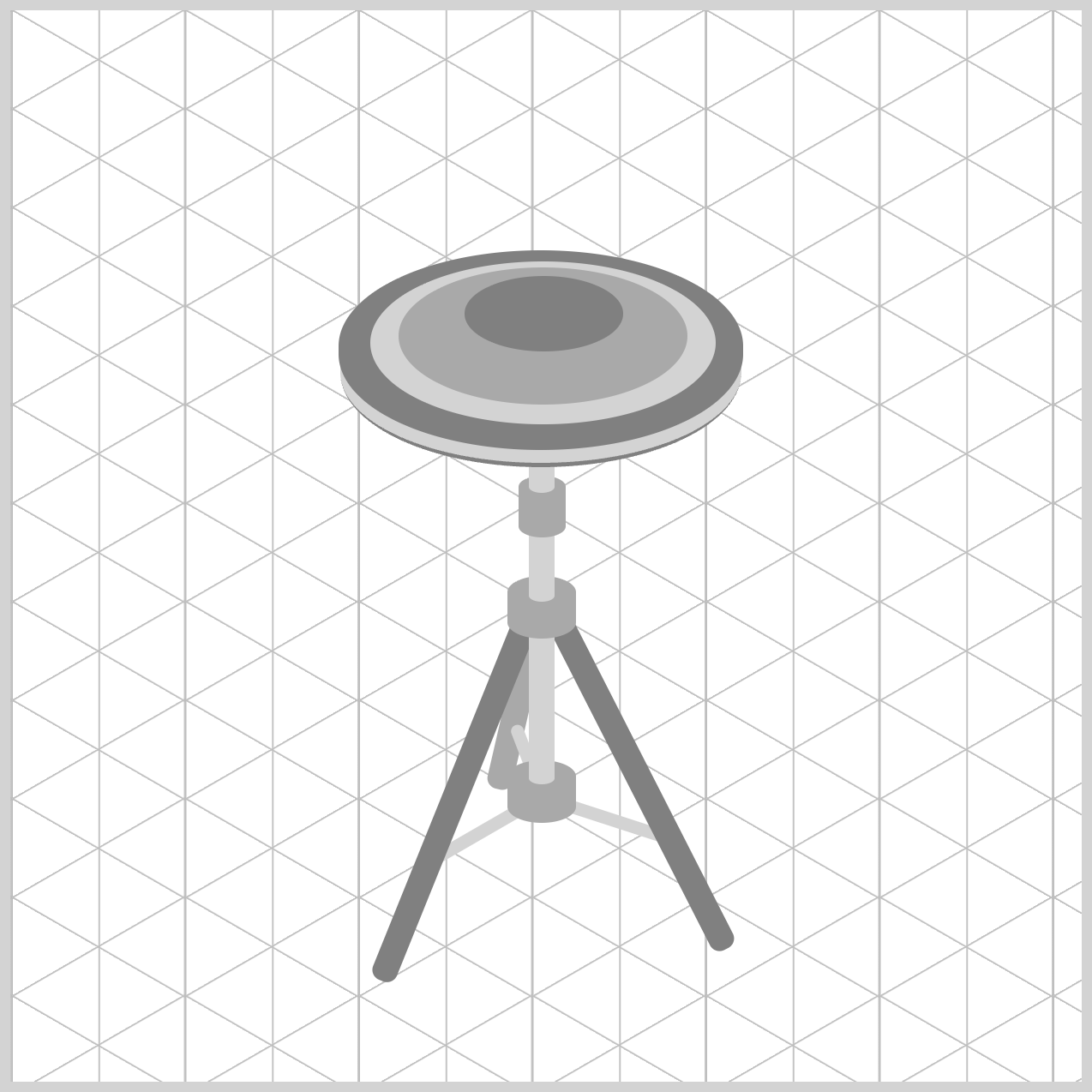
.top-hat-rings::after {
  content: "";
  width: 74px;
  height: 35px;
  left: 44px;
  top: 7px;
  background: gray;
  border-radius: 50%;
}
The ::after pseudo-element is used to create the center bell of the hi-hat cymbal. The center bell (third ring) is the raised dome in the middle of the cymbal where the clutch hardware is mounted.
content: ""creates the pseudo-element so it can appear on the page.width: 74pxsets the width of the center bell, making it smaller than the second (middle) ring.height: 35pxsets the height of the bell and maintains the same flattened perspective as the other cymbal layers.left: 44pxpositions the bell horizontally inside the outer ring so it appears centered.top: 7pxplaces the bell near the top portion of the ring, helping create the look of a raised surface.background: graygives the bell its own shade of gray, making it visually distinct from the lighter outer (first) ring and darker middle (second) ring.
Together, these properties create the innermost cymbal layer (third ring), completing the concentric ring design and giving the hi-hat a realistic raised center bell. The combination of the outer first ring, middle second ring, and center bell third ring helps the cymbal look more detailed and three-dimensional.
With the cymbal's concentric rings and center bell now complete, it's time to add the Clutch component. This small but important component sits above the cymbal, securing the top hi-hat in place and connecting it to the pull rod.
Clutch
The Clutch is a small piece of hardware that holds the top cymbal in place and connects it to the pull rod. Although it is one of the smallest parts of the hi-hat assembly, it plays an important role by sitting directly above the cymbal's center bell and helping tie the entire assembly together visually.
/* Clutch */
.clutch {
  width: 15px;
  height: 19px;
  left: 241px;
  top: 123px;
  background: lightgray;
  border-radius: 95px/45px;
}
The width: 15px and height: 19px properties give the clutch a compact size that looks proportional to the surrounding hardware. The left: 241px and top: 123px values position it neatly over the center of the cymbal, making it appear attached to the bell beneath it.
The background: lightgray property applies a simple neutral color that resembles unfinished metal and helps the clutch stand out from the darker cymbal details.
Finally, border-radius: 95px/45px rounds the shape into a smooth oval, giving it the appearance of a small cylindrical fitting rather than a flat rectangle.
With the Clutch now in place, the final component to add is the Pull Rod.
Pull Rod
The Pull Rod is the vertical rod that runs through the center of the hi-hat assembly. It connects to the clutch and provides the mechanism that allows the top cymbal to move up and down when the pedal is pressed.
Although simple in appearance, this component is essential because it completes the hi-hat's structure and creates the connection between the stand hardware and the moving cymbal.
/* Pull Rod */
.pull-rod {
  width: 5px;
  height: 24px;
  left: 246px;
  top: 105px;
  background: darkgray;
  border-radius: 95px/45px;
}
The width: 5px and height: 24px properties give the rod its thin, elongated appearance, helping it stand out from the wider tubes and hardware components around it.
The left: 246px and top: 105px properties position the rod directly above the clutch so it appears perfectly aligned with the center of the stand. The background: darkgray property gives it a darker metallic tone, creating a clear contrast against the lighter clutch below.
Finally, border-radius: 95px/45px slightly rounds the ends of the rectangle, making the pull rod look more like a smooth metal cylinder. Together, these properties create a simple but realistic pull rod that completes the hi-hat mechanism.
You can see and play with the complete code on Pyxofy’s CodePen page.
See the Pen CSS Art – Build an Isometric Hi-Hat with Gradients & Rotate by Pyxofy (@pyxofy) on CodePen.
Conclusion
In this article, you used a variety of CSS properties to build a complete hi-hat assembly, including the cymbals, rings, clutch, and pull rod.
Properties such as width, height, left, and top controlled the size and placement of each component, while background and border-bottom added visual contrast and depth. The border-radius property transformed simple rectangles into smooth elliptical shapes, helping create realistic cymbals and hardware.
You also used the ::before and ::after pseudo-elements to add layered details without extra HTML, resulting in cleaner and more efficient markup. Together, these techniques demonstrate how modern CSS can transform simple shapes into detailed artwork directly in the browser.
Practice what you learned in this article and share your masterpiece with us on LinkedIn, Threads, Bluesky, Mastodon, X (Twitter) @pyxofy, or Facebook.
We hope you liked this article. Kindly share it with your network. We appreciate it.
Related Articles
 Pyxofy

 Pyxofy

 Pyxofy

 Pyxofy