CSS Animation – How to Make a Sunrise with @property – Part 1
Sunrises are majestic. They cast multiple shades of color and beautiful gradients. You'll learn how to create one in this step-by-step article.
Introduction
Sunrises are always glorious scenes. The sky turns from deep black to light blue, then to a fiery orange hue.
In this two-part step-by-step article, we’ll create a sunset scene using the CSS gradients and @property.
Part 1. Create the Sunrise Scene Elements
Part 2. Animate the Sunrise Scene
Read this article if you’re unfamiliar with @property.
If you’re new to CSS gradients, read this article to understand how they work.
Safari and Chromium-based browsers support @property. Check for the latest browser support if you use @property for production websites.

Want more articles like this one? Become a Pyxofy member!
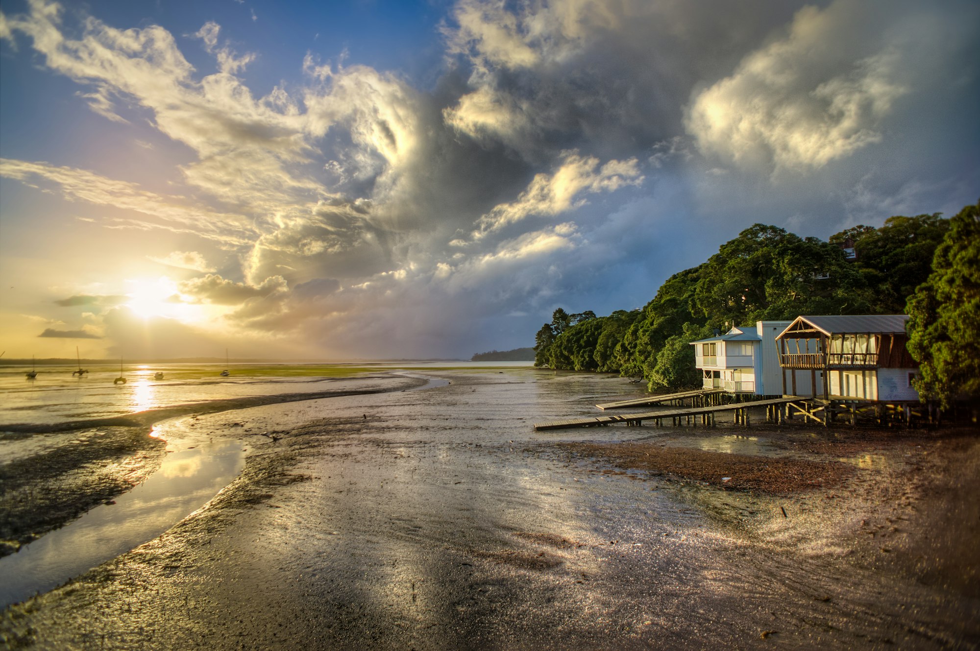
Preview
Sunrise Scene

Prerequisites
Essential CSS and HTML knowledge will help you understand the concepts and techniques introduced in this article. Jump over to this article if you require an HTML and CSS primer.
We assume that you have set up tools to create CSS animation. If you haven’t, this article will show you how to set them up.
Please read this article if you’re unfamiliar with CSS animation and the @keyframes at-rule property.
HTML Structure
<!-- Sunrise scene -->
<div class="container">
  <!-- Sky -->
  <div class="sky"></div>

  <!-- Sun -->
  <div class="sun"></div>

  <!-- House -->
  <div class="house">
    <div class="roof"></div>
    <div class="window"></div>
    <div class="wall"></div>
    <div class="door"></div>
    <div class="door-knob"></div>
  </div>

  <!-- House Foreground -->
  <div class="house-foreground"></div>
</div>
container is the outermost enclosure. It enables the content to be centered and draws a light gray border. The rest of the divs represent each animation sequence.
Keep the HTML structure as is for each animation to display correctly.
Body and Container Div CSS
CSS code for the body and container div.
/* Body and Container Settings */
/* Center shapes */
body {
  margin: 0;
  padding: 0;
  height: 100vh;
  display: flex;
  justify-content: center;
  align-items: center;
  flex-wrap: wrap;
}

/* Set background and border color */
.container {
  min-width: 500px;
  height: 500px;
  border: 5px solid lightgray;
  background: transparent;
  position: relative;
  margin: 5px;
  display: flex;
  justify-content: center;
  align-items: center;
  overflow: hidden;
}
Making the Foreground
In this section, we’ll make the green, grass-like foreground area.

/* House Foreground */
.house-foreground {
  width: 500px;
  height: 95px;
  position: absolute;
  top: 405px;
  left: 0px;
  background: linear-gradient(
    to bottom,
    #519f44 20%,
    #a0cc44,
    #b7d54a,
    #88c741,
    #c4db5f
  );
}
Let’s break down the foreground CSS.
- The
widthis set to500pxand theheightis set to95px. position: absolute;enables us to position the element. Thetopvalue is405px, andleftis set to0px.- The direction for
linear-gradientwe setto bottom. - Our first color is
#519f44, a dark green shade. With20%, it’s set to occupy up to20%of the gradient area. - The rest of our colors
#a0cc44,#b7d54a,#88c741, and#c4db5franges from mid to light green shades.
In the next section, let’s learn how to create the house.
House
The house’s complete CSS code and step-by-step instructions are available in the below article.
 Pyxofy
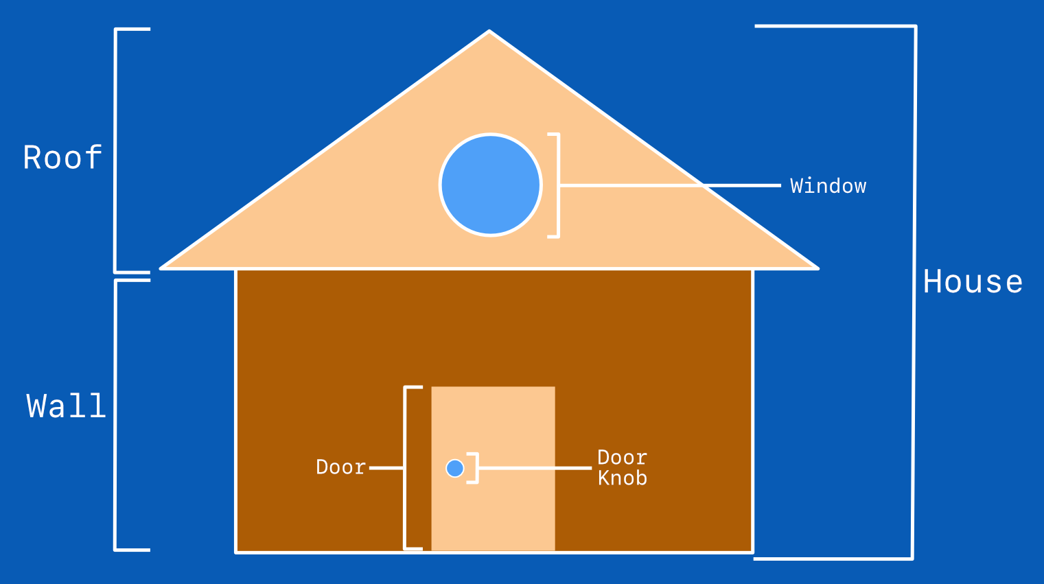
The house needs to be scaled down to fit the sunrise scene.
/* House */
.house {
  position: relative;
  top: 100px;
  left: 100px;
  transform: scale(0.3);
}
We use the CSS transform: scale() property to scale down the house from its original size.
transform: scale(0.3);scales down the house to approximately 30% from its original size.position: relative;combined withtopandleftcontrols the house position.
Next up will be the Sky gradient and the sun.
Sky Gradient
The sky gradient will transition from a night sky to light blue, then to a fiery orange hue, and finally to daytime.

/* Sky Gradient */
.sky {
  position: absolute;
  top: 0;
  left: 0;
  width: 500px;
  height: 1100px;
  background: linear-gradient(
    180deg,
    #03071e 30%,
    #1a3a50,
    #006692,
    #8a92a6,
    #f5a67e,
    #ffe3a4,
    #fafbbd,
    #f4f5d6,
    #f8f8f0 70%
  );
}
The sky gradient is an elongated background. In part 2 of this article, you’ll learn how to make it scroll up. The linear-gradient CSS function uses multiple color stops to simulate the transition between night sky and daytime and everything between.

widthis set to500px, andheightis set to1100px, which is over double the height of the container.linear-gradientprocess color from top to bottom. This means that the first color is placed at the bottom. We reverse this with the180degangle property.#03071eis a very dark shade of blue. We set it to occupy30%of the background.#1a3a50is a dark shade of cyan blue.#006692is a medium-dark shade of cyan.#8a92a6is a blue-purple shade.#f5a67eis a medium-light shade of orange.#ffe3a4is a light shade of yellow.#fafbbdis a light shade of yellow-green.#f4f5d6is a very light shade of yellow-green.#f8f8f0is a lighter yellow-green shade set to occupy70%of the background gradient.
You can use tools like Encycolorpedia to visualize HEX color codes.
In the last section, you’ll learn how to create the sun shape.
Sun
The sun shape is a radial-gradient background.
/* Sun */
.sun {
  width: 70px;
  height: 70px;
  top: 480px;
  position: absolute;
  --sun-color: #e85d04;
  --sun-color-2: #f8f8f0;
  background: radial-gradient(
    circle,
    var(--sun-color) 40%,
    transparent,
    var(--sun-color-2) 55%,
    transparent
  );
  border-radius: 50px;
}
width and height are set to 70px. We position it as absolute; the initial position is 480px from the top. This puts it behind the green foreground. --sun-color: #e85d04; and --sun-color-2: #f8f8f0; are CSS custom property colors. #e85d04 is an orange shade. This is the typical fiery sun color during sunrise.#f8f8f0 is a very light yellow-green shade. It simulates the sun’s halo during sunrise. We alternate between colored and transparent areas. The transparent area helps us transition the sun’s color from sunrise to full daylight. The border-radius CSS property set to 50px rounds the shape to a circle.
You can see and play with the complete code on Pyxofy’s CodePen page.
See the Pen CSS Animation – How to Make a Sunrise with @property by Pyxofy (@pyxofy) on CodePen.
Conclusion
In part 1 of this two-part article, you learned how to make the sunrise scene’s sky gradient, sun, house, and foreground with CSS.
Using multiple colors with linear-gradient, we simulated a sky turning from deep night to a fiery sunrise blaze to full daylight. We made the sun disk and its halo with radial-gradient.
In part 2 of this article, we’ll animate all the elements to simulate a sunrise scene.
Ideas to improve this article? Please share your thoughts via the comments section or our social media channels X (Twitter) @pyxofy, LinkedIn, Mastodon, or Facebook.
We hope you liked this article. Kindly share it with your network. We appreciate it.
Related Articles
Pyxofy
 Pyxofy
