CSS Animation – @property and Conic Gradient Animation
Static pie charts are boring, make them fun with animation! Learn conic gradient animation with CSS @property in this step-by-step article.
Introduction
CSS is ever-evolving. CSS Houdini gave us the CSS @property at-rule, allowing us to define CSS custom properties.
In this article, you’ll learn how to use the @property to animate conic gradients.
@property.Safari and Chromium-based browsers support @property. Check for the latest browser support if you plan to use @property for production websites.

Want more articles like this one? Become a Pyxofy member!
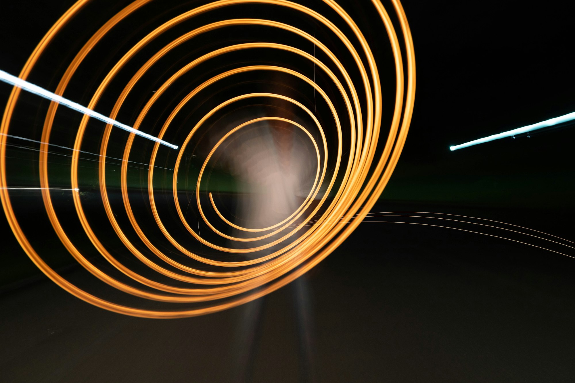
Preview
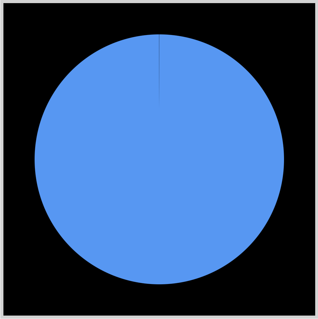
Conic Effect Animation
Conic Multicolor Effect Animation
Prerequisites
Basic CSS and HTML knowledge will help you understand the concepts and techniques introduced in this article. Jump over to this article if you require an HTML and CSS primer.
We assume that you have set up tools to create CSS animation. If you haven’t, this article will show you how to set them up.
If you’re unfamiliar with CSS animation and the @keyframes at-rule property, please read this article.
HTML Structure
<!-- Conic Effect -->
<div class="container">
   <div class="conic-effect"></div>
</div>

<!-- Conic Multicolor Effect -->
<div class="container">
   <div class="conic-multicolor-effect"></div>
</div>
container is the outermost enclosure. It enables the content to be centered and draws a light gray border. The rest of the divs represent each animation sequence.
Keep the HTML structure as is for each animation to display properly.
Body and Container Div CSS
CSS code for the body and container div.
/* Body and Container Settings */
/* Center shapes */
body {
  margin: 0;
  padding: 0;
  height: 100vh;
  display: flex;
  justify-content: center;
  align-items: center;
  flex-wrap: wrap;
}

/* Set background color and light gray border */
.container {
  width: 500px;
  height: 500px;
  border: 5px solid lightgray;
  background: black;
  position: relative;
  margin: 5px;
  display: flex;
  justify-content: center;
  align-items: center;
}
What is CSS @property
The @property at-rule is a CSS feature under the CSS Houdini umbrella, allowing developers to define their CSS custom properties. It has property type checking and default values setting and allows you to define whether a property can inherit values.
@property syntax
@property --property-name {
  syntax: "<color>";
  inherits: false;
  initial-value: #ffe820;
}
- syntax
Describes the allowable syntax for the property.
- inherits
Controls whether the custom property registration specified by @property inherits by default.
- initial-value
Sets the initial value for the property.
Example
@property --custom-color {
  syntax: "<color>";
  inherits: false;
  initial-value: #ffe820;
}
You can use different types in the syntax property.
- length
- number
- percentage
- length-percentage
- color
- image
- url
- integer
- angle
- time
- resolution
- transform-list
- transform-function
- custom-ident (a custom identifier string)
The above syntax types provide the browser with more contextual information, which enables the browser to animate and transition the syntax properties.
Let’s see how we can use the CSS @property to make a simple conic animation.
Conic animation with @property
You’ll learn how to combine the CSS @property and conic-gradient() to make two conic animations. If you’re new to CSS gradients, read this article to get familiar with how they work.
Let’s start with a simple example.
Conic Effect Animation

Conic gradients are often used in pie charts and color wheels. To create the conic animation, we use custom properties using CSS @property. The examples will use the following custom properties.
@property --angle {
  syntax: "<angle>";
  inherits: false;
  initial-value: 0deg;
}
@property --hue {
  syntax: "<number>";
  inherits: false;
  initial-value: 0;
}
--angle sets the angle or degrees of the conic gradient.
--hue sets the hsl hue color property value.
First, let’s make the conic gradient background.
.conic-effect {
  height: 80%;
  width: 80%;
  border-radius: 50%;
  --color: hsl(31, 94%, 61%);
  background: conic-gradient(
    var(--color) var(--angle),
    transparent calc(var(--angle))
  );
}
- Both
heightandwidthproperty values are set to80%. border-radiusset to50%rounds our square image border to a circle.--color: hsl(31, 94%, 61%);is a CSS custom property or variable, setting the circle color to orange.conic-gradientuses two property values,var(--color)sets the gradient color to orange, the starting color.var(--angle)sets the gradient angle and will be animated.transparentis our end color, it lets the black background color to shine through the conic gradient.calc(var(--angle))uses the CSS calc() function to perform a calculation on the CSS variable(--angle). It ensures that the ending angle of the conic gradient is equal to the starting angle, creating a seamless transition.
Second, the animation properties.
.conic-effect {
  animation: conic-effect 2s ease-in-out infinite;
}
The animation name is conic-effect and completes in two seconds, 2s. The animation easing is set to ease-in-out and infinite will loop animation.
Third, the animation keyframe.
@keyframes conic-effect {
  0% {
    --angle: -1deg;
  }

  100% {
    --angle: 360deg;
  }
}
We animate the conic gradient angle using @keyframes at-rule. Our initial angle will be -1deg and our end angle state is set to 360deg.
In the next section, we’ll expand on the current example.
Conic Multicolor Effect Animation
Building on the Conic effect animation example, we’ll animate the color property and slightly change the animation sequence.
We explain only the CSS code that differs from the previous section for brevity.


This example animates the conic gradient color property, transitioning from orange to blue. The animation sequence reverses direction when it reaches 360 degrees, going back to its original position.
/* Conic Multicolor Effect */
.conic-multicolor-effect {
  --color: hsl(var(--hue, 0), 94%, 61%);
  animation: conic-multi-color-effect 2s ease-in-out alternate infinite;
}
--color: hsl(var(--hue, 0), 94%, 61%);is a CSS custom property or variable, setting the circle color to orange.alternatereverses the animation direction for each cycle. The default plays a forward animation sequence.
@keyframes conic-multi-color-effect {
  0% {
    --angle: -1deg;
    --hue: 31;
  }

  100% {
    --angle: 360deg;
    --hue: 211;
  }
}
--hue: 31;set the startinghslcolor value tohsl(31, 94%, 61%), a bright orange color.

- The end color is set to light blue using
--hue: 211;which translates tohsl(211, 94%, 61%)

The animation sequence displays all the colors between hsl hue angle 31 through 211, creating a multicolor animation effect.
You can use this tool to explore hsl color properties.
You can see and play with the full code on Pyxofy’s CodePen page.
See the Pen CSS Animation – @property and Conic Gradient Animation by Pyxofy (@pyxofy) on CodePen.
Conclusion
CSS @property is a fantastic tool for CSS animation. It supports multiple property types such as color, length, and percentage that are commonly used in CSS animation.
You learned how to animate a conic gradient and then expanded on the example by implementing a multicolor animation effect. Conic gradients are handy when you want to create pie charts or color wheels.
What animations will you make using @property and conic gradients? Share your masterpiece with us on Twitter @pyxofy, on LinkedIn, Mastodon, or Facebook.
We hope you liked this article. Kindly share it with your network. We appreciate it.
Related Articles

 Pyxofy