CSS Animation – How to Make a Sunrise with @property – Part 2
In Part 1, you made the sunrise scene elements. In Part 2, let’s learn to animate a picturesque dawn in this step-by-step article.
Introduction
Part 1 of this two-part article taught you how to make the sunrise scene elements. In part 2, you’ll learn how to animate the elements, creating a sunrise scene.
Part 1. Create the Sunrise Scene Elements
Part 2. Animate the Sunrise Scene
Read this article if you’re unfamiliar with @property. If you’re new to CSS gradients, read this article to understand how they work.
Safari and Chromium-based browsers support @property. Check for the latest browser support if you use @property for production websites.

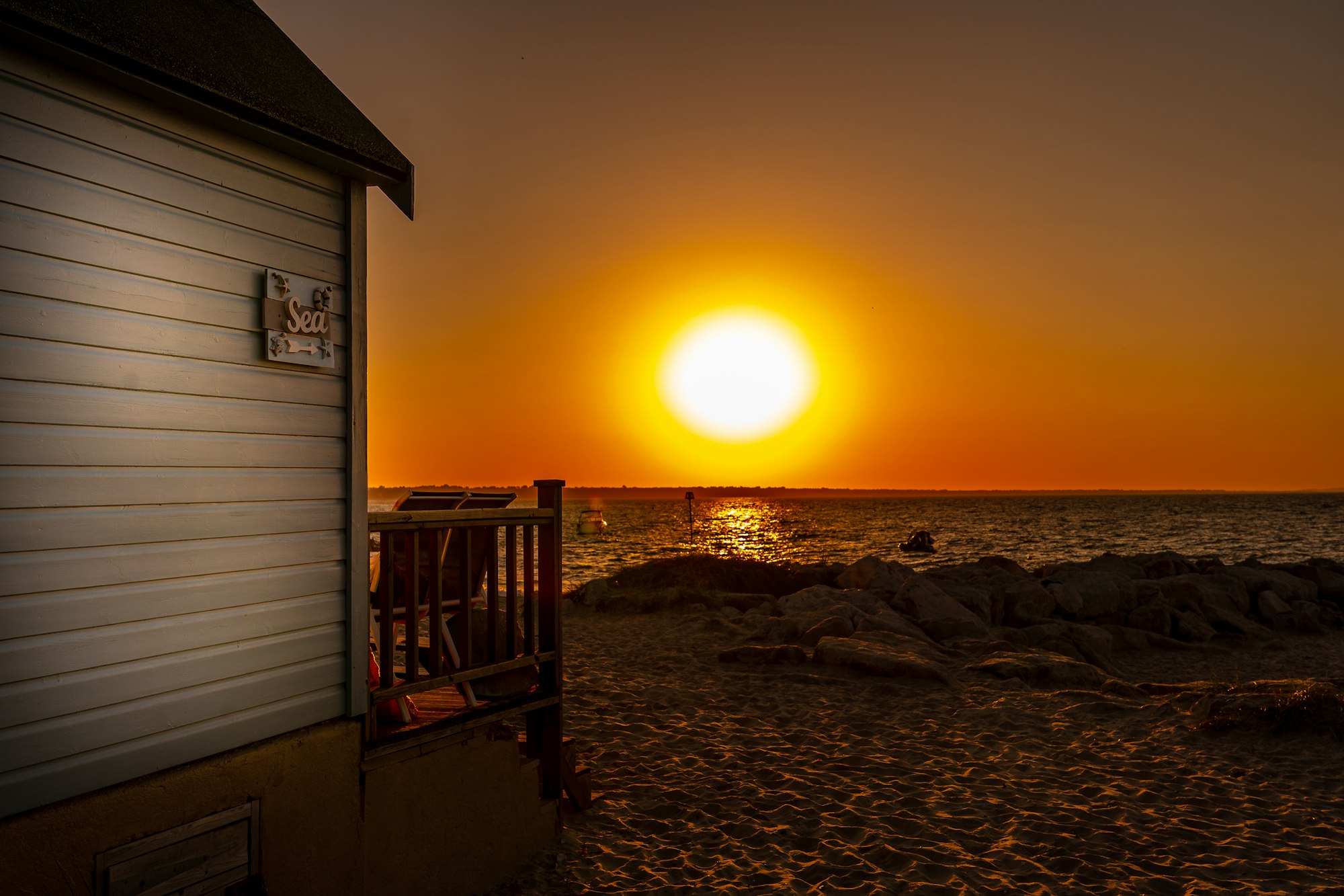
Preview
Sunrise Scene

Prerequisites
Essential CSS and HTML knowledge will help you understand the concepts and techniques introduced in this article. Jump over to this article if you require an HTML and CSS primer.
We assume that you have set up tools to create CSS animation. If you haven’t, this article will show you how to set them up.
Please read this article if you’re unfamiliar with CSS animation and the @keyframes at-rule property.
HTML Structure
<!-- Sunrise scene -->
<div class="container">
  <!-- Sky -->
  <div class="sky"></div>

  <!-- Sun -->
  <div class="sun"></div>

  <!-- House -->
  <div class="house">
    <div class="roof"></div>
    <div class="window"></div>
    <div class="wall"></div>
    <div class="door"></div>
    <div class="door-knob"></div>
  </div>

  <!-- House Foreground -->
  <div class="house-foreground"></div>
</div>
container is the outermost enclosure. It enables the content to be centered and draws a light gray border. The rest of the divs represent each animation sequence.
Keep the HTML structure as is for each animation to display correctly.
Body and Container Div CSS
CSS code for the body and container div.
/* Body and Container Settings */
/* Center shapes */
body {
  margin: 0;
  padding: 0;
  height: 100vh;
  display: flex;
  justify-content: center;
  align-items: center;
  flex-wrap: wrap;
}

/* Set background and border color */
.container {
  min-width: 500px;
  height: 500px;
  border: 5px solid lightgray;
  background: transparent;
  position: relative;
  margin: 5px;
  display: flex;
  justify-content: center;
  align-items: center;
  overflow: hidden;
}
House and Foreground Animation
In this section, you’ll animate the house and foreground. You’ll use the CSS filter: brightness() function to control the house’s and foreground’s brightness.

The house and foreground brightness will be around 5% when the sun peaks out of the horizon.

The brightness will slowly increase to 100% as the sun reaches its zenith.
/* House Foreground */
.house-foreground {
  animation: house 10s ease-in infinite;
}
The animation name is house. It animates for ten seconds,10s, with an ease-in effect. The animation loops infinitely with the infinite value.
@keyframes house {
  from {
    filter: brightness(0);
  }
  20% {
    filter: brightness(15%);
  }

  40% {
    filter: brightness(5%);
  }

  to {
    filter: brightness(100%);
  }
}
- Animation
brightnessstarts at0or zero percent. - At the animation
20%mark, we increase the brightness to15%. This is right before the sun rises from the horizon. - The brightness is set to
5%as the sun peaks from the horizon. The sun’s rays will be very bright when it peaks out of the horizon, rendering the foreground completely dark. brightnesswill animate to100%in sync with the sun’s position in the sky.
Next up, sun animation.
Sun Animation
The sun animation has three components.
- The position of the sun
- The color of the sun disk
- The color of the sun’s halo

The sun disk’s color will turn from a blazing orange hue to transparent as it rises from the horizon.

The sun’s halo will animate from a light yellow-green shade to transparent.
/* Sun */
.sun {
  animation: sunrise, sun-color, sun-color-2;
  animation-duration: 10s;
  animation-timing-function: ease-in;
  animation-iteration-count: infinite;
}
We have three animation components
sunrisecontrols the sun’s positionsun-colorchanges the sun disk colorsun-color-2changes the sun’s halo color
The above components animate for ten seconds,10s, with an ease-in effect. The animation loops infinitely with the infinite value.
/* Custom CSS Property */
@property --sun-color {
  syntax: "<color>";
  initial-value: transparent;
  inherits: false;
}

@property --sun-color-2 {
  syntax: "<color>";
  initial-value: transparent;
  inherits: false;
}
We use CSS @property at-rule to create custom properties for sun-color and sun-color-2.
@keyframes sunrise {
  from {
    top: 480px;
    left: 10px;
  }

  to {
    top: 10px;
    left: 300px;
  }
}

@keyframes sun-color {
  55% {
    --sun-color: transparent;
  }

  100% {
    --sun-color: transparent;
  }
}

@keyframes sun-color-2 {
  100% {
    --sun-color-2: transparent;
  }
}
sunrise
- The sun starts from
top: 480pxandleft: 10px, which positions it behind the house foreground area. - Its final or
toposition istop: 10pxandleft: 300px.
sun-color
- At
0%, the sun’s disk color is orange and fully opaque. - At
55%, it will be fully transparent.
sun-color-2
- The sun’s halo will start fully opaque and become transparent when it reaches
100%.
CSS overflow
CSS overflow controls content behavior within its parent element or container.
overflow has the following values:
visiblehiddenclipscrollauto
For more details on using the overflow values, check this Mozilla Developer Network (MDN) page.
To ensure the sky gradient doesn’t overflow from its container, overflow: hidden; is included in the .container CSS selector. With this CSS ruleset, overflow content is clipped at the parent element’s padding box.
Let’s create the sky gradient animation in the next section.
Sky Gradient Animation
In part 1, Sky Gradient section, the sky gradient was made with CSS linear-gradient with multiple color stops, and its height is 1100px long.
The animation container is 500px by 500px, which means over half of the sky gradient overflows outside the container. As described in the previous section, overflow: hidden ensures overflow content is clipped to the container’s height and width.
Using the following images, let’s explore how to animate a sunrise scene with an elongated gradient background.

The border of the 500px by 500px container is highlighted in red. Without overflow: hidden the linear-gradient background spills out of the container border. The sun and the rest of the gradient are below the bottom red border.
/* Sky Gradient */
.sky {
  animation: sky 10s ease-in infinite;
}
The animation name for the sky gradient is sky. It animates for ten seconds, 10s with an ease-in effect. The animation loops infinitely with the infinite value.
@keyframes sky {
  from {
    top: 0px;
  }
  to {
    top: -690px;
  }
}
The linear-gradient background starts from 0px, the top of the gradient with a very dark shade of blue.

The animation will scroll up to -690px. Take note that negative values will push the gradient up and vice versa.
Again, you must include overflow: hidden in the .container CSS selector to keep the gradient within the container and clip everything outside.
You can see and play with the complete code on Pyxofy’s CodePen page.
See the Pen CSS Animation – How to Make a Sunrise with @property by Pyxofy (@pyxofy) on CodePen.
Conclusion
In part 2 of this two-part article, you learned how to animate the sunrise scene’s house, foreground, sun, and sky gradient with CSS.
You learned how to use CSS @property to animate colors. Ensuring CSS animation elements don’t spill out of their container is essential, and you learned how to control it with CSS overflow.
With the filter: brightness() function, you animated the brightness of the house and its foreground.
Customize the code to your liking. How about turning it into a sunset animation? Share your masterpiece with us on X (Twitter) @pyxofy, LinkedIn, Mastodon, or Facebook.
We hope you liked this article. Kindly share it with your network. We appreciate it.
Related Articles
 Pyxofy
 Pyxofy
 Pyxofy
 Pyxofy