CSS Art – How to Make a Space Shuttle – Rocket
Yes, you can create a space shuttle rocket with CSS. Join us in this two part step-by-step article series to find out how.
Introduction
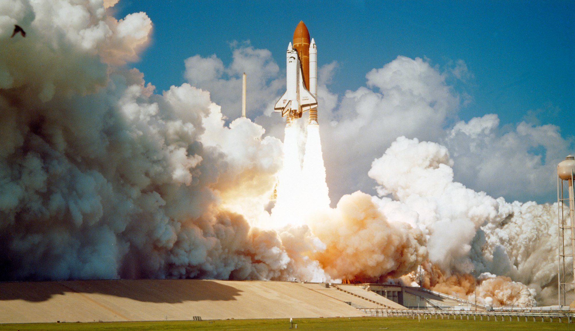
Space shuttles are remarkable mechanical marvels. In this two part article series, we will create it with CSS.
In this article, we will make the space shuttle rocket. We will complete the series in the following article by creating the orbiter.
We will be using different CSS technologies such as:
Jump over to our CSS Art article series if you’re unfamiliar with the above CSS technologies.
Preview

Our space shuttle rocket will consist of three main parts.
- Left Rocket
- Right Rocket
Prerequisites
We don’t assume prior knowledge of CSS or HTML, but it helps if you have some familiarity with how they work. Jump over to this article if you require an HTML and CSS primer.
We assume that you have set up tools to create CSS art. If you haven’t, this article will show you how to set them up.
HTML Structure
Here’s HTML code for our examples.
<div class="container">
  <div class="rocket">
    <!-- Base -->
    <div class="base"></div>

    <!-- Tank -->
    <div class="tank-connector"></div>
    <div class="tank">
      <div class="tank-ring-frame"></div>
    </div>

    <!-- Left and Right Rocket -->
    <div class="left-rocket"></div>
    <div class="left-rocket-thrust-vector-control"></div>
    <div class="right-rocket"></div>
    <div class="right-rocket-thrust-vector-control"></div>
  </div>
</div>
container is our outermost enclosure. This enables us to center the art and put a light gray border. The rest of divs represent each of our space shuttle rocket components.
It is important that <div class="tank-connector"></div> comes before <div class="tank">. This ensures the connectors will be drawn behind the external tank.
Before we start building the space shuttle rocket, let’s talk a small detour and talk about CSS custom properties (variables).
CSS Custom Properties (Variables)
CSS custom properties, sometimes called CSS variables, is used to apply color to different parts of the space shuttle rocket.
CSS variables make it easy to control the color palette. We can change the color code in the variable, and it gets applied to the different parts automatically. No need to manually search and replace color code. You are welcome to change the colors to your personal preference.
CSS Code:
:root {
  --black: #565656;
  --dark-gray: #868689;
  --gray: #eaeae6;
  --red: #833111;
  --silver: #dcdcd7;
  --dark-green: #515f56;
  --orange: #cc9339;
}
Are you ready to start creating?
Let’s start simple, first up is the rocket base.
Rocket Base

CSS Code:
.base {
  position: absolute;
  width: 250px;
  height: 1px;
  top: 480px;
  left: 112px;
  background: var(--dark-green);
}
This is the rocket base, or you may refer to it as the “ground” where the rockets will be on. It’s a thin dark green line on the bottom of our container.
Next, let’s make the biggest part of the space shuttle, the external tank.
External Tank
The external tank holds the liquid fuel to propel the orbiter to outer space.
We will split it in to three parts, the body, tip and bottom.
First up, tank body.
Tank Body

CSS Code:
.tank {
  position: absolute;
  width: 75px;
  height: 290px;
  top: 112px;
  left: 195px;
  background: linear-gradient(to right, var(--orange), var(--red));
}
The external tank is basically a vertically elongated rectangle.
background: linear-gradient(to right, var(--orange), var(--red));
We’re usinglinear-gradientto give the external tank a rounder look. We’re transitioning from an orange to a red hue.
Now that we’re done with the body, let’s make the tank tip.
Tank Tip

CSS Code:
.tank::before {
  content: "";
  position: absolute;
  width: 75px;
  height: 87px;
  top: -87px;
  left: 0px;
  background-image: linear-gradient(to right, var(--orange), var(--red));
  clip-path: path("M 37.5,0 C 0,39 0,82 0,87 L 75,87 C 75,82 75,39 37.5,0");
}
We’re using CSS pseudo-elements and CSS path() function to create the tank tip.
background-image: linear-gradient(to right, var(--orange), var(--red));
This is the same linear gradient that we used for the tank body.clip-path: path("M 37.5,0 C 0,39 0,82 0,87 L 75,87 C 75,82 75,39 37.5,0");
The values in thepath()are called Scalable Vector Graphics (SVG) path strings.
If you’ve used a vector based graphic application such as Sketch or Adobe Illustrator, you may have exported your art as SVG.
SVGs are vector-based and can be scaled without loss of quality.
For brevity, we won’t dive deep in to the SVG path string in this article. Jump over to this site if you want to dig deeper on how to create SVGs.
Up next is the tank bottom.
Tank Bottom

CSS Code:
.tank::after {
  content: "";
  position: absolute;
  width: 75px;
  height: 40px;
  top: 270px;
  left: 0;
  background-image: linear-gradient(to right, var(--orange), var(--red));
  border-radius: 50%;
}
The tank bottom is a squashed ellipse. Half of it is overlapping the tank body.
- border-radius: 50%; rounds the borders of the square and gives you an ellipse shape.
- You can control the “protrusion” of the tank bottom by adjusting the height CSS property.
Next, let’s make the connectors.
Tank Connector
We have two top and two bottom connectors. This will connect the external tank to the rockets.

CSS Code:
.tank-connector {
  position: absolute;
  width: 4px;
  height: 8px;
  background: var(--dark-gray);
  top: 162px;
  left: 192px;
  box-shadow: 77px 0px 0 0 var(--dark-gray);
}
The above code is for the two top connectors.
box-shadow: 77px 0px 0 0 var(--dark-gray);
We’re usingbox-shadowto create an exact replica of the connector box. We move the shadow77pxon the x or horizontal axis. With0px, we set the y or vertical axis so that both connecters align properly.- If you want to change the connector color, change
var(--dark-gray)to a different color variable.
The below code is for the bottom connectors.
CSS Code:
.tank-connector::before {
  content: "";
  position: absolute;
  width: 4px;
  height: 5px;
  background: inherit;
  top: 235px;
  left: 0px;
  box-shadow: 77px 0px 0 0 var(--dark-gray);
}
We’re using ::before CSS pseudo-element for the bottom connectors.
height: 5px;
We made the bottom connectors a little shorter than the top connectors.top: 235px;
The vertical position of the connectors can be set withtop:CSS property. Change the property value. Positive numbers will push it down, negative numbers will move it upwards.
Our last section is for the ring frame. This is the vertical, grill lines beside the top connector.
Ring Frame
The ring frame is part of the external tanks “intertank” structure.

CSS Code:
.tank-ring-frame {
  position: absolute;
  width: 73px;
  height: 62px;
  top: 26px;
  left: 0px;
  border: solid 1px var(--orange);
  background-image: repeating-linear-gradient(
    to right,
    var(--orange) 1% 2%,
    transparent 2% 4%
  );
}
We used repeating-linear-gradient to create the vertical lines for the ring frame. Repeating linear gradients are great if you want to make lines that are uniformly repeated.
border: solid 1px var(--orange);
This code gives use the solid orange border.
Let’s break the repeating linear gradient code down.
background-image: repeating-linear-gradient(
to right,
var(--orange) 1% 2%,
transparent 2% 4%
);
to right
This sets the direction of the gradient to repeat towards the right.var(--orange) 1% 2%,
We get the thin orange lines with the above code.transparent 2% 4%
We set a transparent gap between the orange lines. This lets the background color of the external tank to show through, giving us the illusion of a gap.
We’ve completed the external tank. In the section, we’ll build the left and right solid rocket booster (SRB).

Left Rocket
Rocket Body

CSS Code:
.left-rocket {
  position: absolute;
  width: 32.5px;
  height: 302px;
  top: 159px;
  left: 160px;
  background: linear-gradient(
      to bottom,
      transparent 3px,
      var(--black) 3px,
      var(--black) 6px,
      transparent 6px,
      transparent 25px,
      var(--dark-gray) 25px,
      var(--dark-gray) 27px,
      transparent 27px,
      transparent 28px,
      var(--black) 28px,
      var(--black) 30px,
      transparent 30px,
      transparent 62px,
      var(--dark-gray) 62px,
      var(--dark-gray) 64px,
      var(--black) 64px,
      var(--black) 66px,
      transparent 66px,
      transparent 99px,
      var(--dark-gray) 99px,
      var(--dark-gray) 100px,
      transparent 100px,
      transparent 101px,
      var(--dark-gray) 101px,
      var(--dark-gray) 102px,
      transparent 102px,
      transparent 133px,
      var(--dark-gray) 133px,
      var(--dark-gray) 134px,
      transparent 134px,
      transparent 136px,
      var(--black) 136px,
      var(--black) 138px,
      transparent 138px,
      transparent 172px,
      var(--dark-gray) 172px,
      var(--dark-gray) 173px,
      transparent 173px,
      transparent 208px,
      var(--dark-gray) 208px,
      var(--dark-gray) 210px,
      transparent 210px,
      transparent 285px,
      var(--dark-gray) 285px,
      var(--dark-gray) 288px,
      var(--black) 288px,
      var(--black) 290px,
      transparent 290px,
      transparent 298px,
      var(--dark-gray) 298px,
      var(--dark-gray) 300px,
      var(--black) 300px,
      var(--black) 302px
    ),
    linear-gradient(
      to right,
      var(--silver) 0% 10%,
      var(--gray) 15% 90%,
      var(--dark-gray) 100%
    );
}
Phew! We hear you, that’s a lot of CSS code!
Let’s break it down to more manageable chunks.
First, the width and height of the rocket body.
width: 32.5px;andheight: 302px
Take note of the height,302px. We will be placing rings, dark gray and black horizontal stripes, throughout the length of the rocket body.
Let’s start with the rocket’s background color.
linear-gradient(
  to right,
  var(--silver) 0% 10%,
  var(--gray) 15% 90%,
  var(--dark-gray) 100%
);
We’re using linear gradient to set the shadows, simulating a cone object.
var(--silver) 0% 10%,
We start with a silver color on the left side of the rocket body.var(--gray) 15% 90%,
The rest of the rocket body we set to gray.var(--dark-gray) 100%
We gave the right side a dark gray color to simulate depth.
Let’s use the illustration below to explain how we made the rings, the dark gray and black horizontal stripes, on the rocket body. Let’s zoom in on the top section of the rocket body.

CSS Code:
  background: linear-gradient(
      to bottom,
      transparent 3px,
      var(--black) 3px,
      var(--black) 6px,
      transparent 6px,
      transparent 25px,
      var(--dark-gray) 25px,
      var(--dark-gray) 27px,
      transparent 27px,
      transparent 28px,
  ...
linear-gradient(to bottom,
This code indicates that thelinear-gradientdirection is to the bottom.transparent 3px,
This generates a transparent gradient from0pxto3pxvar(--black) 3px, var(--black) 6px,
This generates a black ring starting from3pxand ending at6px.transparent 6px, transparent 25px,
We generate a transparent area between6pxall the way to25px.var(--dark-gray) 25px, var(--dark-gray) 27px,
From25pxending at27pxwe generate a dark gray ring.transparent 27px, transparent 28px,
Insert another transparent area between27pxand28px.var(--black) 28px, var(--black) 30px,
This code generates the black ring in our illustration.
To summarize our illustration, the areas indicated in orange are the transparent sections. These sections let the background color, silver, gray and dark gray, shine through.
To generate the rings, it’s all about alternating the transparent section and the colored section across the length of the rocket body.
Do take note that each transparent and colored section start and end exactly after one another. If you leave gaps between them, a color transition will occur, this is undesirable for your use case.
It’s hard to understand this concept at first. Use your web browser’s dev tools, change the pixel value for the transparent and colored section. Once you get the hang of this, you can create rings or any kind of stripes you can imagine.
Ok, let's make to the rocket tip.
Rocket Tip

CSS Code:
.left-rocket::before {
  content: "";
  position: absolute;
  width: 32.5px;
  height: 45px;
  top: -45px;
  left: 0px;
  background: linear-gradient(
    to right,
    var(--silver) 0% 10%,
    var(--gray) 15% 90%,
    var(--dark-gray) 100%
  );
  clip-path: path("M 0,45 L 32.5,45 L23,11 Q 17,-11 11,11 L 0,45");
}
- The rocket tip has the same background as the rocket body.
clip-path: path("M 0,45 L 32.5,45 L23,11 Q 17,-11 11,11 L 0,45");
Similar to the external tank tip, we’re using SVG path strings to create the rounded triangle shape of the rocket tip.
Next, let’s make the small rectangular rocket detail.
Rocket Detail

CSS Code:
.left-rocket::after {
  content: "";
  position: absolute;
  width: 8px;
  height: 11px;
  top: 6px;
  left: 5px;
  background-color: var(--silver);
  border: solid 0.5px var(--dark-gray);
}
background-color: var(--silver);
We give the detail a silver background.border: solid 0.5px var(--dark-gray);
Border is a thin solid dark gray line.
Let’s make the thrust vector control in the next section. This is the trapezoid shape at the bottom of the rocket body.
Rocket Thrust Vector Control
First, we’ll make the shape. Then we’ll put in the ring detail, these are the dark gray and black horizontal stripes.

CSS Code:
.left-rocket-thrust-vector-control {
  position: absolute;
  height: 18.5px;
  width: 46px;
  top: 461px;
  left: 152px;
  background: linear-gradient(
    to right,
    var(--silver) 0% 10%,
    var(--gray) 15% 90%,
    var(--dark-gray) 100%
  );
  clip-path: polygon(17% 0%, 83% 0%, 100% 100%, 0% 100%);
}
- Similar to the rocket tip, we use the rocket body background for the thrust vector control.
clip-path: polygon(17% 0%, 83% 0%, 100% 100%, 0% 100%);
We use the CSS polygon function to create a simple trapezoid.

CSS Code:
.left-rocket-thrust-vector-control::before {
  content: "";
  position: absolute;
  width: 46px;
  height: 18.5px;
  top: 0px;
  left: 0px;
  background: linear-gradient(
    to bottom,
    transparent 0 5px,
    var(--dark-gray) 5px,
    var(--dark-gray) 6px,
    transparent 6px,
    transparent 10px,
    var(--dark-gray) 10px,
    var(--dark-gray) 11px,
    transparent 11px,
    transparent 15px,
    var(--black) 15px,
    var(--black) 17px,
    transparent 16px
  );
}
- We’re using linear gradients to create the rings. Same technique we used for the rocket body.
- You may have noticed that the rings run the horizontal width of the trapezoid, even if we don’t explicitly set it. This is a great feature of gradients. It will expand to the width of its enclosing container.
Now we’re done with the left rocket, let’s tackle the right rocket. The design is almost identical, so we will only point out the tiny differences.
Right Rocket
Rocket Body

CSS Code:
  background: linear-gradient(
      to bottom,
      transparent 25px,
      var(--dark-gray) 25px,
      var(--dark-gray) 27px,
      transparent 27px,
      transparent 28px,
      var(--black) 28px,
      var(--black) 30px,
      transparent 30px,
      transparent 62px,
      var(--dark-gray) 62px,
      var(--dark-gray) 64px,
      var(--black) 64px,
      var(--black) 66px,
      transparent 66px,
      transparent 99px,
      var(--dark-gray) 99px,
      var(--dark-gray) 100px,
      transparent 100px,
      transparent 101px,
      var(--dark-gray) 101px,
      var(--dark-gray) 102px,
      transparent 102px,
      transparent 133px,
      var(--dark-gray) 133px,
      var(--dark-gray) 134px,
      transparent 134px,
      transparent 136px,
      var(--black) 136px,
      var(--black) 138px,
      transparent 138px,
      transparent 172px,
      var(--dark-gray) 172px,
      var(--dark-gray) 173px,
      transparent 173px,
      transparent 208px,
      var(--dark-gray) 208px,
      var(--dark-gray) 210px,
      transparent 210px,
      transparent 285px,
      var(--dark-gray) 285px,
      var(--dark-gray) 288px,
      var(--black) 288px,
      var(--black) 290px,
      transparent 290px,
      transparent 298px,
      var(--dark-gray) 298px,
      var(--dark-gray) 300px,
      var(--black) 300px,
      var(--black) 302px
    ),
    linear-gradient(
      to right,
      var(--dark-gray) 0%,
      var(--gray) 10% 90%,
      var(--silver) 90% 100%
    );
}
- We don’t have the first black ring for the right rocket body.
- We reversed the rocket body shading with the below code.
linear-gradient(
  to right,
  var(--dark-gray) 0%,
  var(--gray) 10% 90%,
  var(--silver) 90% 100%
);
Rocket Tip

CSS Code:
.right-rocket::before {
  content: "";
  position: absolute;
  width: 32.5px;
  height: 45px;
  top: -45px;
  left: 0px;
  background: linear-gradient(
    to right,
    var(--dark-gray) 0%,
    var(--gray) 10% 90%,
    var(--silver) 90% 100%
  );
  clip-path: path("M 0,45 L 32.5,45 L23,11 Q 17,-11 11,11 L 0,45");
}
- Similar to the right rocket body, we reversed the shading.
Rocket Detail

CSS Code:
.right-rocket::after {
  content: "";
  position: absolute;
  width: 8px;
  height: 11px;
  top: 6px;
  left: 20px;
  background-color: var(--silver);
  border: solid 0.5px var(--dark-gray);
}
- Location is the only difference for the right rocket detail. We shifted it left
20px.
Rocket Thrust Vector Control

CSS Code:
.right-rocket-thrust-vector-control {
  position: absolute;
  height: 18.5px;
  width: 46px;
  top: 461px;
  left: 267px;
  background: linear-gradient(
    to right,
    var(--dark-gray) 0%,
    var(--gray) 10% 90%,
    var(--silver) 90% 100%
  );
  clip-path: polygon(17% 0%, 83% 0%, 100% 100%, 0% 100%);
}
- We used the same color shading as the right rocket body and tip.

CSS Code:
.right-rocket-thrust-vector-control::before {
  content: "";
  position: absolute;
  width: 46px;
  height: 18.5px;
  top: 0px;
  left: 0px;
  background: linear-gradient(
    to bottom,
    transparent 0 5px,
    var(--dark-gray) 5px,
    var(--dark-gray) 6px,
    transparent 6px,
    transparent 10px,
    var(--dark-gray) 10px,
    var(--dark-gray) 11px,
    transparent 11px,
    transparent 15px,
    var(--black) 15px,
    var(--black) 17px,
    transparent 16px
  );
}
- Identical code to left thrust vector control.
Big congratulations on reading this far!
We explored a lot of CSS techniques and code in this article. You can see and play with the code at Pyxofy’s CodePen page.
See the Pen CSS Art - Space Shuttle Rocket by Pyxofy (@pyxofy) on CodePen.
Conclusion
We mixed different CSS tools and functions to make the space shuttle rocket.
For the external tank and rocket tip, we used SVG paths. We used linear gradients and repeating linear gradients to create rings and vertical stripe patterns. We used the polygon function to create a trapezoid shape.
By combining different shapes and CSS techniques, we successfully created an illustration of a mechanical marvel.
In the second part of this series, we will be creating the orbiter.
Play with the code, change the colors. Make the rocket body rings thicker or thinner. Share your masterpiece with us on Twitter @pyxofy, on LinkedIn or Facebook.
We hope you liked this article. Kindly share this article with your network. We really appreciate it.
Related Articles
 Pyxofy
 Pyxofy
 Pyxofy