CSS Art – How to Make a Turntable
In this article you will learn how to use Hex colors and CSS pseudo-elements. Then we’ll make a simple turntable step-by-step.
Introduction
A turntable, seen from the top, has simple components that can be broken down to basic shapes. We will combine circles, squares and rectangles to make a basic turntable.
We will be using CSS pseudo-elements such as ::before and ::after. Furthermore, we’ll go through CSS Hex color overview, and how we can use them to color different parts of the turntable.
We don’t assume prior knowledge of CSS or HTML, but it helps if you have some familiarity with how they work. Jump over to the below article if you need an HTML and CSS primer.
 Pyxofy
We assume that you have set up tools to create CSS art. If you haven’t, the below article will show you how to set them up.
Pyxofy
Defining Colors in CSS
Color is an important element when creating art. There are multiple ways we can define colors in CSS. Below are common ones that you may have seen before.
- Color keywords
- Red, Green, Blue (RGB) cubic-coordinate system
- Hue, Saturation, Lightness (HSL) cylindrical-coordinate system
- Hue, Whiteness, Blackness (HWB) cylindrical-coordinate system
In a previous article, How to make a Simple House, we used CSS color keywords such as royalblue or lightgray.
CSS color keywords are intuitive. As long as you’re familiar with English colors, you can image how it will display on the screen. The only downside for CSS color keywords is that it’s limited. It doesn’t cover the whole color spectrum supported on your screen display.
RGB hexadecimal string notation (Hex)
For this article, we will be using the RGB hexadecimal string notation, commonly referred to as Hex colors. Hex colors combine numbers and letters to represent color.
- Numbers
0through9 - Letters
AthroughF
Let’s translate our CSS color keywords to Hex color.
royalbluein color keywords will be#4169e1in Hex.lightgraywill be#d3d3d3.
Hex colors will always begin with the hash symbol (#). You can use this color picker tool to explore hex color values. You can dive deep on the CSS color data type here.
That wraps our quick overview of how CSS color keywords and hex color work. In the next section, let’s explore how we can use pseudo-elements ::before and ::after when creating CSS art.
::before and ::after CSS pseudo-elements
CSS pseudo-elements are keywords that are added to a CSS selector. By adding these keywords, you can style a specific part of the selected element(s). Take note that pseudo-elements differ from CSS pseudo-classes. Pseudo-classes are used to style an element based on its state.
Let’s say you want to style the first letter of your paragraph blue, you can use this CSS code.
/* The first letter of every paragraph (<p>) element will be blue. */
p::first-letter {
  color: blue;
}
In CSS art, we can use the ::before and ::after pseudo-element to add additional shapes to a single HTML element.
Let’s go through a simple example. First, let’s make a square. Then we’ll add a magenta circle using the ::before pseudo-element, then add an orange rectangle using the ::after pseudo-element.
- Square

HTML code:
<div class="colored-bars"></div>
CSS code:
.colored-bars {
  position: relative;
  background: burlywood;
  width: 100px;
  height: 100px;
  left: -120px;
}
We shifted the square left by -120px to make room for the circle and rectangle.
- Magenta Circle

CSS code:
.colored-bars::before {
  content: "";
  position: absolute;
  background: darkmagenta;
  width: 100px;
  height: 100px;
  left: 100px;
  border-radius: 50%;
}
Right after the .colored-bars class selector, we type ::before with no spaces. It’s important to include content: "" in your CSS code. Without it, the CSS shape will not show on the screen. We shifted the circle 100px to the right. If we don’t do this the circle will sit on top of the square. With border-radius: 50% we round the borders to make a circle shape.
- Orange Rectangle

CSS code:
.colored-bars::after {
  content: "";
  position: absolute;
  background: orange;
  width: 200px;
  height: 100px;
  left: 200px;
}
Finally, we added the orange rectangle. Similar to the magenta circle, we had to shift the rectangle’s position. This time, we shifted it by 200px to the right, so it doesn’t sit on top of the circle. You can play with the code on Pyxofy’s CodePen page.
Now you have a basic understanding of CSS pseudo-elements and how we can use it for CSS art. Check this article for an explanation on how to make and manipulate basic CSS shapes.
In the next section, we’ll make a turntable using hex colors and CSS pseudo-elements.

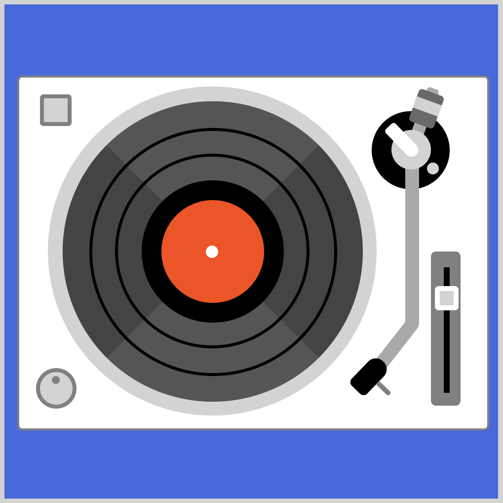
Turntable Preview
This is the image we’ll be creating, a simple illustration of a turntable.

If you’ve never seen a turntable before, you may not know its different parts. Let’s get familiar with the different parts.
- Base
- Start / Stop button
- Power knob
- Platter
- Record
- Spindle
- Pitch adjust slider
- Tone arm
- Headshell
HTML Code Breakdown
This is the full HTML code.
<!doctype html>
<html lang="en"> <!-- HTML element -->

<head> <!-- Head section -->
  <meta charset="utf-8">
  <title>CSS Art - Turntable</title>
  <meta name="viewport" content="width=device-width, initial-scale=1">
  <link rel="stylesheet" href="styles/styles.css">
</head>

<body> <!-- Body section -->

    <!-- CSS art code here -->
	<div class="container">
	  <!-- Base -->
	  <div class="base"></div>
      <div class="start-stop-button"></div>
	  <div class="power-knob"></div>


	  <!-- Platter, record -->
	  <div class="platter"></div>
	  <div class="record"></div>
	  <div class="record-center"></div>
	  <div class="record-ring"></div>

	  <!-- Pitch adjust slider -->
	  <div class="slider"></div>

	  <!-- Tone arm -->
	  <div class="arm-base"></div>
	  <div class="weight-arm"></div>
	  <div class="weight"></div>
	  <div class="tone-arm"></div>
	  <div class="pivot-base"></div>
	  <div class="pivot-mech"></div>
	  <div class="headshell"></div>
	</div>

</body>

</html>
If you’re not familiar with the different HTML elements, this article discusses it in detail.
Pyxofy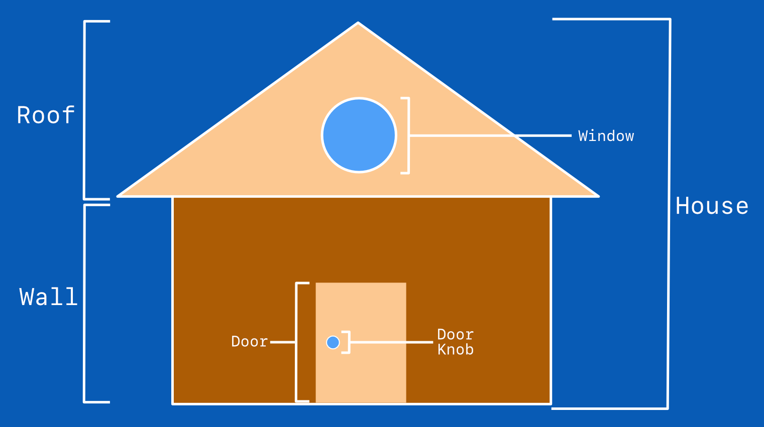
In the next section, we’ll go through the CSS code to create the turntable.
Create a Turntable – Step-by-step
This will be a long section. Stretch, get a fresh cup of your favorite drink. The CSS code will go within your external stylesheet. For this article, we’re using styles.css located in your styles folder.
Ready? Let’s jump in to the CSS code step-by-step.
Step 1. Base

CSS code:
.base {
  width: 474px;
  height: 355px;
  background: white;
  position: absolute;
  left: 13px;
  top: 72px;
  border: solid 2px gray;
  border-radius: 5px;
}
This is our base or body of the turntable. We gave it a white background and a gray border. We set the border-radius to 5px to round the corners a bit.
Next, let’s make the start / stop button.
Step 2. Start / Stop Button

CSS code:
.start-stop-button {
  width: 24px;
  height: 24px;
  background: lightgray;
  position: absolute;
  left: 36px;
  top: 91px;
  border: solid 4px gray;
  border-radius: 10%;
}
We placed the start / stop button in the upper-right corner. We rounded the corners slightly with border-radius: 10%.
Next, let’s make the power knob.
Step 3. Power Knob

CSS Code:
.power-knob {
  width: 33px;
  height: 33px;
  background: lightgray;
  position: absolute;
  left: 32px;
  top: 368px;
  border-radius: 50%;
  border: solid 4px gray;
}

.power-knob::before {
  content: "";
  position: absolute;
  width: 8px;
  height: 8px;
  border-radius: 50%;
  background: gray;
  top: 4px;
  left: 12px;
}
This is the first time we’re using the ::before pseudo-element. With .power-knob we made the knob’s base circle. With .power-know::before we made the small gray dot. Via pseudo-element, we can create additional shapes without declaring additional HTML tags.
Next up, the platter, record, and the spindle.
Step 4. Platter

CSS Code:
.platter {
  width: 303px;
  height: 303px;
  background: gray; /* or transparent */
  position: absolute;
  left: 44px;
  top: 83px;
  border-radius: 50%;
  border: solid 15px lightgray;
}
Using solid 15px lightgray we created a thick border to simulate the outer portion of the platter. We gave background a gray color, but you can change it to transparent after you finish with the record portion.
Let’s make the record base.
Step 5. Record Base

CSS Code:
.record {
  position: absolute;
  width: 0;
  height: 0;
  border-top: 152px solid #555555;
  border-right: 152px solid #444444;
  border-bottom: 152px solid #555555;
  border-left: 152px solid #444444;
  border-radius: 50%;
  left: 59px;
  top: 98px;
}
We used alternating hex colors #555555 and #444444 to simulate a “spinning” effect. For eagle-eyed readers, you may have noticed that these are triangles with rounded corners. Check this article on how to make triangles.
Pyxofy
Let’s make the black rings next.
Step 6. Record Rings
- First ring

CSS Code:
.record-ring {
  width: 191px;
  height: 191px;
  background: transparent;
  position: absolute;
  left: 112px;
  top: 151px;
  border-radius: 50%;
  border: solid 3px black;
}
Since we just want a plain ring, we set background to transparent. We set the border to solid 3px black to get a thin black ring.
- Second ring

CSS Code:
.record-ring::before {
  content: "";
  width: 245px;
  height: 245px;
  background: transparent;
  position: absolute;
  left: -30px;
  top: -30px;
  border-radius: 50%;
  border: solid 3px black;
}
For the second ring, we use ::before pseudo-element. We set width and height property to 245px, which is bigger than the first ring.
Now let’s work on the record’s center portion.
Step 7. Record Center

CSS Code:
.record-center {
  width: 104px;
  height: 104px;
  background: orangered;
  position: absolute;
  left: 139px;
  top: 178px;
  border-radius: 50%;
  border: solid 20px black;
}
The background set to orangered gives it a rustic, classic tone. We gave it a thick border of 20px.
Next, let’s make the spindle.
Step 8. Spindle

CSS Code:
.record-center::before {
  content: "";
  position: absolute;
  width: 12.5px;
  height: 12.5px;
  border-radius: 50%;
  background: white;
  top: 46px;
  left: 45px;
}
We used ::before pseudo-element to place the white spindle in the middle of the record. On a physical turntable, the spindle holds the record in place.
Let’s move on to the pitch adjust slider.
Step 9. Pitch Adjust Slider
We’ll make the pitch adjust slider using both ::before and ::after pseudo-element.
- Slider base

CSS Code:
.slider {
  width: 30px;
  height: 156px;
  background: gray;
  position: absolute;
  left: 432px;
  top: 250px;
  border-radius: 5px;
}
The slider base is a narrow, vertical rectangle with slightly rounded borders. Next, let’s make the slider rail using ::before pseudo-element.
- Slider rail

CSS Code:
.slider::before {
  content: "";
  width: 6px;
  height: 127px;
  background: black;
  position: absolute;
  left: 12px;
  top: 14px;
}
We placed the slider rail in the middle of the slider base. Positioning maybe tricky with pseudo-elements. It’s recommended to set your left and top property values to 0px first. This will show the initial position of the slider rail. Adjust the left property first, then the top property. Remember, small increments are better and easier to control. Up next, slider cap.
- Slider cap

CSS Code:
.slider::after {
  content: "";
  width: 14px;
  height: 14.5px;
  background: lightgray;
  position: absolute;
  left: 3px;
  top: 33px;
  border: solid 5px white;
  border-radius: 15%;
}
We used the ::after pseudo-element to make our slider cap. We set border-radius to 15% to give the cap a semi rounded look. The dark background of the slider rail is a good contrast for the mostly white, light gray color combination of the cap.
By making the slider with pseudo-elements, we save ourselves two HTML tags. For now, that may not sound much, but when you start creating more complicated art, the more keystrokes you can save, the better.
The next sections will be the most challenging. So take a good ten-minute break. Get a fresh cup of your favorite drink, look outside the window to refresh your eyes.
Ready?
Let’s jump in and make the tone arm base.
Step 10. Tone Arm Base
- Arm base

CSS Code:
.arm-base {
  width: 79px;
  height: 79px;
  background: black;
  position: absolute;
  left: 372px;
  top: 108px;
  border-radius: 50%;
}
Our arm base is a plain, black circle. The rest of the parts will be on top of this base.
- Anti-skate adjust

CSS Code:
.arm-base::before {
  content: "";
  position: absolute;
  width: 12px;
  height: 12px;
  border-radius: 50%;
  background: lightgray;
  top: 52px;
  left: 56px;
}
The anti-skate adjust is a light gray circle. Using ::before pseudo-element, we placed the anti-skate adjust within the arm base.
- Pivot base

CSS Code:
.pivot-base {
  width: 40px;
  height: 40px;
  background: lightgray;
  position: absolute;
  left: 392px;
  top: 127px;
  border-radius: 50%;
}
The pivot base is another circle. We placed it right in the middle of the arm base.
- Pivot mech

CSS Code:
.pivot-mech {
  width: 14px;
  height: 40px;
  background: white;
  position: absolute;
  left: 412px;
  top: 117px;
  transform: rotate(-44deg);
  transform-origin: bottom left;
  border-radius: 15px 15px 30px 30px;
}
To make the pivot mech, we combined a couple of CSS properties. First, we used transform: rotate to rotate the shape. We used -44deg property value to do the rotation.
Next, we set the transform-origin to bottom left. This make it so that the -44 degree pivots from the bottom-left corner of the shape.
The border is different for the lower and upper portion of the pivot mech. The lower portion is completely round versus the upper portion’s slightly rounded corners.
Remember, border-radius property values are in this order.
- Top left
- Top right
- Bottom right
- Bottom left
/* top-left | top-right | bottom-right | bottom-left */
border-radius: 15px 15px 30px 30px;
Read this article about border-radius to get familiarized with its different property values.
Next, let’s make the weight arm.
- Weight arm

CSS Code:
.weight-arm {
  width: 13px;
  height: 48px;
  background: darkgray;
  position: absolute;
  left: 412px;
  top: 82px;
  transform: rotate(20deg);
  transform-origin: bottom;
  border-radius: 4px 4px 0px 0px;
}
The weight arm is similar to the pivot mech. For border radius, only the top side is rounded. The bottom side is covered by the pivot mech, so we kept its border as is.
- Weight

CSS Code:
.weight {
  width: 27px;
  height: 35px;
  background: dimgray;
  position: absolute;
  left: 408px;
  top: 87px;
  transform: rotate(20deg);
  transform-origin: bottom;
  border-radius: 4px;
}
We placed the weight shape on top of the weight arm. We gave it slightly rounded borders.
- Weight stripe

CSS Code:
.weight::before {
  content: "";
  width: 27px;
  height: 12px;
  background: lightgray;
  position: absolute;
  left: 0px;
  top: 9px;
}
The weight strip is purely ornamental. We placed it inside the weight shape using ::before pseudo-element.
Up next is the tone arm.
Step 11. Tone Arm
- Tone arm (straight rod)
")
CSS Code:
.tone-arm {
  width: 14px;
  height: 159px;
  background: darkgray;
  position: absolute;
  left: 406px;
  top: 165px;
  border-radius: 0px 0px 2px 0px;
}
We separated the tone arm to two parts, then connected them. We made the bottom right slightly rounded by setting its value to 2px. This slight round corner makes the connection with our next shape, tone arm (bend), look smoother.
- Tone arm (bend)
")
CSS Code:
.tone-arm::before {
  content: "";
  width: 14px;
  height: 60px;
  background: darkgray;
  position: absolute;
  left: 5px;
  top: 152px;
  transform: rotate(38deg);
  transform-origin: top;
  border-radius: 0px 9px 0px 0px;
}
Connecting the tone arm (bend) with the straight rod is tricky. We made the top-right corner slightly rounded so that the bend looks smoother.
On to our last section, the headshell.
- Headshell

CSS Code:
.headshell {
  width: 22px;
  height: 40px;
  background: black;
  position: absolute;
  left: 345px;
  top: 350px;
  transform: rotate(44deg);
  transform-origin: bottom;
  border-radius: 30px 30px 15px 15px;
}
The headshell houses the cartridge in a physical turntable. Its shape is similar to the pivot mech, one side is rounder than the other.
- Headshell (arm)
")
CSS Code:
.headshell::after {
  content: "";
  width: 17px;
  height: 5px;
  background: gray;
  position: absolute;
  left: 22px;
  top: 17px;
  transform: rotate(0deg);
  transform-origin: bottom;
  border-radius: 0px 5px 5px 0px;
}
For the headshell (arm) we used the ::after pseudo-element to place it next to the headshell.
If you made it this far, give yourself a big round of applause.
It’s been a long journey from start to finish, but glad you stuck with us until the end.
You can see and play with the turntable code at Pyxofy’s CodePen page.
See the Pen CSS Art - Turntable by Pyxofy (@pyxofy) on CodePen.
We’ll be releasing more CSS art articles. If you haven’t already, bookmark this page.
Pyxofy
Conclusion
In this article, you learned how to use hex colors and how it compares to CSS color keywords.
We explained how to use pseudo-elements, ::before and ::after, when making shapes in CSS art. We combined two shapes to simulate bends.
Now you have these practical techniques in your toolbox, go ahead and modify the turntable to your liking. Change the colors. Maybe even animate the record, make it spin.
Share your masterpiece with us on Twitter @pyxofy, on LinkedIn or Facebook.
We hope you liked this article. Kindly share this article with your network. We really appreciate it.
Related Articles
Pyxofy Pyxofy