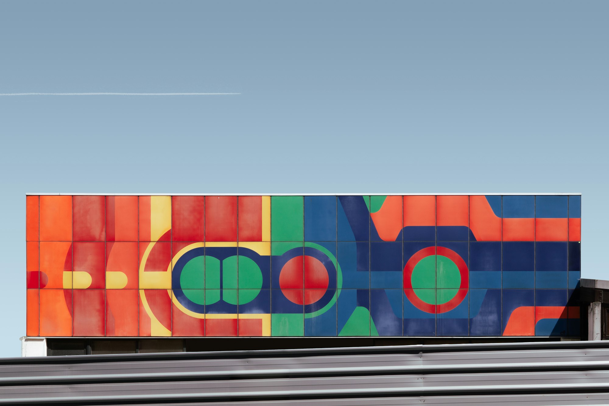
CSS Art – How to Make and Manipulate Basic CSS Shapes
We’ll learn how to make basic CSS shapes such as circle, squares and triangles. Then let’s rotate, scale, skew and move them around the screen.
Introduction
This article is beginner level. We will make squares, rectangles, ellipses, triangles, and other basics shapes using CSS and HTML.
Basic shapes are the building blocks for creating more complex objects. We’ll make basic shapes, then we’ll show you how to manipulate them. By combining basic shapes, we can make more sophisticated art and design.
You don’t have to be an expert in CSS and HTML to complete the examples in this article. We assume that you have set up tools to create CSS art. If you haven’t, the article below will show you how to set them up.
 Pyxofy
Setting up tools for CSS Art
Basic Shapes in CSS
There are two types of basic shapes
- Organic shapes
Organic, alternatively called freeform shapes, are shapes found in nature. They usually do not follow rules, and typically not man-made. Examples are tree leaves, water ripples etc. - Geometric shapes
Geometric or regular shapes are easy to recognize. Most man-made shapes can be classified as geometric shape. They often have names, such as rectangle or circle, associated to them. You can use math to measure its length, depth, or width.
For CSS art, we will be using geometric shapes. First up will be a square. Let’s explore the HTML then CSS code.
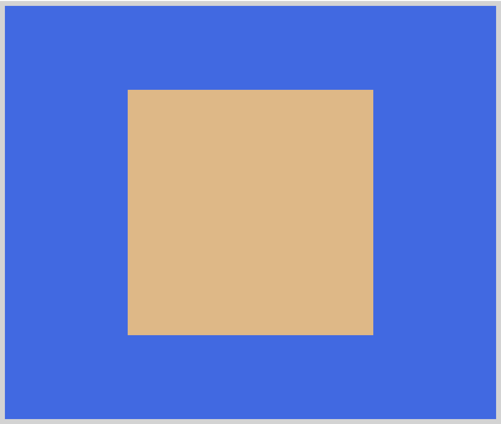
Square
HTML Code:
<div class="square"></div>
The HTML code is simple. It’s a <div> element. We assign square as its class attribute. Next, let’s style this element to look like a square.
CSS Code:
.square {
	width: 250px;
	height: 250px;
	background: burlywood;
}
Squares have equal width and height. We set 250px for our width and height property. For background we assigned burlywood as its property value. This gives it a nice light brown color.
If you look closely at different components in web pages or web applications, you will notice that most of them are square shaped. Up next is another common shape on the web, the rectangle.
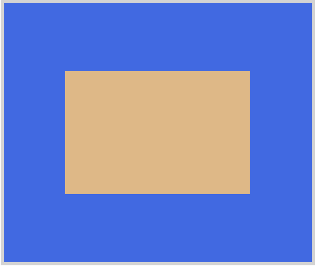
Rectangle
HTML Code:
<div class="rectangle"></div>
The main difference between a rectangle and a square is
- Squares have four sides of equal length.
- Opposite sides of a rectangle are equal and parallel to each other.
With that in mind, let’s write the CSS code.
CSS Code:
.rectangle {
	width: 300px;
	height: 200px;
	background: burlywood;
}
The width and height property value is different for rectangles. The example is longer horizontally. You can reverse the width and height property value. That will give you a vertical rectangle.
We’re done with quadrilaterals. Let’s tackle another common shape, the ellipse. Let’s learn how to make a circle and then an oval with CSS.
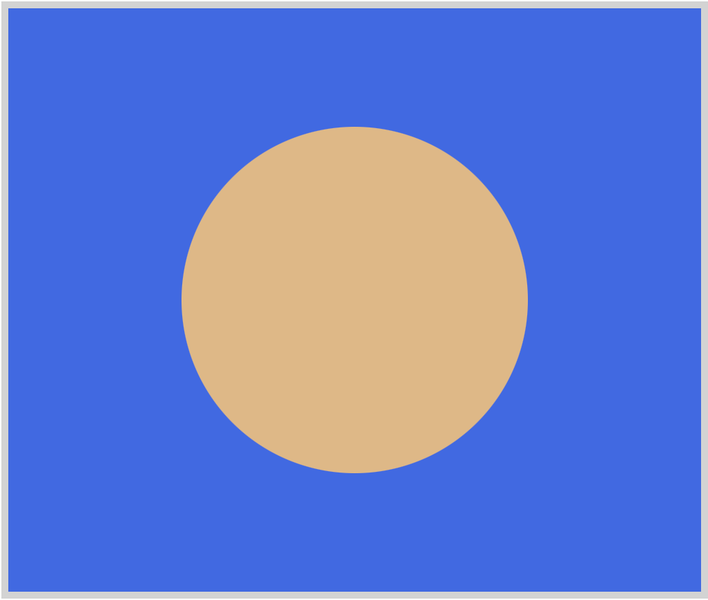
Circle
HTML Code:
<div class="circle"></div>
Similar to a square, to make a circle the width and height property values should be the same value.
.circle {
	width: 250px;
	height: 250px;
	background: burlywood;
	border-radius: 50%;
}
The key to making a circle in CSS is border-radius. Here are the mechanics of how CSS makes a circle in simple terms.
- When you set
width,heightandbackgroundproperties, CSS will draw a square. - Using
border-radiusyou modify the corners of the square. Setting50%as yourborder-radiusproperty value, you make the corners in to a circular shape.
For a more detailed explanation of border-radius check out this article.
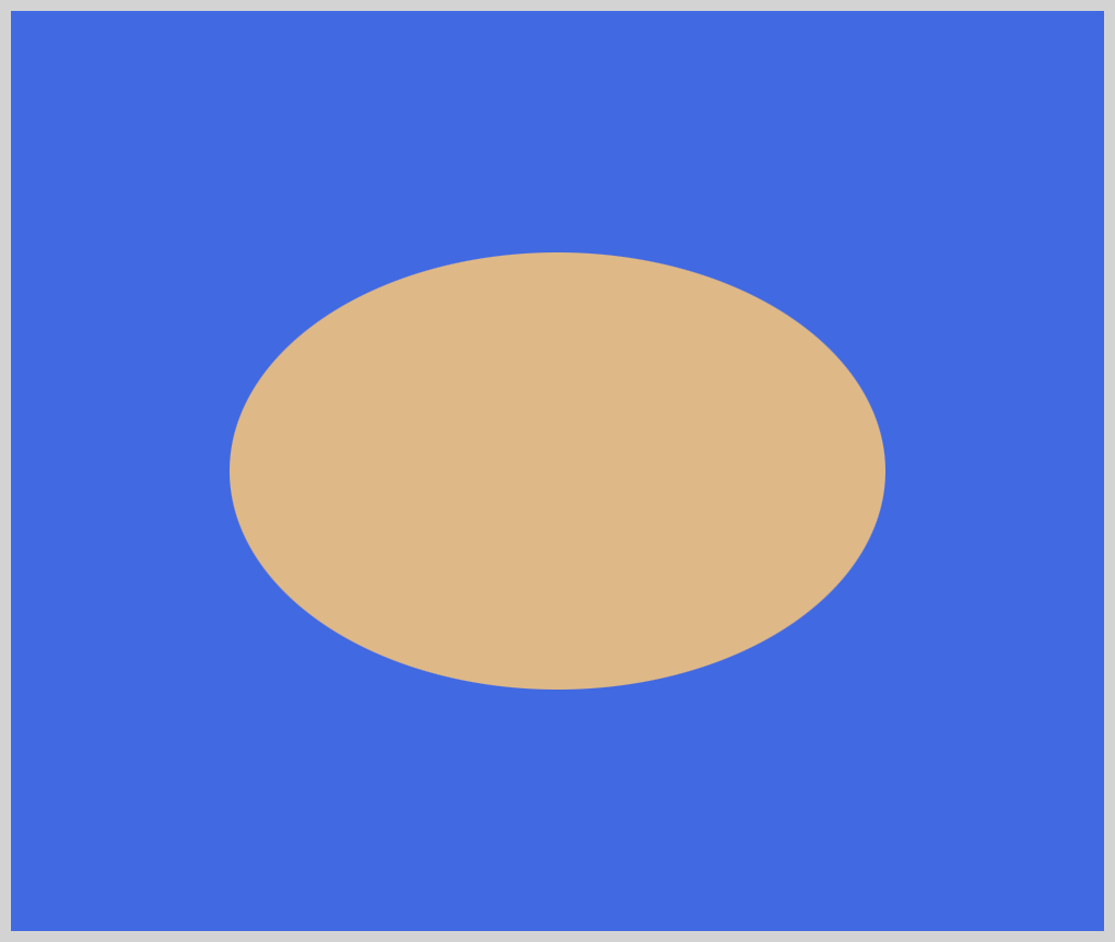
Now that we know how to make a circle, let’s make an oval.
Oval
HTML Code:
<div class="oval"></div>
Similar to a rectangle, an oval’s width and height value are different. Usually, one side is longer or shorter, depending on the use case.
CSS Code:
.oval {
	width: 300px;
	height: 200px;
	background: burlywood;
	border-radius: 50%;
}
The main difference between an oval and a circle is the width and height property value are not equal. This is what makes it elongate horizontally or vertically.
Let’s finish with the triangle. Compared to squares and circles, triangles are a tad tricky to make.
Triangle
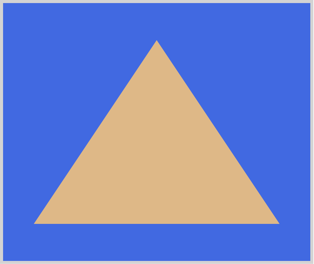
HTML Code:
<div class="triangle"></div>
To make a triangle, you set the width and height property value to 0. This is because if we set these values, CSS will make a square or rectangle. We will use border-left, border-right, and border-bottom to make our triangle.
CSS Code:
.triangle {
	width: 0;
	height: 0;
	border-left: 200px solid transparent;
	border-right: 200px solid transparent;
	border-bottom: 300px solid burlywood;
}
You may have noticed that our border-left and border-right color property value is transparent and we do not have a border-top. Let’s use a different illustration to explain why this is necessary.
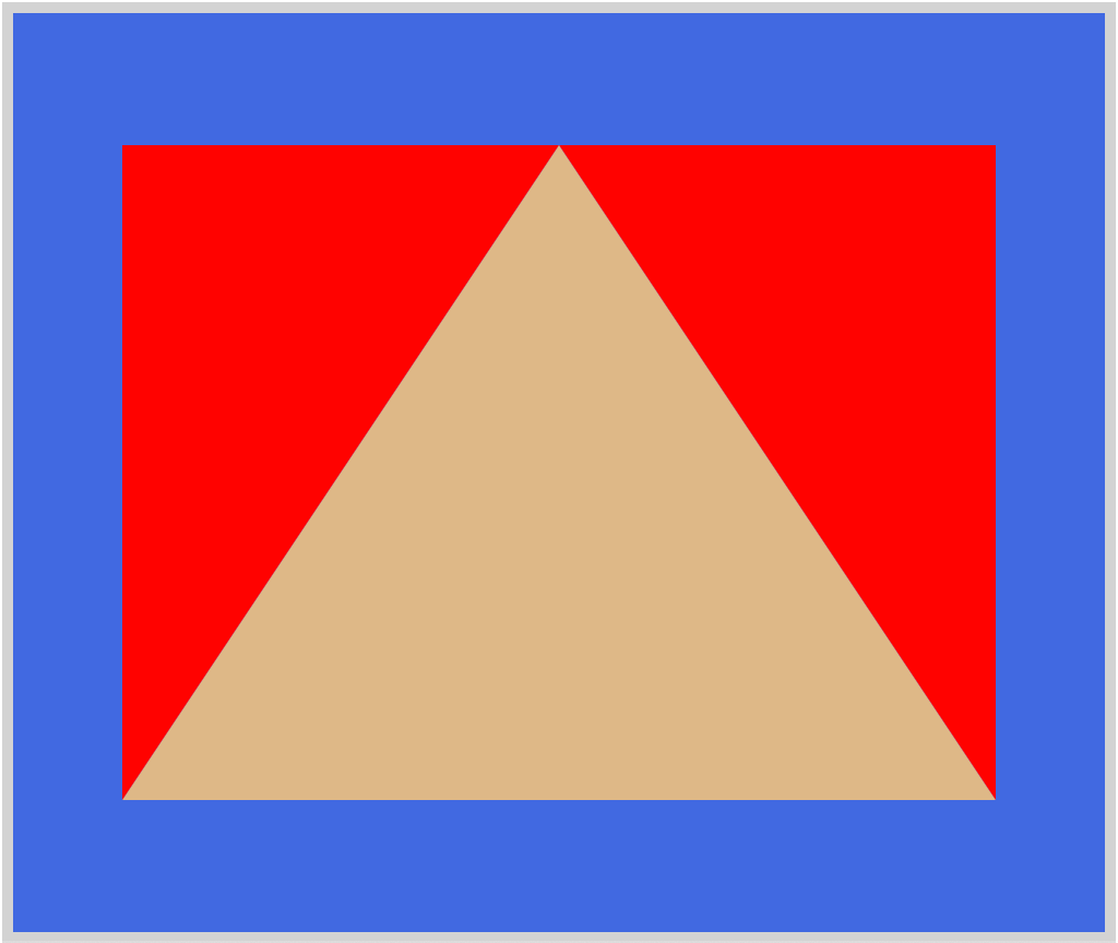
CSS Code:
.triangle-with-red-border {
	width: 0;
	height: 0;
	border-left: 200px solid red;
	border-right: 200px solid red;
	border-bottom: 300px solid burlywood;
}
We changed the border-left and border-right color property value to red. Did you notice the difference between the first illustration and the second one? With the left and right border color set to red, you can see that CSS triangles are just rectangles that have transparent borders. To make a triangle:
- Make a rectangle.
- Set its borders as
transparent.
By playing with border-left, border-right and, border-bottom property values, you can make different triangles. Experiment with the CSS code. Try to make a pyramid looking shape, maybe a downward pointing triangle.
Compared to squares and circles, making triangles in CSS is not straightforward. It takes time to understand the underlying concepts. Practice making more triangles. You can use them as arrows or as a play button. Here’s an in-depth explanation of CSS triangles.
We have covered the common CSS shapes. There are more shapes that we can make with CSS. For an exhaustive list of CSS shapes, check this article.
We will be releasing more CSS art articles. If you haven’t already, bookmark this page.
Pyxofy
CSS Art Article List
In the next section, let’s learn how to rotate, scale, skew, and move (translate) our CSS shapes.
Manipulating CSS Shapes
In the previous section, we learned how to make basic CSS shapes. In this section, we will show you how to manipulate CSS shapes. We will be using the CSS transform property.
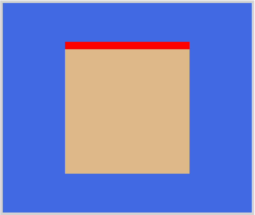
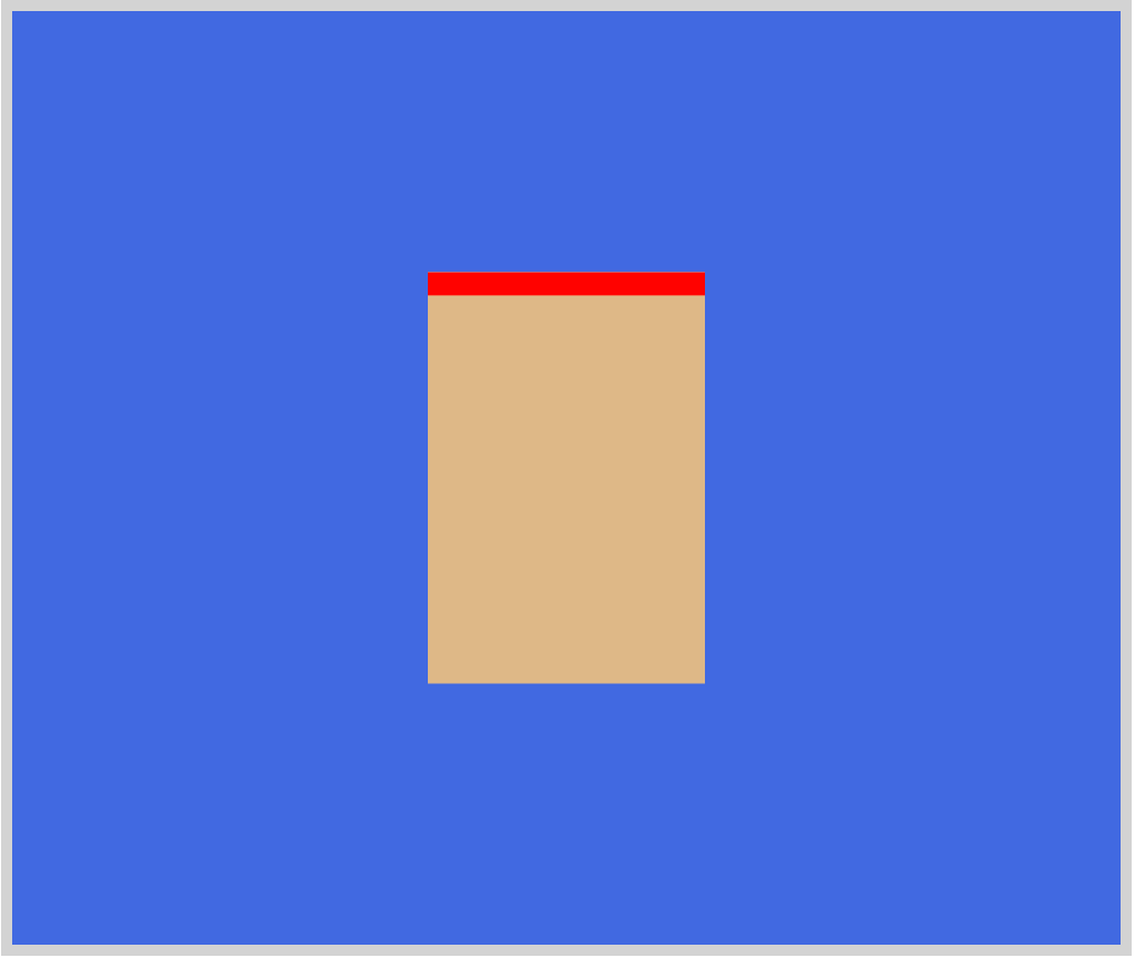
We’re using the square shape. Added a red top border to make it easier to see the changes when we manipulate it.
HTML Code:
<div class="square-red-top-border"></div>
CSS Code:
.square-red-top-border {
	width: 250px;
	height: 250px;
	background: burlywood;
	border-top: 15px solid red;
}
We will be using the following transform-function for our example.
rotate()
Rotates a shape, without deforming it, around a fixed point on the 2D plane. You use degrees,deg, to control the angle of the rotation.scale()
Resizes a shape on the 2D plane. You can resize both horizontal and vertical dimensions separately.skew()
This manipulation is akin to grabbing each corner of the shape and stretching them on the x-axis, y-axis, or both. You can do interesting shape distortion effects usingskew().translate()
You use this to repositions shapes in vertical and horizontal directions. You can use either a length or percentage value.
Let’s look at our first example.
rotate()
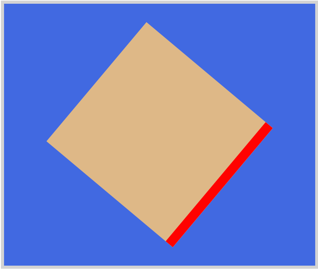
HTML Code:
<div class="square-rotate"></div>
CSS Code:
.square-rotate {
	width: 250px;
	height: 250px;
	background: burlywood;
	border-top: 15px solid red;
	transform: rotate(130deg);
}
Using transform: rotate(130deg), we rotated the square 130 degrees to the right or clockwise. A negative number will rotate the shape in the other direction or counterclockwise.
scale()
HTML Code:
<div class="square-scale"></div>
CSS Code:
.square-scale {
	width: 250px;
	height: 250px;
	background: burlywood;
	border-top: 15px solid red;
	transform: scale(0.5, 0.7);
}
We used numbers to scale the x and y dimensions of the square. It looks like a tall rectangle now. Percentages can be used instead of numbers. 0.5 is the value for the x dimension and 0.7 is for the y dimension.
skew()
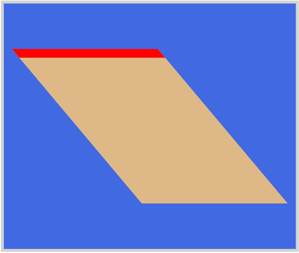
HTML Code:
<div class="square-skew"></div>
CSS Code:
.square-skew {
	width: 250px;
	height: 250px;
	background: burlywood;
	border-top: 15px solid red;
	transform: skew(40deg);
}
For this example, we only skewed the shape on the x-axis, typed like this transform: skew(40deg). If we wanted to skew them on both axes, we use this code transform: skew(40deg, 60deg).
translate()
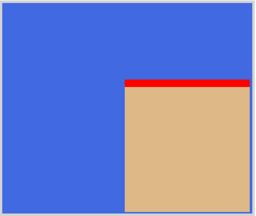
HTML Code:
<div class="square-translate"></div>
CSS Code:
.square-translate {
	width: 250px;
	height: 250px;
	background: burlywood;
	border-top: 15px solid red;
	transform: translate(120px, 75px);
}
We can use either a length or percentage unit for translate(). For this example, we translated or moved the shape to the lower-right corner.
Using all four transform-function we can manipulate the shapes to fit our needs. Want to dig deeper in to CSS shape manipulations, check this article.
The examples we presented are geared for 2D dimensions. There are separate 3D CSS transform functions. 3D requires understanding of depth or z-axis. We will explore these 3D options in a separate article. Meanwhile, if you want to manipulate CSS shape, check this interactive web app.
You can see and play with the basic CSS shapes and manipulations examples at Pyxofy’s CodePen page.
See the Pen CSS Art – Make and Manipulate Basic CSS Shapes by Pyxofy (@pyxofy) on CodePen.
Conclusion
We learned how to make basic shapes, such as squares, circles, and triangles. To make complex art, you need to have a good grasp of how basic shapes are made with CSS.
We introduced CSS transform-function to rotate, scale, skew and move our shapes. This will help us build more complex shapes. In future articles, we will use these manipulations to make CSS animation.
While using your favorite web apps, pay attention to the subtle changes and animations used in the buttons and user interface elements. Most of these are built using CSS.
Which of the basic shapes or manipulation techniques did you like the most?
Let us know via Twitter @pyxofy, LinkedIn, or Facebook.
We hope you liked this article. Kindly share this article with your network. We really appreciate it.
Related Articles
Pyxofy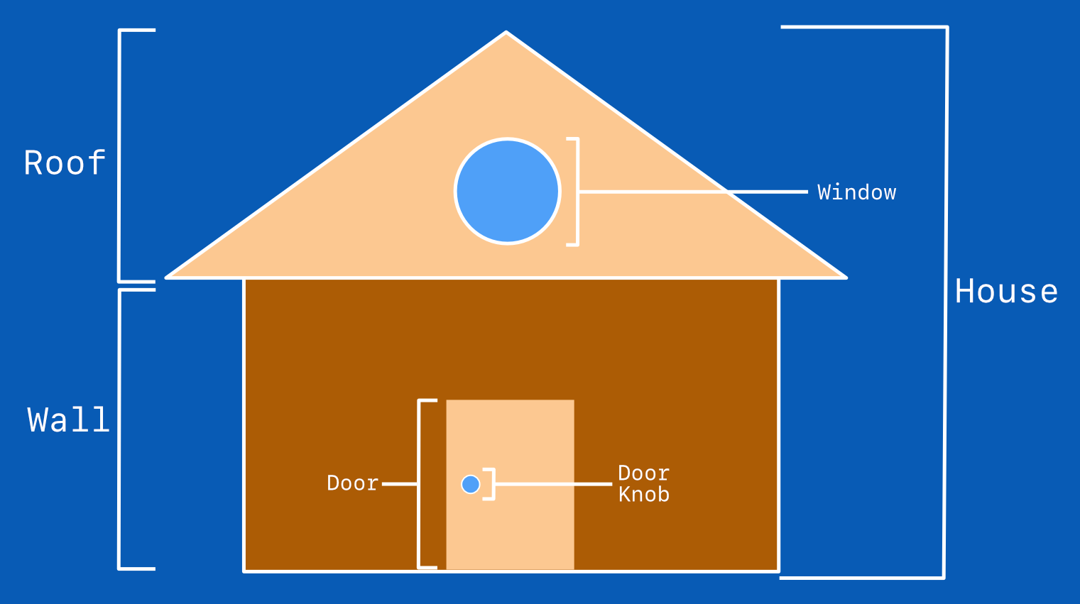
CSS Art - How to Make a Simple House
Pyxofy
What is CSS Art?