CSS Animation – Create Stunning Isometric Effects using Scaling and Translation Techniques
Now you see it, now you don’t. Learn in this step-by-step tutorial how to make an isometric cube move, appear, and disappear using only CSS.

Introduction
Animating web elements to move, appear, and disappear is enjoyable and visually captivating. In this easy-to-follow article, you’ll learn how to blend various CSS properties to make an isometric cube move that visually pops in a three-dimensional (3D) way!
CSS properties you’ll be exploring in this article:
scaletranslateopacitybox-shadow@keyframes
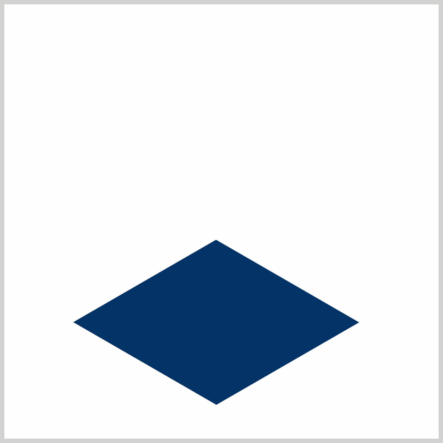
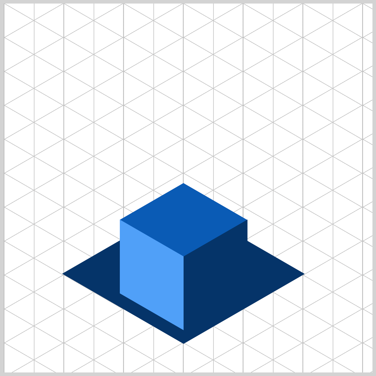
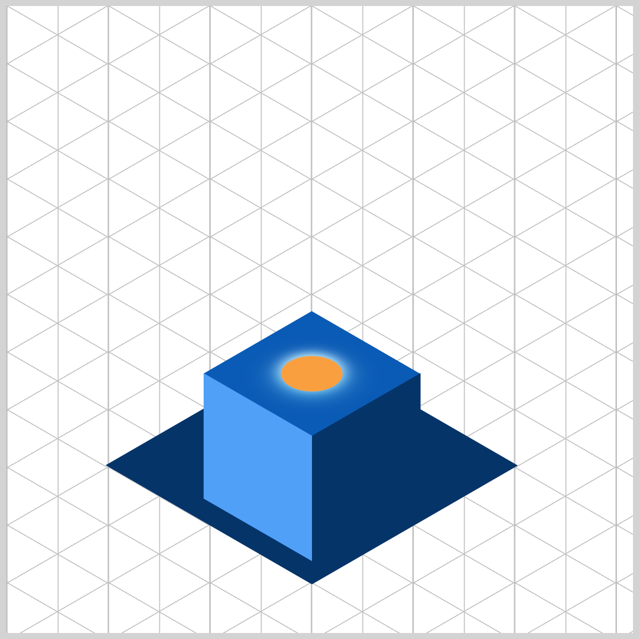
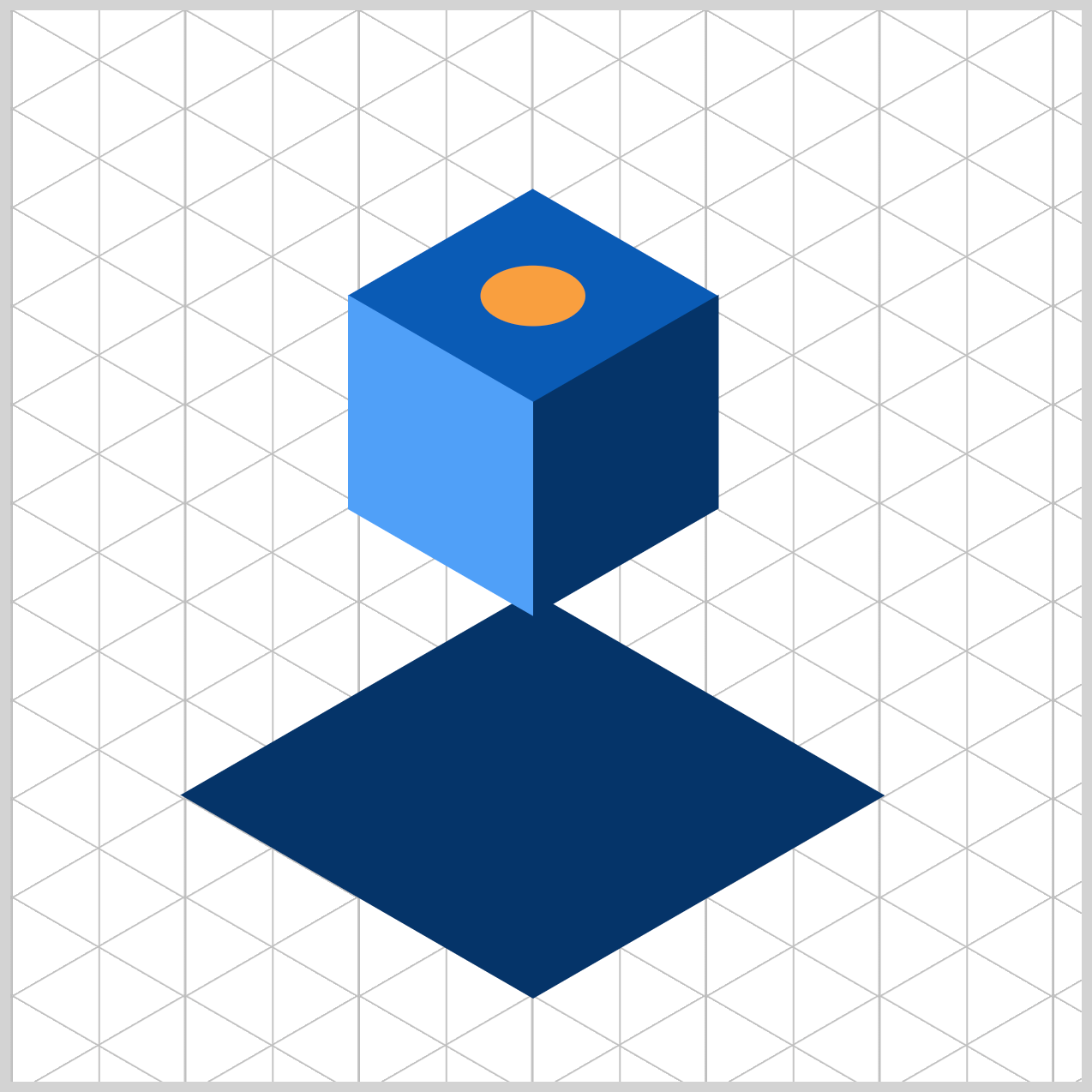
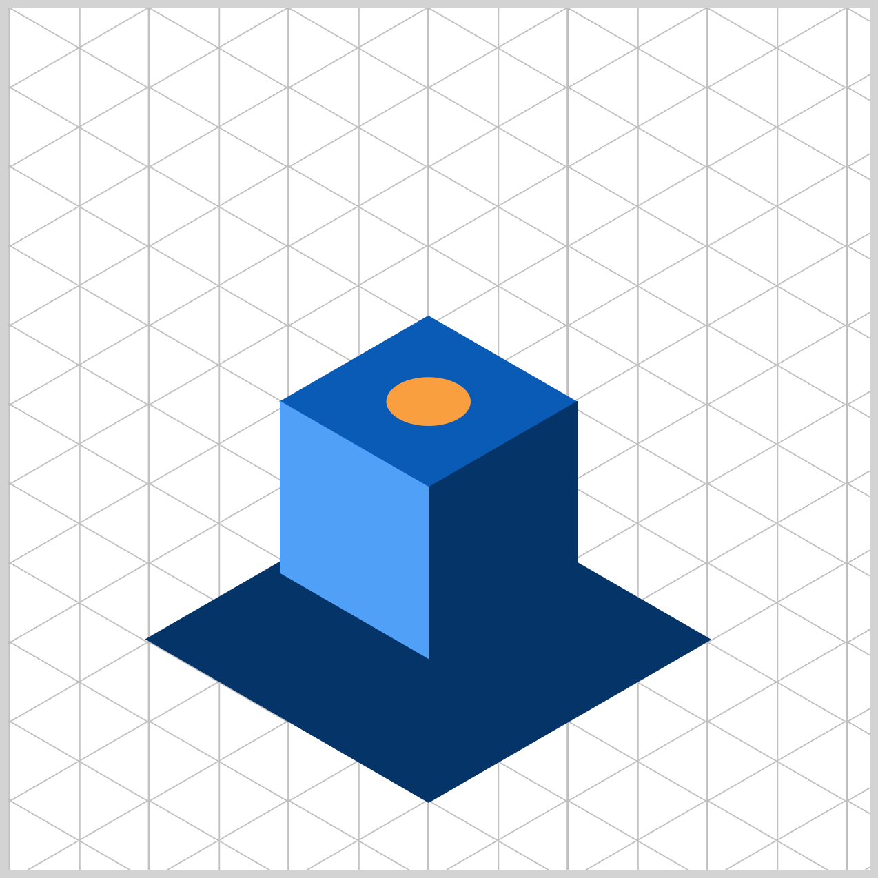
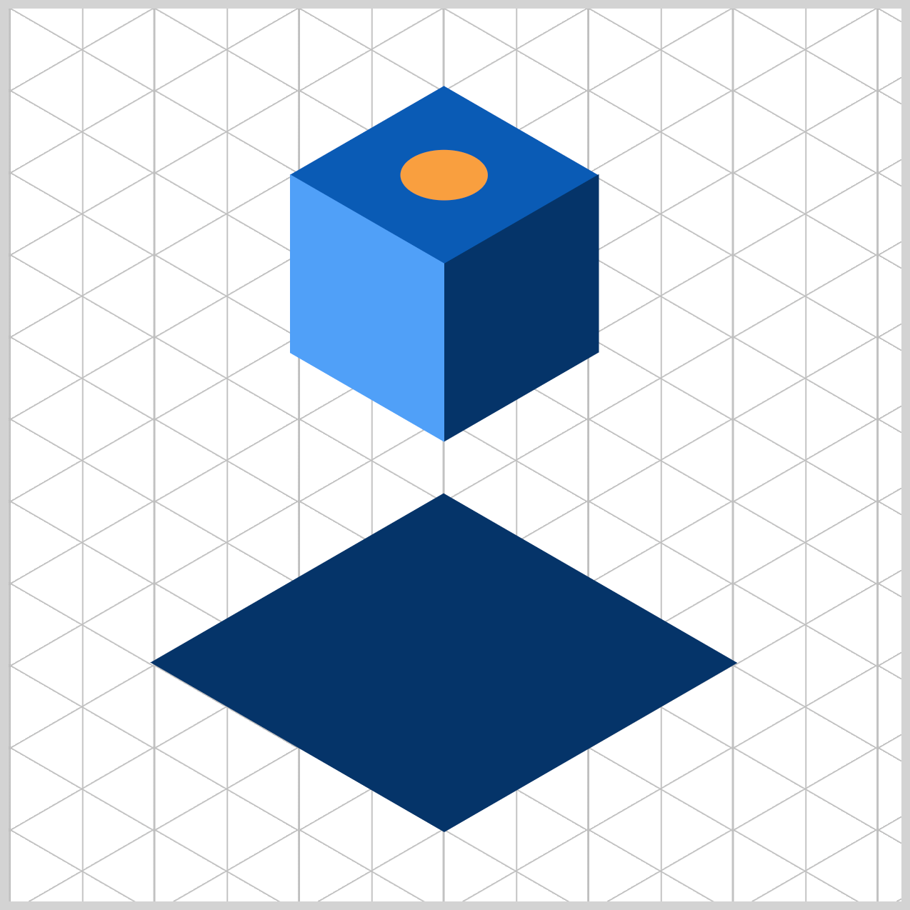
Preview
The animation sequence includes two segments. First, the floor opening features an isometric square that opens and closes. Next, the isometric cube emerges from the floor opening, rises and falls, before finally disappearing back through it.
Prerequisites
Essential CSS and HTML knowledge will help you understand the concepts and techniques introduced in this article. Jump over to this article if you require an HTML and CSS primer.
We assume you have configured tools to modify CSS. If not, this article will guide you through the setup process.
Please read this article if you’re unfamiliar with CSS animation and the @keyframes at-rule property.
HTML Structure
<div class="container">
  <div class="floor-opening">
    <div class="opening"></div>
  </div>
  <div class="isometric-cube">
    <div class="isometric-cube-top">
      <div class="light"></div>
    </div>
    <div class="isometric-cube-right"></div>
    <div class="isometric-cube-left"></div>
  </div>
</div>
container is the outermost enclosure. It enables the content to be centered and draws a light gray border. The rest of the <div>s represent each animation sequence.
Keep the HTML structure as is for the animation to display correctly.
Body and Container <div> CSS
CSS code for the body and container <div>.
/* Body and Container Settings */
/* Center shapes */
body {
  margin: 0;
  padding: 0;
  height: 100vh;
  display: flex;
  justify-content: center;
  align-items: center;
  flex-wrap: wrap;
}

/* Set background and border color */
.container {
  min-width: 500px;
  height: 500px;
  border: 5px solid lightgray;
  background: white;
  position: relative;
  margin: 5px;
  display: flex;
  justify-content: center;
  align-items: center;
}
Common Properties
To keep the code concise, common properties are consolidated. In this instance, the common property is position: absolute;.
/* Common Properties */
.floor-opening,
.opening,
.isometric-cube,
.isometric-cube-right,
.isometric-cube-left {
  position: absolute;
}
Let’s make the floor opening in the next section.
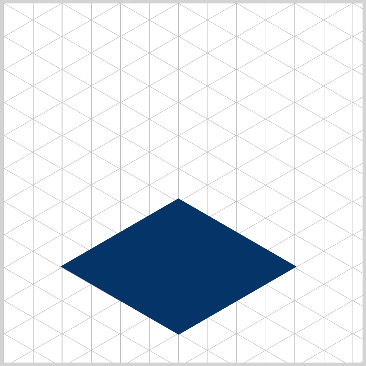
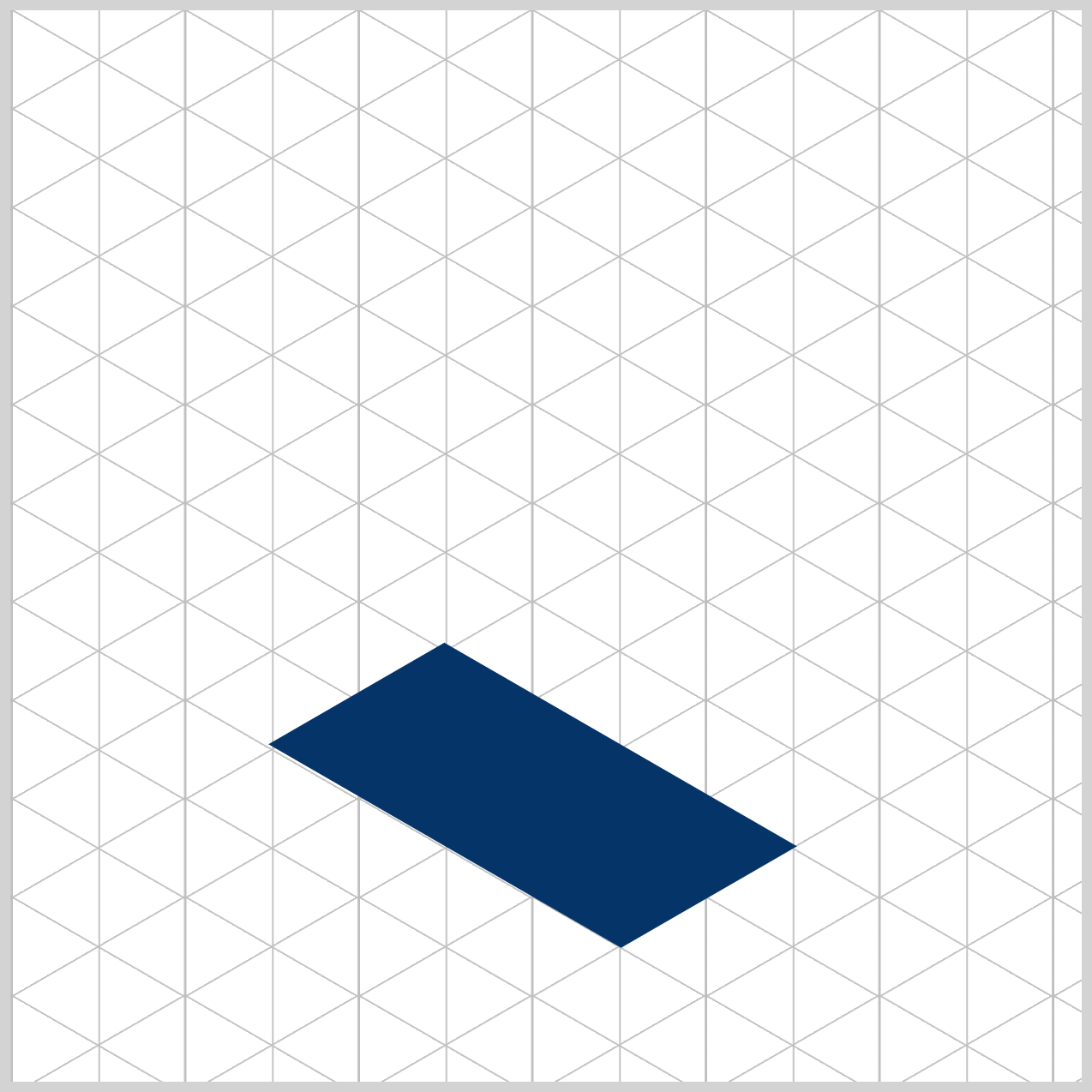
Floor Opening Using scale
The floor opening serves as a portal for the isometric cube, which you will animate to open and close with the CSS scale property.
Two HTML elements are used to make the floor opening.
<div class="floor-opening">
  <div class="opening"></div>
</div>
floor-openingis the parent HTML<div>element and is used to position the floor opening within the grid, and where you apply thetransformCSS property to give it an isometric angle.- The
openingis a square-shaped child HTML<div>that will be animated to open and close.
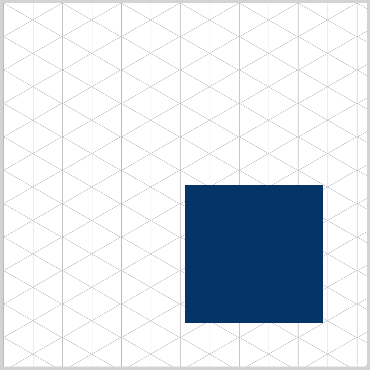
.opening {
  width: 190px;
  height: 190px;
  background: #043468;
  animation: open-close 5.5s ease-in-out infinite;
}
The floor opening is a 190px square, and its background is set to #043468, which is a dark midnight blue shade. The animation name is set to open-close and lasts for 5.5 seconds, 5.5s. The easing function is set to ease-in-out and loops indefinitely with infinite.
/* Floor Opening */
.floor-opening {
  top: 461px;
  left: 244px;
  transform: rotate(210deg) skewX(-30deg) scaleY(0.864);
}
The floor-opening sits 461px down from the top and 244px in from the left edge. Applying transform: rotate(210deg) skewX(-30deg) scaleY(0.864); creates an isometric appearance.
To make the floor opening animation, you use the CSS scale property. The scale property can grow or shrink the HTML element in both its x (horizontal) and y (vertical) axes.
Syntaxscale: x-axis y-axis;
Values exceeding 1 or 100% cause the element to scale up, and values below that result in scaling down.
scale: 1 1;is the floor opening’s default “open” state.scale: 1 0;closes the floor opening by scaling down its vertical or y-axis value to0. It’s crucial to maintain the x-axis value at1to create the illusion of opening and closing.
The CSS @keyframes at-rule is used to control the floor opening animation sequence.
@keyframes open-close {
  from {
    scale: 1 1;
  }
  10% {
    scale: 1 1;
  }
  15% {
    scale: 1 0;
  }
  80% {
    scale: 1 0;
  }
  81% {
    scale: 1 1;
  }
  to {
    scale: 1 1;
  }
}
The from, to, and the rest of the waypoints have scale: 1 1; as their style. scale: 1 0; is set for both 15% and 80% waypoints.
Up next is the cube light.
Cube Light
The cube light alternates between orange and sapphire blue. It has a glow effect, made using multiple box-shadow elements.

The cube light (light) is enclosed by the isometric-cube-top HTML <div> element.
<div class="isometric-cube-top">
  <div class="light"></div>
</div>
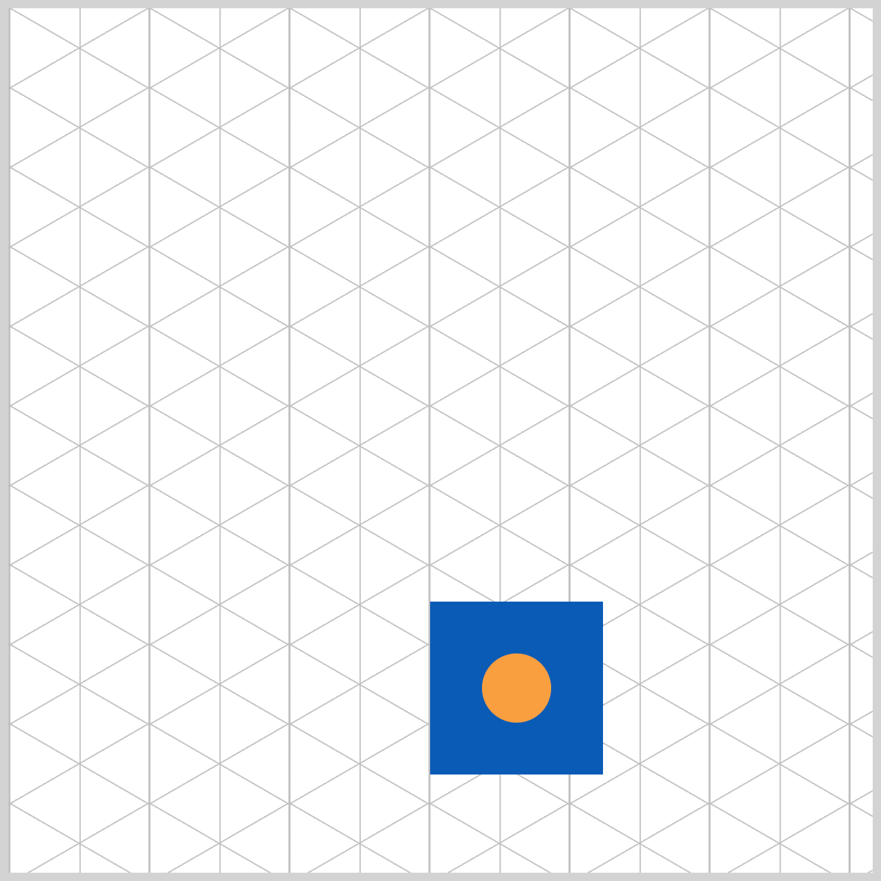
/* Light */
.light {
  position: relative;
  width: 40px;
  height: 40px;
  top: 30px;
  left: 30px;
  background: #f99f3e;
  border-radius: 50%;
  animation: light-flash 5.5s ease-in infinite;
}
The light is a 40px square, positioned 30px from the top and 30px from the left. Its position is set to relative. The color is a saffron orange shade, #f99f3e, and its borders are rounded using border-radius: 50%;.
The animation is named light-flash and has a duration of 5.5 seconds (5.5s). The easing function is set to ease-in, and the iteration count is specified as infinite.
Check this article to learn how to make an isometric cube in depth.
 Pyxofy
The cube light animation alternates between two states.
- Off state: The background color is set to
#085bb5, which is the same color as the isometric cube top, and thebox-shadowproperty value is set tonone. - On with glow state:
#f99f3eis set as the background color, with multiple box shadows applied using2px 2px 10px #cef5ff, -2px -2px 20px #6fdaff, resulting in a glowing effect.


The entire cube light animation @keyframes sequence is listed below. Feel free to change the on and off timing to your liking.
@keyframes light-flash {
  from {
    background: #085bb5;
    box-shadow: none;
  }
  12% {
    background: #f99f3e;
    box-shadow: 2px 2px 10px #cef5ff, -2px -2px 20px #6fdaff;
  }
  24% {
    background: #085bb5;
    box-shadow: none;
  }
  36% {
    background: #f99f3e;
    box-shadow: 2px 2px 10px #cef5ff, -2px -2px 20px #6fdaff;
  }
  48% {
    background: #085bb5;
    box-shadow: none;
  }
  60% {
    background: #f99f3e;
    box-shadow: 2px 2px 10px #cef5ff, -2px -2px 20px #6fdaff;
  }
  72% {
    background: #085bb5;
    box-shadow: none;
  }
  84% {
    background: #f99f3e;
    box-shadow: 2px 2px 10px #cef5ff, -2px -2px 20px #6fdaff;
  }
  92% {
    background: #085bb5;
    box-shadow: none;
  }
  to {
  }
}
The next section will describe how to make the cube animation using the CSS translate and opacity properties.
Cube Animation Using translate and opacity
This last section teaches how to make the cube animation. The cube animation can be broken down into the following sequence:
- Isometric cube jumping out of the floor opening
- The floor opening closes
- Cube floats up and down multiple times
- The floor opening opens
- Cube floats down and disappears through the floor opening
/* Isometric Cube */
.isometric-cube {
  top: 343px;
  left: 244px;
  animation: cube 5.5s ease-in infinite;
}
The isometric cube starts at 343px from the top and 244px from the left edge. The animation, named cube, lasts for 5.5 seconds with 5.5s and uses the ease-in easing function. It will loop indefinitely with infinite.
The CSS translate property accepts two values: the first number represents the horizontal x-axis, while the second number represents the vertical y-axis. A positive number moves the cube down, whereas a negative number pushes the cube upwards.
translate: 0 0;puts the cube back to its default location.translate: 0 -160px;shifts the cube upward by -160 pixels from its initial position.translate: 0 50px;pushes the cube down 50 pixels from its default location.
The cube’s opacity is set to 0 between the from and 8% waypoints, rendering it invisible. It becomes visible when the opacity changes to 1 between 10% and 94%. Finally, at the 95% and to waypoint, the opacity reverts to 0.
@keyframes cube {
  from {
    translate: 0 50px;
    opacity: 0;
  }
  8% {
    translate: 0 50px;
    opacity: 0;
  }
  10% {
    translate: 0 -160px;
    opacity: 1;
  }
  15% {
    translate: 0 -160px;
  }
  20% {
    translate: 0 0;
  }
  30% {
    translate: 0 -65px;
  }
  40% {
    translate: 0 0;
  }
  50% {
    translate: 0 0;
  }
  60% {
    translate: 0 -200px;
    opacity: 1;
  }
  94% {
    opacity: 1;
  }
  95% {
    opacity: 0;
  }
  to {
    opacity: 0;
  }
}
Feel free to modify the animation code to your liking. You can view and play with the complete code on Pyxofy’s CodePen page.
See the Pen CSS Animation - Create Stunning Isometric Effects using Scaling and Translation Techniques by Pyxofy (@pyxofy) on CodePen.
Conclusion
You learned how to create two animation sequences in this article. The first is a flooring opening animation using the CSS scale property. The second involves moving the isometric cube up and down using CSS translate and combining it with opacity to make the cube appear and disappear.
The CSS scale and translate properties are versatile tools for manipulating HTML element sizes and positions. Combining them with the @keyframes at-rule opens a world of possibilities for creating 3D-like effects.
What kind of 3D-like animations will you create using scale and translate? Share your masterpiece with us on LinkedIn, Threads, Bluesky, Mastodon, X (Twitter) @pyxofy, or Facebook.
We hope you liked this article. Kindly share it with your network. We appreciate it.
Related Articles
 Pyxofy
 Pyxofy
 Pyxofy
 Pyxofy