CSS Animation – Diagonal Movement
Zip to the bottom right, then to the upper left hand corner, then switch directions. Let’s learn how to do just that in this step-by-step article.

Introduction
Zigzagging across the screen is always a fun effect to use in animation.
In this article, let’s explore how we can make shapes move diagonally, placing the shape in different corners.
After we learn the basics of diagonal movement, we’ll learn how to make the shape change directions.
Preview
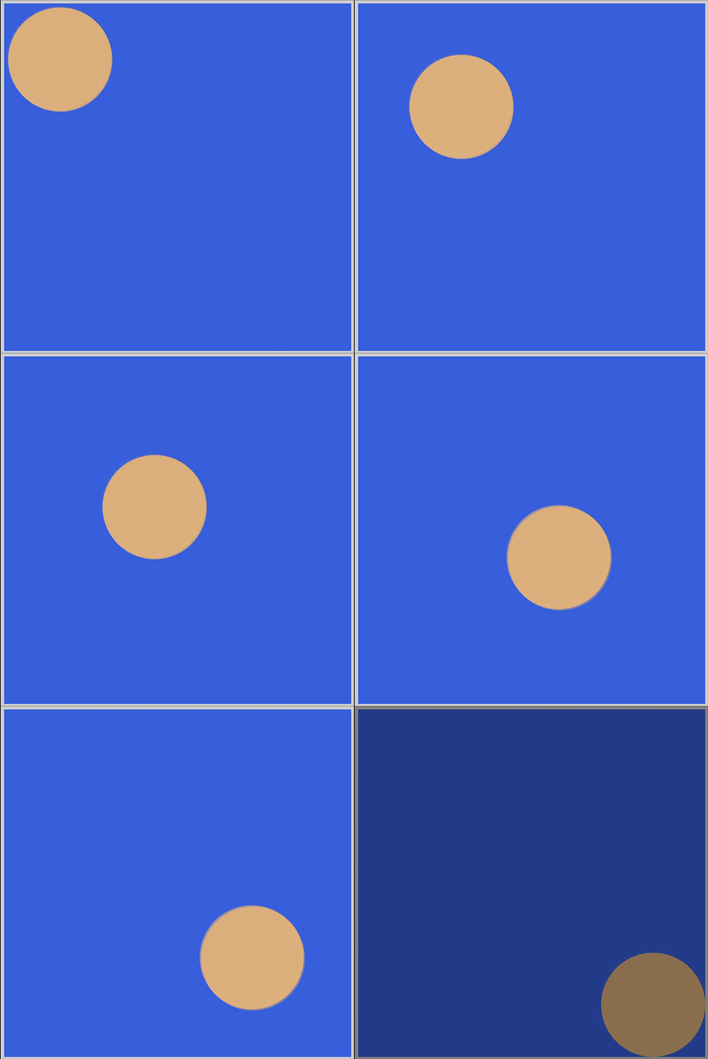
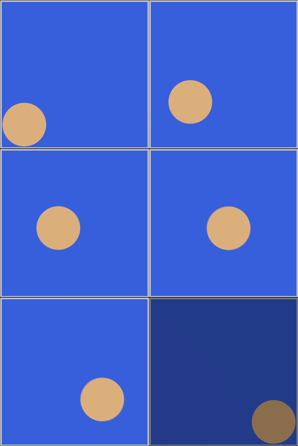
Preview of the animations we’ll make in this article.
Diagonal

Change Direction

Prerequisites
We don’t assume prior knowledge of CSS or HTML, but it helps if you have some familiarity with how they work. Jump over to this article if you require an HTML and CSS primer.
We assume that you have set up tools to create CSS animation. If you haven’t, this article will show you how to set them up.
If you’re unfamiliar with CSS animation and @keyframes at-rule property, catch up with this article.

HTML Structure
Here’s the HTML code for our animation.
<div class="container">
  <div class="circle diagonal-to-bottom-right"></div>
</div>
<div class="container">
  <div class="circle diagonal-to-top-right"></div>
</div>
<div class="container">
  <div class="circle mountain"></div>
</div>
<div class="container">
  <div class="circle arrow"></div>
</div>
container is our outermost enclosure. This enables us to center the content and draw a light gray border. The rest of the divs represent each animation sequence.
It’s important to keep the HTML structure as is for each animation to display properly.
Body and Container Div CSS
CSS code for the body and container div.
/**************************************/
/* Color, Body and Container Settings */
/**************************************/
/* Center shapes */
body {
  margin: 0;
  padding: 0;
  height: 100vh;
  display: flex;
  justify-content: center;
  align-items: center;
  flex-wrap: wrap;
}

/* Set light gray border */
.container {
  width: 500px;
  height: 500px;
  border: 5px solid lightgray;
  background: royalblue;
  position: relative;
  display: flex;
  border-radius: 1px;
  margin: 5px;
}
CSS Shape
The circle shape we’ll animate in this article.
/* Shape */
.circle {
  width: 150px;
  height: 150px;
  background-color: burlywood;
  border-radius: 50%;
  animation-duration: 3s;
  /* animation-iteration-count: 3; */
  animation-iteration-count: infinite;
  animation-timing-function: linear;
}
Diagonal Movement
Let’s start with our first animation. In this section, we’ll animate our circle shape to move diagonally within its container.
Move to Bottom Right
We’ll animate the circle shape to move from the upper left-hand corner to the bottom right-hand corner.
CSS Code
/* Diagonal To Bottom Right */
.diagonal-to-bottom-right {
  animation-name: diagonal-to-bottom-right;
}

@keyframes diagonal-to-bottom-right {
  from {
    transform: translateX(0) translateY(0);
  }

  to {
    transform: translateX(350px) translateY(350px);
  }
}
Let’s break down the CSS code.
- We set
diagonal-to-bottom-rightas our CSS class name andanimation-nameproperty value. fromcontainstransform: translateXandtranslateYfunction. We set both function’s values to0. Our shape is placed in the upper left-hand corner.to, our end state, hastranslateXandtranslateYboth set to350px, placing our shape in the bottom right-hand corner.
If you’re unfamiliar with how x-axis and y-axis grids work, jump over to this article and read the “The Grid” section.
In the next section, let’s make our shape move from the bottom-left corner to the top-right corner.
Move to Top Right
Let’s make our shape move to the top-right corner in this example.
CSS Code
/* Diagonal To Top Right  */
.diagonal-to-top-right {
  animation-name: diagonal-to-top-right;
}

@keyframes diagonal-to-top-right {
  from {
    transform: translateX(0) translateY(350px);
  }

  to {
    transform: translateX(350px) translateY(0);
  }
}
transform: translate(0) translateY(350px)places our circle shape at the bottom left-hand corner.transform: translateX(350px) translateY(0)is our end destination, placing our shape in the upper right-hand corner of its container.
Play around with the function values. How about making it stop in the middle instead of moving all the way to the corner? Maybe make it move from the bottom-right corner to the upper left-hand corner.
Let’s see how we can change the direction or trajectory of the circle shape in the next section.
Change Direction
Our animations in the previous sections were straightforward diagonal sequences. Would it be possible to change directions in CSS animation? Let's see how we can do just that in our next example.
CSS Code
/* Mountain */
.mountain {
  animation-name: mountain;
}

@keyframes mountain {
  from {
    transform: translateX(0) translateY(350px);
  }

  50% {
    transform: translateX(150px) translateY(150px);
  }

  to {
    transform: translateX(350px) translateY(350px);
  }
}
To change direction, we need to insert a halfway point in our animation sequence. We’ll accomplish that by inserting a 50% between our from and to code.
fromwithtransform: translateX(0) translateY(350px)places our shape in the bottom-left corner.- For our halfway point or
50%state, we move the shape to the middle of the container usingtransform: translateX(150px) translateY(150px). - Our shape’s end state will be in the bottom-right corner of the container. We accomplish that with
transform: translateX(350px) translateY(350px)inside thetostyle block.
Let’s expand on this example in our next section.
Arrow Head
In our final section, we’ll make the circle
- move from the upper left-hand corner to the middle
- then move to the bottom left-hand corner.
CSS Code
/* Arrow */
.arrow {
  animation-name: arrow;
}

@keyframes arrow {
  from {
    transform: translateX(0) translateY(0);
  }

  50% {
    transform: translateX(150px) translateY(150px);
  }

  to {
    transform: translateX(0) translateY(350px);
  }
}
- Within our
fromrule, we inserttransform: translateX(0) translateY(0);, this sets the shape's starting point in the upper-left corner. - We set our halfway point with this code
50% {
    transform: translateX(150px) translateY(150px);
  }
- To finish up, we insert
transform: translateX(0) translateY(350px);to ourtorule. This code places the circle shape at the bottom right hand of the container.
And this wraps all our sections in this article.
Modifying the values, playing with them, is the best way to learn how to control the animation sequence.
You can see and play with the entire code at Pyxofy’s CodePen page.
See the Pen CSS Animation — Diagonal Movement by Pyxofy (@pyxofy) on CodePen.
Conclusion
Diagonal movement, zigzagging across the screen, is a fun exercise. We learned how to control which corner the circle will end up with transform: translateX and translateY functions.
By utilizing halfway points, this time 50%, we made the circle shape change directions.
Experimentation is the best way to learn CSS animation. Add more keyframes between from and to, to make the circle shape move in different directions.
Share your latest animations with us on Twitter @pyxofy, on LinkedIn, Mastodon or Facebook.
We hope you liked this article. Kindly share it with your network. We really appreciate it.
Related Articles


