CSS Art – How to Make a Game Character – Super Mario
A plumber jumping in and out of pipes, throwing fireballs while rescuing a princess. Step-by-step article to create a world renowned game character.
Introduction
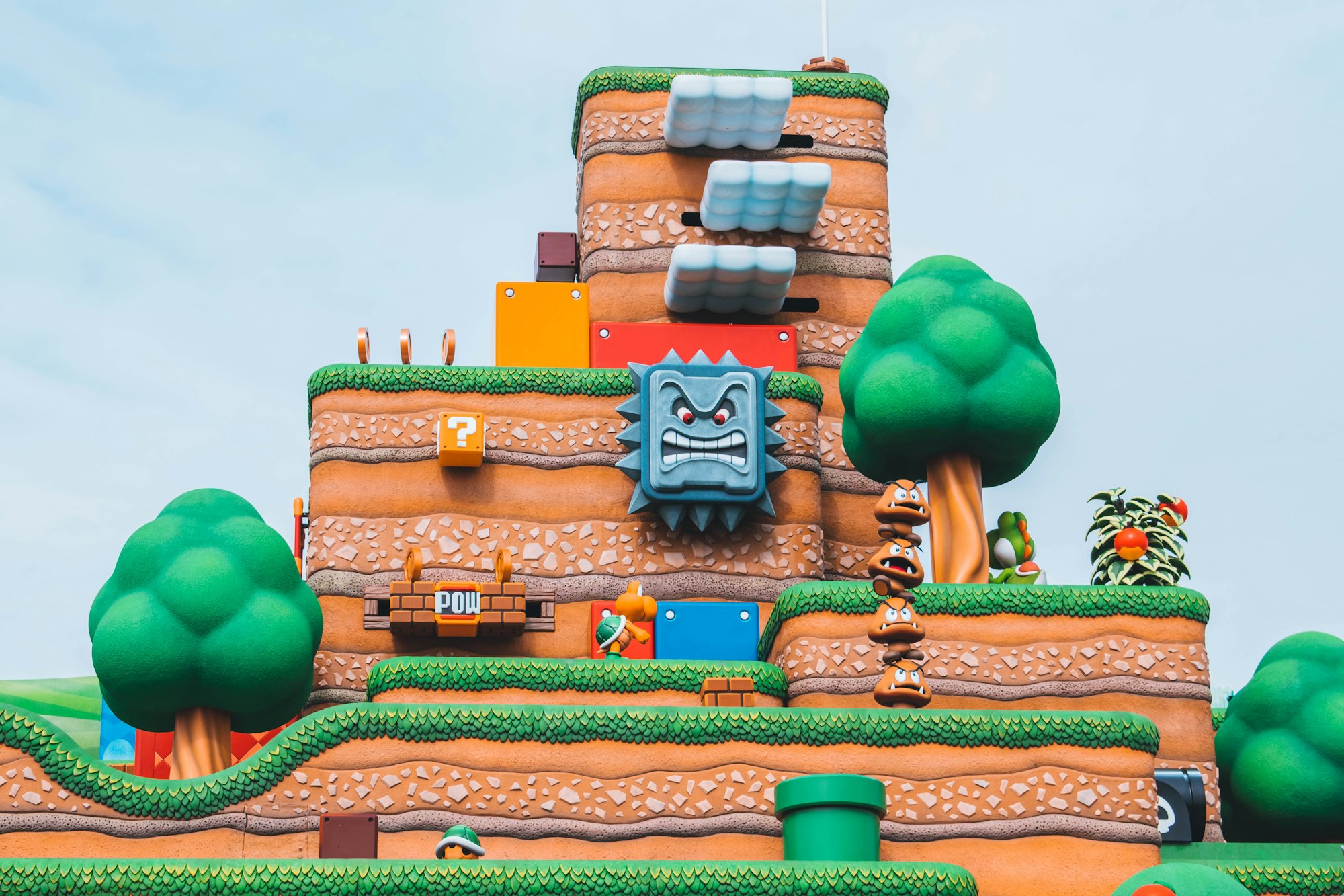
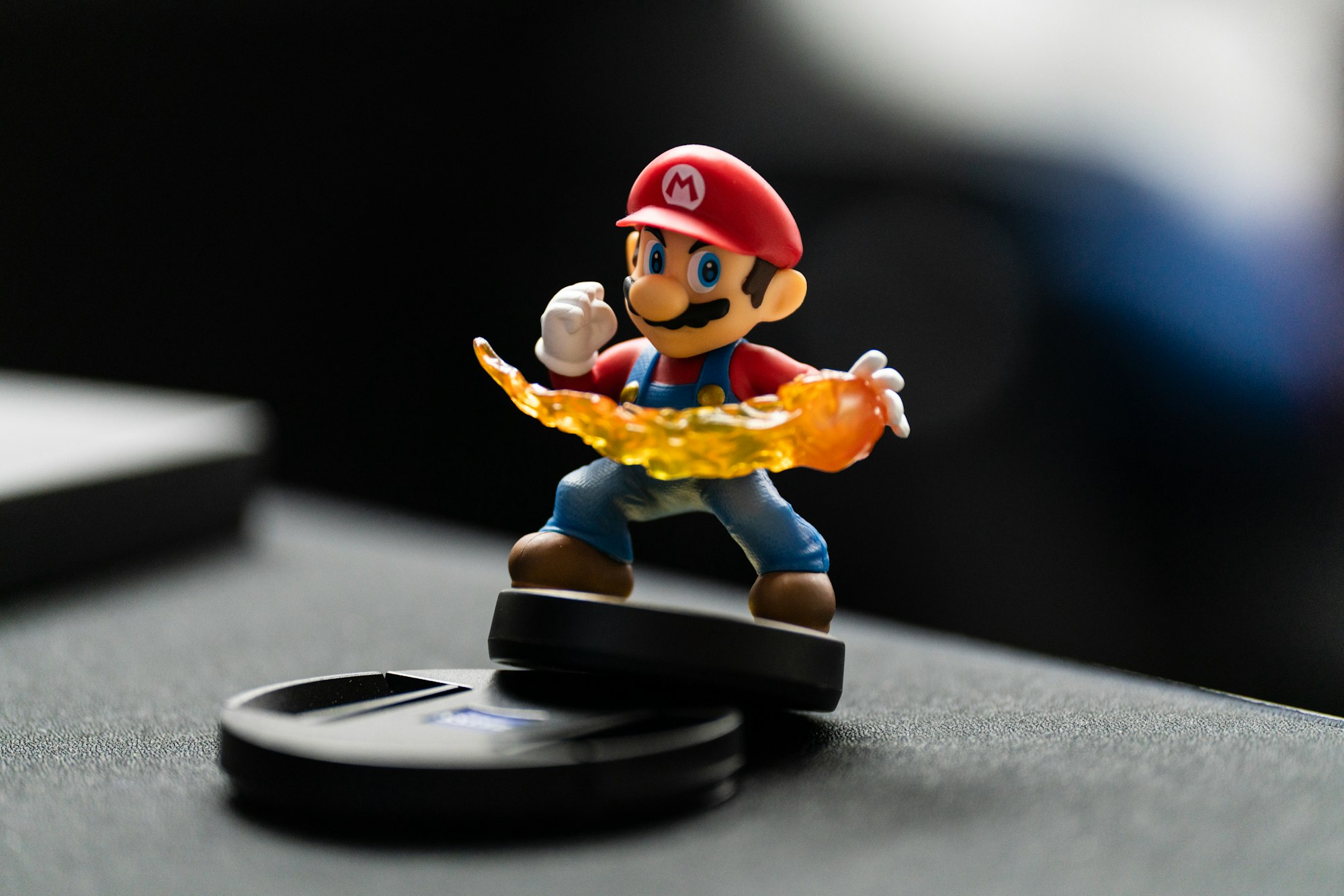
Nintendo’s Super Mario is probably one of the most recognizable video game character in the world. Generations of video game players adore this fun and unique game character.
In this article, we’ll be creating Super Mario with CSS. Here’s a quick list of the different CSS technologies we’ll be using in this article:
Visit our CSS Art articles if you’re unfamiliar with the above CSS technologies.
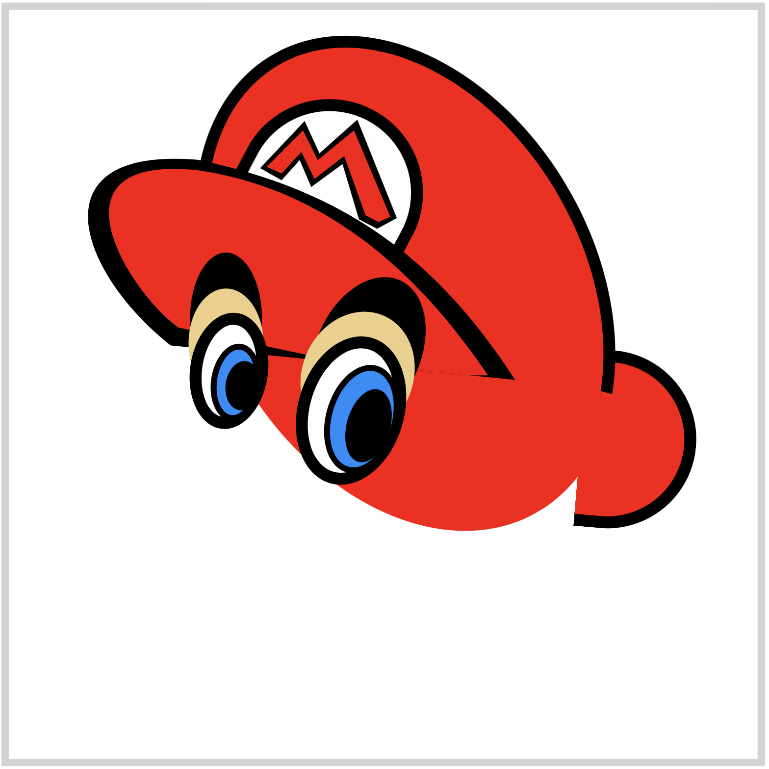
Preview

We will break down our image to these different parts:
- Hat
- Eyes
- Face
- Nose
- Mustache
- Mouth
- Sideburn
- Ears
Prerequisites
We don’t assume prior knowledge of CSS or HTML, but it helps if you have some familiarity with how they work. Jump over to this article if you require an HTML and CSS primer.
We assume that you have set up tools to create CSS art. If you haven’t, this article will show you how to set them up.
HTML Structure
Here’s the HTML code for our image.
<div class="container">
  <div class="character">
    <div class="hat"></div>
    <div class="hat-lip"></div>
    <div class="hat-logo"></div>
    <div class="face"></div>
    <div class="eye-brow-right"></div>
    <div class="eye-right"></div>
    <div class="eye-brow-left"></div>
    <div class="eye-left"></div>
    <div class="eye-highlight"></div>
    <div class="nose"></div>
    <div class="mustache"></div>
    <div class="mouth"></div>
    <div class="sideburn"></div>
    <div class="ear"></div>
  </div>
container is our outermost enclosure. This enables us to center the art and put a light gray border. The rest of divs represent each of Super Mario’s hat and facial parts.
It’s important to keep the HTML structure as is for each part to display properly.
Color Palette
Here’s the CSS code for the color palette, body and container div.
/**************************************/
/* Color, Body and Container Settings */
/**************************************/

/* Color palette using CSS custom properties (variables) */
:root {
  --white: #fefefe;
  --red: #fe0000;
  --dark-red: #b80000;
  --beige: #efcf86;
  --light-blue: #038dfb;
  --brown: #490900;
  --black: #000000;
}

/* Center shapes */
body {
  margin: 0;
  padding: 0;
  height: 100vh;
  display: flex;
  justify-content: center;
  align-items: center;
  flex-wrap: wrap;
}

/* Set light gray border */
.container {
  width: 500px;
  height: 500px;
  border: 5px solid lightgray;
  background: transparent;
  position: relative;
  display: flex;
  justify-content: center;
  align-items: center;
  border-radius: 1px;
}
Ready for this coding adventure?
Let’s dive in to the CSS code. We will be creating the hat part in the next section.
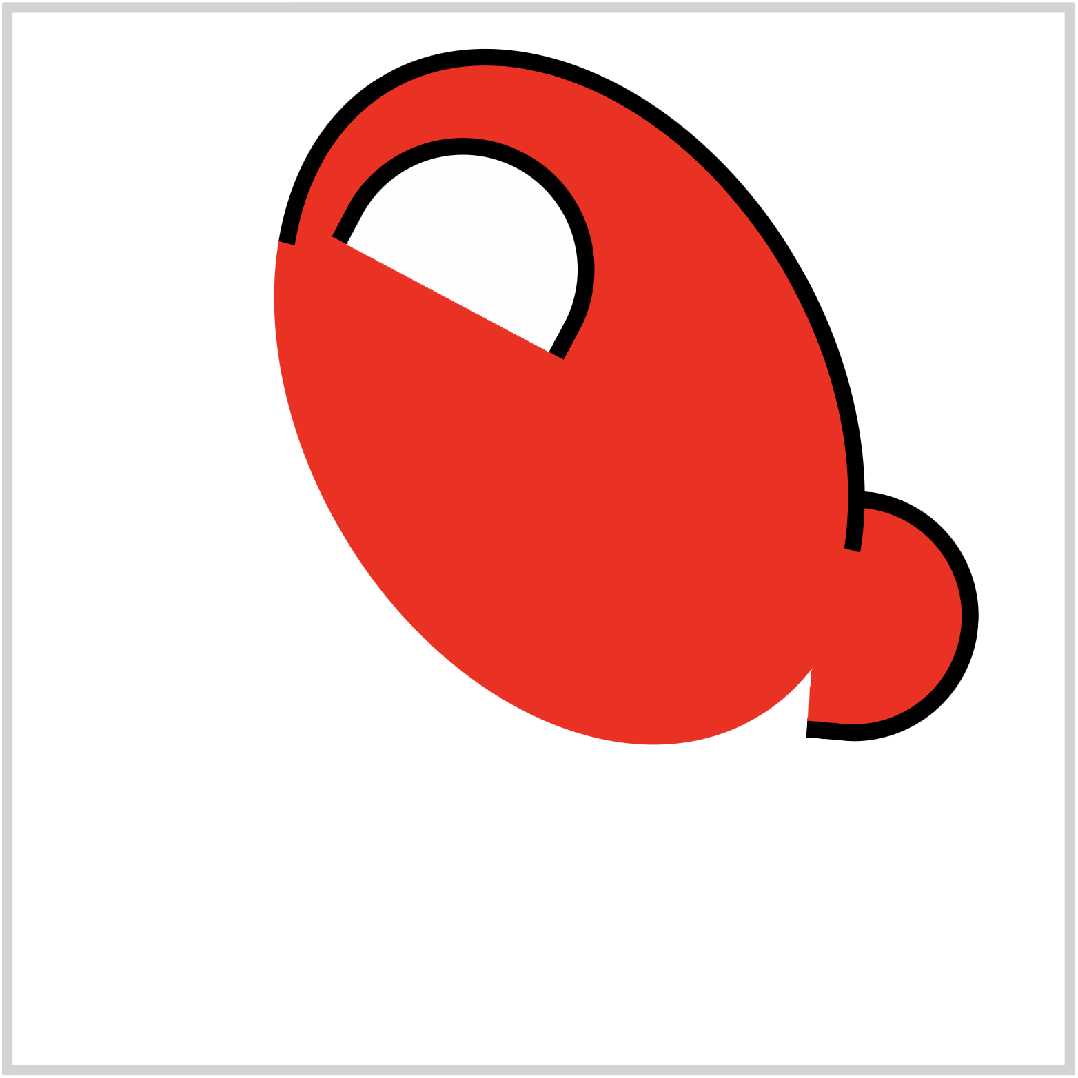
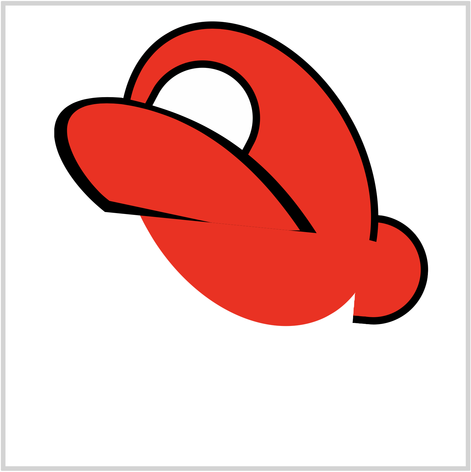
Hat
Let’s start making Super Mario’s hat.

CSS Code:
.hat {
  position: absolute;
  width: 69px;
  height: 103px;
  top: 229px;
  left: 382px;
  background: var(--red);
  border: solid 8px var(--black);
  border-top-right-radius: 100px;
  border-bottom-right-radius: 100px;
  border-left: 0;
  transform: rotate(5deg);
}
We’re using CSS custom properties (variables) to set our colors.
Here’s the default way to set a background color.
background: red;
And here’s how we set colors using CSS custom properties.
background: var(--red);
Big advantages of using CSS custom properties (variables) are being able to centralize the color value. Our red color value is set to a hexadecimal (hex) value of #fe0000. It will be difficult to remember that hex code. By using CSS custom properties, we can assign a more human-readable keyword to the color value.
Another advantage is since we centralized the color value, in the future, let’s say you decide to change the hat color to green, you only need to change the hex value in one location. The color changes propagate throughout the CSS custom properties. Very handy!

CSS Code:
.hat::before {
  content: "";
  position: absolute;
  width: 236px;
  height: 337px;
  top: -217px;
  left: -252px;
  background: var(--red);
  border-top: solid 8px var(--black);
  border-right: solid 8px var(--black);
  border-left: solid 8px transparent;
  border-bottom: solid 8px transparent;
  border-radius: 50%;
  transform: rotate(-35deg);
}
We only need a top and right border for this part. We can set that using the below code.
border-top: solid 8px var(--black);
border-right: solid 8px var(--black);
border-left: solid 8px transparent;
border-bottom: solid 8px transparent;
Left and bottom borders are set to transparent.
We rotated the ellipse with this code.
transform: rotate(-35deg);
CSS Code:
.hat::after {
  content: "";
  position: absolute;
  width: 109px;
  height: 70px;
  top: -157px;
  left: -235px;
  background: var(--white);
  border: solid 8px var(--black);
  border-top-left-radius: 100px;
  border-top-right-radius: 100px;
  border-bottom: 0;
  transform: rotate(23deg);
}
This part will enclose the “M” logo that we’ll be creating in a later section.
We used border-top-left-radius and border-top-right-radius to create this half circle shape.
Let’s make the hat lip in the next section.
Hat Lip
It’s easier to make the outline or border of a shape first. Let’s see how we can do this below.
CSS Code:
.hat-lip {
  position: absolute;
  width: 290px;
  height: 155px;
  top: 98px;
  left: 53px;
  background: var(--black);
  clip-path: path("M 285,149 C 229,62 164,21 73,2 C -36,-7 -7,77 55,126");
}
We’re using the CSS path() function to create this shape. If you’re not familiar with CSS path() and Scalable Vector Graphics (SVG) check this article.
Let’s break down the SVG code.
- We set our starting point with this code.
M 285,149
- This code draws the first arch of the shape.
C 229,62 164,21 73,2
- This code draws the second arch.
C -36,-7 -7,77 55,126
If you want to avoid using SVG, you can experiment with CSS transform-function such as skew() and rotate() function to recreate the hat lip shape. Here’s a step-by-step article on how to use CSS transform-function.
CSS Code:
.hat-lip::after {
  content: "";
  position: absolute;
  width: 285px;
  height: 146px;
  top: 0;
  left: 0;
  background: var(--red);
  clip-path: path("M 276,160 C 229,85 164,22 73,9 C -31,-2 27,90 60,114");
}
Similar to the hat lip outline, we’re using CSS path() function and SVG to create this shape.
In the next section, let’s create the “M” logo.
Logo
CSS Code:
.hat-logo {
  position: absolute;
  width: 110px;
  height: 90px;
  top: 66px;
  left: 159px;
  background: var(--black);
  clip-path: polygon(
    44% 33%,
    67% 8%,
    91% 81%,
    79% 89%,
    68% 82%,
    58% 41%,
    39% 58%,
    32% 38%,
    21% 53%,
    8% 44%,
    35% 9%
  );
}
We’re using CSS polygon() function to create the logo. We won’t explain how to use polygon() function here. Check this article for step-by-step instructions on how to make shapes with polygon().
CSS Code:
.hat-logo::before {
  content: "";
  position: absolute;
  width: 110px;
  height: 90px;
  top: 0px;
  left: 0px;
  background: var(--red);
  clip-path: polygon(
    43% 38%,
    65% 16%,
    87% 80%,
    80% 84%,
    72% 79%,
    59% 35%,
    41% 52%,
    33% 32%,
    21% 48%,
    12% 43%,
    34% 16%
  );
}
Our code for the red shape is similar to the outline shape. You can control the different points of the polygon by adjust the percentage values within the code.
We’re done with the hat. Let’s move on to our first facial part, the right eye.
Right Eye

CSS Code:
.eye-right {
  position: absolute;
  width: 55px;
  height: 85px;
  top: 217px;
  left: 193px;
  background: var(--white);
  border: solid 8px var(--black);
  border-radius: 50%;
  transform: rotate(16deg);
}
Simple white ellipse with black borders. We rotated it slightly with this code transform: rotate(16deg);.
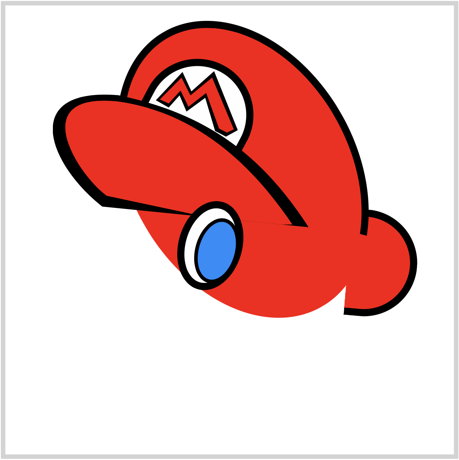
CSS Code:
.eye-right::before {
  content: "";
  position: absolute;
  width: 40px;
  height: 66px;
  top: 9px;
  left: 12px;
  background: var(--light-blue);
  border: solid 4px var(--black);
  border-radius: 50%;
}
We gave the iris shape a light blue background. Using the top and left CSS properties, we positioned it to the bottom-right side of our enclosing white ellipse.

CSS Code:
.eye-right::after {
  content: "";
  position: absolute;
  width: 29px;
  height: 50px;
  top: 24px;
  left: 27px;
  background: var(--black);
  border-radius: 50%;
}
Our pupil code is a slight variation of the iris code. We gave it a black background and set no borders.
Our right eye is almost finished. In the next section, let’s make the right eyebrow.
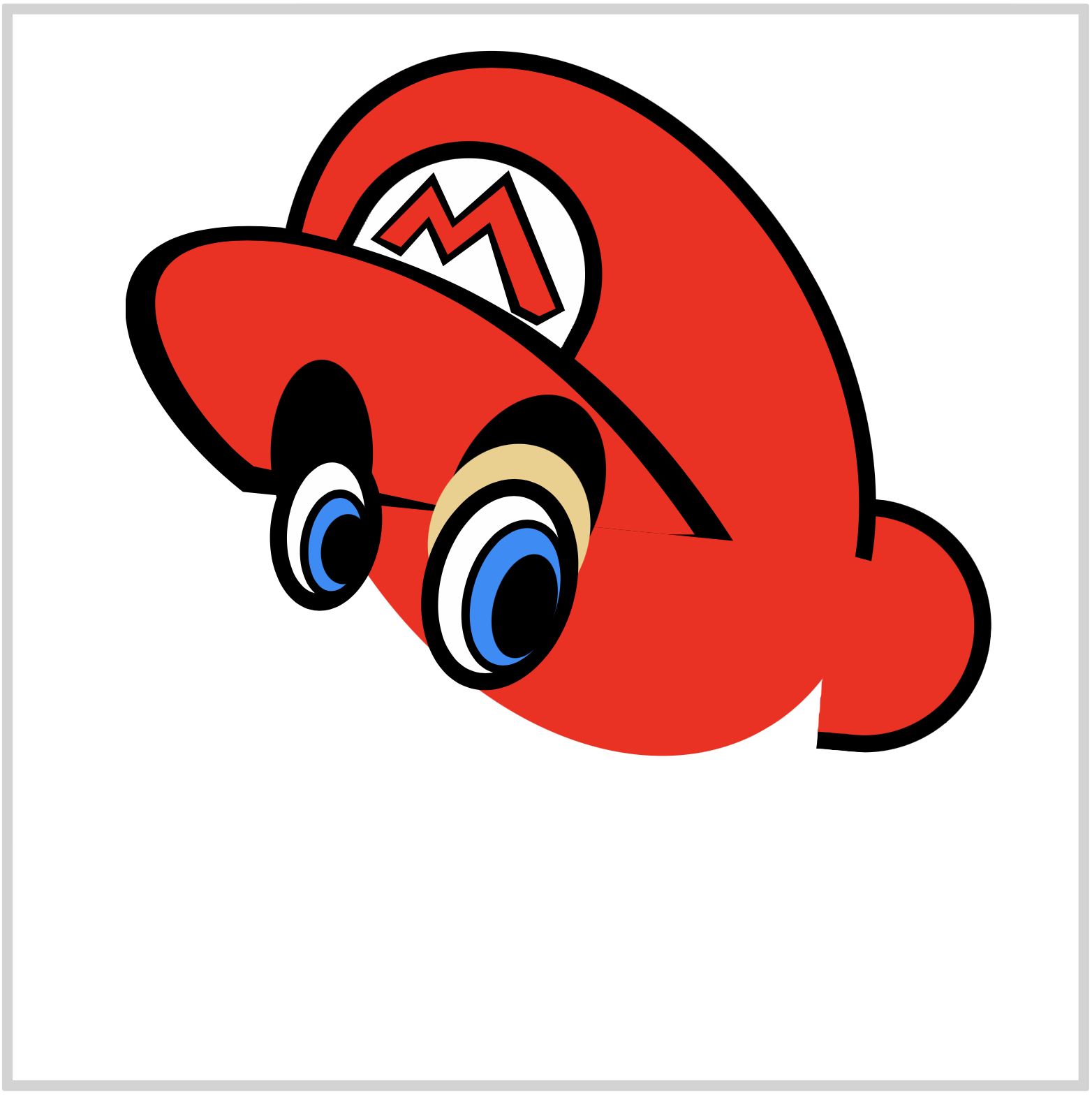
Right Eyebrow
Two ellipses compose the eyebrow. One is black, and the other one is beige color.

CSS Code:
.eye-brow-right {
  position: absolute;
  width: 70px;
  height: 104px;
  top: 176px;
  left: 205px;
  background: var(--black);
  border-radius: 50%;
  transform: rotate(24deg);
}
This ellipse will be our black eyebrow.

CSS Code:
.eye-brow-right::before {
  content: "";
  position: absolute;
  width: 74px;
  height: 87px;
  top: 26px;
  left: -2px;
  background: var(--beige);
  border-radius: 50%;
}
This beige ellipse will give our black eyebrow its crescent shape.
Next section will be left and eyebrow.
With a slight variation in size and location, the process of creating them is similar to the right eye. For brevity, we will only provide the CSS code.
Left Eye

CSS Code:
.eye-left {
  position: absolute;
  width: 36px;
  height: 62px;
  top: 202px;
  left: 121px;
  background: var(--white);
  border: solid 8px var(--black);
  border-radius: 50%;
  transform: rotate(8deg);
}

CSS Code:
.eye-left::before {
  content: "";
  position: absolute;
  width: 25px;
  height: 44px;
  top: 12px;
  left: 7px;
  background: var(--light-blue);
  border: solid 4px var(--black);
  border-radius: 50%;
  transform: rotate(0deg);
}

CSS Code:
.eye-left::after {
  content: "";
  position: absolute;
  width: 23px;
  height: 33px;
  top: 23px;
  left: 17px;
  background: var(--black);
  border-radius: 50%;
}
Left Eyebrow
CSS Code:
.eye-brow-left {
  position: absolute;
  width: 48px;
  height: 88px;
  top: 162px;
  left: 121px;
  background: var(--black);
  border-radius: 50%;
}
CSS Code:
.eye-brow-left::before {
  content: "";
  position: absolute;
  width: 50px;
  height: 73px;
  top: 24px;
  left: -1px;
  background: var(--beige);
  border-radius: 50%;
}
We’ve completed the left eye and eyebrow.
In the next section, let’s make the eye highlights.
Eye Highlight

CSS Code:
.eye-highlight {
  position: absolute;
  width: 9px;
  height: 12px;
  top: 242px;
  left: 155px;
  background: var(--white);
  border-radius: 50%;
  transform: rotate(3deg);
}
Similar to the pupil and iris, the highlight is an ellipse shape.
CSS Code:
.eye-highlight::before {
  content: "";
  position: absolute;
  width: 10px;
  height: 15px;
  top: 15px;
  left: 87px;
  background: var(--white);
  border-radius: 50%;
  transform: rotate(3deg);
}
Experiment with the location of the highlights. Make it so that it’s looking directly at you.
In the next section, we’ll be making the rest of the facial parts.
First up is the face.

Face
The face will be created with path() function and SVG. This is the most complex code in this article.
CSS Code:
.face {
  position: absolute;
  width: 347px;
  height: 302px;
  top: 180px;
  left: 74px;
  background: var(--black);
  clip-path: path(
    "M 0,202 C 0,200 0,240 58,258 C 71,312 161,316 185,274 C 216,277 247,242 246,237 C 246,236 298,271 336,206 C 371,143 316,112 285,118 C 288,112 265,63 262,65 L 248,64 C 235,69 204,29 204,30 C 163,-10 78,-2 60,13 C 35,31 29,59 29,64 Z"
  );
}
First, we create the black outline. If the shape doesn't render properly in your browser, check the path() code meticulously. You can break down the code like this.
M 0,202
C 0,200 0,240 58,258
C 71,312 161,316 185,274
C 216,277 247,242 246,237
C 246,236 298,271 336,206
C 371,143 316,112 285,118
C 288,112 265,63 262,65
L 248,64
C 235,69 204,29 204,30
C 163,-10 78,-2 60,13
C 35,31 29,59 29,64
Z
Take note that each alphabet letter is a command to draw the shape in SVG.

CSS Code:
.face::after {
  content: "";
  position: absolute;
  width: 347px;
  height: 302px;
  top: 0;
  left: 0;
  background: var(--beige);
  clip-path: path(
    "M 12,203 C 15,222 26,234 66,250 C 75,300 156,307 175,266 C 223,267 241,224 241,224 C 267 239 301 244 325 203 C 356 142 311 122 283 131 C 290,144 266,84 252,67 L 251,67 C 235,79 204,53 200,44 C 163,-4 78,2 60,23 C 50,31 43,57 39,68"
  );
}
Let's break down the SVG code again for the beige part.
M 12,203
C 15,222 26,234 66,250
C 75,300 156,307 175,266
C 223,267 241,224 241,224
C 267 239 301 244 325 203
C 356 142 311 122 283 131
C 290,144 266,84 252,67
L 251,67
C 235,79 204,53 200,44
C 163,-4 78,2 60,23
C 50,31 43,57 39,68
You can use an SVG code visualizer tools like this one to help you understand how the different SVG commands work.
Next will be the nose.
Nose

CSS Code:
.nose {
  position: absolute;
  width: 146px;
  height: 132px;
  top: 243px;
  left: 40px;
  background: var(--black);
  clip-path: path("M 130,31.5 C 63,-21 6,-1 0,61 C 0,109 79,178 145,87");
  /* Take care of Webkit border-radius bug */
  -webkit-mask-image: -webkit-radial-gradient(white, black);
}
We’re using this code to take care of a Webkit (Safari) border-radius bug. Without this code, a thin line will appear around the border of the shape.
/* Take care of Webkit border-radius bug */
-webkit-mask-image: -webkit-radial-gradient(white, black);
Firefox and Chromium-based browser doesn’t have the above bug and should display the nose shape properly.

CSS Code:
.nose::after {
  content: "";
  position: absolute;
  width: 146px;
  height: 132px;
  top: 0px;
  left: 00px;
  background: var(--beige);
  clip-path: path("M 136,43.5 C 56,-4 25,4 14,60 C 9,108 101,136 146,66");
}
That completes our nose part.
Next up is the mustache.
Mustache

CSS Code:
.mustache {
  position: absolute;
  width: 222px;
  height: 94px;
  top: 304px;
  left: 46px;
  background: var(--black);
  clip-path: path(
    "M 212,3 C 228,18 223,53 191,53 C 191,80 147,86 137,72 C 137,77 125,103 86,83 C 86,90 57,102 44,79 C 45,78 21,85 16,61 C 11,59 0,54 2,27 C 50,101 117,46 137,30 C 140,32 198,17 205,3"
  );
}
We made the mustache with path() and SVG, but you can use a combination of half circles to make it as well.
path() code break down.
M 212,3
C 228,18 223,53 191,53
C 191,80 147,86 137,72
C 137,77 125,103 86,83
C 86,90 57,102 44,79
C 45,78 21,85 16,61
C 11,59 0,54 2,27
C 50,101 117,46 137,30
C 140,32 198,17 205,3
Let’s make the mouth part in the next section.
Mouth

CSS Code:
.mouth {
  position: absolute;
  width: 78px;
  height: 61px;
  top: 386px;
  left: 157px;
  background: var(--black);
  border-radius: 10px 5px 81px 70px;
  transform: rotate(-15deg);
}
We’re using border-radius to create the mouth shape.
border-radius: 10px 5px 81px 70px;
Experiment with the pixel, px, properties and modify the mouth shape to your liking. May be make it closed instead of open.
CSS Code:
.mouth::before {
  content: "";
  position: absolute;
  width: 62px;
  height: 17px;
  top: 5px;
  left: 9px;
  background: var(--white);
  border-radius: 8px 7px 16px 17px;
}
We made the teeth similar to how we made the mouth, using border-radius.

CSS Code:
.mouth::after {
  content: "";
  position: absolute;
  width: 51px;
  height: 26px;
  top: 26px;
  left: 14px;
  background: var(--red);
  border-radius: 17px 21px 79px 86px;
}
By completing the tongue, we’re done with the mouth part.
We’re almost done. In the following sections, we’ll create the sideburn and the ear.
Sideburn

CSS Code:
.sideburn {
  position: absolute;
  width: 86px;
  height: 106px;
  top: 264px;
  left: 277px;
  background: var(--black);
  clip-path: path(
    "M 61,0 L 83,46 Q 59,70 53,80 C 45,127 -19,94 10,61 C -13,44 7,16 35,24 Q 55,19 61,0"
  );
}
The sideburn is a very tricky shape to make. You may have noticed a pattern by now, for super complicated shapes we use path() and SVG.
M 61,0
L 83,46
Q 59,70 53,80
C 45,127 -19,94 10,61
C -13,44 7,16 35,24
Q 55,19 61,0

CSS Code:
.sideburn::after {
  content: "";
  position: absolute;
  width: 85px;
  height: 106px;
  top: 0px;
  left: 0px;
  background: var(--brown);
  clip-path: path(
    "M 67,7 L 80,39 L 48,73 C 47,113 -13,93 22,63 C 2,54 4,25 37,35 Q 60,27 66,11"
  );
}
That completes our sideburn.
Let’s make our ear.
Ear

CSS Code:
.ear {
  position: absolute;
  width: 65px;
  height: 45px;
  top: 341px;
  left: 334px;
  border-top: solid 8px var(--black);
  border-radius: 50%;
  /* Take care of Webkit border-radius bug */
  -webkit-mask-image: -webkit-radial-gradient(white, black);
  transform: rotate(-42deg);
}
Similar to the nose part, we’re using a Webkit border-radius hack for this part.
CSS Code:
.ear::before {
  content: "";
  position: absolute;
  width: 32px;
  height: 20px;
  top: 0px;
  left: 13px;
  border-top: solid 5px var(--black);
  border-radius: 50%;
  /* Take care of Webkit border-radius bug */
  -webkit-mask-image: -webkit-radial-gradient(white, black);
  transform: rotate(32deg);
}
We’re done with our ear part.
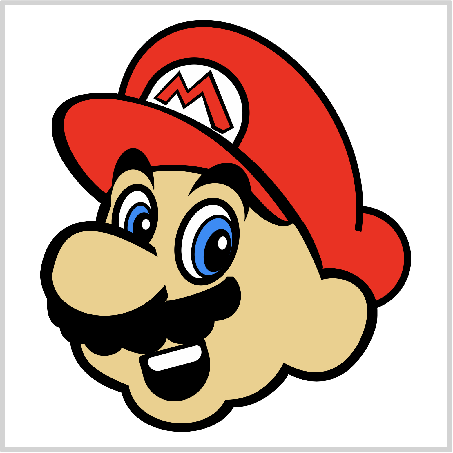
You’ve successfully created a Super Mario image. Give yourself a big pat on the back for joining us all the way to the end.
Please don't hesitate to experiment with the CSS code. How about changing the hat or iris color? Maybe make the hat logo have a much rounder shape.
You can see and play with the code at Pyxofy’s CodePen page.
See the Pen CSS Art – How to Make a Game Character – Super Mario by Pyxofy (@pyxofy) on CodePen.
Conclusion
To create Super Mario, we combined path(), SVG, polygon() and other CSS functions and properties.
SVG code within path() is initially challenging, but through practice you will be able to grasp how they work. Use the SVG visualizer tools introduced in the article to help you get up to speed with SVG syntax and commands.
We’ll be making two more video game characters. Can you guess which ones? Share your guess with us on Twitter @pyxofy, on LinkedIn, or Facebook.
We hope you liked this article. Kindly share it with your network. We really appreciate it.
Related Articles
 Pyxofy
 Pyxofy
 Pyxofy
 Pyxofy