CSS Art – How to Make a Space Shuttle – Orbiter
Space shuttle orbiters are amazing machines. Can we make it with CSS? You bet! Join us making it step-by-step.
Introduction
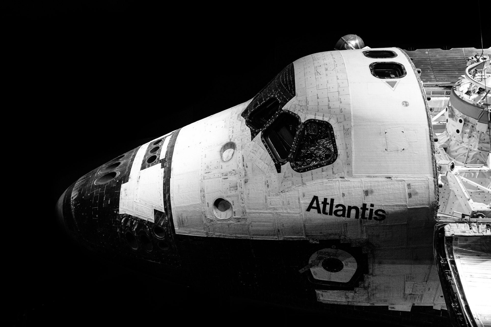
Space shuttle orbiters did numerous missions. They delivered astronauts, satellites, repair parts to and from the International Space Station (ISS).
For the second article in our space shuttle series, we will create it with CSS. If you haven’t read the space shuttle rocket article, you can check it out here.
We will be using different CSS technologies in this article, such as:
Visit our CSS Art articles if you’re unfamiliar with the above CSS technologies.
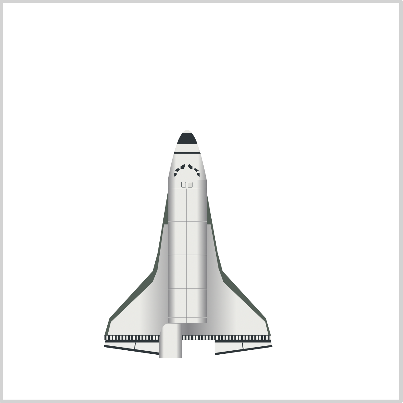
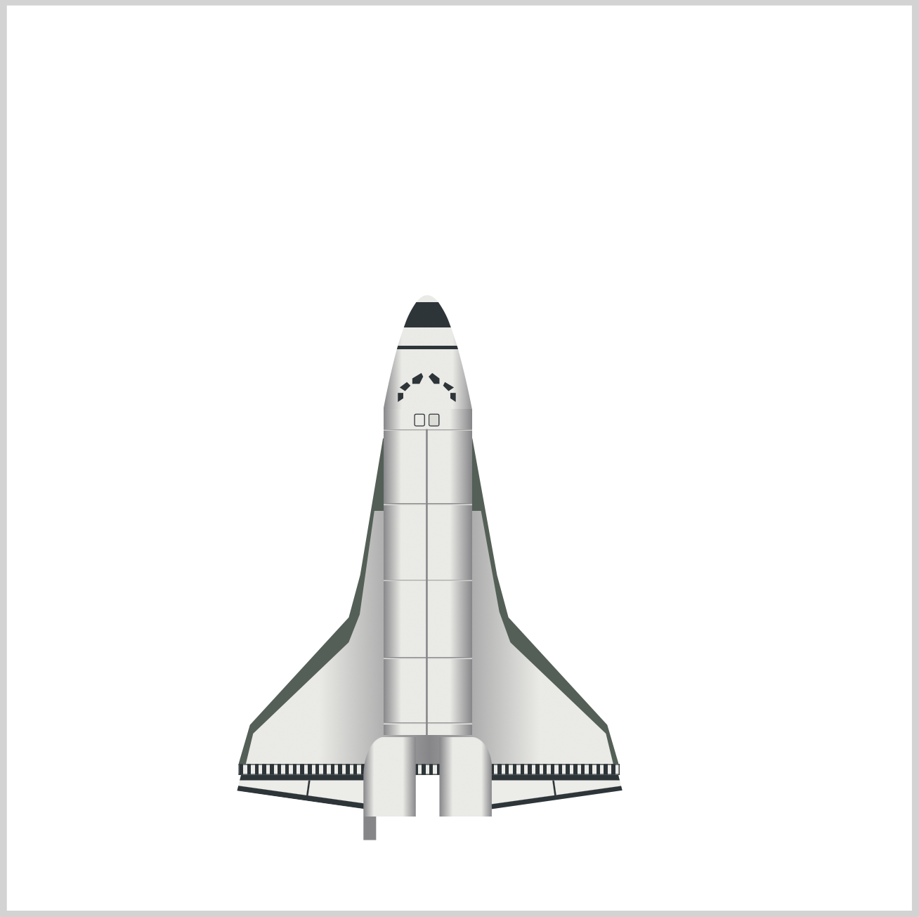
Preview

Our space shuttle orbiter consist of these components:
- Wing
- Forward Fuselage
- Cabin
- Cargo Bay
- Elevon
- Maneuvering Engine
- Main Engine
- Aft Fuselage
- Vertical Stabilizer
Check this webpage for detailed explanation of each component.
Prerequisites
We don’t assume prior knowledge of CSS or HTML, but it helps if you have some familiarity with how they work. Jump over to this article if you require an HTML and CSS primer.
We assume that you have set up tools to create CSS art. If you haven’t, this article will show you how to set them up.
HTML Structure
Here’s HTML code for space shuttle orbiter.
<div class="container">
  <div class="orbiter">
    <!-- Wing -->
    <div class="wing-bottom"></div>
    <div class="wing-upper"></div>

    <!-- Fuselage -->
    <div class="fuselage"></div>
    <div class="fuselage-window"></div>

    <!-- Cabin -->
    <div class="cabin"></div>

    <!-- Cargo Bay -->
    <div class="cargo-bay"></div>

    <!-- Elevon -->
    <div class="elevon"></div>
    <div class="elevon-left"></div>
    <div class="elevon-right"></div>

    <!-- Main Engine Left -->
    <div class="main-engine-left-connector"></div>
    <div class="main-engine-left"></div>

    <!-- Main Engine Right -->
    <div class="main-engine-right-connector"></div>
    <div class="main-engine-right"></div>

    <!-- Main Engine Top -->
    <div class="main-engine-top-connector"></div>
    <div class="main-engine-top"></div>

    <!-- Maneuvering Engine -->
    <div class="maneuvering-engine-right"></div>
    <div class="maneuvering-engine-left"></div>

    <!-- Aft Fuselage -->
    <div class="aft-fuselage"></div>
  </div>

  <!-- Vertical Stabilizer -->
  <div class="vertical-stabilizer"></div>
</div>
container is our outermost enclosure. This enables us to center the art and put a light gray border. The rest of divs represent each of our space shuttle orbiter section.
It’s important to keep the HTML structure as is for each component to display properly.
Are you ready to dive in to the code? Let’s create the wing component in the next section.
Wing
We will split the wing to two components. The bottom section and the upper section. First, let’s make the bottom section.
Bottom Wing

CSS Code:
.wing-bottom {
  position: absolute;
  height: 180px;
  width: 210px;
  top: 239px;
  left: 128px;
  background: var(--dark-green);
  clip-path: polygon(
    38% 0%,
    61.5% 0%,
    68% 42%,
    71% 55%,
    97% 88%,
    100% 100%,
    0% 100%,
    3% 88%,
    29% 55%,
    32% 42%
  );
}
We used CSS clip-path polygon() function to create the bottom wing. We gave it a dark green shade. The polygon() function is very useful when creating irregular shapes. You use percentages to control the position of the shape. Check this article for an in-depth explanation.
Next, let’s make the upper wing.
Upper Wing

CSS Code:
.wing-upper {
  position: absolute;
  height: 140px;
  width: 203px;
  top: 279px;
  left: 132px;
  background: linear-gradient(
    to right,
    var(--gray) 0% 20%,
    var(--dark-gray) 50%,
    var(--gray) 80% 100%
  );
  clip-path: polygon(
    35% 0%,
    64% 0%,
    69% 40%,
    72% 52%,
    98% 88%,
    100% 100%,
    0% 100%,
    2% 88%,
    28% 52%,
    31% 41%
  );
}
Similar to the bottom wing, we used polygon() function to create the custom shape. If you look closely, the shapes are very similar.

CSS Code:
background: linear-gradient(
  to right,
  var(--gray) 0% 20%,
  var(--dark-gray) 50%,
  var(--gray) 80% 100%
);
We used linear-gradient() to generate the gradient effect. Resulting in the above image.
Check this article for step-by-step explanation on how to create different CSS gradients.
Next, let’s create the forward fuselage.
Forward Fuselage
The forward fuselage houses the cockpit and is the command and control center for the orbiter.

CSS Code:
.fuselage {
  position: absolute;
  height: 63px;
  width: 51px;
  top: 160px;
  left: 208px;
  background: linear-gradient(
      to bottom,
      transparent 0 4px,
      var(--gun-metal) 4px,
      var(--gun-metal) 18px,
      transparent 18px,
      transparent 28px,
      var(--gun-metal) 28px,
      var(--gun-metal) 30px,
      transparent 30px
    ),
    linear-gradient(
      to right,
      var(--dark-gray) 0%,
      var(--gray) 20% 75%,
      var(--dark-gray) 100%
    );
  clip-path: path("M 0,63 Q 24,-63 49,63 z");
}
There’s a lot of code to make the fuselage. Let’s break it down. First up is the basic shape.

CSS Code:
clip-path: path("M 0,63 Q 24,-63 49,63 z");
We used CSS path() function to create the custom shape. Take note that path() is different from polygon() function we used for the wings. The parameters in the function, M and Q, are SVG parameters.
Check this article for a step-by-step tutorial on how to make shapes with path().
Let’s explore how to make the gradient.

CSS Code:
linear-gradient(
  to right,
  var(--dark-gray) 0%,
  var(--gray) 20% 75%,
  var(--dark-gray) 100%
);
Similar to the upper wing, we’re giving our forward fuselage a gradient effect. CSS linear-gradient() gradient makes it have a rounder look.
Let’s make the fuselage horizontal stripes.

CSS Code:
linear-gradient(
  to bottom,
  transparent 0 4px,
  var(--gun-metal) 4px,
  var(--gun-metal) 18px,
  transparent 18px,
  transparent 28px,
  var(--gun-metal) 28px,
  var(--gun-metal) 30px,
  transparent 30px
);
We alternate between transparent and gun metal color to create the stripes. This alternating pattern may take some trial and error to make. Experiment by changing the pixel value and see how it affects the stripe height and position.
Let’s create the windows using CSS path() function and SVG.
CSS Code:
.fuselage-window {
  position: absolute;
  height: 23px;
  width: 51px;
  top: 200px;
  left: 208px;
  background: var(--gun-metal);
  clip-path: path(
    "M 8,14 h 3 v 3 L 8,19 M 9,11 l 4,-3 l 2,2 l -3,3 M 21,3 l -5,3 l 0,3 l 1,0 l 3,0 l 2,-4 M 27,3 l 4,3 l 0,3 l -3,0 l -3,-4 M 34,8 l 5,3 l -3,2 l -3,-3 z M 40,14 l -3,0 l 0,3 l 3,2 z"
  );
}
Yes, that’s a lot of SVG code inserted in the path() function. We won’t explain it in detail, but check this article for a step-by-step tutorial on how to make shapes with path().
In the following section, let’s create our cabin component.
Cabin
The cabin is simple to make. We combine rectangle and squares.

CSS Code:
.cabin {
  position: absolute;
  height: 11px;
  width: 49px;
  top: 223px;
  left: 208px;
  background: linear-gradient(
    to right,
    var(--dark-gray) 0%,
    var(--gray) 20% 75%,
    var(--dark-gray) 100%
  );
}

/* Cabin Left Window */
.cabin::before {
  content: "";
  position: absolute;
  height: 6px;
  width: 5px;
  top: 2.5px;
  left: 17px;
  background: var(--silver);
  border-radius: 1px;
  border: solid 0.5px var(--gun-metal);
}

/* Cabin Right Window */
.cabin::after {
  content: "";
  position: absolute;
  height: 6px;
  width: 5px;
  top: 2.5px;
  left: 25px;
  background: var(--silver);
  border-radius: 1px;
  border: solid 0.5px var(--gun-metal);
}

CSS Code:
height: 11px;
width: 49px;
The height and width property controls the shape. The cabin is a horizontally elongated shape; hence our width property value is bigger than our height property value.

CSS Code:
linear-gradient(
  to right,
  var(--dark-gray) 0%,
  var(--gray) 20% 75%,
  var(--dark-gray) 100%
);
Our gradient values are identical to the fuselage gradient.
Let’s create the cabin’s left and right window.

CSS Code:
/* Cabin Left Window */
.cabin::before {
  content: "";
  position: absolute;
  height: 6px;
  width: 5px;
  top: 2.5px;
  left: 17px;
  background: var(--silver);
  border-radius: 1px;
  border: solid 0.5px var(--gun-metal);
}

/* Cabin Right Window */
.cabin::after {
  content: "";
  position: absolute;
  height: 6px;
  width: 5px;
  top: 2.5px;
  left: 25px;
  background: var(--silver);
  border-radius: 1px;
  border: solid 0.5px var(--gun-metal);
}
The code for both left and right cabin windows are nearly identical. We use the left property to control the position of the window. For the left window it will be 17px and for the right window we set it to 25px.
Our cabin section is complete. Ready to make the cargo bay?
Let’s jump to the next section.
Cargo Bay

CSS Code:
.cargo-bay {
  position: absolute;
  width: 49px;
  height: 169px;
  top: 234px;
  left: 208px;
  background: var(--silver);
  background-image: linear-gradient(
      to bottom,
      transparent 0,
      var(--dark-gray) 0px,
      var(--gray) 1px,
      transparent 1px,
      transparent 41px,
      var(--dark-gray) 41px,
      var(--gray) 42px,
      transparent 42px,
      transparent 83px,
      var(--dark-gray) 83px,
      var(--gray) 84px,
      transparent 84px,
      transparent 126px,
      var(--dark-gray) 126px,
      var(--gray) 127px,
      transparent 127px,
      transparent 162px,
      var(--dark-gray) 162px,
      var(--gray) 163px,
      transparent 163px
    ),
    linear-gradient(
      to right,
      var(--dark-gray) 0%,
      var(--gray) 20% 75%,
      var(--dark-gray) 100%
    );
}

.cargo-bay::before {
  content: "";
  position: absolute;
  width: 23.5px;
  height: 169px;
  top: 0px;
  left: 0px;
  background: transparent;
  border-right: solid 1px var(--dark-gray);
}
Let’s split the cargo bay code to two sections. One section is for the basic shape, gradient and horizontal line. The other section is for the vertical line.

CSS Code:
width: 49px;
height: 169px;
We use the width and height property to make the vertically elongated rectangle.

CSS Code:
linear-gradient(
  to right,
  var(--dark-gray) 0%,
  var(--gray) 20% 75%,
  var(--dark-gray) 100%
);
We’re using the identical gradient pattern here we used for the cabin and fuselage component.

CSS Code:
linear-gradient(
  to bottom,
  transparent 0,
  var(--dark-gray) 0px,
  var(--gray) 1px,
  transparent 1px,
  transparent 41px,
  var(--dark-gray) 41px,
  var(--gray) 42px,
  transparent 42px,
  transparent 83px,
  var(--dark-gray) 83px,
  var(--gray) 84px,
  transparent 84px,
  transparent 126px,
  var(--dark-gray) 126px,
  var(--gray) 127px,
  transparent 127px,
  transparent 162px,
  var(--dark-gray) 162px,
  var(--gray) 163px,
  transparent 163px
)
Similar to what we did in the fuselage section, we alternate color and transparent areas to create the horizontal stripes.
CSS Code:
background: transparent;
border-right: solid 1px var(--dark-gray);
To create the vertical line, we first create a rectangle. We place it to the left side. We give the rectangle a solid 1px dark gray border. Then we set its color to transparent. The rectangle disappears, and only the right border appears on the screen.
In the next section, let’s tackle the elevon component.

Elevon
Elevons control the aircraft’s pitch (elevator) and roll (aileron) functions.

We have three sections for our elevon. The horizontal bar, left and right section. First, let’s create the horizontal bar.

CSS Code:
.elevon {
  position: absolute;
  height: 5px;
  width: 209.5px;
  top: 419px;
  left: 128px;
  background: var(--off-white);
  background-image: repeating-linear-gradient(
    to right,
    var(--gun-metal) 0% 1%,
    transparent 1% 2%
  );
  border: 0.5px solid var(--gun-metal);
}
The height: 5px; and width: 209.5px; gives us a thin, long rectangle.

We put a thin, 0.5px, solid gun metal border with the below CSS code.
CSS Code:
border: 0.5px solid var(--gun-metal);
Next, let’s make the stripes.

CSS Code:
repeating-linear-gradient(
  to right,
  var(--gun-metal) 0% 1%,
  transparent 1% 2%
);
Making so many stripes manually will be challenging.
Fortunately, we can use CSS repeating-linear-gradient() function to generate the stripes. Heres a step-by-step article on how to make repeating linear gradients.
Up next is the left elevon section.

CSS Code:
.elevon-left {
  position: absolute;
  height: 16px;
  width: 73px;
  top: 425px;
  left: 125px;
  background: var(--off-white);
  clip-path: polygon(6% 0%, 100% 0%, 100% 100%, 3% 46%);
  border-top: solid 3px var(--gun-metal);
}

.elevon-left::before {
  content: "";
  position: absolute;
  height: 9px;
  width: 2px;
  top: 0px;
  left: 41px;
  background: transparent;
  border-left: solid 1px var(--gun-metal);
  transform: skew(-8deg);
}

.elevon-left::after {
  content: "";
  position: absolute;
  height: 4px;
  width: 73px;
  top: 4px;
  left: 2px;
  background: transparent;
  border-bottom: solid 3px var(--gun-metal);
  transform: rotate(8deg);
}
We need to split the left elevon in to three sections. First the basic shape and top border. Second is the horizontal stripe. Third is the bottom border.
1. Basic shape and top border.
clip-path: polygon(6% 0%, 100% 0%, 100% 100%, 3% 46%);
border-top: solid 3px var(--gun-metal);
We give the shape a gun metal color.
2. Horizontal stripe.
border-left: solid 1px var(--gun-metal);
transform: skew(-8deg);
We use skew() to give the horizontal stripe a slight slant.
3. Bottom border.
border-bottom: solid 3px var(--gun-metal);
transform: rotate(8deg);
rotate() tilts the shape to match the shape of the elevon.
Let’s make the right elevon.

CSS Code:
.elevon-right {
  position: absolute;
  height: 16px;
  width: 73px;
  top: 425px;
  left: 267px;
  background: var(--off-white);
  clip-path: polygon(0% 0%, 97% 0%, 100% 45%, 0% 100%);
  border-top: solid 3px var(--gun-metal);
}

.elevon-right::before {
  content: "";
  position: absolute;
  height: 9px;
  width: 2px;
  top: 0px;
  left: 35px;
  background: transparent;
  border-left: solid 1px var(--gun-metal);
  transform: skew(8deg);
}

.elevon-right::after {
  content: "";
  position: absolute;
  height: 4px;
  width: 75px;
  top: 4px;
  left: 0px;
  background: transparent;
  border-bottom: solid 3px var(--gun-metal);
  transform: rotate(-8deg);
}
The right elevon is a mirror image of the left elevon. Check the code meticulously, you’ll find out slight differences between the left and right elevon code.
Now that we’ve finished the elevon component, let’s make the Aft Fuselage in the next section.
Aft Fuselage
The Aft Fuselage houses the orbiter’s engines.

CSS Code:
.aft-fuselage {
  position: absolute;
  height: 44px;
  width: 29px;
  top: 404px;
  left: 197px;
  background: linear-gradient(
    to right,
    var(--dark-gray) 0%,
    var(--gray) 20% 75%,
    var(--dark-gray) 100%
  );
  border-radius: 40% 0% 0% 0% / 50% 0% 0% 0%;
}

.aft-fuselage::before {
  content: "";
  position: absolute;
  height: 44px;
  width: 29px;
  top: 0px;
  left: 42px;
  background: linear-gradient(
    to left,
    var(--dark-gray) 0%,
    var(--gray) 20% 75%,
    var(--dark-gray) 100%
  );
  border-radius: 0% 40% 0% 0% / 0% 40% 0% 0%;
}

.aft-fuselage::after {
  content: "";
  position: absolute;
  width: 7px;
  height: 13px;
  top: 44px;
  left: 0px;
  background: var(--dark-gray);
  box-shadow: 64px 0 0 0 var(--dark-gray);
  z-index: -1;
}
Let’s make the left section first.

CSS Code:
border-radius: 40% 0% 0% 0% / 50% 0% 0% 0%;
We used CSS border-radius to make the aft fuselage’s basic shape.
CSS Code:
linear-gradient(
	to right,
    var(--dark-gray) 0%,
    var(--gray) 20% 75%,
    var(--dark-gray) 100%
);
For the gradient, we make it go to the right. This gives the fuselage a more rounded shape.
Let’s work on the right section.

CSS Code:
border-radius: 0% 40% 0% 0% / 0% 40% 0% 0%;
Same as the left section, we used border-radius to make our basic shape.

CSS Code:
linear-gradient(
    to left,
    var(--dark-gray) 0%,
    var(--gray) 20% 75%,
    var(--dark-gray) 100%
  );
For the gradient, we set it to move in the left direction.
The final component in the aft fuselage are the blocks.
CSS Code:
background: var(--dark-gray);
box-shadow: 64px 0 0 0 var(--dark-gray);
z-index: -1;
We make a plain dark gray box. We used CSS box-shadow to replicate the shape and shift it 64px to the right.
Don’t forget to put z-index: -1;, this ensures that the blocks don’t cover the maneuvering engines that we’ll create in the next section.
Maneuvering Engine
Maneuvering engines give pilots fine grain control over the orbiter.

Let’s tackle the right maneuvering engine first.
CSS Code:
.maneuvering-engine-right {
  position: absolute;
  height: 12px;
  width: 13px;
  top: 447px;
  left: 250px;
  background: linear-gradient(
      to bottom,
      transparent 0 5px,
      var(--black) 5px,
      var(--black) 7px,
      transparent 7px,
      transparent 10px,
      var(--black) 10px,
      var(--black) 11px,
      transparent 11px,
      transparent 15px,
      var(--black) 15px,
      var(--black) 17px,
      transparent 16px
    ),
    linear-gradient(
      to right,
      var(--dark-green) 0%,
      var(--silver) 60% 70%,
      var(--dark-green) 90% 100%
    );
  clip-path: polygon(31% 0%, 72% 0%, 100% 100%, 0% 100%);
  transform: rotate(-15deg);
}

CSS Code:
clip-path: polygon(31% 0%, 72% 0%, 100% 100%, 0% 100%);
transform: rotate(-15deg);
We use CSS clip-path polygon() function to make the basic shape. We rotate it -15deg.

CSS Code:
linear-gradient(
	to right,
    var(--dark-green) 0%,
    var(--silver) 60% 70%,
    var(--dark-green) 90% 100%
);
Instead of gun metal, we give the maneuvering engine a dark green gradient.

CSS Code:
linear-gradient(
	to bottom,
    transparent 0 5px,
    var(--black) 5px,
    var(--black) 7px,
    transparent 7px,
    transparent 10px,
    var(--black) 10px,
    var(--black) 11px,
    transparent 11px,
    transparent 15px,
    var(--black) 15px,
    var(--black) 17px,
    transparent 16px
)
We used linear-gradient to create the two stripes.
Now, let’s make the left maneuvering engine.
CSS Code:
.maneuvering-engine-left {
  position: absolute;
  height: 12px;
  width: 13px;
  top: 447px;
  left: 202px;
  background: linear-gradient(
      to bottom,
      transparent 0 5px,
      var(--black) 5px,
      var(--black) 7px,
      transparent 7px,
      transparent 10px,
      var(--black) 10px,
      var(--black) 11px,
      transparent 11px,
      transparent 15px,
      var(--black) 15px,
      var(--black) 17px,
      transparent 16px
    ),
    linear-gradient(
      to right,
      var(--dark-green) 0%,
      var(--silver) 30% 40%,
      var(--dark-green) 90% 100%
    );
  clip-path: polygon(31% 0%, 72% 0%, 100% 100%, 0% 100%);
  transform: rotate(15deg);
}


The left maneuvering engine is a mirror image of the right maneuvering engine. Take a look at the code and see what we changed to make this mirror image.
Main Engine
Three main engines give the orbiter thrust during lift off.

For brevity, we will only explore the top engine, and it’s connector code.
With just a few adjustments, such as color and gradient direction, the code for the left / right main engine are almost identical to the top engine and connector code.
CSS Code:
/* Main Engine Top Connector */
.main-engine-top-connector {
  position: absolute;
  width: 15px;
  height: 10px;
  top: 440px;
  left: 224px;
  background: linear-gradient(
    to right,
    var(--dark-gray) 0% 20%,
    var(--gray) 35% 40%,
    var(--dark-gray) 80% 100%
  );
  clip-path: polygon(0% 0%, 100% 0%, 100% 75%, 82% 100%, 18% 100%, 0% 75%);
}

.main-engine-top-connector::before {
  content: "";
  position: absolute;
  width: 15px;
  height: 10px;
  top: 0px;
  left: 0px;
  background: repeating-linear-gradient(
    to bottom,
    var(--black) 5% 10%,
    transparent 10% 30%
  );
}

/* Main Engine Top */
.main-engine-top {
  position: absolute;
  height: 23px;
  width: 24px;
  top: 450px;
  left: 220px;
  background: linear-gradient(
    to right,
    var(--dark-gray) 0% 20%,
    var(--gray) 35% 40%,
    var(--dark-gray) 80% 100%
  );
  clip-path: polygon(27% 0%, 70% 0%, 100% 100%, 0% 100%);
}

.main-engine-top::before {
  content: "";
  position: absolute;
  height: 23px;
  width: 24px;
  top: 0px;
  left: 0px;
  background: repeating-linear-gradient(
    to bottom,
    var(--black) 6% 8%,
    transparent 8% 12%
  );
}
Let’s look at the connector first.

CSS Code:
clip-path: polygon(0% 0%, 100% 0%, 100% 75%, 82% 100%, 18% 100%, 0% 75%);
CSS clip-path polygon() is our tool of choice for making the connector and engine basic shape.

CSS Code:
linear-gradient(
	to right,
    var(--dark-gray) 0% 20%,
    var(--gray) 35% 40%,
    var(--dark-gray) 80% 100%
);
Our connector’s gradient is a light gray color. Play around with the percentages to move the highlight location.

CSS Code:
repeating-linear-gradient(
	to bottom,
    var(--black) 5% 10%,
    transparent 10% 30%
);
We simulate the stripes or grooves for the connector using repeating-linear-gradient.
Let’s make the top main engine next.

CSS Code:
clip-path: polygon(27% 0%, 70% 0%, 100% 100%, 0% 100%);
Using polygon() we make a trapezoid shape.

CSS Code:
linear-gradient(
    to right,
    var(--dark-gray) 0% 20%,
    var(--gray) 35% 40%,
    var(--dark-gray) 80% 100%
);
We apply the same gradient pattern we used for the connector for the top main engine. The gradient makes the trapezoid shape more cone like, simulating the engine funnel.

CSS Code:
repeating-linear-gradient(
	to bottom,
    var(--black) 6% 8%,
    transparent 8% 12%
);
Our top main engine stripes are more fine, closer, compared to the connector. Play around with the percentages to change the distance between the stripes.
Onward to our last component, the vertical stabilizer.
Vertical Stabilizer
Vertical stabilizer with the rudder provide control, stability and trim in yaw (directional or weathercock stability).

CSS Code:
.vertical-stabilizer {
  position: absolute;
  width: 15px;
  height: 98px;
  top: 403px;
  left: 224px;
  background: linear-gradient(
    to right,
    var(--dark-gray) 0% 25%,
    var(--off-white) 40% 65%,
    var(--dark-gray) 85% 100%
  );
  clip-path: polygon(63% 0%, 42% 0%, 21% 26%, 55% 89%, 86% 26%);
}

.vertical-stabilizer::before {
  content: "";
  position: absolute;
  width: 15px;
  height: 98px;
  top: 0px;
  left: 0px;
  background: linear-gradient(
    to right,
    transparent 0 7px,
    var(--black) 7px,
    var(--black) 9px,
    transparent 9px
  );
}

CSS Code:
clip-path: polygon(63% 0%, 42% 0%, 21% 26%, 55% 89%, 86% 26%);
}
We’re viewing the vertical stabilizer from the top, giving it a very unusual, unique shape.

CSS Code:
linear-gradient(
    to right,
    var(--dark-gray) 0% 25%,
    var(--off-white) 40% 65%,
    var(--dark-gray) 85% 100%
);
The gradient gives the vertical stabilizer a more three-dimensional look.
CSS Code:
linear-gradient(
    to right,
    transparent 0 7px,
    var(--black) 7px,
    var(--black) 9px,
    transparent 9px
);
For the stripe, we use the linear-gradient, alternating between black and transparent color.
That’s it, we’re all done.
If you followed along this far, congrats and a big “Thank You”!
For those who want more, here’s a quick challenge.

Using the above image as reference, try to combine the rocket and orbiter together. All you need to do is experiment with the top and left property values to position the orbiter above the rockets.
You can see and play with the code at Pyxofy’s CodePen page.
See the Pen CSS Art – How to Make a Space Shuttle – Orbiter by Pyxofy (@pyxofy) on CodePen.
Conclusion
In this two part article series, we used many CSS functions and properties. We used clip-path’s polygon() and path() function to create custom shapes.
We used linear-gradient and repeating-linear-gradient to generate gradients and stripes, making the orbiter components more realistic.
This was a very challenging article, but we hope it helped you see how you can use CSS to make art. Share your masterpiece with us on Twitter @pyxofy, on LinkedIn, or Facebook.
We hope you liked this article. Kindly share it with your network. We really appreciate it.
Related Articles
 Pyxofy
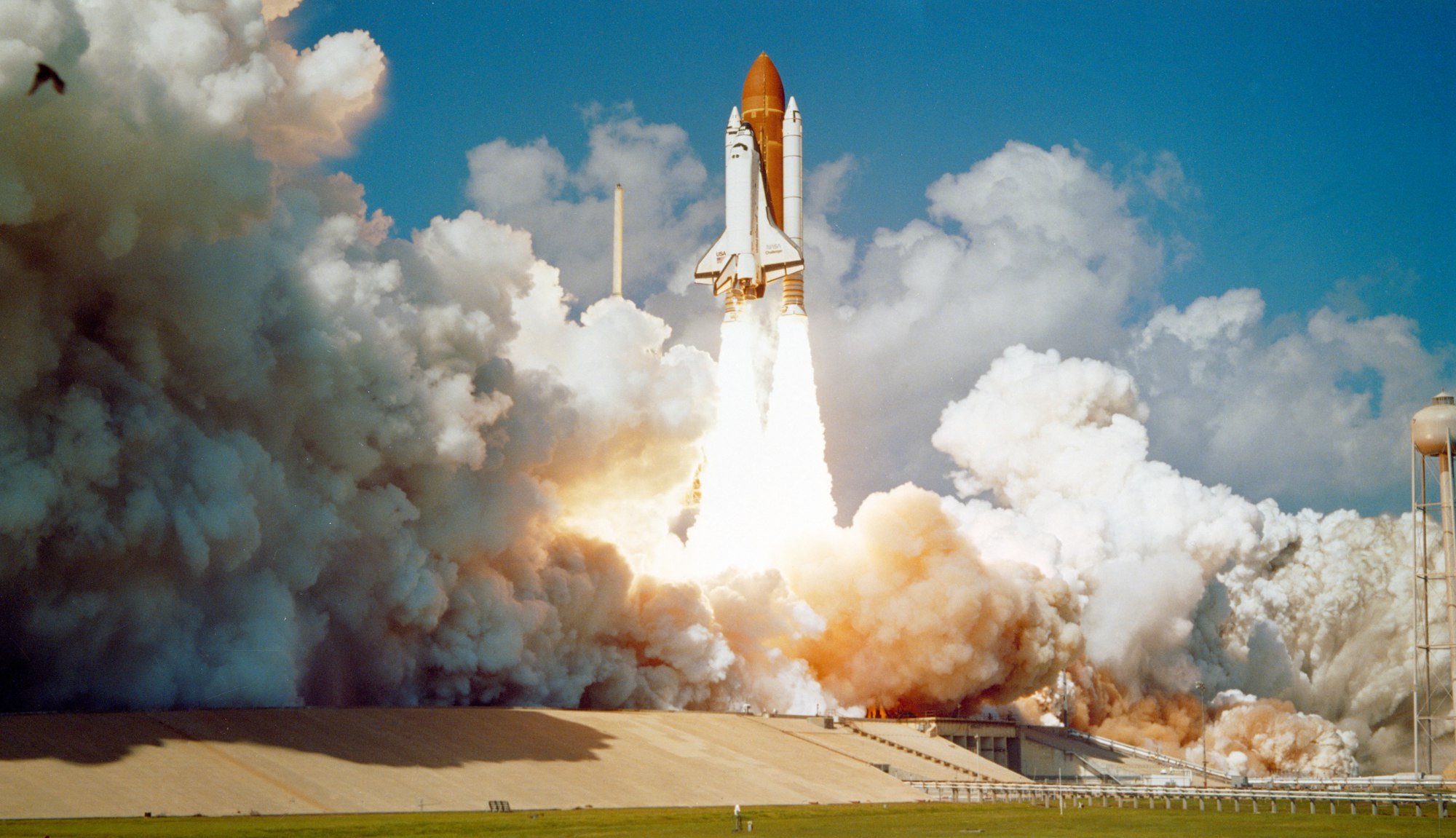 Pyxofy
 Pyxofy
 Pyxofy