CSS Art – shape() Function & Transform: Create an Isometric House
No bricks. No mortar. Just CSS. Learn how to build a stunning 3D house using the shape() function, step by step.

Introduction
Want to create a 3D‑looking house using only HTML and CSS? In this beginner‑friendly article, you’ll build an isometric house step by step using clip-path: shape(), accurate positioning, and smart shading. No images. No SVGs. Just clean, modern CSS that’s easy to understand.
Here are the CSS properties and functions you’ll explore in this article:
clip-path: shape()transform: rotate()border-radiusposition: absolute- CSS Custom Properties (Variables)
Preview
Here’s a quick preview of the isometric house you’ll be building in this article. It’s a fun, hands‑on project that shows how powerful pure CSS can be.


Before you dive in, we highly recommend reading these two articles to get familiar with how the CSS shape() function works. They’ll make the concepts in this article much easier to understand.
 Pyxofy
 Pyxofy
You may also want to check the official MDN browser compatibility page to see the latest browser support for the shape() function, so you know exactly where it works today.
Prerequisites
Essential CSS and HTML knowledge will help you understand the concepts and techniques introduced in this article. Jump over to this article if you require an HTML and CSS primer.
We assume you have configured tools to modify CSS. If not, this article will guide you through the setup process.
HTML Structure
<div class="container">
  <div class="house">
    <div class="wall-front"></div>
    <div class="wall-right"></div>
    <div class="roof-front"></div>
    <div class="roof-right"></div>
    <div class="window"></div>
    <div class="door"></div>
    <div class="door-knob"></div>
  </div>
</div>
container is the outermost enclosure. It enables the content to be centered and draws a light gray border. The rest of the <div>s represent each image component.
Keep the HTML structure as is for the image to display correctly.
Body and Container <div> CSS
CSS code for the body and container <div>.
/* Body and Container Settings */
/* Center shapes */
body {
  margin: 0;
  padding: 0;
  height: 100vh;
  display: flex;
  justify-content: center;
  align-items: center;
  background-color: #f0f0f0;
}

/* Set background and border color */
.container {
  width: 500px;
  height: 500px;
  border: 5px solid lightgray;
  position: relative;
  margin: 5px;
}
Color Palette
You’ll color the isometric house using CSS Custom Properties (Variables). By defining colors once and reusing them, your CSS becomes cleaner, easier to update, and much more maintainable—perfect for managing shading and keeping your design consistent as it grows.
/* Color Palette */
:root {
  --wall-front: sienna;
  --wall-right: #753c22; /* Saddle Brown */

  --roof-front: burlywood;
  --roof-right: #8c7352; /* Peru */
  --window: royalblue;

  --door: burlywood;
  --door-knob: royalblue;
}
Common Properties
To keep your code clean, organized, and easy to maintain, we’ll group shared CSS properties together. By doing this, you avoid repeating the same styles again and again, which makes your CSS shorter and easier to read. Even better, when you need to make changes later, you can update one place instead of many—saving time and reducing mistakes.
/* Common Properties */
.wall-front,
.wall-right,
.roof-front,
.roof-right,
.door {
  width: 100%;
  height: 100%;
}
You set both the width and height to 100%, which tells each house element to fully fill its parent container—the .house wrapper.
In simple terms, this gives every part a full square canvas to work with. Why is this important? The CSS clip-path property works like cutting paper with scissors. Before you can cut an interesting shape, you need a full sheet of paper first. By setting the size to 100%, you ensure there’s plenty of space to carve out those angled, isometric shapes later using clip-path.
This makes your shapes more predictable, easier to design, and much more fun to work with.
House Properties
/* House Properties */
.house,
.house div {
  position: absolute;
}
By applying position: absolute;, you completely change how the browser places your elements, preparing them for a clean and precise 3D-style drawing.
First, you smartly target multiple elements at once using a comma. The rule applies to both .house (the main wrapper) and .house div (every wall, roof, and door inside it). This means you only have to write position: absolute; one time, keeping your CSS neat and easy to maintain.
Next comes the “deck of cards” effect. Normally, <div> elements stack vertically, one after another. But with position: absolute;, they are removed from that normal flow and all snap to the same starting point—the top-left corner of their container. The result? Every piece sits perfectly on top of the others, just like a stack of cards. This is crucial, because it ensures all your clip-path coordinates line up perfectly when you start cutting out walls and roofs.
.house {
  left: 22px;
  top: 58px;
  width: 100%;
  height: 100%;
}
Finally, you position the main stage itself. By giving .house values like left: 22px; and top: 58px;, you move the entire house slightly within the 500×500 container. Since all the individual parts live inside this wrapper, shifting the wrapper moves the whole illustration together.
In the next section let’s start working on the House Walls.
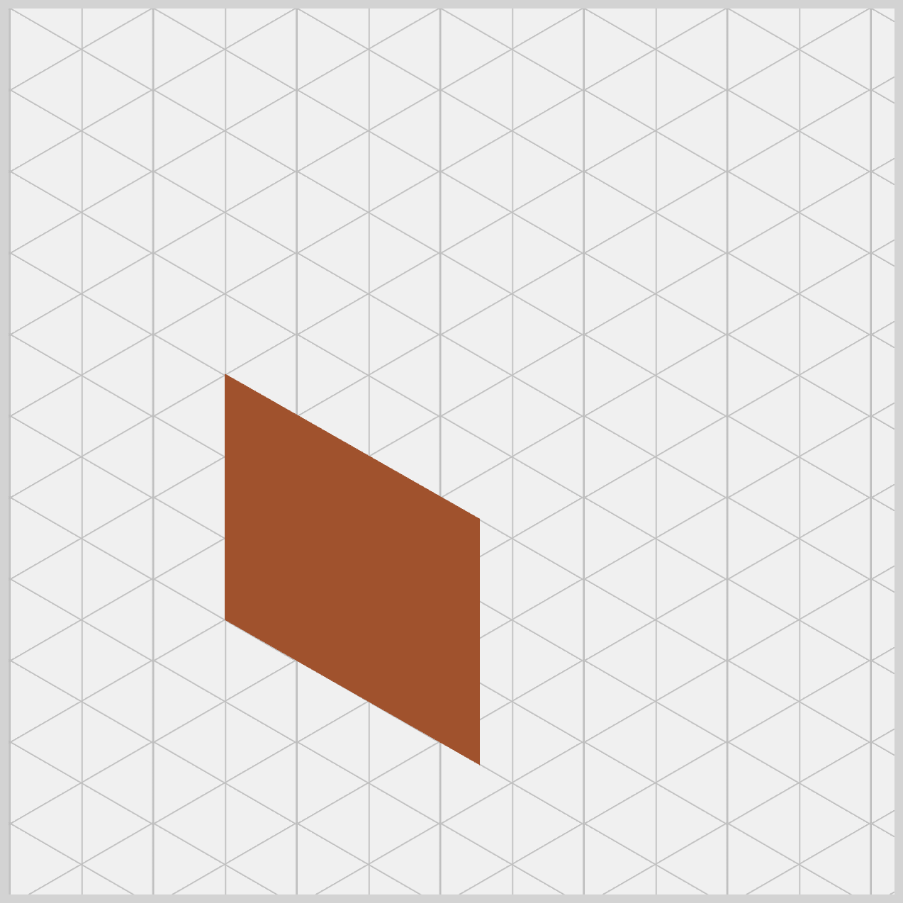
House Walls
You’ll build two walls in this section, the front and the right side wall. You’ll see how simple <div> elements, combined with CSS positioning and clip-path: shape(), can be transformed into angled walls that give your house its isometric, 3D look.
By default, .wall-front starts as a simple, flat square because its width and height are both set to 100%. This gives us a full, solid base to work with. From there, the clip-path: shape() property steps in like a pair of scissors, carefully cutting away the parts of the box we don’t need. What’s left behind is our custom wall shape—clean, precise, and ready to fit perfectly into the isometric house design.
To use the shape() function correctly, it helps to understand how the browser measures space.
The browser uses an invisible grid. The X‑axis runs horizontally, starting at 0px on the left and increasing as you move right. The Y‑axis runs vertically, starting at 0px at the very top and increasing as you move downward.
This is important to remember because it’s the opposite of the math graphs many of us learned in school.
/* House Wall */
.wall-front {
  background: var(--wall-front);
  clip-path: shape(
    from 244px 369px,
    line to 100px 287px,
    line to 100px 148px,
    line to 244px 230px,
    close
  );
}
You can think of clip-path: shape() as a fun game of connect the dots. The browser follows your coordinates in order, like a digital pen drawing a path using commands.
- When you write
from 244px 369px, you place the pen at the bottom‑right point of the front wall. - The next command,
line to 100px 287px, draws a line left and slightly upward, forming the bottom‑left corner. - Then
line to 100px 148pxgoes straight up to where the wall meets the roof. - After that,
line to 244px 230pxmoves right and slightly down, creating the top‑right edge of the wall. - Finally,
closeconnects everything back to the starting point so the browser can fill the shape with yourbackground: var(--wall-front);, a Sienna hue.
Here’s the isometric secret. If you look closely at the numbers, both the left and right edges move straight up vertically, and the top and bottom edges stay perfectly parallel. This careful alignment is what tricks the eye into seeing depth and perspective. Even though everything is flat CSS, your wall suddenly feels solid and three‑dimensional—pure CSS magic.
Next, let’s move on to the Right Wall of the house. This step follows the same overall idea as the Front Wall, but with new coordinates to create the angled side that adds depth to the design.
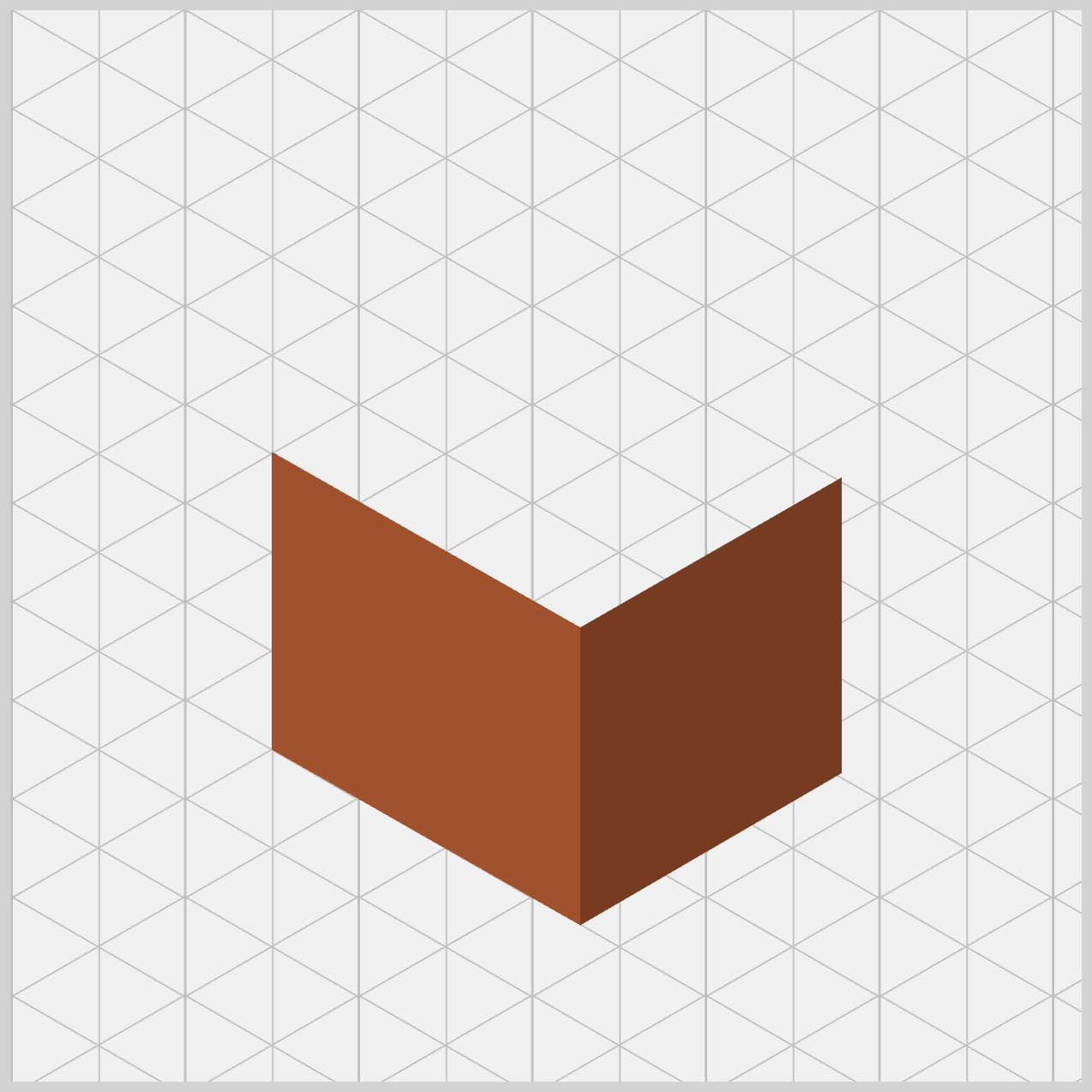
From here on, we’ll skip the base shape explanation and jump straight into the clip-path: shape() logic for brevity. Since the setup is already in place, we can focus on how the coordinates and commands shape each wall and bring the isometric effect to life.
.wall-right {
  background: var(--wall-right);
  clip-path: shape(
    from 244px 369px,
    line to 366px 298px,
    line to 366px 160px,
    line to 244px 230px,
    close
  );
}
First, notice the shading. The right wall uses background: var(--wall-right);, which is a darker brown (Saddle Brown) than the front wall’s sienna. This small change makes a big difference. By darkening the right side, you’re simulating a light source, as if light is hitting the house from the left. This is a classic artist’s trick—and it works beautifully in CSS—to make flat shapes feel solid and three‑dimensional.
Let’s break down the shape() commands line by line.
from 244px 369px: Pen starts at bottom center. This is the "Common Corner" where the walls meet.line to 366px 298px: Moves right (366px) and up (298px). The Bottom-Right corner of the whole house.line to 366px 160px: Moves straight up to160px. The Top-Right vertical edge of the house.line to 244px 230px: Moves left (244px) and down (230px). The Top-Center peak where the two walls meet.close: Connects back to the start. Fills the right-side polygon with color.
Finally, look at the symmetry. The front wall extends left to 100px, while the right wall extends right to 366px. Because the vertical distances match the front wall’s angles, everything stays visually balanced. The result is a clean, convincing isometric corner that looks like it’s pointing straight toward the viewer.
Great! Now that the walls are complete, it’s time to move on to the House Roof.
House Roof
This is where the design really comes together and the isometric effect becomes more obvious.
Just like the walls, the roof is built using simple elements and shaped with the shape() function. We’ll create two parts—the Front Roof and the Right Roof—and use slightly different colors to suggest light and shadow. This contrast helps the roof feel layered and three‑dimensional, even though everything is still flat CSS.
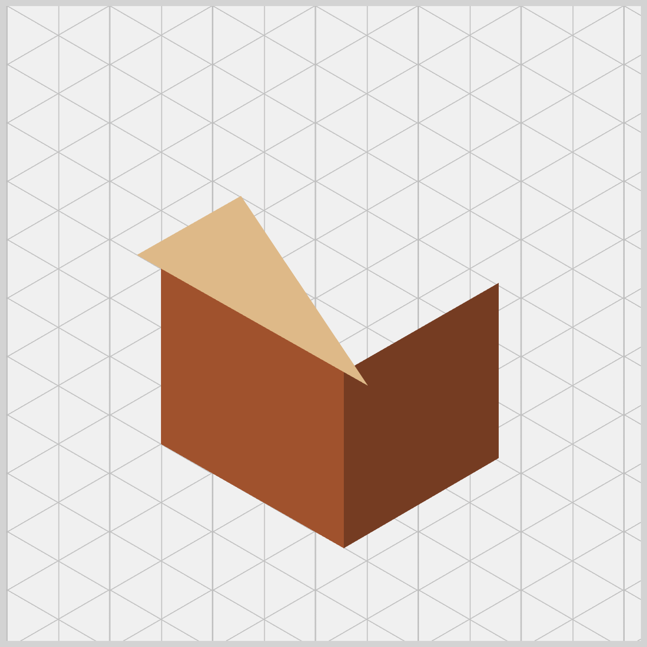
/* House Roof */
.roof-front {
  background: var(--roof-front);
  clip-path: shape(
    from 81px 138px,
    line to 263px 241px,
    line to 163px 91.5px,
    close
  );
}
For the roof, we apply background: var(--roof-front);, which uses the burlywood color. This choice is intentional. Compared to the walls, this shade is lighter and warmer, helping the roof stand out visually.
The design logic is simple but effective: in most 3D artwork, the roof faces upward toward the sky or sun. Because of that, it should appear brighter than the walls. The result is a more realistic look—your house instantly feels more natural and three‑dimensional.
Now let’s breakdown the clip-path: shape() commands.
- Start:
from 81px 138px. Which is the Bottom-Left corner of the roof (it hangs slightly over the wall). - Point 2:
line to 263px 241px. The Bottom-Right corner, meeting the center peak where the walls join. - Point 3:
line to 163px 91.5px. The Highest Peak of the house roof. - Finish:
close. Connects back to the start, filling the triangle with color.
Did you notice that the roof’s coordinates are slightly different from the wall’s? For example, the wall begins at 100px horizontally, but the roof starts further out at 81px. That small shift is very intentional.
By making the roof wider and slightly lower than the wall, you create an eave—the part of the roof that hangs over the edge of the house. This subtle detail adds a lot of realism. Instead of looking like stacked flat shapes, your CSS house now feels like an actual building, complete with thoughtful architectural touches.
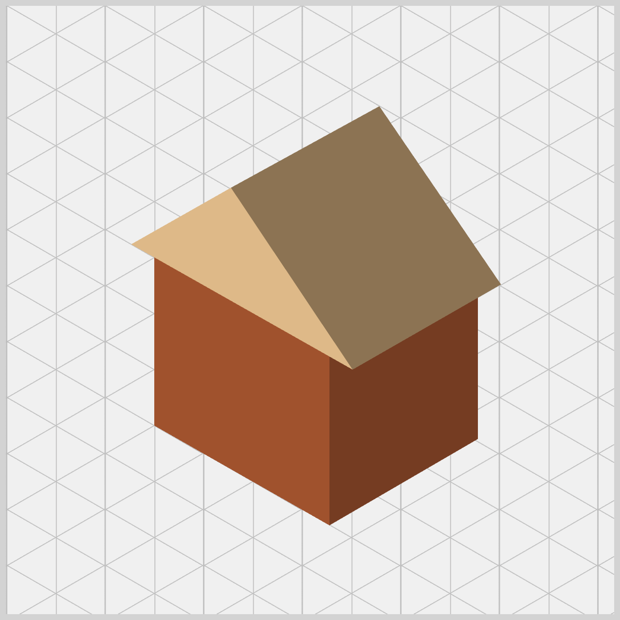
.roof-right {
  background: var(--roof-right);
  clip-path: shape(
    from 163px 91.5px,
    line to 285px 24.5px,
    line to 385px 171px,
    line to 263px 241px,
    close
  );
}
Now we are adding the final large piece of the structure: the Right Roof. While the front roof was a triangle, this piece is a four-sided polygon (a rectangle tilted in space) that covers the side of the house.
Just like the walls, the right side of the roof uses a darker shade (Peru) with background: var(--roof-right);. This color choice isn’t random—it’s doing important visual work.
The logic is simple: since the front roof is brighter, the right side naturally falls into shadow. By using a darker tone here, you create a clear contrast between the two roof planes. The result is a convincing “fold” at the top of the house, making the roof feel solid and three‑dimensional instead of flat. This small shading detail adds a big boost to realism.
The shape() command line by line breakdown.
- Start:
from 163px 91.5px
The Highest Peak (matching the front roof exactly). - Point 2:
line to 285px 24.5px
The Back Peak (creating the length of the house). - Point 3:
line to 385px 171px
The Far Right Corner of the roof edge. - Point 4:
line to 263px 241px
The Front Corner where the roof meets the wall corner. - Finish:
close
Fills the slanted rectangle with color.
Here’s the secret that makes everything feel seamless: shared coordinates. Both roof pieces start at 163px 91.5px, and both meet at 263px 241px. By using the exact same numbers where shapes connect, you prevent gaps or “light leaks.” The result is a roof that looks like one heavy piece of material folded cleanly over the walls.
Next up is the House Window.
House Window
The House Window is a small detail that adds a lot of charm. By adjusting the size, position, and using border-radius, you create a soft, rounded shape that stands out against the sharp angles of the walls and roof. Using transform: rotate(), a slight rotate finishes the look, helping the window blend naturally into the isometric design.

/* House Window */
.window {
  width: 30px;
  height: 40px;
  left: 146px;
  top: 131px;
  background: var(--window);
  border: 1px solid white;
}
With width: 30px; and height: 40px;, the window starts as a tall rectangle. Positioning is just as important. Using left: 146px; and top: 131px; places the window precisely on the surface of the front wall.background: var(--window); applied a Royal Blue background color. A thin 1px solid white border acts like a window frame, helping the royal blue color stand out clearly against the darker wall.

.window {
  border-radius: 50%;
}
When you apply border-radius: 50%, the rectangle turns into a smooth oval instead of a perfect circle. This works beautifully for isometric designs—on a slanted wall, a circular window naturally appears oval to the eye.
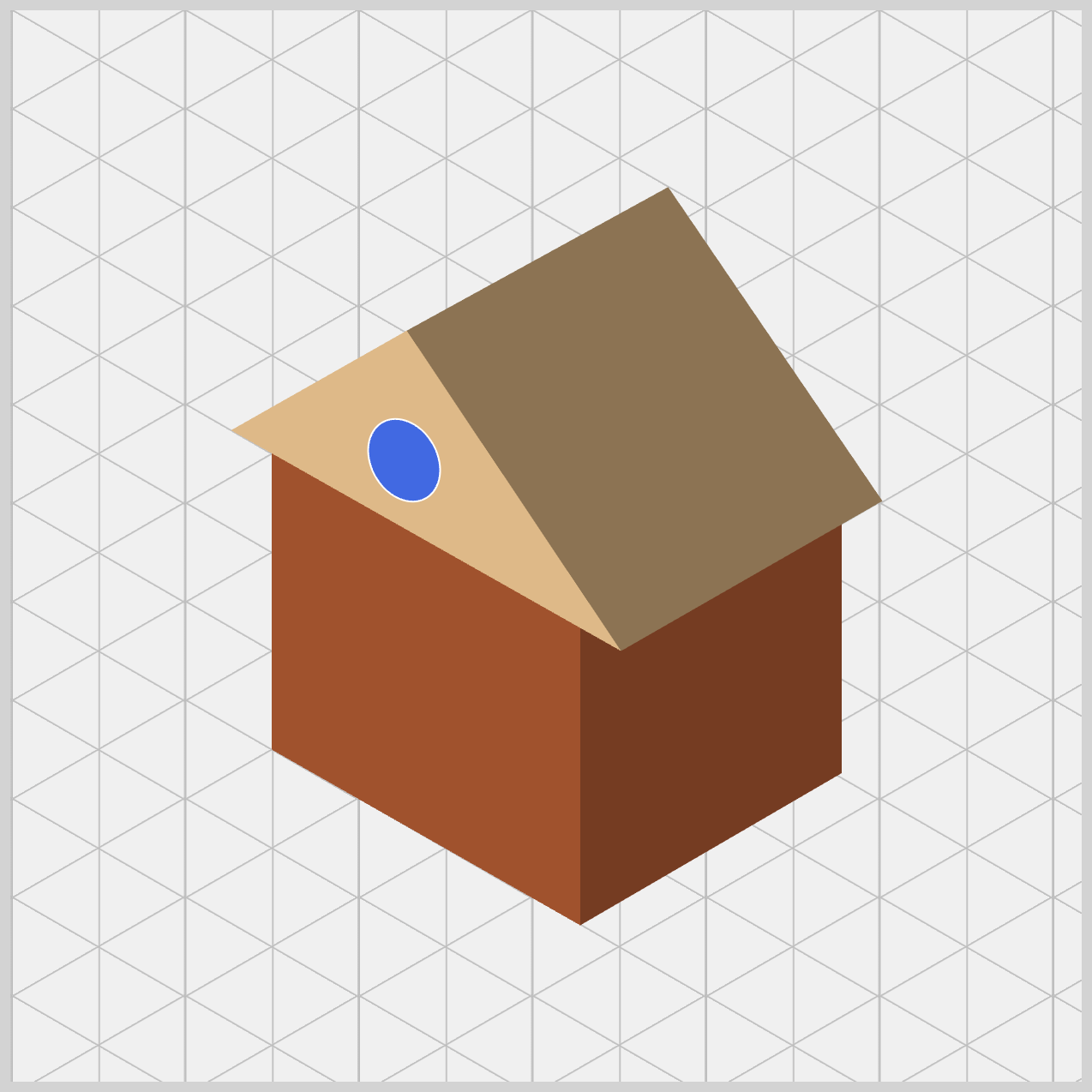
.window {
  transform: rotate(-30deg);
}
The final touch is the isometric tilt. With transform: rotate(-30deg);, the window is rotated slightly to match the angle of the wall. Without this rotation, the window would look flat or misplaced. By tilting it, the window feels properly built into the house.
Let’s work on the House Door next.
House Door
Just like the walls and roof, the door starts as a simple shape and is refined using clip-path: shape(). By carefully shaping and positioning it on the front wall, the door naturally follows the house’s isometric angle. This keeps everything visually consistent and reinforces the 3D illusion.
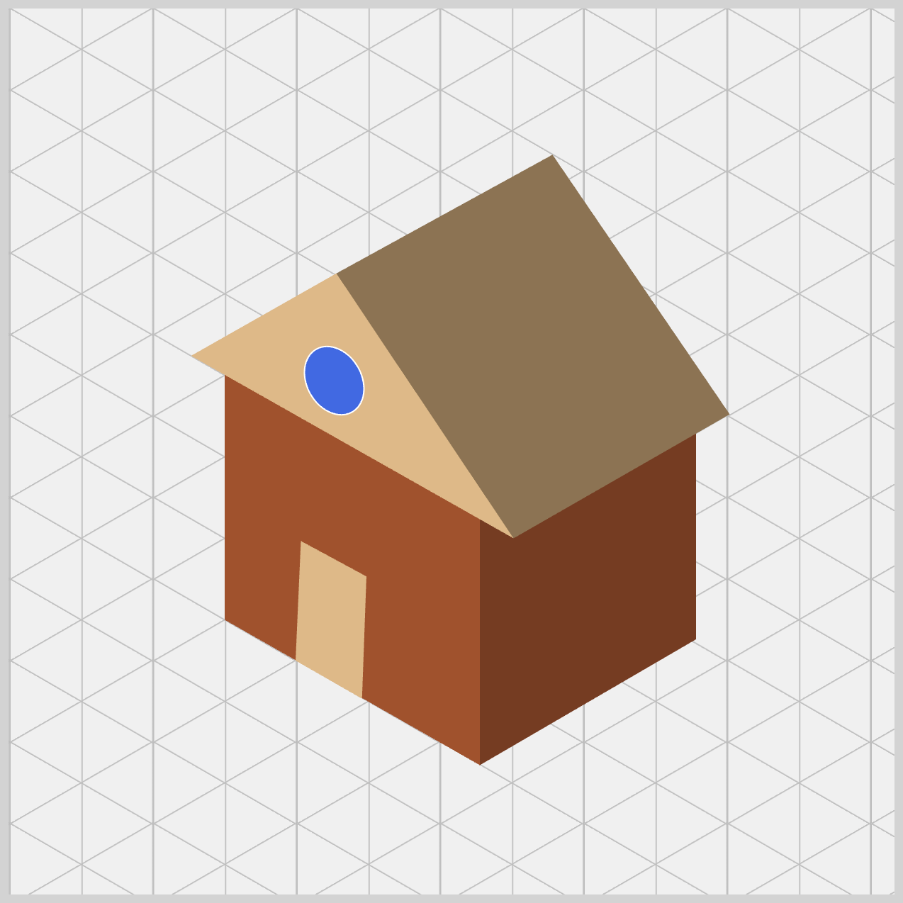
/* House Door */
.door {
  background: var(--door);
  clip-path: shape(
    from 177.5px 331.5px,
    line to 140px 310px,
    line to 143px 242.5px,
    line to 180px 262.5px,
    close
  );
}
The door uses background: var(--door);, which is set to burlywood—the same color used for the front roof. This is a thoughtful design choice. By reusing the same color, you create a sense of material consistency, as if the door and roof were made from the same type of material.
To draw the door, we once again let our digital pen trace a custom path using shape() commands.
- The path starts at
177.5px 331.5px, marking the bottom‑right corner of the door. - From there, it moves left to
140px 310px, then up to143px 242.5px. - Finally, it goes back to the right at
180px 262.5pxbefore closing the shape. Once closed, the browser fills this slanted rectangle with your door color, neatly placing it onto the front wall.
You might notice the coordinates use decimal values like 177.5px. This is intentional. CSS supports sub‑pixel precision, which gives you finer control over angled shapes. Because the door sits on a slanted, isometric wall, its edges aren’t perfectly horizontal or vertical. For example, the top edge rises from 242.5px on the left to 262.5px on the right. That subtle difference is what makes the door look like it truly follows the wall’s perspective.
Let’s wrap things up by adding the Door Knob—the final detail that completes our CSS isometric house.
Door Knob
Even though the Door Knob is a very small element, it plays an important role. With careful positioning, a soft rounded shape, and a slight rotation, the door knob matches the house’s isometric angle perfectly. This tiny finishing touch brings personality and realism to the design, proving that small details make a big difference.

/* House Door Knob */
.door-knob {
  width: 5px;
  height: 8px;
  left: 145px;
  top: 275px;
  background: var(--door-knob);
  border: 0.7px solid white;
}
The door knob starts with a very small shape, using width: 5px; and height: 8px;. Because the height is slightly larger than the width, it begins as a tiny vertical rectangle, which already feels more natural for a knob on an angled door.
Next, precise positioning brings it to life. With left: 145px; and top: 275px;, the knob is placed exactly where a person’s hand would naturally reach. This small detail helps the door feel believable and human‑scaled.
Just like the house window, the knob uses background: var(--door-knob);, set to royalblue. A thin 0.7px solid white border acts like a subtle highlight, making the knob stand out clearly against the wooden door.

.door-knob {
  border-radius: 50%;
}
Just like the window, we apply border-radius: 50% to the door knob. On a perfect square, this would create a circle—but here, the width and height are different, so the browser naturally squashes that circle.
The result is a tiny oval, which is exactly what we want. In isometric drawing, a round door knob seen from the side doesn’t look perfectly round. This small oval shape makes the knob feel correctly angled and realistic.
.door-knob {
  transform: rotate(-30deg);
}
To finish things off, we apply the final tilt using transform: rotate(-30deg);. This step ties everything together beautifully.
The wall is slanted, the door is slanted, so the door knob must be slanted too. By rotating it minus 30 degrees, the knob sits perfectly flat against the surface of the angled door. Without this rotation, it would look slightly “off,” but with it, the knob feels naturally attached and fully aligned with the house’s isometric perspective. A small adjustment—yet the perfect final touch to complete your CSS house.
You can see and play with the complete code on Pyxofy’s CodePen page.
See the Pen CSS Art – shape() Function & Transform: Create an Isometric House by Pyxofy (@pyxofy) on CodePen.
Conclusion
In this article, you explored how modern CSS tools such as clip-path: shape(), CSS Custom Properties (Variables), position: absolute, and transform: rotate() work together to build an isometric house.
The clip-path: shape() function is the core technique, allowing you to plot exact coordinates and carve walls and roofs from simple rectangles. Using position: absolute makes precise layering possible, while border-radius: 50% and transform: rotate() add essential isometric details like windows and door knobs.
By managing a consistent color palette with CSS variables, you create believable depth through shading. Together, these lightweight and reusable techniques help you turn flat layouts into polished CSS illustrations—taking your skills beyond basic layouts and into creative digital art.
Practice makes perfect! Share your masterpiece with us on LinkedIn, Threads, Bluesky, Mastodon, X (Twitter) @pyxofy, or Facebook.
We hope you liked this article. Kindly share it with your network. We appreciate it.
Related Articles
Pyxofy Pyxofy
 Pyxofy