CSS Art – shape() Function & Gradients: Build an Isometric Gift Box - Part 2
Shadows are just gradients in disguise. Step-by-step, combine linear-gradient stripes with clip-path to build a 3D gift box from scratch in CSS

Introduction
Modern CSS lets you build rich, three‑dimensional visuals without images or extra markup. Learn how linear-gradient(), precise color stops, and layered backgrounds work together to create a realistic gift box.
- In Part 1 of this article series, you focused on building the structure of the isometric gift box using the CSS
clip-path: shape()function. You learned how carefully placed coordinates can transform simple<div>elements into clean, angled surfaces. - In Part 2, this article, the spotlight shifts to visual polish and realism. Here, you’ll explore how
linear-gradient()can be used to create decorative ribbon stripes, smooth lighting transitions, and subtle shading. These techniques add depth, atmosphere, and dimension, turning your structured box into a finished, eye‑catching isometric design.
CSS functions and properties you’ll be learning in these article:
linear-gradient()clip-pathshape()transparent
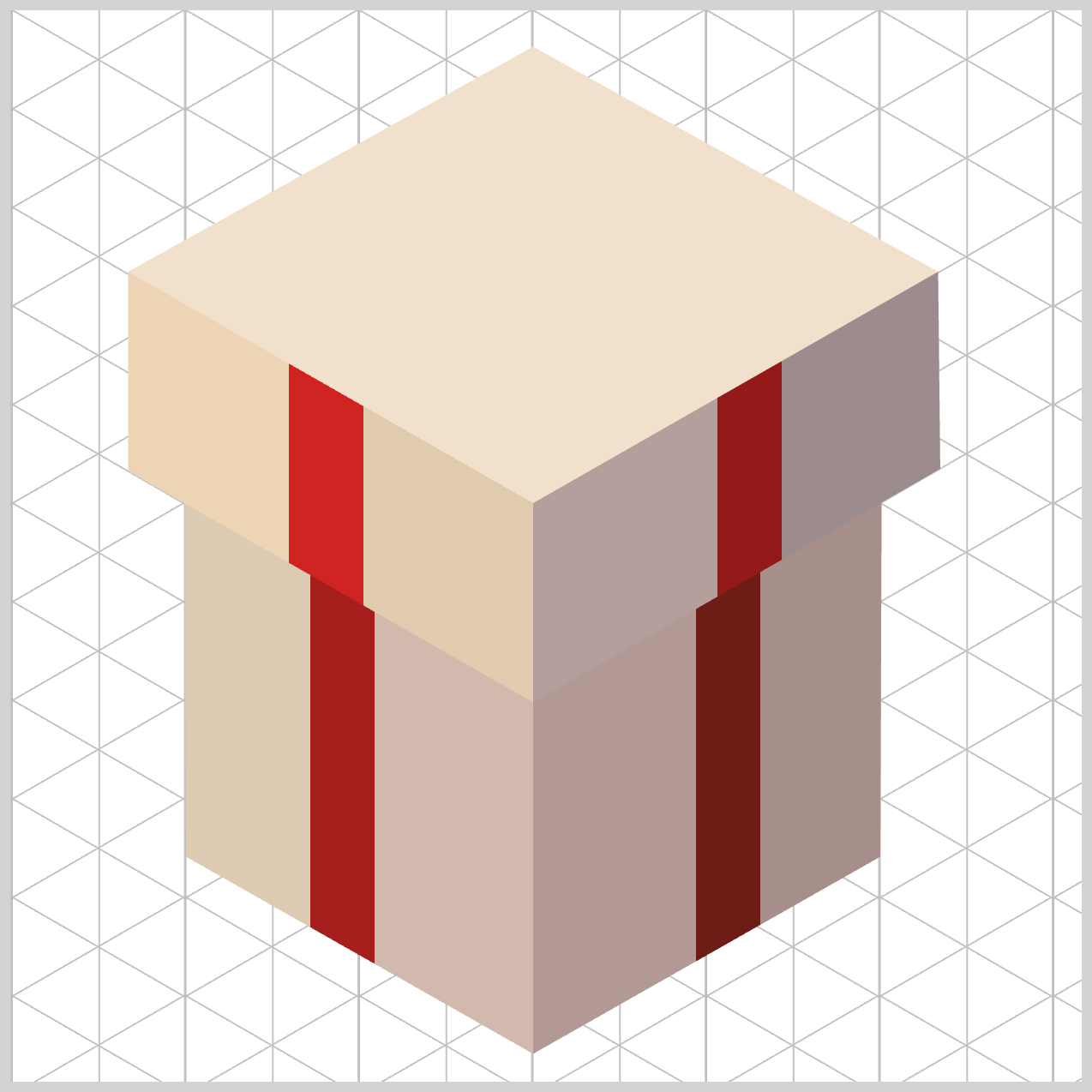
Preview
Here’s a quick sneak peek at the isometric gift box you’ll be creating throughout this two‑part series. By the end of the article, you’ll clearly see how each small piece comes together to form a dynamic, eye‑catching image built entirely with CSS.
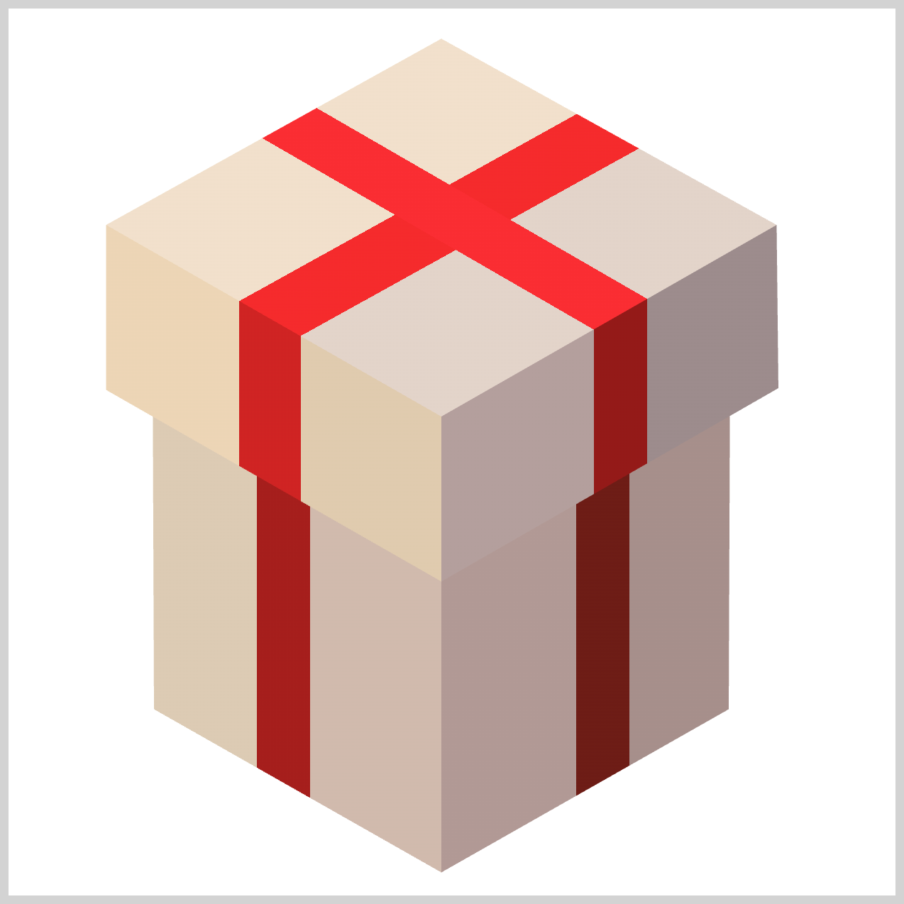
If you haven’t explored Part 1 yet, we highly recommend starting there. It walks through the core building blocks and lays the essential foundation you’ll need to follow the techniques in Part 2 with confidence, clarity, and ease.
 Pyxofy
Prerequisites
Essential CSS and HTML knowledge will help you understand the concepts and techniques introduced in this article. Jump over to this article if you require an HTML and CSS primer.
We assume you have configured tools to modify CSS. If not, this article will guide you through the setup process.
HTML Structure
<div class="container">
  <div class="box-body-left"></div>
  <div class="box-body-right"></div>
  <div class="box-cover-left"></div>
  <div class="box-cover-right"></div>
  <div class="box-top"></div>
</div>
container is the outermost enclosure. It enables the content to be centered and draws a light gray border. The rest of the <div>s represent each image component.
Keep the HTML structure as is for the image to display correctly.
Body and Container <div> CSS
CSS code for the body and container <div>.
/* Body and Container Settings */
/* Center shapes */
body {
  margin: 0;
  padding: 0;
  height: 100vh;
  display: flex;
  justify-content: center;
  align-items: center;
  flex-wrap: wrap;
}

/* Set background and border color */
.container {
  width: 500px;
  height: 500px;
  border: 5px solid lightgray;
  background: white;
  position: relative;
  margin: 5px;
  display: flex;
  justify-content: center;
  align-items: center;
}
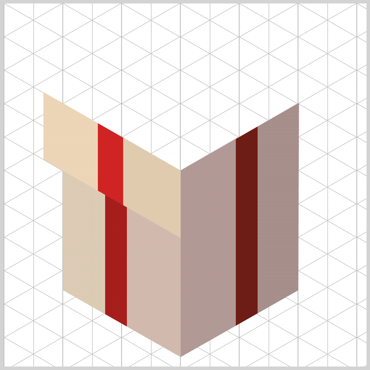
Box Body
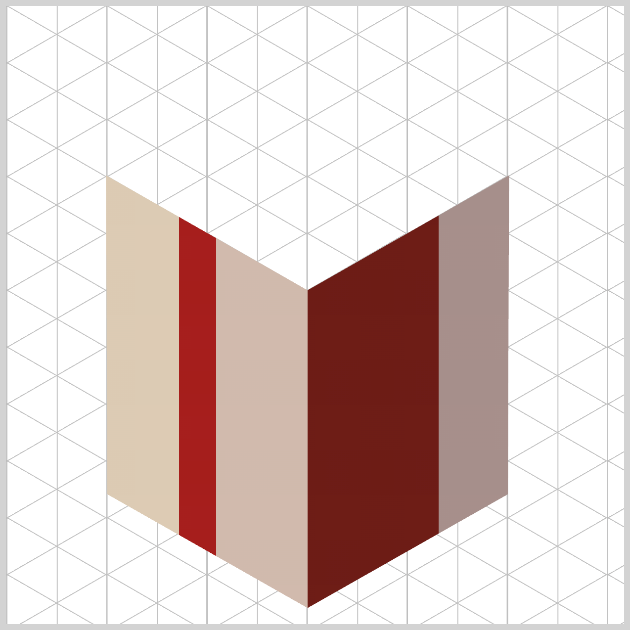
The Box Body is made up of two faces: the left side and the right side. Both faces share the similar visual style, including the base colors and the decorative ribbon‑like gradients. This consistency helps the box feel solid and well‑designed, rather than flat or uneven.
In this section, you’ll learn how to use the CSS linear-gradient() function to create these shared stylistic elements. By applying gradients carefully, you can add depth, shading, and visual interest to both sides of the box using only CSS.
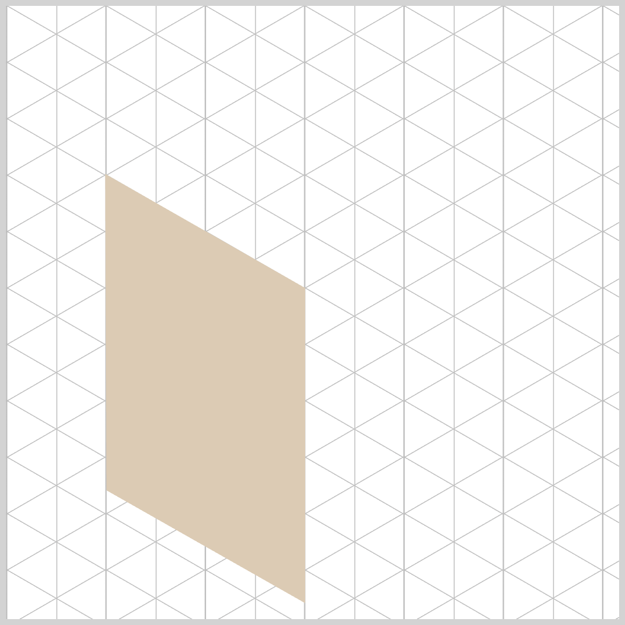
.box-body-left {
  background: linear-gradient(
    90deg,
    #dccbb4 0% 28%,
    #a61e1c 28% 34%,
    #d0baad 34%
  );
}
Let’s breakdown the linear-gradient() function code in detail.
By setting the gradient angle to 90deg, you tell the browser to draw the color transition horizontally, starting from the far left edge and moving smoothly toward the right side. Because this panel represents the left face of the box, a horizontal light direction makes perfect sense. It mimics how light would gently slide across the surface of a real 3D object, helping the box look more solid, and three‑dimensional.
#dccbb4 — Light Tan (0% to 28%)
This color marks the starting point of the gradient, appearing right at the front‑left edge of the left face. It creates a clean, softly lit base that feels warm and welcoming. By placing this lighter tone at the beginning of the gradient, you instantly suggest where the light is hitting the surface, helping the box look sunlit, solid, and realistic.
#a61e1c — Dark Crimson (28% to 34%)
This deep, bold red introduces a narrow accent band that instantly catches the eye. Positioned tightly within the gradient, it forms the first vertical strip of the decorative gift ribbon. The sharp contrast against the lighter beige tones adds definition and richness, giving the box face a crafted, intentional look that feels both festive and refined.
#d0baad — Soft Beige (34% onward)
This color fills in the remaining right side of the box wall, gently closing out the gradient. By transitioning from Light Tan to this slightly darker Soft Beige, the brightness drops just enough to suggest a subtle geometric shadow. This shift helps the panel feel as though it’s moving deeper toward the box’s center spine, adding a quiet sense of depth and elegance without overpowering the design.
You may have noticed that the each color starts and stops at similar percentages. For example the dark crimson color ends at 34% and the soft beige color starts at 34%. The percentage are called color stops and control where each color begins and ends, giving you precise control over highlights, shadows, and decorative accents—like the ribbon effect on the box body.
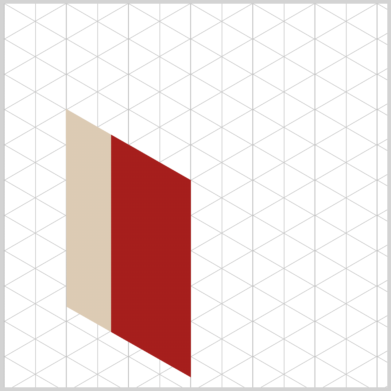
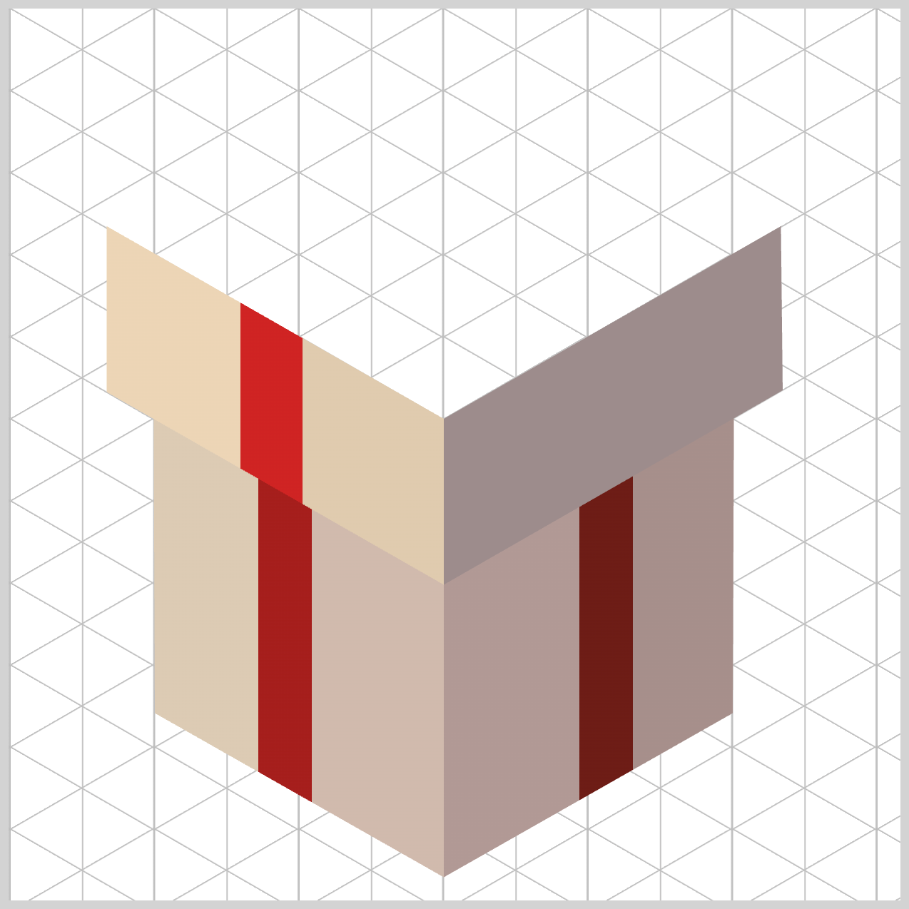
Now that the left face is complete, it’s time to move on to the right face of the box.
Structurally and stylistically, the right face works almost the same way as the left face—using the same base colors and ribbon‑style gradient—but with one key difference: the light direction is reversed.
.box-body-right {
  background: linear-gradient(
    -90deg
  );
}
By adjusting the gradient angle, in this instance by minus 90 degrees, -90deg, we make the shading flow in the opposite direction, ensuring the lighting feels balanced and realistic when both faces are viewed together.
The stripe design (ribbon) is a mirror image of the left face. This mirrored approach keeps the design visually consistent while reinforcing the illusion of a three‑dimensional gift box.
.box-body-right {
  background: linear-gradient(
    -90deg,
    #a68f8b 0% 30%,
    #6d1c16 30% 36%,
    #b19995 36%
  );
}
Just like with the left face, we avoid smooth color blending here and instead force the browser to render sharp, structural edges using carefully placed color stops.
The first color, #a68f8b — Dusty Rose Brown (0% to 30%), establishes the outer‑right surface of the panel. Its muted tone sets a calm, solid foundation and prepares the eye for a strong visual transition.
Next, #6d1c16 — Dark Maroon (30% to 36%) snaps into place exactly at the 30% mark. By matching the end position of the base plane, you create a perfect hard stop, forcing the browser to switch colors instantly. This narrow, high‑contrast band becomes the gift ribbon accent, occupying just 6% of the total gradient before stopping cleanly at 36%.
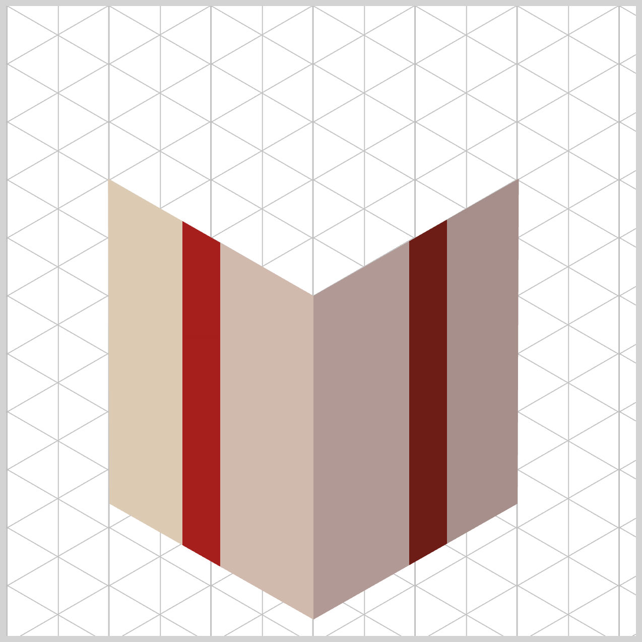
Finally, #b19995 — Muted Rose (36% onward) fills in the remaining left‑hand surface of the box wall. This softer shade helps the panel visually settle as it moves flush against the box’s center corner edge, completing the face with a natural sense of depth and balance.
On the left face component, the design starts with a base of Light Tan / Warm Beige, giving that side a bright, sunlit appearance. In contrast, the right panel uses deeper tones like Dusty Rose Brown and Muted Rose. Because these colors are noticeably darker and more subdued, the right face naturally appears to sit slightly inside an atmospheric shadow. This contrast creates a beautiful sense of depth and helps the box feel three‑dimensional and grounded.
Take a closer look at how the ribbon colors follow the lighting shift. On the brighter left side, the ribbon shines in Dark Crimson, catching the light with a bold, festive glow. As the box transitions into shadow on the right panel, the ribbon smoothly shifts into Dark Maroon. This subtle color change keeps the ribbon visually connected while respecting the lighting environment, making the entire design feel cohesive, realistic, and intentional.
Next up is the Box Cover.
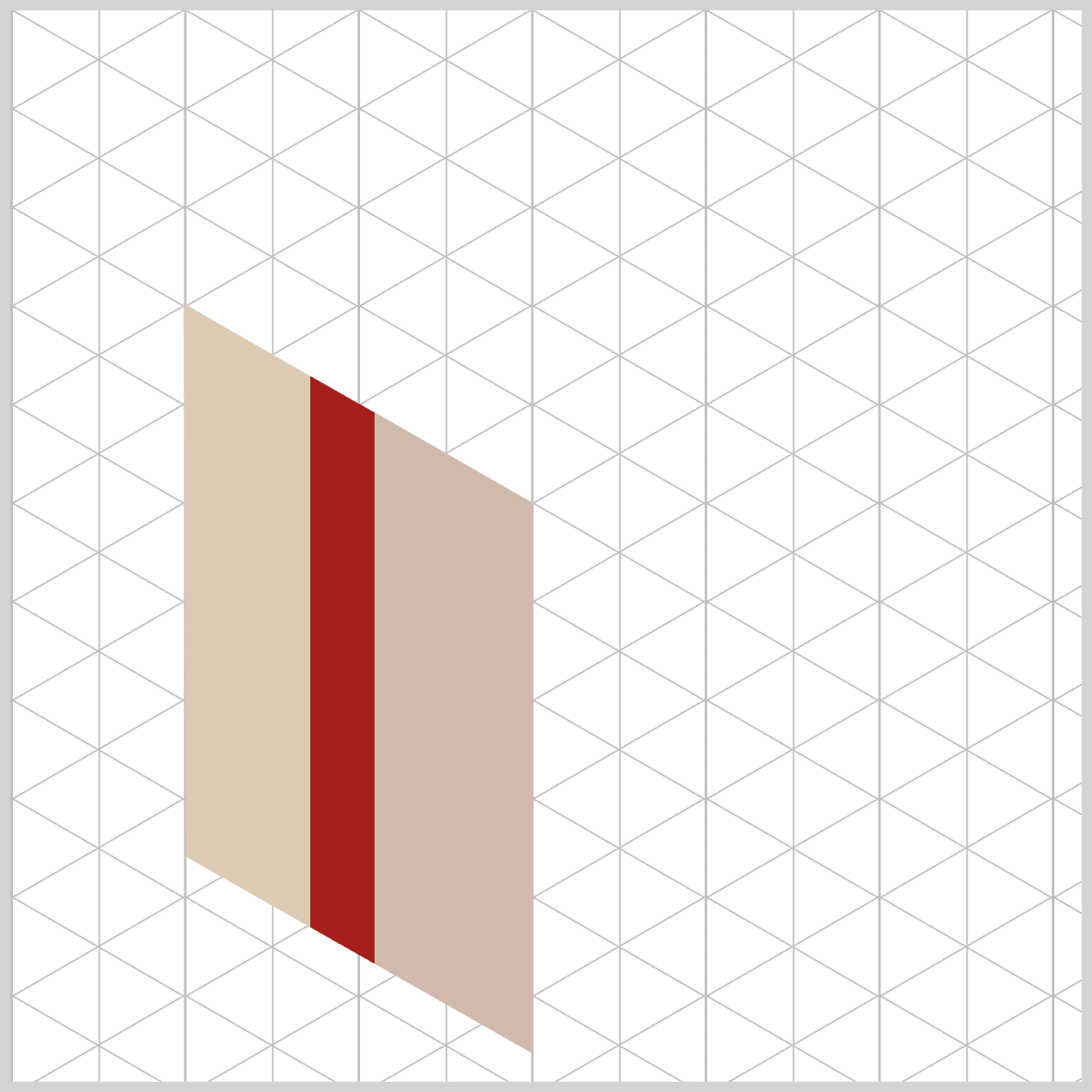
Box Cover
The Box Cover really sells the illusion of a three‑dimensional gift box. Unlike the Box Body faces, the cover sits above the box body, so its styling needs to clearly communicate height, angle, and perspective.
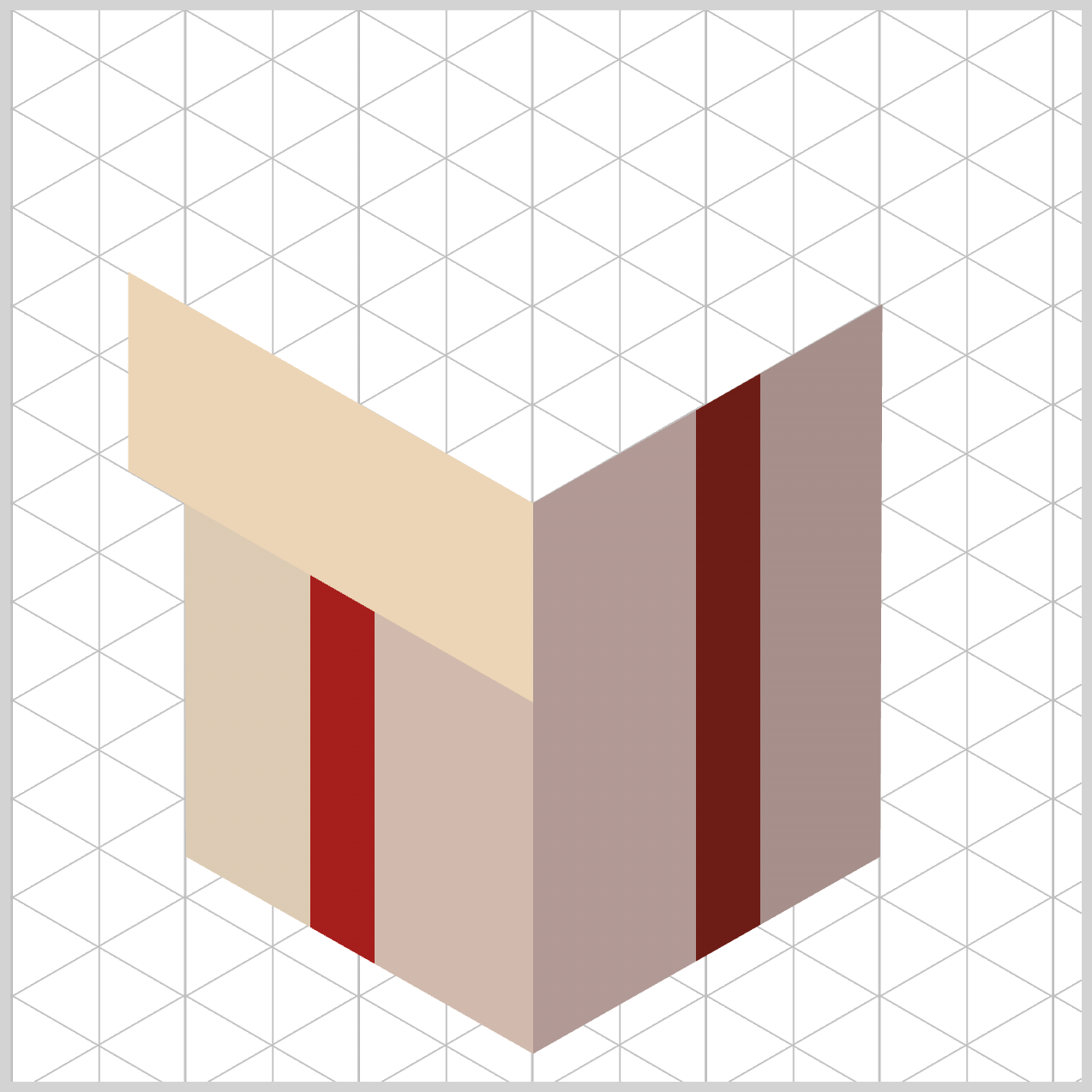
.box-cover-left {
  background: linear-gradient(
    90deg
  );
}
By keeping the gradient angle set to 90deg, you ensure the light direction stays perfectly aligned with the Box Body left face. This creates a unified lighting system across the design, so everything feels visually connected rather than pieced together.
Because the light flows horizontally across the entire left side of the box, both the cover and the box body receive illumination from the same geometric angle. This consistency is what makes the box cover feel like a natural extension of the component below, reinforcing the illusion of a cohesive, three‑dimensional object.
.box-cover-left {
  background: linear-gradient(
    90deg,
    #ecd5b6 0% 26%,
    #cf2323 26% 33%,
    #e0cbae 33%
  );
}
Once again, you use intentional percentage, color stops, overlaps to create crisp, razor‑sharp background patterns.
The gradient begins with #ecd5b6 — Pale Wheat (0% to 26%), which lays down the primary background plane of the lid face. This light, warm tone helps the cover feel elevated and closer to the light source.
Next comes #cf2323 — Strong Red (26% to 33%). The result is a clean, bold color band that maps out the overhanging ribbon loop with precision.
Finally, #e0cbae — Light Sand (33% onward) fills in the remaining right side of the left box cover wall as it moves toward the center seam. This gentle shift in tone softly closes out the gradient, keeping the box cover visually balanced while reinforcing the box’s three‑dimensional form.
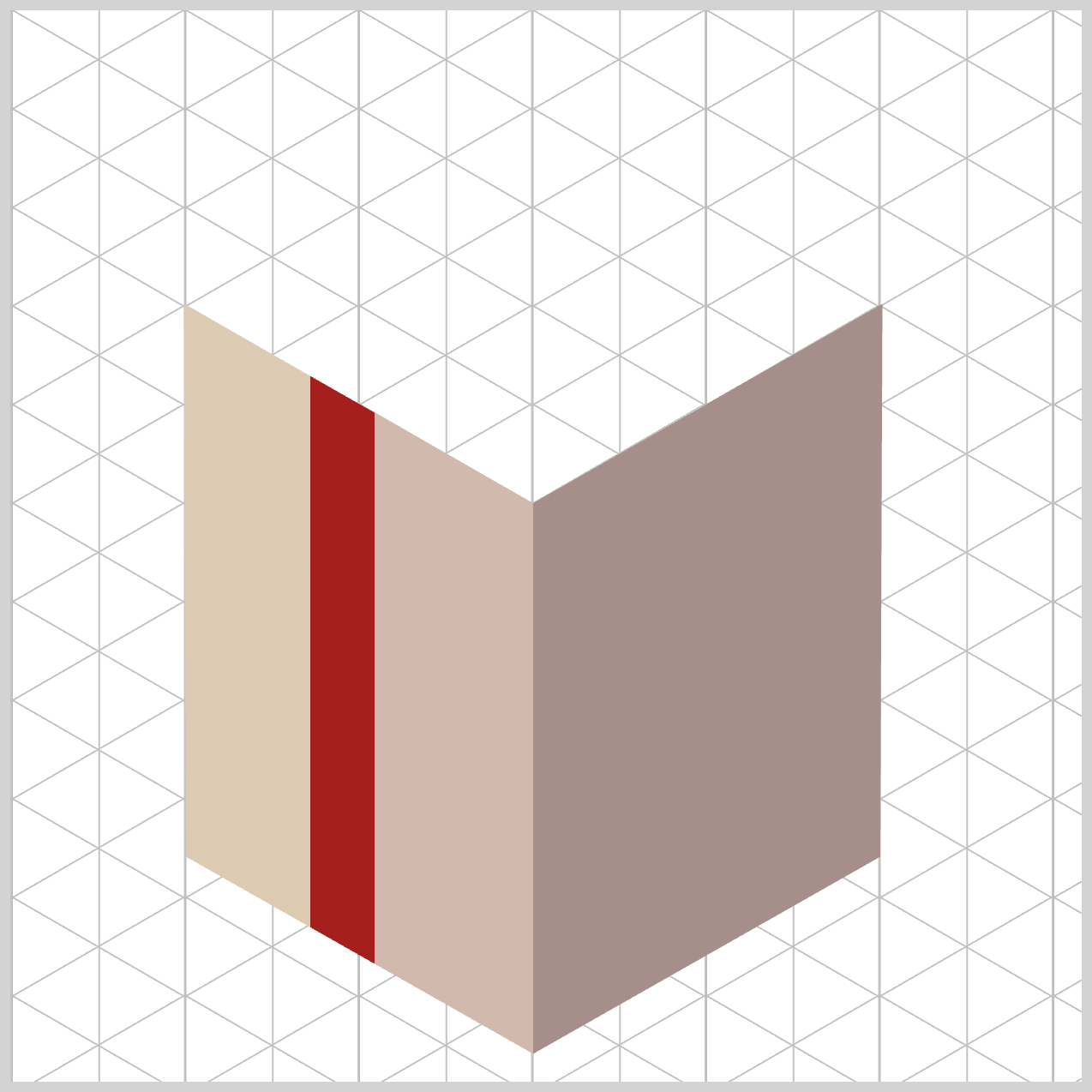
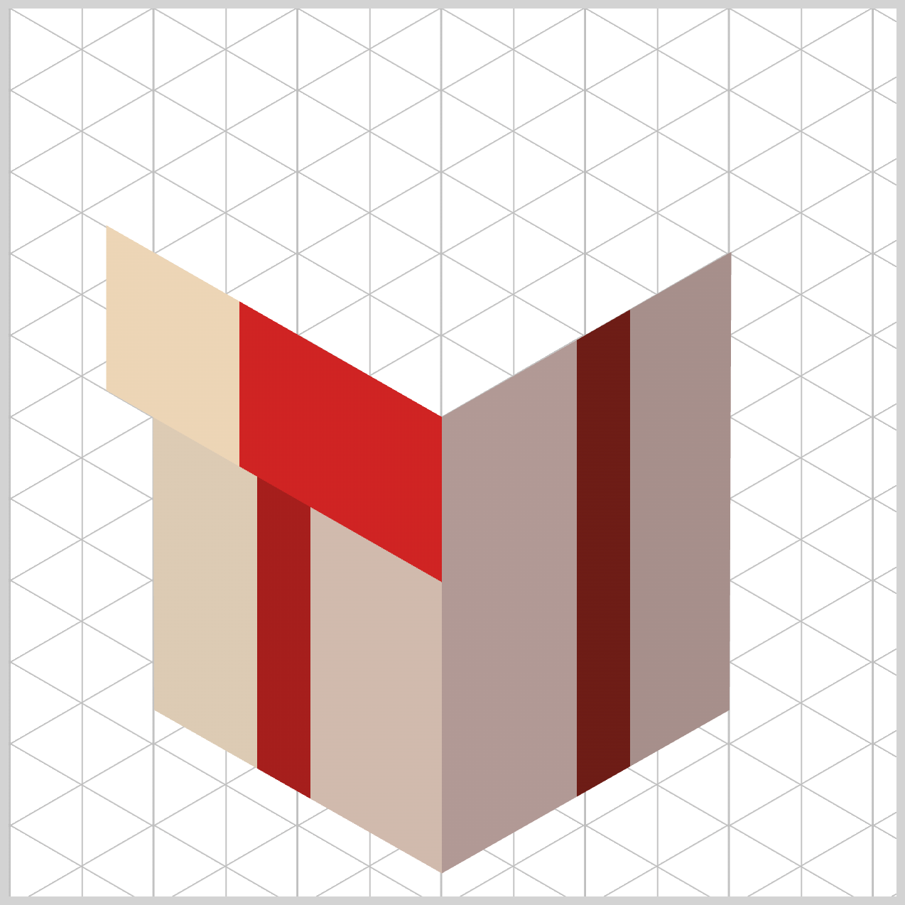
Let’s move on to the right face of the box cover.
.box-cover-right {
  background: linear-gradient(
    -90deg
  );
}
By setting the gradient angle to -90deg, you reverse the horizontal light flow so it moves from right to left. This perfectly matches the direction used on the box body right face panel, keeping the lighting logic consistent across the entire box.
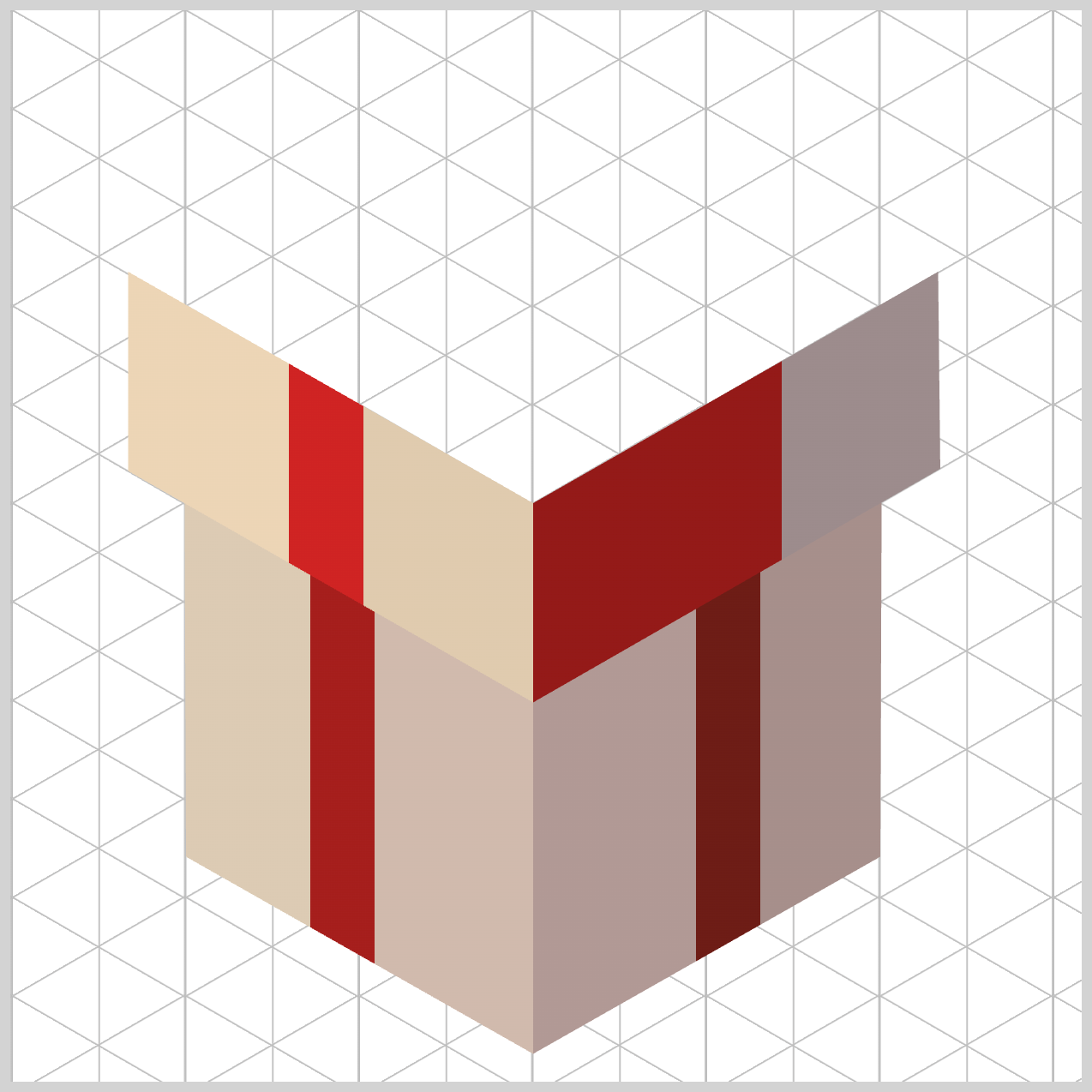
.box-cover-right {
  background: linear-gradient(
    -90deg,
    #9c8c8c 0% 28%,
    #941918 28% 34%,
    #b49f9d 34%
  );
}
The gradient begins with #9c8c8c — Warm Gray (0% to 28%), which establishes the outer‑right face of the box lid. This neutral, muted tone creates a calm, shadowed base, helping the cover feel naturally tucked away from the light source.
Next, #941918 — Deep Red Wine (28% to 34%) snaps in precisely at the same 28% boundary. By locking the start position to the end of the previous color, you force a hard stop transition, instantly forming a clean, narrow color band. This sharp accent defines the right‑facing path of the ribbon, keeping it visually crisp and structurally intentional.
Finally, #b49f9d — Soft Taupe (34% onward) fills the remaining left portion of the lid face as the gradient moves inward. This softer shade gently closes out the surface as it travels flush toward the center corner seam, completing the cover with balance and depth.
Great—now that the Box Cover is fully complete, we can move on to the final section of the build . This last part brings everything together and finishes the illusion of a fully formed, three‑dimensional object.
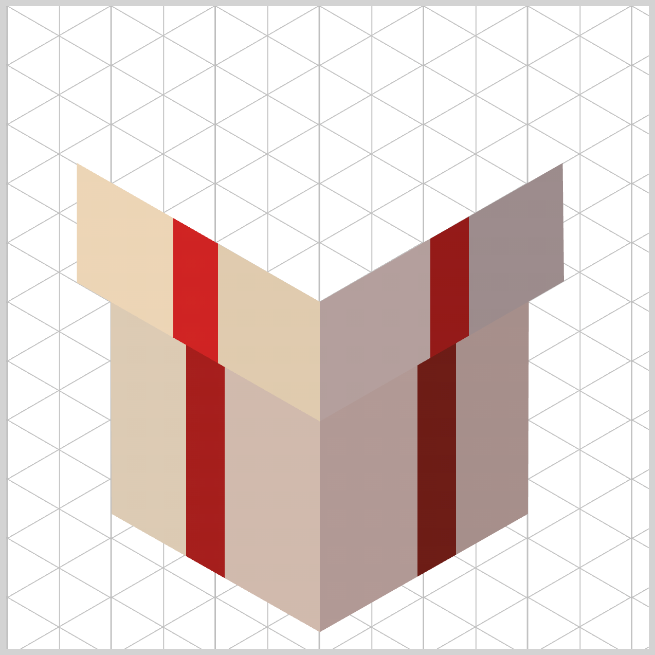
Box Top
In this section, you’ll focus on the top face of the box—the most visually expressive element in the entire design. Here, you’ll combine layered linear-gradient() effects, transparent color stops, to suggest highlights, folds, and surface detail.
At a high level, the front‑end strategy here is all about layering multiple independent backgrounds to work together as one. Instead of relying on a single image or complex markup, you stack carefully crafted linear-gradient() layers on top of each other. Each layer plays a small role, but together they weave a unified cross‑ribbon pattern across the surface.
.box-top {
  background: linear-gradient(
      151deg
}
This first ribbon gradient layer defines the base surface of the box top while guiding the intersecting ribbon along a 151deg angle. That diagonal direction mirrors the geometry of the right‑facing walls, helping the entire structure feel visually aligned and structurally sound.
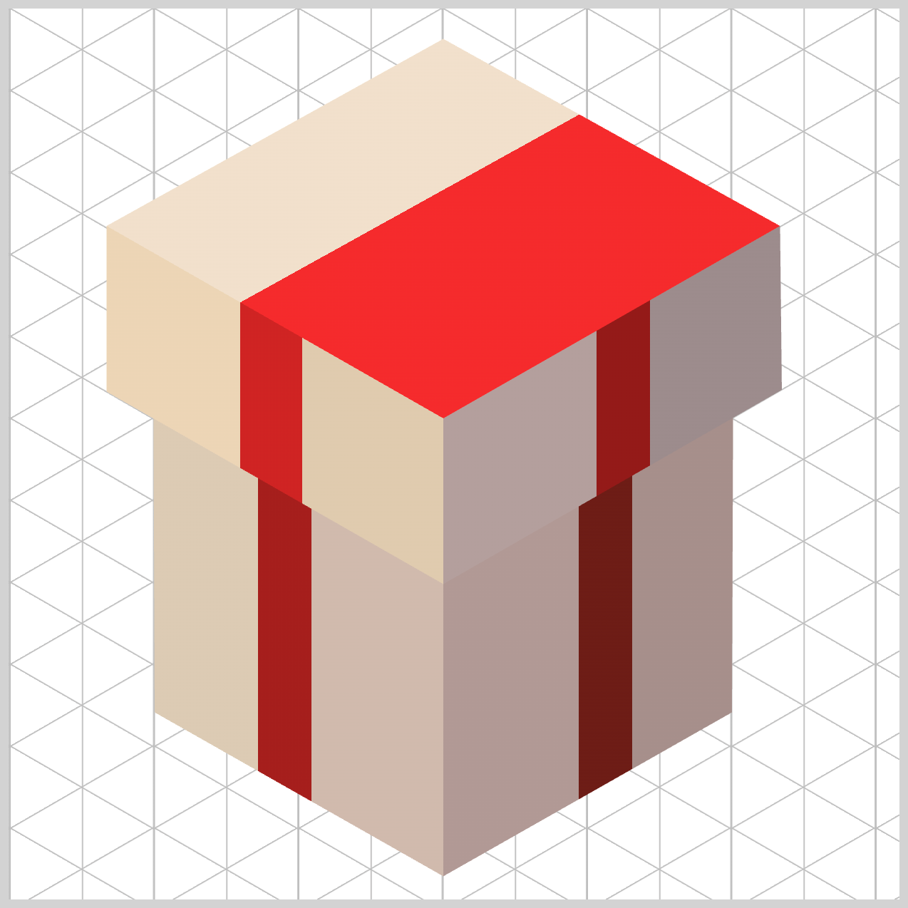
.box-top {
  background: linear-gradient(
      151deg,
      #f1e0cb 0% 30.5%,
      #f52a2c 30.5% 35.5%,
      #e2d3c9 35.5%
    );
}
The gradient opens with #f1e0cb — Cream Beige (0% to 30.5%), which paints the sunlit front corner of the box top component. This lighter tone immediately tells the eye where the light source is coming from.
Next, #f52a2c — Vivid Red (30.5% to 35.5%) carves out the intersecting ribbon strip. At the precise point where this band passes beneath the top layer, the browser naturally forms a clean cross‑ribbon pattern—no extra markup or images required.
Finally, #e2d3c9 — Light Taupe (35.5% onward) fills the rear quadrant of the lid. By shifting from Cream Beige to Light Taupe, you introduce a gentle lighting falloff, simulating how light fades across a flat roof surface and adding a subtle sense of depth.
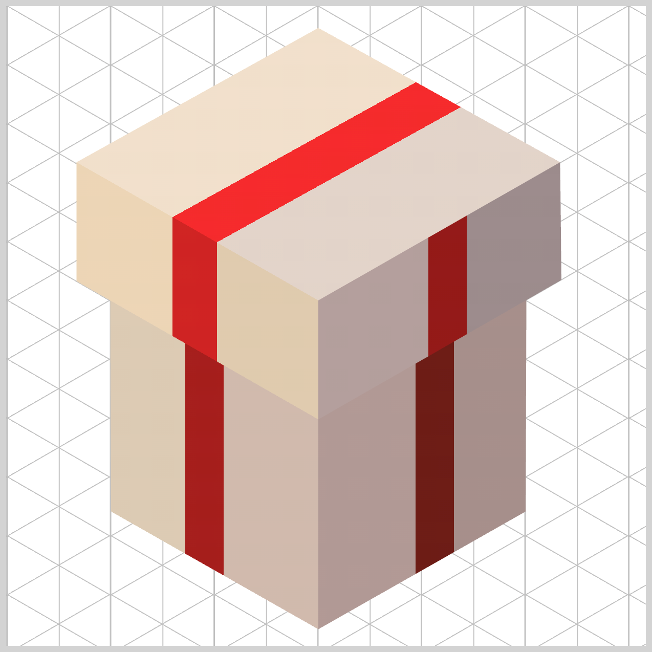
Next, let’s build the second ribbon layer. This ribbon runs in the opposite direction, crossing over the first one to complete the classic gift‑wrap “X” pattern on the box top.
.box-top {
  background: linear-gradient(
      210deg,
      transparent 0% 31%,
      #fa2c32 31% 35.4%,
      transparent 35.4%
    ),
    linear-gradient(
      151deg,
      #f1e0cb 0% 30.5%,
      #f52a2c 30.5% 35.5%,
      #e2d3c9 35.5%
    );
}
This second ribbon layer is angled at 210deg, slicing diagonally across the box top to line up perfectly with the box’s left‑facing sides. This opposing direction is what completes the classic cross‑ribbon look, making the top feel wrapped rather than decorated.
The gradient begins with transparent (0% to 31%), leaving nearly a third of the layer completely clear. This allows the lower gradient layer color to show through naturally, keeping the design lightweight and avoiding unnecessary visual clutter.
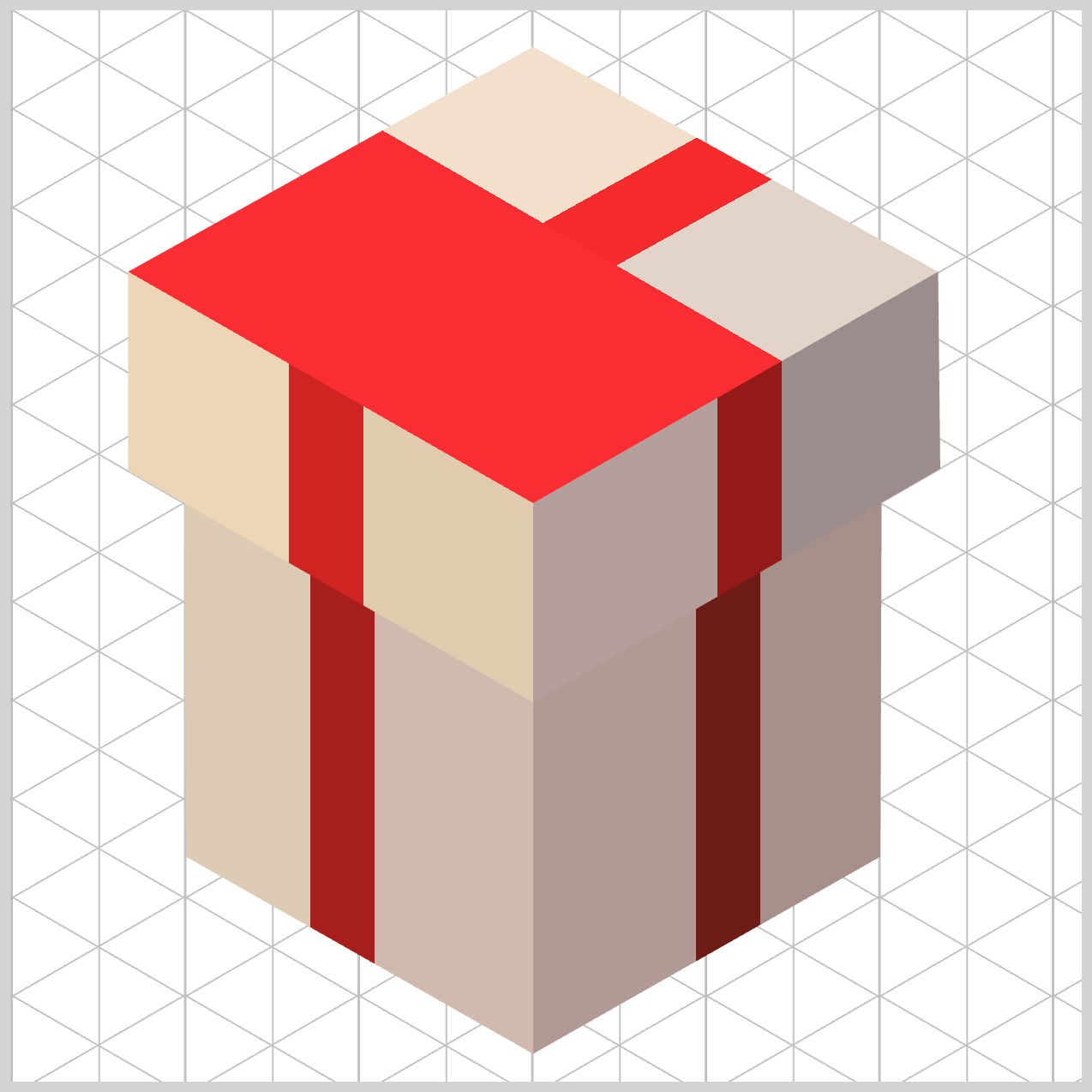
Next, #fa2c32 — Bright Coral Red (31% to 35.4%) snaps into place with a sharp hard stop. This narrow band forms the highlight ribbon strip, catching a strong hit of light from our virtual overhead light source and adding energy to the composition.
Finally, transparent (35.4% onward) clears the rest of the layer, fully revealing the base colors beneath. This selective use of transparency is what makes the ribbon feel woven into the surface, rather than simply painted on top.
You can see and play with the complete code on Pyxofy’s CodePen page.
See the Pen CSS Art – shape() Function & Gradients: Build an Isometric Gift Box by Pyxofy (@pyxofy) on CodePen.
Conclusion
In Part 2 of this two-part article series, you saw how core CSS tools like linear-gradient() function, percentage‑based color stops, transparent layers, and clip-path can be combined to simulate light, depth, and structure.
By controlling gradient angles, enforcing color hard stops, and layering independent backgrounds, the browser naturally renders shadows, ribbon crossings, and surface planes. These techniques keep the design modular, image‑free, and highly reusable, proving that modern CSS alone is powerful enough to create polished, three‑dimensional looking artwork.
What isometric images will you be making with the techniques you learned in this article series? Share your masterpiece with us on LinkedIn, Threads, Bluesky, Mastodon, X (Twitter) @pyxofy, or Facebook.
We hope you liked this article. Kindly share it with your network. We appreciate it.
Related Articles
 Pyxofy
 Pyxofy
 Pyxofy
 Pyxofy