CSS Animation – calc() Function & Gradients: Create an Isometric Tornado - Part 1
Learn to build an animated 3D isometric tornado using only CSS—no images or JavaScript required!

Introduction
In this beginner-friendly guide, you’ll discover how modern CSS—like transforms, gradients, and shadows—can create stunning visuals without images or JavaScript. Step by step, we’ll transform flat shapes into a smooth, animated, and realistic isometric tornado funnel.
- In Part 1, this article, you’ll learn how to build each part of the isometric tornado by combining multiple CSS properties and functions. We’ll focus on shaping basic HTML
<div>elements into layered tornado rings, helping you understand how structure and styling work together to form the final design. - In Part 2, we’ll bring everything to life with animation. You’ll use the CSS
calc()function to control movement and create a smooth, natural side‑to‑side swaying motion, making your tornado feel dynamic, fluid, and realistic.
CSS functions and properties explored in this article:
calc()repeating-linear-gradient()perspectivetransform-style: preserve-3dtransformbox-shadow
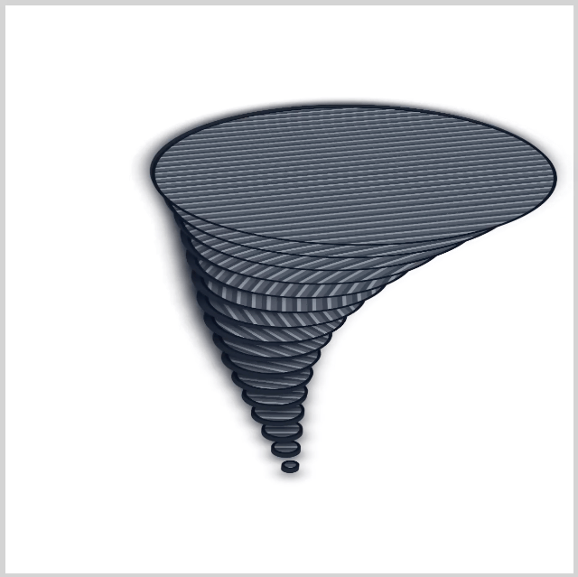
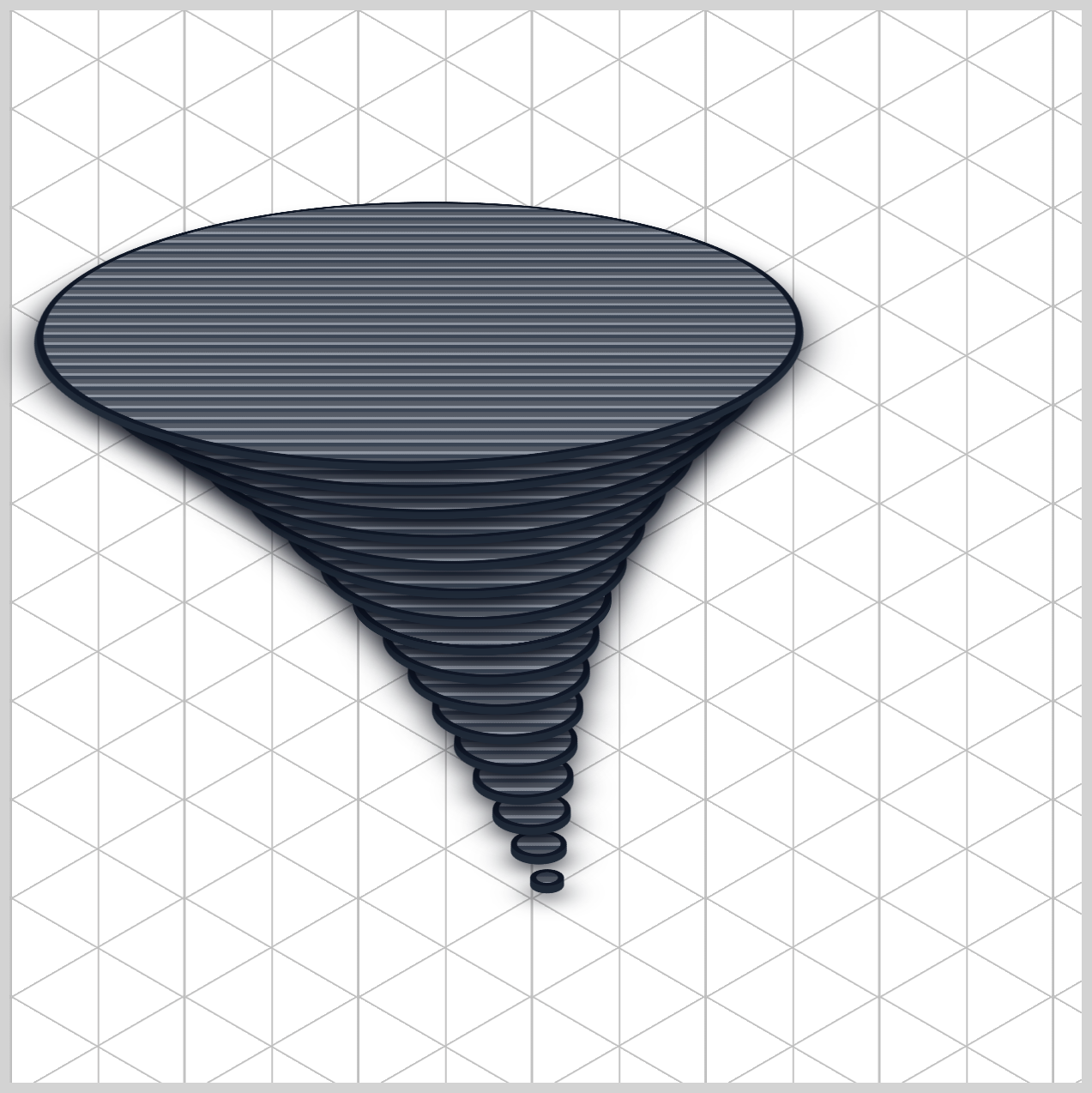
Preview
A quick preview of what you’ll be making in this two-part article series.
Prerequisites
Essential CSS and HTML knowledge will help you understand the concepts and techniques introduced in this article. Jump over to this article if you require an HTML and CSS primer.
We assume you have configured tools to modify CSS. If not, this article will guide you through the setup process.
Please read this article if you’re unfamiliar with CSS animation and the @keyframes at-rule property.
HTML Structure
<div class="container">
  <div class="environment">
    <div class="tornado-funnel">
      <div class="ring" style="--i: 1; --w: 10px"></div>
      <div class="ring" style="--i: 2; --w: 20px"></div>
      <div class="ring" style="--i: 3; --w: 30px"></div>
      <div class="ring" style="--i: 4; --w: 40px"></div>
      <div class="ring" style="--i: 5; --w: 50px"></div>
      <div class="ring" style="--i: 6; --w: 62px"></div>
      <div class="ring" style="--i: 7; --w: 75px"></div>
      <div class="ring" style="--i: 8; --w: 90px"></div>
      <div class="ring" style="--i: 9; --w: 108px"></div>
      <div class="ring" style="--i: 10; --w: 128px"></div>
      <div class="ring" style="--i: 11; --w: 150px"></div>
      <div class="ring" style="--i: 12; --w: 175px"></div>
      <div class="ring" style="--i: 13; --w: 205px"></div>
      <div class="ring" style="--i: 14; --w: 238px"></div>
      <div class="ring" style="--i: 15; --w: 275px"></div>
      <div class="ring" style="--i: 16; --w: 315px"></div>
    </div>
  </div>
</div>
container is the outermost enclosure. It enables the content to be centered and draws a light gray border. The rest of the <div>s represent each animation sequence.
Keep the HTML structure as is for the animation to display correctly.
Body and Container <div> CSS
CSS code for the body and container <div>.
/* Body and Container Settings */
/* Center shapes */
body {
  margin: 0;
  padding: 0;
  height: 100vh;
  display: flex;
  justify-content: center;
  align-items: center;
  flex-wrap: wrap;
}

/* Set background and border color */
.container {
  min-width: 500px;
  height: 500px;
  border: 5px solid #d3d3d3;
  background: #ffffff;
  position: relative;
  margin: 5px;
  display: flex;
  justify-content: center;
  align-items: center;
}
Environment and Funnel
This section of code sets up your 3D “studio” environment—the space where your animation comes to life. You can think of the .environment class as your all‑in‑one stage, camera, and tripod. Without it, the browser would treat everything as flat, 2D shapes with no depth.
.environment {
  perspective: 1500px;
  transform-style: preserve-3d;
  position: absolute;
  top: 420px;
  left: 250px;
}
1.perspective: 1500px;
This property controls how “deep” your 3D scene feels—like adjusting a camera lens.
- A smaller value (like
300px) puts the camera very close, creating a dramatic and slightly distorted view. - A larger value (like
1500px) moves the camera farther away, resulting in a more natural and realistic depth.
In this case, 1500px gives your tornado a clean, believable 3D look without distortion.
2.transform-style: preserve-3d;
This is the switch that enables true 3D layering. By default, browsers flatten everything into 2D.
With preserve-3d, you’re telling the browser:
“Keep my elements in real 3D space—don’t squash them flat!”
This allows each ring in your tornado to sit properly along the X, Y, and Z axes, creating that stacked, dimensional effect.
3.position: absolute;, top: 420px; and left: 250px;
absolute removes the element from the normal page flow so you can position it freely.
These values act like precise coordinates on your screen.
top: 420px;moves the stage down from the topleft: 250px;moves it right from the left edge
Together, they “pin” your 3D scene exactly where you want it to appear.
Let’s walk through the .tornado-funnel code next.
.tornado-funnel {
  position: relative;
  transform-style: preserve-3d;
  transform: rotateX(60deg) rotateZ(-45deg);
}
The .tornado-funnel acts like a projection system that transforms your flat HTML elements into a tilted 3D scene.
1.position: relative;
This sets up a local positioning context for all the .ring elements inside it. In simple terms, each ring will position itself relative to this funnel, not the whole page. This keeps everything neatly centered and controlled within the tornado structure.
2.transform-style: preserve-3d;
Just like in .environment, this ensures that all child elements stay in true 3D space. Without it, your rings would flatten together—but with it, they can stack, overlap, and spread out along the Z-axis, forming a real 3D funnel shape.
3.transform: rotateX(60deg) rotateZ(-45deg);
This is the most exciting part—it controls the viewing angle of your tornado.
rotateX(60deg)tilts the scene upward, like lifting the front edge of a tablerotateZ(-45deg)rotates the scene diagonally, creating a stylish isometric view
Together, these transforms turn a flat stack of circles into a dynamic, angled tornado that feels alive and dimensional.
Now that your environment and funnel are ready, it’s time for the fun part—building the tornado itself!
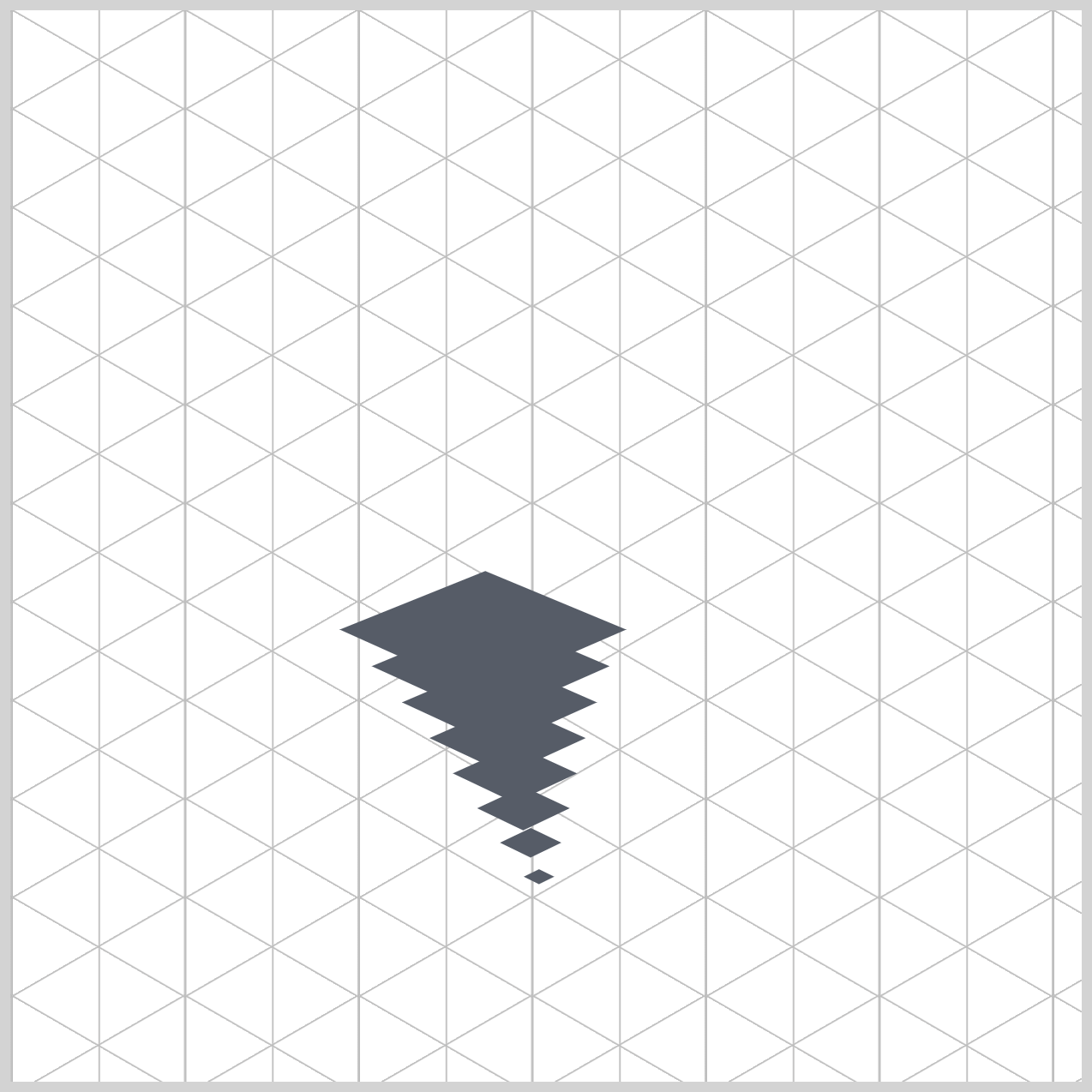
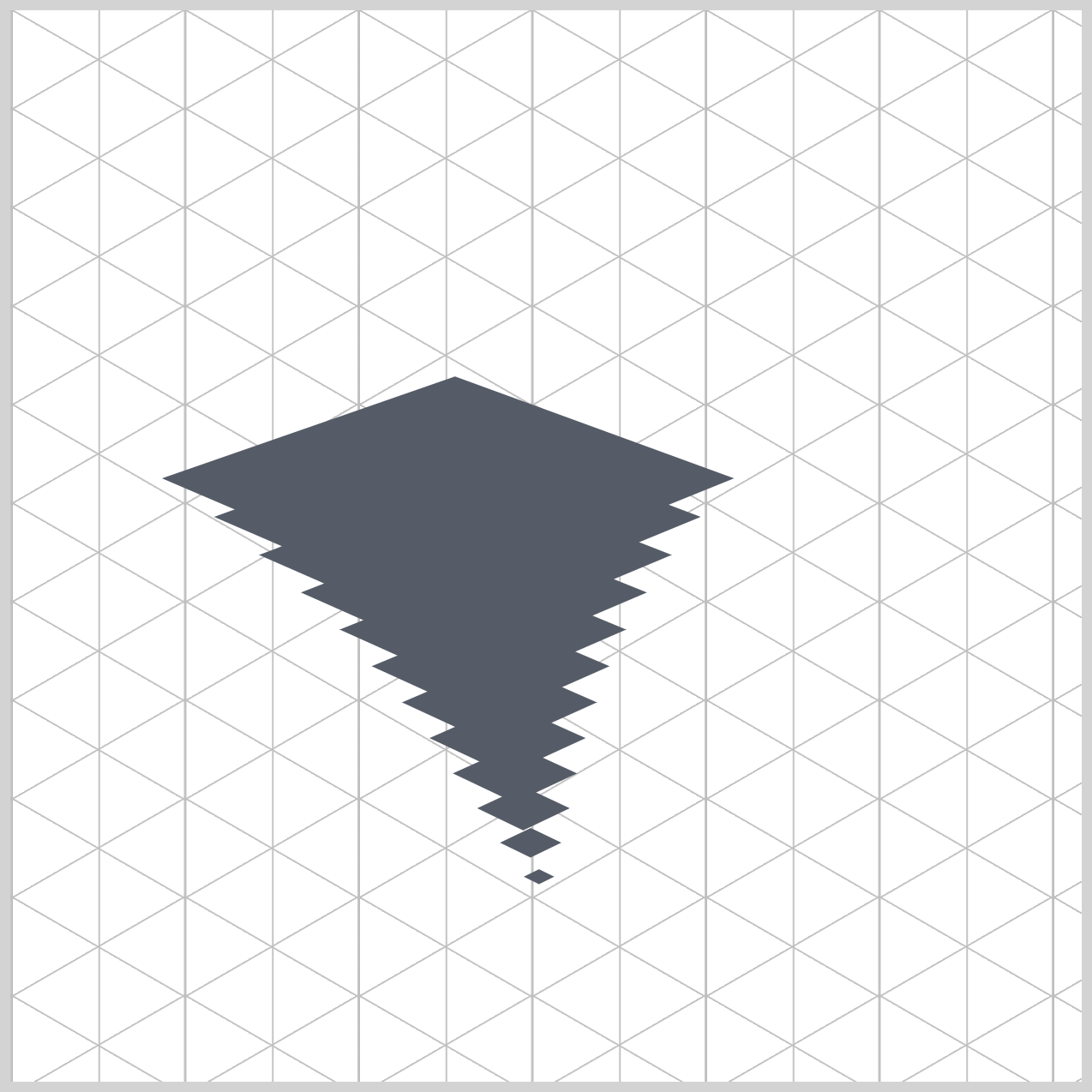
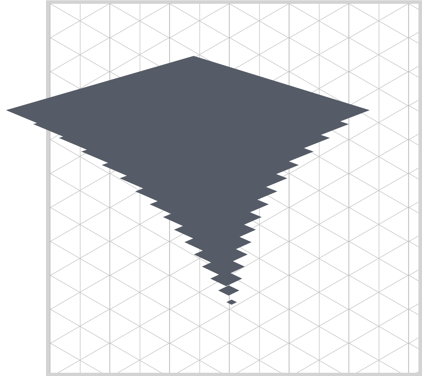
Tornado Basic Shape
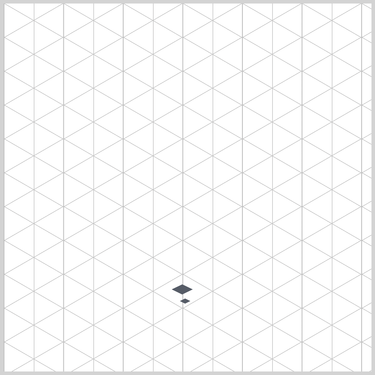
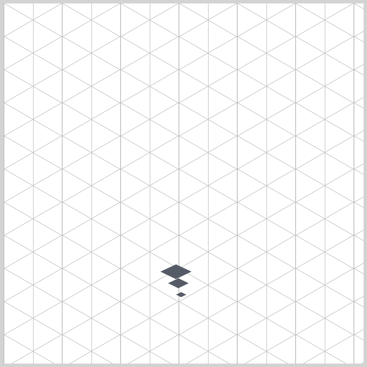
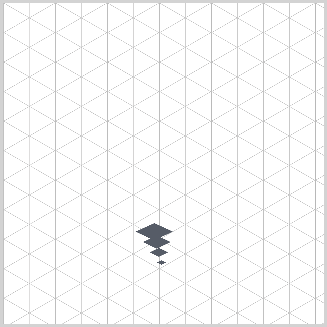
The tornado’s shape is built using 16 layered .ring elements, each one carefully sized to form a smooth funnel .
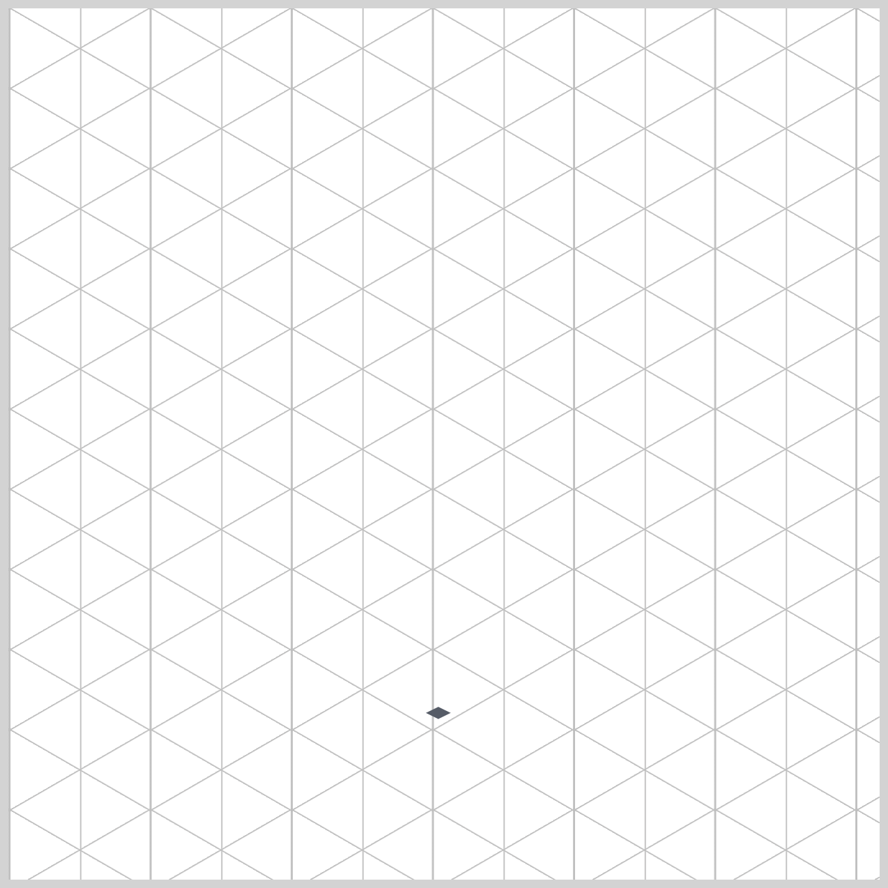
Think of it like stacking circles: the bottom starts small (the “root” of the tornado), and each new ring becomes slightly larger as it moves upward. This gradual increase in size naturally creates the familiar cone-shaped tornado form.
Let’s begin by looking at the HTML structure and its inline styling, which together form the foundation of your tornado.
<div class="tornado-funnel">
  <div class="ring" style="--i: 1; --w: 10px"></div>
  <div class="ring" style="--i: 2; --w: 20px"></div>
  <div class="ring" style="--i: 3; --w: 30px"></div>
  <div class="ring" style="--i: 4; --w: 40px"></div>

  <!-- continues to 16 rings -->

</div>
The tornado is built using multiple <div> elements, each with the class ring. These rings are placed inside the .tornado-funnel container, which keeps everything organized and centered. Each ring represents one layer of the tornado.
What makes this approach powerful is the use of inline CSS custom properties:
--i→ Defines the index (order) of the ring--w→ Defines the width (size) of the ring
For example:
<div class="ring" style="--i: 1; --w: 20px;"></div>
Here’s what’s happening in a simple way:
--i: 1tells the browser this is the first ring (the smallest, at the bottom)--w: 20pxsets its size to 20 pixels
As the rings continue, both values increase:
<div class="ring" style="--i: 16; --w: 315px;"></div>
By gradually increasing the width, each ring becomes larger than the one before it. This creates a smooth, natural funnel shape from bottom to top.
Why this is useful:
Using inline variables makes each ring easy to control and customize without writing separate CSS rules. You can quickly adjust sizes or add more layers just by changing these values.
Now let’s explore the .ring CSS properties.
.ring {
  position: absolute;
  top: 50%;
  left: 50%;
  margin-top: calc(var(--w) / -2);
  margin-left: calc(var(--w) / -2);
  width: var(--w);
  height: var(--w);
}
This block of code is responsible for creating and centering each tornado ring, so they all stack neatly on the same invisible core. It combines simple positioning rules with a bit of smart math to keep everything aligned, no matter the size.
First, position: absolute; allows each ring to float freely instead of following normal page layout rules. This means all the rings can sit directly on top of each other without pushing or spacing out—just like layers in a design tool.
Next, top: 50%; and left: 50%; move each ring’s starting point to the center of the .tornado-funnel. However, this places only the top-left corner of the ring at the center, which makes it look slightly off.
That’s where the clever fix comes in using:
margin-top: calc(var(--w) / -2);
margin-left: calc(var(--w) / -2);
This calculation shifts each ring back up and to the left by half of its own size. Since var(--w) represents the ring’s width, dividing it by -2 produces a negative value that pulls the element into perfect alignment.
The result: every ring is centered, no matter how big or small it is.
Finally, width: var(--w); and height: var(--w); ensure each ring is a perfect square using the custom width value you defined in the HTML. This sets the foundation for turning each ring into a clean circle later.
This section contained a lot of properties and was the longest section in this article. Let’s work on the tornado border in the next section.
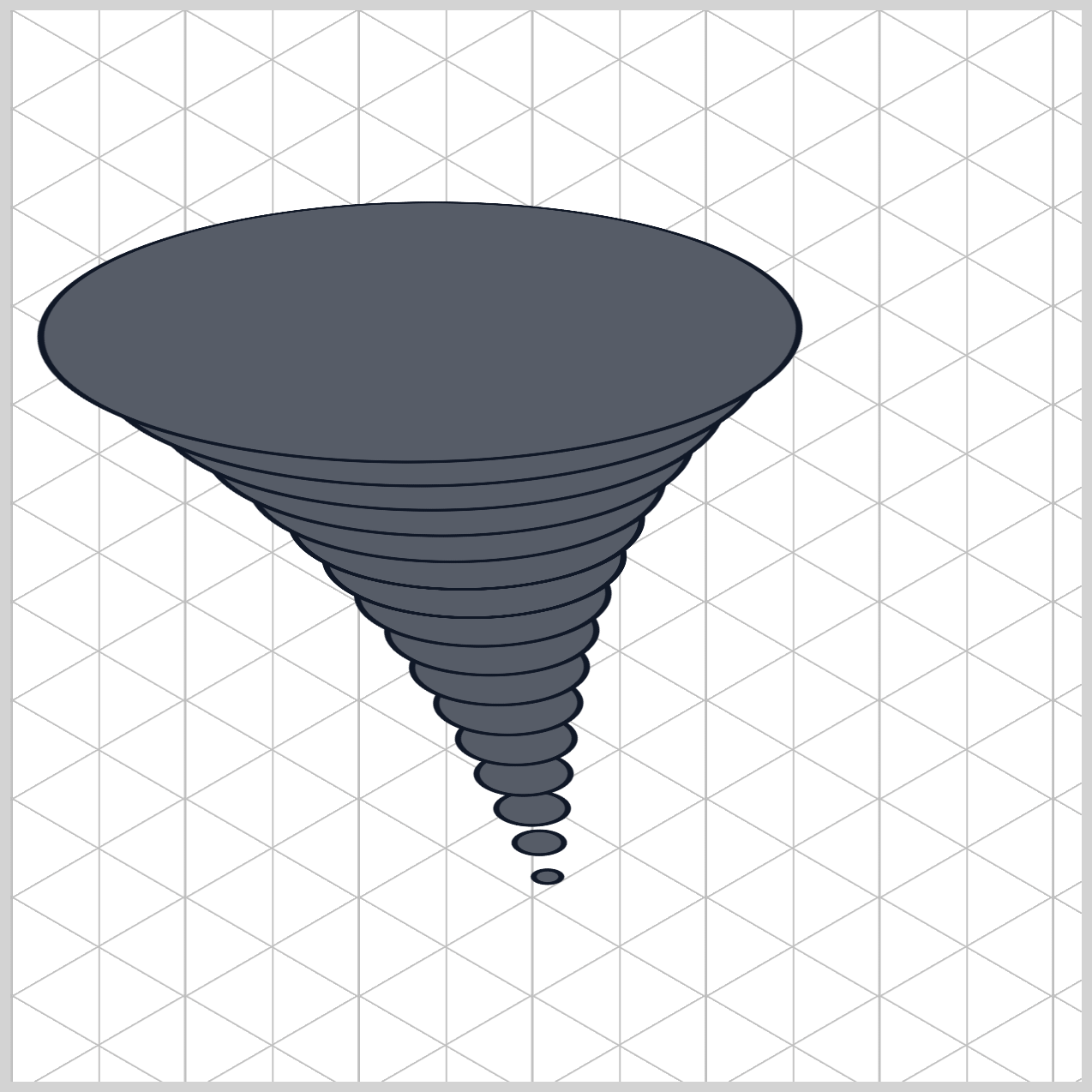
Tornado Rounded Border
In this section, we focus on how each ring gets its clean outline and defined shape. The border plays an important role because it helps separate each layer, making the tornado easier to see and more visually striking.
.ring {
  border-radius: 50%;
  border: 3px solid #111827;
}
This code adds visual polish to each tornado ring by shaping it into a circle and giving it a bold outline.
First, border-radius: 50%; transforms each square <div> into a perfect circle. Since both the width and height are equal (var(--w)), setting the radius to 50% smoothly curves all corners until they meet—creating a clean, mathematically precise circle.
Here’s the interesting part: even though each ring is technically a perfect circle, it doesn’t look like one on screen. Because the parent .tornado-funnel is tilted using rotateX(60deg), the browser visually compresses the circle into an oval (ellipse). This effect creates the illusion of depth and perspective, making the rings feel like spinning layers in a 3D space.
Next, border: 3px solid #111827; adds a strong outline around each ring.
3pxcontrols the thicknesssolidensures a continuous line#111827gives it a deep, near‑black color
This border isn’t just decorative—it gives your tornado a sharp, stylized look, similar to cel‑shaded graphics or comic illustrations. It helps each layer stand out clearly, even as everything moves and overlaps.
Let’s work on the tornado stripe gradient in the next section.
Tornado Stripe Gradient
The stripe gradient adds motion, texture, and depth to each ring, making them look like swirling clouds instead of flat shapes.
The background-image uses a repeating-linear-gradient() function, which creates repeating diagonal stripes across each ring. Instead of a solid color, you now get a pattern that looks like wind bands and debris moving through the storm.

.ring {
  background-image: repeating-linear-gradient(
    45deg,
    #9ca3afcc,
    #9ca3afcc 3px,
    #00000000 3px,
    #00000000 8px,
    #374151e6 8px,
    #374151e6 12px
  );
}
This specific property handles Procedural Material Texture Synthesis. Instead of loading a bulky external picture file (like a .png or .jpg), you are using pure CSS code to paint a detailed, vector-based texture pattern directly onto the rings.
For a beginner, the repeating-linear-gradient() function can look like a wall of confusing numbers and color codes. However, it follows a strict "hard-stop" math formula to build clean stripes.
1.The Direction: 45deg
The first value, 45deg, controls the angle of the stripes. This tilts the pattern diagonally from bottom-left to top-right. When your animation rotates, these diagonal lines create a natural sense of swirling motion, just like real wind currents.
2.Each color uses an 8-digit hex code, where the last two digits control opacity:
#9ca3afcc→ a light gray with some transparency#00000000→ fully transparent#374151e6→ a dark gray with strong opacity
3.Instead of a smooth gradient, this code creates sharp, clean stripes using precise pixel stops:
- Light gray from
0px→3px - Transparent from
3px→8px - Dark gray from
8px→12px
4.Why it “Repeats”:
The total pattern length is 12px. After that, the browser simply loops it again and again: 0–12px → 12–24px → 24–36px → ...
This creates an infinite set of evenly spaced stripes across the entire ring.
In the final section, let’s work on the tornado shadow.
Tornado Shadow
In this final section, we focus on the tornado shadow, which adds depth and makes the entire animation feel grounded and realistic.
.ring {
	box-shadow:
		-1px 1px 0 #1f2937,
		-2px 2px 0 #1f2937,
		-3px 3px 0 #1f2937,
		-4px 4px 0 #1f2937,
		-5px 5px 0 #1f2937,
		-10px 10px 15px #030712cc;
}
This block of code is a Volumetric Extrusion Matrix. For a beginner, it reveals one of the most powerful visual design secrets in pure CSS: how to trick the human eye into seeing a thick, multi-dimensional physical object using nothing but a completely flat 2D layer!
1.The Anatomy of a CSS Shadow
Before looking at the stack, let’s remember how a single shadow value is structured in CSS:
/* Syntax Guide */
box-shadow: X-offset  Y-offset  blur-radius  color;
- X-offset: How far right (positive) or left (negative) the shadow shifts.
- Y-offset: How far down (positive) or up (negative) the shadow shifts.
- Blur-radius: How fuzzy or blurry the shadow is.
0means it has a sharp, solid edge like a plastic brick. - Color: The paint applied to the shadow layer.
2.Building Thickness with Layered Shadows
The first set of values stacks several sharp shadows:
.ring {
	box-shadow:
		-1px 1px 0 #1f2937,
		-2px 2px 0 #1f2937,
		-3px 3px 0 #1f2937,
		-4px 4px 0 #1f2937,
		-5px 5px 0 #1f2937,
	``
}
Each shadow is:
- slightly offset (left and down)
- completely sharp (0 blur)
- the same dark color
Because they are placed very close together, they blend into what looks like a solid edge, making each ring feel like it has physical thickness instead of being flat.
3.Adding Atmosphere with a Soft Shadow
The final shadow adds realism:
.ring {
	box-shadow:
		-10px 10px 15px #030712cc;
}
Here’s what makes it special:
- a larger offset pushes it farther away
- a
15pxblur makes it soft and natural - a semi-transparent dark tone keeps it subtle
This creates a gentle ambient shadow, helping the tornado feel grounded in space.
You can see and play with the complete code on Pyxofy’s CodePen page.
See the Pen CSS Animation – calc() Function & Gradients: Create an Isometric Tornado by Pyxofy (@pyxofy) on CodePen.
Conclusion
This article highlights the power of modern CSS to simulate realistic volumetric depth on a flat screen. By combining perspective and dual-axis transform rotations, we warp standard layout boxes into an elegant 3D isometric tornado.
Each property plays a specific role—from shaping perfect circles with border-radius, spacing them using calc(), to simulating motion with repeating-linear-gradient(), to adding depth using box-shadow.
By mastering these fundamentals, you gain the ability to build lightweight, scalable, and high-performance visual effects—perfect for modern web design.
Practice makes perfect! Share your masterpiece with us on LinkedIn, Threads, Bluesky, Mastodon, X (Twitter) @pyxofy, or Facebook.
We hope you liked this article. Kindly share it with your network. We appreciate it.
Related Articles
 Pyxofy
 Pyxofy
 Pyxofy
 Pyxofy