CSS Art – Hot Air Balloon
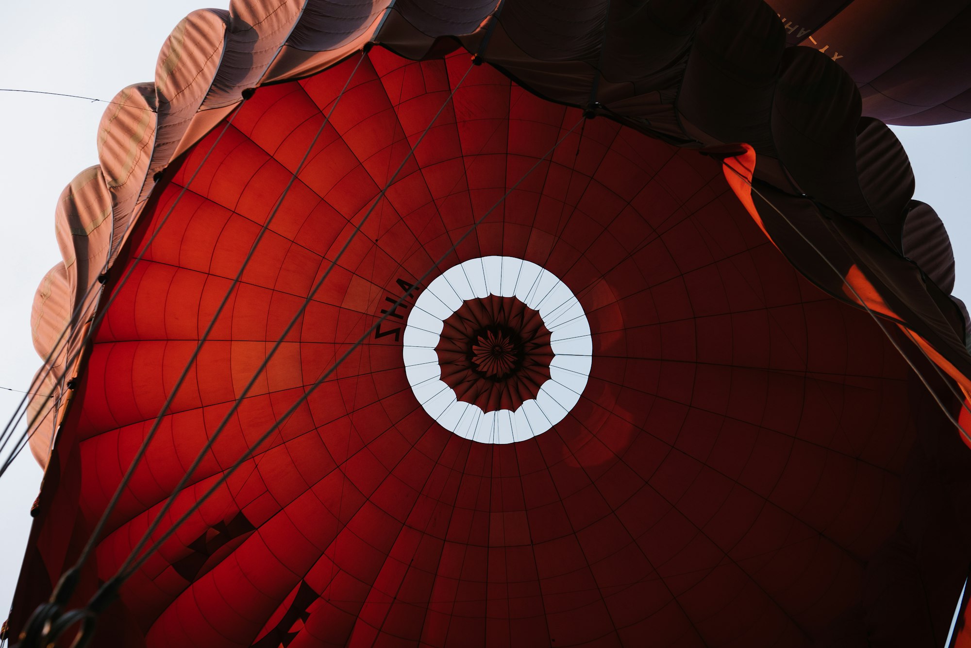
Is it a bird or a plane? It’s a hot air balloon! Learn with us how to make a colorful hot air balloon using CSS in this step-by-step article.
Introduction
Hot air balloons are colorful and come in all shapes and sizes. In this article, you will learn to make a hot air balloon using CSS.
You’ll learn how to use the CSS linear-gradient, polygon() function, radial-gradient, and drop-shadow() function properties.
Preview

Hot air balloon parts:
- Envelope (Bag containing heated air)
- Skirt
- Rigging
- Basket
- Sand Bag
Prerequisites
Essential CSS and HTML knowledge will help you understand the concepts and techniques introduced in this article. Jump over to this article if you require an HTML and CSS primer.
We assume that you have set up tools to manipulate CSS. If you haven’t, this article will show you how to set them up.
HTML Structure
<div class="container">
  <!-- Hot Air Balloon -->
  <div class="envelope"></div>
  <div class="rigging"></div>
  <div class="skirt"></div>
  <div class="sand-bag-side"></div>
  <div class="basket"></div>
  <div class="sand-bag-center"></div>
</div>
container is the outermost enclosure. It enables the content to be centered and draws a light gray border. The rest of the divs represent each image component.
Keep the HTML structure as is for the image to display correctly.
Body and Container Div CSS
CSS code for the body and container div.
/* Body and Container Settings */
/* Center shapes */
body {
  margin: 0;
  padding: 0;
  height: 100vh;
  display: flex;
  justify-content: center;
  align-items: center;
  flex-wrap: wrap;
}

/* Set background and border color */
.container {
  min-width: 500px;
  height: 500px;
  /*   border: 5px solid lightgray; */
  background: transparent;
  position: relative;
  margin: 5px;
  display: flex;
  justify-content: center;
  align-items: center;
  overflow: hidden;
}
Envelope
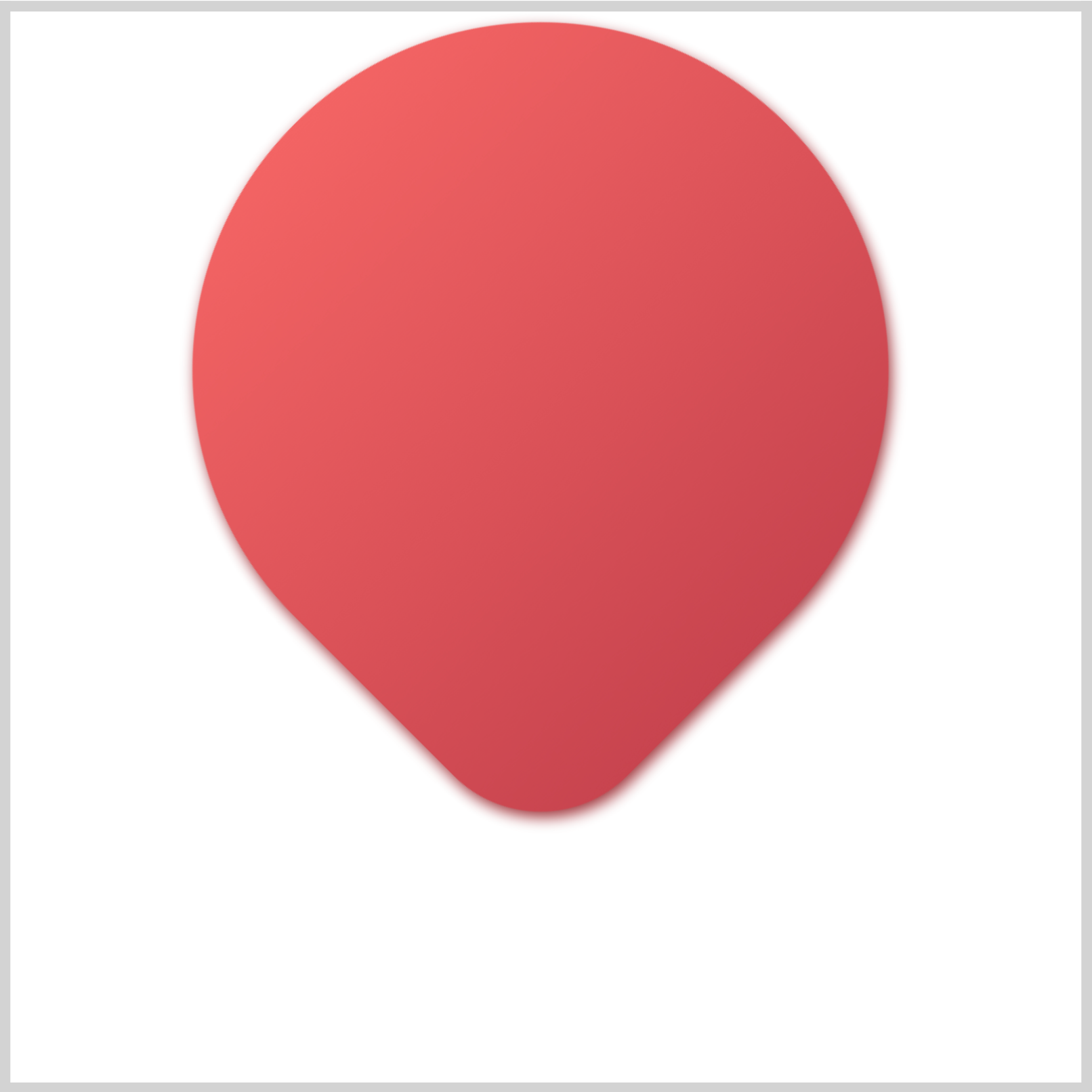
The envelope shape is a modified circle. You’ll use the CSS border-radius property to shape the envelope.
/* Envelope */
.envelope {
  position: absolute;
  top: 5px;
  left: 85px;
  height: 325px;
  width: 325px;
  background: linear-gradient(#c8444f, #f36464);
  border-radius: 150%;
  border-bottom-left-radius: 425%;
  border-bottom-right-radius: 425%;
  border-top-left-radius: 425%;
  border-top-right-radius: 150%;
  transform: rotate(135deg);
  filter: drop-shadow(#9e343c 1px -3px 4px);
}
The height and width CSS properties are both set to 325px. The envelope background is set to a linear gradient using linear-gradient(#c8444f, #f36464);. #c8444f is a dark red while #f36464 is light red hue. With the exception of border-top-right-radius, the rest of the borders are set to 425%. You rotate the shape with transform: rotate(135deg); so that the envelope tip is pointing down. To give the envelope a subtle drop shadow, you use filter: drop-shadow(#9e343c 1px -3px 4px);.

.envelope::before {
  content: "";
  position: absolute;
  top: -20px;
  left: 45px;
  height: 349px;
  width: 252px;
  background: linear-gradient(#ffffff, #e1e0e6);
  border-bottom-left-radius: 80%;
  border-bottom-right-radius: 80%;
  border-top-left-radius: 80%;
  border-top-right-radius: 80%;
  transform: rotate(-135deg);
}
To create the white ellipse, we set height to 349px and width to 252px. The background will be a linear gradient, from white to light gray, linear-gradient(#ffffff, #e1e0e6);. All four border radii are set to 80%. Don’t forget to add transform: rotate(-135deg); to ensure the shape is positioned upright.

.envelope::after {
  content: "";
  position: absolute;
  top: -21px;
  left: 112px;
  height: 350px;
  width: 120px;
  background: linear-gradient(300deg, #c8444f, #ec5c5c);
  border-bottom-left-radius: 80%;
  border-bottom-right-radius: 80%;
  border-top-left-radius: 80%;
  border-top-right-radius: 80%;
  transform: rotate(-135deg);
}
To complete the stripe pattern, you’ll create a red ellipse. Similar to the white ellipse, the border radius is set to 80%. The height property is 350px and the width is 120px. You set the background with linear-gradient(300deg, #c8444f, #ec5c5c); to match the envelope base linear gradient.
OK, you’ve completed the envelope. Up next is the skirt component.
Skirt
The skirt helps channel the hot air from the burner into the envelope (balloon), creating a stove pipe effect and improving fuel efficiency, particularly on windy days.

/* Skirt */
.skirt {
  position: absolute;
  top: 345px;
  left: 196px;
  height: 42px;
  width: 104px;
  background: radial-gradient(circle at top left, #286179, #264154);
  clip-path: polygon(0 0, 100% 0, 87% 100%, 13% 100%);
}
The background is set to a radial gradient with radial-gradient(circle at top left, #286179, #264154);. To make the trapezoid shape, you use the CSS clip-path: polygon() function.
Check this article on how to create advanced shapes with polygon().
Let’s create the rigging in the next section.
Rigging
The rigging connects the envelope (balloon) to the basket. The basket is sometimes referred to as a gondola. You’ll make four riggings in this section.

/* Rigging */
.rigging {
  position: absolute;
  top: 387px;
  left: 232px;
  height: 39px;
  width: 5px;
  background: black;
  box-shadow: 30px 0 0 0 black;
}
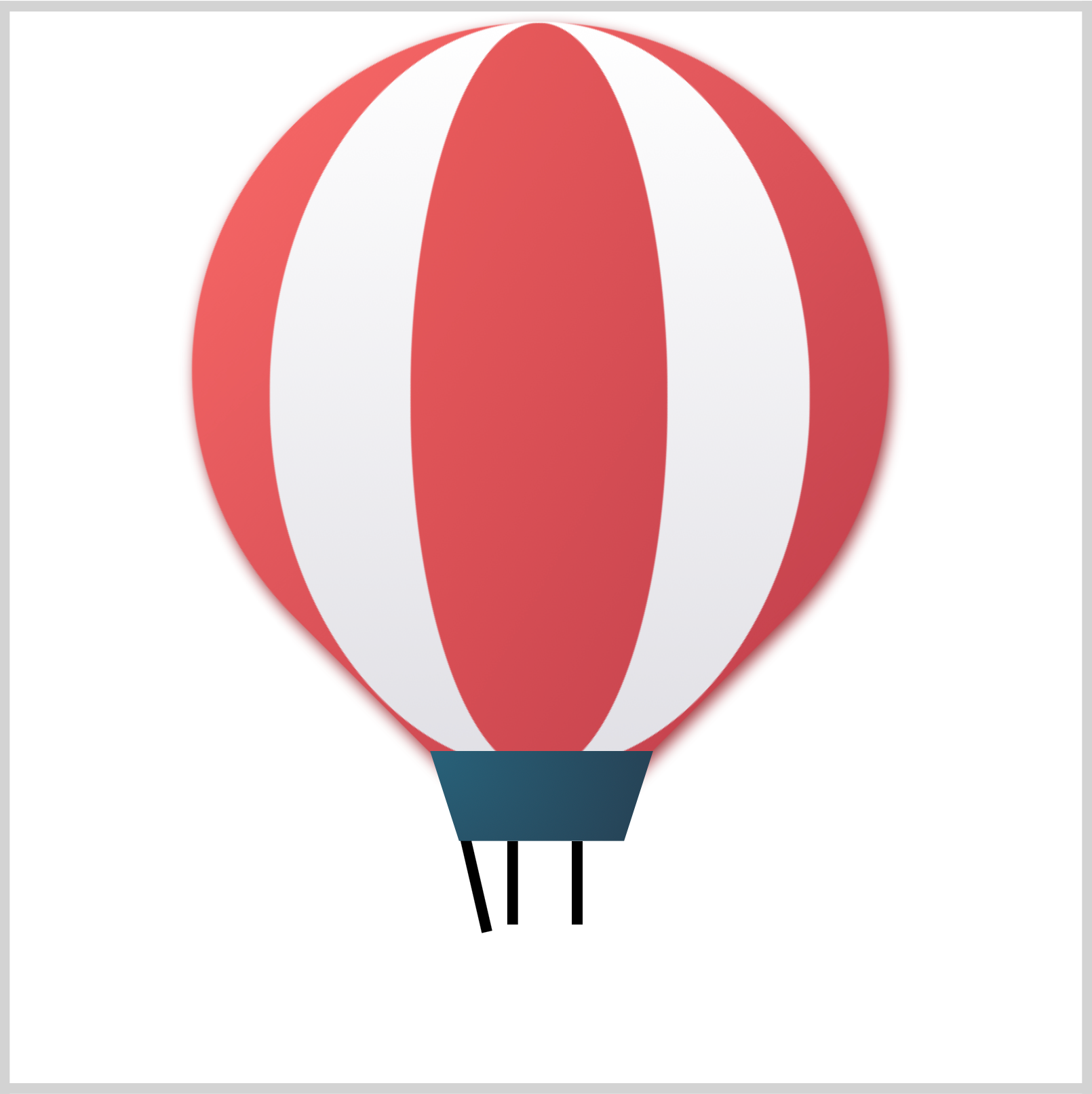
The middle riggings are composed of a thin rectangle with a height of 39px and a width of 5px. The thin rectangle is positioned on the left side. To create the second rectangle, you use the CSS box-shadow property. box-shadow: 30px 0 0 0 black; positions the shadow 30px from the original shape and colors it black.
.rigging::before {
  content: "";
  position: absolute;
  top: -2px;
  left: -17px;
  height: 45px;
  width: 5px;
  background: black;
  transform: rotate(-13deg);
}
You make a thin black rectangle and rotate it with transform: rotate(-13deg);.
.rigging::after {
  content: "";
  position: absolute;
  top: -2px;
  left: 44px;
  height: 46px;
  width: 5px;
  background: black;
  transform: rotate(13deg);
}
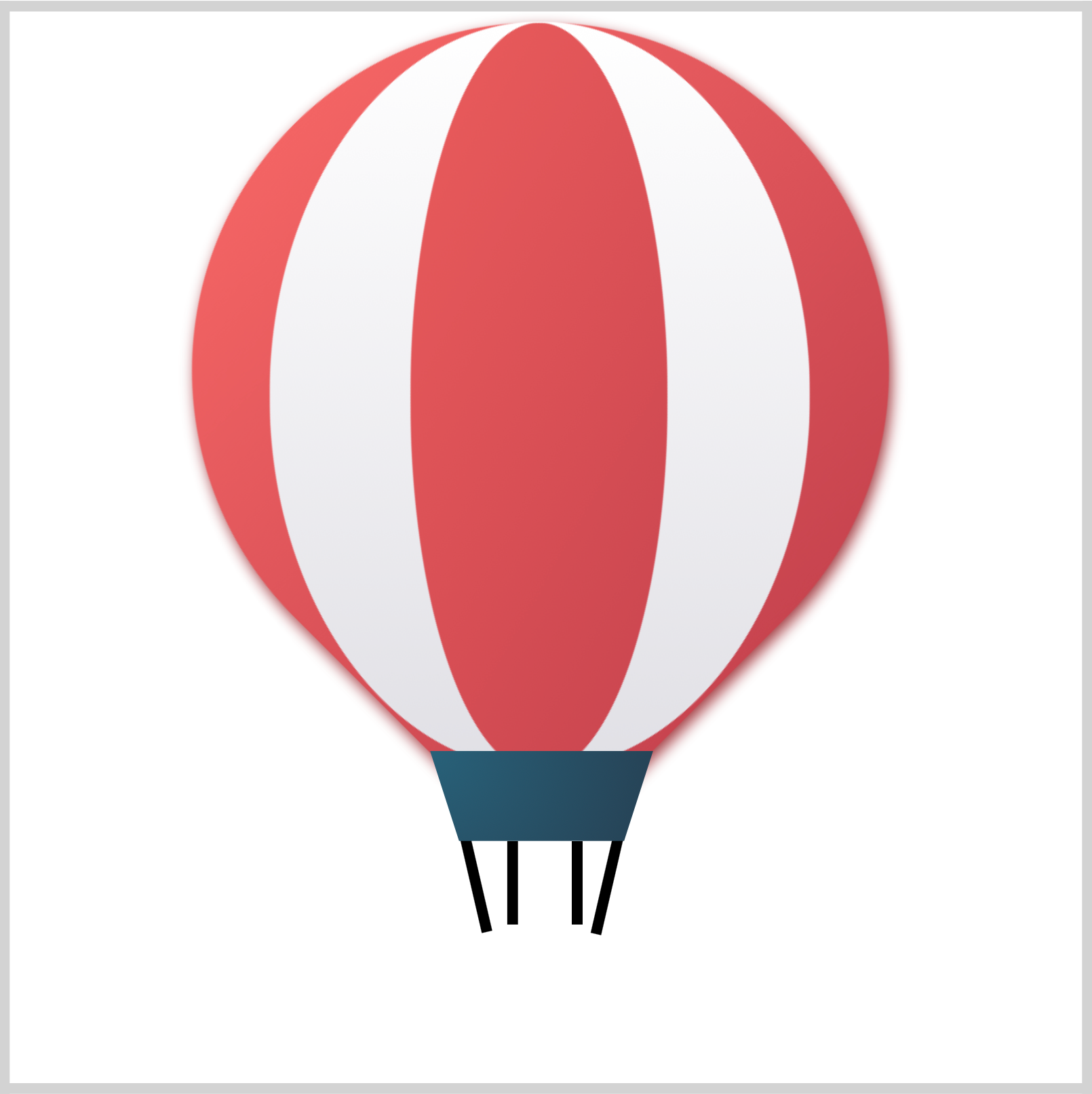
The right rigging is similar to the left rigging. Make sure you rotate it with transform: rotate(13deg);.
Basket
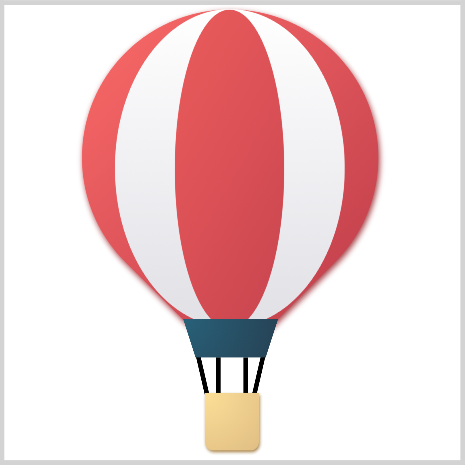
The basket is where the passengers ride and houses the propane gas tanks for the burners.
/* Basket */
.basket {
  position: absolute;
  top: 426px;
  left: 220px;
  height: 63px;
  width: 59px;
  background: radial-gradient(circle at top left, #fddf97, #e0be84);
  border-bottom-left-radius: 15%;
  border-bottom-right-radius: 15%;
  filter: drop-shadow(#a68347 1px 2px 2px);
}
First, you’ll round the bottom left and right of the rectangle using border-bottom-left-radius and border-bottom-right-radius, setting both of them to 15%. You use radial-gradient(circle at top left, #fddf97, #e0be84); to give the background a radial gradient effect. CSS filter: drop-shadow(#a68347 1px 2px 2px); provides the basket with a drop shadow.

.basket::before {
  content: "";
  position: absolute;
  top: 0px;
  left: -5px;
  height: 16px;
  width: 70px;
  background: radial-gradient(circle at top left, #fddf97, #e0be84);
  border-radius: 5px 5px;
  filter: drop-shadow(#a68347 1px 2px 2px);
}
Compared to the basket base, the basket top lip is a rounded, horizontally elongated rectangle. Its corners are rounded using border-radius: 5px 5px;. Similar to the basket base, you give it a radial gradient and drop shadow effect.
Check this article on how to create CSS gradients.
Next up are the sandbags.
Sandbags
The sandbags help balance the basket, especially during windy conditions. You’ll make the center sandbag first, then the side sandbags.

/* Sandbags */
.sand-bag-center {
  position: absolute;
  top: 446px;
  left: 239px;
  height: 21px;
  width: 21px;
  background: radial-gradient(at top left, #ec5c5c, #c8444f);
  filter: drop-shadow(#9e343c 3px 1px 2px);
  border-top-left-radius: 30%;
  border-top-right-radius: 150%;
  border-bottom-right-radius: 150%;
  border-bottom-left-radius: 150%;
  transform: rotate(45deg);
}
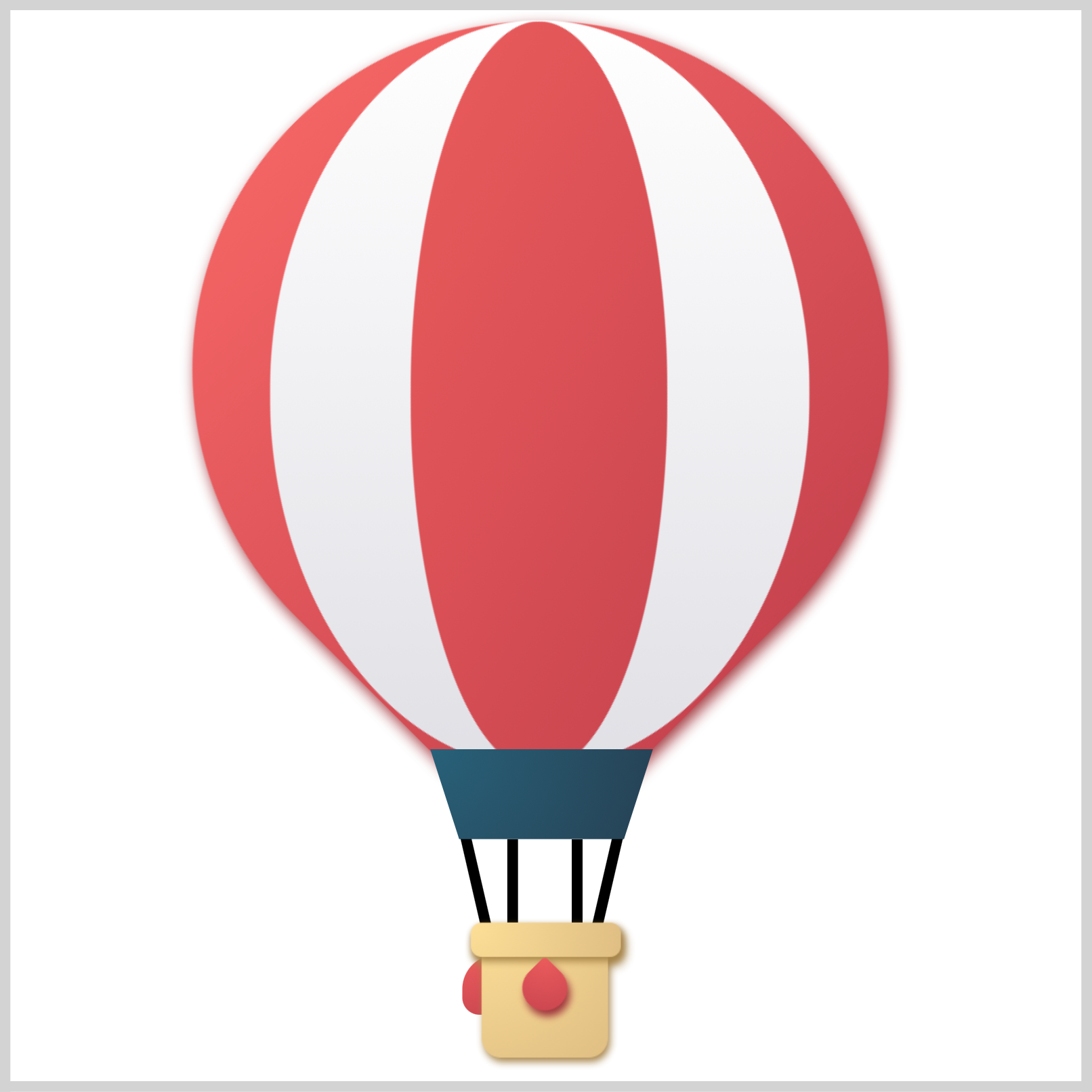
The center sandbag is a smaller and reversed version of the envelope. You rotate it using transform: rotate(45deg);. Similar to the envelope, you give it a radial gradient effect using background: radial-gradient(at top left, #ec5c5c, #c8444f); and a drop shadow with filter: drop-shadow(#9e343c 3px 1px 2px);.
.sand-bag-side {
  position: absolute;
  top: 441px;
  left: 211px;
  height: 28px;
  width: 21px;
  background: radial-gradient(circle at top left, #ec5c5c, #c8444f);
  border-radius: 16px 0px 0px 8px;
}
You make the left sandbag by rounding the top left and bottom left corners of a square shape using border-radius: 16px 0px 0px 8px;. To give the left sandbag a slightly rounded gradient, you use radial-gradient(circle at top left, #ec5c5c, #c8444f);

.sand-bag-side::before {
  content: "";
  position: absolute;
  top: 0px;
  left: 57px;
  height: 28px;
  width: 21px;
  background: #c8444f;
  border-radius: 0px 16px 8px 0px;
}
The right sandbag is a reverse mirror image of the left sandbag minus the radial gradient effect.
You can see and play with the complete code on Pyxofy’s CodePen page.
See the Pen CSS Art - Hot Air Balloon by Pyxofy (@pyxofy) on CodePen.
Conclusion
In this article, you combined multiple CSS properties to make the hot air balloon art. Both radial-gradient and linear-gradient enabled you to give the shapes subtle gradients. You learned how to use box-shadow to create rectangle shapes.
You used the CSS rotate() function to rotate the CSS shape. With the clip-path: polygon(), you made a trapezoid shape, and the filter: drop-shadow() function enabled you to give the shapes drop shadows.
Feel free to modify the CSS code. How about changing the envelope’s primary color from red to orange? How about changing the background from white to sky blue?
Please share your masterpiece with us on LinkedIn, Threads, Mastodon, X (Twitter) @pyxofy or Facebook.
We hope you liked this article. Kindly share it with your network. We appreciate it.
Related Articles
