CSS Art – How to Make a Sunset Scene
In this step-by-step article, we’ll combine CSS linear, radial, conic gradient and mask image to make a sunset scene.
Introduction
Sunsets have beautiful gradients. They fade from fiery reds to deep blues. We will simulate these color transitions using CSS gradient such as linear, radial and conic gradients.
After learning the techniques in this article, you will be able to create your own sunset scene with relative ease.
We don’t assume prior knowledge of CSS or HTML, but it helps if you have some familiarity with how they work. Jump over to the below article if you need an HTML and CSS primer.
 Pyxofy
We assume that you have set up tools to create CSS art. If you haven’t, the below article will show you how to set them up.
Pyxofy
Before we start making the sunset scene, we recommend you read the below article about CSS gradients.
Pyxofy
CSS linear, radial and conic gradients will be our tool of choice to create the sunset scene. If you’re already familiar with CSS gradients, dive right in to the article.
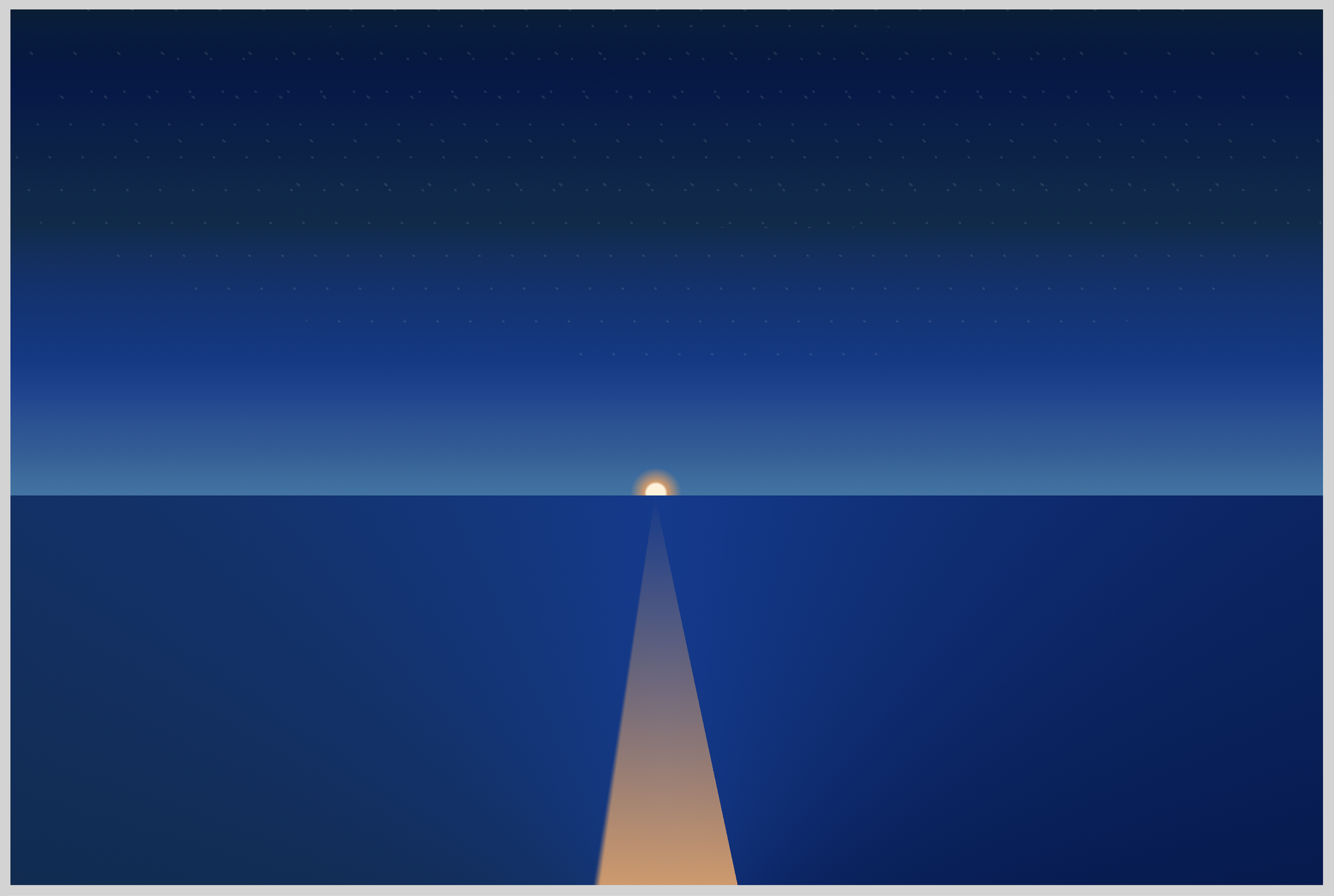
Sunset Scene Preview
We will be creating this image with CSS gradients. It may look daunting at first glance, but we will break down each component, explain how to make them with CSS.

Five components make the sunset scene.
- Ocean
We will use conic-gradient to simulate the ocean. Oceans during sunset have color transition from light blue to deep blacks. - Sky
Sunset skies can range from bright yellow, fiery orange fading to blue and then to pitch darkness. We will use linear-gradient to create the sky for our sunset. - Sun
Compared to the midday, sunset sun is much smaller, milder. The core is still bright white, but the outer edges fade to yellow then orange. Using radial-gradient we will simulate the sunset sun. - Stars
Stars during sunsets have different degrees of brightness. Some you don’t see clearly because of the sun. But as the sun rays weaken, the sky turns to pitch black. This is when the stars are brightest. We will use radial-gradient to make a dot pattern to simulate stars. - Sun reflection
If you’re viewing a sunset or sunrise by the sea or ocean, you will definitely see its reflection on the water. By combining conic-gradient, linear-gradient and mask-image, we will simulate the sun's fading rays before it goes below the horizon.
HTML Structure
Here’s the HTML code for the sunset scene.
HTML code:
<div class="container">
	<div class="sky">
        <div class="sun"></div>
        <div class="stars"></div>
    </div>
    <div class="ocean"></div>
    <div class="sun-reflection"></div>
</div>
<div class="container">serves as our container. We will give the container a light gray border.<div class="sky">will enclose both thesunandstars.- Next is
<div class="ocean"></div>and finally<div class="sun-reflection"></div>. - It’s important that
sun-reflectionbe afterocean. If this is reversed,sun-reflectionwill be positioned behindocean, and will not be visible.
Next, let’s style the container surrounding the sunset scene.
Container
Our container will be wider by about 200px compared to its height.
border: 5px solid lightgray; gives our container a light gray border.
CSS code:
.container {
  width: 600px;
  height: 400px;
  border: 5px solid lightgray;
  position: relative;
  display: flex;
  justify-content: center;
  align-items: center;
}

You can change the border color to whatever you prefer.
Do take caution with how the border color contrasts with your background color. If you have a dark or black background, you may want to make your border color a lighter shade and vice versa.
Let’s start with the ocean.
Ocean
For the ocean, we want to simulate a transition from a light blue center to a dark outer edge.
CSS code:
.ocean {
  position: absolute;
  width: inherit;
  height: 178px;
  left: 0px;
  top: 222px;
  background: conic-gradient(
    from 90deg at 50% 125%,
    #021e34,
    #055ca7,
    #052b4c,
    #003b90,
    #00174a
  );
}

Let’s break down the ocean code.
We’re using the CSS conic-gradient() function to create the ocean gradation.
from 90deg at 50% 125%
The conic gradient starts from90deginstead of the default0degangle. With50%we shift the starting position to 50 percent on the x-axis or horizontal position. We move the gradient down the y-axis or vertical position with125%. This pushes the gradient out of the visible area, but it gives us the shiny middle portion surrounded by dark colors.#021e34, #055ca7, #052b4c, #003b90, #00174a
These are different Hexadecimal (hex) colors to simulate different shades of blue. You can use gradient generators to make your own color combination.
For simplicity’s sake, we only used a couple of colors. There are no limits as to how many colors you can use. Add or subtract colors. Experiment until you find the best-looking colors that matches your preference.
Sky
For the sky, we’re using the linear-gradient() function. Linear gradients are great for top to bottom color transitions.
CSS code:
.sky {
  position: absolute;
  width: inherit;
  height: 222px;
  top: 0;
  left: 0;
  background-image: linear-gradient(
    0deg,
    hsl(205deg 55% 42%) 0%,
    hsl(207deg 58% 40%) 4%,
    hsl(210deg 63% 37%) 9%,
    hsl(213deg 69% 35%) 15%,
    hsl(216deg 80% 32%) 21%,
    hsl(215deg 98% 27%) 28%,
    hsl(215deg 96% 25%) 35%,
    hsl(214deg 94% 23%) 42%,
    hsl(212deg 91% 20%) 49%,
    hsl(208deg 88% 16%) 56%,
    hsl(210deg 89% 16%) 63%,
    hsl(213deg 91% 15%) 70%,
    hsl(216deg 93% 15%) 76%,
    hsl(220deg 96% 15%) 82%,
    hsl(220deg 98% 14%) 87%,
    hsl(218deg 97% 13%) 91%,
    hsl(215deg 95% 13%) 95%,
    hsl(211deg 94% 12%) 98%,
    hsl(206deg 93% 11%) 100%
  );
}

0degis the default angle. The gradation will start from the top.hsl(205deg 55% 42%) 0%
We’re using HSL (hue, saturation, lightness) color model for the sky. The0%after the HSL color declaration is a color hint. Color hints give the browser “hints” how to transition from one color to another.
By using multiple HSL colors, 19 to be exact, we simulated a smooth gradation from light blue all the way to a deep dark blue color.
Our image is starting to resemble a sunset. In the next section will explore how to create the Sun.
Sun
We will use radial-gradient() function to create the Sun. Do take note that half of the sun will be below the horizon.
CSS code:
.sun {
  position: absolute;
  width: 30px;
  height: 30px;
  top: 206px;
  left: 280px;
  background: radial-gradient(
    circle,
    #fff2d6 20%,
    #d89766 25%,
    transparent 55%
  );
}

circletells the browser to render the gradient as a circle, instead of the default ellipse.#fff2d6 20%, #d89766 25%, transparent 55%
We start with a white center,#fff2d6and transition to an orange hue,#d89766.- The last color we set
transparentso that the orange hue slow fades to the light blue background.
We made the sun small for this image. You can change the size by modifying the width and height properties.
Stars
We’ll split stars into three sections.
- The first section,
.starswill act as the container. .stars::beforeis the first group of stars..stars::afteris the second group of stars.
The ::before and ::after are pseudo-elements. If you’re not familiar with pseudo-elements, check this article for details.
Similar to the sun, we will be using the radial-gradient() function to create the stars.
CSS code:
.stars {
  position: absolute;
  width: inherit;
  height: 150px;
  top: 0;
  left: 0;
}
.stars positions the stars' container on top of the sky. We placed it on the darker portion of the sky.
Let’s work on our first group of stars.
- Stars – First group
CSS Code:
.stars::before {
  content: "";
  position: absolute;
  width: inherit;
  height: 160px;
  top: 0;
  left: 0;
  background: radial-gradient(#fff 5%, transparent 5%);
  background-position: top left, 5px 23px;
  background-size: 15px 15px;
  border-radius: 50%;
  opacity: 0.1;
  transform: skew(20deg);
}

Let’s break down the radial-gradient technique and code we used to generate the Stars.
We can use radial-gradient to generate dot patterns, these are repeating circles. Let’s use the below illustration to explain this.

Here’s the workflow.
- Create a circle.
- Set the rest of the gradient color to transparent.
For this illustration, the light blue color is the transparent area. - Place the circle in the top-left corner.
- Set the size of the gradient.
Now let’s see how this translates to our CSS code.
background: radial-gradient(#fff 5%, transparent 5%);
We use radial-gradient to generate the circle. The rest of the gradient color we set to transparent.background-position: top left, 5px 23px;
We place the circle in the top-left corner of the gradient.5pxis the x-axis or horizontal position.23pxis the y-axis or vertical position.background-size: 15px 15px;
Each gradient is 15px by 15px. By adjustingbackground-size, we can control the size of the gradient.
Repeating dot pattern.
radial-gradient repeat by default, and that’s how we get the below pattern.

Our stars for this image are basic. Try to change the color, position, and background size to your liking. Control the stars opacity by modifying opacity: 0.1;.
Make them bigger, brighter. You can make them more condensed or spread them apart.
- Stars – Second group
CSS code:
.stars::after {
  content: "";
  position: absolute;
  width: inherit;
  height: 130px;
  top: -30px;
  left: 10px;
  background: radial-gradient(#fff2d6 5%, transparent 5%);
  background-position: top left, 15px 15px;
  background-size: 20px 20px;
  border-radius: 50%;
  opacity: 0.1;
  transform: skew(35deg);
}

The only difference for the Second group is the color. Instead of #fff, we used #fff2d6.
We changed transform: skew from 20deg to 30deg for a more blurred effect.
If you’re unfamiliar with CSS skew, check this article.
Let’s tackle our last section.
Sun Reflection
To make the sun reflection, we’re combining conic-gradient, linear-gradient and mask-image. conic-gradient is handy when you want to make irregular shaped triangles. mask-image and linear-gradient will give us the fading effect.
CSS code:
.sun-reflection {
  position: absolute;
  width: 357px;
  height: 178px;
  top: 222px;
  left: 116px;
  background: conic-gradient(
    from 168deg at top,
    #d89766 0deg 20deg,
    #0000 21deg
  );
  -webkit-mask: linear-gradient(#0000, #000);
  mask-image: linear-gradient(#0000, #000);
}
This conic-gradient code gives us the beam like sun reflection.
conic-gradient(
from 168deg at top,
    #d89766 0deg 20deg,
	#0000 21deg
);
from 168deg at top
The conic gradient needs to start from the top. It starts right below the sun.#d89766 0deg 20deg
We choose a medium light shade of orange,#d89766. It will only show between0degand20deg.#0000 21deg
From21degonwards, set to a transparent color,#0000.
Next, linear-gradient and mask-image combination.
  -webkit-mask: linear-gradient(#0000, #000);
  mask-image: linear-gradient(#0000, #000);
linear-gradient(#0000, #000);gives us alinear-gradientstarting with a transparent color,#0000, that fades to black,#000.- We overlay the
linear-gradienton top of theconic-gradientusingmask-image. The mask-image give us the fade effect, where the foreground color is solid but fades in to the distance as it gets closer to the sun. - We use
-webkit-maskbrowser prefix. At the time of this writing, without it, the mask-image effect will not work properly on Chrome-based browsers. This may change in the future.
What does your sunset scene look like? Is it similar to the preview image?
Pat yourself on the back for joining us until the very end of the article! Bravo!
You can see and play with the full sunset scene code at Pyxofy’s CodePen page. You are welcome to fork it and make your own sunset scene.
See the Pen CSS Art - How to Make a Sunset Scene by Pyxofy (@pyxofy) on CodePen.
Conclusion
We used all three CSS gradients to produce this sunset scene.
Linear, radial and conic gradients are great tools to use when you want to have subtle transitions or fades in your CSS art. Gradients can give your CSS art depth and even simulate perspective.
By stacking up multiple colors, we created a fluid gradation between colors. You can stack as much or as little colors. Use your taste or maybe a reference image to guide you.
We demonstrated how to use radial gradient to create dot patterns and modify them to simulate stars. We learned how to combine linear-gradient and mask-image to generate fade effects.
Challenge yourself! How about changing the sunset scene to a sunrise scene? Share your CSS art with us on Twitter @pyxofy, on LinkedIn or Facebook.
We hope you liked this article. Kindly share it with your network. We really appreciate it.
Related Articles
Pyxofy Pyxofy
 Pyxofy