CSS Animation – Linear Path Animation
Recycle your old rulers and fully embrace CSS. Learn how to animate a circle shape along a straight, linear path in this step-by-step article.
Introduction
Straight, crisp linear lines are the foundations of great animation.
In this article, we’ll learn how to combine multiple linear paths to draw then animate basic shapes, draw scribbles and other interesting forms.
Preview
Pulse
Scribble
Cone
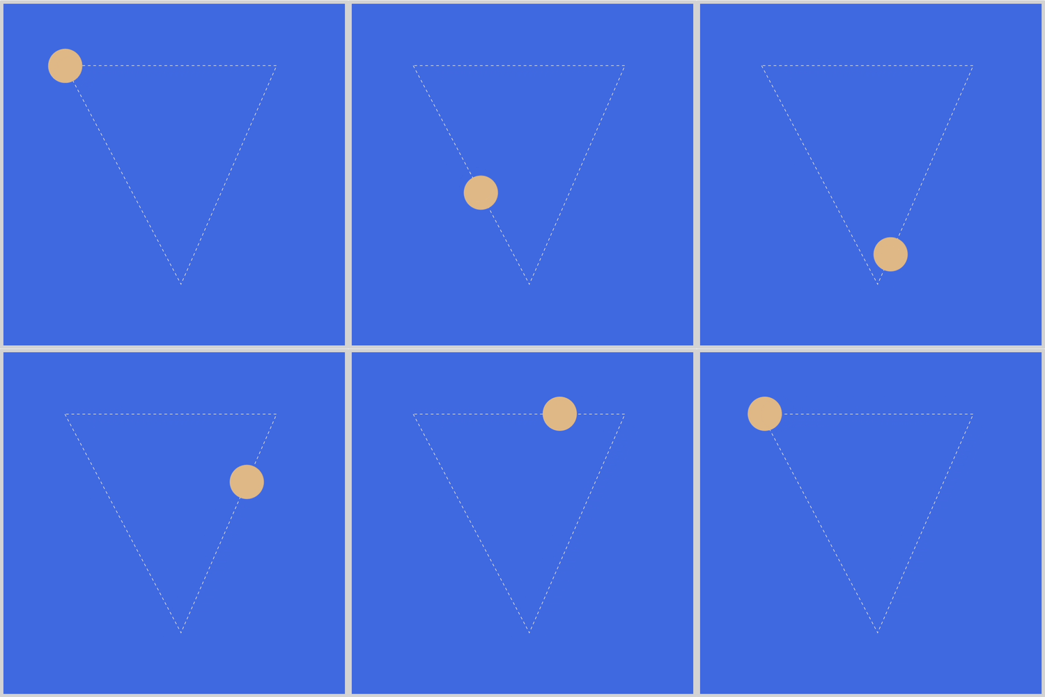
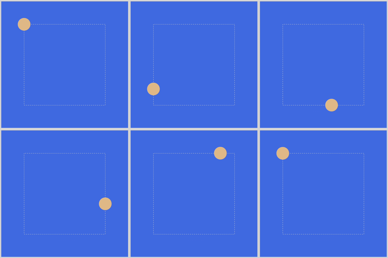
Square
Prerequisites
Basic CSS and HTML knowledge will help you understand the concepts and techniques introduced in this article. Jump over to this article if you require an HTML and CSS primer.
We assume that you have set up tools to create CSS animation. If you haven’t, this article will show you how to set them up.
If you’re unfamiliar with CSS animation and the @keyframes at-rule property, please read this article.
HTML Structure
<div class="container">
  <div class="square-shape-box">
    <svg viewBox="0 0 400 400">
      <path
        d="M 40,40 V 360 H 360 V 40 Z"
        fill="none"
        stroke="lightgrey"
        stroke-dasharray="4"
      />
    </svg>
    <div class="circle square-shape"></div>
  </div>
</div>
<div class="container">
  <div class="cone-shape-box">
    <svg viewBox="0 0 400 400">
      <path
        d="M 40,40 L 210,360 L 350,40 Z"
        fill="none"
        stroke="lightgrey"
        stroke-dasharray="4"
      />
    </svg>
    <div class="circle cone-shape"></div>
  </div>
</div>
<div class="container">
  <div class="scribble-box">
    <svg viewBox="0 0 500 500">
      <path
        d="M 40,40 V 70 L 61,59 L 52,169 L 183,105 L 102,316 L 333,168 L 244,440 L 440,390"
        fill="none"
        stroke="lightgrey"
        stroke-dasharray="4"
      />
    </svg>
    <div class="circle scribble"></div>
  </div>
</div>
<div class="container">
  <div class="pulse-box">
    <svg viewBox="0 0 500 500">
      <path
        d="M 30,200 H 77 L 99,125 L 170,367 L 249,42 L 364,430 L 412,201 H 470"
        fill="none"
        stroke="lightgrey"
        stroke-dasharray="4"
      />
    </svg>
    <div class="circle pulse"></div>
  </div>
</div>
container is the outermost enclosure. It enables the content to be centered and draws a light grey border. The rest of the divs represent each animation sequence.
Keep the HTML structure as is for each animation to display properly.
Body and Container Div CSS
body, container div and svg element CSS code.
/**************************************/
/* Color, Body and Container Settings */
/**************************************/
/* Center shapes */
body {
  margin: 0;
  padding: 0;
  height: 100vh;
  display: flex;
  justify-content: center;
  align-items: center;
  flex-wrap: wrap;
}

/* Set light gray border */
.container {
  width: 500px;
  height: 500px;
  border: 5px solid lightgray;
  background: royalblue;
  position: relative;
  display: flex;
  justify-content: center;
  align-items: center;
  border-radius: 1px;
  margin: 5px;
}

/* SVG position */
svg {
  position: absolute;
}
CSS Shape
CSS code to create a circle shape.
/* Shape */
.circle {
  position: absolute;
  width: 50px;
  height: 50px;
  background-color: burlywood;
  border-radius: 50%;
}
Square
The first example for this article will be a square shape animation. It’s a very basic shape that can be used as a building block for more complex animation sequences.
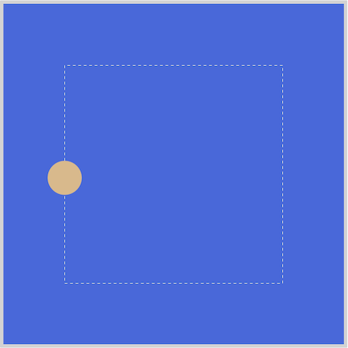
The square example is made with two components.
- Scalable Vector Graphics (SVG) image outline.
- CSS
path()andanimation.
All examples in the article follow the same SVG image outline + CSS path() and animation convention.
SVG / HTML Code
<div class="container">
  <div class="square-shape-box">
    <svg viewBox="0 0 400 400">
      <path
        d="M 40,40 V 360 H 360 V 40 Z"
        fill="none"
        stroke="lightgrey"
        stroke-dasharray="4"
      />
    </svg>
    <div class="circle square-shape"></div>
  </div>
</div>
The main focus area for the SVG code is d="M 40,40 V 360 H 360 V 40 Z". This defines the shape of the image outline. The M, V, H and Z letters you see within the code are SVG commands.
Here’s a quick explanation:
M 40,40
Pick up the pen and Move it to x: 40, y: 40 position.V 360
Put down the pen and Move vertically to 360.H 360
Move horizontally to 360.V 40
Move vertically to 40.Z
Draw a line straight back to the start.
If you're new to SVG commands, please read this article. You can use this application to visualize the SVG path.
Let’s look at the CSS code next.
/* Square Shape */
.square-shape-box {
  width: 400px;
  height: 400px;
  position: relative;
}

.square-shape {
  offset-path: path("M 40,40 V 360 H 360 V 40 Z");
  animation: square-shape 5s linear infinite;
}

@keyframes square-shape {
  100% {
    offset-distance: 100%;
  }
}
We use .square-shape-box to control the SVG image. We set its dimensions, both width and height to 400px. position is set it to relative.
You may have noticed the path() property value is identical to the SVG path value, offset-path: path("M 40,40 V 360 H 360 V 40 Z");. This is intentional. Using the same values ensure that the circle shape animates on the SVG image outline.
animation is a CSS shorthand property. Using a shorthand property, you can write more concise (and often more readable) style sheets, saving time and energy.
square-shapeis the animation name.5sequals to five second animation duration.linearmake the animation timing equal throughout the sequence. No acceleration or deceleration.infiniteis the animation iteration count.infiniteensures the animation loops nonstop.
In the next section, you’ll learn how to animate the circle along a cone-shaped SVG image.

Cone
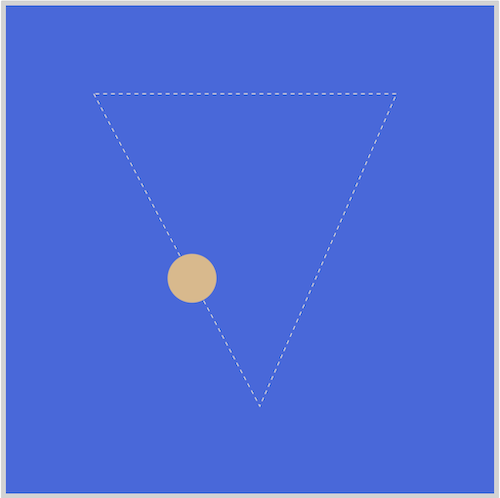
The cone example follows the same design convention as the square example. The image outline is created with SVG. CSS animate is used to move the circle shape.
/* Cone Shape */
.cone-shape-box {
  width: 400px;
  height: 400px;
  position: relative;
}

.cone-shape {
  offset-path: path("M 40,40 L 210,360 L 350,40 Z");
  animation: cone-shape 3s linear infinite;
}

@keyframes cone-shape {
  100% {
    offset-distance: 100%;
  }
}
The usage of the Line or L SVG command is a major difference between the cone and the previous square example.
SVG command breakdown:
M 40,40
Pick up the pen and Move it to x: 40, y: 40.L 210,360
Put down the pen and Draw a line to x: 210, y: 360.L 350,40
Draw a line to x: 350, y: 40.Z
Draw a line straight back to the start.
Use the L command to draw diagonal lines. This command requires both an x (horizontal) and y (vertical) coordinates. View the SVG path here. All CSS properties, except for the SVG L command, remain identical to the square example.
Ever wanted to learn how to make scribbles? You’ll learn how to make one in the next section.
Scribble
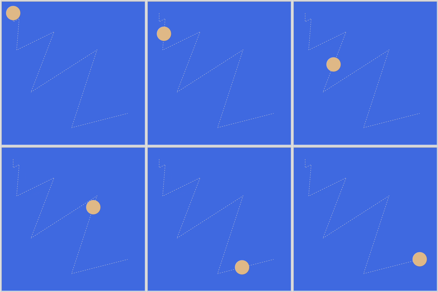
The scribble example will expand on the SVG L command used in the previous section.
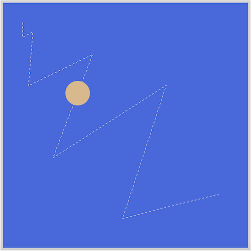
The scribble image is produced by combining multiple L commands. Remember, we use the same SVG path values in both our SVG and CSS path code.
/* Scribble */
.scribble-box {
  width: 500px;
  height: 500px;
  position: relative;
}

.scribble {
  offset-path: path(
    "M 40,40 V 70 L 61,59 L 52,169 L 183,105 L 102,316 L 333,168 L 244,440 L 440,390"
  );
  animation: scribble 4s infinite ease-in-out;
}

@keyframes scribble {
  100% {
    offset-distance: 100%;
  }
}
Here’s a quick explanation:
M 40,40
Pick up the pen and Move it to x: 40, y: 40.V 70
Put down the pen and Move vertically to 70.L 61,59
Draw a line to x: 61, y: 59.L 52,169
Draw a line to x: 52, y: 169.L 183,105
Draw a line to x: 183, y: 105.L 102,316
Draw a line to x: 102, y: 316.L 333,168
Draw a line to x: 333, y: 168.L 244,440
Draw a line to x: 244, y: 440.L 440,390
Draw a line to x: 440, y: 390.
A total of six L commands are used to make the image. The animation-timing-function property value is to ease-in-out.
Please don't hesitate to experiment with the example code and modify the SVG command properties. You can change the diagonal scribble to a vertical or horizontal scribble by modifying the code.
Onward to the last section.
Pulse
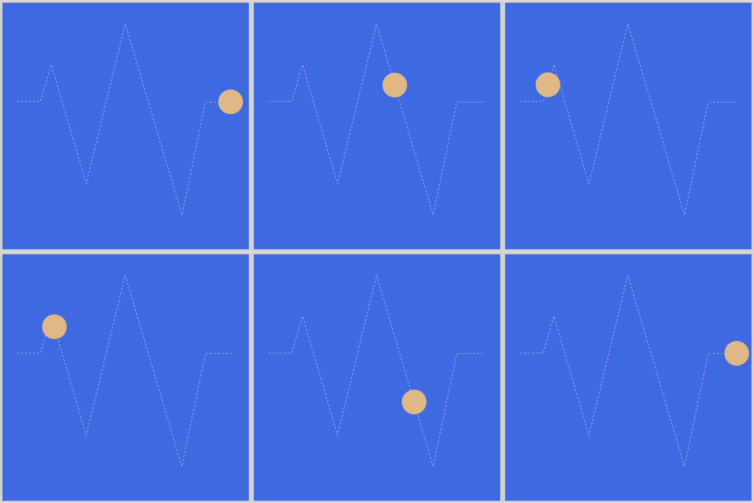
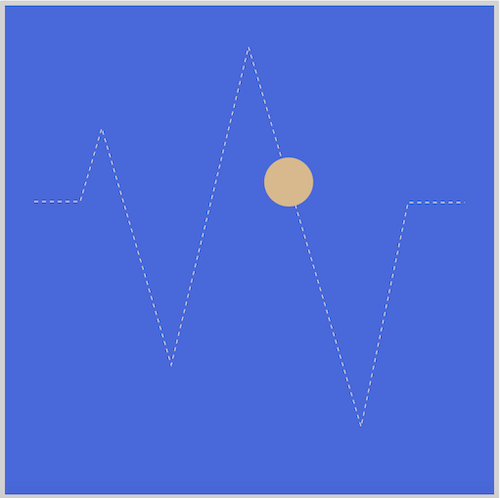
The last example simulates a pulse-ish animation sequence that you may have seen on a heart, health, or seismic monitor device.
/* Pulse */
.pulse-box {
  width: 500px;
  height: 500px;
  position: relative;
}

.pulse {
  offset-path: path(
    "M 30,200 H 77 L 99,125 L 170,367 L 249,42 L 364,430 L 412,201 H 470"
  );
  animation: pulse 4s alternate infinite ease-in-out;
}

@keyframes pulse {
  100% {
    offset-distance: 100%;
  }
}
The SVG container box is slight bigger for this example. The .pulse-box class width and height property values are set to 500px.
The alternate CSS property value reverses the play direction. The first animation iteration always plays forward, then reverses after each play cycle.
SVG command breakdown:
M 30,200
Pick up the pen and Move it to x: 30, y: 200.H 77
Put down the pen and Move horizontally to 77.L 99,125
Draw a line to x: 99, y: 125.L 170,367
Draw a line to x: 170, y: 367.L 249,42
Draw a line to x: 249, y: 42.L 364,430
Draw a line to x: 364, y: 430.L 412,201
Draw a line to x: 412, y: 201.H 470
Move horizontally to 470.
Please give yourself a big pat on the back for making it this far. The examples were challenging, but not impossible to make. You can see and play with the full code at Pyxofy’s CodePen page.
See the Pen CSS Animation – Linear Path Animation by Pyxofy (@pyxofy) on CodePen.
Conclusion
You worked with CSS animation path() and SVG commands extensively to make image outlines and to animate the circle shape. By combining multiple linear paths, you were able to make different shapes.
Basic shapes such as squares and cones are easy to make with SVG commands. The more you get familiar with SVG command syntax, the more interesting animation path sequences you’ll be able to make.
You learned how to reverse animation direction and how to make the animation sequence loop infinitely.
What will you make with your newly acquired knowledge? How about a car, maybe an airplane or a sunset scene? Share your next masterpiece with us on Twitter @pyxofy, on LinkedIn, Mastodon or Facebook.
We hope you liked this article. Kindly share it with your network. We really appreciate it.
Related Articles
