CSS Animation – Jumping Box with @property – Part 2
You learned how to make a 3D-ish box and shadow in part 1. Let’s make the box shrink and then jump in part 2 of this step-by-step article.
Introduction
In part 1, you learned how to make the box and shadow components. In this article, you will learn how to make the box jump with CSS.
Part 1. Make the Box and Shadow
Part 2. Make the Jumping Box Animation
Read this article if you’re unfamiliar with @property.
Safari and Chromium-based browsers support @property. Check for the latest browser support if you use @property for production websites.

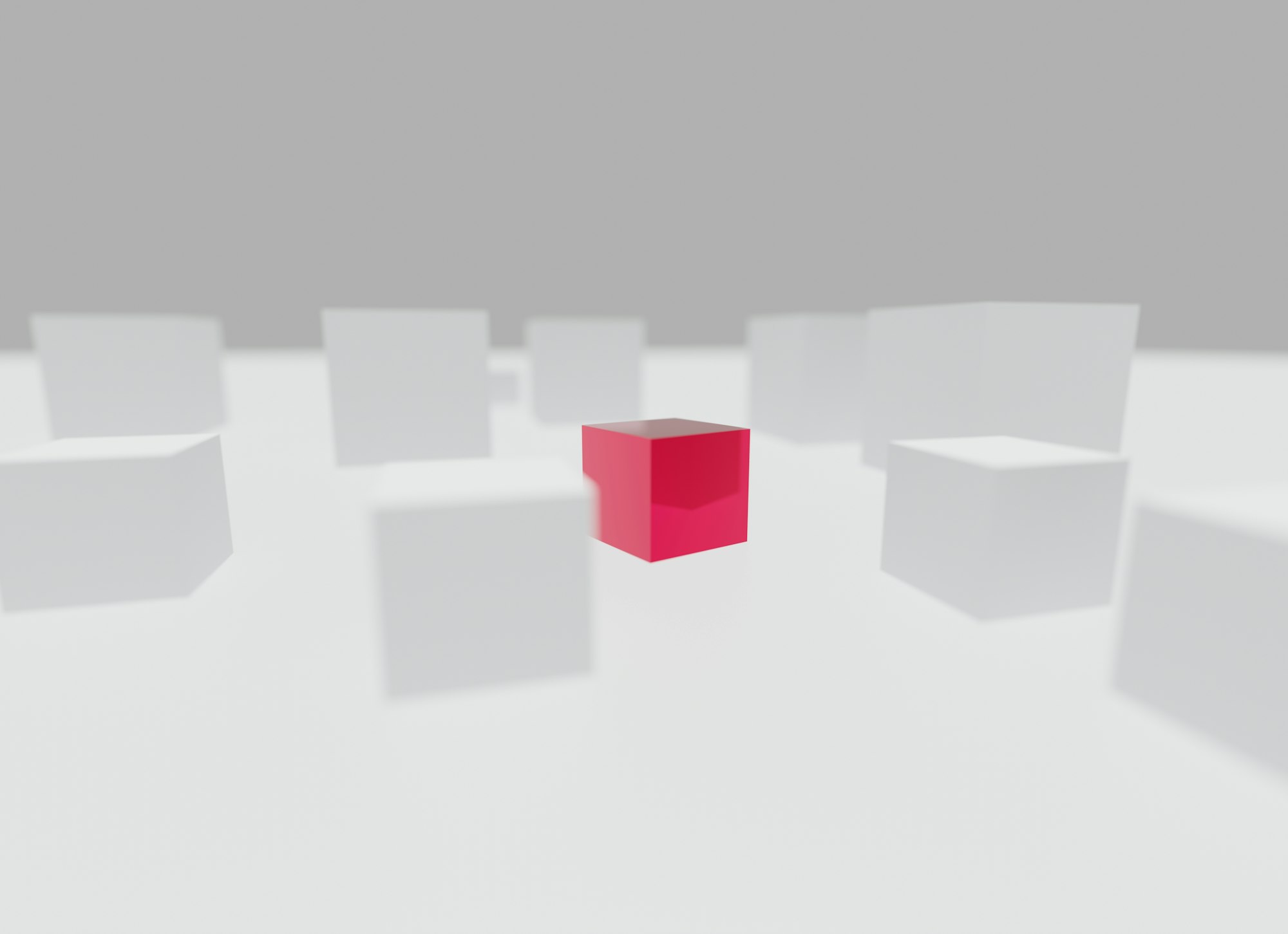
Preview
Jumping Box Animation

Prerequisites
Essential CSS and HTML knowledge will help you understand the concepts and techniques introduced in this article. Jump over to this article if you require an HTML and CSS primer.
We assume that you have set up tools to create CSS animation. If you haven’t, this article will show you how to set them up.
Please read this article if you’re unfamiliar with CSS animation and the keyframes at-rule property.
HTML Structure
<div class="container">
  <!-- Box -->
  <div class="box-container">
    <div class="box-top"></div>
    <div class="box-left"></div>
    <div class="box-right"></div>
  </div>
  <!-- Shadow -->
  <div class="shadow"></div>
</div>
container is the outermost enclosure. It enables the content to be centered and draws a light gray border. The rest of the divs represent each animation sequence.
Keep the HTML structure as is for each animation to display correctly.
Body and Container Div CSS
CSS code for the body and container div.
/* Body and Container Settings */
/* Center shapes */
body {
  margin: 0;
  padding: 0;
  height: 100vh;
  display: flex;
  justify-content: center;
  align-items: center;
  flex-wrap: wrap;
}

/* Set background and border color */
.container {
  min-width: 500px;
  height: 500px;
  border: 5px solid lightgray;
  background: #121212;
  position: relative;
  margin: 5px;
  display: flex;
  justify-content: center;
  align-items: center;
  overflow: hidden;
}
Animate the Shadow
The shadow will have two animations.
- Shadow width
The shadow will be full width when the box is above it. Its length will shorten as the box goes up the screen. - Shadow color
The initial shadow color will be dark orange and transition from mid-tone to light orange as its distance from the box increases.

- Shadow initial width with dark orange color.

- Shadow color turns to mid-tone orange at mid-length.

- The shadow color will be light orange at its shortest.
Only CSS code related to animating the shadow will be explained for brevity.
/* Custom CSS Property */
@property --shadow-color {
  syntax: "<color>";
  initial-value: transparent;
  inherits: false;
}
The above code is the custom CSS property to animate the shadow’s color.
/* Shadow */
.shadow {
  --shadow-color: #ac5c05;
  border-bottom: 5px var(--shadow-color) solid;
  transform-origin: center bottom;
  animation: shadow 3s ease-out infinite;
}
--shadow-color: #ac5c05;is the initial dark orange color.- The border color
var(--shadow-color), will be animated later using@keyframes. - Make sure that
transform-origin: center bottom;is included to ensure the border transforms from the center instead of the default left side. - The
animationis namedshadow. It lasts three seconds,3s, with anease-outtiming. It will loop forever withinfinite;.
@keyframes shadow {
  from {
    transform: scaleX(100%);
  }

  10% {
    transform: scaleX(100%);
    --shadow-color: #ac5c05;
  }

  20% {
    transform: scaleX(5%);
    --shadow-color: #fcc891;
  }

  30% {
    transform: scaleX(10%);
    --shadow-color: #fab367;
  }

  to {
    transform: scaleX(95%);
  }
}
- At
10%, the shadow width will be100%and dark orange,#ac5c05. - The box will be at its highest position at
20%; hence, the shadow color is light orange,--shadow-color: #fcc891, and the width is set to5%. - At about the mid-point, the color changes to a mid-tone orange,
--shadow-color: #fab367, and the shadow width will transition to10%.
In the next section, you’ll animate the box, making it look like it’s jumping up and floating down.
Make the Box Jump
Similar to the shadow animation in the previous section, the box will have multiple positions or animation states.
- Box position
The box will transition from the bottom of the screen, its initial position, to the top of the screen, its end position. - Box scale and shrink
The box scale will be modified during the animation sequence. A shrink effect will be applied at the beginning of the animation to simulate anticipation, similar to a person crouching down slightly before springing upwards.
/* Box */
.box-container {
  transform-origin: bottom;
  animation: box 3s ease-in infinite;
}
transform-origin: bottom;ensures that the box shrinks or transforms towards thebottomversus the defaultcenter.- The
animationname isboxand lasts three seconds,3s. It has anease-intiming and aninfiniteiteration count.

- We set the box’s initial position with
transform: translateY(0);

transform: scaleX(0.9);shrinks the box to about 90% of its height.

- To make the box slightly thinner as it goes up,
transform: scaleY(0.8);, scales the box to about 80% of its original width.

transform: translateY(-250px)puts the box-250pxvertically from it’s original position.
Below is the full animation sequence.
@keyframes box {
  from {
    transform: scaleY(0.8);
  }

  10% {
    transform: scaleY(1);
  }

  15% {
    transform: translateY(-250px) scaleX(0.9);
  }

  to {
    transform: translateY(0);
  }
}
You can see and play with the complete code on Pyxofy’s CodePen page.
See the Pen CSS Animation - Jumping Box with @property by Pyxofy (@pyxofy) on CodePen.
Conclusion
In part 2 of this two-part article series, you learned how to make the box jump with CSS. You learned how to animate the shadow color with @property.
@property is handy for creating CSS custom properties. We used it to animate the shadow, changing its color from light to dark orange depending on the box’s height.
Play with the CSS code. How about making the box drop or changing the shadow’s color? Share your masterpiece with us on X (Twitter) @pyxofy, LinkedIn, Mastodon, or Facebook.
We hope you liked this article. Kindly share it with your network. We appreciate it.
Related Articles
 Pyxofy
 Pyxofy
 Pyxofy