CSS Animation – Jumping Box with @property – Part 1
You can make an orange-colored 3D-ish box jump up and down with CSS. Learn how to make this animation in this step-by-step article.
Introduction
Have you ever tried to make a box jump? Is that even possible?
In this two-part step-by-step article, you’ll create a jumping box animation using the CSS clip-path: path() function and @property at-rule.
Part 1. Make the Box and Shadow
Part 2. Make the Jumping Box Animation
Read this article if you’re unfamiliar with @property. You can read this article for details about path() function.
Safari and Chromium-based browsers support @property. Check for the latest browser support if you use @property for production websites.

Preview
Jumping Box Animation

Prerequisites
Essential CSS and HTML knowledge will help you understand the concepts and techniques introduced in this article. Jump over to this article if you require an HTML and CSS primer.
We assume that you have set up tools to create CSS animation. If you haven’t, this article will show you how to set them up.
Please read this article if you’re unfamiliar with CSS animation and the @keyframes at-rule property.
HTML Structure
<div class="container">
  <!-- Box -->
  <div class="box-container">
    <div class="box-top"></div>
    <div class="box-left"></div>
    <div class="box-right"></div>
  </div>
  <!-- Shadow -->
  <div class="shadow"></div>
</div>
container is the outermost enclosure. It enables the content to be centered and draws a light gray border. The rest of the divs represent each animation sequence.
Keep the HTML structure as is for each animation to display correctly.
Body and Container Div CSS
CSS code for the body and container div.
/* Body and Container Settings */
/* Center shapes */
body {
  margin: 0;
  padding: 0;
  height: 100vh;
  display: flex;
  justify-content: center;
  align-items: center;
  flex-wrap: wrap;
}

/* Set background and border color */
.container {
  min-width: 500px;
  height: 500px;
  border: 5px solid lightgray;
  background: #121212;
  position: relative;
  margin: 5px;
  display: flex;
  justify-content: center;
  align-items: center;
  overflow: hidden;
}
Make Box with path()
The box will have three components
- Top
- Left side
- Right side
In this section, we won’t dive deep into the path() function Scalable Vector Graphics (SVG) commands. Please read this article for in-depth information about each SVG command.
To group the three components, we first make a container.
/* Box */
.box-container {
  position: absolute;
  top: 220px;
  left: 100px;
  width: 250px;
  height: 250px;
}
- The container
positionis set toabsoluteand is placed220pxfrom thetopand100pxfrom theleft. widthandheightare set to250px.
The box is styled to be cube-shaped with three sides visible. The light comes from the upper right corner, and we adjust the colors accordingly.

.box-top {
  position: absolute;
  width: inherit;
  height: inherit;
  background: #fcc891;
  clip-path: path("M 154 63 L 239 94 L 155 127 L 72 94 Z");
}
- Similar to the box container, the box top component is positioned as
absolute. widthandheightare inherited from the box container and are automatically set to250pxwith CSS property valueinherit.- The
backgroundcolor is set to#fcc891, which is a light orange hue. clip-path: path("M 154 63 L 239 94 L 155 127 L 72 94 Z");makes the diamond shape top component.
Next up is the left-side component.

.box-left {
  position: absolute;
  width: inherit;
  height: inherit;
  background: #ac5c05;
  clip-path: path("M 72 94 L 72 199 L 153 243 L 155 127 Z");
}
#ac5c05is a dark orange tone.clip-path: path("M 72 94 L 72 199 L 153 243 L 155 127 Z");makes the left-side component.
Let’s make the last component.

.box-right {
  width: inherit;
  height: inherit;
  background: #fab367;
  clip-path: path("M 153 243 L 238 200 L 239 94 L 155 127 Z");
}
- The
backgroundcolor is#fab367, a mid-tone orange color. - The right-side component is made with
clip-path: path("M 153 243 L 238 200 L 239 94 L 155 127 Z");.
The box shape is completed. In the next section, you’ll be making the box shadow.
Make Shadow
In this section, you’ll be making the box shadow.

/* Shadow */
.shadow {
  position: absolute;
  top: 465px;
  left: 170px;
  width: 170px;
  --shadow-color: #ac5c05;
  border-bottom: 5px var(--shadow-color) solid;
  filter: blur(1px);
}
- Same as the box shape, the shadow
positionis set toabsolute. - The shadow is placed
465pxfrom thetopand170pxfrom theleft. - Shadow
widthis set to170px. --shadow-color: #ac5c05;is a CSS custom property you’ll be animating in part 2 of this article.border-bottom: 5px var(--shadow-color) solid;draws a solid line using the CSSborder-bottomproperty.- A blur effect is added with
filter: blur(1px).
Your completed box and shadow should look like this.
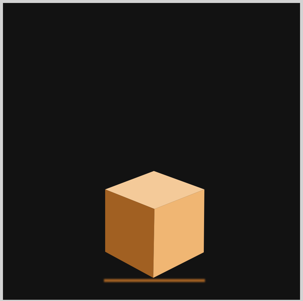
You can see and play with the complete code on Pyxofy’s CodePen page.
See the Pen CSS Animation - Jumping Box with @property by Pyxofy (@pyxofy) on CodePen.
Conclusion
You learned how to make the box and shadow components in part 1 of this two-part article series.
You used the CSS path() function to write Scalable Vector Graphics (SVG) commands to draw the top, left, and right side of the box shape. To make the shadow, we used the CSS bottom border property.
In part 2 of this article, we’ll make the box jump using the CSS @keyframs at-rule. We’ll use @property to change the shadow’s color depending on the box’s height from the ground.
Please share your thoughts about this article with us on X (Twitter) @pyxofy, LinkedIn, Mastodon, or Facebook.
We hope you liked this article. Kindly share it with your network. We appreciate it.
Related Articles
 Pyxofy
 Pyxofy
 Pyxofy
 Pyxofy