CSS Animation – @property Linear Gradient Rotate Animation with cubic-bezier()
Yes, CSS linear gradients can be rotated! Join us in this step-by-step article to learn how to animate multicolor shapes with CSS @property.
Introduction
Using CSS, it’s easy to create rotate animations. In this article, you will learn how to combine linear-gradient(), @property and cubic-bezier() to create rotate animations.
Read this article if you’re unfamiliar with @property.
At the time of this writing, Firefox doesn’t support CSS @property.
Safari and Chromium-based browsers support @property. Check for the latest browser support if you plan to use @property for production websites.
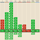 Can I use... Support tables for HTML5, CSS3, etc
If you’re new to CSS gradients, read this article to understand how they work.
Want more articles like this one? Become a Pyxofy member!
Preview
Simple Rotate Animation

Advanced Rotate Animation with cubic-bezier()

Prerequisites
Basic CSS and HTML knowledge will help you understand the concepts and techniques introduced in this article. Jump over to this article if you require an HTML and CSS primer.
We assume that you have set up tools to create CSS animation. If you haven’t, this article will show you how to set them up.
If you’re unfamiliar with CSS animation and the @keyframes at-rule property, please read this article.
HTML Structure
<!-- Rotate Effect -->
<div class="container">
	<div class="rotate-effect"></div>
</div>
<!-- Advanced Rotate Effect -->
<div class="container">
	<div class="advanced-rotate"></div>
</div>
container is the outermost enclosure. It enables the content to be centered and draws a light gray border. The rest of the divs represent each animation sequence.
Keep the HTML structure as is for each animation to display properly.
Body and Container Div CSS
CSS code for the body and container div.
/* Body and Container Settings */
/* Center shapes */
body {
  margin: 0;
  padding: 0;
  height: 100vh;
  display: flex;
  justify-content: center;
  align-items: center;
  flex-wrap: wrap;
}

/* Set background and border color */
.container {
  width: 500px;
  height: 500px;
  border: 5px solid lightgray;
  background: black;
  position: relative;
  margin: 5px;
  display: flex;
  justify-content: center;
  align-items: center;
}
cubic-bezier() Introduction
The cubic-bezier() functional notation is used to define a cubic Bézier curve.
A Bézier curve (pronounced[bezje]) is a mathematically described curve used in computer graphics and animation. In vector images, they are used to model smooth curves that can be scaled indefinitely.
The curve is defined by a set of control points with a minimum of two. Web related graphics and animations often use cubic Béziers, which are curves with four control points P0, P1, P2, and P3.
Animation of a cubic Bézier curve

In this article, we’ll be using cubic-bezier() with the <easing-function> CSS data type.
Syntax
/* cubic-bezier function and keywords */
/* cubic-bezier(<x1>, <y1>, <x2>, <y2>) */
cubic-bezier(0.42, 0.0, 1.0, 1.0)
- Numeric value
0.0represents the initial state, and1.0represents the final state. - When you specify an invalid cubic Bézier curve, CSS ignores the whole property.
CSS animation shorthand
animation:
advanced-rotate
2s
cubic-bezier(0.68, -0.57, 0.26, 1.65) /* cubic-bezier function */
infinite;
You can use cubic-bezier() visualization tools to get familiarized with the Bézier curve.
Another great Bézier curve deep dive resource is The Beauty of Bézier Curves by Freya Holmér.
Now that you’re familiar with how cubic-bezier() works, let’s work on our first example in the next section.
Simple Rotate Animation

To create the rotate animation, we use custom properties using CSS @property. The examples will use the following custom properties.
/* Custom CSS Property */
@property --angle {
  syntax: "<angle>";
  initial-value: 0deg;
  inherits: false;
}
First, let’s create the linear-gradient background.
/* Rotate Animation */
.rotate-animation {
  width: 90%;
  height: 90%;
  border: 2px solid white;
  border-radius: 50%;
  background: linear-gradient(var(--angle, 0deg), #30a2ff 50%, #ffe7a0 0);
}
widthandheightare both set to90%, ensuring they fit within the light gray squarecontainer.- The borders are set to
2px solid white. border-radius: 50%;turns our square object to a round object.background: linear-gradient(var(--angle, 0deg), #30a2ff 50%, #ffe7a0 0);
–(var(--angle, 0deg)is a custom CSS property.–#30a2ff 50%gives us the light blue color.–#ffe7a0 0is the light yellow color.
Next, the animation property values.
/* Rotate Animation */
.rotate-animation {
  animation: rotate-effect 2s infinite;
}
rotate-effectis the animation name, which will be referenced by the@keyframesat-rule.2ssets the animation duration to two seconds.- The animation will loop with
infinite.
Finally, the animation keyframes.
@keyframes rotate-effect {
  to {
    --angle: 360deg;
  }
}
to, the end state, will animate CSS custom property--angleto rotate from 0 degrees to 360 degrees.
In the next section, we’ll use the cubic-bezier() to make an advanced rotate animation sequence.
Advanced Rotate Animation with cubic-bezier()
In this section, we’ll expand on the previous example. We explain only the CSS code that differs from the previous section for brevity.
You will be using three colors and use cubic-bezier() for the easing function.
")
Let’s tackle the three-color gradient.
/* Advanced Rotate Animation */
.advanced-rotate {
  background: linear-gradient(
    var(--angle, 0deg),
    #cd113b 0% 33%,
    #ff7600 33% 66%,
    #ffa900 66%
  );
}
(var(--angle, 0deg)is our customer property, defaulting to0deg.#cd113b 0% 33%creates the red color stop.#ff7600 33% 66%is the orange middle area.#ffa900 66%will be dark yellow color stop.
Next up is the animation section.
/* Advanced Rotate Animation */
.advanced-rotate {
  animation: advanced-rotate 2s cubic-bezier(0.68, -0.57, 0.26, 1.65) infinite;
}
cubic-bezier(0.68, -0.57, 0.26, 1.65)is a custom cubic Bézier curve controlling the animation sequence easing function.

Use this CSS Cubic Bezier Generator tool to visualize the control points.
 CSS Portal
Use the CSS Cubic Bezier Generator to play around with cubic-bezier() values. Experiment to find a combination you like.
Below are examples of default <easing-function> Bézier curves:
- linear
- ease-in
- ease-out
- ease-in-out
 CSS Portal
Last, but not the least, the animation keyframes.
@keyframes advanced-rotate {
  to {
    --angle: 360deg;
  }
}
Similar to the previous example, we animate the rotate angle from the default 0deg to 360deg.
You can see and play with the full code on Pyxofy’s CodePen page.
See the Pen CSS Animation – @property Linear Gradient Rotate Animation with cubic-bezier() by Pyxofy (@pyxofy) on CodePen.
Conclusion
Linear gradients are superb animation tools. You learned how to combine CSS linear-gradient(), @property, and cubic-bezier() to create a rotate animation.
Using multiple linear gradient stops, you learned to make two colors and three color circles.
Use the visualization tools we shared in the previous sections to visualize the cubic-bezier() values. Play around with them and learn how the value combinations affect the final animation.
What rotate animation will you make? Share your masterpiece with us on Twitter @pyxofy, on LinkedIn, Mastodon, or Facebook.
We hope you liked this article. Kindly share it with your network. We really appreciate it.
Tweet this article!
Related Articles
 Pyxofy
 Pyxofy
 Pyxofy
 Pyxofy