CSS Animation – Hot Air Balloon Launch
Ever wondered how to make things launch and float using only CSS? Join us in this step-by-step article to learn how to launch a hot air balloon.
Introduction
Hot air balloon launch scenes are majestic, full of energy and vibrant colors.
In this article, you will learn how to use the CSS transform: scale() function, linear-gradient, and @keyframes percentages.
You’ll learn how to make a hot air balloon launch and float with CSS.
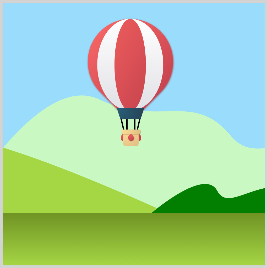
Preview

The hot air balloon launch scene components:
- Foreground
Green gradient where hot air balloon launches from. - Background
The background consists of sky, mountains, and clouds. - Hot Air Balloon
You’ll be animating the hot air balloon CSS art in this article.
 Pyxofy
Prerequisites
Essential CSS and HTML knowledge will help you understand the concepts and techniques introduced in this article. Jump over to this article if you require an HTML and CSS primer.
We assume that you have set up tools to manipulate CSS. If you haven’t, this article will show you how to set them up.
Please read this article if you’re unfamiliar with CSS animation and the @keyframes at-rule property.
HTML Structure
<div class="container">
  <!-- Background -->
  <div class="background-container"></div>
  <!-- Mountains -->
  <div class="mountains-container">
    <div class="mountain-1"></div>
    <div class="mountain-2"></div>
    <div class="mountain-3"></div>
  </div>
  <!-- Clouds -->
  <div class="clouds-container">
    <div class="cloud-1"></div>
    <div class="cloud-2"></div>
    <div class="cloud-3"></div>
  </div>
  <!-- Foreground -->
  <div class="foreground-container"></div>
  <!-- Hot Air Balloon -->
  <div class="hot-air-balloon">
    <div class="envelope"></div>
    <div class="rigging"></div>
    <div class="skirt"></div>
    <div class="sand-bag-side"></div>
    <div class="basket"></div>
    <div class="sand-bag-center"></div>
  </div>
</div>
container is the outermost enclosure. It enables the content to be centered and draws a light gray border. The rest of the divs represent each animation sequence.
Keep the HTML structure as is for the animation to display correctly.
Body and Container Div CSS
CSS code for the body and container div.
/* Body and Container Settings */
/* Center shapes */
body {
  margin: 0;
  padding: 0;
  height: 100vh;
  display: flex;
  justify-content: center;
  align-items: center;
  flex-wrap: wrap;
}

/* Set background and border color */
.container {
  min-width: 500px;
  height: 500px;
  border: 5px solid lightgray;
  background: transparent;
  position: relative;
  margin: 5px;
  display: flex;
  justify-content: center;
  align-items: center;
  overflow: hidden;
}
Make the Foreground
The foreground is a green background gradient that will act as the launch area for the hot air balloon.

/* Foreground */
.foreground-container {
  position: absolute;
  width: 500px;
  height: 100px;
  top: 400px;
  left: 0;
  background: linear-gradient(#6f9323, #a5d645);
}
You use the CSS position: absolute property to control the exact location of the foreground. You place it 400px from the top and 0 pixel from the left. The foreground is 400px wide and 100px high. You make the gradient background with background: linear-gradient(#6f9323, #a5d645). #a5d645 is light green, and #6f9323is a dark green hue.

For reference, here’s how the hot air balloon will look on top of the foreground component.
In the next section, let’s discuss how to make the background components.
Make the Background
The background consists of a light blue sky, mountain, and cloud components. We won’t dive deep into how to create the background elements in this article. Access the bookmark links to learn how to make each component.
Light Blue Sky Background

This article will teach you how to make the light blue sky background.
Pyxofy
Mountains

Check this article to learn how to make the mountains.
Pyxofy
This article teaches how to animate the mountains.
Clouds

Jump to this article to learn how to make the clouds.
PyxofyThis article will show you how to make the clouds move.
Let’s animate the hot air balloon in the next section.
Animate the Hot Air Balloon
Are you ready to start animating? First, jump to this article.
PyxofyYou will animate the hot air balloon created in the above article. You need to apply a slight modification to the hot air balloon before animating it.

The original CSS art has a drop shadow applied to the basket component. For this article, remove the basket drop shadow by deleting the CSS code or commenting it out.
/* Basket */
.basket {
  filter: drop-shadow(#a68347 1px 2px 2px);
  /* Delete or comment out drop-shadow */
}
You can comment out the drop shadow like this, /* filter: drop-shadow(#a68347 1px 2px 2px); */.
Next, the hot air balloon needs to be scaled down.

/* Hot Air Balloon Animation */
.hot-air-balloon {
  position: absolute;
  top: 230px;
  left: 255px;
  transform: scale(0.5);
  animation: balloon 12s ease-in infinite;
}
You use the CSS transform: scale() function to scale down CSS elements. The hot air balloon will be scaled down to half its size by putting 0.5 in the transform scale function.
To put the hot air balloon in its animation starting position, you use top: 230px and left: 255px. The animation’s name is balloon and will last for twelve seconds, 12s. It will have an ease-in effect and loops infinitely, infinite.
The hot air balloon animation sequence goes like this:
- Starting position at bottom right side corner.
- Slowly rise to the upper center area.
- Move up and down to simulate “floating” movement.
- Slowly move to the middle left area while scaling up the balloon size.
- Frame out.
You will be using the @keyframes percentage syntax for fine-grain animation control.

@keyframes balloon {
  from {
    top: 230px;
    transform: scale(0.5);
  }
}
from sets the balloon’s initial position, top: 230px, and its scale with transform: scale(0.5).

@keyframes balloon {
  35% {
    top: 20px;
    left: 120px;
    transform: scale(0.5);
  }
  40% {
    top: 30px;
    left: 120px;
    transform: scale(0.5);
  }
  50% {
    top: 20px;
    left: 120px;
    transform: scale(0.5);
  }
  60% {
    top: 30px;
    left: 120px;
    transform: scale(0.5);
  }
  65% {
    top: 20px;
    left: 120px;
    transform: scale(0.5);
  }
}
35% moves the balloon to the upper center area with top: 20px and left: 120px.
40% through 65% creates the “floating” effect by moving the hot air balloon between top: 20px and top: 30px.

@keyframes balloon {
  90% {
    left: -400px;
    transform: scale(0.9);
  }
}
To start moving the balloon to the middle left area, you use left: -400px. Make sure you type the minus symbol - before 400px. CSS transform: scale(0.9) scales up the balloon size slowly.

@keyframes balloon {
  to {
    top: -100px;
    left: -500px;
    transform: scale(1);
  }
}
to, the animation end state, set to top: -100px and left: -500px will move the balloon out of frame. transform: scale(1) scales the balloon to its original size, giving the illusion that it’s moving closer to the viewer.

In the final section, let’s combine the hot air balloon animation, foreground, and background.
Combine Balloon Animation, Foreground, and Background
You can combine the hot air balloon, foreground, sky, mountains, and clouds to your liking.
Feel free to modify the code. How about changing the sky or cloud color?


Extend your CSS skills, and try to change the balloon or mountain hue to different colors.
You can see and play with the complete code on Pyxofy’s CodePen page.
See the Pen CSS Animation - Hot Air Balloon Launch by Pyxofy (@pyxofy) on CodePen.
Conclusion
In this article, you learned to use the CSS transform: scale() function, linear-gradient, and @keyframes percentages. @keyframes percentages enable fine-grain animation control for myriad CSS elements.
You created a foreground component and then combined it with the hot air balloon, mountain, and cloud components to make a dynamic launch scene.
Modify the components to your liking, and change their color or size. Please share your masterpiece with us on LinkedIn, Threads, Mastodon, X (Twitter) @pyxofy or Facebook.
We hope you liked this article. Kindly share it with your network. We appreciate it.
Related Articles
Pyxofy
 Pyxofy