CSS Animation – Changing Color
Viva Magenta, Molten Metallic or Tranquil Blue? You’ll learn how to use colors and more with CSS in this step-by-step article.
Introduction
Colors! Everybody loves colors, and they’re all over the World Wide Web.
In this article, we’ll dive deep in to the CSS background-color property and learn how it can change our CSS shape’s color.
We’ll learn how to combine multiple CSS properties to produce unique animation sequences.
Preview
Preview of the animations we’ll make in this article.
Change Color and Move to Corners

Change Color, Move, Change Size

Prerequisites
We don’t assume prior knowledge of CSS or HTML, but it helps if you have some familiarity with how they work. Jump over to this article if you require an HTML and CSS primer.
We assume that you have set up tools to create CSS animation. If you haven’t, this article will show you how to set them up.
If you’re unfamiliar with CSS animation and @keyframes at-rule property, please read this article.
HTML Structure
<div class="container">
  <div class="circle change-color-corner"></div>
</div>
<div class="container">
  <div class="circle change-multi-color"></div>
</div>
<div class="container">
  <div class="circle change-color"></div>
</div>
<div class="container">
  <div class="circle change-color-move"></div>
</div>
container is our outermost enclosure. This enables us to center the content and draw a light gray border. The rest of the divs represent each animation sequence.
It’s important to keep the HTML structure as is for each animation to display properly.
Body and Container Div CSS
CSS code for the body and container div.
/**************************************/
/* Color, Body and Container Settings */
/**************************************/
/* Center shapes */
body {
  margin: 0;
  padding: 0;
  height: 100vh;
  display: flex;
  justify-content: center;
  align-items: center;
  flex-wrap: wrap;
}

/* Set light gray border */
.container {
  width: 500px;
  height: 500px;
  border: 5px solid lightgray;
  background: royalblue;
  position: relative;
  display: flex;
  justify-content: center;
  align-items: center;
  border-radius: 1px;
  margin: 5px;
}
CSS Shape
The circle shape we’ll animate in this article.
/****** Shape ******/
.circle {
  position: absolute;
  width: 150px;
  height: 150px;
  background-color: burlywood;
  border-radius: 50%;
  animation-duration: 3s;
  /* animation-iteration-count: 3; */
  animation-iteration-count: infinite;
  animation-timing-function: ease-in-out;
}
Change Color
For our first example, let’s do a simple color transition. We’ll be using RGB hexadecimal string notation, commonly referred to as Hex colors. If you’re unfamiliar with Hex colors, check this article for details.
CSS Code
/* Change color */
.change-color {
  animation-name: change-color;
}

@keyframes change-color {
  from {
    background-color: #ed7e07;
  }
  to {
    background-color: #ddb787;
  }
}
To change a shape's color, we’ll be targeting the CSS background-color property.
The syntax is background-color: <color>.
We’ll transition our shape background from a dark orange, #ed7e07, to a light-brown hue, #ddb787.
In our from or start state, we set dark orange like this.
@keyframes change-color {
  from {
    background-color: #ed7e07;
  }
Then for our to or end state, we set light brown color this way.
to {
   background-color: #ddb787;
}
The animation-duration property is set to three seconds, 3s. The color transition from dark orange to light brown completes within three seconds.
We mainly use Hex colors in this article. Besides Hex colors, you can use different color models to assign background colors to your shape.
- Color keywords
- RGB hexadecimal string notation (Hex)
- Red, Green, Blue (RGB) cubic-coordinate system
- Hue, Saturation, Lightness (HSL) cylindrical-coordinate system
For a quick challenge, change the from or to background color property to your favorite color.
In the next section, let’s find out how to transition between three colors.
Change Multiple Colors
Let’s explore how to change between three colors in this section.
The three colors will be:
#ffffff- White#fcc891- Light Orange#ff8f00- Bright Orange
CSS Code
.change-multi-color {
  animation-name: change-multi-color;
}

@keyframes change-multi-color {
  from {
    background-color: #ffffff;
    transform: scale(2);
  }

  50% {
    background-color: #fcc891;
  }

  to {
    background-color: #ff8f00;
  }
}
We set our from state background-color to white.
from {
  background-color: #ffffff;
}
Next we set a middle state, in this case 50%. We set the background color to light orange.
50% {
  background-color: #fcc891;
}
The to or end state color we set to bright orange.
to {
  background-color: #ff8f00;
}
You may have noticed a transform: scale(2); in the from section.
This CSS property will scale the shape size twice as big as its default size. This is an optional CSS property. Please don't hesitate to remove it. For details on how to change shape size, jump to this article.
In the next section, let’s combine changing color and size while our shape is in motion.
Change Color While Moving and Changing Size
Let’s combine three techniques in our next animation example. We’ll change the shape’s color while changing size and moving it from the left side to the right side of the container.
CSS Code
.change-color-move {
  animation-name: change-color-move;
}

@keyframes change-color-move {
  from {
    background-color: #ddb787;
    top: 400px;
    left: 0px;
    transform: scale(0);
  }
  50% {
    background-color: #ffffff;
    top: 150px;
    left: 150px;
    transform: scale(2);
  }

  to {
    background-color: #f99f3e;
    top: 400px;
    left: 400px;
    transform: scale(0);
  }
}
First, let’s break down our from state.
from {
  background-color: #ddb787;
  top: 400px;
  left: 0px;
  transform: scale(0);
}
We start with a light brown,#ddb787 background color. We position our shape on the bottom left-hand side of the container using top: 400px; and left: 0px;. Initial shape size will be set to 0. The shape will not be visible on the screen. We accomplish this with transform: scale(0);.
Next, let’s tackle the middle or 50% state.
50% {
  background-color: #ffffff;
  top: 150px;
  left: 150px;
  transform: scale(2);
}
background-color: #ffffff;
Sets the background color to white.top: 150px;andleft: 150px;
This will position the shape in the middle of the container.transform: scale(2);
Shape size will be twice its default size.
Third, let's see how the to state works.
to {
  background-color: #f99f3e;
  top: 400px;
  left: 400px;
  transform: scale(0);
}
We set the shape’s final color to orange, with background-color: #f99f3e;. The shape’s position is set to top: 400px; and left: 400px;. This will put the shape on the bottom right-hand corner. We use transform: scale(0); to make the shape disappear from the screen.
Was this section challenging?
For our final section, we’ll make the shape move to different corners of the container while changing its color.
Change Colors While Moving to Corners
Our final example will have six color variations. The animation will start from the middle of the container and proceed to the different corners of the container while changing color.
CSS Code
/* Change color while moving to corners */
.change-color-corner {
  animation-name: change-color-corner;
  animation-duration: 6s;
}

@keyframes change-color-corner {
  from {
    background-color: #ddb787;
  }

  20% {
    background-color: #4fa0f8;
    transform: translate(170px, -170px);
  }

  40% {
    background-color: #ed7e07;
    transform: translate(170px, 170px);
  }

  60% {
    background-color: #121212;
    transform: translate(-170px, 170px);
  }

  80% {
    background-color: #08b59b;
    transform: translate(-170px, -170px);
  }

  to {
    background-color: #ffffff;
  }
}
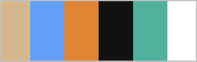
The color palette we’ll be using in this example.