CSS Animation – calc() Function & Gradients: Create an Isometric Tornado - Part 2
Build an animated isometric tornado using only CSS! Learn how calc() and gradients create a stunning 3D vortex effect from scratch


Introduction
Ready to build a stunning 3D tornado animation using only HTML and CSS? In this step-by-step article, you’ll learn how the CSS calc() function, smart translate movements, and smooth animation settings work together to create a natural swirling effect.
- In Part 1, you learned how to build each part of the isometric tornado by combining multiple CSS properties and functions. Focusing on shaping basic HTML
<div>elements into layered tornado rings, helped you understand how structure and styling work together to form the final design. - In Part 2, this article, we’ll bring everything to life with animation. You’ll use the CSS
calc()function to control movement and create a smooth, natural side‑to‑side swaying motion, making your tornado feel dynamic, fluid, and realistic.
CSS functions and properties explored in this article:
calc()will-changetranslateanimationanimation-delay@keyframes- CSS Custom Properties (Variables)
Preview
A quick preview of what you’ll be animating in this two-part article series.
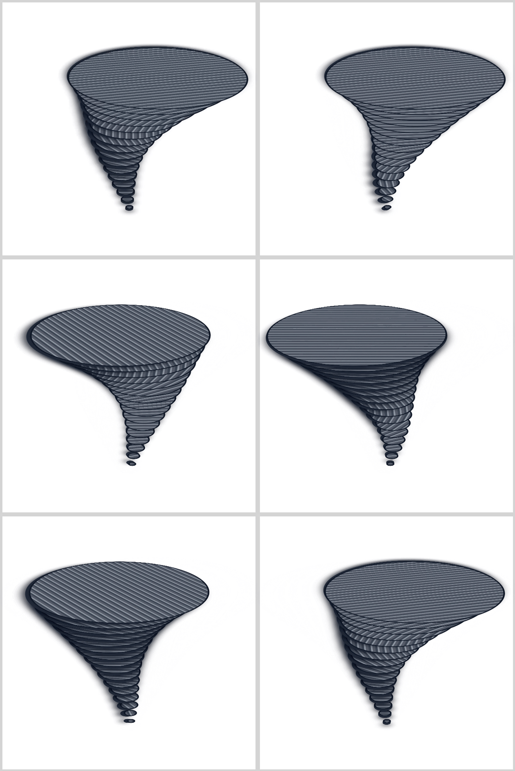
If you haven’t checked out Part 1 yet, we highly recommend giving it a quick read before diving into Part 2. It not only covers the core building concepts of the project but gives you the essential foundation you’ll need to follow the animation techniques introduced here easily.
 Pyxofy
Prerequisites
Essential CSS and HTML knowledge will help you understand the concepts and techniques introduced in this article. Jump over to this article if you require an HTML and CSS primer.
We assume you have configured tools to modify CSS. If not, this article will guide you through the setup process.
Please read this article if you’re unfamiliar with CSS animation and the @keyframes at-rule property.
HTML Structure
<div class="container">
  <div class="environment">
    <div class="tornado-funnel">
      <div class="ring" style="--i: 1; --w: 10px"></div>
      <div class="ring" style="--i: 2; --w: 20px"></div>
      <div class="ring" style="--i: 3; --w: 30px"></div>
      <div class="ring" style="--i: 4; --w: 40px"></div>
      <div class="ring" style="--i: 5; --w: 50px"></div>
      <div class="ring" style="--i: 6; --w: 62px"></div>
      <div class="ring" style="--i: 7; --w: 75px"></div>
      <div class="ring" style="--i: 8; --w: 90px"></div>
      <div class="ring" style="--i: 9; --w: 108px"></div>
      <div class="ring" style="--i: 10; --w: 128px"></div>
      <div class="ring" style="--i: 11; --w: 150px"></div>
      <div class="ring" style="--i: 12; --w: 175px"></div>
      <div class="ring" style="--i: 13; --w: 205px"></div>
      <div class="ring" style="--i: 14; --w: 238px"></div>
      <div class="ring" style="--i: 15; --w: 275px"></div>
      <div class="ring" style="--i: 16; --w: 315px"></div>
    </div>
  </div>
</div>
container is the outermost enclosure. It enables the content to be centered and draws a light gray border. The rest of the <div>s represent each animation sequence.
Keep the HTML structure as is for the animation to display correctly.
Body and Container <div> CSS
CSS code for the body and container <div>.
/* Body and Container Settings */
/* Center shapes */
body {
  margin: 0;
  padding: 0;
  height: 100vh;
  display: flex;
  justify-content: center;
  align-items: center;
  flex-wrap: wrap;
}

/* Set background and border color */
.container {
  min-width: 500px;
  height: 500px;
  border: 5px solid #d3d3d3;
  background: #ffffff;
  position: relative;
  margin: 5px;
  display: flex;
  justify-content: center;
  align-items: center;
}
Custom Properties
/* Custom Properties */
:root {
  --animation-length: 2.5s;
  --animation-easing: ease-in-out;
  --animation-iteration: infinite alternate;
}
By defining these variables inside the :root pseudo-class, you're placing them at the very top level of your document—the <html> element.
This means your animation settings are globally available. Think of :root as your central control panel, where any selector in your CSS can easily access and reuse these values.
Understanding the Animation Variables:
1.--animation-length: 2.5s;
This sets how long one full animation cycle takes.
A 2.5-second duration feels just right:
- Fast enough to look lively and dynamic
- Slow enough to stay smooth and easy on the eyes
It creates that perfect balance for natural-looking motion.
2.--animation-easing: ease-in-out;
This controls how the animation moves over time.
Instead of moving at a constant speed, ease-in-out makes the motion feel more realistic:
- Starts slowly
- Speeds up in the middle
- Slows down again at the end
The result? A smooth, organic flow—not stiff or robotic.
3.--animation-iteration: infinite alternate;
This is where the animation really comes to life!
infinite→ keeps the animation running foreveralternate→ reverses direction each cycle
Instead of jumping back to the start, the motion flows back and forth seamlessly, creating a continuous, natural rhythm—just like a real swirling tornado.
Next, let’s take a look at the animation settings.
Animation
The animation properties define how the motion behaves, using the custom variables you set earlier in :root. By referencing them, you keep your code clean, consistent, and easy to tweak anytime.
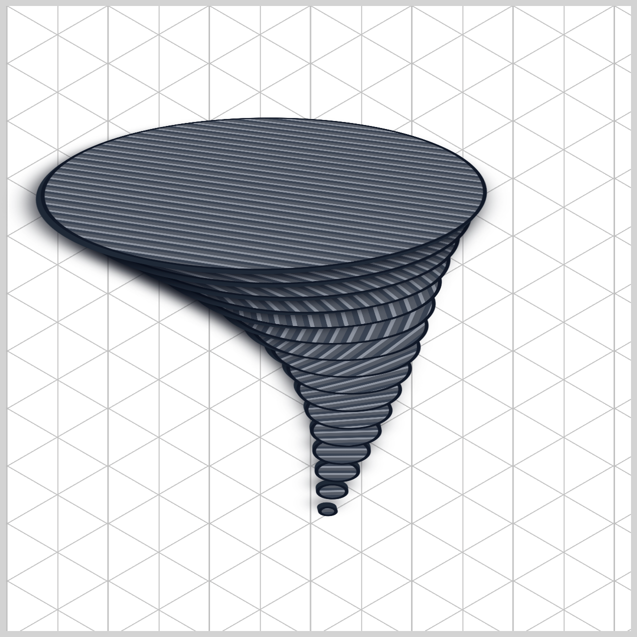
.ring {
	animation: vortexKinematics
var(--animation-length)
var(--animation-easing)
var(--animation-iteration);
}
Here’s what’s happening in the above code:
- The animation is named
vortexKinematics, which links directly to your@keyframesdescribed in a later section. var(--animation-length)controls the speed of the motion.var(--animation-easing)shapes the flow of movement.var(--animation-iteration)decides how the animation repeats.
By centralizing these values, you can adjust the entire animation system just by updating a few variables—no need to rewrite multiple rules.
Let’s dive into the animation-delay property.
.ring {
	animation-delay: calc(var(--i) * -0.15s);
}
This line introduces what we can call the Chronological Phase Shifter (or simply, the wave delay). It’s the small but powerful detail that turns your design from a stiff, solid stack of rings into a smooth, flowing tornado animation.
If all 16 rings started their animation at the exact same time, they would move together in perfect sync. The result? A rigid, pipe-like structure that feels unnatural.
By adding a calculated delay using calc(), each ring starts at a slightly different moment. This creates a soft, cascading wave effect, where every ring follows the motion of the one before it.
1.The Index Value → var(--i)
Each ring has its own index number defined in the HTML.
For example:
- Ring 1 →
--i: 1 - Ring 5 →
--i: 5
2.The Timing Formula → * -0.15s
This index is multiplied by a small negative delay. So the browser calculates:
- Ring 1 → -0.15s
- Ring 2 → -0.30s
- Ring 5 → -0.75s
3.The “Time Travel” Effect
Normally, a positive delay makes an animation wait before starting.
But a negative delay does something special:
- It tells the browser to start immediately, but as if the animation has already been running.
The Final Result: A Living Wave
Because each ring is slightly ahead in time:
- Higher rings appear further along in the animation cycle
- Lower rings follow behind
This creates a continuous ripple effect from bottom to top—right from the first frame.
will-change CSS Property
.ring {
	will-change: translate, rotate;
}
This single line—will-change: translate, rotate;—may look small, but it’s a powerful performance hint that keeps your animation running smoothly.
Think of it as a friendly “heads-up notice” to the browser.
You’re telling it: “Get ready—these elements are about to move and rotate a lot!”
Normally, the browser uses the CPU to handle layouts and updates. That works fine for simple pages—but your tornado is different. It has many layers moving and rotating continuously, which can make the CPU work too hard and cause lag or stuttering.
The browser prepares in advance by:
- Moving the elements to the GPU (graphics card)
- Creating a dedicated rendering layer just for them
Because the GPU is designed for fast visual processing, your rings can move and spin smoothly, like objects in a video game. The browser doesn’t need to constantly repaint everything, so your animation stays fluid and responsive.
Let’s move to the last section in this article and tackles the animation keyframes.
Keyframes
Welcome to the core engine of your tornado!
The @keyframes vortexKinematics block is where all the motion magic happens. It transforms your design from something stiff into a smooth, organic swirling storm.
Modern CSS lets you move elements in 3D space using:
translate: X-axis Y-axis Z-axis;
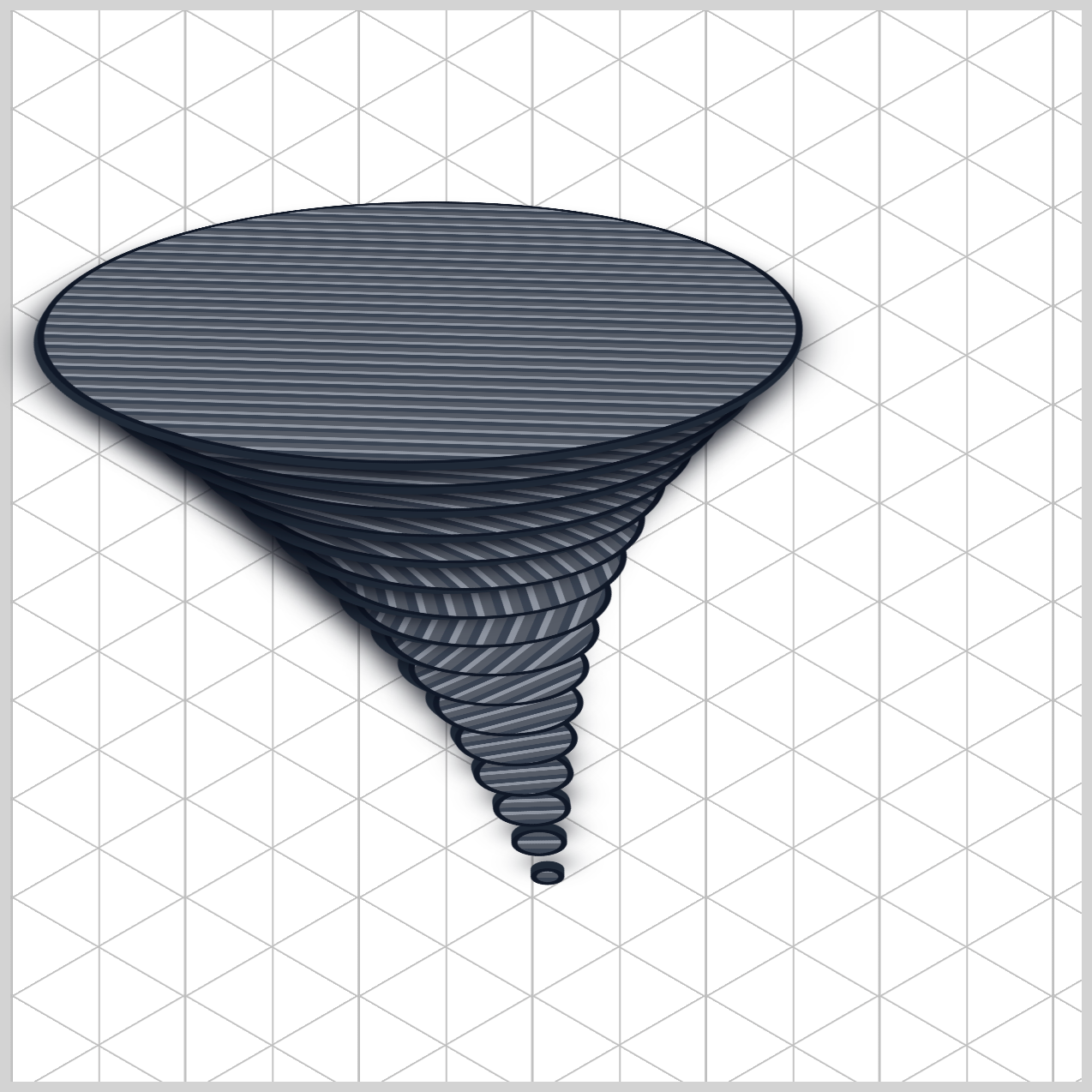
@keyframes vortexKinematics {
  0% {
    translate:
	calc(var(--i) * -2.5px)
	calc(var(--i) * -2.5px)
    calc(var(--i) * 18px);
    rotate: 0deg;
  }

  100% {
    translate:
	calc(var(--i) * 2.5px)
	calc(var(--i) * 2.5px)
    calc(var(--i) * 18px);
    rotate: 180deg;
  }
}
By plugging in var(--i) (each ring’s index), every ring gets its own unique position in space. Let’s breakdown the animation code in detail.
1.Z‑Axis → Building the Funnel Height
calc(var(--i) * 18px)
This value stays the same from 0% to 100%. It lifts each ring upward and creates the vertical stack of the tornado.
Example:
- Ring 1 →
18px - Ring 5 →
90px - Ring 16 →
288px
This is what gives your tornado its height and structure.
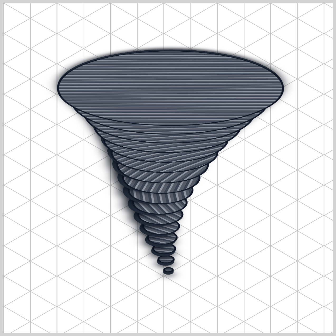
2.X & Y Axes: The Sway Motion
- At
0%:calc(var(--i) * -2.5px) - At
100%:calc(var(--i) * 2.5px)
This creates a side-to-side movement.
- Lower rings move very little → stable base
- Higher rings move much more → wide, dramatic swing
Example:
- Ring 1 → moves only ±2.5px (almost still)
- Ring 16 → moves ±40px (big sweeping motion!)
This scaling makes the tornado feel anchored at the bottom and wild at the top.
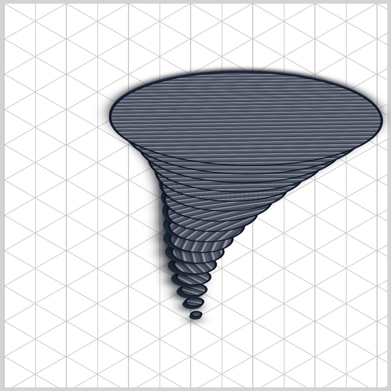
3.Rotation → Spinning Energy
rotate: 0deg → 180deg;
While the rings sway, they also spin in place. Because your rings have a textured gradient:
- The rotation makes patterns shift and swirl
- It looks like debris, wind, and storm particles
Quick Customization Tips
Want to adjust your tornado’s personality?
- More violent motion: Increase
2.5px→4pxor5px - Taller funnel: Increase
18px→25pxor30px
In short:
- Z-axis builds the height
- X/Y adds motion
- Rotation adds energy
Together, they create a tornado that feels alive, dynamic, and realistic.
You can see and play with the complete code on Pyxofy’s CodePen page.
See the Pen CSS Animation – calc() Function & Gradients: Create an Isometric Tornado by Pyxofy (@pyxofy) on CodePen.
Conclusion
This article highlighted the true power of modern CSS. You explored how powerful CSS features like @keyframes, translate, and rotate can simulate realistic motion. The calc() function safely reads each HTML index to automate vertical height and wide lateral sways through the 3D translate property. The animation performance is optimized using will-change for a smoother viewing experience.
By combining multi-axis positioning, scaled movement using var(--i), and negative animation-delay, each ring moves naturally in a flowing wave. The Z-axis builds height, while X and Y create dynamic sway. Together, these properties turn simple elements into a smooth, organic tornado animation, showing how CSS can produce complex visual effects without JavaScript.
What CSS animations will you make with? Share your masterpiece with us on LinkedIn, Threads, Bluesky, Mastodon, X (Twitter) @pyxofy, or Facebook.
We hope you liked this article. Kindly share it with your network. We appreciate it.
Related Articles
 Pyxofy
 Pyxofy
 Pyxofy
 Pyxofy