CSS Art – Using the CSS shape() Function to Make Basic Shapes: Squares, Rectangles, Circles, Ellipses, and Triangles
Creating art is all about the basics. Learn how to make triangles, ellipses, and much more using the CSS shape() in this step-by-step article.

Introduction
Basic shapes serve as the building blocks of artwork, and it’s essential that you can create them with ease. With the CSS shape() function, you can construct basic shapes such as triangles and ellipses to more complex shapes such as hearts and crosses.
In this article, you will learn how to create squares, rectangles, circles, ellipses, and triangles using the CSS shape() function.
CSS functions and properties you’ll be learning in this article.
shape()clip-pathbackground
Preview
Discover the CSS shape() function, how it differs from path(), and explore ways to create simple shapes for use in your artwork.

Prerequisites
Essential CSS and HTML knowledge will help you understand the concepts and techniques introduced in this article. Jump over to this article if you require an HTML and CSS primer.
We assume you have configured tools to modify CSS. If not, this article will guide you through the setup process.
HTML Structure
<div class="container">
  <div class="square"></div>
</div>
<div class="container">
  <div class="rectangle"></div>
</div>
<div class="container">
  <div class="circle"></div>
</div>
<div class="container">
  <div class="ellipse"></div>
</div>
<div class="container">
  <div class="triangle"></div>
</div>
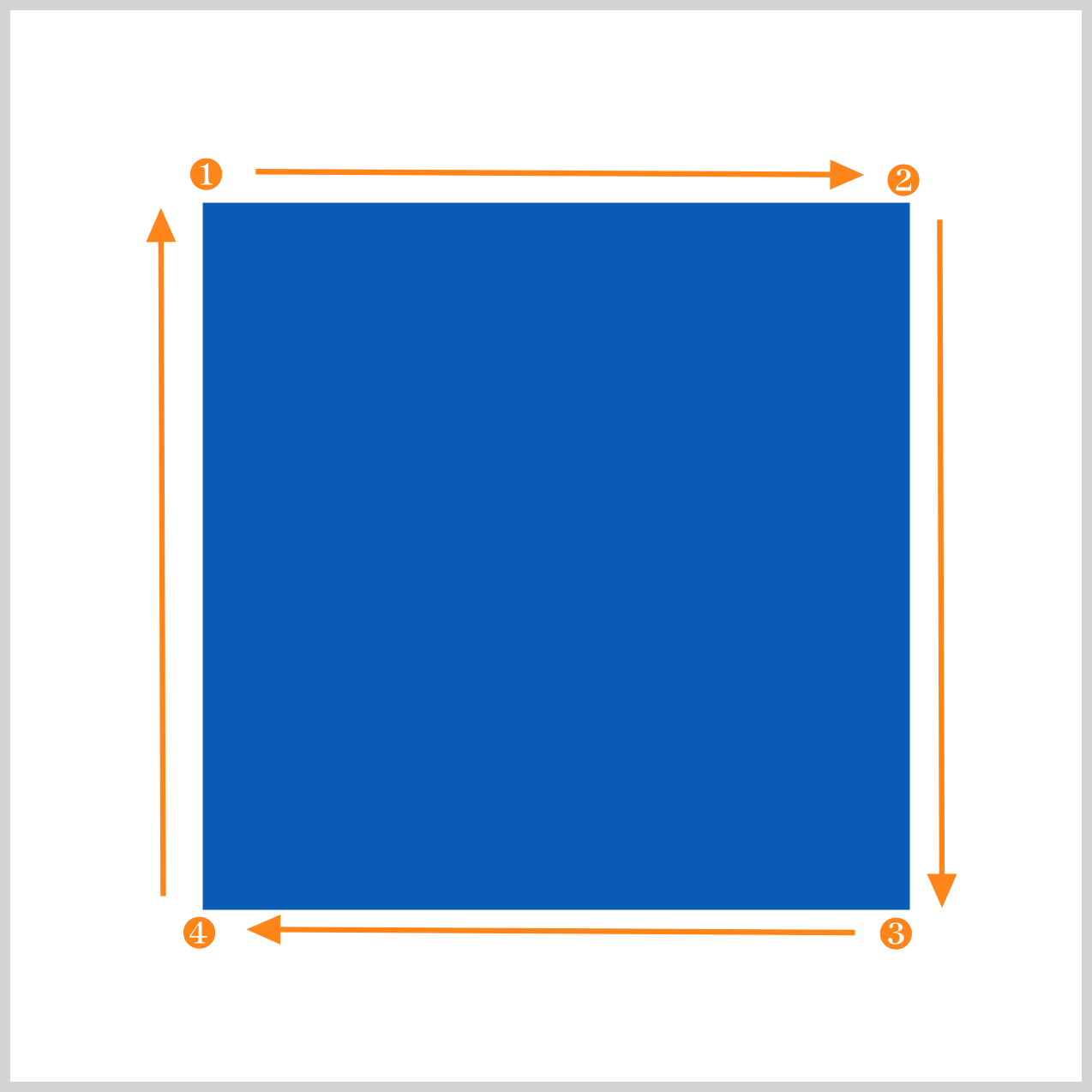
container is the outermost enclosure. It enables the content to be centered and draws a light gray border. The rest of the <div>s represent each image component.
Keep the HTML structure as is for the image to display correctly.
Body and Container <div> CSS
CSS code for the body and container <div>.
/* Body and Container Settings */
/* Center shapes */
body {
  margin: 0;
  padding: 0;
  height: 100vh;
  display: flex;
  justify-content: center;
  align-items: center;
  flex-wrap: wrap;
}

/* Set blue background and light gray border */
.container {
  min-width: 500px;
  height: 500px;
  border: 5px solid lightgray;
  background: white;
  position: relative;
  margin: 5px;
  display: flex;
  justify-content: center;
  align-items: center;
}
shape() Function
The CSS shape() function allows you to create shapes such as squares, triangles, ellipses, and even complex shapes like hearts, crosses, and blob-like images. Before the shape() function, you used the CSS path() function and Scalable Vector Graphics (SVG) commands to make advanced shapes.
Unlike the path() function, which uses SVG path syntax, the shape() function uses standard CSS syntax. This makes it simpler to create and modify shapes. It supports various CSS units, such as percentages, rem, and em, whereas path() is limited to single-string pixel units.
shape() also supports CSS math functions, such as calc(), max(), and abs(), giving you more flexibility when defining shapes.
Check this page out for the shape() function's latest browser compatibility level.

Parameters and Commands
You’ll be using several shape() parameters and commands to make the basic shapes in this article.
from <coordinate-pair>: Defines the starting point of the first<shape-command>as a pair of coordinates that are measured from the top-left corner of thereference box. Coordinates are given as space-separated values for the horizontal axis(x)and vertical axis(y). Percentage values are relative to the width and height of the element's reference box, respectively. Insert a comma after this parameter.<move-command>: Specifies the starting point for the next command and does not draw anything.<line-command>: It creates a straight line connecting the command’s starting point to its ending point.<hv-line-command>: Usinghline, you can draw a horizontal line from the command’s starting pointtoorbythe specifiedxposition. Withvline, a vertical line is drawn.<arc-command>: This command draws an elliptical arc between a starting point and ending point.close: Use this command to close the shape by drawing a straight line from the current position (the end of the last command) to the starting point of the path defined in thefromparameter.
Common Properties
Common properties are combined to ensure minimal code size.
/* Common Properties */
.square,
.rectangle,
.circle,
.ellipse,
.triangle, {
  width: 500px;
  height: 500px;
  background: #085bb5;
}
- The width and height properties are both set to
500px. - The shape’s background color is set to a blue,
#085bb5, shade.
Let’s start working on the first basic shape, a square, in the next section.
Square
The square is a fundamental shape and can be made easily by combining shape() commands.
.square {
  clip-path: shape(
    from 90px 90px,
    hline by 330px,
    vline by 330px,
    hline by -330px,
    close
  );
from 90px 90pxsets the starting point90pxfrom the left edge and90pxfrom the top.hline by 330pxdraws a horizontal line from thefromparameter's location, extending from90pxto330px. Your current location is near the upper right-hand side.- To draw a vertical line, you use
vline by 330px, which draws a straight line down from the previoushlinelocation. The current location is on the bottom right-hand side. - To draw a horizontal line from the bottom right-hand side to the bottom left-hand side, you use
hline by -330px. Take note of the minus (-) symbol. - The
closecommand draws a straight vertical line from the bottom left corner to the upper left corner, effectively closing the square shape.
Rectangle
Drawing the rectangle works just like creating a square - you combine the hline and vline commands.

.rectangle {
  clip-path: shape(
    from 40px 90px,
    hline by 415px,
    vline by 330px,
    hline by -415px,
    close
  );
}
The starting point is set using from 40px 90px. A horizontal straight line is drawn using hline by 415px and placing the current location to 415 pixels from the left edge. vline by 330px draws a vertical line downwards to the lower right corner. To extend another horizontal line towards the lower left corner, you use the hline by -415px. Finally, the close command draws a straight line from the lower left corner back to the starting point, thereby closing the shape.
Up next is the circle shape.
Circle
To make the circle image, you use the shape() <arc-command>.
With the elliptical arc curve command, you can create two ellipses that intersect both the starting and ending points. Each ellipse can be traced in a clockwise or counterclockwise direction, yielding four possible arcs based on the size, direction, and angle.
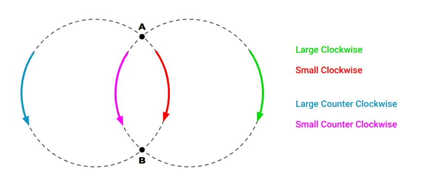
Source: CSS-Tricks
The <arc-command> includes these parameters to create elliptical shapes.
<arc-sweep>: Specifies whether the desired arc is traced around the ellipse in a clockwise (cw) or counterclockwise (ccw) direction. If not specified, it defaults toccw.<arc-size>: Indicates whether the desired arc is the larger (large) or the smaller (small) of the two arcs. If omitted, it defaults tosmall.<angle>: Defines the angle, in degrees, to rotate the ellipse around the x-axis. A positive angle rotates the ellipse clockwise, while a negative angle rotates it counterclockwise. If not specified, the default is0deg.
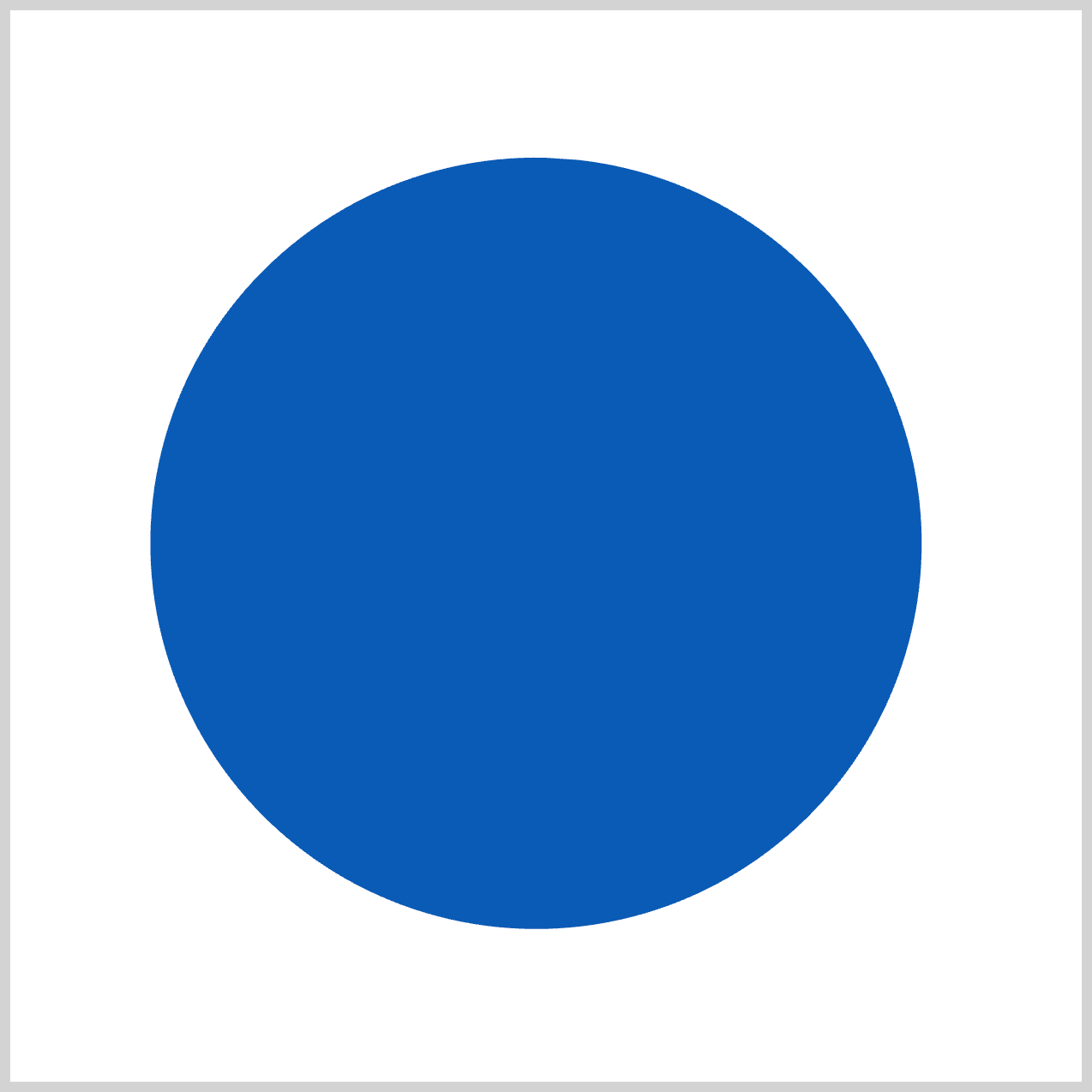
.circle {
  clip-path: shape(
    from 265px 70px,
    arc to 250px 69px of 180px cw large,
    close
  );
}
from 265px 70pxsets the starting point.arc to 250px 69pxsets the arc’s endpoint.of 180pxsets the horizontal and vertical size of the arc to180px.cwsets the<arc-sweep>parameter to clockwise.- The
<arc-size>value is set to large with thelargeparameter keyword.
The circle is complete; let’s work on the ellipse shape in the next section.
Ellipse
Similar to the previous circle, the ellipse shape is made using the <arc-command>.
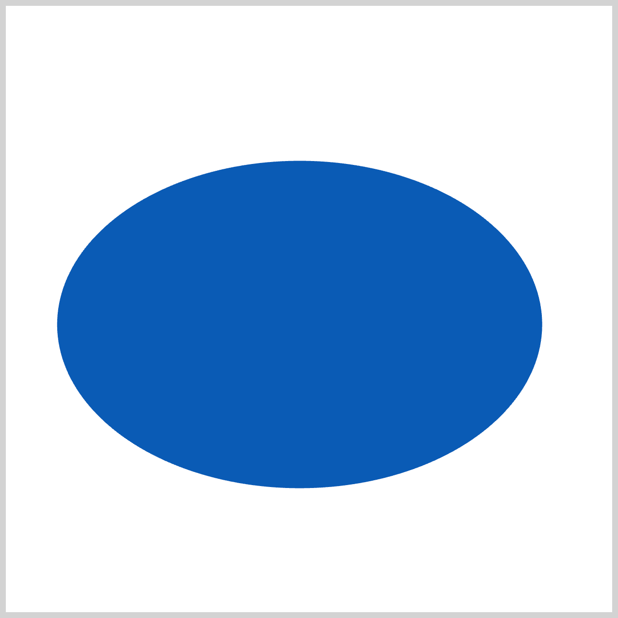
.ellipse {
  clip-path: shape(
    from 240px 128px,
    arc to 245px 128px of 200px 135px ccw large,
    close
  );
}
Set the starting point with from 240px 128px, and the end point with arc to 245px 128px. Creating an ellipse shape requires setting both the horizontal and vertical sizes, in this case, using of 200px 135px. The <arc-sweep> parameter is set to ccw or counter-clockwise, and the <arc-size> is set to large.
Let’s wrap up by creating a triangle in the final section.
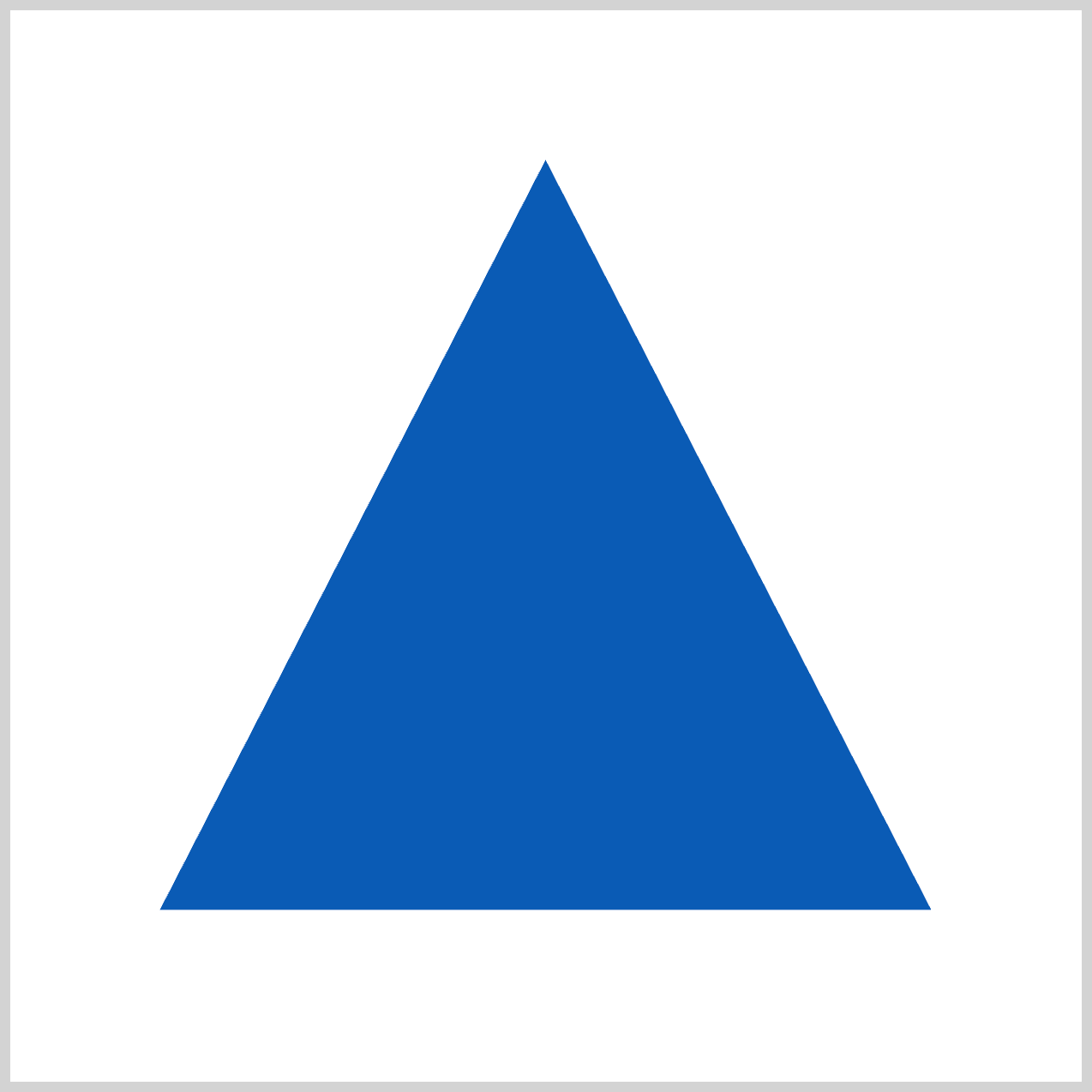
Triangle
The triangle is made using the <line-command>. The <line-command> requires both a horizontal (x) value and a vertical (y) value.

.triangle {
  clip-path: shape(
    from 250px 70px,
    line by -180px 350px,
    line by 360px 0px,
    close
  );
}
- The starting point is set using
from 250px 70px. line by -180px 350pxdraws a diagonal line towards the lower left corner.line by 360px 0pxextends a straight line from the lower left corner towards the lower right corner.- To close the triangle shape, the
closecommand closes the shape by drawing a diagonal line from the lower right corner back to the starting point.
You can see and play with the complete code on Pyxofy’s CodePen page.
See the Pen CSS Art – Using the CSS shape() Function to Make Basic Shapes: Squares, Rectangles, Circles, Ellipses, and Triangles by Pyxofy (@pyxofy) on CodePen.
Conclusion
In this article, you learned how to create basic shapes using the CSS shape() function. Compared to the path() function, the shape() function is more versatile and easy to understand because it allows you to use standard CSS syntax.
It supports standard CSS features such as CSS units, including percentages like rem and em. You can use CSS math functions such as calc(), abs(), and max() with shape(), which greatly expands your image creation toolset.
What basic shapes will you make shape()? Share your masterpiece with us on LinkedIn, Threads, Bluesky, Mastodon, X (Twitter) @pyxofy, or Facebook.
We hope you liked this article. Kindly share it with your network. We appreciate it.
Related Articles
 Pyxofy
 Pyxofy
 Pyxofy
 Pyxofy