CSS Animation – Radial Text Background Animation
Your text doesn’t have to be flat on a 2D screen. You’ll learn to bake in drama and flare to your text background in this step-by-step article.

Introduction
Making your content eye-catching and memorable on the internet is a daunting task.
In this article, you will learn how to make two interesting effects: a spotlight effect and a polka effect.
If you’re new to CSS gradients, read this article to get familiar with how they work.

Preview
Radial Text Background / Spotlight Effect

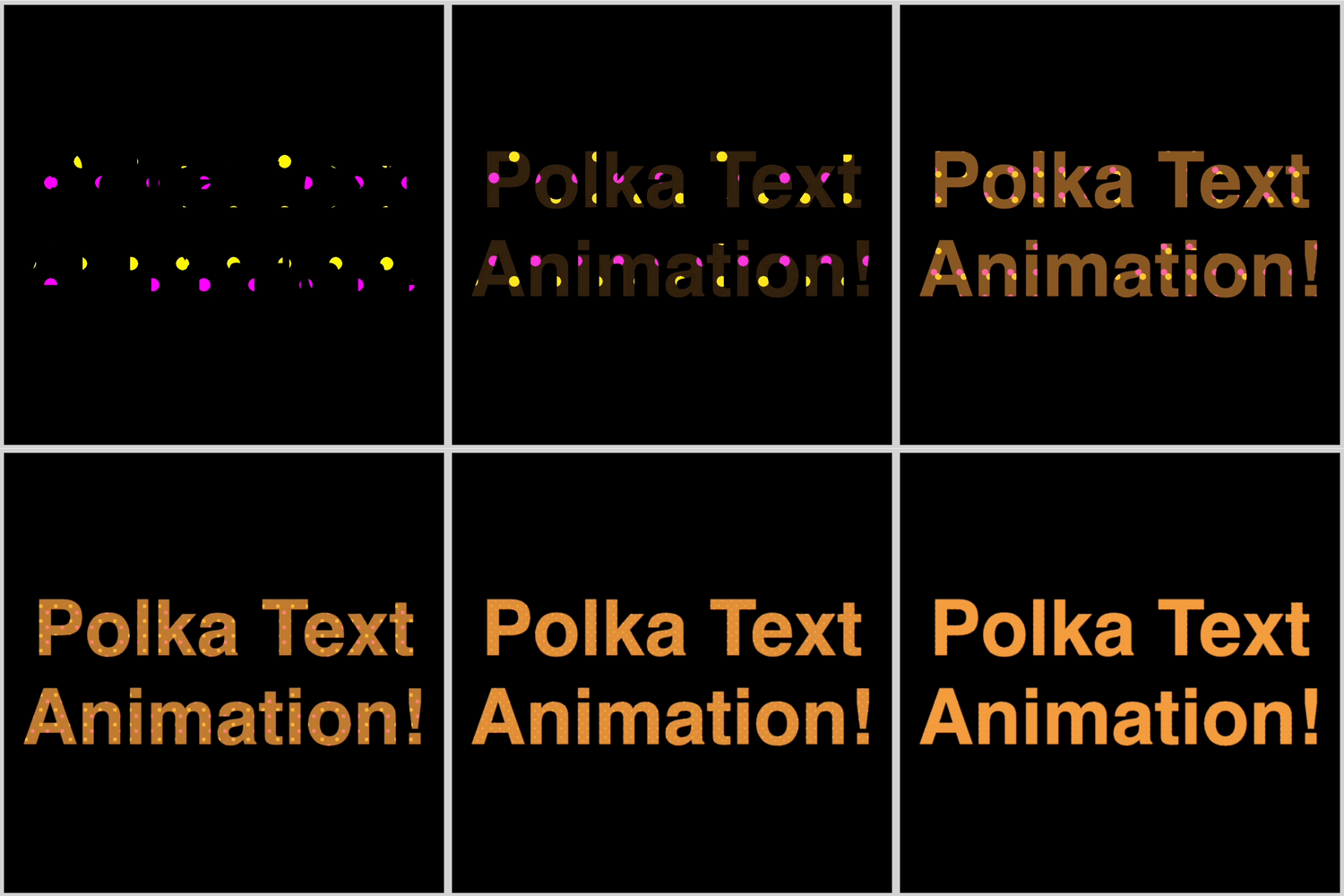
Polka Effect
Prerequisites
Basic CSS and HTML knowledge will help you understand the concepts and techniques introduced in this article. Jump over to this article if you require an HTML and CSS primer.
We assume that you have set up tools to create CSS animation. If you haven’t, this article will show you how to set them up.
If you’re unfamiliar with CSS animation and the @keyframes at-rule property, please read this article.
HTML Structure
<!-- Radial Text Background / Spotlight Effect -->
<div class="container">
  <div class="radial-text-container">
    <p class="radial-text">Radial Text Animation!</p>
  </div>
</div>

<!-- Polka Effect -->
<div class="container">
  <div class="polka-text-container">
    <p class="polka-text">Polka Text Animation!</p>
  </div>
</div>
container is the outermost enclosure. It enables the content to be centered and draws a light gray border. The rest of the divs represent each animation sequence.
Keep the HTML structure as is for each animation to display properly.
Body and Container Div CSS
CSS code for the body and container div.
/* Body and Container Settings */
/* Center shapes */
body {
  margin: 0;
  padding: 0;
  height: 100vh;
  display: flex;
  justify-content: center;
  align-items: center;
  flex-wrap: wrap;
}

/* Set blue background and light gray border */
.container {
  width: 500px;
  height: 500px;
  border: 5px solid lightgray;
  background: transparent;
  position: relative;
  margin: 5px;
  display: flex;
  justify-content: center;
  align-items: center;
}
Spotlight Effect
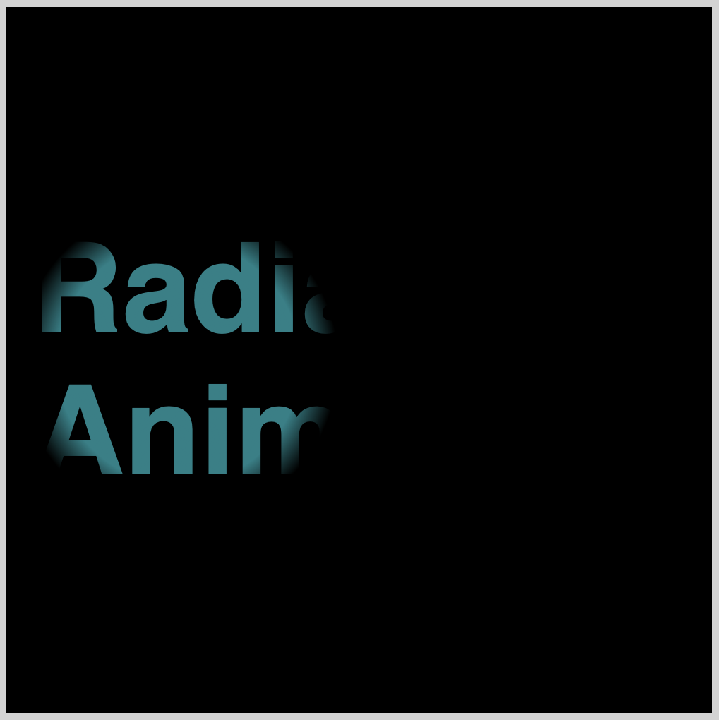
You’ll learn how to create a spotlight effect using CSS with the first example. Spotlight effects add a sense of mystery and allow you to control when to show or hide content.
The spotlight effect, as well as the polka effect in the section, consists of three components:
- A background
- A text mask
- An animation sequence

Let’s learn how to create the background.
/* Radial Background Gradient */
.radial-text {
  background: radial-gradient(circle, #00f2ff 0% 32%, transparent 42% 100%);
}
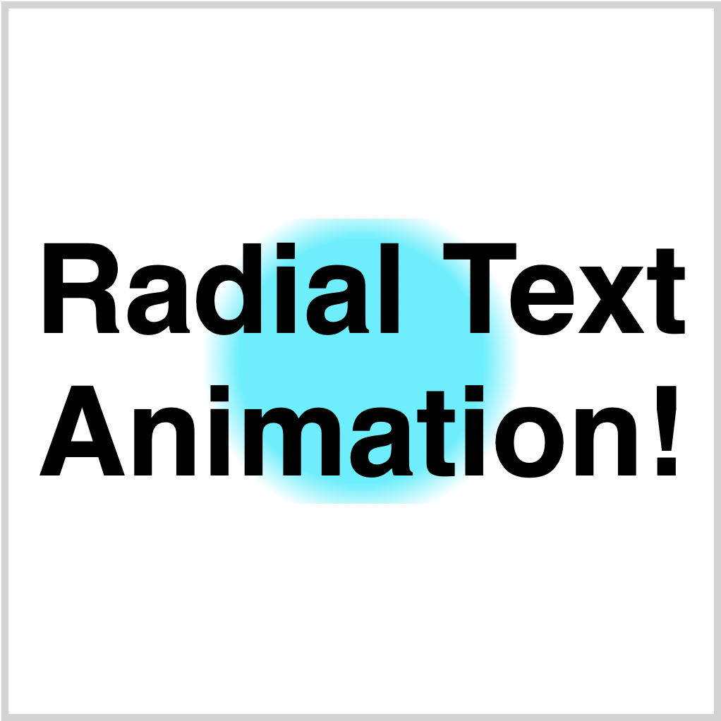
The CSS radial-gradient() function produces the circular cyan gradient. By modifying this Hex code #00f2ff, you can change the circle gradient’s color.
You can change the size of the circle gradient. Try adjusting the percentage values of 0% 32% and transparent 42% 100% to make the gradient smaller or bigger. Have fun playing around with it!
Let’s make the static text next.
/* Radial Text Container */
.radial-text-container {
  width: 500px;
  height: 500px;
  font: 900 5.5rem sans-serif;
  text-align: center;
  display: flex;
  justify-content: center;
  align-items: center;
  background: black;
}
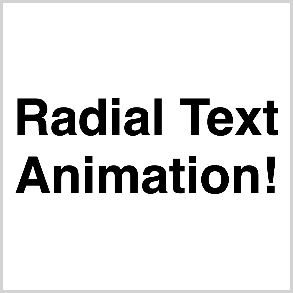
You can change the font size to your preferred style by modifying the 5.5em value. Similarly, you can adjust the font weight by changing the 900 value and select a different font family by replacing sans-serif with your desired font.
We temporarily changed background: black to background: white to make the black text visible for the sample image.
Next up, text mask.
/* Radial Background Gradient */
.radial-text {
  background: radial-gradient(circle, #00f2ff 0% 32%, transparent 42% 100%);
  /* Background Clip */
  /* webkit vendor prefix start */
  -webkit-background-clip: text;
  -webkit-text-fill-color: transparent;
  /* webkit vendor prefix end */
  background-clip: text;
}
You create the text mask effect by combining background-clip: text and -webkit-text-fill-color: transparent CSS properties. At the time of this writing, this vendor prefix, -webkit-background-clip: text, is required for Chromium-based browsers for the text mask effect to work.
Combine background-clip: text and -webkit-text-fill-color: transparent CSS properties to create the text mask effect. For Chromium-based browsers, the vendor prefix -webkit-background-clip: text is required for the text mask effect to work at the time of this writing.
Let’s make the animation sequence.
You use two CSS components to create an animation sequence. The animation property describes the CSS animation style. The @keyframes at-rule specifies the start and end states of the animation’s style and any intermediate waypoints.
Check this article for a detailed explanation of making CSS animation sequences.
/* Radial Background Gradient */
  animation: radial-text-animation 5s ease-in-out infinite;
}
CSS shorthand is used to declare the animation CSS property values. The following is a detailed breakdown of the CSS shorthand.
animation-nameequates toradial-text-animation.animation-duration=5sor five seconds.animation-timing-function=ease-in-out.animation-iteration-count=infinite.
Animation will loop continuously in this mode.
/* Radial Text Animation */
@keyframes radial-text-animation {
  from {
    opacity: 0;
    background-position: -175px -200px;
  }

  50% {
    opacity: 1;
  }

  to {
    background-position: 175px -200px;
    opacity: 0;
  }
}
To create the spotlight effect, you use the CSS opacity and background-position properties.
- Set the
opacityto0and thebackground-positionto-175pxon the x-axis and-200pxon the y-axis in thefromor initial state. - Set the
opacityto1in the50%or midpoint state. The text and background will be fully opaque. - To move the circle gradient all the way to the right, set the
background-positionto175px -200pxin thetostate. Make the background and text disappear from the screen by setting theopacityto0.
Full Spotlight Effect Animation CSS Code
/* Radial Text Container */
.radial-text-container {
  width: 500px;
  height: 500px;
  font: 900 5.5rem sans-serif;
  text-align: center;
  display: flex;
  justify-content: center;
  align-items: center;
  background: black;
}

/* Radial Background Gradient */
.radial-text {
  background: radial-gradient(circle, #00f2ff 0% 32%, transparent 42% 100%);
  /* Background Clip */
  /* webkit vendor prefix start */
  -webkit-background-clip: text;
  -webkit-text-fill-color: transparent;
  /* webkit vendor prefix end */
  background-clip: text;
  animation: radial-text-animation 5s ease-in-out infinite;
}

/* Radial Text Animation */
@keyframes radial-text-animation {
  from {
    opacity: 0;
    background-position: -175px -200px;
  }

  50% {
    opacity: 1;
  }

  to {
    background-position: 175px -200px;
    opacity: 0;
  }
}
Play around and experiment with different CSS property values. How about moving the circle gradient to the left? Recreate the spotlight effect on vertical text instead of horizontal text.
You will learn how to create a “Polka” effect in the next section.

Polka Effect
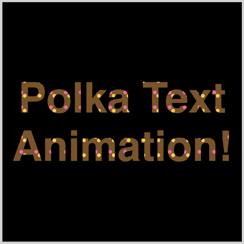
Polka dots are a staple design element in the fashion world. In this section, you will learn how to simulate a polka effect and use it as an animated text background.
We explain only the CSS code that differs from the previous Spotlight Effect section for brevity.
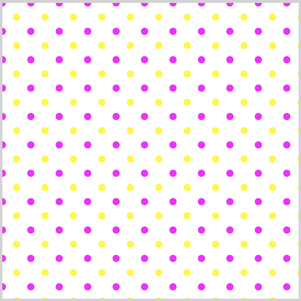
/* Polka Background Gradient */
.polka-text {
  background-image: radial-gradient(#fff700 18%, transparent 18%),
    radial-gradient(magenta 18%, transparent 18%);
  background-position: 0px 0px, 24px 24px;
  background-size: 48px 48px;
}
Two radial-gradient are combined to make the yellow and magenta polka dots.
This code produces the yellow dot.
radial-gradient(#fff700 18%, transparent 18%)
For the magenta dot, we use this code.
radial-gradient(magenta 18%, transparent 18%)
You can change the size of the dots by adjusting the percentage value. To make the yellow dot bigger or smaller, adjust 18% to a bigger or smaller value. Change the value to 28%, see how it affects the size of the dot.
Both dots are very crisp or in focus. You can add a blur effect by changing the transparent value. Change the transparent 18% to let say 38%, the dots are blurred.
You control the position of each dot with this code.
background-position: 0px 0px, 24px 24px;
- The yellow gradient,
#fff700, is positioned at0pxfrom the left and0pxfrom the top. - The magenta gradient is positioned
24pxfrom the left and24pxfrom the top.
The image background size is controlled with this code.
background-size: 48px 48px;
- Both width and height properties are set to
48px. The image is square shaped.
Let’s break down the animation sequence next.
/* Polka Background Gradient */
.polka-text {
  animation: polka-text-animation 4s infinite;
}
Similar to the spotlight effect, animation-iteration-count is set to infinite. The animation will continuously loop.
/* Polka Text Animation */
@keyframes polka-text-animation {
  from {
    background-size: 58px 58px;
  }

  to {
    text-shadow: #f99f3e 0 0 1px;
    background-size: 5px 5px;
  }
}
Two changes are made from the initial state, from, and the end, to, state.
background-sizeis changed from58px 58pxto5px 5px. This makes a receding or zooming out effect, making the dots smaller throughout the animation sequence.- An orange,
#f99f3e, text shadow is applied to the text.
Here’s the full Polka Effect CSS code.
/* Polka Container */
.polka-text-container {
  width: 500px;
  height: 500px;
  font: 900 5.5rem sans-serif;
  text-align: center;
  display: flex;
  justify-content: center;
  align-items: center;
  background: black;
}

/* Polka Background Gradient */
.polka-text {
  background-image: radial-gradient(#fff700 18%, transparent 18%),
    radial-gradient(magenta 18%, transparent 18%);
  background-position: 0px 0px, 24px 24px;
  background-size: 48px 48px;
  /* Background Clip */
  /* webkit vendor prefix start */
  -webkit-background-clip: text;
  -webkit-text-fill-color: transparent;
  /* webkit vendor prefix end */
  background-clip: text;
  animation: polka-text-animation 4s infinite;
}

/* Polka Text Animation */
@keyframes polka-text-animation {
  from {
    background-size: 58px 58px;
  }

  to {
    text-shadow: #f99f3e 0 0 1px;
    background-size: 5px 5px;
  }
}
You can see and play with the full code at Pyxofy’s CodePen page.
See the Pen CSS Animation – Radial Text Background Animation by Pyxofy (@pyxofy) on CodePen.
Conclusion
In this article, you learned how to make two fascinating effects: a spotlight effect and a polka effect.
Here’s a recap of each animation effect:
- Spotlight effect: The spotlight effect is created by using a
radial-gradientto create a circular shape that fades from opaque to transparent. - Polka effect: The polka effect is created by using two
radial-gradientto create a grid of polka dots. The two gradients can be animated to slowly fade in to solid text.
Both animation effects are enjoyable and simple to create. Incorporate them into your content to enhance its dynamism and visual appeal.
Share your masterpiece with us on Twitter @pyxofy, on LinkedIn, Mastodon or Facebook.
We hope you liked this article. Kindly share it with your network. We really appreciate it.
Want more articles like this one? Become a Pyxofy member!
Related Articles


