CSS Art – Create 3D Shapes with Border Radius, Rotate and Gradients - Part 2
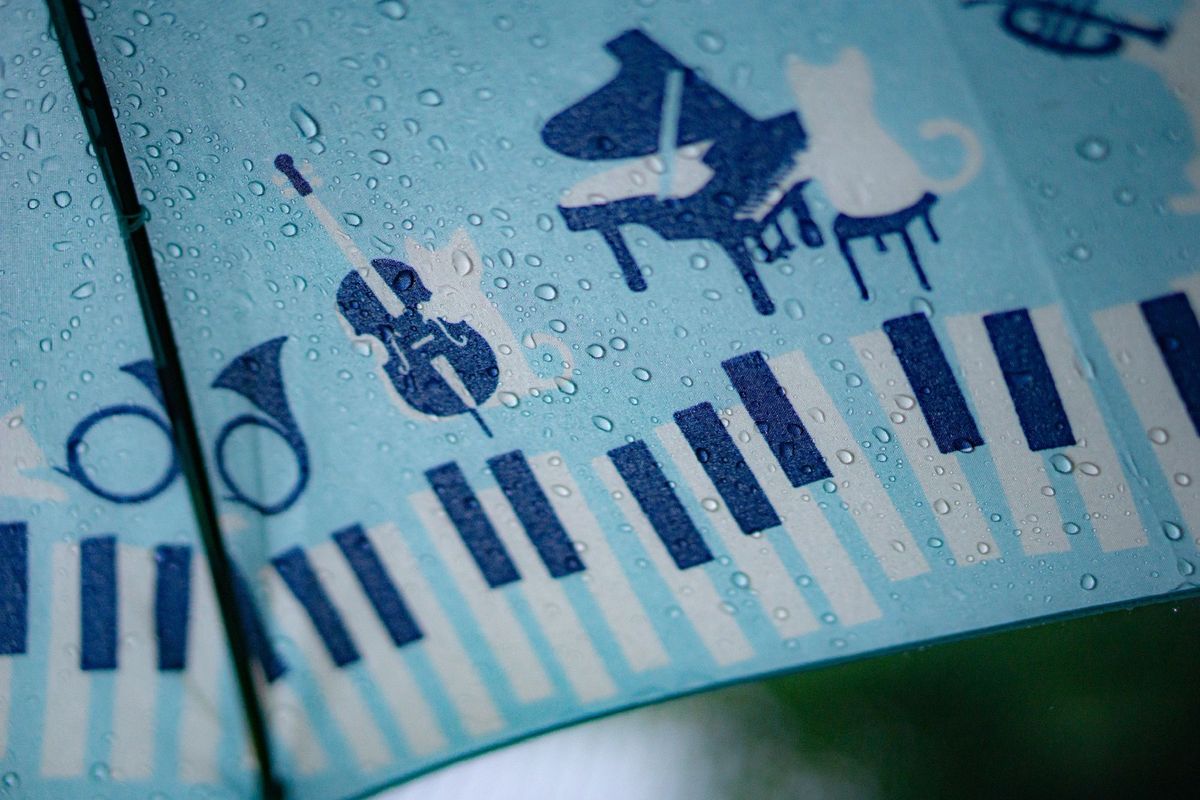
Think depth and volume need images? Think again. Learn how pure CSS gradients, highlights, and shadows can make flat shapes look real.

Introduction
Light and shadow are two sides of the same coin. Once you learn how to control both, you unlock the ability to make flat, two‑dimensional shapes feel like they’re popping off the screen.
This two‑part article series walks you step by step through the entire process in a clear and beginner‑friendly way.
- In Part 1, you focused on building the chair’s core structure—the Chair Body, Chair Top, and Legs—using essential CSS properties and functions.
- In Part 2 (this article), you will take things further by combining multiple CSS gradients—including
linear-gradient()andradial-gradient()—to enhance lighting, add depth, and make the chair look more three‑dimensional, and realistically isometric, all while keeping the code clean and easy to follow.
CSS properties and functions that will be introduced in this article:
linear-gradient()radial-gradient()- CSS Custom Properties (Variables)
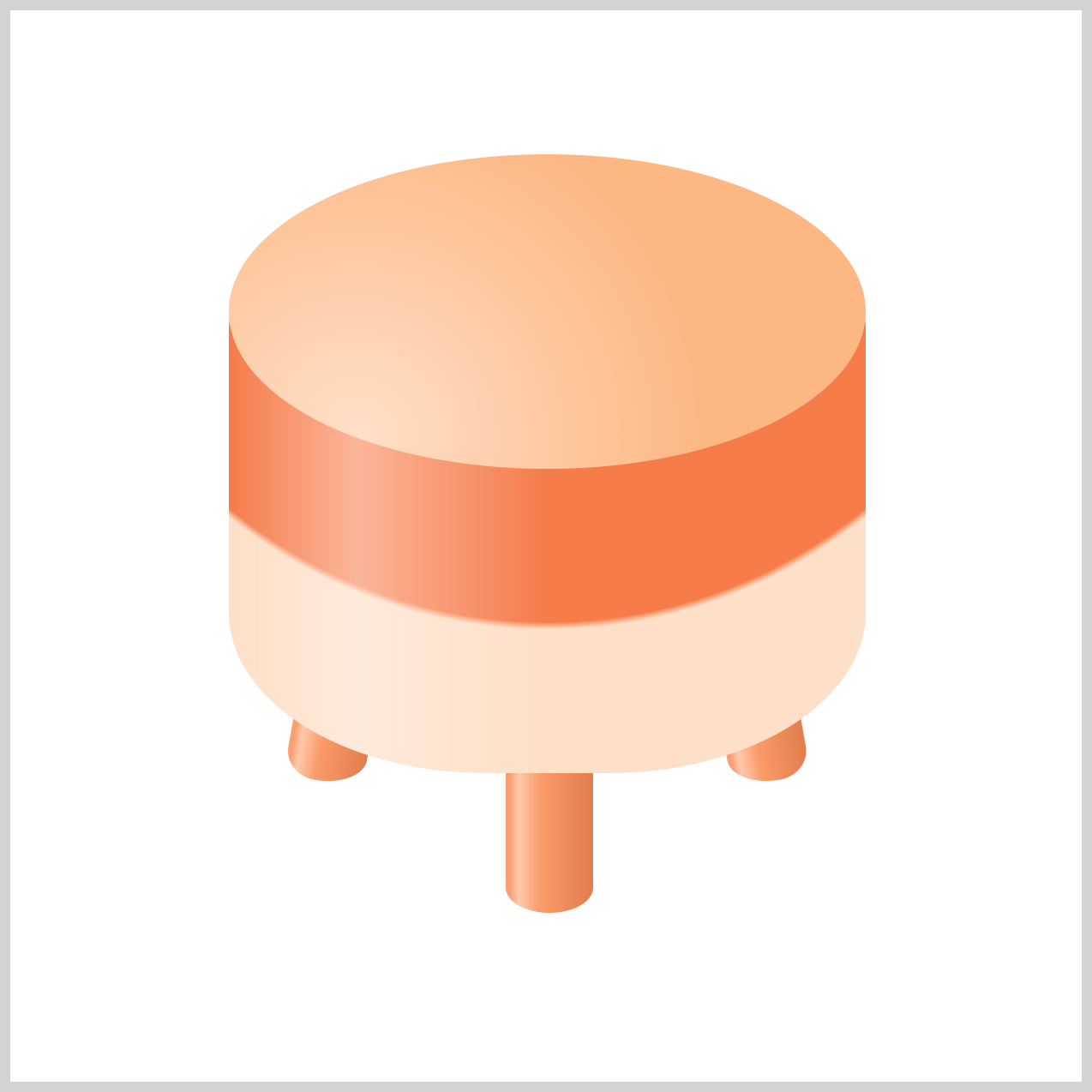
Preview
Here’s a quick sneak peek of the CSS art you’ll be creating throughout this two‑part series. By the end of this article, you’ll clearly see how each small piece fits together to form a dynamic, eye‑catching image.

If you haven’t explored Part 1 yet, we highly recommend giving it a quick read first—it covers the core building blocks and provides the essential foundation you’ll need to follow the techniques in Part 2 with confidence and ease.
 Pyxofy
Prerequisites
Essential CSS and HTML knowledge will help you understand the concepts and techniques introduced in this article. Jump over to this article if you require an HTML and CSS primer.
We assume you have configured tools to modify CSS. If not, this article will guide you through the setup process.
HTML Structure
<div class="container">
  <div class="leg-left leg"></div>
  <div class="leg-mid leg"></div>
  <div class="leg-right leg"></div>
  <div class="chair-body"></div>
  <div class="chair-top"></div>
</div>
container is the outermost enclosure. It enables the content to be centered and draws a light gray border. The rest of the <div>s represent each image component.
Keep the HTML structure as is for the image to display correctly.
Body and Container <div> CSS
CSS code for the body and container <div>.
/* Body and Container Settings */
/* Center shapes */
body {
  margin: 0;
  padding: 0;
  height: 100vh;
  display: flex;
  justify-content: center;
  align-items: center;
  flex-wrap: wrap;
}

/* Set background and border color */
.container {
  width: 500px;
  height: 500px;
  border: 5px solid lightgray;
  background: transparent;
  position: relative;
  margin: 5px;
  display: flex;
  justify-content: center;
  align-items: center;
}
Color Palette
You’ll color the isometric chair using CSS Custom Properties (Variables), which helps keep your CSS clean, organized, and easy to maintain. By defining colors once with --variables, you can update the entire design from a single place. This approach also makes your code future‑proof—if you later add details like armrests, cushions, or decorative trim, your color system will scale smoothly without extra effort.
/* Color Palette */
:root {

  /* Chair Top */
  --chair-top-1: #ffdfc7; /* Soft Peach */
  --chair-top-2: #fcb783; /* Warm Apricot */

  /* Chair Body */
  --chair-body-1: #f57b4a; /* Coral Orange */
  --chair-body-2: #ffdfc7; /* Soft Peach */
  --chair-shine: #fff6f076; /* Pale Cream Glow (transparent) */

  /* Chair Legs */
  --chair-leg-1: #fa9f71; /* Light Salmon */
  --chair-leg-2: #ffc9ab; /* Peach Cream */
  --chair-leg-3: #fa9a69; /* Sunset Peach */
  --chair-leg-4: #e27d4c; /* Burnt Orange */
}
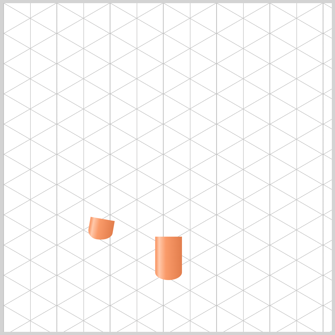
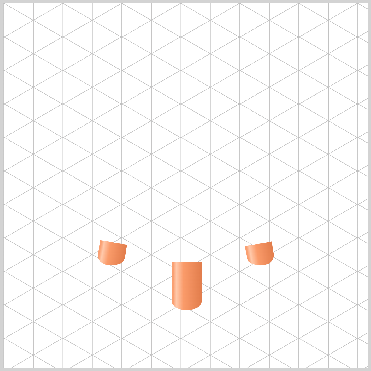
Chair Legs
The Chair Legs uses a four‑color gradient, starting with --chair-leg-1 (Light Salmon) and gradually transitioning to --chair-leg-4, a Burnt Orange tone. This smooth color shift helps simulate circular shading, giving the leg a more rounded, three‑dimensional look. A lighter highlight, --chair-leg-2 (Peach Cream) within the gradient adds depth and makes the shading feel more natural and polished.
/* Chair Legs */
.leg {
  background: linear-gradient(
    to right,
    var(--chair-leg-1) 0% 5%,
    var(--chair-leg-2) 15%,
    var(--chair-leg-3) 40%,
    var(--chair-leg-4) 100%
  );
}
Let’s break down the linear-gradient() values in a simple, beginner‑friendly way.
to rightdefines the direction of the gradient. It means the colors start on the left side of the element and gradually move toward the right side, creating a smooth horizontal color transition.
Color stops are the points that control where each color appears in the gradient. The percentages (0%, 5%, 15%, and so on) work like marks on a ruler, telling CSS exactly where a color should begin and end along the gradient line. By adjusting these values, you can fine‑tune the shading—making transitions sharper, smoother, or more dramatic—without changing the colors themselves.
var(--chair-leg-1) 0% 5%defines the first color stop in the gradient. The Light Salmon color stored in--chair-leg-1is applied from the very start of the gradient at0%and continues until5%. It represents the hard left edge color of the chair leg. This tone helps define the leg’s outer boundary and making the shape feel more solid and three‑dimensional rather than flat.var(--chair-leg-2) 15%is the second color stop in the gradient. At the15%mark—still close to the left edge—we apply our lightest shade, Peach Cream. This color works as a highlight, making it feel as if a soft light source is shining directly onto the chair leg. The result is a more rounded, glossy look that enhances the 3D effect.
var(--chair-leg-3) 40%is the third color stop in the gradient. This shade, Sunset Peach, acts as a mid‑tone as the colors move toward the center of the leg. By gradually darkening at this point, the gradient reinforces the rounded, cylindrical shape, helping the chair leg feel more three‑dimensional and realistic.var(--chair-leg-4) 100%is the final color stop, placed at the very end of the gradient on the right side. Here, we use our darkest shade, Burnt Orange. Because this color is much deeper than the others, it creates the illusion that the chair leg is curving away from us and falling into shadow. This strong contrast completes the shading effect and really sells the three‑dimensional, rounded look of the legs.
Next, let’s move on to coloring the Chair Body.
Chair Body
In this section, you’ll see how we combine two CSS gradients—a radial gradient and a linear gradient—to give the chair body its main shape, depth, and a subtle shine. By carefully layering these gradients, the body starts to feel rounded, soft, and three‑dimensional.
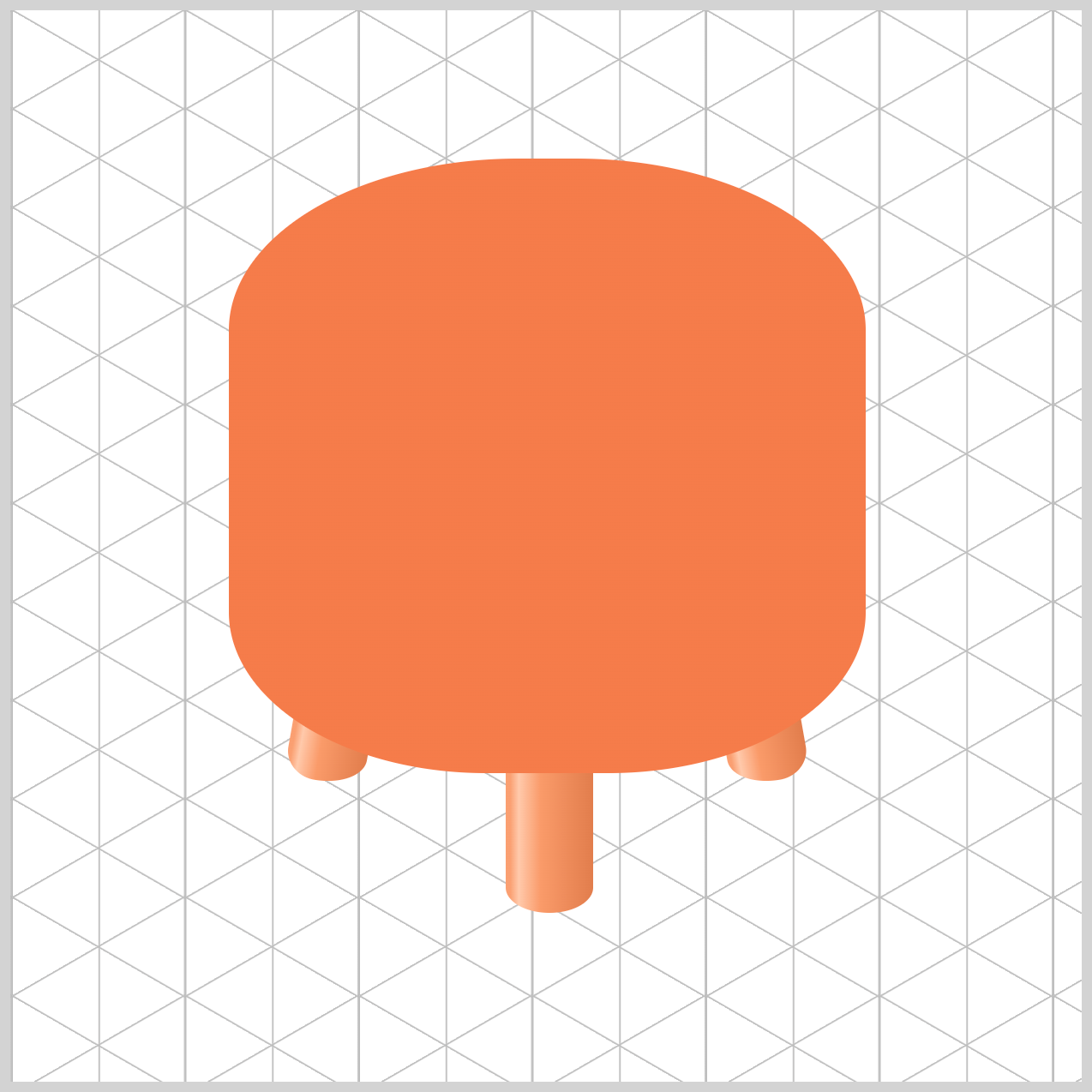
/* Chair Body */
.chair-body {
  background: radial-gradient(
      circle at 50% -6%,
      var(--chair-body-1)
    );
}
Let’s break down the Chair Body radial-gradient() values in a simple, beginner-friendly way.
The value circle at 50% -6% controls the focal point of the gradient. Normally, a radial gradient starts in the center of an element, but here we deliberately move the center outside the shape. The 50% centers the circle horizontally (left to right), while the -6% is the clever trick—it pushes the center above the element using a negative value.
Because the circle’s center sits above the box, we only see the lower edge of the circle inside the element. This creates a smooth, elegant curve that looks like the natural arc of a chair’s seat, which we’ll use in the next step to set a two-tone color design.
.chair-body {
  background: radial-gradient(
      circle at 50% -6%,
      var(--chair-body-1) 69%,
      var(--chair-body-2) 70%
    );
}
The values var(--chair-body-1) 69% and var(--chair-body-2) 70% control where the color change happens in the radial gradient.
The browser paints the Coral Orange shade from the center of the circle all the way out to the 69% mark, then quickly switches to the lighter Soft Peach color at 70%.
Because there’s only a 1% gap between these two stops, the colors don’t have much space to blend or fade. To the human eye, this creates a sharp, clean edge, which helps define the chair body’s shape and gives it a crisp, polished look.
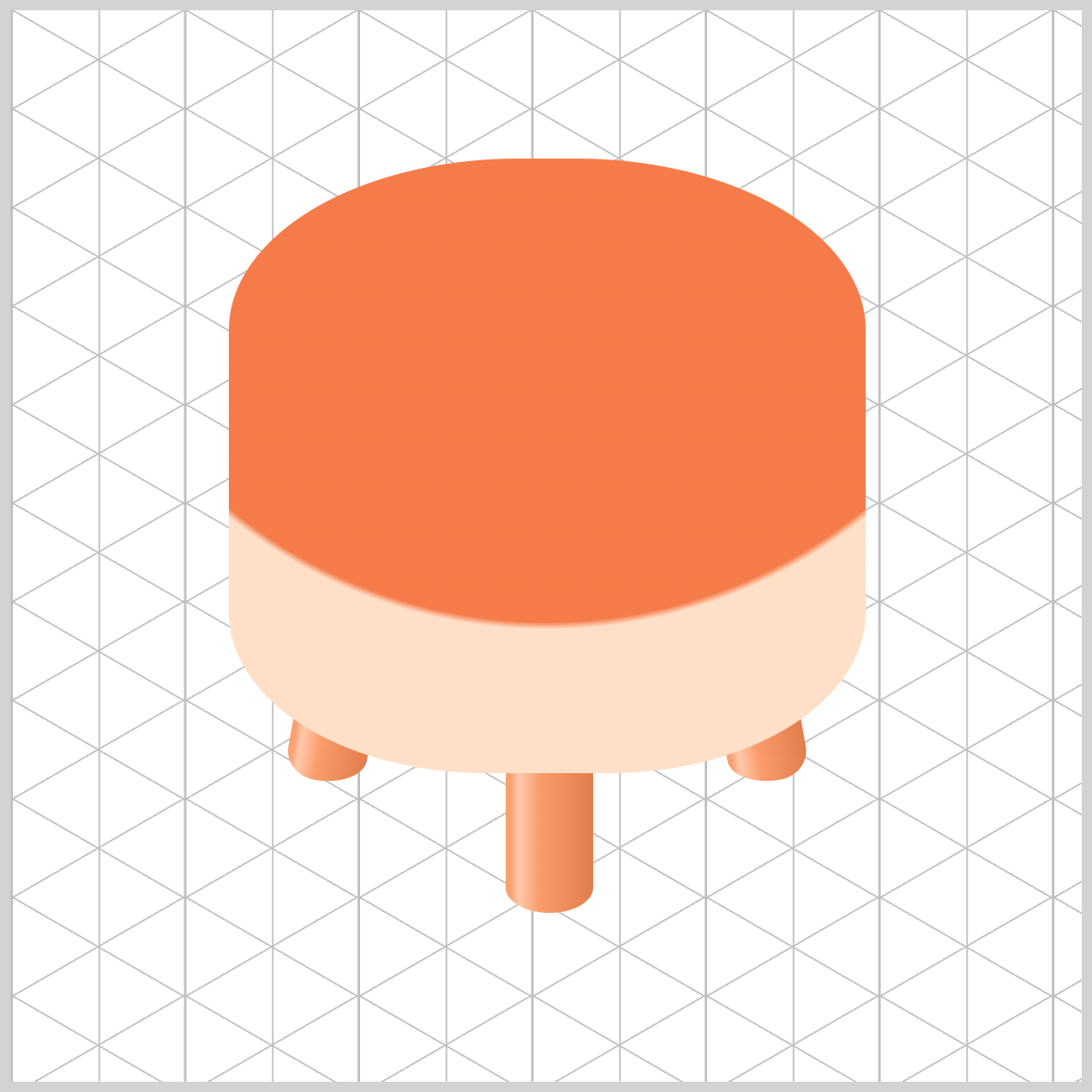
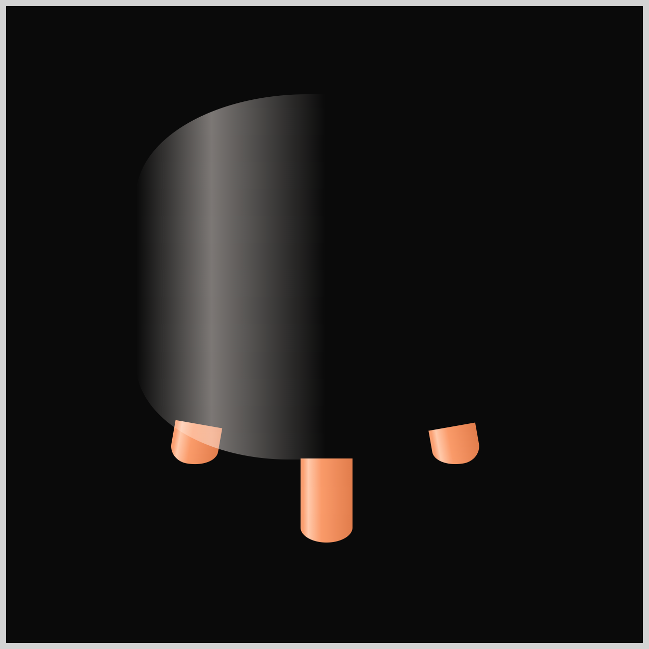
In the next step, you’ll learn how to layer a semi‑transparent linear-gradient() on top of the radial gradient to create a soft highlight effect. This extra layer mimics how light reflects off a curved surface, making the Chair Body feel more cylindrical and dimensional.
To make the semi‑transparent highlight easier to see, we’ve temporarily changed the background color to black in the below reference image.
.chair-body {
  background: linear-gradient(
      to right,
      transparent 0%,
      var(--chair-shine) 20%,
      transparent 50% 100%
    );
}
The most important word here is transparent. In CSS, transparent means the color has 0% opacity, so you can see right through it. This is crucial for highlights. If we used a solid color, it would cover up the chair body. By using transparent, the main chair color from the radial gradient still shows through, while we only add a soft streak of light on top.
Let’s break down the linear-gradient() stops:
transparent 0%means there’s no color on the far left edge.var(--chair-shine) 20%is where the highlight—our Pale Cream Glow—is at its strongest. You can control the highlight position by increasing or decreasing the percentage value.transparent 50% 100%fades the highlight out completely, from the middle of the chair all the way to the right edge.
This layering technique creates a subtle, realistic highlight that makes the Chair Body feel more rounded and cylindrical, without overwhelming the base colors.
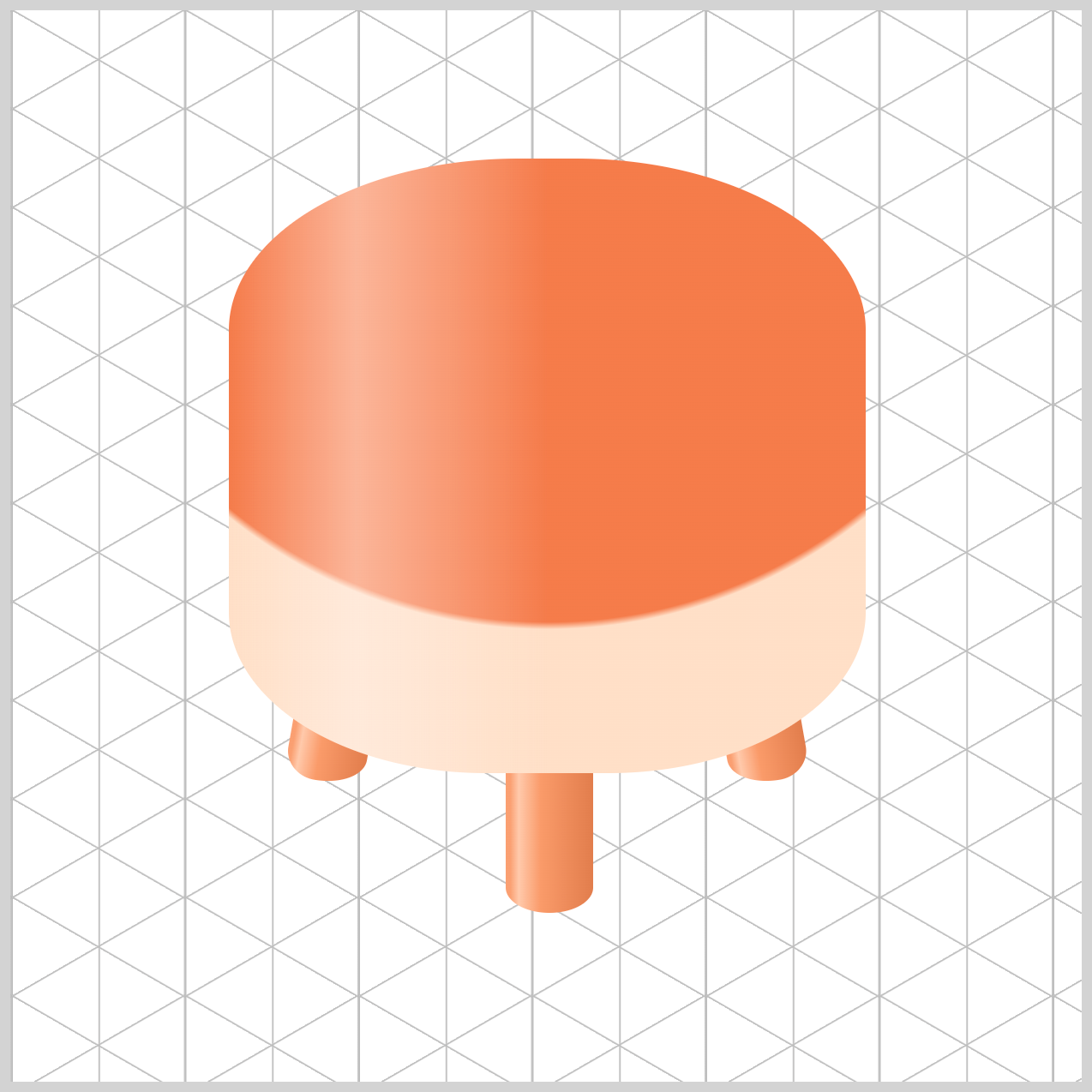
Full Chair Body CSS code.
.chair-body {
  background: linear-gradient(
      to right,
      transparent 0%,
      var(--chair-shine) 20%,
      transparent 50% 100%
    ),
    radial-gradient(
      circle at 50% -6%,
      var(--chair-body-1) 69%,
      var(--chair-body-2) 70%
    );
}
The gradient “stacking” technique is a key concept for beginners to understand. You can think of CSS background layers like a stack of papers placed on top of each other. The browser reads them from top to bottom, starting with the first layer listed.
- The top layer is the
linear-gradient()—this is the shine effect. Because it’s mostlytransparent, it behaves like a sheet of glass laid over the chair, letting the colors underneath show through while adding a soft highlight. - Beneath it sits the bottom layer, the
radial-gradient(), which provides the main color and curved shape of the chair body.
Together, these layered gradients create depth, realism, and a smooth, three‑dimensional look using only CSS.
Now that the Chair Body is complete, let’s move on to the final section and start coloring the Chair Top.
Chair Top
In this step, we’ll use a simple radial gradient to give the Chair Top a soft, comfortable look that visually blends well with above the chair body.
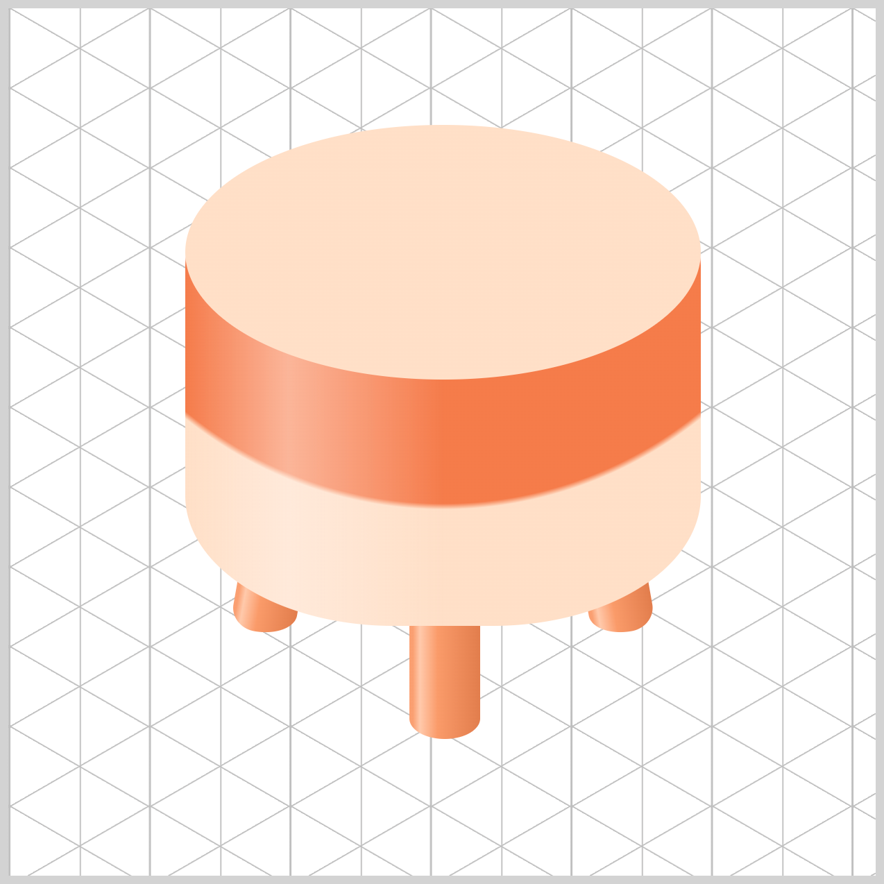
/* Chair Top */
.chair-top {
  background: radial-gradient(
    circle at 20% 90%,
    var(--chair-top-1)
  );
}
You control the light source using circle at 20% 90%.
The 20% value shifts the center of the gradient toward the left, while 90% pushes it down toward the bottom of the shape. By placing the center in the bottom‑left corner, the color naturally radiates upward and outward.
This makes it feel like light is hitting one specific area of the Chair Top more strongly than the rest, which adds depth, direction, and a more realistic sense of lighting to the design.
var(--chair-top-1), a Soft Peach hue, serves as the base background color for the Chair Top. This gentle, warm tone lays the foundation for the gradient.
.chair-top {
  background: radial-gradient(
    circle at 20% 90%,
    var(--chair-top-1) 0%,
    var(--chair-top-2) 60%
  );
}
Similar to the earlier gradients, we’re using two colors to complete the Chair Top gradient.
The first color acts as the base tone, defined by var(--chair-top-1) 0%, laying down a Soft Peach foundation for the Chair Top. The second color, var(--chair-top-2) 60%—a Warm Apricot—gently blends in as the gradient spreads outward.
This smooth transition adds depth and softness, helping the Chair Top feel rounded, comfortable, and visually cohesive with the rest of the design.
You can see and play with the complete code on Pyxofy’s CodePen page.
See the Pen CSS Art - Create 3D Shapes with Border Radius, Rotate and Gradients by Pyxofy (@pyxofy) on CodePen.
Conclusion
In Part 2 of this two‑part article series, you completed the coloring of the chair’s key components—the Chair Legs, Chair Body, and Chair Top—using pure CSS gradients.
By combining the linear-gradient() and radial-gradient() functions, you learned how to control light and shadow, making the chair feel more cylindrical, isometric, and convincingly three‑dimensional.
You also used transparency and gradient layering to add a vertical highlight to the Chair Body, enhancing realism. Finally, by carefully stacking multiple colors, you gave the Chair Legs and Top a look that’s both eye‑catching and visually polished.
With these newly learned CSS techniques, what will you create next? Share your masterpiece with us on LinkedIn, Threads, Bluesky, Mastodon, X (Twitter) @pyxofy, or Facebook.
We hope you liked this article. Kindly share it with your network. We appreciate it.
Related Articles
Pyxofy Pyxofy
 Pyxofy