CSS Art – How to Make Shadows and Angles
We will learn how to implement HTML and text shadows in CSS. Then we’ll explore how to make right, obtuse and acute angles in this article.
Introduction
Shadows are essential in art. They give your illustration perspective, depth, and texture. We will learn the different shadows CSS has to offer.
Making angles and bends with CSS can be tricky, tedious. We will explore different ways to simulate angles in this article.
We don’t assume prior knowledge of CSS or HTML, but it helps if you have some familiarity with how they work. Jump over to the below article if you need an HTML and CSS primer.
 Pyxofy
We assume that you have set up tools to create CSS art. If you haven’t, the below article will show you how to set them up.
Pyxofy
CSS Shadow
In this section, we’ll describe how we can use three CSS shadow properties for CSS art. One by one we will learn the syntax and how to use the following CSS properties.
Light source
Before diving in to the CSS shadow properties, let’s take a short detour about light sources. Light source determines how shadows are cast.
- Key light
Key lights are akin to spotlights, midday sunlight or any harsh light source that casts very sharp shadows. - Ambient light
Ambient light cast very soft, blurred shadows. If you’ve been to a professional photo studio, you may have noticed numerous lights with umbrellas covering them. These umbrellas diffuse the light resulting in ambient lighting, making the photographs softer.
Before you start using shadows in your CSS art, it’s important to decide beforehand what your light source will be. Is it a single key light at a 45-degree angle? Or will it be multiple ambient light sources, making soft, blurred shadows?
Once you have decided on your light source, you need to make sure that your CSS property values are consistent with the light source. If you chose key light, you set your shadows with minimum or no blur. For ambient light, you will combine multiple shadows slightly angled differently, simulating multiple light sources.
Now that we understand the concept of light source, let’s start with box-shadow property.
box-shadow
If you’ve used Photoshop, Figma or any another graphics tool, think of box-shadowas a way of putting “drop shadow” to your elements. You can set multiple shadows by separating them with commas(,).
Syntax:
box-shadow: [horizontal offset] [vertical offset] [blur radius] [optional spread radius] [color];
box-shadow supports 5 parameters.
- Horizontal offset (required)
You can control the horizontal position of the shadow with the horizontal offset. A positive number will put the shadow to the right, a negative number will put the shadow to the left of the HTML element. - Vertical offset (required)
With the vertical offset, you can control the vertical position of the shadow. A negative number will put the shadow above the HTML element. A positive number will move the shadow below the element. - Blur radius (required)
Default value is0, resulting in a sharp shadow. A higher number will make the shadow more blurred and the shadow extending from the HTML element. For example, a shadow with10pxhorizontal offset and a10pxof blur radius will result in20pxof shadow. Negative values are not allowed. - Spread radius (optional)
This is optional. A default value of0will give the shadow the same size as blur. A positive number makes the shadow bigger. A negative number decreases the shadow size. - Color (required)
You can use Color keywords, Hex, RGB or HSL values to set the shadow color. If you don’t specify a color value, it will inherit the color value from its parent element.
Take note for older WebKit browsers (pre Chrome 20 and Safari 6) the rule is ignored when color property value is omitted.
CSS code:
.box-shadow {
  width: 250px;
  height: 250px;
  background: burlywood;
  box-shadow: 0px 7px 29px 0px black;
}
box-shadow applies shadow to the entire HTML element’s box. For this example, we offset the shadow vertically by 7px. We gave it a blur-radius of 29px. We didn’t set the spread radius or the horizontal offset property value.
filter: drop-shadow()
drop-shadow() is a CSS function that applies a drop shadow effect to the input image. A drop shadow is effectively a blurred, offset version of the input image's alpha mask, drawn in a specific color and composited below the image.
Syntax:
drop-shadow(offset-x offset-y blur-radius color)
drop-shadow() parameters are identical to box-shadow parameters, except:
- it doesn’t have a spread radius parameter.
insetparameter not supported.
CSS code:
.drop-shadow {
  width: 250px;
  height: 250px;
  background: burlywood;
  filter: drop-shadow(0px 7px 29px black);
}
We used the same property values of drop-shadow from the previous example. Look at the shadow carefully, compare it to the box-shadow example. You may have noticed that shadows applied by drop-shadow() is different from box-shadow.
Let’s explore this difference in the next section.
Difference between box-shadow and filter: drop-shadow()
The main difference between box-shadow and drop-shadow() is
- the box-shadow property creates a rectangular shadow behind an element's entire box,
- the drop-shadow() filter function creates a shadow that conforms to the shape (alpha channel) of the image itself.
Let’s use a triangle to explain the difference between box-shadow and drop-shadow().
- Triangle

CSS code:
.triangle {
  width: 0;
  height: 0;
  border-left: 200px solid transparent;
  border-right: 200px solid transparent;
  border-bottom: 300px solid burlywood;
}
Triangle with no shadow. In the following examples, we will apply box-shadow and drop-shadow(). Visually, you can compare how shadows are applied to the image.
- Triangle with
box-shadow

CSS code:
.triangle-box-shadow {
  width: 0;
  height: 0;
  border-left: 200px solid transparent;
  border-right: 200px solid transparent;
  border-bottom: 300px solid burlywood;
  box-shadow: 0px 7px 29px 0px black;
}
box-shadow applies the shadow to the entire box of the image. The triangle we created has a box shape. Both border-left and border-right color are transparent. We can see the outline of the box after applying box-shadow. The shadow applies not to the triangle image, but to its box.
- Triangle with
drop-shadow()
")
CSS code:
.triangle-drop-shadow {
  width: 0;
  height: 0;
  border-left: 200px solid transparent;
  border-right: 200px solid transparent;
  border-bottom: 300px solid burlywood;
  filter: drop-shadow(0px 7px 29px black);
}
drop-shadow() applies shadow by mimicking the image's outline more naturally. This differs from box-shadow, where it applies shadow to the whole box of the image. Another perk for drop-shadow() is some browsers provide hardware acceleration for better performance.
Check this article for a detailed comparison table between box-shadow and drop-shadow().
Now we know the difference between box-shadow and drop-shadow(), you can choose which shadow to apply to different shapes in your CSS art.
Next, let’s learn how to apply shadow to text.
text-shadow
text-shadow CSS property enables you to add shadows to text. You can add multiple shadows via comma-separated list. You can set each shadow to have different parameters such as color, blur, and offset to create unique text designs.
Syntax:
text-shadow: [horizontal offset] [vertical offset] [blur radius] [color];
Similar to drop-shadow(), text-shadow doesn’t have a spread radius parameter.
Let’s see text-shadow in action with a couple of examples.
- Text with no shadow

CSS code:
.text {
  color: #fff;
  font-size: 7rem;
  line-height: 7rem;
  font-family: "lato", sans-serif;
  font-weight: 900;
  text-align: center;
}
This is normal text with no shadows applied. We’re using Google “Lato” font for this example.
In the next example, let us give our text a simple shadow.
- Text with simple shadow

CSS code:
.text-simple-shadow {
  color: #fff;
  font-size: 7rem;
  line-height: 7rem;
  font-family: "lato", sans-serif;
  font-weight: 900;
  text-align: center;
  text-shadow: 10px 10px 10px black;
}
We added a “drop shadow” to our text. The texts now looks more “lifted” from the background.
Next, let’s learn how to add multiple shadows.
- Text with multiple colored shadows

CSS code:
.text-multiple-shadow {
  color: #fff;
  font-size: 7rem;
  line-height: 7rem;
  font-family: "lato", sans-serif;
  font-weight: 900;
  text-align: center;
  text-shadow: 40px 30px 10px lightpink, -20px -20px 15px deepskyblue;
}
You’re not limited to one shadow. You can add multiple shadows with different colors, different blurs. Remember to add multiple shadows, comma-separate each property value.
CSS shadow section ends here.
In the next section, let's explore how to make different angles in CSS.
Make different angles
Learning how to simulate different angles are important in CSS art. Geometric design uses many angles. Let’s go through a couple of examples how we can do this with different CSS properties.
These are three types of angles we’ll be making.
- Right angle
Measure 90 degrees. - Obtuse angle
Measures more than 90 degrees. - Acute angle
Measures less than 90 degrees.
Let’s start with a right angle.
Right angle

CSS code:
.right-angle {
	height: 100px;
	width: 200px;
	border-bottom: 30px solid burlywood;
	border-left: 30px solid burlywood;
}
You can make a right angle using the border property. For this example, we used border-bottom and border-left. Remember, even though we only use two border properties, the shape is still a box. In the following examples, we will put a dotted white border, making it easier to understand how the shape changes in accordance to the CSS box model.
Let’s use transform: rotate() to change this shape in to a simple check mark.

CSS code:
.angle-check-mark {
	height: 100px;
	width: 200px;
	border: dotted 1px white;
	border-bottom: 30px solid burlywood;
	border-left: 30px solid burlywood;
	transform: rotate(-45deg);
}
Using transform: rotate(-45deg); we rotated the right angle, transforming it to a simple check mark. You can remove the white dotted border by deleting this line of code, border: dotted 1px white;.
Next, let’s flip the right angle.

CSS code:
.right-angle-flip {
	height: 100px;
	width: 200px;
	border: dotted 1px white;
	border-bottom: 30px solid burlywood;
	border-right: 30px solid burlywood;
}
To flip the right angle, we changed border-left to border-right. The rest of the code remain the same.
In our final example, let’s change the right angle to simulate the letter “L”.

CSS code:
.right-angle-letter-l {
	height: 200px;
	width: 100px;
	border: dotted 1px white;
	border-bottom: 30px solid burlywood;
	border-left: 30px solid burlywood;
}
We reversed the height and width property value to simulate a capital letter “L”. height was originally 100px, we changed it to 200px. width was 200px and we changed it to 100px.
Right angles are easy to make with CSS as it conforms to the CSS box model. Next we’ll show you how to make obtuse and acute angles.
Obtuse and Acute angle
There are several ways to make obtuse and acute angles with CSS. One is using transform: skew() CSS function. Another way is to combine two boxes to simulate an angle.
- Obtuse angle

CSS code:
.obtuse-angle {
  height: 100px;
  width: 250px;
  border: dotted 1px white;
  border-bottom: 20px solid burlywood;
  border-left: 30px solid burlywood;
  transform: skew(45deg);
}
To make the obtuse angle, we used CSS transform: skew() function. Skew changes the angle of the entire image box. Depending on the angle, the image will be distorted. We adjusted the border-bottom to be a little thinner with this code, border-bottom: 20px solid burlywood;. Visually, it’s now consistent with border-left.
If you want absolute control of the angles, you can choose to combine two boxes to simulate the angle.
- Acute angle

CSS code:
.acute-angle {
  width: 300px;
  height: 30px;
  background: burlywood;
  position: absolute;
  left: 90px;
  top: 250px;
  border-radius: 10px 0px 2px 0px;
}

.acute-angle::before {
  content: "";
  width: 200px;
  height: 30px;
  background: burlywood;
  position: absolute;
  left: 15px;
  top: 0px;
  transform: rotate(-30deg);
  transform-origin: bottom left;
  border-radius: 10px 0px 0px 10px;
}
With .acute-angle we made the horizontal box. Using CSS ::before pseudo-element we made the angled box, .acute-angle::before. To make the angle transition smoother between the two boxes, we adjusted the border-radius of both boxes.
- Horizontal box
border-radius: 10px 0px 2px 0px; - Angled box
border-radius: 10px 0px 0px 10px;
See and play with the full code samples at Pyxofy’s CodePen page.
See the Pen CSS Art - Shadow by Pyxofy (@pyxofy) on CodePen.
See the Pen CSS Art - Angle by Pyxofy (@pyxofy) on CodePen.
Conclusion
In this article, we explored different ways to apply shadows to an HTML element such as box-shadow, filter: drop-shadow() and text-shadow. Each shadow property behavior is unique. Play around with the property values. Add multiple shadows to a single element. Change shadow color from black to all sorts of color.
We explored how to simulate right, obtuse and acute angles by using CSS border properties, transform: skew() and combining two boxes. To challenge yourself, change the code to simulate a 10-degree or 120-degree angle.
Shadows and angles are wonderful tools for your CSS art tool-belt.
What art will you make incorporating shadows and angles? Share your CSS art with us on Twitter @pyxofy, on LinkedIn or Facebook.
We hope you liked this article. Kindly share this article with your network. We really appreciate it.
Related Articles
Pyxofy Pyxofy
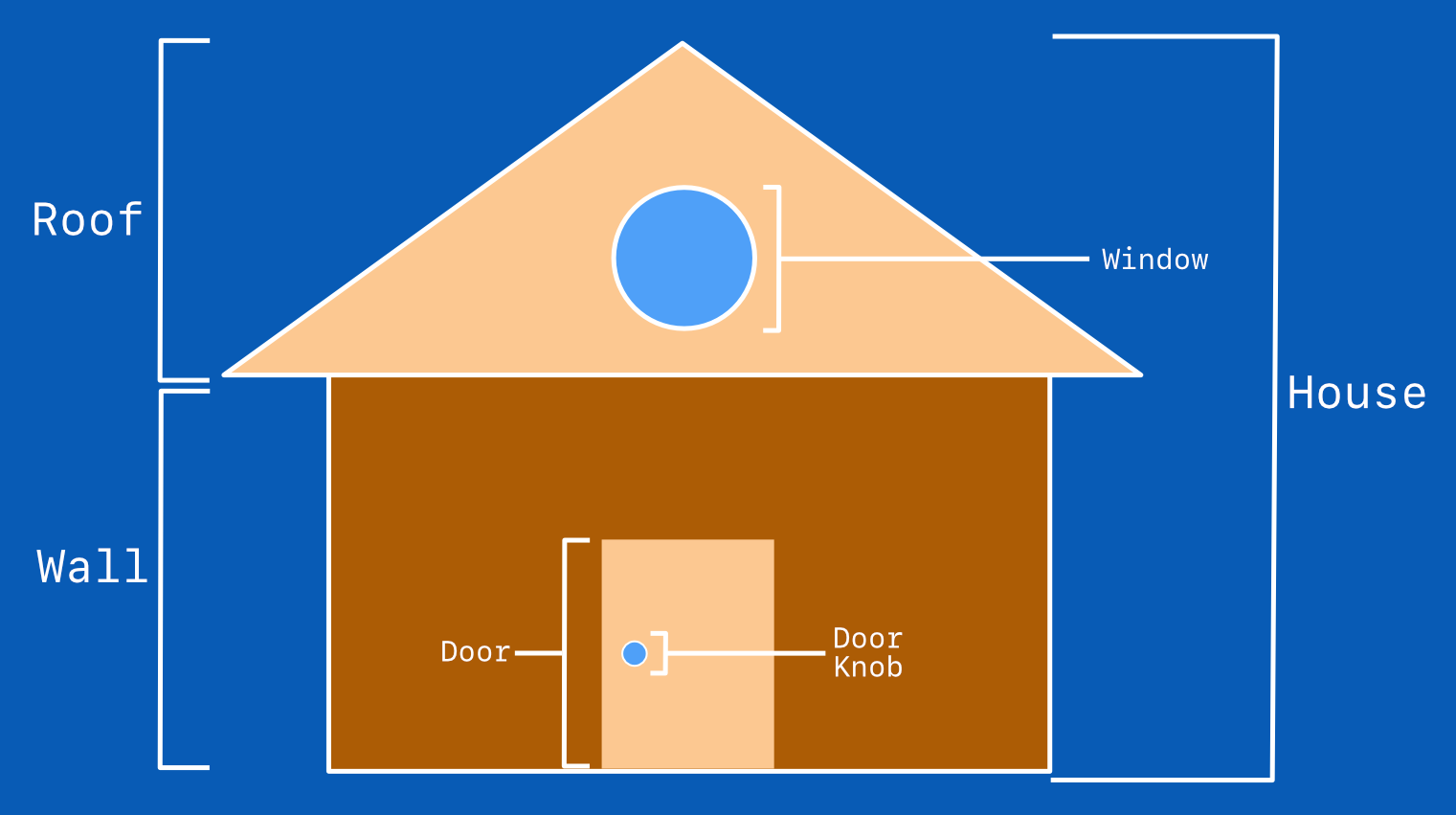 Pyxofy