CSS Art – Create 3D Shapes with Border Radius, Rotate and Gradients - Part 1
Build a 3D‑looking isometric chair using only CSS. Learn how simple shapes, border-radius, and transform work together—step by step.

Introduction
Creating 3D‑looking shapes with CSS might seem intimidating at first, but it doesn’t have to be complicated. In this series, you’ll join us in learning how to build an isometric chair using only CSS—no images, no SVGs, just clean and creative code.
This two‑part article series walks you step by step through the process.
- In Part 1—this article—you’ll focus on building the base components: the chair body, chair top, and legs using a mix of essential CSS properties and functions.
- In Part 2, you’ll learn how to combine multiple CSS gradients to add depth and make the chair look even more 3D‑like and realistic.
CSS properties and functions that will be introduced in this article:
border-radiusrotate()transform
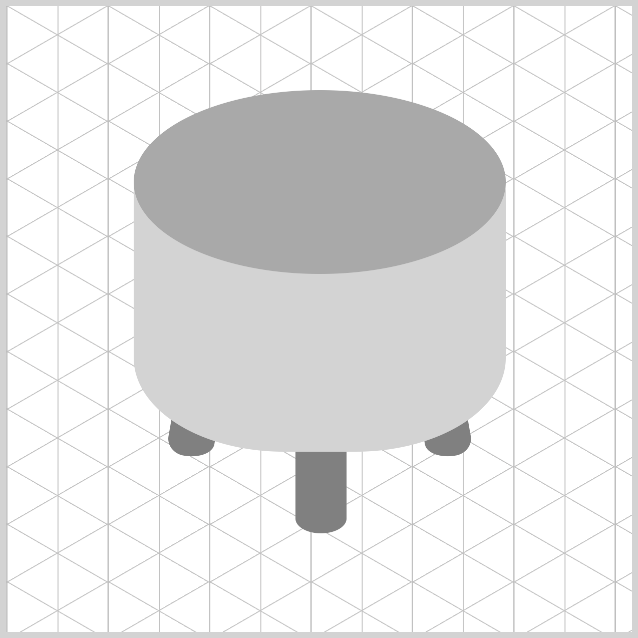
Preview
Here’s a quick preview of the isometric chair you’ll be building in this two‑part CSS article series. Don’t worry if it looks complex at first—we’ll break everything down step by step and build it together.

Prerequisites
Essential CSS and HTML knowledge will help you understand the concepts and techniques introduced in this article. Jump over to this article if you require an HTML and CSS primer.
We assume you have configured tools to modify CSS. If not, this article will guide you through the setup process.
HTML Structure
<div class="container">
  <div class="leg-left leg"></div>
  <div class="leg-mid leg"></div>
  <div class="leg-right leg"></div>
  <div class="chair-body"></div>
  <div class="chair-top"></div>
</div>
container is the outermost enclosure. It enables the content to be centered and draws a light gray border. The rest of the <div>s represent each image component.
Keep the HTML structure as is for the image to display correctly.
Body and Container <div> CSS
CSS code for the body and container <div>.
/* Body and Container Settings */
/* Center shapes */
body {
  margin: 0;
  padding: 0;
  height: 100vh;
  display: flex;
  justify-content: center;
  align-items: center;
  flex-wrap: wrap;
}

/* Set background and border color */
.container {
  width: 500px;
  height: 500px;
  border: 5px solid lightgray;
  background: transparent;
  position: relative;
  margin: 5px;
  display: flex;
  justify-content: center;
  align-items: center;
}
Common Properties
To keep your code clean and easy to maintain, we consolidate shared CSS properties instead of repeating them. This reduces duplication, keeps your styles organized, and makes updates much easier in the future. In professional programming, this practice is called DRY code, which stands for Don’t Repeat Yourself. By grouping related selectors and reusing common styles, you’re writing cleaner, smarter CSS.
/* Common Properties */
.leg-left,
.leg-mid,
.leg-right,
.chair-body,
.chair-top {
  position: absolute;
}
Using position: absolute; allows you to place each visual element exactly where you want inside the container. Instead of following the normal page flow, each element can be positioned with precise top and left values, giving you full control over the layout. This is especially helpful when building CSS art, where accuracy and alignment really matter.
In the next section, we’ll start building the chair legs. This is where the design really begins to take shape, as we use simple CSS properties to create sturdy, well‑positioned legs that support the chair and add balance to the overall illustration.
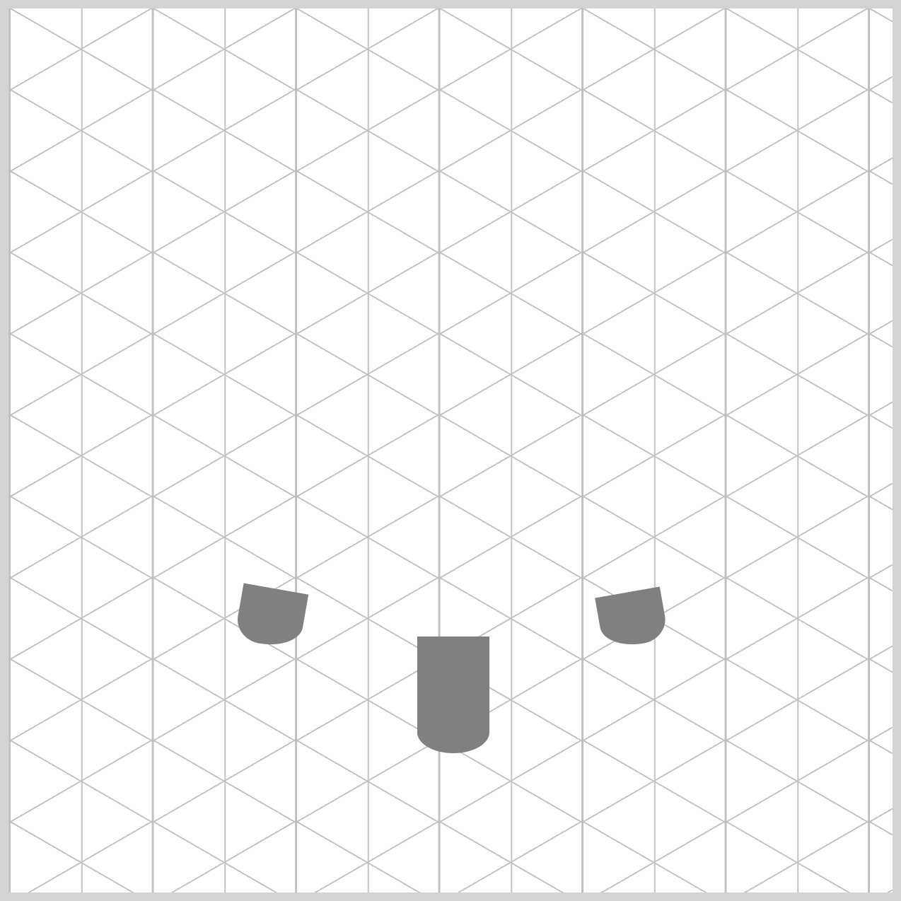
Chair Legs
In this section, you’ll create three chair legs: a left leg, a middle leg, and a right leg. Each one is styled slightly differently, but together they work as a set to support the chair and give it a balanced, isometric look. By breaking the legs into individual elements, the design stays flexible and easy to adjust.
First let’s go through the HTML code.
<div class="container">
  <div class="leg-left leg"></div>
  <div class="leg-mid leg"></div>
  <div class="leg-right leg"></div>
</div>
You’ll use two CSS selectors to style the chair legs in a clean and organized way. The shared leg class handles the color, so all legs look consistent.
/* Chair Legs */
.leg {
  background: gray;
}
Then, the individual classes—leg-left, leg-mid, and leg-right—control where each leg is positioned inside the container grid. This separation keeps your code tidy, easy to read, and simple to adjust as your design evolves.
Left Leg
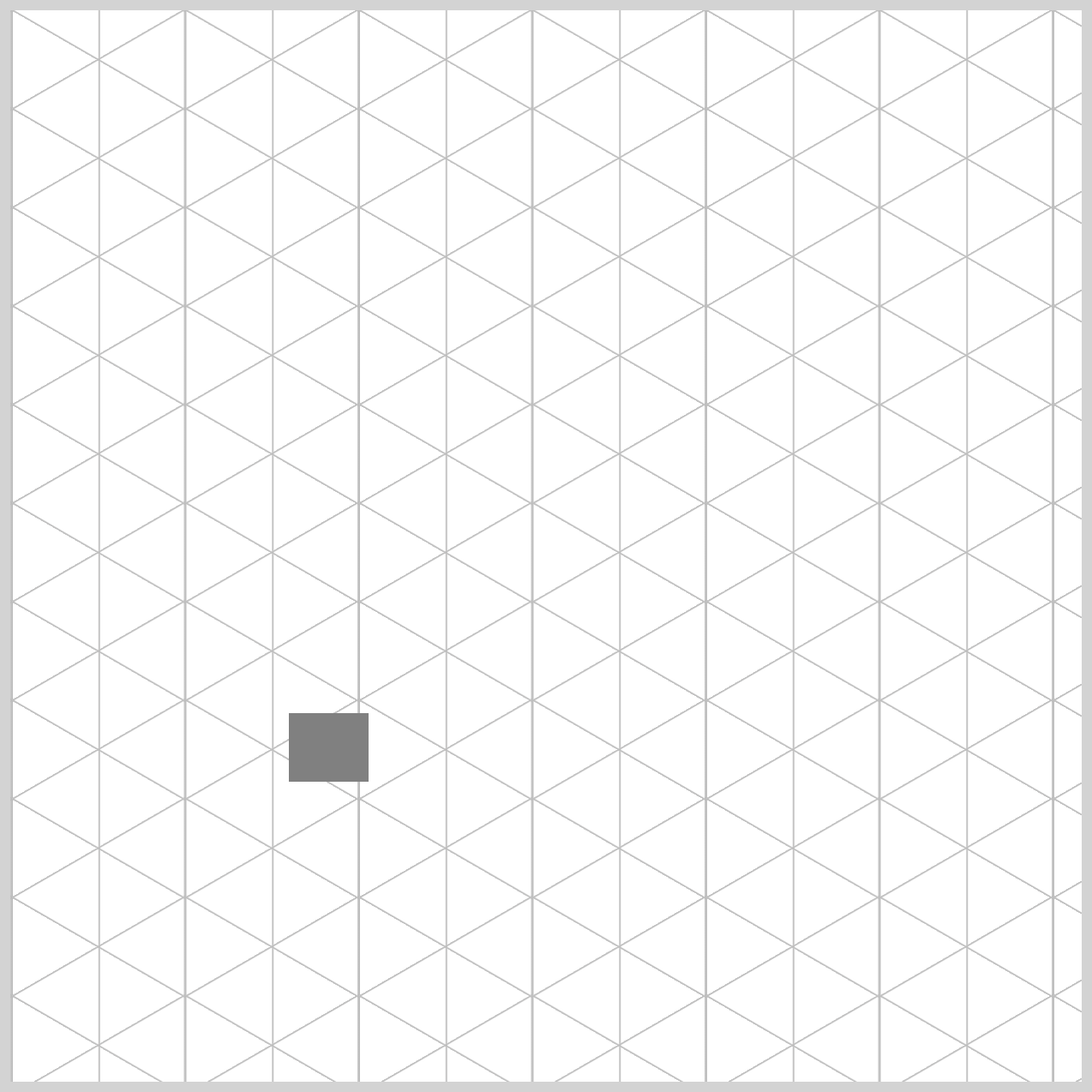
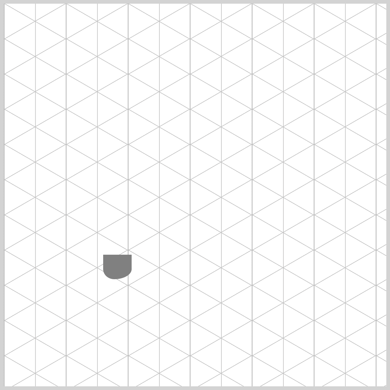
The left leg is the first part we’ll build. We begin with a simple rectangular shape, then soften it by rounding the corners. Finally, we rotate it slightly to give the leg a more natural, angled look. These small adjustments turn a basic shape into something that feels more realistic and visually interesting.
.leg-left {
  width: 37px;
  height: 32px;
  top: 328px;
  left: 130px;
}
The left leg starts with a compact, rectangular base. Its width property value is set to 37 pixels and its height to 32 pixels, giving it a solid shape. We then position it precisely within the container by placing it 328 pixels from the top and 130 pixels from the left, which helps align the leg correctly on the grid before adding rounding and rotation.
.leg-left {
  border-radius: 0 0 95px 60px / 0 0 55px 55px;
}
In CSS, the border-radius property values are read in a clockwise order. They start at the top‑left corner, then move to the top‑right, bottom‑right, and finally the bottom‑left. Understanding this order makes it much easier to control how each corner is rounded and fine‑tune the shape exactly the way you want.
Normally, border-radius creates a smooth, perfectly rounded curve. However, when you add a slash (/), you unlock more control and can create elliptical (oval) curves instead. This is important here because if we used only one set of values, the bottom of the leg would look like a perfect ball. By adding different values after the slash, we gently “squash” the curve, making the leg look more realistic—like it’s viewed at an angle.
- The numbers before the slash (
0 0 95px 60px) control the horizontal radius, or how wide the curve stretches left to right. - The numbers after the slash (
0 0 55px 55px) control the vertical radius, or how tall the curve stretches up and down.
Together, these values help shape the leg so it feels solid and natural instead of overly round.

.leg-left {
  transform: rotate(10deg);
}
As a final touch, the left leg is rotated slightly using transform: rotate(10deg). This small tilt makes a big visual difference, helping the leg feel less flat and more dynamic. By angling it just a bit, the leg fits better into the isometric style and gives the chair a more natural, three‑dimensional look.
Next, we’ll move on to the middle leg. This leg is built using the same basic ideas as the left one, but with its own size and placement to keep the chair balanced. By reusing familiar techniques, you’ll see how small changes in positioning and shape can create a new component while keeping the overall design consistent.
Middle Leg
The middle leg begins as a tall, vertically stretched rectangle, giving it a strong and stable appearance. To soften its shape, we round only the bottom-left and bottom-right corners using CSS. This subtle rounding helps the leg feel more natural and prevents it from looking too sharp or boxy, while still keeping a clean, structured design.
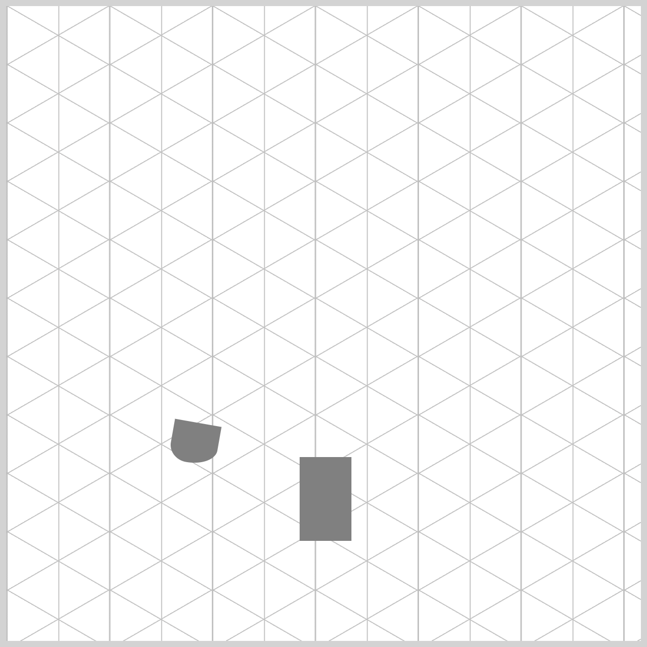
.leg-mid {
  width: 41px;
  height: 66px;
  top: 355px;
  left: 231px;
}
The middle leg is designed to be twice as long as the left and right legs, which helps create a stronger sense of isometric depth. This extra length makes the chair feel more three‑dimensional and visually grounded.
Its width is set to 41px and the height to 66px, giving it a tall, sturdy shape. We then position it precisely within the container—355px from the top and 231px from the left edge—so it sits perfectly in the center and supports the overall balance of the chair.
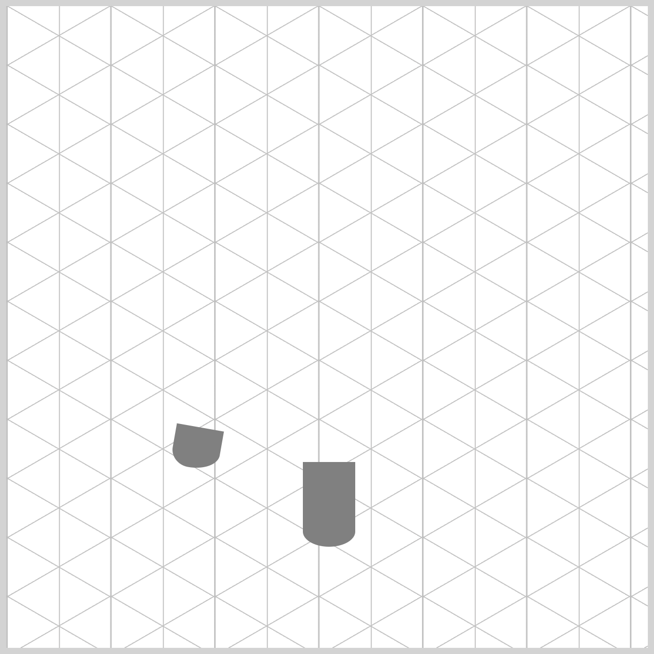
.leg-mid {
  border-radius: 0 0 95px 95px / 0 0 55px 55px;
}
Compared to the left leg, the middle leg uses a more symmetrical curve. Because it sits in the center, there’s no need to tilt it—keeping it straight helps maintain balance and visual stability.
The border-radius: 0 0 95px 95px / 0 0 55px 55px; rounds only the bottom-left and bottom-right corners, giving the lower section a smooth, cylindrical shape while the top remains rectangular. This contrast makes the leg feel sturdy and realistic without overcomplicating the design.
Next, let’s tackle the final leg component. This last leg completes the chair’s foundation and brings everything together visually. We’ll apply the same core techniques you’ve already learned—shared styling, careful positioning, and subtle shaping—while making small adjustments so it fits naturally into the isometric perspective.
Right Leg
The right leg works as a mirror image of the left leg you created earlier. It follows the same overall shape, size, and styling, but everything is flipped to the opposite side. This mirrored approach keeps the design consistent while reinforcing the isometric perspective, making the chair feel balanced, symmetrical, and visually complete.
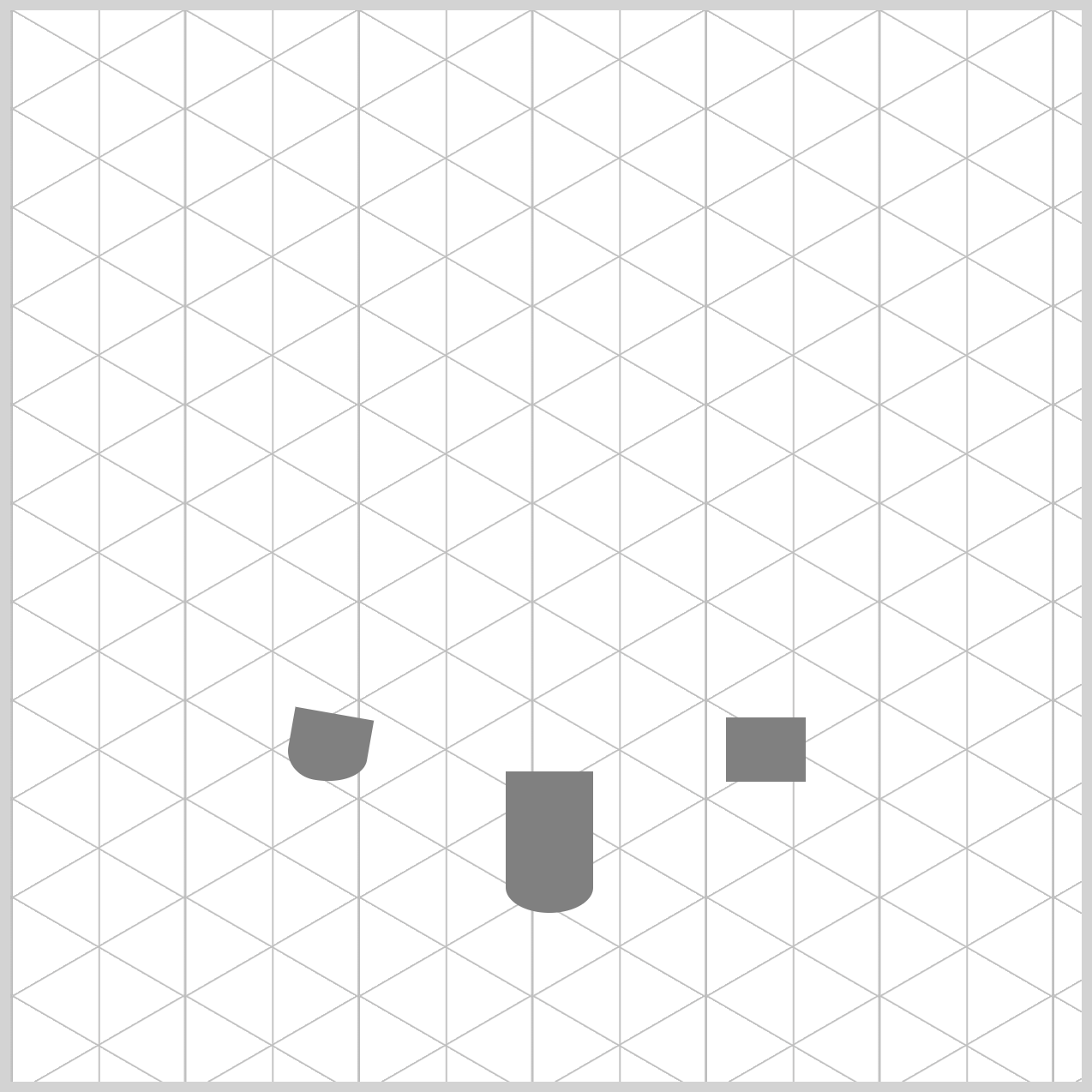
.leg-right {
  width: 37px;
  height: 30px;
  top: 330px;
  left: 334px;
}
The right leg closely matches the left leg in size and style, keeping the design consistent. Its width is set to 37px, just like the left leg, but the height is slightly shorter at 30px, which adds a subtle sense of perspective. We then position it carefully within the container—330px from the top and 334px from the left edge.
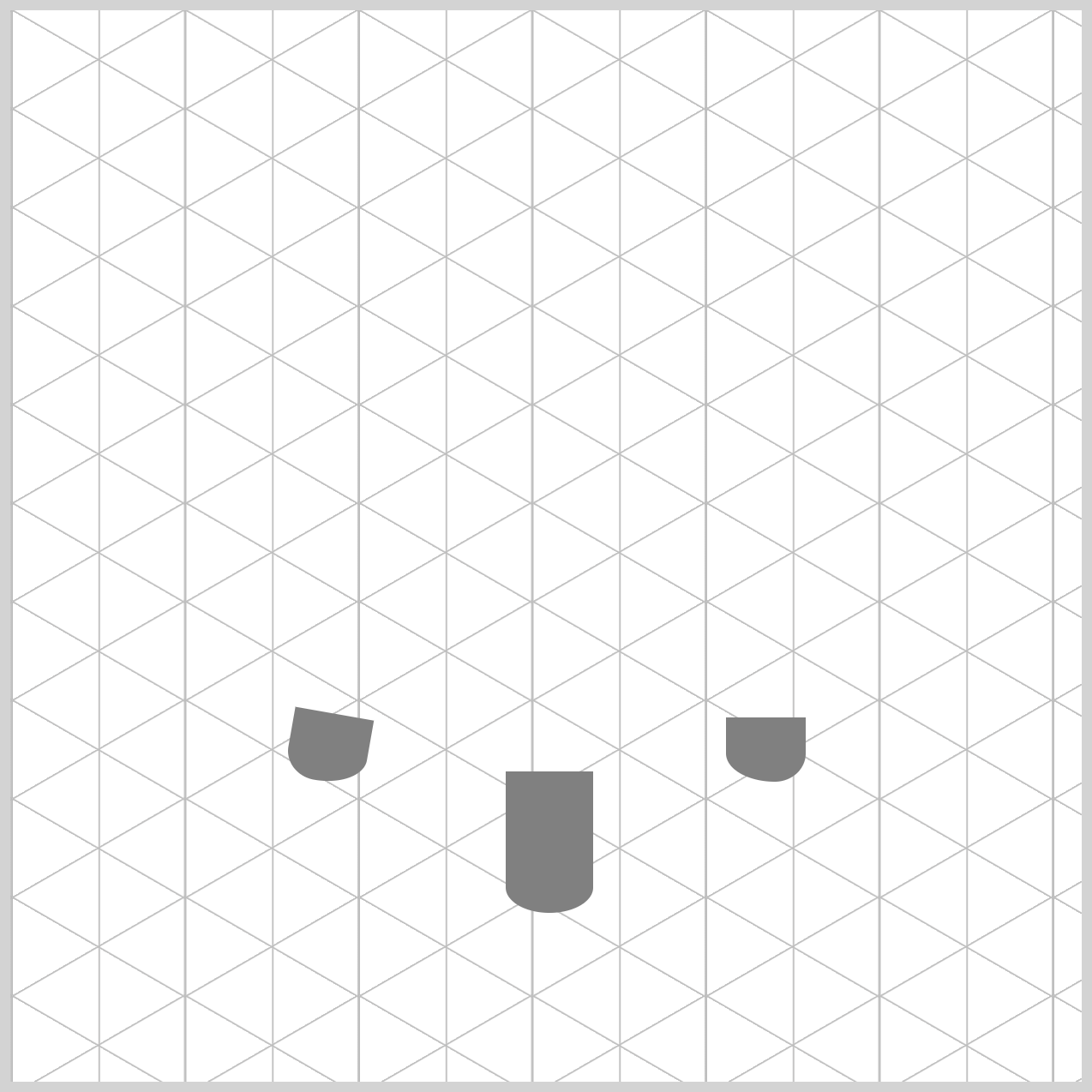
.leg-right {
  border-radius: 0 0 60px 95px / 0 0 55px 55px;
}
The border-radius property value on the right leg is what creates that clean, mirror‑image symmetry. The values 60px 95px are an exact reversal of the left leg’s settings, which flips the curve naturally to the opposite side. Meanwhile, the 55px 55px values remain the same as the other legs, keeping the vertical curve consistent. This combination helps the leg feel cylindrical, while maintaining visual harmony across all three legs.
.leg-right {
  transform: rotate(-10deg);
}
The right leg is rotated using a negative value, transform: rotate(-10deg), which results in a counter‑clockwise rotation. This is the opposite of the left leg and helps reinforce the mirror‑image effect.
In CSS, it’s important to remember that positive values rotate clockwise (to the right), while negative values rotate to the left, or counter‑clockwise. This subtle rotation adds to the isometric perspective and makes the chair feel more dynamic and three‑dimensional.
Ok, let’s move on to the chair body component. This section brings everything together, as the body sits above the legs and gives the chair its main shape and character.
Chair Body
The chair body is the most eye‑catching part of the design because it adds the main sense of weight and volume to the chair. Just like with the legs, you’ll use the CSS border-radius property to shape it into a smooth, cylindrical form. By carefully rounding the edges, the body feels solid and three‑dimensional instead of flat, helping the chair look sturdy, balanced, and visually appealing.
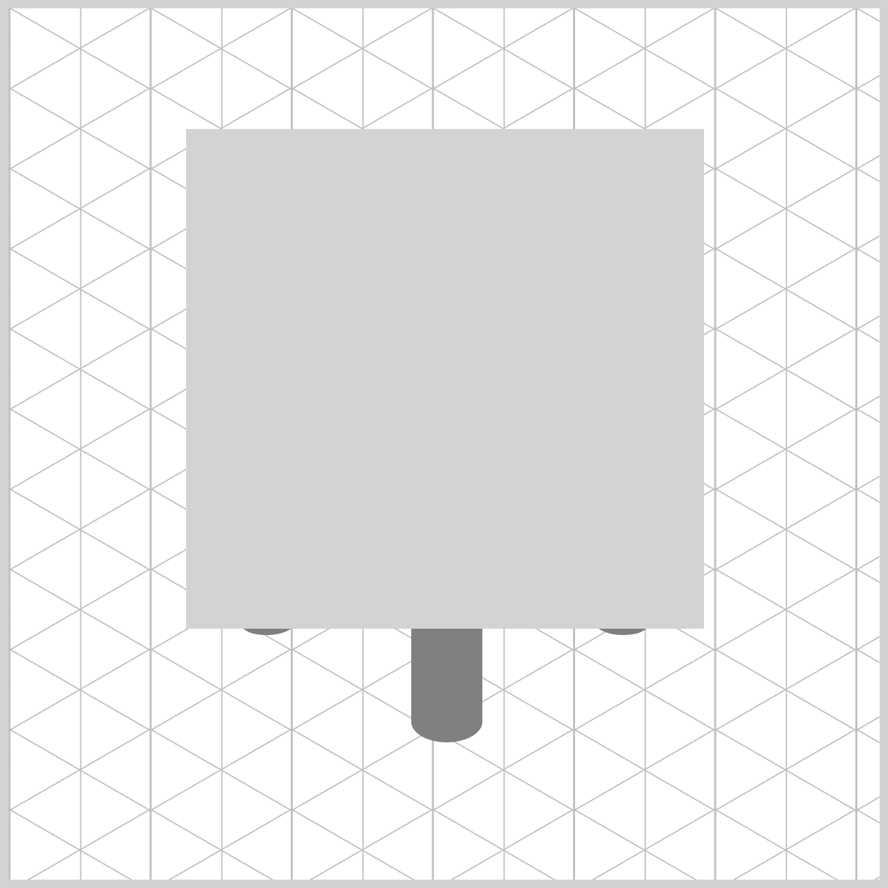
/* Chair Body */
.chair-body {
  width: 297px;
  height: 287px;
  top: 69px;
  left: 102px;
  background: lightgray;
}
The chair body is sized to clearly span across all three legs, giving it a solid and grounded appearance. Its width is set to 297px, allowing it to stretch comfortably from left to right, while the height is also 287px, creating a balanced, substantial shape.
We then position it precisely inside the container by setting the top value to 69px and the left value to 102px. For now, a simple lightgray background is applied, making the body easy to see and adjust before adding more advanced styling.
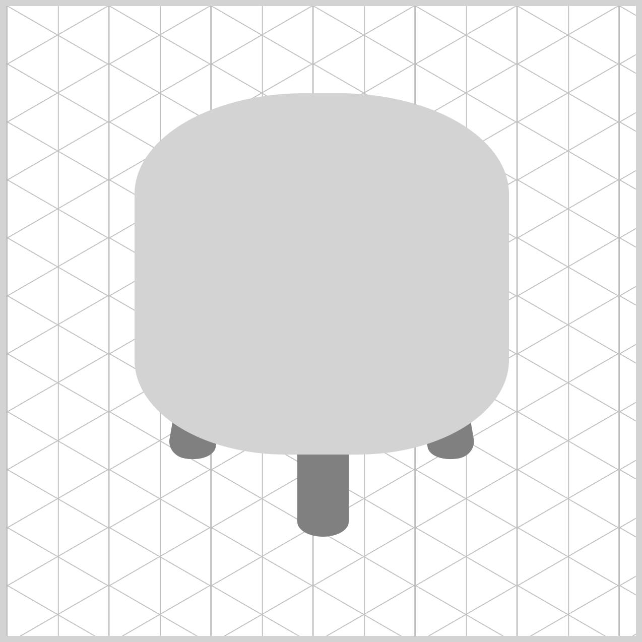
.chair-body {
  border-radius: 135px 135px 120px 120px / 80px 80px 75px 75px;
}
The chair body’s border-radius property value may look a little intimidating at first, but it becomes much clearer when you break it down.
- Top Corners:
135pxis the horizontal (width) and80pxis the vertical (height) which creates a very smooth, broad curve that makes the top of the chair look like a wide circle seen from an angle. - Bottom Corners:
120px, horizontal (width), and75px, vertical (height), produces a tapered effect. It makes the bottom of the chair body look slightly narrower than the top, which is a secret trick in drawing to show that the object is solid and has "form."
Let’s move on to the final section and build the chair top component. This piece sits above the chair body and visually completes the design.
Chair Top
By keeping the chair top shape simple and using smooth, rounded curves, you give the design a polished and comfortable feel. This simplicity helps the top blend naturally with the rest of the chair, while still standing out as a distinct component. At the same time, the gentle curves reinforce the isometric style, making the illustration feel cohesive, balanced, and visually pleasing.
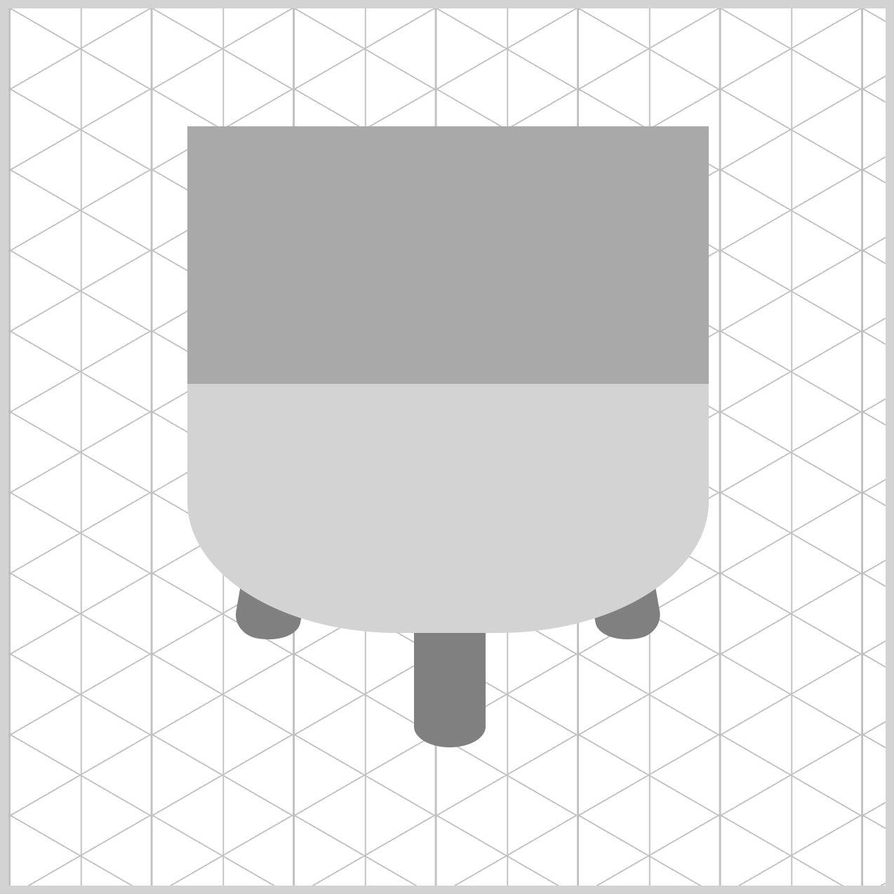
/* Chair Top */
.chair-top {
  width: 297px;
  height: 147px;
  top: 67px;
  left: 102px;
  background: darkgray;
}
The chair top is sized to visually match the chair body, with its width set to 297px. The height is set to 147px, which is roughly half the width. Why shorter? In the real world, when you view a round object from a side angle, the top surface appears slightly squashed. This visual effect is called foreshortening. By making the height smaller than the width, you’re subtly telling the viewer’s brain: “This is a flat, circular surface tilted away from you.”
To place it correctly, the chair top is positioned 67px from the top and 102px from the left, aligning it perfectly above the chair body. For now, a simple darkgray background is used so the shape is easy to see before adding more refined styling.
.chair-top {
  border-radius: 50%;
}
The final touch is shaping the chair top into a smooth oval (ellipse) using border-radius. By setting the value to 50%, all four corners of the rectangle are rounded evenly. This transforms the flat rectangle into a clean, elliptical shape, perfectly representing a round seat viewed from an angle.
It’s a simple CSS trick, but it makes a big difference—instantly giving the chair top a softer, more realistic, and professional finish.
You can see and play with the complete code on Pyxofy’s CodePen page.
See the Pen CSS Art - Create 3D Shapes with Border Radius, Rotate and Gradients by Pyxofy (@pyxofy) on CodePen.
Conclusion
In Part 1 of this two‑part article series, you built the core chair components—the chair body, chair top, and legs—using a combination of essential CSS properties and functions.
Along the way, you saw how flexible border-radius can be, from creating perfect circles and smooth ellipses to crafting fully customized shapes. You also learned how the rotate() function helps adjust flat CSS elements so they feel naturally placed in 3D space.
In Part 2, you’ll take things even further by combining multiple CSS gradients to add depth, lighting, and a more realistic 3D appearance to the chair. Until then, keep practicing and experimenting—every shape you build sharpens your CSS skills.
Share your masterpiece with us on LinkedIn, Threads, Bluesky, Mastodon, X (Twitter) @pyxofy, or Facebook.
We hope you liked this article. Kindly share it with your network. We appreciate it.
Related Articles
 Pyxofy
 Pyxofy
 Pyxofy