CSS Animation - Using cubic-bezier() for Anticipation and Spring Effects
Anticipation and spring effects make your animations dynamic. Learn to animate isometric cubes with CSS using cubic-bezier(), step-by-step.

Introduction
Anticipation and spring-like motion are essential techniques in animation, bringing energy and realism to your projects. In this article, you’ll discover how to create dynamic, lifelike movements using CSS. We’ll explore the CSS cubic-bezier() function, the animation property, the @keyframes at-rule, and more—step by step.
CSS properties and functions you’ll be exploring in this article:
transformanimation@keyframescubic-bezier()rotate()translate()scale()
Preview
You’ll learn how to use the CSS cubic-bezier() function to add anticipation and spring-like motion to the isometric cube animation.

This technique helps bring your animations to life with smooth, dynamic transitions that feel natural and engaging.
Prerequisites
Essential CSS and HTML knowledge will help you understand the concepts and techniques introduced in this article. Jump over to this article if you require an HTML and CSS primer.
We assume you have configured tools to modify CSS. If not, this article will guide you through the setup process.
Please read this article if you’re unfamiliar with CSS animation and the @keyframes at-rule property.
HTML Structure
<div class="container">
  <div class="cube-1">
    <div class="isometric-cube-top"></div>
    <div class="isometric-cube-right"></div>
    <div class="isometric-cube-left"></div>
  </div>
  <div class="cube-2">
    <div class="isometric-cube-top"></div>
    <div class="isometric-cube-right"></div>
    <div class="isometric-cube-left"></div>
  </div>
  <div class="cube-3">
    <div class="isometric-cube-top"></div>
    <div class="isometric-cube-right"></div>
    <div class="isometric-cube-left"></div>
  </div>
</div>
container is the outermost enclosure. It enables the content to be centered and draws a light gray border. The rest of the <div>s represent each animation sequence.
Keep the HTML structure as is for the animation to display correctly.
Body and Container <div> CSS
CSS code for the body and container <div>.
/* Body and Container Settings */
/* Center shapes */
body {
  margin: 0;
  padding: 0;
  height: 100vh;
  display: flex;
  justify-content: center;
  align-items: center;
  flex-wrap: wrap;
}

/* Set background and border color */
.container {
  width: 500px;
  height: 500px;
  border: 5px solid lightgray;
  background: #121212;
  position: relative;
  margin: 5px;
  display: flex;
  justify-content: center;
  align-items: center;
}
Organizing Common CSS Properties
To keep your code clean and easy to manage, it’s best to group shared CSS properties at the beginning. This approach helps you avoid repetition and makes future updates much simpler.
/* Common Properties */
.cube-1,
.cube-2,
.cube-3,
.isometric-cube-top,
.isometric-cube-right,
.isometric-cube-left {
  position: absolute;
  transform-origin: 0 0;
}
position: absolute;
Lets you place each piece precisely within the cube’s container.transform-origin: 0 0;
Sets the transform anchor to the top-left. This makes isometric rotations/translations more predictable because everything pivots from a common corner.
Creating a Custom Color Palette
Just like with common properties, defining a custom color palette using CSS variables (Custom Properties) streamlines your workflow. This makes it easy to update colors—such as those for our isometric cubes and their animations—without hunting through your code for every instance.
/* Custom Properties */
:root {
/* Cube Colors */
--cube-top-color: #4fa0f8;
--cube-right-color: #f99f3e;
--cube-left-color: #4ff8de;
/* Cube Animation Properties */
--animation-length: 4s;
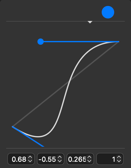
--animation-easing: cubic-bezier(0.68, -0.55, 0.265, 1);
--animation-iteration: infinite;
}
Cube colors:
#4fa0f8is a vibrant sky blue with a strong, cool tone.#f99f3eis an orange with strong golden undertones.#4ff8deis a bright aqua or turquoise color with a cool, tropical feel.
Cube animation properties:
4sor four seconds is set as the animation length.- The animation easing function is set to
cubic-bezier(0.68, -0.55, 0.265, 1). - The animation loops infinitely with
infiniteset as the animation iteration value.
Check this article for detailed instructions on how to make a custom color palette.
 Pyxofy
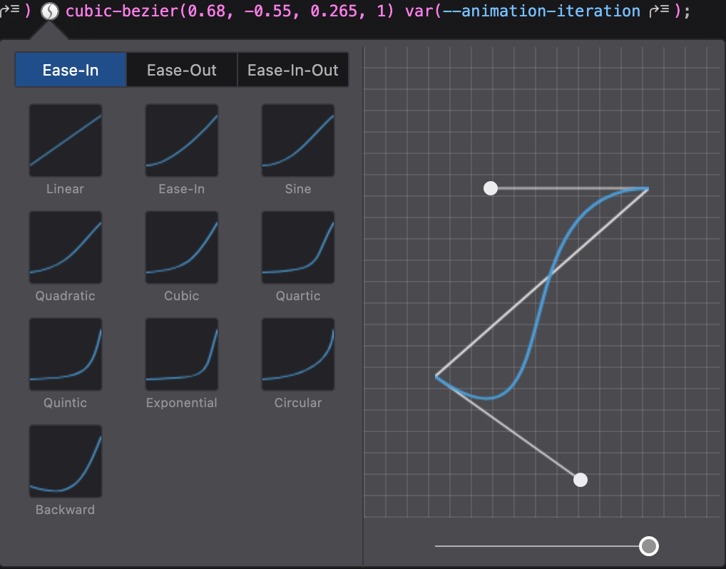
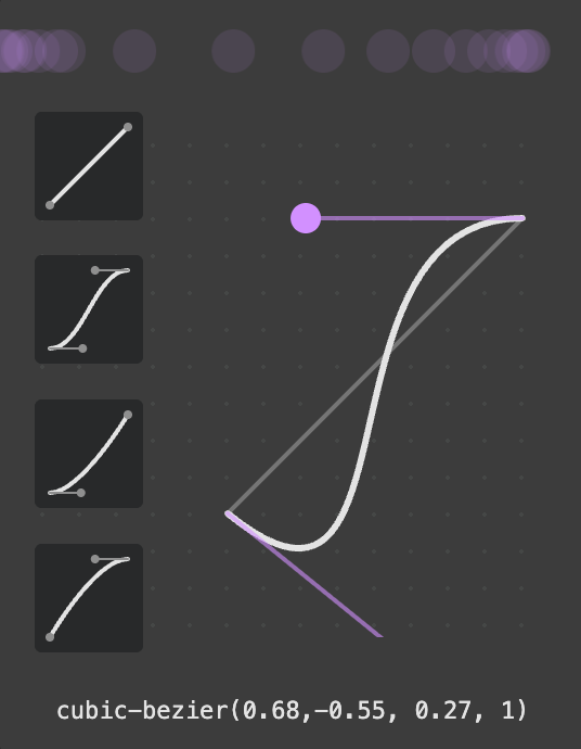
Visualizing the cubic-bezier() Function
For our animation’s easing function, we’ll use a custom cubic Bézier curve. If you’re new to cubic Bézier functions, check out this article for a quick introduction.
 Pyxofy
You can also use your browser’s developer tools to visualize and experiment with different cubic-bezier() values. In this article, we’ll use cubic-bezier(0.68, -0.55, 0.265, 1) to achieve a springy, dynamic feel.
Building Isometric Cube Components
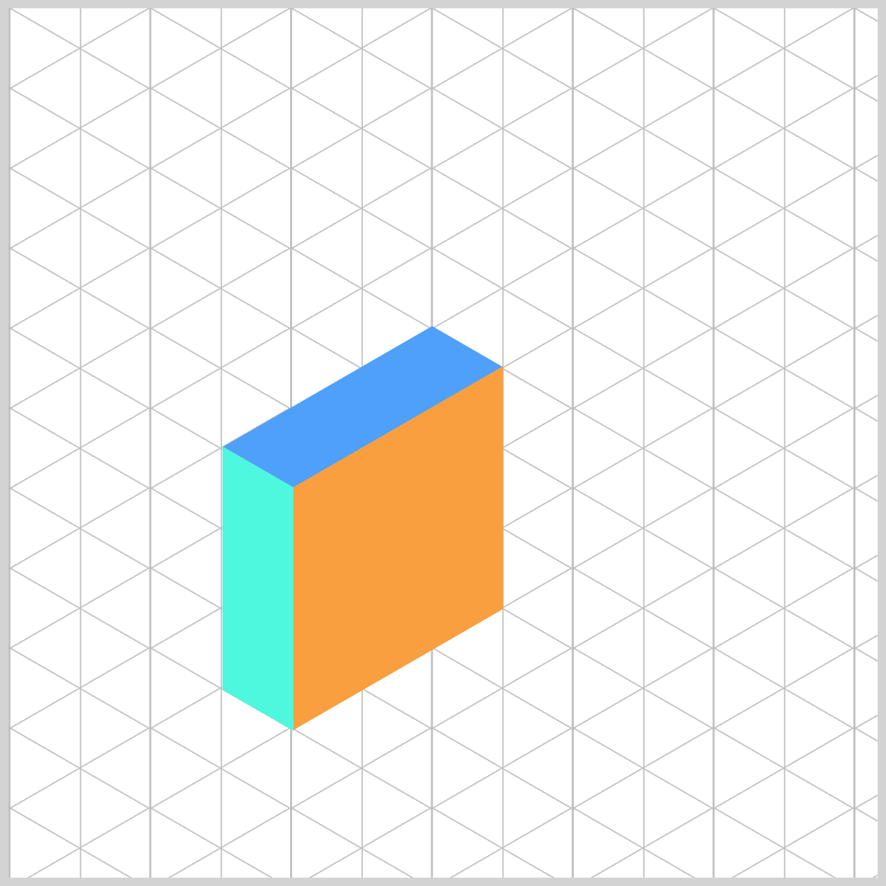
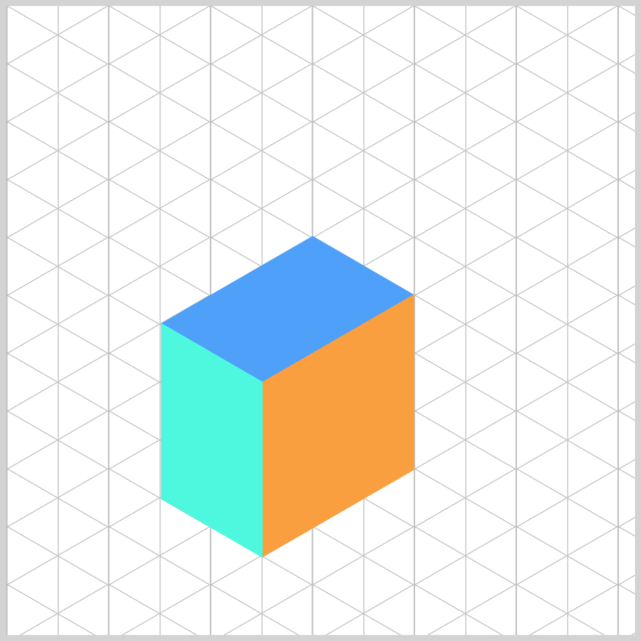
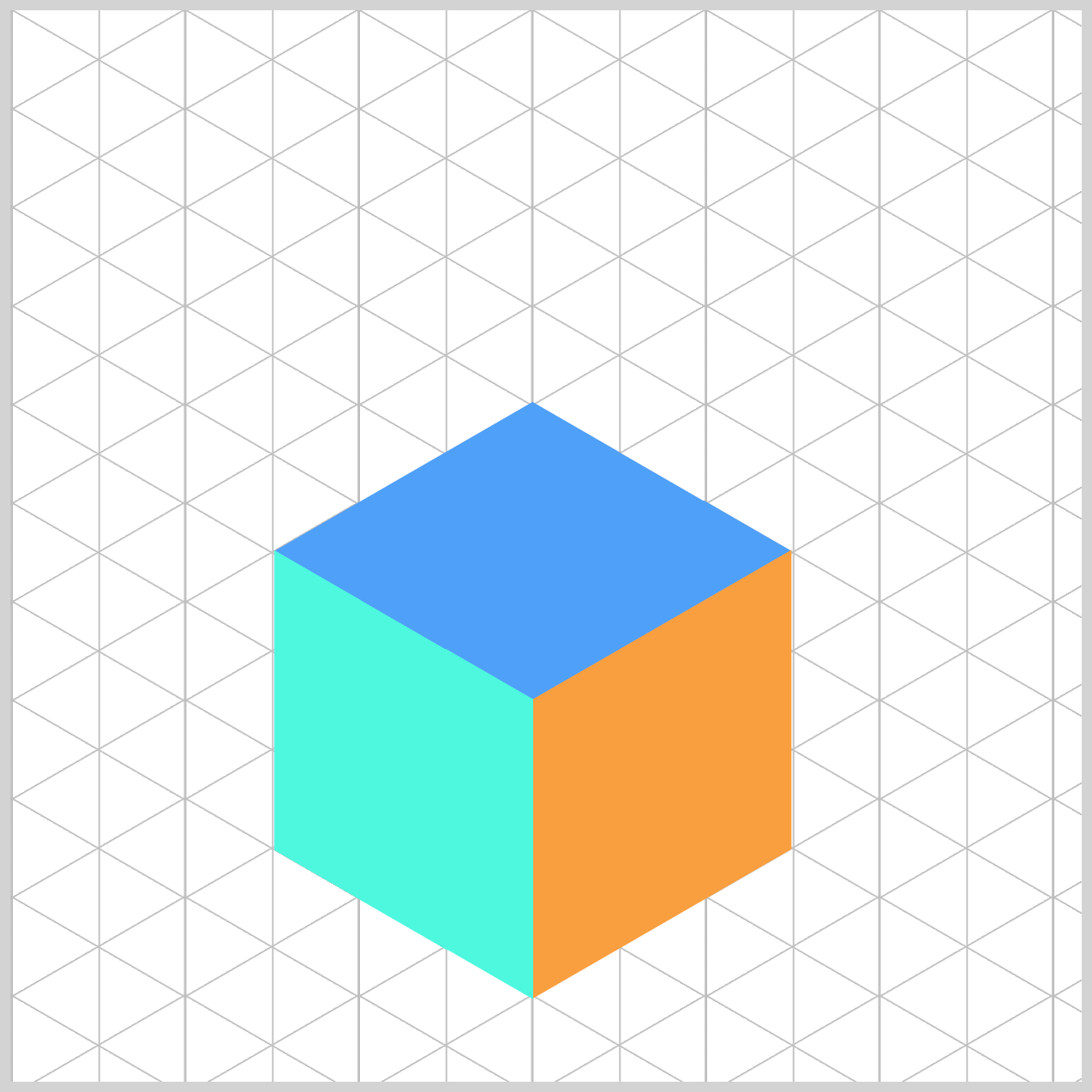
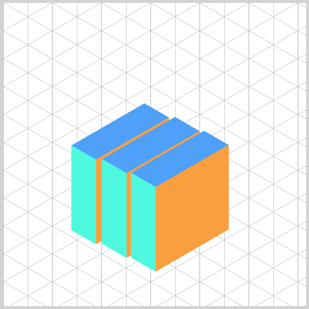
Let’s start by creating the isometric cube. Our cube will have three faces: top, right, and left.
This design is inspired by this article. Feel free to explore it for more background, then return here to follow along with our step-by-step guide.
 Pyxofy
Isometric cube parts CSS code:
/* Isometric Cube Parts */
.isometric-cube-top {
  width: 47px;
  height: 139.7px;
  background: var(--cube-top-color);
  transform: rotate(210deg) skewX(-30deg) scaleY(0.864);
}

.isometric-cube-right {
  width: 139.2px;
  height: 140px;
  background: var(--cube-right-color);
  transform: rotate(-30deg) skewX(-30deg) translate(0, -0.5px) scaleY(0.864);
}

.isometric-cube-left {
  width: 140px;
  height: 47px;
  background: var(--cube-left-color);
  transform: rotate(90deg) skewX(-30deg) scaleY(0.864) translate(-0.5px, 0);
}
- The top face is a rectangle:
47pxwide and139.7pxhigh. - The right face is an imperfect square with a width of
139.2pxand a height of140px. - The left face is set to
140pxwide and47pxhigh.
Next, all three cube components need to be positioned so they form an isometric cube. First up is cube-1, which acts as the base reference, making it easier to align the rest of the components accurately.
.cube-1 {
  top: 276px;
  left: 164px;
}
cube-1 serves as the base reference, positioned at top: 276px; left: 164px;.
.cube-2 {
  top: 299px;
  left: 204px;
}
The second component, cube-2, is positioned to the right side of the previous component, 299px from the top and 204px from the left.
.cube-3 {
  top: 322px;
  left: 244px;
}
cube-3, the last component is placed to the right of cube-2 withtop: 322px; and left: 244px;.
Animating the Isometric Cube
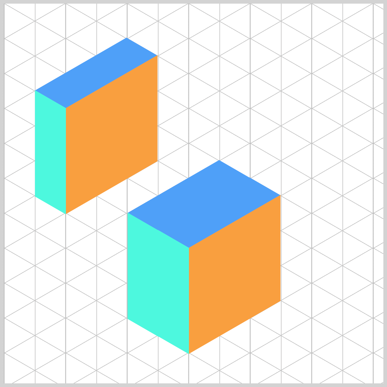
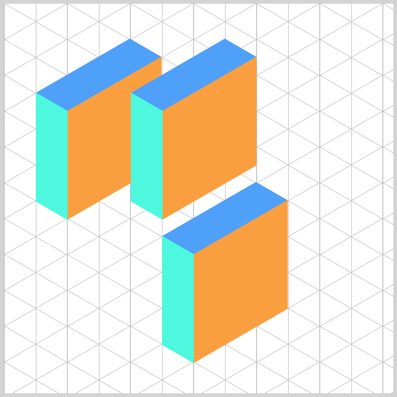
The animation sequence will flow through three key states to create a spring-like split effect, going up, anticipation, and a slow downward motion back to its original state.
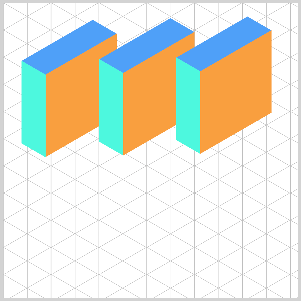
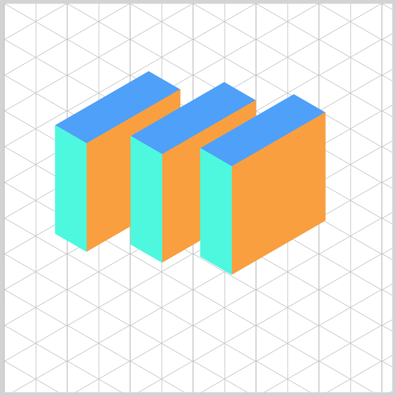
- Start Position: All three components form a complete cube at the bottom of the grid.
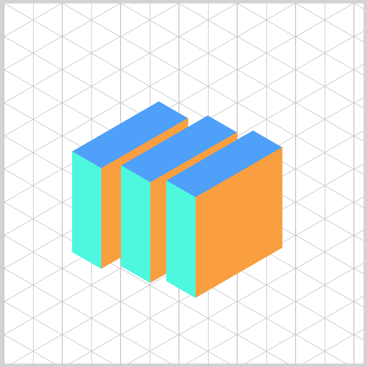
- Mid State Position: Is the halfway point, where the cube components separate, creating a dynamic split.
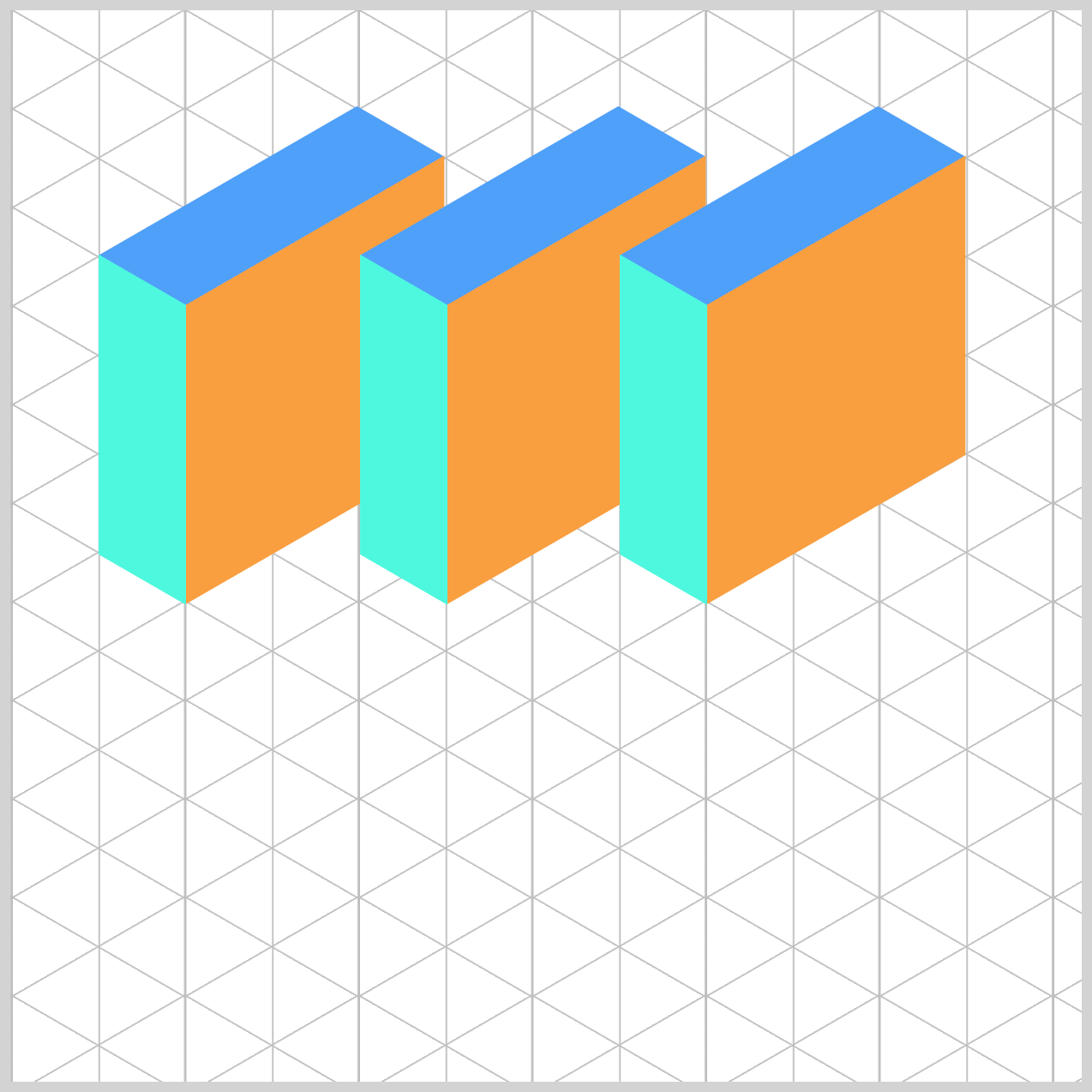
- Final Position: The three components are fully apart.
Let’s focus on each cube component’s animation in the next section, starting with cube-1.
Cube 1 Animation
cube-1 sits on the left side of the isometric cube stack. Its initial position will be top: 276px; and left: 164px;, and it will move towards top: 138px; and left: 82px;.
You need to add the animation property to the cube-1 CSS selector to enable the animation as follows:
.cube-1 {
  animation: cube-1 var(--animation-length) var(--animation-easing)
    var(--animation-iteration);
}
The animation properties are described in detail in the previous section on Custom Color Palette. The same property values (except for the animation name) will also apply to cube-2 and cube-3.
Let’s tackle the @keyframes at-rule next.
@keyframes cube-1 {
  0% {
    top: 276px;
    left: 164px;
  }
  5% {
    top: 138px;
    left: 82px;
  }
  30% {
    top: 138px;
    left: 82px;
  }
  81% {
    top: 276px;
    left: 164px;
  }
  100% {
    top: 276px;
    left: 164px;
  }
}
The cube-1 animation starts at top: 276px; and left: 164px;. At 5%, its position jumps to top: 138px; and left: 82px; and remains there until the 30% mark. cube-1 gradually returns to its original position for the remainder of the animation sequence.
Cube 2 Animation
cube-2 is located in the middle of the cube stack, adjacent to cube-1.
.cube-2 {
  animation: cube-2 var(--animation-length) var(--animation-easing)
    var(--animation-iteration);
}
Besides the top and left property values, the cube-2 animation timing is similar to cube-1.
@keyframes cube-2 {
  0% {
    top: 299px;
    left: 204px;
  }
  5% {
    top: 138px;
    left: 204px;
  }
  30% {
    top: 138px;
    left: 204px;
  }
  80% {
    top: 299px;
    left: 204px;
  }
  100% {
    top: 299px;
    left: 204px;
  }
}
The animation sequence starts with cube-2 positioned at top: 299px; and left: 204px;. At the 5% mark, it springs to top: 138px; and left: 204px; and remains there until the 30% mark. cube-2 returns to its original at the 80% mark, which is slightly faster compared to cube-1’s 81%.
Cube 3 Animation
cube-3 is at the right end of the isometric cube stack, next to cube-2, and completes the isometric cube structure.
.cube-3 {
  animation: cube-3 var(--animation-length) var(--animation-easing)
    var(--animation-iteration);
}

@keyframes cube-3 {
  0% {
    top: 322px;
    left: 244px;
  }
  5% {
    top: 138px;
    left: 325px;
  }
  30% {
    top: 138px;
    left: 325px;
  }
  79% {
    top: 322px;
    left: 244px;
  }
  100% {
    top: 322px;
    left: 244px;
  }
}
The cube-3 animation transitions between top: 322px; left: 244px; and top: 138px; left: 325px; from the 0% and 30% marks. cube-3 returns to its original position on the 79% mark, which is quicker compared to the previous cubes.
Reversing the Animation Sequence
The previous section illustrated how the three cubes animated upwards. In this section, you’ll see how the animation is reversed, where the cubes move down to their original position.
The cubic-bezier() function adds an “anticipation” effect, making the cubes stretch slightly outward before settling back to their original position.
Take note that in @keyframes, percentages, %, represent time, not distance. So if you spend less of the timeline getting from A → B (forward), and more getting from B → A (reverse), the reverse will play slower—even with the same total duration.
You can see and play with the complete code on Pyxofy’s CodePen page.
See the Pen CSS Animation - Using cubic-bezier() for Anticipation and Spring Effects by Pyxofy (@pyxofy) on CodePen.
Conclusion
You learned how to create isometric cubes and animate them using only CSS. The animation sequence included quick, spring-type movement and anticipation.
You’ve now seen how the CSS cubic-bezier() function can be used to control animation easing, allowing you to create unique movement and timing effects. Don’t hesitate to experiment with different cubic-bezier() values—adjust them to match the style and feel you want for your animation!
Now it’s your turn. What creative CSS animations will you build next? Share your masterpiece with us on LinkedIn, Threads, Bluesky, Mastodon, X (Twitter) @pyxofy, or Facebook.
We hope you liked this article. Kindly share it with your network. We appreciate it.
Related Articles
 Pyxofy
 Pyxofy
 Pyxofy
 Pyxofy