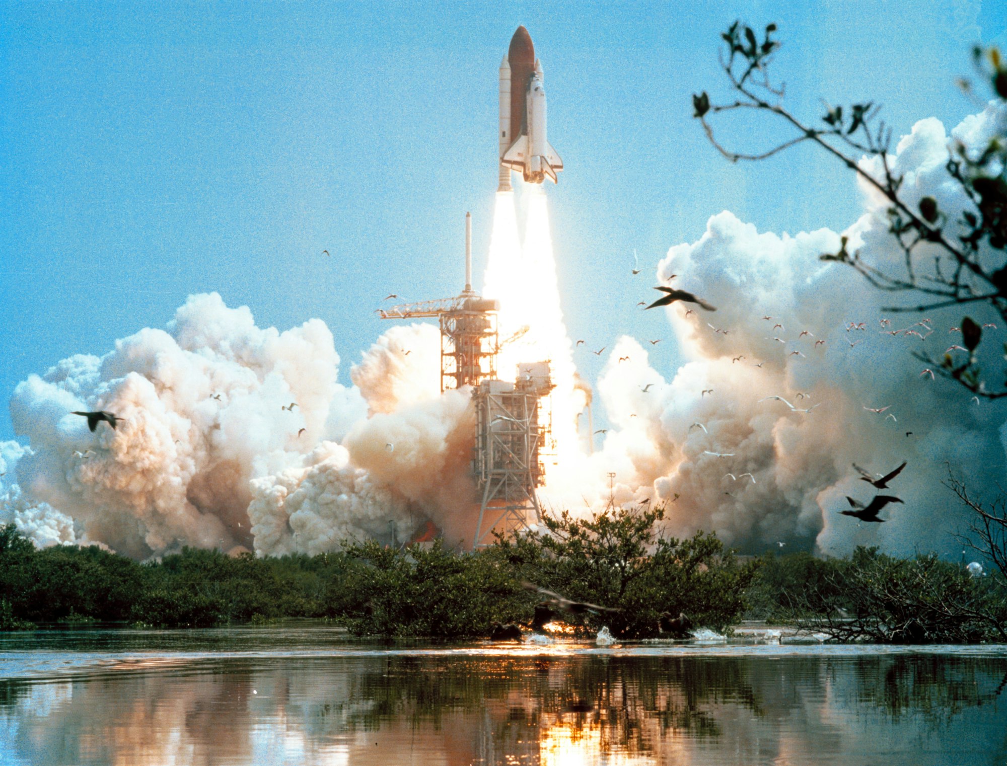
CSS Animation – Space Shuttle Launch
Space, the final frontier! Join us in recreating the iconic space shuttle launch scene using CSS in this step-by-step article.
Introduction
Space Shuttle Launches are majestic, exuding technological ingenuity and raw power.
In this article, you’ll be combining CSS linear-gradient, transform: translateX, and path() to recreate a space shuttle launch scene.
Preview

Prerequisites
Essential CSS and HTML knowledge will help you understand the concepts and techniques introduced in this article. Jump over to this article if you require an HTML and CSS primer.
We assume that you have set up tools to create CSS animation. If you haven’t, this article will show you how to set them up.
Please read this article if you’re unfamiliar with CSS animation and the @keyframes at-rule property.
HTML Structure
<div class="container">
  <!-- Sky -->
  <div class="sky"></div>

<!-- Space Shuttle -->
  <div class="space-shuttle-container">
    <div class="rocket">

      <!-- Tank -->
      <div class="tank-connector"></div>
      <div class="tank">
        <div class="tank-ring-frame"></div>
      </div>

      <!-- Rocket -->
      <div class="left-rocket"></div>
      <div class="left-rocket-engine"></div>
      <div class="right-rocket"></div>
      <div class="right-rocket-engine"></div>
    </div>

    <!-- Orbiter -->
    <div class="orbiter">
      <div class="wing-bottom"></div>
      <div class="wing"></div>
      <div class="fuselage"></div>
      <div class="fuselage-window"></div>
      <div class="cabin"></div>
      <div class="cargo-bay"></div>
      <div class="elevon"></div>
      <div class="elevon-left"></div>
      <div class="elevon-right"></div>
      <div class="aft-fuselage-block"></div>
      <div class="main-engine-left-connector"></div>
      <div class="main-engine-left"></div>
      <div class="main-engine-right-connector"></div>
      <div class="main-engine-right"></div>
      <div class="main-engine-top-connector"></div>
      <div class="main-engine-top"></div>
      <div class="maneuvering-engine-right"></div>
      <div class="maneuvering-engine-left"></div>
      <div class="vertical-stabilizer"></div>
      <div class="aft-fuselage"></div>
    </div>

    <!-- Rocket Exhaust -->
    <div class="solid-rocket-booster-exhaust"></div>
    <div class="main-engine-exhaust"></div>
  </div>

  <!-- Water Clouds -->
  <div class="water-clouds"></div>
</div>
container is the outermost enclosure. It enables the content to be centered and draws a light gray border. The rest of the divs represent each animation sequence.
Keep the HTML structure as is for the animation to display correctly.
Body and Container Div CSS
CSS code for the body and container div.
/* Body and Container Settings */
/* Center shapes */
body {
  margin: 0;
  padding: 0;
  height: 100vh;
  display: flex;
  justify-content: center;
  align-items: center;
  flex-wrap: wrap;
}

/* Set background and border color */
.container {
  min-width: 500px;
  height: 500px;
  border: 5px solid lightgray;
  background: transparent;
  position: relative;
  margin: 5px;
  display: flex;
  justify-content: center;
  align-items: center;
  overflow: hidden;
}
Making the Space Shuttle

We won’t dive deep into making the space shuttle in this article. The space shuttle is based on two previous CSS art articles linked below.
 Pyxofy
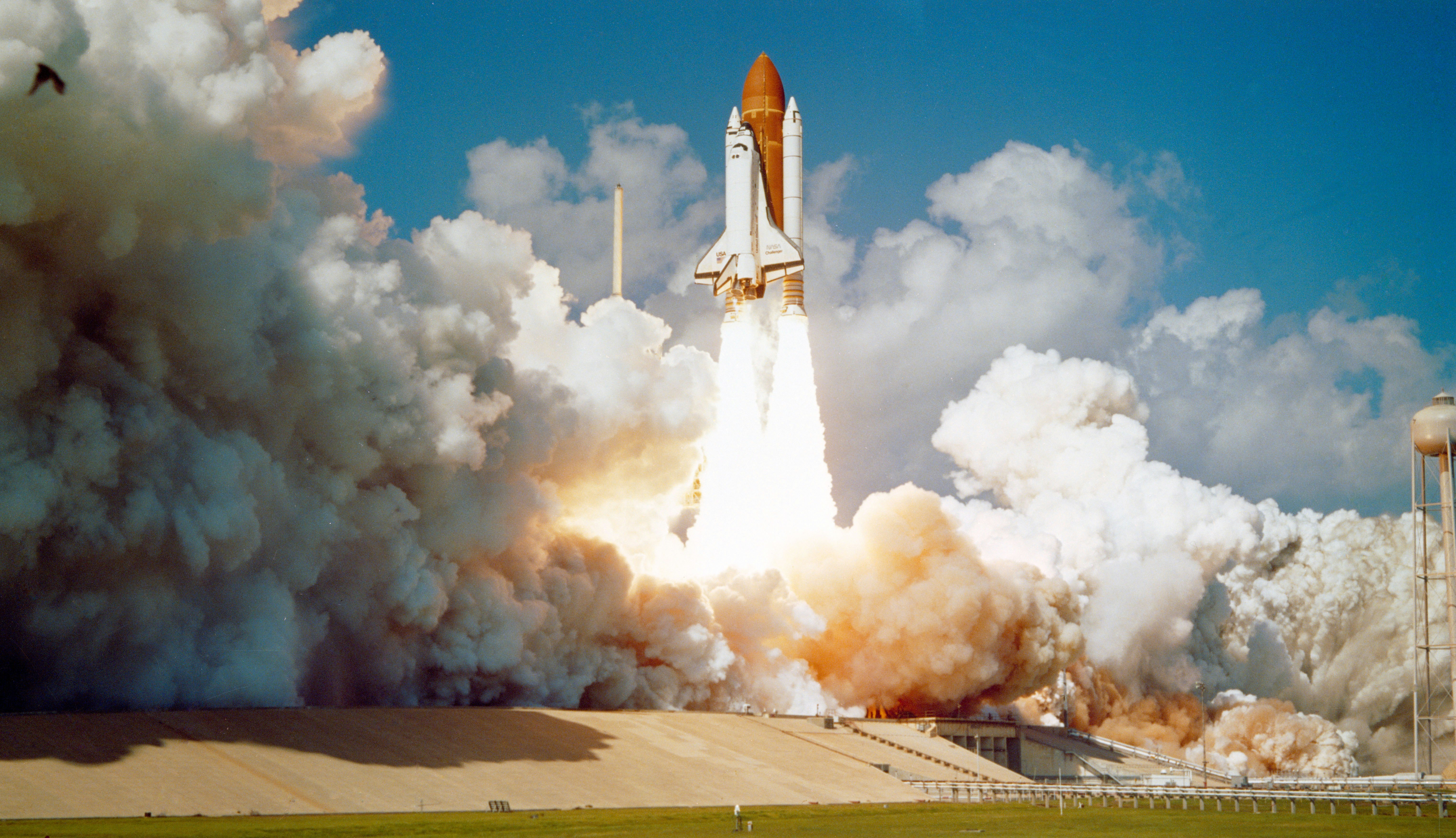 Pyxofy
Two modifications need to be done for the Space Shuttle Orbiter pertaining to the Aft Fuselage Blocks CSS code.
We have to break out the Fuselage Blocks, these are the two dark gray blocks right below the Aft Fuselage. The reason to break them out is because, as is, they will disappear when the Space Shuttle is animated. This is caused by the z-index: -1; CSS property in the original code.

Original CSS code
.aft-fuselage::after {
  content: "";
  position: absolute;
  width: 7px;
  height: 13px;
  top: 44px;
  left: 0px;
  background: var(--dark-gray);
  box-shadow: 64px 0 0 0 var(--dark-gray);
  z-index: -1;
}
Here are the modifications
- Create a separate HTML
divfor the Aft Fuselage Block.<div class="aft-fuselage-block"></div> - Put the Aft Fuselage Block CSS code in a separate CSS selector. Remove the
z-index: -1CSS code.
New CSS code
.aft-fuselage-block {
  position: absolute;
  width: 7px;
  height: 13px;
  top: 448px;
  left: 197px;
  background: var(--dark-gray);
  box-shadow: 64px 0 0 0 var(--dark-gray);
}
Next, to group the rocket and orbiter, you create a new CSS selector, .space-shuttle-container. You will use this selector for the animation.
Space Shuttle Container
.space-shuttle-container {
  position: absolute;
  top: 0px;
  left: 10px;
}
In the next section, let’s work on the water clouds. These are the clouds produced when the side rocket booster (SRB) and main engine exhaust collide with the water sprayed on the launch platform during the space shuttle launch.
Water Cloud Shapes
The water cloud consists of two shapes: the dark gray shape in the back and the light gray one in the foreground.
- The dark gray cloud we’ll refer to as
water-cloud-1. - The light gray cloud we’ll call
water-cloud-2.

.water-clouds {
  position: absolute;
  width: 800px;
  height: 500px;
  top: 0px;
  left: -40px;
  background: transparent;
}
The .water-clouds selector is the container for both clouds. Its width is set to 800px and the height is 500px. We’re shifting it to -40px for its left property. The background is set to transparent.
Both clouds are made using the CSS path() function. Read this article for a detailed explanation of how to create shapes with path().
Pyxofy

.water-clouds::before {
  content: "";
  position: absolute;
  width: 700px;
  height: 400px;
  top: 100px;
  left: -30px;
  background: rgb(169, 169, 169);
  clip-path: path(
    "M -40 400 C 1 17 18 60 115 228 S 205 126 255 373 C 279 190 330 144 407 258 S 647 -183 600 400 Z"
  );
}
To get the dark gray shade, you set the background to rgb(169, 169, 169).

.water-clouds::after {
  content: "";
  position: absolute;
  width: 700px;
  height: 200px;
  top: 300px;
  left: 0px;
  background: rgb(238, 238, 238);
  clip-path: path(
    "M -40 200 C 1 17 100 70 138 138 S 211 59 243 167 C 257 112 347 63 384 117 S 494 -94 600 200 Z"
  );
}
Setting the background to rgb(238, 238, 238) gives you a light gray color for the foreground cloud.
The water clouds are completed. In the next section, let’s work on the sky gradient.
Sky Gradient
The sky gradient simulates a daytime light blue sky gradually transitioning to dark blue.

/* Sky Gradient */
.sky {
  position: absolute;
  width: 500px;
  height: 1000px;
  top: 0;
  left: 0;
  background: linear-gradient(
    180deg,
    #000e34,
    #002e88,
    #0552c0,
    #0780e6,
    #28baff
  );
}
You use the CSS linear-gradient() function to create the sky gradient. We have five colors, starting with #000e34, a dark blue color, and ending in #28baff for the daytime light blue color. The angle is set to 180deg.
For details on how to make CSS gradients, check this article.
Pyxofy
Next up is the rocket engine exhaust.
Rocket Engine Exhaust

You’ll be making the side rocket booster (SRB) and main engine exhaust in this section. The SRB exhausts are longer compared to the main engine exhaust.
Both exhausts are gradients consisting of:
- Red
- Orange
- White
- Transparent
You will set the colors using CSS Custom Properties (variables) like this
var(--color)
You can read this article for details on how to use CSS Custom Properties.
Pyxofy
Side Rocket Booster (SRB) Exhaust
A close-up image of the SRB exhaust gradient.

Let’s make the left-side gradient.

.solid-rocket-booster-exhaust {
  position: absolute;
  width: 46px;
  height: 300px;
  top: 480px;
  left: 152px;
  background: linear-gradient(
    to bottom,
    var(--red),
    var(--orange) 5%,
    var(--off-white),
    transparent
  );
}
Similar to the sky gradient, we use the CSS linear-gradient() function to make the exhausts. The gradient direction is set to bottom. The orange, var(--orange), color is explicitly set to start at 5%. The rest of the colors are evenly distributed.

The right-side SRB exhaust is a replica of the left-side exhaust described above. We position it with left: 115px.
.solid-rocket-booster-exhaust::before {
  content: "";
  position: absolute;
  width: 46px;
  height: 300px;
  top: 0px;
  left: 115px;
  background: linear-gradient(
    to bottom,
    var(--red),
    var(--orange) 5%,
    var(--off-white),
    transparent
  );
}
Let’s work on the main engine exhaust next.
Main Engine Exhaust

The main engine exhaust is shorter compared to the SRB exhaust. Another difference is its bottom border is round.

.main-engine-exhaust {
  position: absolute;
  width: 23px;
  height: 70px;
  top: 477.5px;
  left: 205px;
  background: linear-gradient(
    to bottom,
    var(--red),
    var(--orange) 20%,
    transparent
  );
  border-radius: 0 0 200px 200px;
}
The orange color, var(--orange), is explicitly set to start at 20%. To round the bottom area of the exhaust, you use border-radius: 0 0 200px 200px;.

.main-engine-exhaust::before {
  content: "";
  position: absolute;
  width: 23px;
  height: 70px;
  top: 0px;
  left: 30px;
  background: linear-gradient(
    to bottom,
    var(--red),
    var(--orange) 20%,
    transparent
  );
  border-radius: 0 0 200px 200px;
}
You position the right side exhaust by setting the left property value to 30px.

Ok, you’ve completed the static images. In the final section, you’ll learn how to animate them.
Animating the Launch Scene
You will be animating three sections:
- Space Shuttle
- Water Clouds
- Sky Gradient
Do take note that the animation viewport is 500px by 500px, which is demarcated by the light gray border. Comment out overflow: hidden in the .container CSS selector so you can view the shapes in full while working on the animation.
/* Set background and border color */
.container {
  overflow: hidden; <- Comment overflow while working on the animation.
}
Space Shuttle Animation
The space shuttle will move from the bottom of the screen to the top of the screen. We’ll make it slightly shake sideways while moving to the top, and then it will slowly fade out.

.space-shuttle-container {
  animation: space-shuttle 7s ease-in infinite;
}
The animation name is space-shuttle and the duration is seven seconds, 7s. It loops infinitely and has an ease-in effect.
@keyframes space-shuttle {
  from {
    top: 0px;
    opacity: 1;
  }
  to {
    top: -495px;
    opacity: 0.4;
  }
}
The animation starts with the space shuttle positioned at top: 0px and opaque with opacity: 1. The space shuttle end state will be at top: -495px and semi-transparent with opacity: 0.4.
Next, you’ll make the shake effect.
/* Shake Effect */
.rocket,
.orbiter,
.main-engine-exhaust,
.solid-rocket-booster-exhaust {
  animation: shake 0.5s linear infinite;
}
The shake effect targets four CSS selectors. It lasts for 0.5s seconds and infinitely loops.
@keyframes shake {
  from {
    transform: translateX(0);
  }
  50% {
    transform: translateX(1px);
  }
  to {
    transform: translateX(0);
  }
}
Using transform: translateX, we shift the space shuttle 1px to the left from its original position.
Let’s animate the water clouds in the next section.
Water Clouds Animation
The water clouds will move left to right and vice versa while it moves down the screen. It will slowly fade out as it moves to its end state.

- Water Cloud 1 - Dark Grey
.water-clouds::before {
  animation: water-cloud-1 7s ease-in infinite;
}
Water Cloud 1 animates for seven seconds with an ease-in effect.
@keyframes water-cloud-1 {
  from {
    opacity: 0.7;
    top: 100px;
    left: 0px;
  }
  20% {
    left: -20px;
  }
  40% {
    left: 20px;
  }
  60% {
    left: -20px;
  }
  to {
    opacity: 0;
    top: 500px;
    left: 0px;
  }
}
Using the @keyframes percentage property, you animate the water cloud to zig-zag across the screen. It will fully fade out as it reaches top: 500px by setting opacity to 0.

- Water Cloud 2 - Light Gray
The Water Cloud 2 is a slight variation of the above animation sequence.
.water-clouds::after {
  animation: water-cloud-2 7s ease-out infinite;
}
@keyframes water-cloud-2 {
  from {
    opacity: 0.9;
    left: 0px;
    top: 300px;
  }
  20% {
    left: 10px;
  }
  40% {
    left: -10px;
  }
  60% {
    left: 10px;
    opacity: 0.3;
  }
  to {
    opacity: 0;
    left: 0px;
    top: 400px;
  }
}
Let’s animate the sky gradient next.
Sky Gradient Animation
The sky gradient starts with the daytime light blue color and moves down the screen, ending at the dark blue color.

.sky {
  animation: sky 7s ease-in infinite;
}
@keyframes sky {
  from {
    top: -500px;
  }
  to {
    top: 0px;
  }
}
Setting top: -500px in the from state and top: 0px in the to state, the gradient will animate smoothly from top to bottom.

You can see and play with the complete code on Pyxofy’s CodePen page.
See the Pen CSS Animation - Space Shuttle Launch by Pyxofy (@pyxofy) on CodePen.
Conclusion
You created a space shuttle launch scene by combining multiple CSS properties, such as @keyframes at-rule, linear-gradient, and opacity. You used the top and left CSS properties to animate the space shuttle, water clouds, and the sky gradient.
Play around with the sample code and modify the CSS code to your liking. How about changing the sky gradient to a sunrise or maybe a sunset scene? Perhaps you can exchange the space shuttle with the classic Saturn V rocket.
Please share your fantastic work of art with us on LinkedIn, Threads, Mastodon, X (Twitter) @pyxofy or Facebook.
We hope you liked this article. Kindly share it with your network. We appreciate it.
Related Articles
 Pyxofy