CSS Animation – How to Use Keyframes and steps() to Animate an Analog Alarm Clock - Part 2
Learn to rotate, scale, and fade in elements with pure CSS! Follow this step-by-step article to create stunning and visually catchy animations.

Introduction
Mastering the combination of rotation, scaling, and fade-in effects may seem challenging at first, but once you get the hang of it, you’ll unlock the ability to create fascinating, professional-quality animations that visually stand out.
- In Part 1, you learned how to animate the hour and minute hands along with the clock body. This involved using multiple CSS properties and functions, such as
animationandsteps(), to create smooth, precise movements. - Part 2 (this article) builds on that foundation by showing you how to combine multiple CSS properties to create dynamic rotating and scaling animation sequences. You’ll apply these techniques to the remaining elements of the clock, including the clock face, numbers, feet, bells, and hammer.
CSS properties you’ll be learning about in this article:
opacityrotatescale- CSS Custom Properties (Variables)
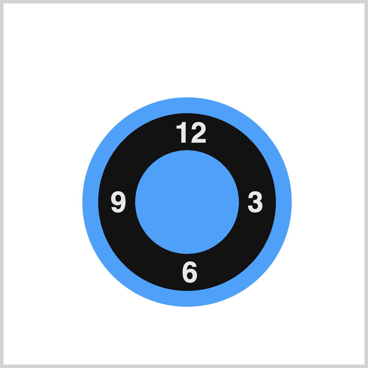
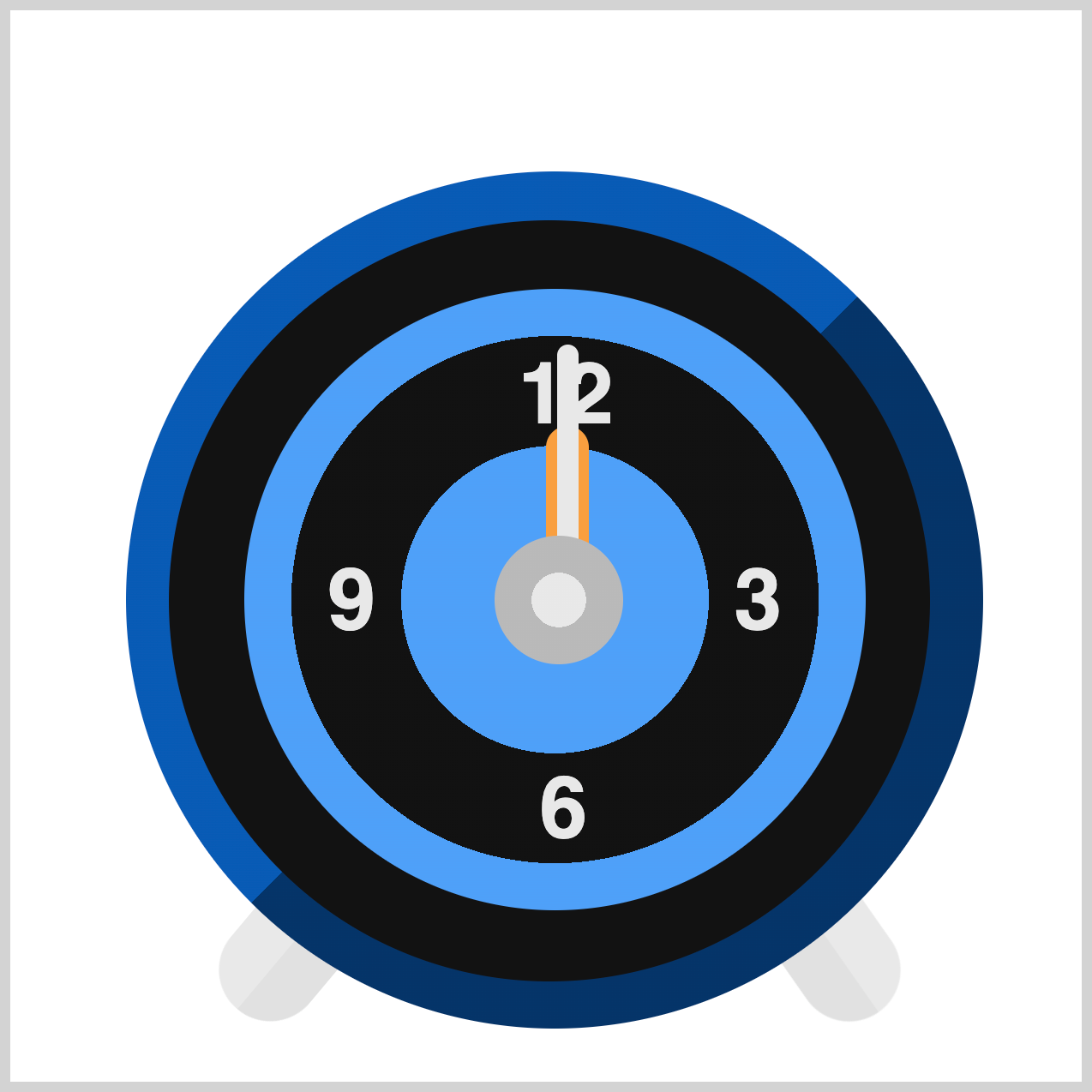
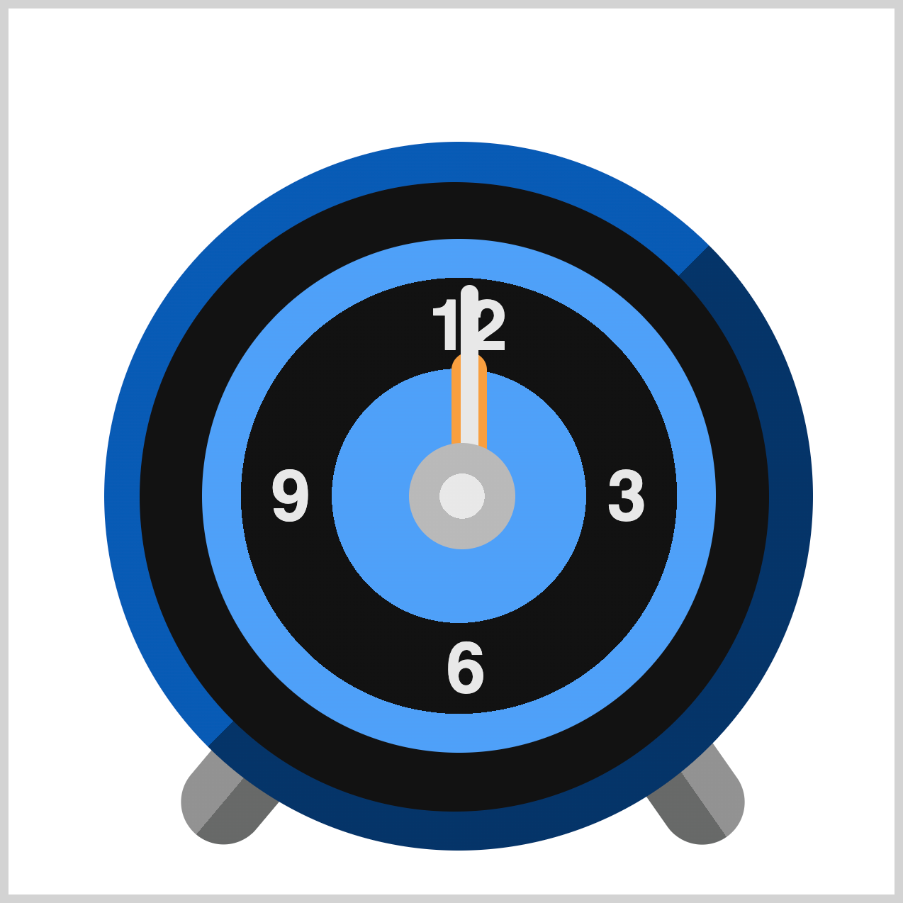
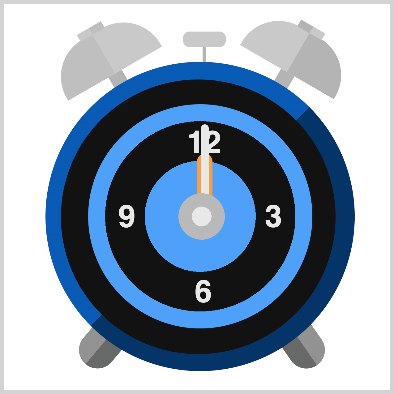
Preview

Alarm clock components you’ll be animating in this article:
- Clock Face and Numbers
- Clock Feet
- Clock Bells and Hammer
Before moving forward, we recommend checking out Part 1 of this series. It introduces the core concepts behind the animation sequences, providing a solid foundation to build upon. Reviewing it first will ensure you’re fully prepared for the steps ahead.
Prerequisites
Essential CSS and HTML knowledge will help you understand the concepts and techniques introduced in this article. Jump over to this article if you require an HTML and CSS primer.
We assume you have configured tools to modify CSS. If not, this article will guide you through the setup process.
Please read this article if you’re unfamiliar with CSS animation and the @keyframes at-rule property.
HTML Structure
<div class="container">
  <div class="bell-tip"></div>
  <div class="left-bell"></div>
  <div class="right-bell"></div>
  <div class="bell-hammer"></div>
  <div class="clock-feet"></div>
  <div class="clock-body"></div>
  <div class="clock-face">
    <div class="number twelve">12</div>
    <div class="number three">3</div>
    <div class="number six">6</div>
    <div class="number nine">9</div>
  </div>
  <div class="hour-hand"></div>
  <div class="minute-hand"></div>
  <div class="dial"></div>
</div>
container is the outermost enclosure. It enables the content to be centered and draws a light gray border. The rest of the <div>s represent each animation sequence.
Keep the HTML structure as is for the animation to display correctly.
Body and Container <div> CSS
CSS code for the body and container <div>.
/* Body and Container Settings */
/* Center shapes */
body {
  margin: 0;
  padding: 0;
  height: 100vh;
  display: flex;
  justify-content: center;
  align-items: center;
  flex-wrap: wrap;
}

/* Set background and border color */
.container {
  width: 500px;
  height: 500px;
  border: 5px solid lightgray;
  background: transparent;
  position: relative;
  margin: 5px;
  display: flex;
  justify-content: center;
  align-items: center;
}
Clock Face and Numbers
In this section, you’ll combine several CSS properties—such as opacity, rotate, and scale—to bring both the Clock Face and the Numbers to life with smooth animations.

/* Clock Face */
.clock-face {
  animation: clock-face 1s var(--animation-timing-function);
}
- The animation name is set to
clock-face 1ssets the animation duration, which is equal to one second.var(--animation-timing-function)pulls in the timing function from a CSS variable, in this instanceease-in-out.

@keyframes clock-face {
  from {
    opacity: 0;
    rotate: -600deg;
  }
  to {
    opacity: 1;
    rotate: 0deg;
  }
}
The animation begins with the Clock Face completely invisible (opacity: 0) and rotated to -600deg. As the sequence progresses, it transitions to full visibility (opacity: 1) while smoothly rotating back to 0deg, creating a clockwise spin effect.

/* Numbers */
.number {
  animation: number 1s var(--animation-timing-function);
}
Aside from the animation name (number), all other properties use the same values as those applied to the Clock Face animation.

@keyframes number {
  from,
  80% {
    opacity: 0;
    scale: 0;
  }

  to {
    opacity: 1;
    scale: 1;
  }
}
- Starting state (
from, 80%): The Numbers are completely hidden (opacity: 0) and scaled down to zero (scale: 0), making them invisible. - Ending state (
to): The Numbers become fully visible (opacity: 1) and return to their normal size (scale: 1).
This creates a smooth “pop-in” effect where the Numbers fade in and grow into place.

By combining opacity, rotate, and scale, CSS properties, you’ve created a dynamic effect that makes both the Clock Face and Numbers appear in an engaging, eye-catching way.
This approach adds depth and movement, turning a simple design into something visually appealing and interactive.
Next, we’ll move on to animating the Clock Feet.
Clock Feet
The Clock Feet animation uses the CSS opacity property to create a smooth fade-in effect, making the feet gradually appear on the screen. This simple technique adds a subtle yet elegant touch to the overall design.
/* Clock Feet */
.clock-feet {
  animation: clock-feet 1.5s var(--animation-timing-function);
}
The animation is named clock-feet, runs for 1.5 seconds (1.5s), and uses var(--animation-timing-function) to pull in the timing function, ease-in-out, from a CSS variable.
This approach keeps your code flexible and consistent by leveraging CSS variables for reusable values.

@keyframes clock-feet {
  from,
  80% {
    opacity: 0;
  }
  to {
    opacity: 1;
  }
}
This @keyframes at-rule defines the animation for the Clock Feet:
- Starting state (
from, 80%): The feet are completely hidden (opacity: 0) for most of the animation duration. - Ending state (
to): The feet fade in smoothly (opacity: 1) at the end of the sequence.
This creates a subtle fade-in effect, making the Clock Feet appear gradually without any abrupt changes.
To wrap things up, our next section will focus on animating the Clock Bells and Hammer. These elements will add the final layer of detail, making your clock design truly complete and visually striking.
Clock Bells and Hammer
Just like the Clock Feet, the Clock Bells, and the Hammer will fade in using the CSS opacity property. Their animation sequences are combined for simplicity, while the Bell Tip animation is staggered with a slight delay to create a more natural and visually appealing effect.

/* Alarm Bells */
.left-bell {
  animation: alarm-bell 1.7s var(--animation-timing-function);
}

.right-bell {
  animation: alarm-bell 1.7s var(--animation-timing-function);
}

/* Bell Hammer */
.bell-hammer {
  animation: alarm-bell 1.7s var(--animation-timing-function);
}
The .left-bell, .right-bell, and .bell-hammer CSS selectors all share the same animation settings. The animation is named alarm-bell, runs for 1.7 seconds (1.7s), and uses the timing function defined by the CSS variable var(--animation-timing-function), in this case is ease-in-out.
This setup ensures smooth, consistent motion across all elements while keeping your code flexible and maintainable.
/* Bell Tip */
.bell-tip {
  animation: alarm-bell 1.9s var(--animation-timing-function);
}
Other than the updated animation duration of 1.9 seconds (1.9s), all remaining properties are the same as those used for the bells and hammer animation. This keeps the design consistent while introducing a slightly longer fade-in effect, 1.9 seconds versus 1.7 seconds, for the Bell Tip.
@keyframes alarm-bell {
  from,
  80% {
    opacity: 0;
  }
  to {
    opacity: 1;
  }
}
The alarm-bell animation uses the same opacity values as the Clock Feet animation, ensuring a consistent fade-in effect across all elements. This approach keeps the design cohesive while maintaining simplicity in your CSS.
You can see and play with the complete code on Pyxofy’s CodePen page.
See the Pen CSS Animation - How to Use Keyframes and steps() to Animate an Analog Alarm Clock by Pyxofy (@pyxofy) on CodePen.
Conclusion
Part 2 of this two-part series walks you through creating a visually appealing analog clock animation using CSS. It builds on the foundation animation sequence introduced in Part 1.
In this second part, you’ll learned how to:
- Animate the Clock Face and Numbers
Combine CSS properties likeopacity,rotate, andscaleto make the clock face and numbers dynamically appear with smooth transitions. - Clock Feet Animation
Use theopacityproperty to create a subtle fade-in effect for the clock feet, adding elegance to the design. - Clock Bells and Hammer Animation
Apply similar fade-in techniques for the bells and hammer, with staggered delays for the bell tips to achieve a natural, polished look. - Reusable Animation Properties
Maintain consistency by reusing animation values across elements, while adjusting durations for visual balance. CSS variables, such asvar(--animation-timing-function), help keep your code flexible and maintainable.
You learned how to fully animate the analog clock with layered effects that feel dynamic and professional—all achieved with pure CSS. What will you create with these new techniques? Share your masterpiece with us on LinkedIn, Threads, Bluesky, Mastodon, X (Twitter) @pyxofy, or Facebook.
We hope you liked this article. Kindly share it with your network. We appreciate it.
Related Articles
 Pyxofy
 Pyxofy

 Pyxofy