CSS Art – shape() Function & Gradients: Build an Isometric Gift Box - Part 1
Your CSS boxes are crying out for depth. Transform them into eye-catching 3D shapes like a pro—step by step.

Introduction
Ready to turn simple lines of code into amazing 3D web art? In this article, you’ll learn how to build a realistic isometric gift box using modern CSS only. We’ll explore position: absolute to precisely place each panel and dive into the cutting‑edge shape() function to carve clean, geometric forms.
- In Part 1 of this article, you’ll learn how to build each component of the isometric gift box using the CSS
clip-path: shape()function. This part focuses on shaping and structuring the box, showing how precise coordinates can turn simple<div>HTML elements into clean, isometric shapes. - In Part 2, we shift our attention to visual polish. You’ll explore how to use CSS
linear-gradient()to create decorative stripe effects and subtle color transitions, adding depth, lighting, and a more realistic finish to your isometric design.
CSS functions and properties introduced in this article:
clip-pathshape()backgroundwidthheight
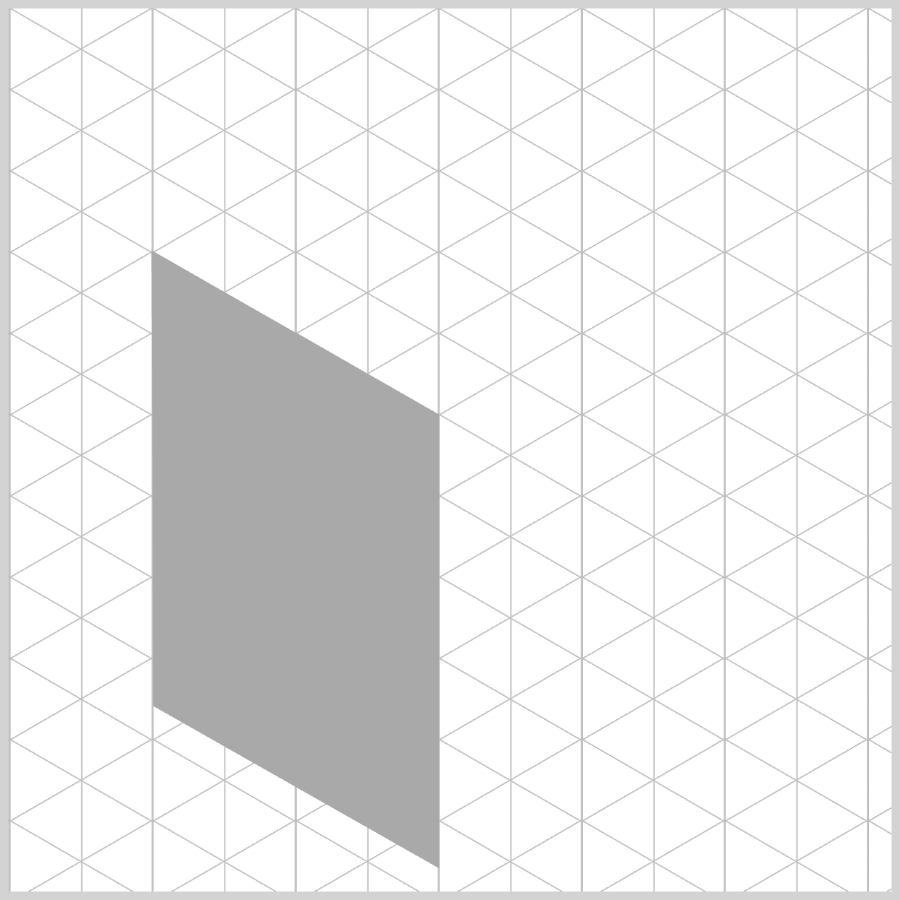
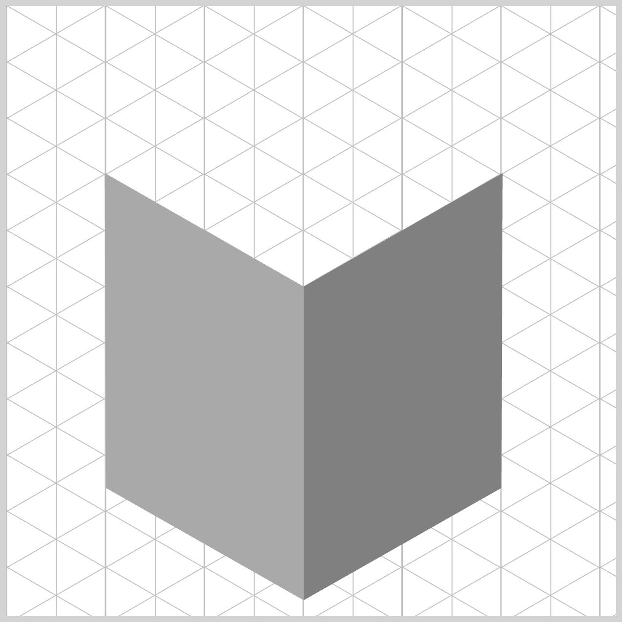
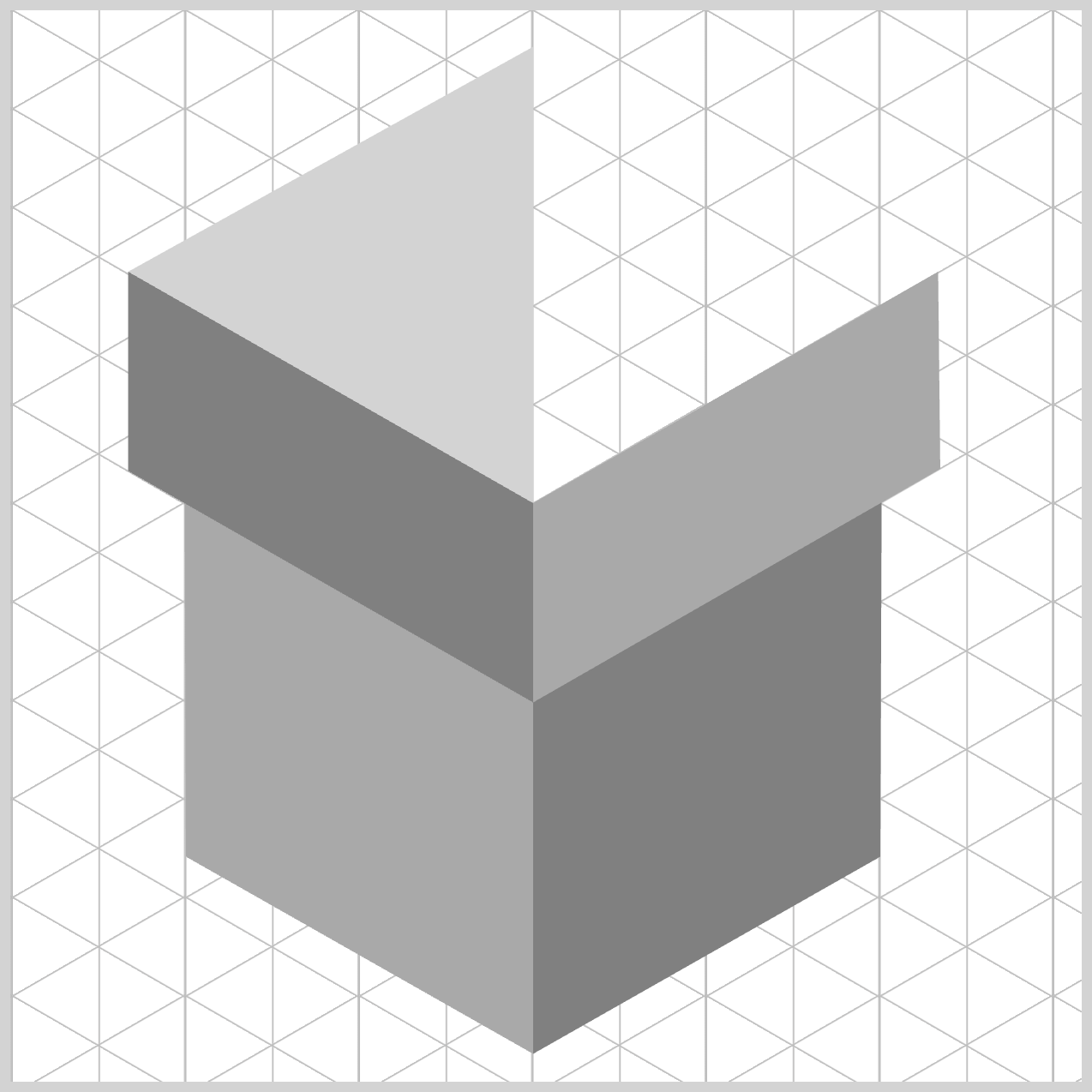
Preview
Here’s a quick preview of what you’ll be creating in this two‑part article.
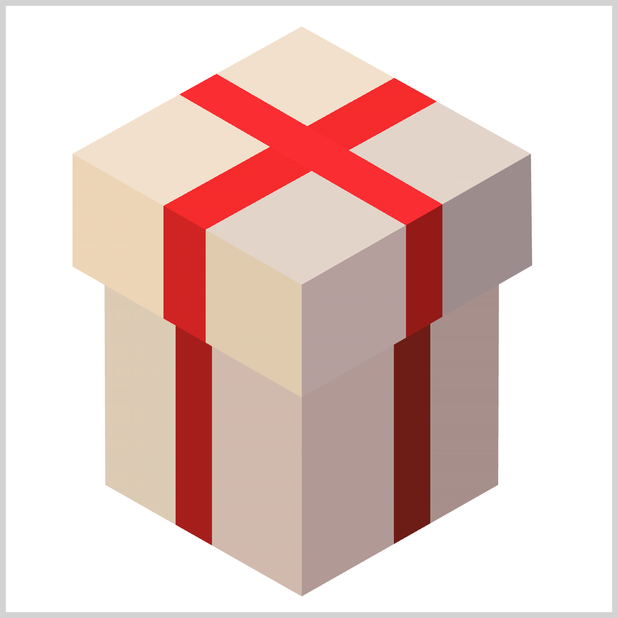
This preview gives you a clear idea of the final result before we dive into the step‑by‑step build.

Before you dive in, we highly recommend checking out these two articles to get comfortable with how the CSS shape() function works. Taking a little time to explore them first will give you a much stronger foundation and make the ideas in this article easier to follow.
 Pyxofy
 Pyxofy
You may also want to visit the official MDN browser‑compatibility page to see the latest support details for the CSS shape() function. This quick check helps you understand which browsers currently support it and where it’s safe to use in production, so there are no surprises when your design goes live.
Prerequisites
Essential CSS and HTML knowledge will help you understand the concepts and techniques introduced in this article. Jump over to this article if you require an HTML and CSS primer.
We assume you have configured tools to modify CSS. If not, this article will guide you through the setup process.
HTML Structure
<div class="container">
  <div class="box-body-left"></div>
  <div class="box-body-right"></div>
  <div class="box-cover-left"></div>
  <div class="box-cover-right"></div>
  <div class="box-top"></div>
</div>
container is the outermost enclosure. It enables the content to be centered and draws a light gray border. The rest of the <div>s represent each image component.
Keep the HTML structure as is for the image to display correctly.
Body and Container <div> CSS
CSS code for the body and container <div>.
/* Body and Container Settings */
/* Center shapes */
body {
  margin: 0;
  padding: 0;
  height: 100vh;
  display: flex;
  justify-content: center;
  align-items: center;
  flex-wrap: wrap;
}

/* Set background and border color */
.container {
  width: 500px;
  height: 500px;
  border: 5px solid lightgray;
  background: white;
  position: relative;
  margin: 5px;
  display: flex;
  justify-content: center;
  align-items: center;
}
Common Properties
To keep your CSS clean, readable, and easy to maintain, we group shared properties instead of repeating the same code over and over. This approach reduces duplication, keeps everything nicely organized, and makes future updates much simpler.
In professional development, this idea is known as DRY code—short for Don’t Repeat Yourself. By grouping related selectors and reusing common styles, you’re writing smarter, more efficient CSS that’s easier to understand and manage.
/* Common Properties */
.box-body-left,
.box-body-right,
.box-cover-left,
.box-cover-right,
.box-top {
  position: absolute;
  width: 100%;
  height: 100%;
}
Using position: absolute; gives you full control over where each visual element appears inside the container. Unlike the normal page flow, absolutely positioned elements can be placed exactly where you want using precise coordinates. This makes it perfect for layered designs and custom shapes, where accuracy and control are essential.
Setting width: 100%; and height: 100%; tells each panel to fully fill its parent wrapper, which in this case is the .container. In other words, every box starts out at the exact same size as the canvas, making it easy to layer and align elements consistently.
Even though the clip-path: shape() rules will later cut these full‑size panels into unique polygons, triangles and diamond‑like forms, each element begins as a complete rectangle. This approach keeps your layout predictable and easy to manage, because all visual elements share the same starting point before being shaped into their final designs.
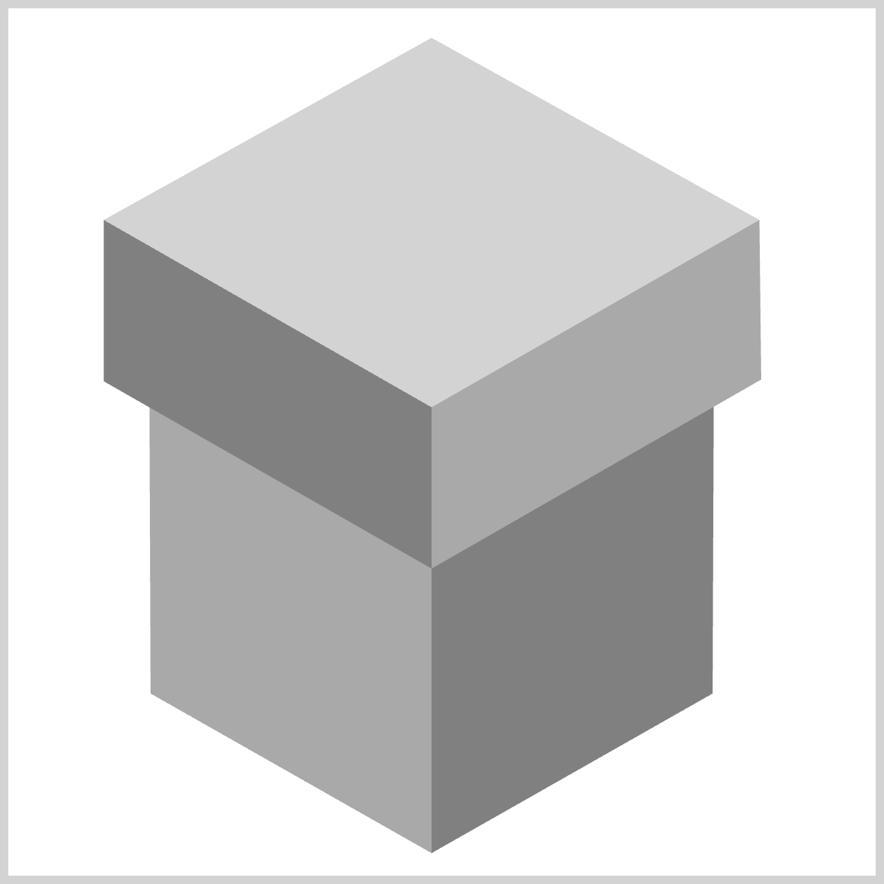
Now that we’ve covered the basics, let’s move on to the Box Body.
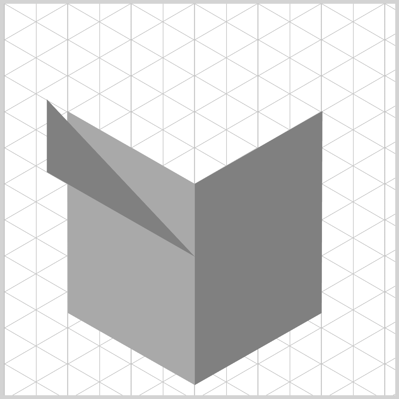
Box Body
In this section, we’ll focus on how the main body of the box is constructed and styled. This is where the overall shape really starts to come together, and you’ll see how clip‑path: shape(), and layering work together to create depth.
By default, .box-body-left—along with the other isometric present box components—starts out as a simple, flat square. This happens because both width: 100%; and height: 100%; are applied, giving each element a full‑size, solid base that perfectly matches the container.
From there, the real magic begins. The clip-path: shape() property works like a pair of digital scissors, carefully trimming away the parts of the square we don’t need. What remains is a clean, precise custom shape that fits seamlessly into the isometric gift box design. Starting with a full canvas and shaping it afterward keeps the process simple, predictable, and easy to control.
.box-body-left {
  background: darkgray;
  clip-path: shape(
    from 244px 487px,
    line to 82px 395px,
    line to 81px 137px,
    line to 244px 230px,
    close
  );
}
- The background color is initially set to dark gray, giving the shape a neutral base.
- The
from 244px 487pxpoint acts as the bottom corner anchor. Here, the browser places the “pen tip” at the very lowest part of the gift box profile, roughly centered along the bottom edge of the canvas. - Next,
line to 82px 395pxdraws the lower‑left slanted edge. The pen moves upward and to the left at a classic isometric angle, forming the bottom edge of the box’s left wall. - With
line to 81px 137px, the pen travels straight up, creating the left vertical edge of the present and defining its outer boundary. - Then,
line to 244px 230pxcreates the upper‑left slant, angling back inward toward the center. This line marks the transition point where the main box body meets the lid above. - Finally,
closeseals the shape. Instead of manually drawing a line back to the starting point, the browser automatically connects the last point to the first, neatly completing a sharp, four‑sided isometric polygon.
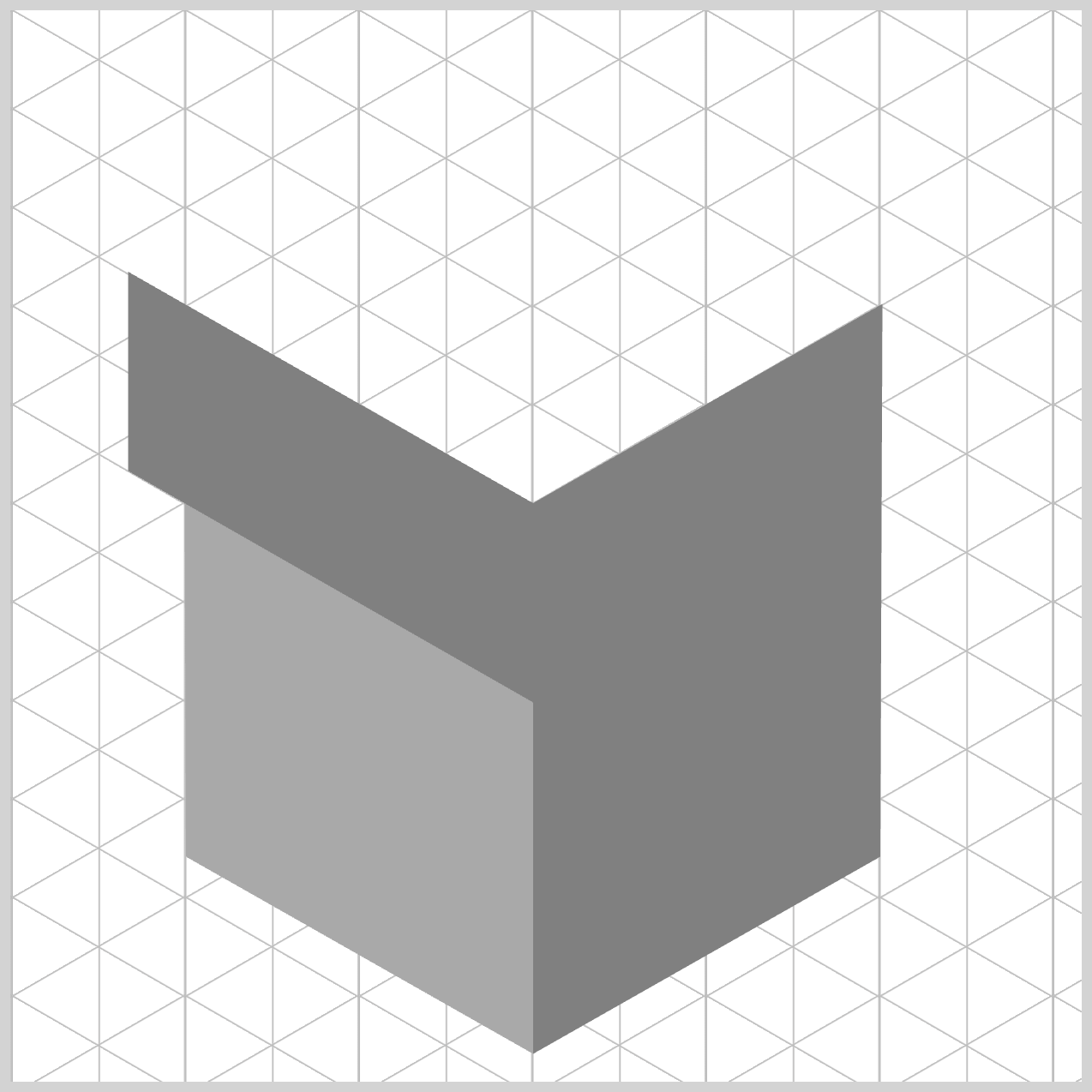
Let’s move on and build the right side of the box body next. To really understand how the shape() commands works, we’ll start simple. This time, we’ll begin with a three‑point shape, which is the minimum number of points required for the browser to draw a shape() image on the screen.

By stripping the shape down to its essentials first, it becomes much easier to see how each coordinate affects the final result. Once this foundation is clear, adding more points—and more complexity—will feel natural and intuitive as the box starts to take form.
.box-body-right {
  background: gray;
   clip-path: shape(
    from 244px 487px,
    line to 406px 395px,
    line to 407px 137px
    close
  );
}
The right side box body component acts as as geometric counterpart to the left side we just explored. By carefully adjusting the coordinate endpoints, you’re essentially instructing the browser to mirror the previous polygon over to the right side of the canvas. This symmetry is what allows both sides of the box to feel balanced and physically connected.
- On the previous component, you used
darkgray, but for this side you transition to agraybackground. - Everything begins at
from 244px 487px, which is the shared seam connection. This starting point is identical to the left wall’s anchor, and that’s intentional. By dropping the virtual pen at the exact same pixel location, both walls lock together perfectly at the bottom center—no gaps, no overlaps, just a clean, seamless join. - From the starting point, the
clip-path: shape()command traces the right‑facing profile. The line drawn to406px 395pxcreates the lower‑right slanted edge, angling upward and outward to define the base of the right wall. - Next, the
line to 407px 137pxmoves straight up, forming the right vertical edge. Notice how this height precisely matches the left wall’s vertical edge—this consistency is what keeps the box looking solid, aligned, and convincingly three‑dimensional.
Let’s add the final shape() function command in the next step to complete the isometric shape.
.box-body-right {
  clip-path: shape(
    from 244px 487px,
    line to 406px 395px,
    line to 407px 137px,
    line to 244px 230px,
    close
  );
}
The final step completes the shape and locks everything together. With line to 244px 230px, the pen slants inward and downward to the left, connecting directly to the center ridge. This point is especially important because it’s the exact same upper seam used by the left side, creating a clean, shared peak line across the front of the box body.
Finally, the close command finishes the job. Instead of manually drawing the last edge, the browser automatically snaps a straight line back to the starting point at from 244px 487px. This instantly seals the polygon, forming a complete, solid right wall that aligns perfectly with the rest of the isometric box.
We’ll use this same three‑point → four‑point learning pattern for the rest of the components as we move forward.
Next, we’ll shift our focus to the Box Cover component.
Box Cover
The Box Cover component follows the same familiar structure as the Box Body, with both a left and a right side working together to form the top layer. To keep things clear and easy to understand, we’ll once again start by rendering a simple three‑point shape first. This lets you clearly see the core geometry before moving on.
.box-cover-left {
  background: gray;
}
For the Box Cover left side component, we assign gray as the fallback background color. This choice is intentional. Since this overhanging shape sits directly above the lighter box body component, the slightly different shade visually separates it from the box body below, reinforcing the illusion of depth and layering.
.box-cover-left {
  clip-path: shape(
    from 244px 323px,
    line to 55px 215px,
    line to 55px 122px,
    close
  );
}
It all begins with from 244px 323px, where the browser places its virtual pen at the lower rim anchor of the lid. Notice how this point sits lower than the body’s top seam (244px 230px). That vertical offset is intentional—it’s what makes the cover look like it’s hanging over the box below rather than sitting flat on top.
From there, the clip-path: shape() coordinates carve out the cover’s profile. The line to 55px 215px slants down and left, pushing farther outward than the body panel underneath. This extra width is what visually sells the overhang effect.
Next, line to 55px 122px moves straight up, forming the vertical thickness of the cover’s edge.
.box-cover-left {
  clip-path: shape(
    from 244px 323px,
    line to 55px 215px,
    line to 55px 122px,
    line to 244px 230px,
    close
  );
}
The path then angles back inward with line to 244px 230px, reconnecting at the center-front spine where the Box Cover will later rest.
Finally, the close command seals the shape by snapping back to the starting point, locking everything into a clean, four‑sided polygon. The result is a crisp, believable lid that clearly sits on top of the box body—exactly what we want for a strong 3D illusion.
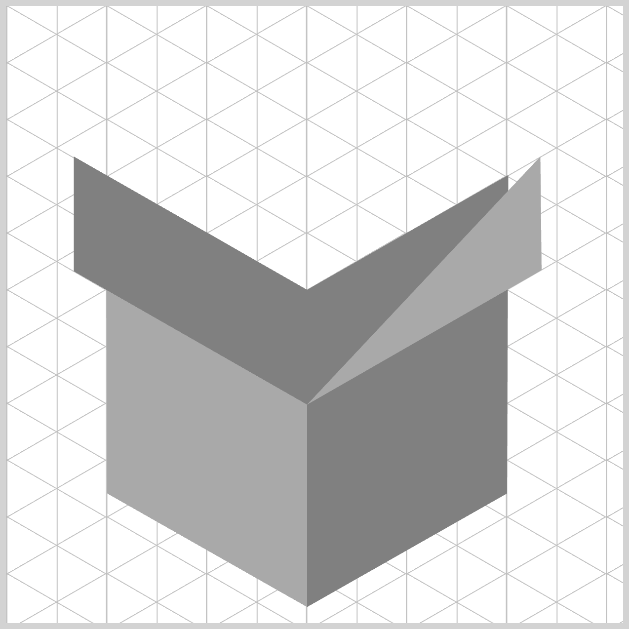
.box-cover-right {
  background: darkgray;
  clip-path: shape(
    from 244px 323px,
    line to 434px 214px,
    line to 433px 122px,
    line to 244px 230px,
    close
  );
}
The right side of the box cover is essentially a close mirror image of the left side you just learned. Since it follows the same structure, logic, and clip-path: shape() pattern, we won’t repeat the full breakdown here. This keeps the article concise while reinforcing an important idea: once you understand one side, you already understand the other. Simply flip the coordinates, and the geometry falls neatly into place.
Now let’s move on to the final section: the Box Top component.
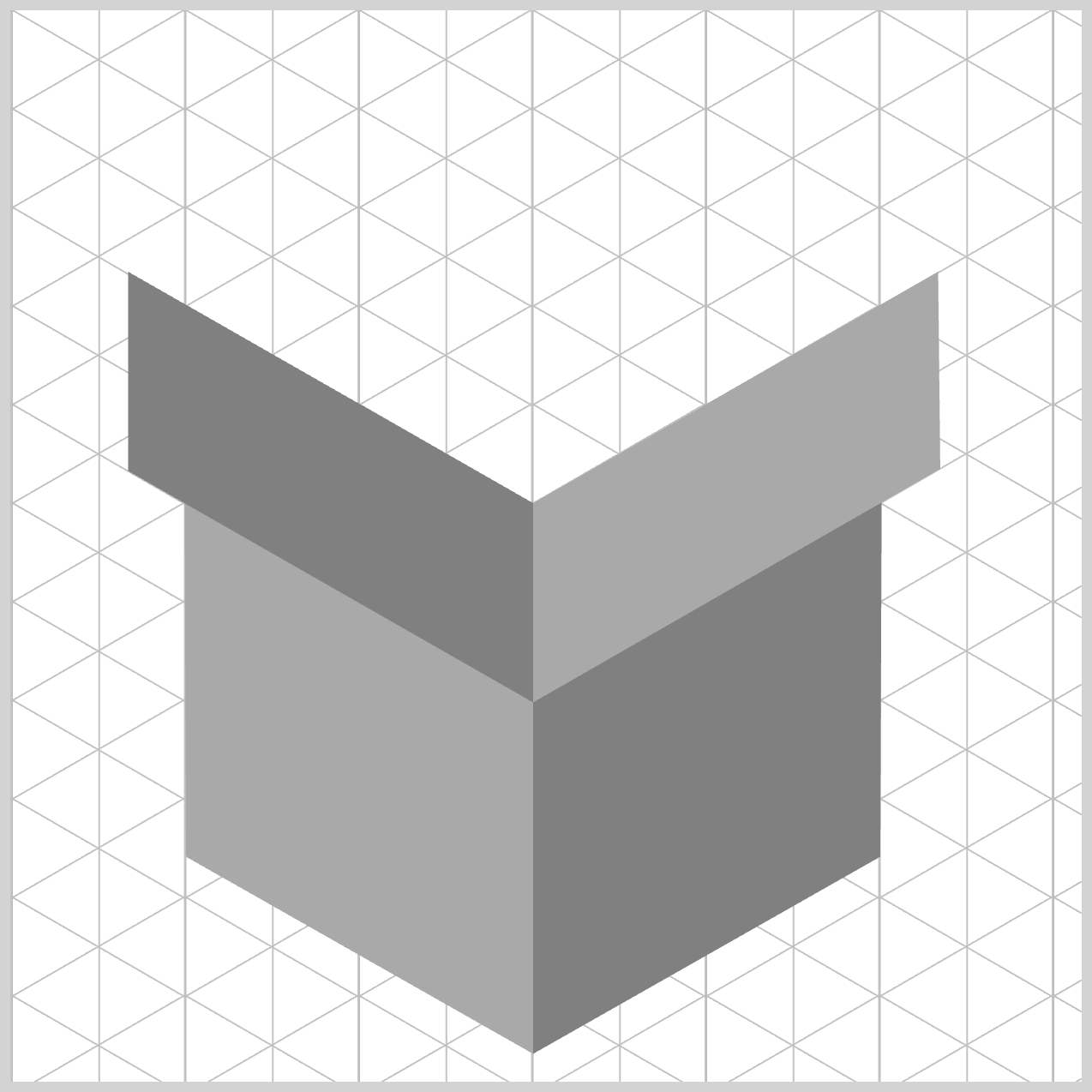
Box Top
This is where everything comes together and the gift box truly feels complete. Unlike the side components, the Box Top component sits above all other elements, so we use differentiated color shadings and a carefully angled polygon to give it an isometric look.
.box-top {
  background: lightgray;
  clip-path: shape(
    from 244px 230px,
    line to 55px 122px,
    line to 244px 17px,
    line to 433px 122px,
    close
  );
}
For the Box Top component, we assign lightgray as the background color. In 3D and isometric design, the top‑facing surface is usually treated as the area closest to the sky or an overhead light source. By making this diamond shape noticeably brighter than the gray and darkgray side components, you instantly create a strong light‑reflection contrast.
The Box Top begins at a very important coordinate: from 244px 230px. At this point, the browser drops its virtual pen on the front peak anchor of the box. This location is critical because it’s the exact same upper spine where .box-cover-left and .box-cover-right meet. By starting the box top face here, you guarantee a perfect, gap‑free connection between the cover and the side panels, keeping the entire structure visually solid.
From that anchor, the clip-path: shape() command traces out the diamond‑shaped shape. The line to 55px 122px slopes up and to the left, neatly matching the upper edge of the left cover lid.
Next, the pen moves to 244px 17px, reaching the highest and farthest point of the design. This coordinate represents the deepest back corner of the box top and gives the lid its full isometric depth. The path then continues to 433px 122px, slanting down and to the right to form the opposite roof edge.
Finally, the close command snaps everything back to the starting point at 244px 230px, sealing the diamond cleanly. With that single instruction, the browser completes a crisp, well‑aligned top surface that sits perfectly above the rest of the box—bringing the entire isometric form together beautifully.
You can see and play with the complete code on Pyxofy’s CodePen page.
See the Pen CSS Art – shape() Function & Gradients: Build an Isometric Gift Box by Pyxofy (@pyxofy) on CodePen.
Conclusion
In Part 1 of this two-part article series, you learned how modern CSS can be used as a visual design tool, not just for layout. By combining clip-path: shape() and absolute positioning, simple <div> elements were transformed into a clean, isometric gift box.
Shared properties followed the DRY (Don’t Repeat Yourself) principle, keeping the code easy to maintain. Together, these CSS functions and properties demonstrate how thoughtful structure, consistent coordinates, and smart color choices can create convincing depth and isometric effects—using pure CSS only.
How will you apply these CSS techniques? Share your masterpiece with us on LinkedIn, Threads, Bluesky, Mastodon, X (Twitter) @pyxofy, or Facebook.
We hope you liked this article. Kindly share it with your network. We appreciate it.
Related Articles
Pyxofy Pyxofy
 Pyxofy
 Pyxofy