CSS Art – Combining Gradients and Custom Properties – Part 1
Sunshine and sizzling heat are the whole mark of summer. Using CSS, learn how to keep cool by creating a Japanese Furin wind chime, step-by-step.

Introduction
Combining CSS gradients and Custom Properties opens up infinite possibilities for creating distinctive shapes and images. In this two-part article series, you’ll learn how to use CSS gradients and Custom Properties to make a Japanese "Furin" wind chime.
You’ll learn about these CSS properties in this article.
Preview
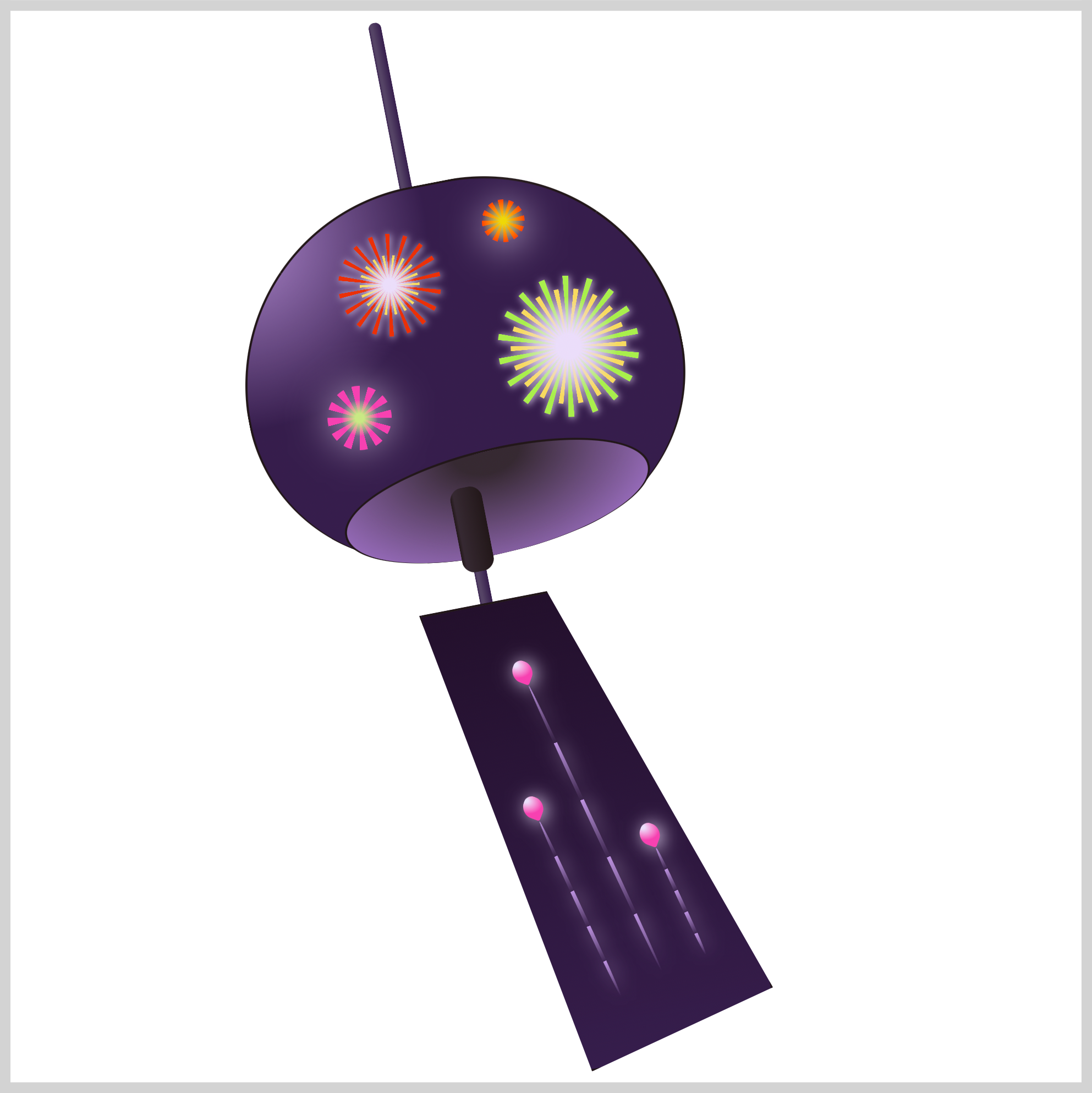
In the first installment of this two-part article series, you’ll learn how to make the Furin wind chime. The second article installment will focus on creating the fireworks.
The Furin wind chime consists of the following components:
- String
- Bowl “Gaikan”
- Bowl Bottom Opening
- Bell Clapper “Zetsu”
- Paper “Tanzaku”
Prerequisites
Essential CSS and HTML knowledge will help you understand the concepts and techniques introduced in this article. Jump over to this article if you require an HTML and CSS primer.
We assume that you have set up tools to create CSS art. If you haven’t, this article will show you how to set them up.
HTML Structure
<div class="container">
  <div class="string"></div>
  <div class="bowl-gaiken"></div>
  <div class="bell-clapper-zetsu"></div>
  <div class="paper-tanzaku"></div>
  <div class="firework"></div>
  <div class="firework-2"></div>
  <div class="firework-3"></div>
  <div class="firework-4"></div>
  <div class="firework-streaks">
    <div class="streak-1">
      <div class="streak"></div>
    </div>
    <div class="streak-2">
      <div class="streak"></div>
    </div>
    <div class="streak-3">
      <div class="streak"></div>
    </div>
  </div>
</div>
container is the outermost enclosure. It enables the content to be centered and draws a light gray border. The rest of the divs represent each image component.
Keep the HTML structure as is for the image to display correctly.
Body and Container Div CSS
CSS code for the body and container div.
/* Body and Container Settings */
/* Center shapes */
body {
  margin: 0;
  padding: 0;
  height: 100vh;
  display: flex;
  justify-content: center;
  align-items: center;
  flex-wrap: wrap;
}

/* Set background and border color */
.container {
  min-width: 500px;
  height: 500px;
  border: 5px solid lightgray;
  background: transparent;
  position: relative;
  margin: 5px;
  display: flex;
  justify-content: center;
  align-items: center;
  overflow: hidden;
}
CSS Custom Properties (Variables)
You’ll be using CSS custom properties, sometimes referred to as CSS variables, to set a color palette for both the Furin wind chime and the fireworks.
/* Color Palette */
:root {
  /* Furin Wind Chime */
  --furin-1: #ae88ce; /* African Violet */
  --furin-2: #554466; /* English Violet */
  --furin-3: #23102c; /* Dark Purple */
  --furin-4: #362932; /* Black Coffee */
  --furin-5: #221719; /* Eerie Black */
  --furin-6: #361d4c; /* Russian Violet */
  --furin-7: #af7cdc; /* Lavender */

  /* Fireworks */
  --fireworks-1: #f7da5f; /* Naples Yellow */
  --fireworks-2: #ea3109; /* Electric Orange */
  --fireworks-3: #b3523a; /* Brown */
  --fireworks-4: #c9e984; /* Yellow-Green */
  --fireworks-5: #f741b1; /* Wild Strawberry */
  --fireworks-6: #ebddfa; /* Light Lavender */
  --fireworks-7: #bc92df; /* Bright Lavender */
  --fireworks-8: #efd80a; /* Safety Yellow */
  --fireworks-9: #ff4400; /* Red Orange */
  --fireworks-10: #a9ef4d; /* Inchworm  */
}
Custom properties make property value reuse easier. You only change the custom property value, and the changes propagate throughout the document. For example, if you want to change the wind chime color from purple to, let’s say, orange, you can conduct the color change in the :root pseudo-class, and the changes will be applied globally.
For a deep dive into CSS custom properties and how to make a color palette, please check this article.

Let’s start making the wind chime in the following section.
String
The string is a simple shape, a thin, elongated rectangle.

/* String */
.string {
  position: absolute;
  width: 6px;
  height: 287px;
  top: 3px;
  left: 194px;
  background: linear-gradient(
    to right,
    var(--furin-6),
    var(--furin-6)
  );
}
You create the string shape by setting the width to 6px and the height to 287px. The position property value is absolute. The string is positioned 3px from the top and 194px from the left.
You’ll use the linear-gradient() function to set the background color. The gradient direction is set to right, and for now, the start and end color is set to a CSS custom property, var(--furin-6). The custom property value is set to #361d4c, a Russian Violet hue.

.string {
  background: linear-gradient(
    to right,
    var(--furin-6),
    var(--furin-2) 15% 30%,
    var(--furin-6)
  );
}
To give the string a slight round effect, you’ll insert another color between the beginning and end color stop.
var(--furin-2) 15% 30%
- The hex color value for
furin-2is#554466, an English Violet color. - The English Violet color will start at the
15%mark and end at the30%mark.
.string {
  transform: rotate(-11deg);
}
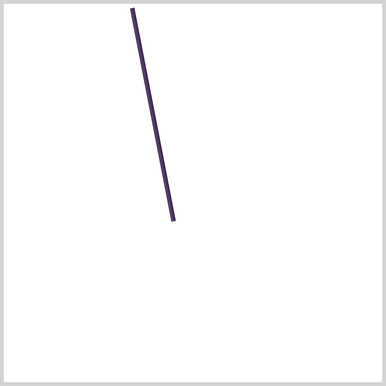
The angle of the string needs to be slightly adjusted. You can use the CSS rotate() function to rotate the string by -11deg. As a result, the upper portion of the string will rotate to the left while the bottom portion’s position remains unchanged.
.string {
  border-radius: 10px;
}
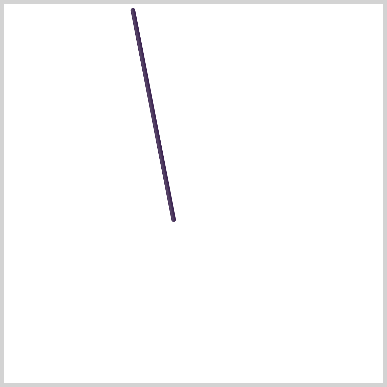
To finish up with the string, you need to round its four corners using border-radius: 10px.
Next up will be the bowl “gaikan”.
Bowl “Gaikan”
The bowl, known as “gaikan” in Japanese, is the largest part of the Furin wind chime. The bowl can be made out of copper, bronze, iron, or glass.
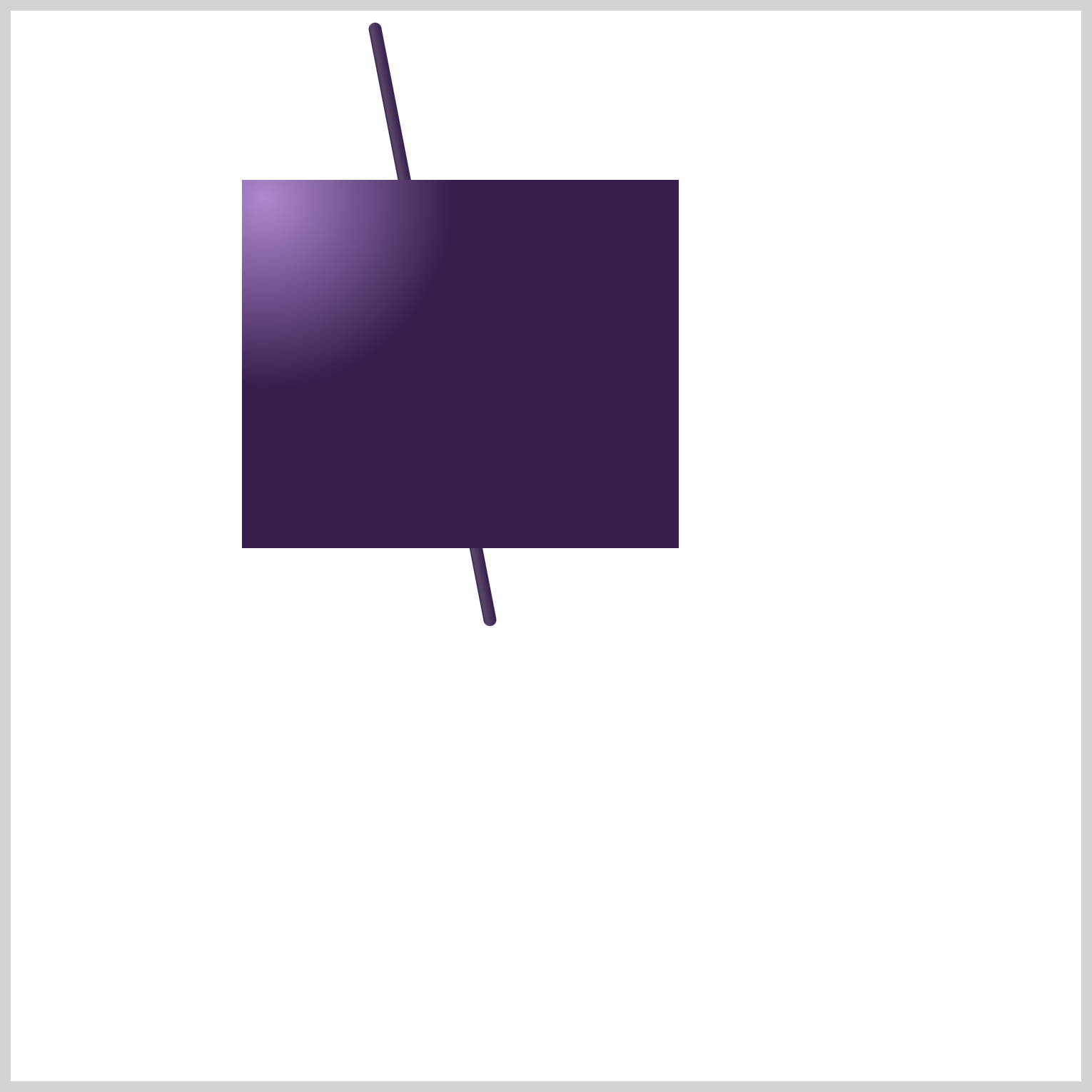
/* Bowl Gaiken */
.bowl-gaiken {
  position: absolute;
  width: 204px;
  height: 172px;
  top: 79px;
  left: 108px;
  background: radial-gradient(
    circle at 5% 5%,
    var(--furin-1),
    var(--furin-6) 35%
  );
}
The bowl’s initial shape is a rectangle with a width of 204px and a height of 172px. You’ll use the radial-gradient() function to set the background color. The radial gradient will start on the upper left side, 5% 5% and set to a circle shape.
The color stops are:
--furin-1: #ae88ce; /* African Violet */, from 0%.--furin-6: #361d4c; /* Russian Violet */, from 35% mark.
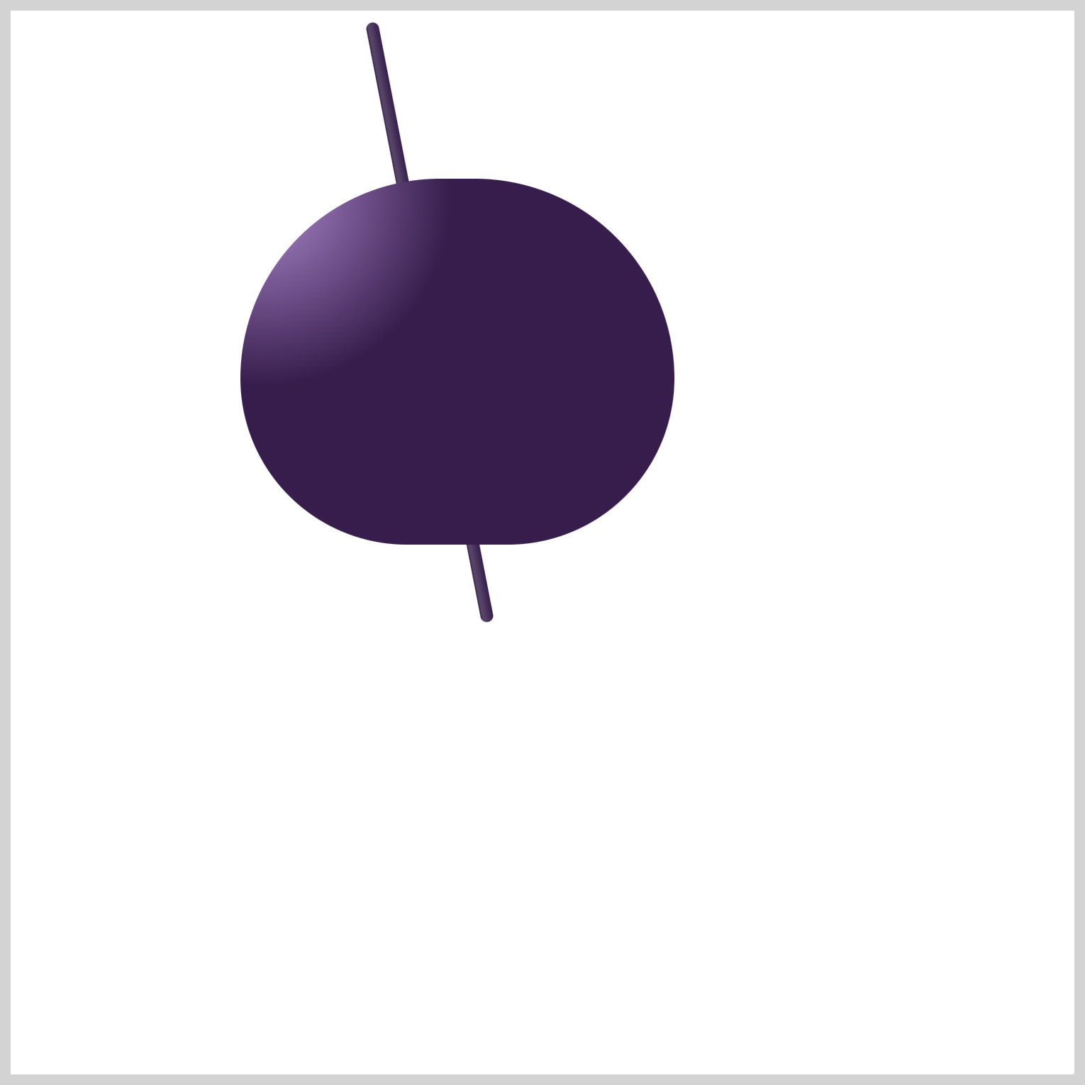
.bowl-gaiken {
  border-radius: 96px 96px 80px 80px;
}
To create a bowl shape with rounded corners, you use border-radius: 96px 96px 80px 80px;. This will result in the upper left and right corners being more rounded, with a radius of 96px, while the lower left and right corners will have a radius of 80px.

.bowl-gaiken {
  transform: rotate(-11deg);
}
Similar to the previous string, you’ll rotate the bowl to -11deg.
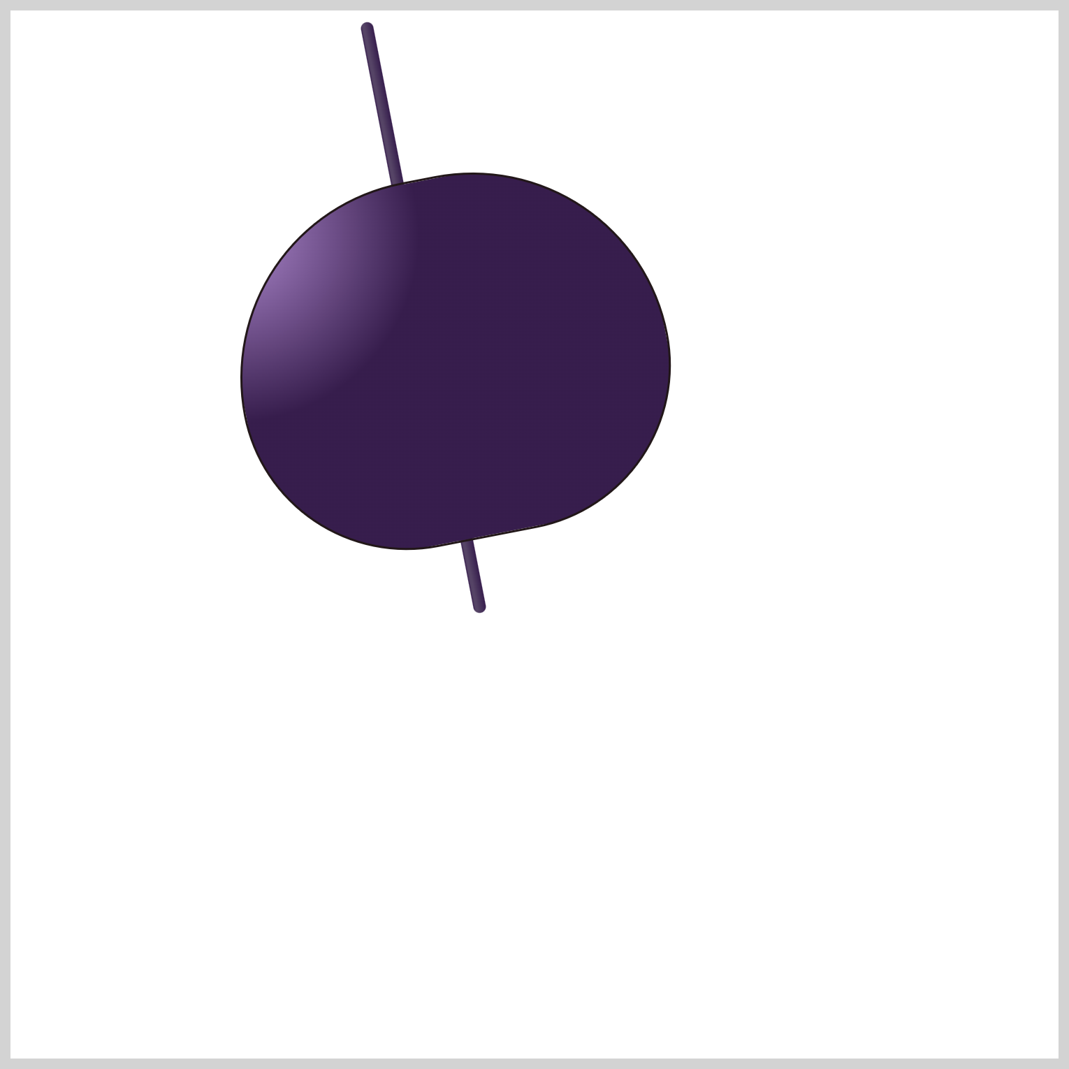
.bowl-gaiken {
  border: 1px solid var(--furin-5);
}
Let’s give the bowl a border using border: 1px solid var(--furin-5). The border will be 1px, solid, and the color is set to --furin-5: #221719; /* Eerie Black */.

.bowl-gaiken {
  border-bottom: 0;
}
To ensure that the bowl bottom doesn’t clash with the next section’s bowl bottom opening, we remove it using border-bottom: 0;.
The bowl is done! Let’s work on the bowl opening in the next section.
Bowl Bottom Opening
The opening at the bottom of the bowl is a crucial component of the Furin wind chime. The interaction between the opening and the Bell Clapper, or “Zetsu,” produces the iconic sound of the Furin chime.

/* Bowl Bottom */
.bowl-gaiken::after {
  content: "";
  position: absolute;
  width: 144px;
  height: 48px;
  top: 126px;
  left: 33px;
  background: radial-gradient(at top, var(--furin-4) 15%, var(--furin-7));
}
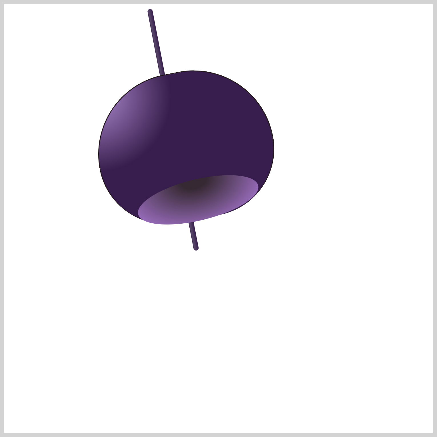
The CSS pseudo-element ::after is used to create the bowl bottom shape. The shape initially appears as a rectangle with a width of 144px and a height of 48px. Similar to the previous bowl shape, you use the CSS radial-gradient() function to simulate a round shape. The gradient starts from the top, with --furin-4: #362932; /* Black Coffee */ up to the 15% mark and then fades to --furin-7: #af7cdc; /* Lavender */. This gradient creates a concave appearance, contributing to the sense of depth in the bowl bottom.

.bowl-gaiken::after {
  border-radius: 50%;
}
To turn the square into an ellipse shape, you set the border-radius property value to 50%.
.bowl-gaiken::after {
  transform: rotate(-2.5deg);
}
To align the ellipse with the bowl angle, adjust its rotation using the CSS rotate() function and set the property value to -2.5deg.

.bowl-gaiken::after {
  border: 1px solid var(--furin-5);
}
Similar to the previous bowl, you give it a border using border: 1px solid var(--furin-5);

.bowl-gaiken::after {
  border-bottom: 0;
}
To make sure that the bottom bowl opening blends with the bowl shape, you need to remove the bottom border.
Let’s work on the bell clapper “zetsu” in the next section.
Bell Clapper “Zetsu”
The bell clapper, “Zetsu” in Japanese, is usually located near the bowl opening. The bell clapper striking the bowl produces the unique, high-pitched Furin chime sound. The bell clapper is typically made from the same material as the bowl itself. It can be made out of copper, bronze, iron, or glass.

/* Bell Clapper Zetsu */
.bell-clapper-zetsu {
  position: absolute;
  width: 15px;
  height: 40px;
  top: 222px;
  left: 208px;
  background: linear-gradient(
    to right,
    var(--furin-5),
    var(--furin-4) 12%,
    var(--furin-5)
  );
}
Similar to the string, the linear-gradient() function is used to give the bell clapper a rounded look. --furin-5: #221719; /* Eerie Black */ is set as the start and end color stop, and --furin-4: #362932; /* Black Coffee */ inserted from the 12% mark.

.bell-clapper-zetsu {
  transform: rotate(-11deg);
}
The bell clapper is rotated using transform: rotate(-11deg) to align with the angle of the string and the bowl.

.bell-clapper-zetsu {
  border-radius: 6px;
}
To complete the bell clapper, you round its borders with border-radius: 6px.
Let’s make the Paper “Tanzaku” in the next section.
Paper “Tanzaku”
The “Tanzaku” usually consists of colorful strips of paper and serves as the centerpiece of the Furin. As the summer breeze glides through, the Tanzaku sway gracefully, prompting the bell clapper to make contact with the bowl and create a soft, melodic chime. This soothing sound is often linked with a sense of coolness and invigoration.
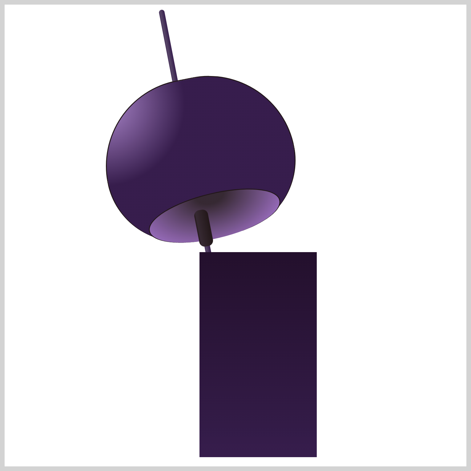
/* Paper Tanzaku */
.paper-tanzaku {
  position: absolute;
  width: 127px;
  height: 222px;
  top: 268px;
  left: 211px;
  background: linear-gradient(to bottom, var(--furin-3), var(--furin-6));
}
The initial shape of the Tanzaku will be a rectangle that’s 127px wide and 222px high. A linear-gradient() is set to start with --furin-3: #23102c; /* Dark Purple */ at the top and ends with --furin-6: #361d4c; /* Russian Violet */ at the bottom.
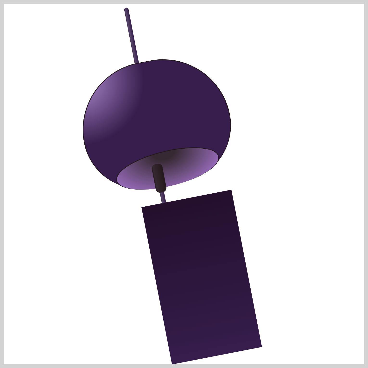
.paper-tanzaku {
  transform: rotate(-11deg);
}
You’ll align the Tanzaku with the rest of the Furin using rotate(-11deg).
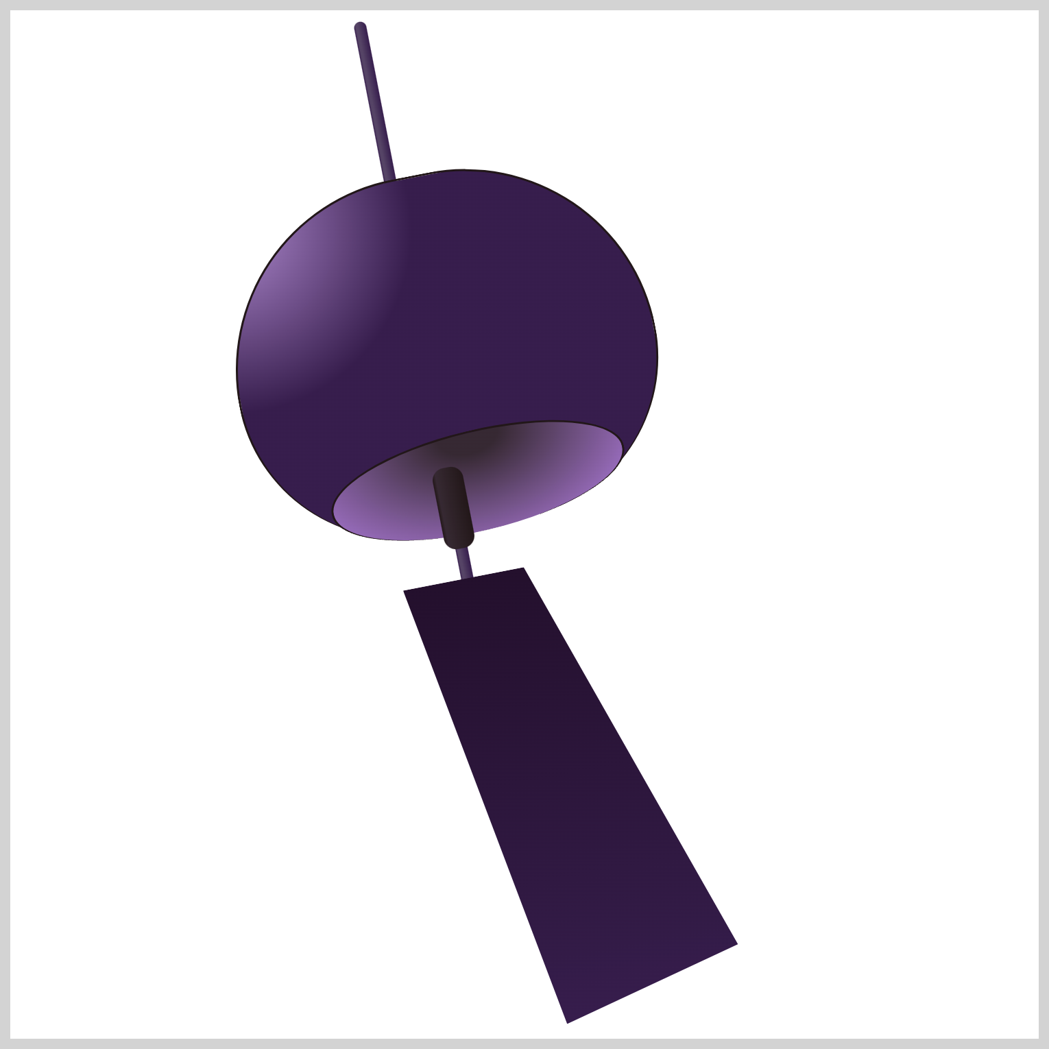
.paper-tanzaku {
  clip-path: polygon(0 0, 47% 0, 100% 90%, 30% 100%);
}
The Tanzaku’s shape needs modification and you’ll use the CSS clip-path: polygon() function to accomplish this. Let’s break down the percentage values.
0 0controls the polygon’s upper left corner position. The first number,0, controls the x-axis, and the second number,0, the y-axis.47% 0sets the upper right corner position to47%on the x-axis and0on the y-axis.100% 90%puts the lower right corner to100%on the x-axis and90%on the y-axis.30% 100%positions the lower left corner to30%on the x-axis and100%on the y-axis.
Check this article for more details about the CSS polygon() function.

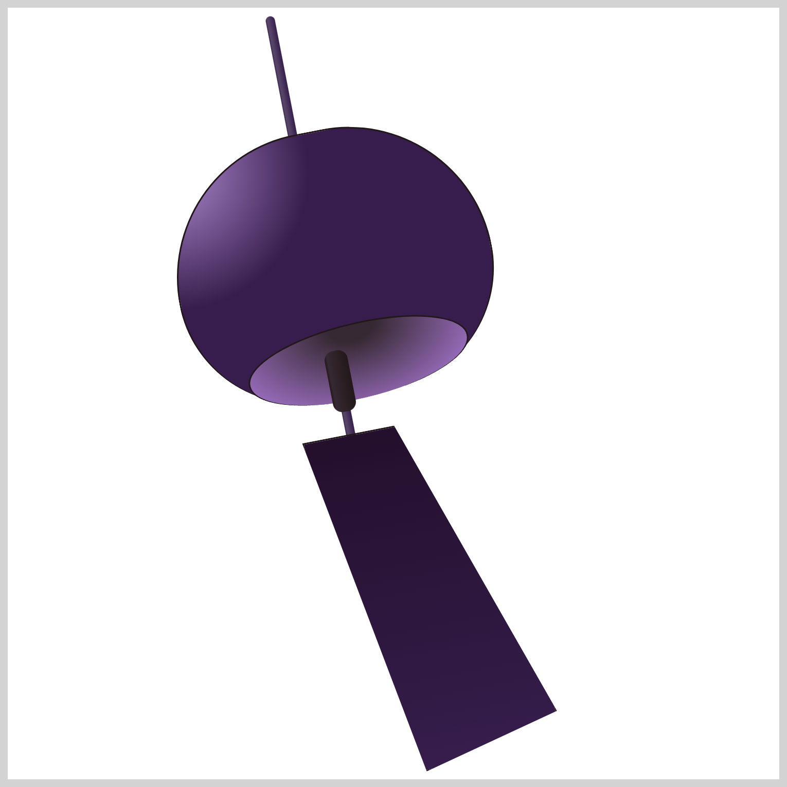
.paper-tanzaku {
  border: 1px solid var(--furin-5);
}
To complete this section, give the Tanzaku a border using border: 1px solid var(--furin-5).
You can see and play with the complete code on Pyxofy’s CodePen page.
See the Pen CSS Art – Combining Gradients and Custom Properties by Pyxofy (@pyxofy) on CodePen.
Conclusion
In the first installment of this two-part article series, you learned how to use CSS gradients such as linear-gradient() and radial-gradient() functions. The gradients can give dimensions to otherwise flat 2D images.
You shaped the paper Tanzaku using the polygon() function and used the CSS rotate() function to align the Furin shapes. In part 2 of this article series, you will learn how to make the firework decoration.
In the meantime, brush up on your CSS skills using the techniques you learned in this article and share your masterpiece with us on LinkedIn, Threads, Mastodon, X (Twitter) @pyxofy, or Facebook.
We hope you liked this article. Kindly share it with your network. We appreciate it.
Related Articles


