CSS Art – How to Make a Game Character – Bowser (King Koopa)
Large golden horns, spiky turtle back and a fiery breath. Let’s make Super Mario’s famous nemesis in this article, step-by-step.

Introduction
After making Super Mario in our previous article, we had to make his arch nemesis Bowser, King of the Koopa clan.
In this article, we’ll be creating Bowser with CSS and Scalable Vector Graphics (SVG). Here’s a quick list of the different CSS technologies we’ll be using in this article:
- clip-path
- path()
- CSS gradients
- CSS custom properties (variables)
- Pseudo-elements
- Scalable Vector Graphics (SVG)
Visit our CSS Art articles if you’re unfamiliar with the above CSS technologies.
We will be using CSS path() and SVG heavily in this article. Jump to this article if you’re unfamiliar with them.
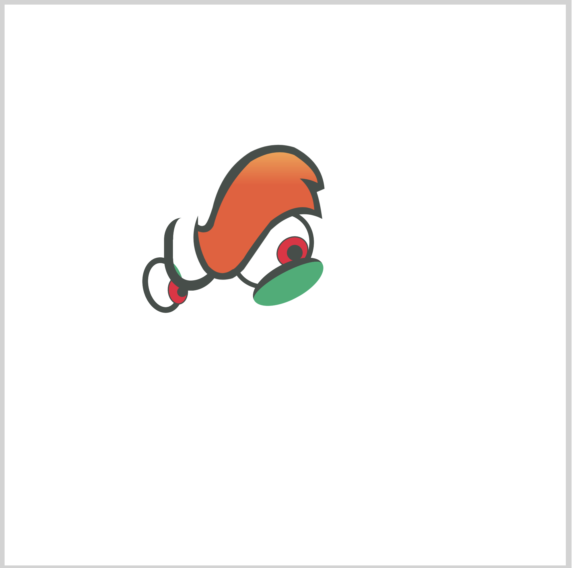
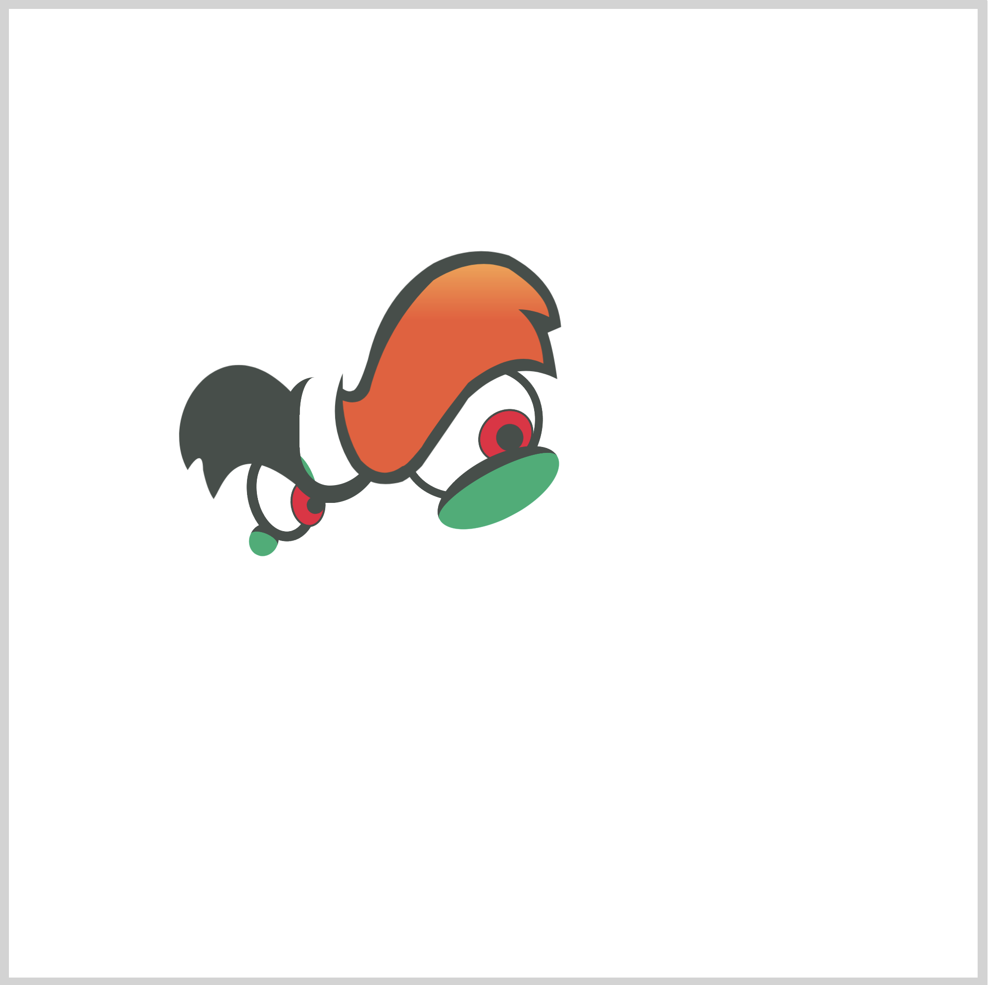
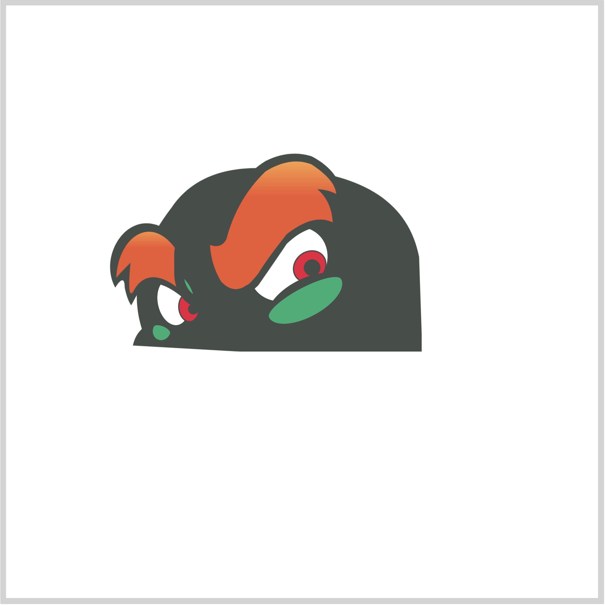
Preview
")
Our image will consist of these different parts:
- Hair
- Face
- Anger mark
- Eyes
- Glabella
- Horns
- Jaw
- Mouth
- Teeth
- Nose
Prerequisites
We don’t assume prior knowledge of CSS or HTML, but it helps if you have some familiarity with how they work. Jump over to this article if you require an HTML and CSS primer.
We assume that you have set up tools to create CSS art. If you haven’t, this article will show you how to set them up.
HTML Structure
Here’s the HTML code for our image.
<div class="container">
  <div class="character">
    <div class="hair"></div>
    <div class="face"></div>
    <div class="anger-mark"></div>
    <div class="anger-mark-2"></div>
    <div class="eye-right"></div>
    <div class="horn-right"></div>
    <div class="eye-brow-right"></div>
    <div class="eye-lid-right"></div>
    <div class="horn-left"></div>
    <div class="eye-left"></div>
    <div class="eye-brow-left"></div>
    <div class="eye-lid-left"></div>
    <div class="glabella"></div>
    <div class="jaw"></div>
    <div class="mouth"></div>
    <div class="teeth"></div>
    <div class="teeth-gap"></div>
    <div class="nose-highlight"></div>
    <div class="nose"></div>
  </div>
</div>
container is our outermost enclosure. This enables us to center the art and put a light gray border. The rest of divs represent each of Bowser’s facial parts.
It’s important to keep the HTML structure as is for each part to display properly.
Color Palette
Here’s the CSS code for the color palette, body and container div.
/**************************************/
/* Color, Body and Container Settings */
/**************************************/
/* Color palette */
:root {
  --dark-grey: hsl(154, 5%, 29%);
  /* Face */
  --green: hsl(156, 76%, 39%);
  --light-green: hsl(124, 27%, 66%);
  --white: hsl(0, 0%, 100%);
  --red: hsl(349, 85%, 51%);
  /* Horns */
  --gold: hsl(39, 97%, 55%);
  /* Hair, Eyebrows */
  --red-orange: hsl(12, 87%, 57%);
  /* Snout */
  --dark-orange: hsl(7, 86%, 57%);
  --yellow-orange: hsl(35, 97%, 65%);
  --beige: hsl(28, 85%, 87%);
  --light-salmon: hsl(16, 89%, 69%);
}

/* Center shapes */
body {
  margin: 0;
  padding: 0;
  height: 100vh;
  display: flex;
  justify-content: center;
  align-items: center;
  flex-wrap: wrap;
}

/* Set container and optional light gray border */
.container {
  width: 500px;
  height: 500px;
  border: 5px solid lightgray;
  background: transparent;
  position: relative;
  display: flex;
  justify-content: center;
  align-items: center;
  border-radius: 1px;
}
To remove the light gray border, you can comment out this line of CSS code border: 5px solid lightgray;.
You comment out CSS code by surrounding it with an asterisk, *, and a forward slash, /, like the example below.
/* border: 5px solid lightgray; */
Are you ready to start coding? Let’s start making the right eye.
Right Eye

CSS Code:
.eye-right {
  position: absolute;
  width: 71px;
  height: 58px;
  top: 185px;
  left: 199px;
  background: var(--white);
  border: solid 4px var(--dark-grey);
  border-radius: 50%;
  transform: rotate(-39deg);
}
The right eye and the left eye we’ll be making later is a circle shape.
We use border-radius to make a circle in CSS. We control the radius of the border with percentage, like this border-radius: 50%;, in this example.
Likewise, we give the circle a slight slant angle using the rotate() function as follows.transform: rotate(-39deg);
Next, let’s draw the iris.

CSS Code:
.eye-right::before {
  content: "";
  position: absolute;
  width: 28px;
  height: 24px;
  top: 29px;
  left: 33px;
  background: var(--red);
  border: solid 1px var(--dark-grey);
  border-radius: 50%;
}
The iris is a circle shape. We give it a dark grey, solid border. We set its background color to red.
Let’s draw the pupil next.

CSS Code:
.eye-right::after {
  content: "";
  position: absolute;
  width: 14px;
  height: 14px;
  top: 37px;
  left: 42px;
  background: var(--dark-grey);
  border-radius: 50%;
}
Similar to the eye and iris, our pupil is a circle. The only difference, it’s a solid, dark grey shape. We don’t set any borders.
Next up is the eyelid.
Right Eyelid

CSS Code:
.eye-lid-right {
  position: absolute;
  width: 69px;
  height: 25px;
  top: 231px;
  left: 218px;
  background: var(--green);
  border: 7px solid var(--dark-grey);
  border-radius: 50%;
  border-left: 0;
  border-right: 0;
  border-bottom: 0;
  transform: rotate(-28deg);
}
The eyelid is an elliptical shape. The base color is green, and we give it a dark grey top border. We rotate it by -28 degrees.
Next up is the eyebrow.
We will be using CSS path() function and SVG. If you’re unfamiliar with both of these, check this article.
Right Eyebrow

CSS Code:
.eye-brow-right {
  position: absolute;
  width: 121px;
  height: 125px;
  top: 123px;
  left: 166px;
  background: var(--dark-grey);
  clip-path: path(
    "M 6,65 Q -4,89 10.5,113 Q 20,126 37,121 Q 41,119 47,113 Q 63,90 71,78 Q 94,56 117,68 Q 115,53 112,44 L 119,41 Q 117,17 92,4 Q 73,-2 53,8 Q 27,24 19,58 Q 14,74 11,74 Q 9,75 6,73 Q 6,65 6,65"
  );
}
Everything inside the path() function are SVG commands. You can arrange the same SVG code line by line.
M 6,65
Q -4,89 10.5,113
Q 20,126 37,121
Q 41,119 47,113
Q 63,90 71,78
Q 94,56 117,68
Q 115,53 112,44
L 119,41
Q 117,17 92,4
Q 73,-2 53,8
Q 27,24 19,58
Q 14,74 11,74
Q 9,75 6,73
Q 6,65 6,65
It’s easier to read them in this format.
This shape is the eyebrow outline. We give it a dark grey color.
Through the rest of this article, our SVG shapes will consist of an outline, usually dark grey, and serves as a border. On top of the outline will be a highlight shape.
Next, let’s work on the highlight.

CSS Code:
.eye-brow-right::before {
  content: "";
  position: absolute;
  width: 121px;
  height: 125px;
  top: 0px;
  left: 0px;
  background: linear-gradient(var(--yellow-orange) 0, var(--red-orange) 30%);
  clip-path: path(
    "M 6,79 Q 7,96 15.5,110 Q 26,121 37,113 Q 39,113 47,103 Q 55,90 71,70 Q 94,52 110,60 Q 109,42 97,32 Q 105,32 113,36 Q 112,24 92,11 Q 74,4 53,17 Q 29,40 20,74 Q 17,80 11,80 Q 9,80 6,79"
  );
}
Here’s the SVG code, line by line.
M 6,79
Q 7,96 15.5,110
Q 26,121 37,113
Q 39,113 47,103
Q 55,90 71,70
Q 94,52 110,60
Q 109,42 97,32
Q 105,32 113,36
Q 112,24 92,11
Q 74,4 53,17
Q 29,40 20,74
Q 17,80 11,80
Q 9,80 6,79
We use CSS linear gradients to transition from a yellow-orange to red color.
background: linear-gradient(var(--yellow-orange) 0, var(--red-orange) 30%);
You can control the transition position by changing the percentage value. Go ahead and change 30% to maybe 45%, you should see the transition position change.
Ok, next up is the Glabella.
Glabella

CSS Code:
.glabella {
  position: absolute;
  width: 40px;
  height: 56px;
  top: 190px;
  left: 142px;
  background: transparent;
  border-top: 0;
  border-right: 5px solid transparent;
  border-bottom: 9px solid var(--dark-grey);
  border-left: 8px solid var(--dark-grey);
  border-radius: 35% 0% 66% 52%;
}
The glabella is a bit tricky to make.
- Right border is set to
transparent. - Bottom and left border color is set to dark grey.
- We control each border radius with this code,
border-radius: 35% 0% 66% 52%;.
Play around, modify the border-radius percentage values to change the Glabella shape.
Let’s make the left eye in the next section.
Left Eye

CSS Code:
.eye-left {
  position: absolute;
  width: 26px;
  height: 40px;
  top: 225px;
  left: 123px;
  background: var(--white);
  border-top: solid 5px var(--dark-grey);
  border-right: solid 5px var(--green);
  border-bottom: solid 5px var(--dark-grey);
  border-left: solid 5px var(--dark-grey);
  border-radius: 50%;
  transform: rotate(-12deg);
}
The left eye is different from the right eye, where its right border is green and the rest of the borders are dark grey.
border-right: solid 5px var(--green); /* Green border */
We rotate it -12 degrees to give a slight slant.
Next up is the iris.

CSS Code:
.eye-left::before {
  content: "";
  position: absolute;
  width: 16px;
  height: 23px;
  top: 15px;
  left: 16px;
  background: var(--red);
  border: solid 1px var(--dark-grey);
  border-radius: 50%;
  transform: rotate(6deg);
}
Red background and grey border is similar to the right eye. Our left eye iris is more vertically elongated. We give it a 6-degree rotation.
Let’s make the pupil next.
CSS Code:
.eye-left::after {
  content: "";
  position: absolute;
  width: 9px;
  height: 9px;
  top: 25px;
  left: 24px;
  background: var(--dark-grey);
  border-radius: 50%;
}
Same as the right eye pupil, our left eye pupil is solid dark grey.
In the next section, let’s make the left eyelid.
Left Eyelid

CSS Code:
.eye-lid-left {
  position: absolute;
  width: 15px;
  height: 12px;
  top: 265.5px;
  left: 124px;
  background: var(--green);
  border: 5px solid var(--dark-grey);
  border-radius: 50%;
  border-left: 0;
  border-right: 0;
  border-bottom: 0;
  transform: rotate(23deg);
}
Our left eyelid is smaller compared to our right eyelid.
Up next is the right eyebrow.
Left Eyebrow
CSS Code:
.eye-brow-left {
  position: absolute;
  width: 65px;
  height: 73px;
  top: 182px;
  left: 85px;
  background: var(--dark-grey);
  clip-path: path(
    "M 7,56 C -10,26 25,-24 62,17 L 63,63.5 C 31,38 25,65 20.5,71 Q 17,66 15,56 C 15,45 10,51 7,56"
  );
}
We use path() function and SVG to create the eyebrow base.

CSS Code:
.eye-brow-left::before {
  content: "";
  position: absolute;
  width: 65px;
  height: 73px;
  top: 0px;
  left: 0px;
  background: linear-gradient(var(--yellow-orange) 0, var(--red-orange) 30%);
  clip-path: path(
    "M 8,48 C 9,15 36,-7 58,23 Q 55,35 61,57 C 32,34 23,59 22,60 Q 17,66 20,35 Q 8,47 8,48"
  );
}
Similar to the right eyebrow, we give our left eyebrow a color transition between yellow orange to red.
Now that we’ve finished the eyes section, let’s start making the face.
Face
CSS Code:
.face {
  position: absolute;
  width: 245px;
  height: 157px;
  top: 135px;
  left: 106px;
  background: var(--dark-grey);
  clip-path: path(
    "M 1,152 Q 3,143 8.6,138 Q -7,88 34,35 Q 56,3 103,2 Q 228,0 243,77 L 246,166"
  );
}
Compared to the eyebrows, SVG code for the face is much simpler. Besides using SVG, you may combine circles and half circles to make the face shape.
We give our face base shape a dark grey color.

CSS Code:
.face::after {
  content: "";
  position: absolute;
  width: 245px;
  height: 157px;
  top: 0px;
  left: 0px;
  background: radial-gradient(
    at 40% 0,
    var(--light-green) 0 10%,
    var(--green) 50%
  );
  clip-path: path(
    "M 9,149 Q 8,147 15,140 Q 1,108 30,55 Q 46,16 96,10 Q 141,6 173,33 Q 198,53 228,55 L 235,74 Q 201,69 172,96 Q 142,120 137,133 Q 122,125 107,134 Q 85,115 59,122 Q 32,130 21,152 Z"
  );
}
We give the face a color transition from light green to green with this code.
 background: radial-gradient(
    at 40% 0,
    var(--light-green) 0 10%,
    var(--green) 50%
  );
We use radial-gradient(), and shifted its start position slightly to the left using this code at 40% 0. Change the percentage values. The first percentage value is the x or horizontal position. The second percentage value is the y or vertical position.
In the next section, let’s make Bowser’s anger mark. We’re making a total of four.
Anger Mark

CSS Code:
.anger-mark {
  position: absolute;
  width: 14px;
  height: 14px;
  top: 186px;
  left: 275px;
  border-right: 2px solid var(--dark-grey);
  border-radius: 50%;
  transform: rotate(6deg);
}
Our anger marks are crescent shapes. All four are given different positions and rotation.
Anger Mark Two

CSS Code:
.anger-mark::before {
  content: "";
  position: absolute;
  width: 14px;
  height: 14px;
  top: 17px;
  left: 10px;
  border-right: 2px solid var(--dark-grey);
  border-radius: 50%;
  transform: rotate(-73deg);
}
Anger Mark Three

CSS Code:
.anger-mark-2 {
  position: absolute;
  width: 15px;
  height: 15px;
  top: 175px;
  left: 290px;
  border-left: 2px solid var(--dark-grey);
  border-radius: 50%;
  transform: rotate(-57deg);
}
Anger Mark Four

CSS Code:
.anger-mark-2::before {
  content: "";
  position: absolute;
  width: 13px;
  height: 18px;
  top: 17px;
  left: -10px;
  border-left: 2px solid var(--dark-grey);
  border-radius: 50%;
  transform: rotate(56deg);
}
Ok, next up is the right horn.

Right Horn
The right horn consists of an outline, highlight, and base.

CSS Code:
.horn-right {
  position: absolute;
  width: 120px;
  height: 175px;
  top: 20px;
  left: 255px;
  background: var(--dark-grey);
  clip-path: path(
    "M 31,9 Q 47,-4 81,11 Q 104,23 110,49 Q 120,94 86,139 C 99,144 97,178 69,169 Q 36,165 4,130 C -3,121 -1,97 24,100 C 53,77 55,34 31,15 Q 30,12 31,9"
  );
}
Again, you can rearrange the SVG code within path() to make it easier to follow.
M 31,9
Q 47,-4 81,11
Q 104,23 110,49
Q 120,94 86,139
C 99,144 97,178 69,169
Q 36,165 4,130
C -3,121 -1,97 24,100
C 53,77 55,34 31,15
Q 30,12 31,9
This is our outline shape, we give it a dark grey shade.

CSS Code:
.horn-right::before {
  content: "";
  position: absolute;
  width: 120px;
  height: 175px;
  top: 0px;
  left: 0px;
  background: var(--gold);
  clip-path: path(
    "M 42,10 Q 62,6 85,23 Q 91,27 101,46 Q 116,92 77,137 C 92,151 88,170 64,162 Q 36,156 11,126 C 1,118 8,101 31,108 C 52,85 68,49 43,18 Q 37,12 42,10"
  );
}
We give our highlight section a gold hue. We kept it flat, but you can use a gradient to make it look rounder.

CSS Code:
.horn-right::after {
  content: "";
  position: absolute;
  width: 80px;
  height: 46px;
  top: 80px;
  left: 18px;
  background: transparent;
  border-bottom: 5px solid var(--dark-grey);
  border-top: 5px solid transparent;
  border-left: 5px solid transparent;
  border-right: 5px solid transparent;
  border-radius: 0% 0% 50% 50%;
  transform: rotate(33deg);
}
For the horn base, we use a horizontally elongated ellipse. We used this code to control the border radius.
border-radius: 0% 0% 50% 50%;
As a challenge, change the border radius values and see how it affects the shape of the base.
Now that we finished the right horn, let’s work on the left horn.
Left Horn

CSS Code:
.horn-left {
  position: absolute;
  width: 91px;
  height: 135px;
  top: 100px;
  left: 55px;
  background: var(--dark-grey);
  clip-path: path(
    "M 41,8 Q 2,28 4,73 Q 11,109 33,119 L 80,87 L 85,70.5 Q 76,67 70,73 Q 38,54 50,17 Q 56,3 41,8"
  );
}
The left horn is almost a mirror image of the right horn. We adjusted its shape a bit, as some parts of will be covered by the left eyebrow.

CSS Code:
.horn-left::before {
  content: "";
  position: absolute;
  width: 91px;
  height: 135px;
  top: 0px;
  left: 0px;
  background: var(--gold);
  clip-path: path(
    "M 32,21 Q 9,41 12,73 Q 23,104 34,109 Q 45,82 64,84 L 66,78 Q 34,63 41,23 Q 47,6 32,21"
  );
}
The left horn highlight is golden, same as the right horn.

CSS Code:
.horn-left::after {
  content: "";
  position: absolute;
  width: 11px;
  height: 11px;
  top: 75px;
  left: 69px;
  background: var(--gold);
  border-radius: 72% 8% 22% 15%;
  transform: rotate(15deg);
}
The base for the left horn is small compared to the right horn. We use border radius to control its shape.
border-radius: 72% 8% 22% 15%;
We’re done with the horns. Let’s make the hair in the next section.
Hair
The hair, jaw, mouth, and teeth have the most complex SVG codes. Pay attention to each line of SVG code. If it doesn’t display properly, double check SVG code, line by line.

CSS Code:
.hair {
  position: absolute;
  width: 333px;
  height: 242px;
  top: 2px;
  left: 121px;
  background: var(--dark-grey);
  clip-path: path(
    "M 25,161 L 224,191 Q 264,180 315,235 L 332,234 L 329,226 Q 318,202 305,187 L 314,187 Q 300,167 293,163 Q 290,161 294,162 Q 294,162 311,167 Q 304,122 243,117 L 180,82.5 L 173,82.5 Q 167,83 171,79 L 177,74 Q 163,65 147,70 Q 141,72 143,66 Q 153,16 115,3 Q 114,17 61,56 Q 52,62 58,53 L 68,39 Q 23,53 7,93 Q -4,131 23,164 Z"
  );
}
To make the spiky hairstyle, we combine multiple SVG code commands, such as Q or quadratic and L or line.
We give our hair outline a dark grey hue.

CSS Code:
.hair::before {
  content: "";
  position: absolute;
  width: 333px;
  height: 242px;
  top: 0px;
  left: 0px;
  background: radial-gradient(
    at 40% 0,
    var(--yellow-orange) 0,
    var(--red-orange) 50%
  );
  clip-path: path(
    "M 27,158.5 Q 87,103 225,183 Q 269,172 318,230 L 325,230 Q 311,197 285,178 Q 298,179 301,181 Q 294,170 270,156 Q 290,154 304,160 Q 289,126 239,125.5 L 178,88.5 Q 166 88 155 93 L 167,77 Q 152,71 135,80 Q 148,23 118,8 Q 121,11 100,33 Q 54,66 47,77 Q 47,62 54,50 Q 28,62 15,95 Q 3,131 26,158 Z"
  );
}
Similar to the eyebrows, we give the hair a yellow orange to red gradient. It gives a “fiery” image to the hair, which is Bowser’s trademark.
Let’s make the jaw in the next section.
Jaw
The jaw consists of an outline, base color and highlight. We’re using a large amount of SVG code in this section.

CSS Code:
.jaw {
  position: absolute;
  width: 337px;
  height: 297px;
  top: 201px;
  left: 63px;
  background: var(--dark-grey);
  clip-path: path(
    "M 100,221 Q 70,233 79,263 Q 87,286 105,291 Q 130,300 154,279 C 166,287 235,289 237.5,250 Q 278,211 283,174 Q 341,148 331,70 Q 322,27 286,10 Q 242,-4 194,48 Q 187,55 179.5,67 Q 165,59 150,68 C 118,38 73,61 64,86 Q 19,74 6,116 Q 2,156 25,173 Q 39,190 73,192 Q 81,211 100,221"
  );
}
SVG code is hard to visualize in the browser. You can use this tool to explore how the SVG code implements the shape.
Our outline is uniform with other outline shapes, we give it a dark grey color.

CSS Code:
.jaw::before {
  content: "";
  position: absolute;
  width: 337px;
  height: 297px;
  top: 0px;
  left: 0px;
  background: var(--beige);
  clip-path: path(
    "M 102,226 Q 79,233 86,263 Q 92,278 106,283 Q 130,292 145,276 Q 133,265.5 134,263 C 175,293 248,267 226.5,239 Q 229,238 234,242 Q 263,213 275,171 Q 334,137 321,70 Q 311,25 270,16 Q 242,13 203,48 Q 187,63 182,71 Q 184,73 185,76 Q 163,65 153.5,71.5 Q 160,79 161,88 C 125,35 67,66 62.5,102 Q 59.5,96.5 62,90 Q 23,84 14,122 Q 11,151 35,170 Q 47,181 70,184 Q 101,185 115,169 Q 104,163 102.5,159 C 139,179 201,151 229,83 Q 231,78 247,87 Q 272,103 271,135 Q 222,180 206,221 Q 137,211 97,240 Q 98,236 104.5,229.5 Z"
  );
}
Our base color is beige. The base color forms the chin, cheeks, and nose.

CSS Code:
.jaw::after {
  content: "";
  position: absolute;
  width: 337px;
  height: 297px;
  top: 0px;
  left: 0px;
  background: radial-gradient(var(--beige) 0 50%, var(--dark-orange) 90% 100%);
  clip-path: path(
    "M 97,240 Q 89,250 95,265 Q 109,289 141,272 Q 133,265.5 134,263 C 183,284 225,260 226.5,239 Q 229,239 230,239 Q 263,198 266,168 Q 317,149 313,80 Q 311,35 273,23 Q 255,15 203,48 Q 187,63 182,71 Q 184,73 185,76 Q 163,65 153.5,71.5 Q 160,79 161,88 C 114,42 73,77 62.5,102 Q 59.5,95.5 62,90 Q 18,90 17,127 Q 18,150 33,161 Q 44,173 61,176 Q 94,181 111,166 Q 104,163 102.5,159 C 145,170 201,138 229,83 Q 231,78 247,87 Q 272,103 271,135 Q 222,180 206,221 Q 137,211 97,240 Q 98,236 104.5,229.5 Z"
  );
}
The highlight gives the jaw a rounder effect. We used a radial gradient, transitioning from beige to dark orange.
That wraps up the jaw section. Let’s make the mouth in the next section.
Mouth

CSS Code:
.mouth {
  position: absolute;
  width: 205px;
  height: 159px;
  top: 278px;
  left: 134px;
  background: var(--red);
  clip-path: path(
    "M 162,10 Q 175,17 186,34 Q 178,34 171,33 Q 166,18 162,10 M 191,44 L 194,56 Q 156,83 133,134 Q 122,120 108,90 L 103,83 L 106,82 Q 117,99 136,112 Q 140,110 141,105 Q 144,86 138,53 L 142,51 L 163,70 Q 172,76 173,62 Q 174,55 172,41 Z M 103,83 Q 85,93 64,96.5 Q 56,104 52,122.5 Q 54,129 59,139.5 L 88,135 Q 88,108 96,96 Q 102,85 105,86 M 56,95 L 50,94 Q 47.5,97 37,106 L 38,110 Q 46,101 49,109"
  );
}
We give the mouth a red hue. You may have noticed the outline of the teeth. Let’s make them in the next section.
Teeth

CSS Code:
.teeth {
  position: absolute;
  width: 205px;
  height: 159px;
  top: 278px;
  left: 134px;
  background: var(--white);
  clip-path: path(
    "M 144,44 L 158,20 Q 168,34 168,59 Q 168,67 164,64 Z M 133 58 Q 137,71 137,98 Q 138,110 129,101 Q 115,86 110,78 Z M 106,93 Q 104,96 127,136 Q 115,134 95,135 Q 94,118 99,103 Q 102,94 104,93 M 55,141 Q 44,144 37,150 Q 33,130 39,116 Q 44,105 46,114 Q 49,129 55,141 M 24,112 Q 17,114 8,115 Q 15,131 27,137 Q 32,140 30,135 Q 27,125 24,112"
  );
}
The unique aspect of teeth shape is usage of multiple M or move commands. This moves our drawing start point to a different location within the canvas.
M 144,44  <!-- Move command -->
L 158,20
Q 168,34 168,59
Q 168,67 164,64
Z
M 133 58  <!-- Move command -->
Q 137,71 137,98
Q 138,110 129,101
Q 115,86 110,78
Z
The Z or close path command automatically closes our SVG shapes. Check this article for more details about SVG commands.
We’ll be making a small teeth gap in the next section.
Teeth Gap

CSS Code:
.teeth-gap {
  position: absolute;
  width: 7px;
  height: 15px;
  top: 387px;
  left: 162px;
  background: var(--red);
  border-radius: 55% 94% 100% 91%;
}
We need to make this small gap to separate the two left teeth. Without this tiny detail, the teeth looks unnatural. You can change the shape of the gap to whatever you like by playing with border-radius: 55% 94% 100% 91%;.
If you have gone this far, pat yourself on the back!
Next up is the nose, our final section.
Nose
Our nose consist of three parts, highlight, left and right nostril.

CSS Code:
.nose-highlight {
  position: absolute;
  width: 108px;
  height: 70px;
  top: 266px;
  left: 120px;
  background: linear-gradient(var(--light-salmon) 0, transparent 30%);
  border-top-left-radius: 100px;
  border-top-right-radius: 100px;
  border-bottom: 0;
  transform: rotate(-11deg);
}
We make the nose highlight using a linear gradient. It transitions from light salmon color to transparent. The transparent area lets the underlying beige color to shine through.
Left Nostril

CSS Code:
.nose {
  position: absolute;
  width: 13px;
  height: 22px;
  top: 290px;
  left: 134px;
  background: linear-gradient(var(--light-salmon) 0, var(--beige) 80%);
  border: 3px solid var(--dark-grey);
  border-radius: 50% 129% 51% 113%;
  border-bottom: 0;
  transform: rotate(-23deg);
}
We use border radius to make our left nostril.
border-radius: 50% 129% 51% 113%;
By changing the percentage values, you can modify the nostril shape. You can change the border thickness, border: 3px as well.
Right Nostril
Our right nostril is split in two sections, an upper half and a lower half.

CSS Code:
.nose::before {
  content: "";
  position: absolute;
  width: 14px;
  height: 29px;
  top: 5px;
  left: 45px;
  background: linear-gradient(var(--light-salmon) 0, var(--beige) 80%);
  border: 3px solid var(--dark-grey);
  border-radius: 61% 30% 44% 64%;
  border-bottom: 0;
  border-right: 0;
  transform: rotate(58deg);
}
This upper half’s shape is closer to the letter “L”.

CSS Code:
.nose::after {
  content: "";
  position: absolute;
  width: 25px;
  height: 4px;
  top: 24px;
  left: 46px;
  background: var(--dark-grey);
  border-radius: 0% 100% 50% 100%;
  transform: rotate(-35deg);
}
The lower half is a simple box shape with modified border radius.
This concludes all the sections we have in this article.
Big thanks and congratulations on joining us all the way to the end of the article.
You can see and play with the code at Pyxofy’s CodePen page.
See the Pen CSS Art - How to Make a Game Character – Bowser (King Koopa) by Pyxofy (@pyxofy) on CodePen.
Conclusion
We combined CSS gradients, such as linear and radial, to make our shape highlights. To make the complex shapes, we used CSS path() function and SVG commands.
CSS custom properties (variables) were used to manager our color palette.
By combining CSS and SVG, you can make versatile art with less code. Lesser code size makes it easier to trouble shoot and of course much easier to type.
What will you make using CSS and SVG? Share your masterpiece with us on Twitter @pyxofy, on LinkedIn, or Facebook.
We hope you liked this article. Kindly share it with your network. We really appreciate it.
Related Articles
 Pyxofy
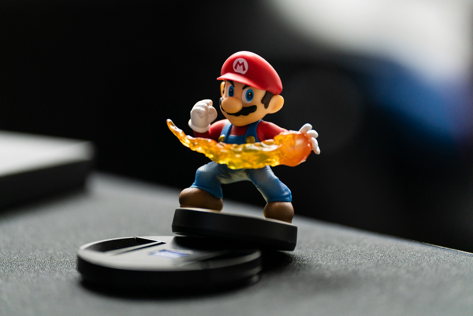 Pyxofy
 Pyxofy