CSS Animation – Turntable – Part 1
Vinyl records are popping and crackling! Learn how to animate a record turntable with CSS step-by-step in this two-part article.

Introduction
Vinyl records are back with their analog sound, pops, and grooves. In this two-part article, you’ll learn how to make a turntable animation sequence.
You will be using CSS transform: rotate(), filter: blur() functions, and the top property, combining them to animate the record turntable.
Preview

For part 1, you’ll animate these components:
- Power Button
- Record
- Slider Button
You’ll use this turntable CSS art.
 Pyxofy
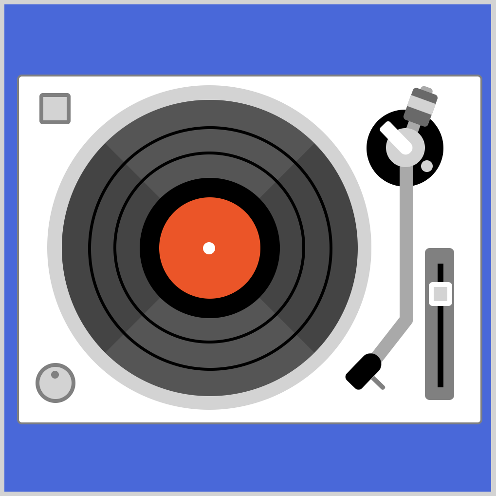
Prerequisites
Essential CSS and HTML knowledge will help you understand the concepts and techniques introduced in this article. Jump over to this article if you require an HTML and CSS primer.
We assume that you have set up tools to manipulate CSS. If you haven’t, this article will show you how to set them up.
Please read this article if you’re unfamiliar with CSS animation and the @keyframes at-rule property.
HTML Structure
<div class="container">
  <!-- Base -->
  <div class="base"></div>
  <div class="power-button"></div>
  <div class="volume-button"></div>
  <div class="audio-meter-top"></div>
  <div class="audio-meter-bottom"></div>

  <!-- Turntable -->
  <div class="record"></div>
  <div class="record-center"></div>
  <div class="record-ring-1"></div>
  <div class="record-ring-2"></div>

  <!-- Slider -->
  <div class="slider-base"></div>
  <div class="slider-rail"></div>
  <div class="slider-button"></div>

  <!-- Tone arm -->
  <div class="tone-arm-unit">
    <div class="arm-base"></div>
    <div class="weight-arm"></div>
    <div class="weight"></div>
    <div class="tone-arm"></div>
    <div class="pivot-base"></div>
    <div class="pivot-mech"></div>
    <div class="headshell"></div>
  </div>
</div>
container is the outermost enclosure. It enables the content to be centered and draws a light gray border. The rest of the divs represent each animation sequence.
Keep the HTML structure as is for the animation to display correctly.
Body and Container Div CSS
CSS code for the body and container div.
/* Body and Container Settings */
/* Center shapes */
body {
  margin: 0;
  padding: 0;
  height: 100vh;
  display: flex;
  justify-content: center;
  align-items: center;
}

/* Set background and border color */
.container {
  width: 500px;
  height: 500px;
  border: 5px solid lightgray;
  background: #1c1c1c;
  position: relative;
  display: flex;
  justify-content: center;
  align-items: center;
Record and Background Modifications

A few modifications need to be made to the original CSS art version of the image. First, the record center color needs to be changed.

Change the Record Center Color
/* Record */
.record-center {
  background: #170468; /* Dark purple color */
}
The original CSS art version of the image used an orange-red hue, background: orangered. For the CSS animation version, we want to tone it down a bit. Hence, we give it a dark purple color using background: #170468.
Change the Record Ring Border Width and Color
Next, you will change the record ring border width and color.

.record-ring-1 {
  border: solid 1.5px darkgray;
  border-top: solid 1.5px black;
}
The record-ring-1 is the inner ring closest to the record center. Change the border width from 3px to 1.5px. Besides the top border, border-top: solid 1.5px black, you will change the rest of the border color from black to darkgray using border: solid 1.5px darkgray.

.record-ring-2 {
  border: solid 1.5px darkgray;
  border-left: solid 1.5px black;
  border-right: solid 1.5px black;
}
For record-ring-2, which is the outer ring, you change the border width from 3px to 1.5px. Next you will change the top and bottom color from black to darkgray using border: solid 1.5px darkgray.
Add Blur Filter
.record {
  filter: blur(0.5px);
}
To make the record rings pop, you will add a slight blur filter to the .record element using filter: blur(0.5px).
Change Background Color
/* Set background and border color */
.container {
  background: #1c1c1c; /* Black background */
}
The final modification is changing the background color from the original royalblue to #1c1c1c.
Let’s start working on the power button animation in the next section.
Power Button
The power button animation sequence consists of changing its border color from gray to orange, #f99f3e, and applying an inset box-shadow effect.

.power-button {
  border: solid 4px gray;
  animation: power-button linear 10s infinite;
}
Take note of border: solid 4px gray as you’ll be changing this in the following @keyframes section. You add the animation CSS property with its property values power-button linear 10s infinite. The animation name is power-button, animation timing will be linear, lasting for ten seconds, 10s, and loops infinitely with infinite.

@keyframes power-button {
  from {
    border: solid 4px gray;
  }
  10% {
    border: solid 4px gray;
  }
  12% {
    border: solid 4px #f99f3e;
    box-shadow: inset 0 0 5px gray;
  }
  88% {
    border: solid 4px #f99f3e;
    box-shadow: inset 0 0 5px gray;
  }
  91% {
    border: solid 4px gray;
  }
  to {
    border: solid 4px gray;
  }
}
The from,to, 10%, and 91% keyframes are set to border: solid 4px gray. You set the orange border using border: solid 4px #f99f3e and apply the inset shadow effect with box-shadow: inset 0 0 5px gray between keyframes 12% and 88%.
Up next will be the record animation sequence.
Record Animation
You’ll be targeting the .record-ring-1, .record-ring-2, and .record CSS selectors to create the record animation sequence.

.record-ring-1,
.record-ring-2,
.record {
  animation: record linear 10s infinite;
}
To target multiple CSS selectors, you separate them using a comma ,. The animation name is set to record. The animation timing will be linear, lasting for ten seconds, 10s, and loops infinitely, infinite.

@keyframes record {
  from {
    transform: rotate(0deg);
  }
  12% {
    transform: rotate(0deg);
  }
  92% {
    transform: rotate(360deg);
  }
  to {
    transform: rotate(360deg);
  }
}
To rotate the record and its rings, you use the CSS transform: rotate() function. The from and 12% keyframes are set to transform: rotate(0deg), pausing the animation. The rotate animation starts from the 13% keyframe mark and finishes at 92% with transform: rotate(360deg).
Let’s work on the slider button animation in the next section.
Slider Button
The slider button has three animations:
- Change button location
- Change the background color
- Apply a shadow

.slider-button {
  background: lightgray;
  animation: slider-button linear 10s infinite;
}
The background color, initially set to lightgray, will be changed to an orange hue, #f99f3e. The animation name is slider-button, and the rest of the settings are the same as the previous section’s animation sequences.

@keyframes slider-button {
  from {
    top: 310px;
  }
  12% {
    top: 310px;
    background: lightgray;
  }
  14% {
    top: 285px;
    background: #f99f3e;
    box-shadow: 0px 1px 2px #2b2b2b;
  }
  89% {
    top: 285px;
    background: #f99f3e;
    box-shadow: 0px 1px 2px #2b2b2b;
  }
  91% {
    top: 310px;
    background: lightgray;
  }
  to {
    top: 310px;
  }
}
The slider button position starts at top: 310px, placing it in the middle area of the slider rail. To place the slider button slightly higher than the middle, you set its top property value to 285px.
You change the slider button background color from lightgray to #f99f3e. Finally, you apply a shadow using box-shadow: 0px 1px 2px #2b2b2b.
You can see and play with the complete code on Pyxofy’s CodePen page.
See the Pen CSS Animation - Turntable by Pyxofy (@pyxofy) on CodePen.
Conclusion
In part 1 of this two-part article, you learned how to use the filter: blur() and transform: rotate() functions to give the images a slight blur effect and rotate the record and its rings.
You learned how to change background and border colors using the @keyframes at-rule. You used the top CSS property to change the animation component’s position.
Feel free to modify the CSS code and share your masterpiece with us on LinkedIn, Threads, Mastodon, X (Twitter) @pyxofy, or Facebook.
We hope you liked this article. Kindly share it with your network. We appreciate it.
Related Articles
 Pyxofy
 Pyxofy