CSS Animation – @property Radial Gradient Zoom Animation
Zoom in and Zooming out. Zoom animation effects are fun! In this step-by-step article, you’ll learn how to make them with CSS.
Introduction
Zoom is a versatile animation tool. You can use it to highlight important areas of your content.
In this article, you’ll learn how to make a zoom-in and zoom-out animation effect by combining CSS @property and radial-gradient.
Read this article if you’re unfamiliar with @property.
Safari and Chromium-based browsers support @property. Check for the latest browser support if you use @property for production websites.

If you’re new to CSS gradients, read this article to understand how they work.
Want more articles like this one? Become a Pyxofy member!
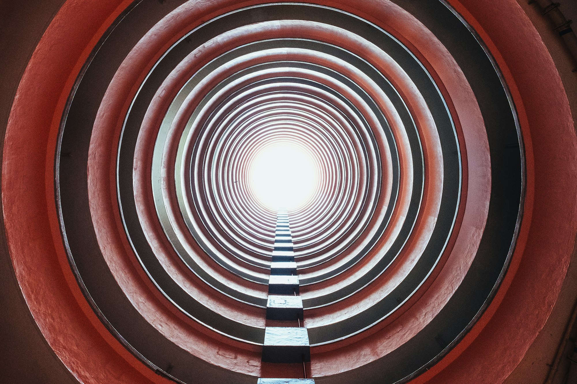
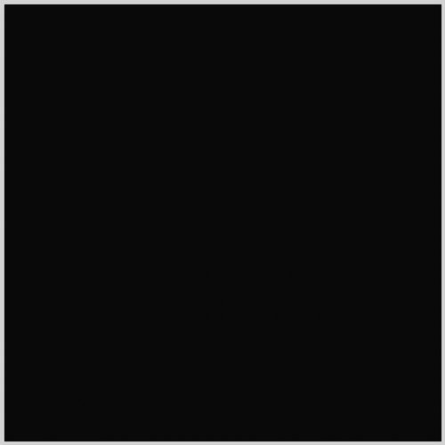
Preview
Zoom In Animation

Zoom Out Animation
Prerequisites
Essential CSS and HTML knowledge will help you understand the concepts and techniques introduced in this article. Jump over to this article if you require an HTML and CSS primer.
We assume that you have set up tools to create CSS animation. If you haven’t, this article will show you how to set them up.
Please read this article if you’re unfamiliar with CSS animation and the @keyframes at-rule property.
HTML Structure
<!-- Radial Zoom In -->
<div class="container">
  <div class="radial-zoom-in"></div>
</div>
<!-- Radial Zoom Out -->
<div class="container">
  <div class="radial-zoom-out"></div>
</div>
container is the outermost enclosure. It enables the content to be centered and draws a light gray border. The rest of the divs represent each animation sequence.
Keep the HTML structure as is for each animation to display correctly.
Body and Container Div CSS
CSS code for the body and container div.
/* Body and Container Settings */
/* Center shapes */
body {
  margin: 0;
  padding: 0;
  height: 100vh;
  display: flex;
  justify-content: center;
  align-items: center;
  flex-wrap: wrap;
}

/* Set background and border color */
.container {
  width: 500px;
  height: 500px;
  border: 5px solid lightgray;
  background: black;
  position: relative;
  margin: 5px;
  display: flex;
  justify-content: center;
  align-items: center;
}
Zoom In Animation
The first example is a zoom-in animation. It will alternate between two colors as it zooms in.

To create the zoom animation, we use custom properties using CSS @property. The examples will use the following custom properties.
/* Custom CSS Property */
@property --position {
  syntax: "<length-percentage>";
  initial-value: 0%;
  inherits: false;
}
@property --color-0 {
  syntax: "<color>";
  initial-value: transparent;
  inherits: false;
}
@property --color-1 {
  syntax: "<color>";
  initial-value: transparent;
  inherits: false;
}
--positionis used to control the position of theradial-gradient.--color-0and--color-1are used to set two colors for our examples.
Let’s break down the zoom-in CSS code.
/* Radial Zoom In */
.radial-zoom-in {
  height: 100%;
  width: 100%;
  --color-0: #ffffff;
  --color-1: #676968;
  background: radial-gradient(
    circle,
    var(--color-0) var(--position, 0%),
    var(--color-1) 0
  );
  animation-name: color-0, position, color-1;
  animation-duration: 4s, 2s;
  animation-timing-function: steps(1), ease-in;
  animation-iteration-count: infinite;
}

@keyframes position {
  90%,
  100% {
    --position: 100%;
  }
}
@keyframes color-0 {
  50% {
    --color-0: #676968;
  }
}
@keyframes color-1 {
  50% {
    --color-1: #ffffff;
  }
}
heightandwidthare set to100%. This ensures that our circleradial-gradientfills our container box.--color-0: #ffffff;is the first color. We set it to a white shade.--color-1: #676968;is the second color. It’s a dark gray color.
Next up is the radial-gradient.
background: radial-gradient(
  circle,
  var(--color-0) var(--position, 0%),
  var(--color-1) 0
);
circlesets our radial gradient to a circular shape.var(--color-0)is the first color custom CSS variable. We’ll be changing its property with@keyframes.var(--position, 0%)is the position property custom CSS variable. The initial value is set to0%. We’ll be changing its property with@keyframes.var(--color-1) 0is the second color. Don’t forget to include the0. Without it, you will get a gradient circle instead of a solid one.
Let’s break down the animation properties.
animation-name: color-0, position, color-1;
animation-duration: 4s, 2s;
animation-timing-function: steps(1), ease-in;
animation-iteration-count: infinite;
animation-name: color-0, position, color-1;sets our first color, position, and second color animation name.animation-duration: 4s, 2s;sets our animation duration to 4 and 2 seconds.animation-timing-function: steps(1), ease-in;ensures that each animation stop is shown for an equal length of time.animation-iteration-count: infinite;loops our animation infinitely.
Now let’s breakdown @keyframes
@keyframes position {
  90%,
  100% {
    --position: 100%;
  }
}
@keyframes color-0 {
  50% {
    --color-0: #676968;
  }
}
@keyframes color-1 {
  50% {
    --color-1: #ffffff;
  }
}
--position: 100%;animates our circle from the initial0%to100%. This makes our circle change in size, simulating a zoom-in animation.--color-0: #676968;changes the first color from the default#ffffff, white color to#676968dark gray color.--color-1: #ffffff;changes the second color from dark gray,#676968to#ffffff, white color.
You create an interesting zoom-in animation effect by alternating the first and second colors.
Zoom Out Animation
In this section, we’ll reverse the previous example from zoom-in to zoom-out. We explain only the CSS code that differs from the last section for brevity.

--color-0: #0a0a0a;
--color-1: #777777;
We use a light gray color, #0a0a0a; for the first color. #777777; is a black color we use for the second color.
animation-name: adv-color-0, adv-position, adv-color-1;
To differentiate our animation color from the previous example, we add adv to the animation names of each property value.
animation-timing-function: steps(1), ease-out;
ease-out; is used instead of ease-in.
@keyframes adv-position {
  0%,
  10% {
    --position: 100%;
  }
}
Position property value is set to 0%, 10%. This changes the size of the circle from large to small, creating a zoom-out animation effect.
You can see and play with the complete code on Pyxofy’s CodePen page.
See the Pen CSS Animation - @property Radial Gradient Zoom Animation by Pyxofy (@pyxofy) on CodePen.
Conclusion
You learned to make a zoom-in animation effect while alternating between two colors. You expanded that knowledge by creating a zoom-out effect.
The CSS @property at-rule is a versatile tool that lets you set CSS custom properties.
Play with the example code. How about changing the colors? Maybe move the zoom direction or its speed.
What will you be creating with radial-gradient and @property?
Share your masterpiece with us on Twitter @pyxofy, LinkedIn, Mastodon, or Facebook.
We hope you liked this article. Kindly share it with your network. We appreciate it.
Related Articles
 Pyxofy
 Pyxofy
 Pyxofy