CSS Animation – How to Use Keyframes and steps() to Animate an Analog Alarm Clock - Part 1
Learn to animate an analog alarm clock using only CSS! Spin the clock hands and dynamically scale the clock body in this step-by-step article.

Introduction
A spinning hour and minute hand combined with a clock body that scales up creates a dynamic and visually appealing animation sequence.
In this two-part article series, you’ll learn how to animate an analog alarm clock using pure CSS:
- Part 1 (this article): You’ll animate the hour hand, minute hand, and the clock body to bring the core structure of the clock to life.
- Part 2: We’ll continue by animating the remaining parts—such as the clock feet, bells, hammer, and more—to complete the design with dynamic motion.
CSS properties and functions introduced in this article include:
steps()@keyframesanimationrotatescale- CSS Custom Properties (Variables)
Preview

The Analog Alarm Clock was built using the following two-part article series.
 Pyxofy
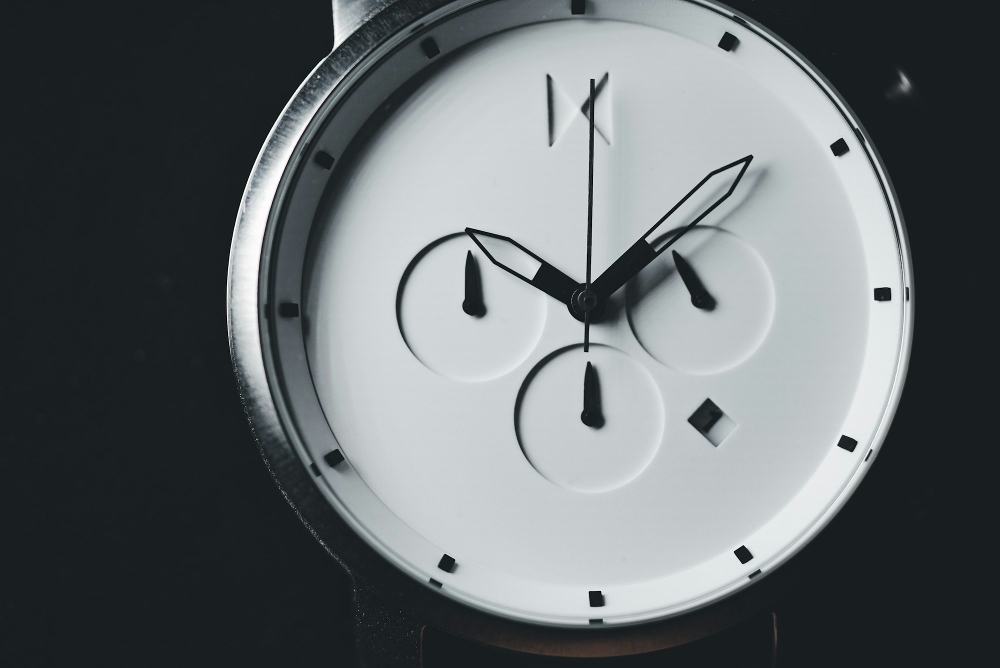
 Pyxofy
We recommend exploring these articles first—they provide the essential concepts and step-by-step guidance for creating the individual clock components. Understanding these foundations will make the animation implementation process much easier and more enjoyable.
Prerequisites
Essential CSS and HTML knowledge will help you understand the concepts and techniques introduced in this article. Jump over to this article if you require an HTML and CSS primer.
We assume you have configured tools to modify CSS. If not, this article will guide you through the setup process.
Please read this article if you’re unfamiliar with CSS animation and the @keyframes at-rule property.
HTML Structure
<div class="container">
  <div class="bell-tip"></div>
  <div class="left-bell"></div>
  <div class="right-bell"></div>
  <div class="bell-hammer"></div>
  <div class="clock-feet"></div>
  <div class="clock-body"></div>
  <div class="clock-face">
    <div class="number twelve">12</div>
    <div class="number three">3</div>
    <div class="number six">6</div>
    <div class="number nine">9</div>
  </div>
  <div class="hour-hand"></div>
  <div class="minute-hand"></div>
  <div class="dial"></div>
</div>
container is the outermost enclosure. It enables the content to be centered and draws a light gray border. The rest of the <div>s represent each animation sequence.
Keep the HTML structure as is for the animation to display correctly.
Body and Container <div> CSS
CSS code for the body and container <div>.
/* Body and Container Settings */
/* Center shapes */
body {
  margin: 0;
  padding: 0;
  height: 100vh;
  display: flex;
  justify-content: center;
  align-items: center;
  flex-wrap: wrap;
}

/* Set background and border color */
.container {
  width: 500px;
  height: 500px;
  border: 5px solid lightgray;
  background: transparent;
  position: relative;
  margin: 5px;
  display: flex;
  justify-content: center;
  align-items: center;
}
Animation Custom Variable
You’ll add the following custom variable to the :root pseudo-class.
This step ensures that your styles are globally accessible, making it easier to maintain and update your animation settings later.
/* Animation Setting */
:root {
  --animation-timing-function: ease-in-out;
}
The animation sequence uses the ease-in-out timing function. This means the animated properties start transitioning slowly, accelerate in the middle, and then slow down again toward the end. This creates a smooth and natural motion that feels more polished compared to linear transitions.
In the next section, we’ll focus on animating the Hour Hand.
Hour Hand
Now, let’s define the animation for the Hour Hand. We’ll use the animation property to apply a smooth, step-based movement that mimics the behavior of a real clock.

/* Clock Hands */
.hour-hand {
  animation: hour-hand 1.5s steps(12);
}
- The
animationname is set tohour-hand, which links this element to the corresponding@keyframesrule. - The duration is
1.5s, meaning the animation completes in one and a half seconds. - The
steps(12)function ensures the Hour Hand moves in 12 discrete jumps—one for each hour—rather than sliding smoothly. This creates a realistic ticking effect.

The Hour Hand animation is designed to snap precisely to each clock hour during the sequence. This creates a realistic ticking effect, rather than a smooth continuous movement, which better mimics the behavior of a traditional analog clock.

@keyframes hour-hand {
  from {
    rotate: 0deg;
  }
  to {
    rotate: 360deg;
  }
}
@keyframesat-propertyhour-handsets up the motion the element will follow during the animation.- The
fromandtodefine the start and end states—here,rotate: 0degtorotate: 360degfor one full turn.


Great job! The Hour Hand animation sequence is now complete.
In the next section, we’ll move on to animating the Minute Hand. This step will add even more realism to your clock by creating smooth, precise movement for the minute indicator.
Minute Hand
Unlike the Hour Hand, the Minute Hand will move continuously throughout its animation sequence. This creates a smooth, flowing motion that closely mimics the behavior of a real analog clock, where the minute hand glides rather than jumps between positions.

.minute-hand {
  animation: minute-hand 1.5s var(--animation-timing-function);
}
minute-handis theanimationname that will link to our@keyframesdefinition.1.5ssets the duration of the animation.var(--animation-timing-function)pulls in the timing function from a CSS variable, in this instanceease-in-out.

@keyframes minute-hand {
  from {
    rotate: 0deg;
  }
  to {
    rotate: -360deg;
  }
}
fromis the starting point, and the Minute Hand is set torotate: 0deg.- The
tokeyframe sets a full counterclockwise rotation usingrotate: -360deg.

The Minute Hand will complete one entire sweep in the opposite direction of the default clockwise rotation, creating the smooth, continuous motion we want for an analog clock effect.

With the Hour and Minute Hand animations complete, it’s time to bring the entire clock to life.
Up next, we’ll focus on animating the Clock Body. This step will add subtle motion and polish, making the overall design feel dynamic and visually appealing.
Clock Body
The Clock Body animation sequences combine two CSS properties:
scalerotate

The Clock Body animation sequence starts with the element completely invisible and then gradually scales it up while rotating. This creates a smooth, eye-catching entrance effect that makes the animation feel dynamic and polished.

/* Clock Body */
.clock-body {
  animation: clock-body 1s var(--animation-timing-function);
}
clock-bodyis theanimationname that will link to the@keyframesdefinition.- The animation length is set to
1sor one second. - The animation timing function is set to
var(--animation-timing-function), which pulls in the timing function from a CSS variable, in this instanceease-in-out.

@keyframes clock-body {
  from {
    scale: 0;
    rotate: 180deg;
  }
  to {
    scale: 1;
    rotate: 0deg;
  }
}
- The
scaleproperty controls the element’s size;0is fully collapsed,1is normal size. - The
rotateproperty spins the element, starting at180deg, or 180 degrees, adds a dramatic reveal as it rotates to0deg.

You can see and play with the complete code on Pyxofy’s CodePen page.
See the Pen CSS Animation - How to Use Keyframes and steps() to Animate an Analog Alarm Clock by Pyxofy (@pyxofy) on CodePen.
Conclusion
In Part 1 of this two-part series, you learned how to animate the Hour Hand, Minute Hand, and Clock Body using only CSS.
- You explored the
steps()function to create a realistic, step-based animation for the Hour Hand. - You combined the CSS
rotate,scale, andopacityproperties to give the Clock Body a dynamic entrance effect.
In Part 2, we’ll take things further by animating the remaining elements of the analog clock. Until then, keep practicing and share your masterpiece with us on LinkedIn, Threads, Bluesky, Mastodon, X (Twitter) @pyxofy, or Facebook.
We hope you liked this article. Kindly share it with your network. We appreciate it.
Related Articles
 Pyxofy
 Pyxofy
 Pyxofy
 Pyxofy