CSS Animation - Create Dynamic Split and Spring Animation Transitions with Pure CSS
Make your designs and UI pop! Learn to split and animate an isometric cube with smooth motion and springy bounce in this step-by-step tutorial.

Introduction
Animating isometric cubes with CSS is both dynamic and fun—and a great way to level up your front-end skills. In this article, you’ll learn how to create split-and-spring animations by combining several CSS properties, including transform, animation, rotate(), and more.
CSS properties and functions you’ll be exploring in this article:
transformanimation@keyframesrotate()translate()scale()
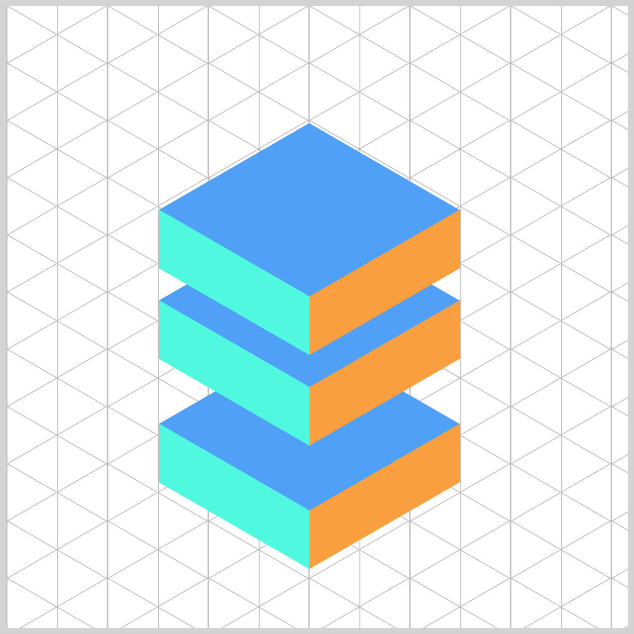
Preview

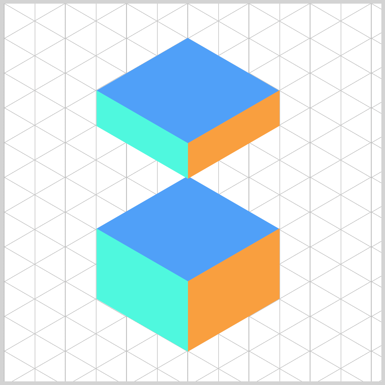
The animation sequence features an isometric cube to simulate a dynamic transformation: it splits apart, slides downward, and reassembles itself—followed by a spring-like bounce back to its original position.
Prerequisites
Essential CSS and HTML knowledge will help you understand the concepts and techniques introduced in this article. Jump over to this article if you require an HTML and CSS primer.
We assume you have configured tools to modify CSS. If not, this article will guide you through the setup process.
Please read this article if you’re unfamiliar with CSS animation and the @keyframes at-rule property.
HTML Structure
<div class="container">
  <div class="cube-1">
    <div class="isometric-cube-top"></div>
    <div class="isometric-cube-right"></div>
    <div class="isometric-cube-left"></div>
  </div>
  <div class="cube-2">
    <div class="isometric-cube-top"></div>
    <div class="isometric-cube-right"></div>
    <div class="isometric-cube-left"></div>
  </div>
  <div class="cube-3">
    <div class="isometric-cube-top"></div>
    <div class="isometric-cube-right"></div>
    <div class="isometric-cube-left"></div>
  </div>
</div>
container is the outermost enclosure. It enables the content to be centered and draws a light gray border. The rest of the <div>s represent each animation sequence.
Keep the HTML structure as is for the animation to display correctly.
Body and Container <div> CSS
CSS code for the body and container <div>.
/* Body and Container Settings */
/* Center shapes */
body {
  margin: 0;
  padding: 0;
  height: 100vh;
  display: flex;
  justify-content: center;
  align-items: center;
  flex-wrap: wrap;
}

/* Set background and border color */
.container {
  width: 500px;
  height: 500px;
  border: 5px solid lightgray;
  background: #121212;
  position: relative;
  margin: 5px;
  display: flex;
  justify-content: center;
  align-items: center;
}
Common Properties
To make our code cleaner and easier to maintain, we’ll group all the shared styles for the isometric cube components into one place. This way, instead of repeating the same properties for each part, we can define them once and keep things efficient.
.cube-1,
.cube-2,
.cube-3,
.isometric-cube-top,
.isometric-cube-right,
.isometric-cube-left {
  position: absolute;
  transform-origin: 0 0;
}
position: absolute;
Lets you place each piece precisely within the cube’s container.transform-origin: 0 0;
Sets the transform anchor to the top-left. This makes isometric rotations/translations more predictable because everything pivots from a common corner.
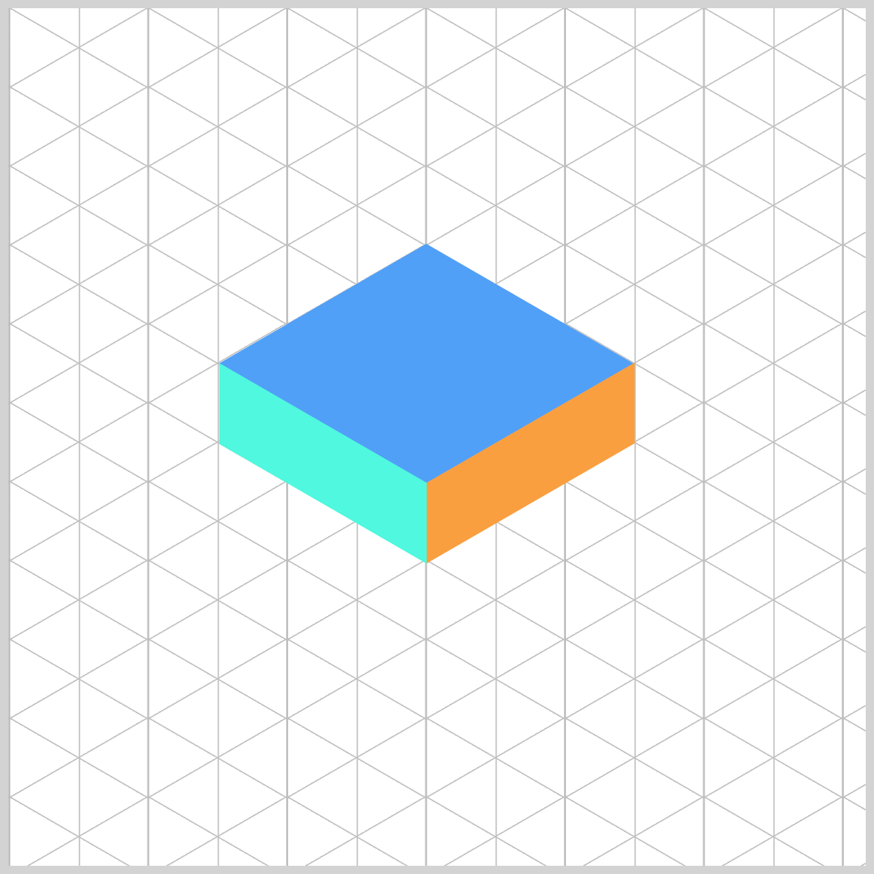
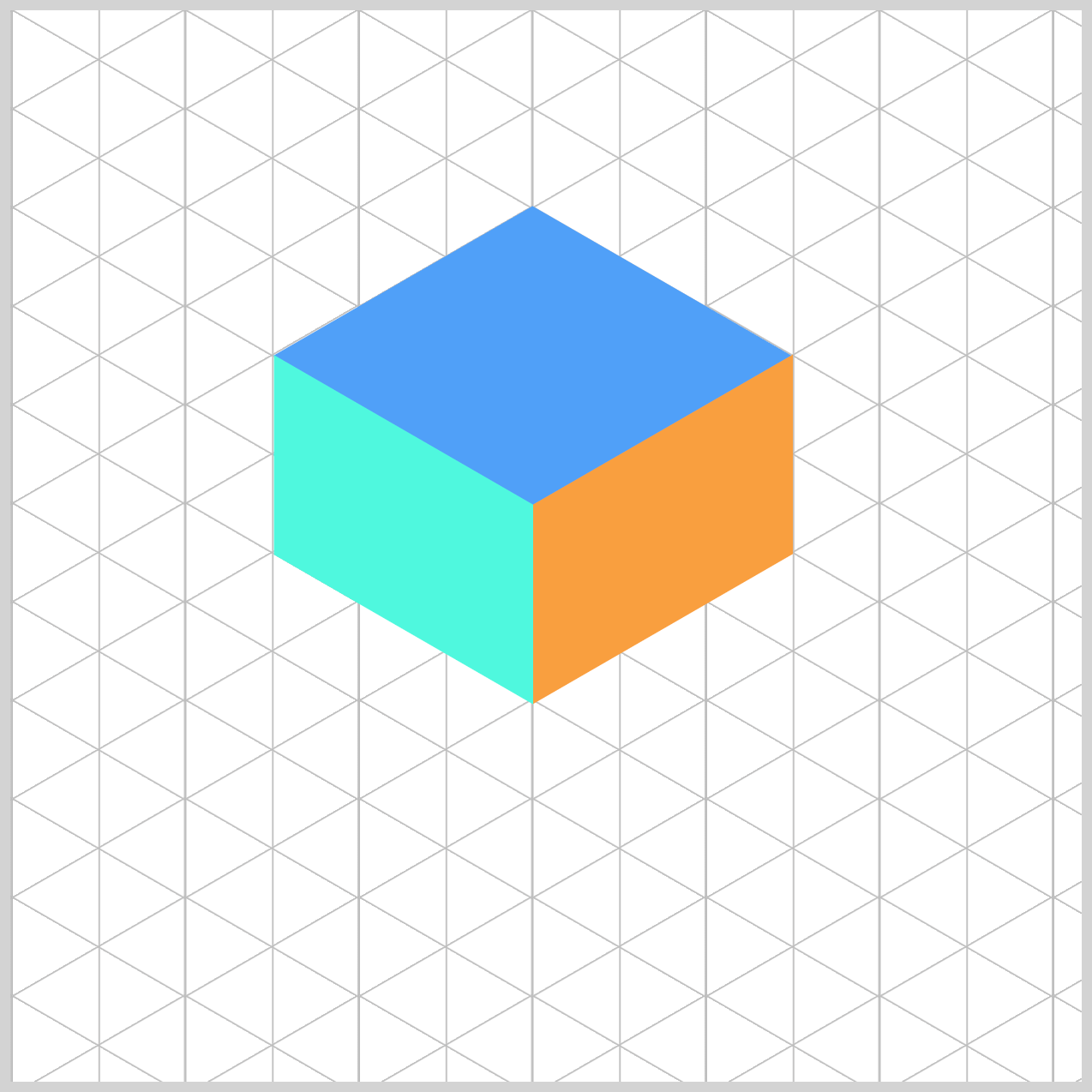
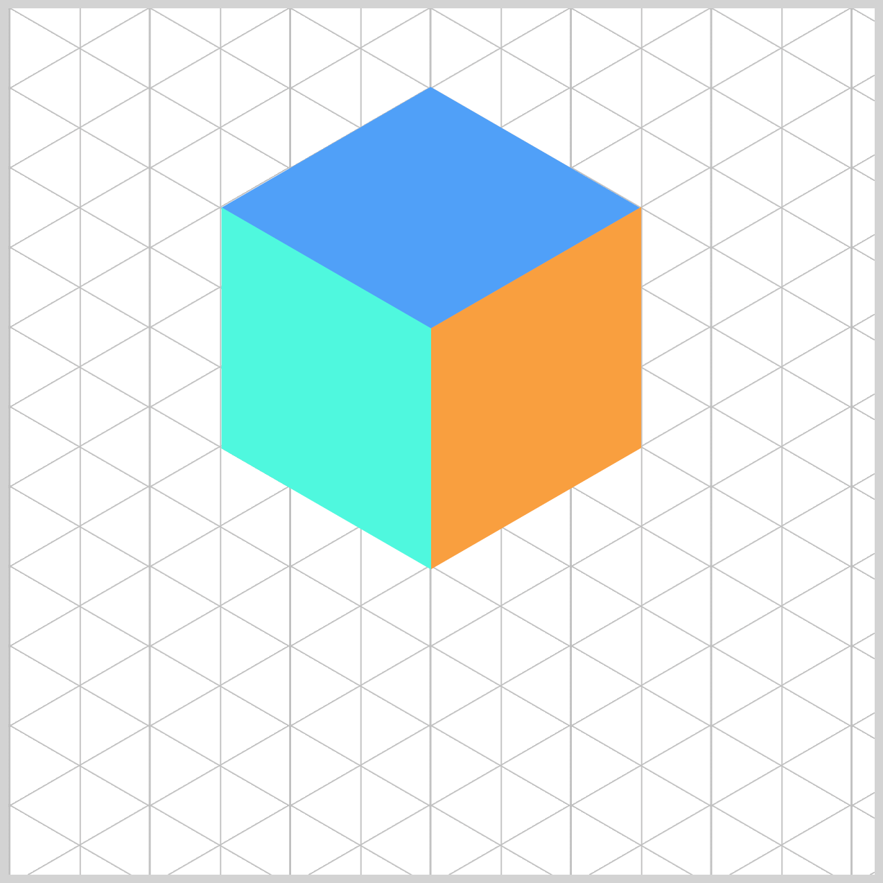
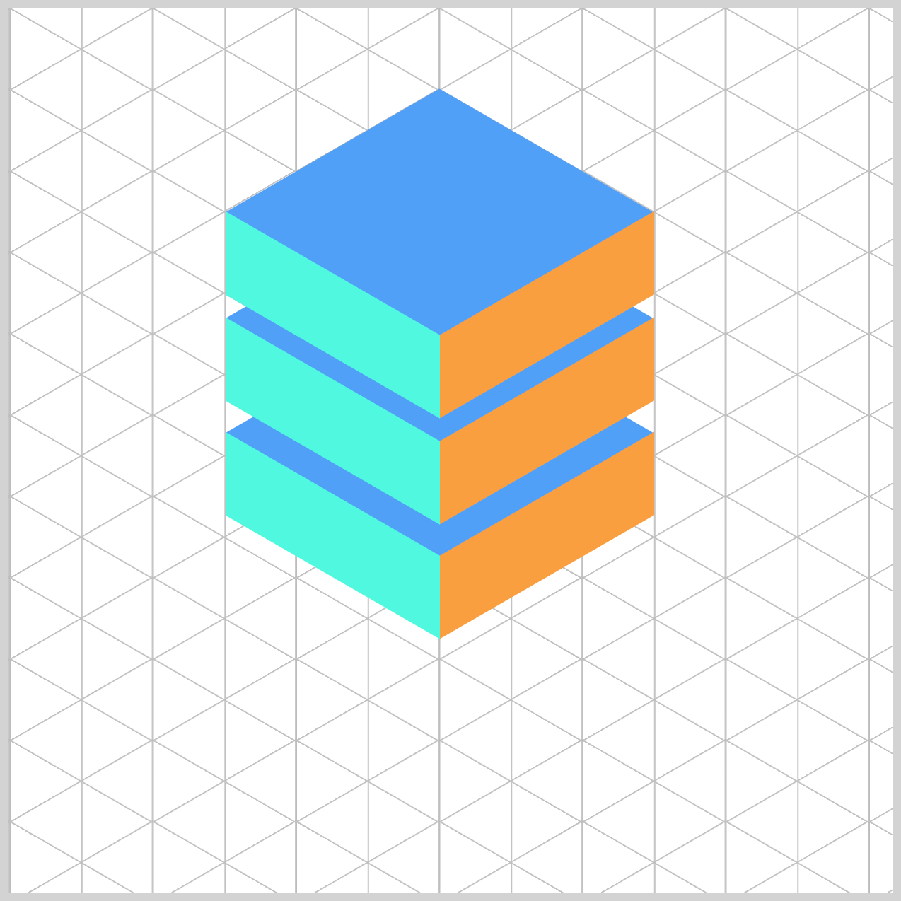
Isometric Cube Components
Let’s start by creating the isometric cube components that we’ll soon bring to life with animation.
The isometric cube design we’re creating is based on this article. Feel free to check it out for a deeper dive into the concept, then come back here to follow along with our step-by-step approach.
 Pyxofy
Here’s the HTML code.
<!-- Isometric Cube Parts HTML -->
<div class="cube-1">
  <div class="isometric-cube-top"></div>
  <div class="isometric-cube-right"></div>
  <div class="isometric-cube-left"></div>
</div>
<div class="cube-2">
  <div class="isometric-cube-top"></div>
  <div class="isometric-cube-right"></div>
  <div class="isometric-cube-left"></div>
</div>
<div class="cube-3">
  <div class="isometric-cube-top"></div>
  <div class="isometric-cube-right"></div>
  <div class="isometric-cube-left"></div>
</div>
And here’s the CSS code.
/* Isometric Cube Parts CSS */
.isometric-cube-top {
  width: 140px;
  height: 140px;
  background: #4fa0f8;
  transform: rotate(210deg) skewX(-30deg) scaleY(0.864);
}

.isometric-cube-right {
  width: 140px;
  height: 47px;
  background: #f99f3e;
  transform: rotate(-30deg) skewX(-30deg) translate(0, -0.5px) scaleY(0.864);
}

.isometric-cube-left {
  width: 47px;
  height: 140px;
  background: #4ff8de;
  transform: rotate(90deg) skewX(-30deg) scaleY(0.864) translate(-0.5px, 0);
}
- The top face is a perfect square:
140pxby140px. This gives the cube a balanced, even look from the top. - The right face is
140pxwide and47pxhigh. The shorter height creates the illusion of depth when viewed in isometric perspective. - The left face is flipped and set to
47pxwide and140pxhigh. This mirrors the right face, maintaining symmetry and completing the 3D effect.
Now, let’s start positioning each part of the cube, beginning with cube-1. We’ll start here because cube-1 acts as the base reference for the other components. Once it’s in place, it becomes much easier to align the remaining components accurately.
.cube-1 {
  top: 277px;
  left: 244px;
}
The first component, cube-1, will be positioned 277px from the top and 244px from the left edge of its container. This placement sets the foundation for the entire layout, allowing the other cubes to align correctly around it.
.cube-2 {
  top: 231px;
  left: 244px;
}
The second component, cube-2, is positioned on top of the previous components, 231px from the top and 244px from the left.
.cube-3 {
  top: 185px;
  left: 244px;
}
cube-3, the final component is placed on top of cube-2 using top: 185px; and left: 244px;.
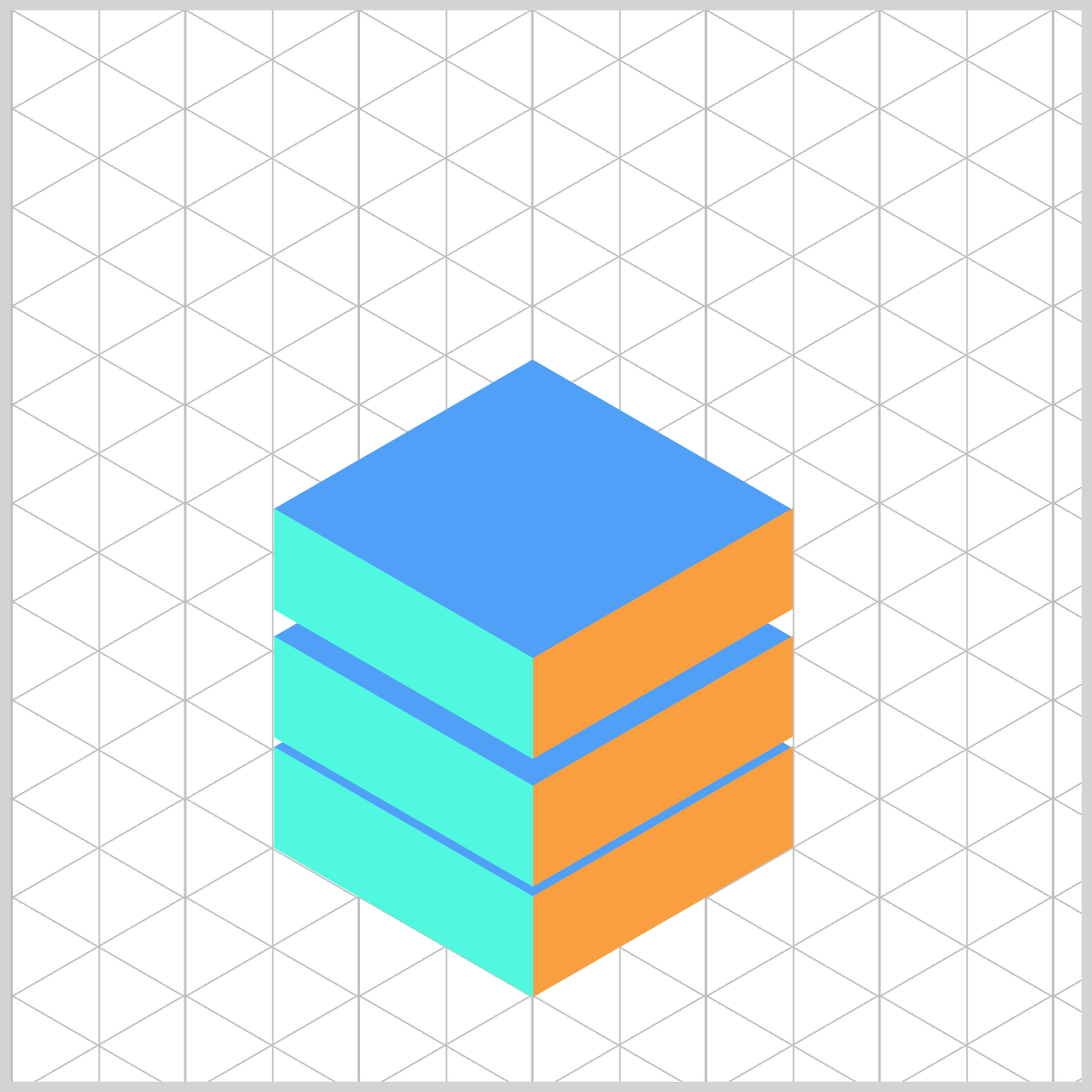
This step-by-step stacking creates the illusion of height, giving our isometric cube its layered 3D look.
Next up, we’ll dive into the fun part—creating the animation sequence that brings our cubes to life! We’ll make them fall, then rise, and stack smoothly, adding that extra touch of motion to make the animation feel dynamic and engaging.
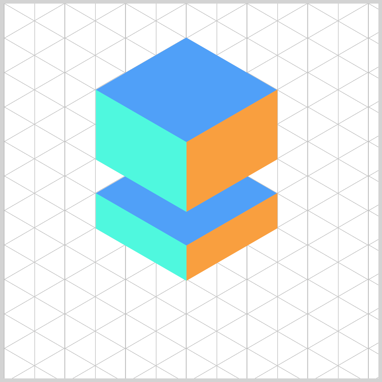
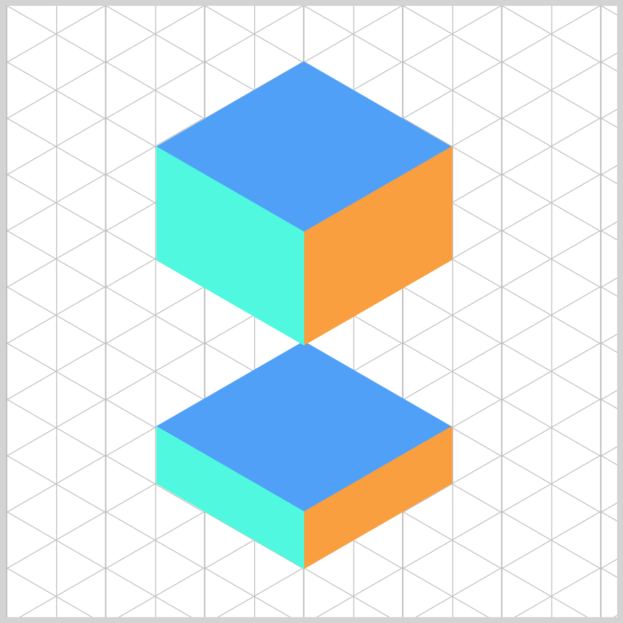
Isometric Cube Animation Sequence
Our animation will flow through three key states to create a smooth stacking effect.
- Initial Position
All the isometric components start aligned at the top of the grid, ready to move into place.

- Middle Position
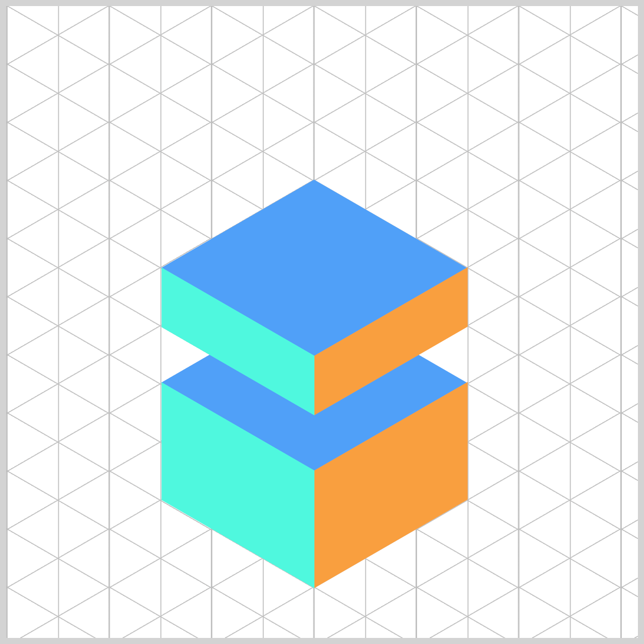
This is the halfway point:cube-1settles at the bottom, whilecube-2hovers in betweencube-1andcube-3.
- End Position
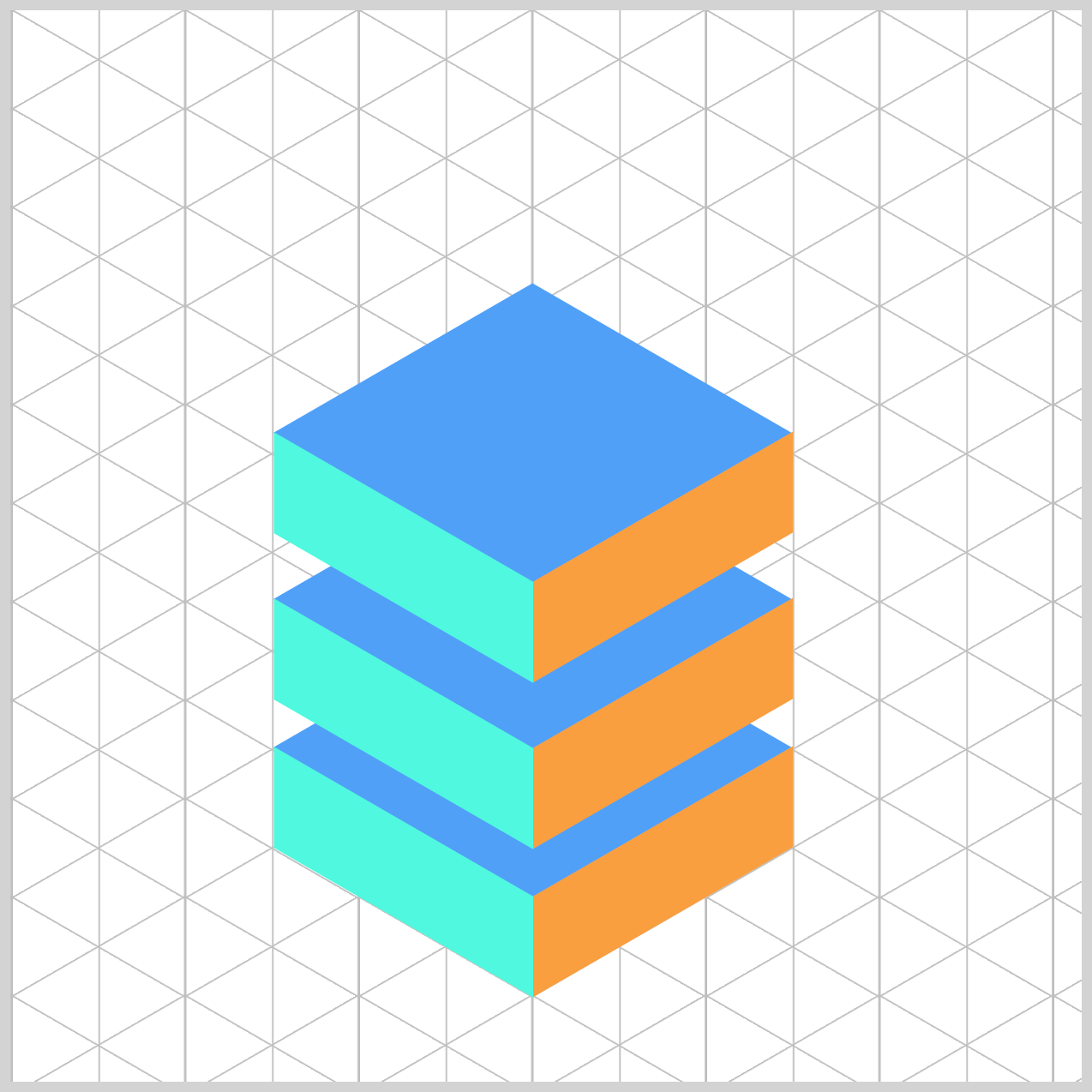
Finally, all the components come together at the bottom of the grid, forming the complete stacked structure.
In the next section, we’ll focus on animating cube-1. This is where the magic begins—bringing the first piece of our isometric stack to life!
Cube 1 Animation
cube-1 sits at the bottom of the isometric stack. Its animation will move it from top: 277px; (starting position) down to top: 414px; (final position), creating the effect of one third of the cube dropping smoothly into place.
To enable the animation for cube-1, we’ll add the animation property to its CSS selector.
.cube-1 {
  animation: cube-1 4s ease-in-out infinite;
}
Here’s what each part means:
cube-1: This is the name of the animation we’ll define in @keyframes.4s: The animation will run for four seconds.ease-in-out: This easing function makes the movement start and end smoothly.infinite: The animation will loop forever.
The same property values (except for the animation name) will also apply to cube-2 and cube-3.
@keyframes cube-1 {
  from {
    top: 277px;
  }
  40% {
    top: 414px;
  }
  84% {
    top: 414px;
  }
  to {
    top: 277px;
  }
}
For cube-1, the animation starts at top: 277px and ends at top: 414px. To create a smooth effect, it stays in the bottom position between 40% and 84% of the animation timeline before snapping back to its starting point. This timing gives the cube a nice pause at the bottom before the quick reverse.
Cube 2 Animation
cube-2 is positioned in the middle of the stack, sitting right above cube-1. This placement helps create the layered effect that makes the isometric cube look three-dimensional.
.cube-2 {
  animation: cube-2 4s ease-in-out infinite;
}

@keyframes cube-2 {
  from {
    top: 231px;
  }
  40% {
    top: 305px;
  }
  60% {
    top: 368px;
  }
  75% {
    top: 368px;
  }
  to {
    top: 231px;
  }
}
from→40%:cube-2moves from the starting spot (231px) down to the middle position (305px).40%→60%: It continues down to368px, getting closer to the final stack, so it sits betweencube-1andcube-3.60%→75%: It holds at368pxfor a moment—this makes the stacking feel deliberate.75%→to: It returns quickly to the starting position (231px). Because this part only uses 25% of the timeline, the reverse feels snappier, which keeps the loop lively.
Cube 3 Animation
cube-3 is positioned at the very top of the isometric stack, sitting above cube-2 and cube-1. This placement completes the layered 3D effect, making the structure look like a true isometric cube.
.cube-3 {
  animation: cube-3 4s ease-in-out infinite;
}
@keyframes cube-3 {
  from {
    top: 185px;
  }
  30% {
    top: 185px;
  }
  65% {
    top: 322px;
  }
  68% {
    top: 322px;
  }
  to {
    top: 185px;
  }
}
from→30%:cube-3waits at185px, lettingcube-1andcube-2establish the stack below it.30%→65%: It moves down to322px, aligning with the rest of the stack.65%→68%: A tiny hold at the bottom helps the final pose read clearly.68%→to: It returns to185px. Because this section is shorter than the forward move, the reverse feels snappier.
Reversing The Animation Sequence
After reaching the final stacked position, the animation reverses back to its starting point—but this time much faster, creating a snappy return effect. This quick reverse adds energy and makes the loop feel dynamic.
The following images will walk you through the reverse animation step by step so you can see exactly how it works. You can control the reverse animation speed by adjusting the @keyframes percentages in combination with the top position CSS property.
You can make the reverse part of the loop run faster by how you ‘budget’ time in your @keyframes.
Percentages in @keyframes represent time, not distance. So if you spend more of the timeline getting from A → B (forward), and less getting from B → A (reverse), the reverse will play faster—even with the same total duration.

You can see and play with the complete code on Pyxofy’s CodePen page.
See the Pen CSS Animation - Create Dynamic Split and Spring Animation Transitions with Pure CSS by Pyxofy (@pyxofy) on CodePen.
Conclusion
In this article, you discovered how to create visually striking isometric cubes using CSS, stack them to build dynamic compositions, and bring them to life with smooth animations.
We explored how the CSS transform property—alongside functions like rotate(), translate(), and scale()—can be used to simulate a three-dimensional effect, giving your components depth and perspective.
To animate these cubes, we used the CSS animation property in combination with the @keyframes at-rule. By defining keyframes at specific percentage points, you can precisely control the timing and flow of your animation—whether you want it to speed up, slow down, or pause momentarily.
Feel free to experiment with the keyframe percentages to customize the animation to your liking. Small tweaks can lead to big visual differences, so don’t hesitate to play around and see what works best for your animation! Share your masterpiece with us on LinkedIn, Threads, Bluesky, Mastodon, X (Twitter) @pyxofy, or Facebook.
We hope you liked this article. Kindly share it with your network. We appreciate it.
Related Articles
 Pyxofy
 Pyxofy