CSS Animation – Burst Effects Using Animation Delays, Transform and Gradients - Part 2
Burst effects add energy and impact. Learn how to blend key CSS properties and functions to create dynamic, eye‑catching animations for the web.

Introduction
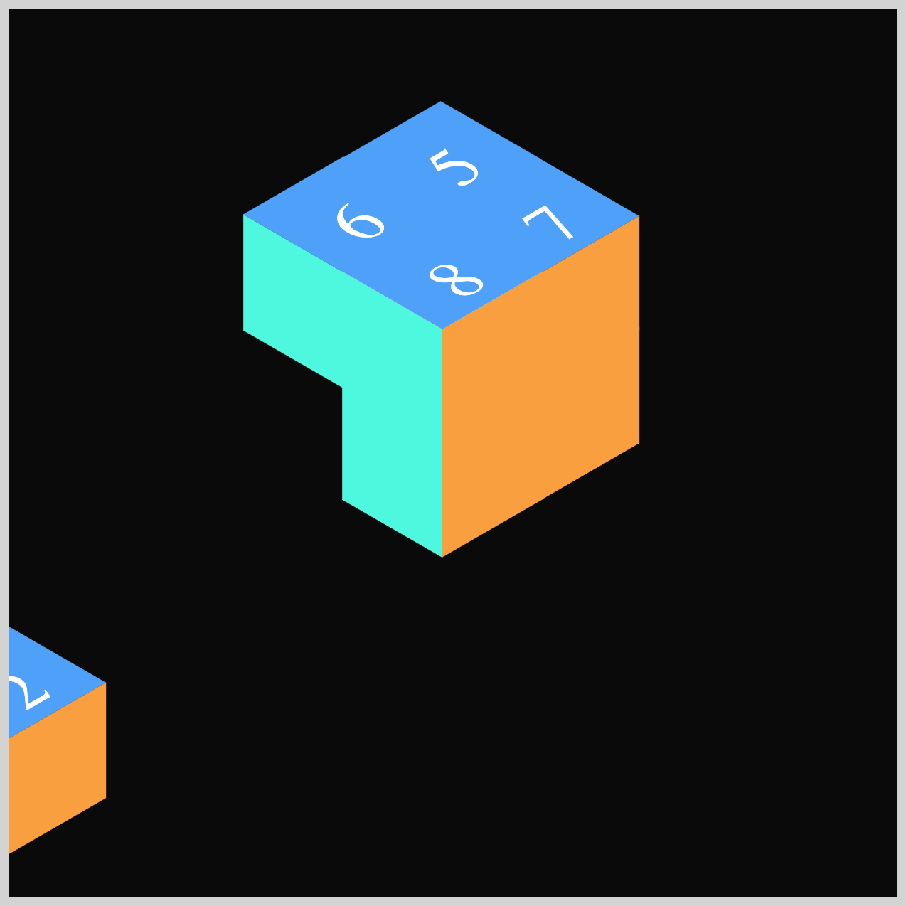
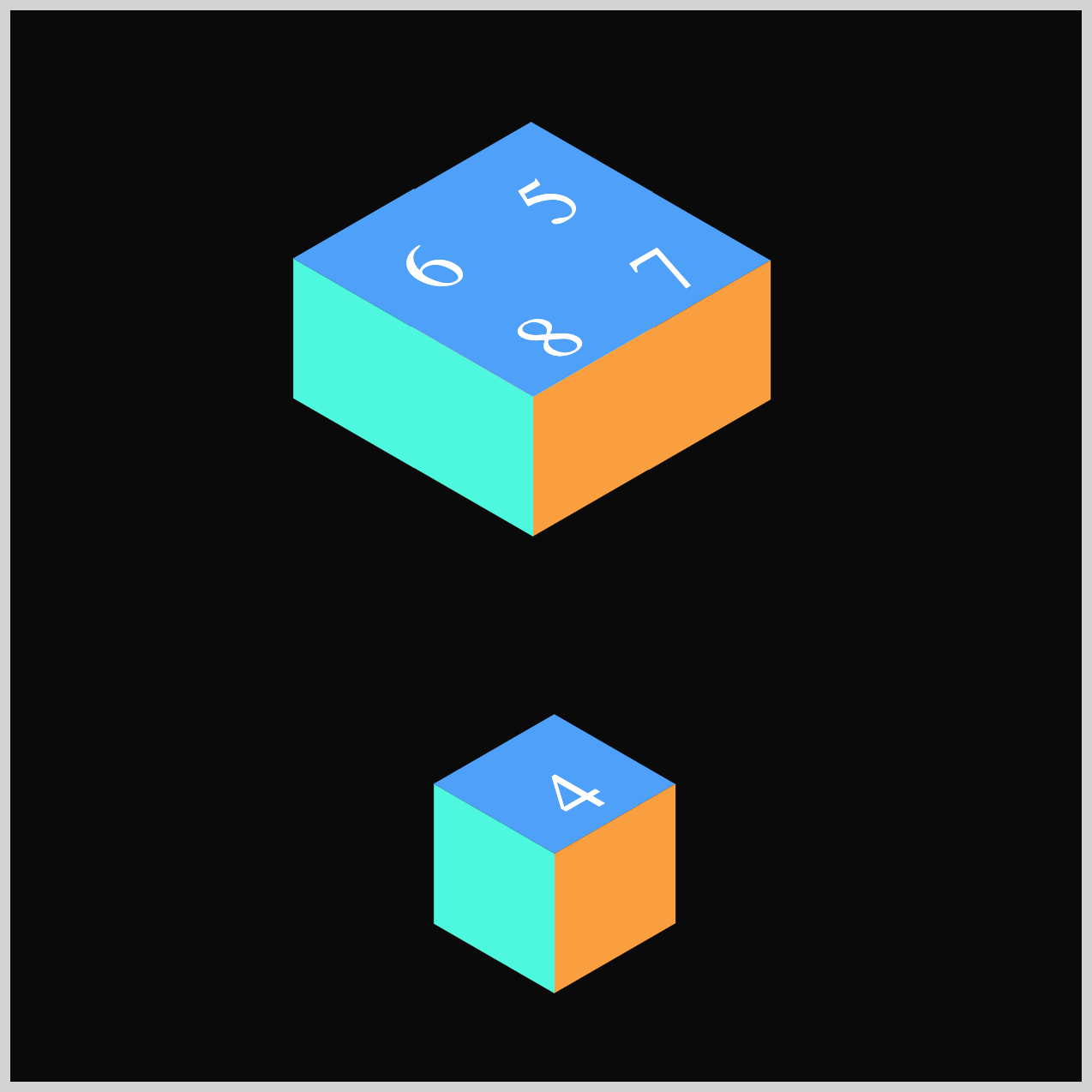
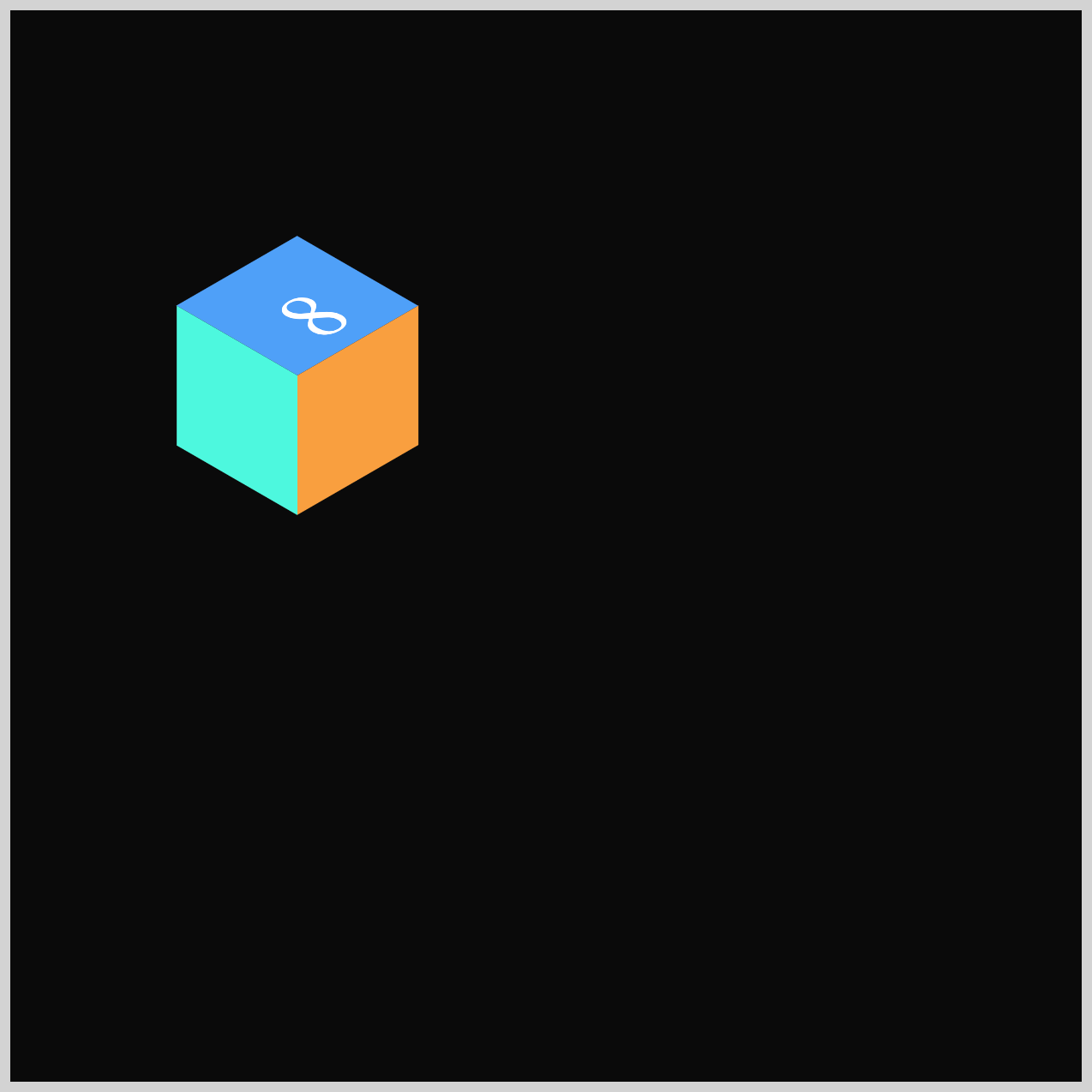
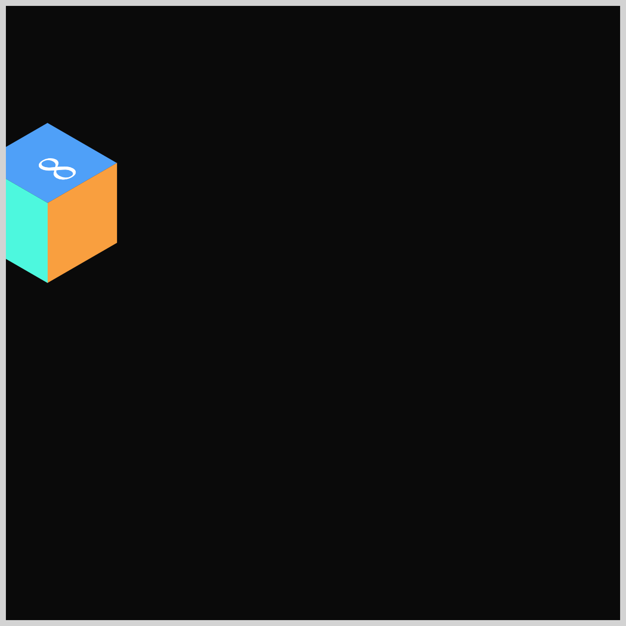
Bring your animation to life with a dramatic burst of isometric cubes, glowing light rays, and a transforming floor opening.
In this two‑part article series, you’ll explore how using multiple CSS properties and functions works together to create a smooth, rhythmic, and visually striking 3D effect.
- In Part 1, you built the foundation of the project by creating the core visual elements: the isometric cubes, the glowing light rays, and the animated floor opening.
- In Part 2—this article—you’ll bring everything to life. You’ll learn how to animate each component using key CSS tools like
translate,scale,opacity, andanimation-delayto create a smooth, energetic burst effect that feels dynamic and exciting on screen.
CSS properties and functions you’ll be exploring in this article:
animation-delayscaleopacitytranslate- CSS Custom Properties (Variables)
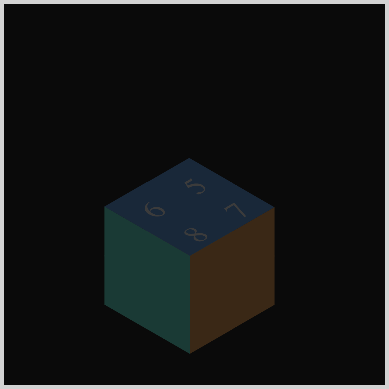
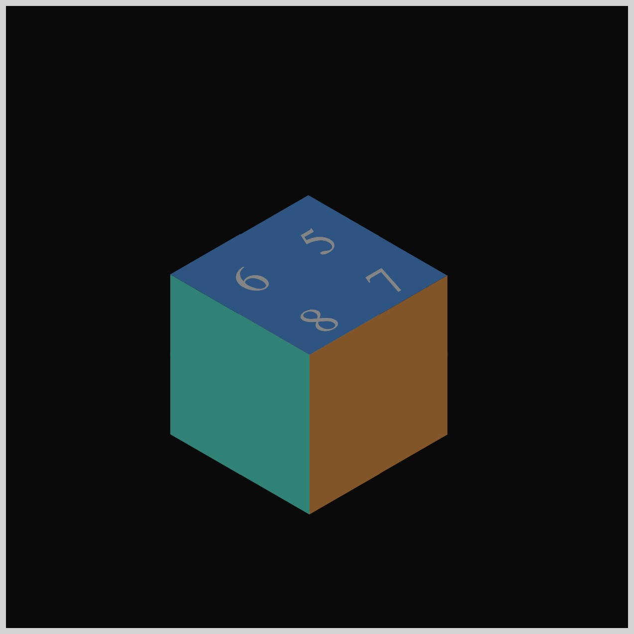
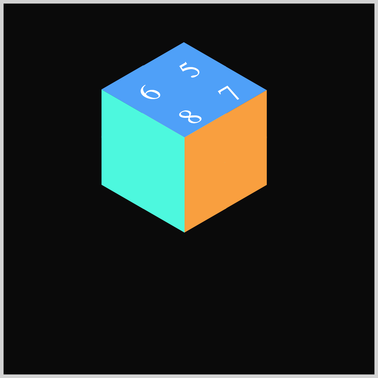
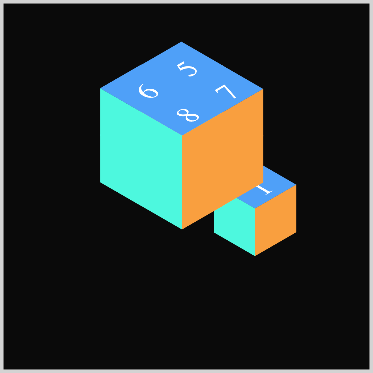
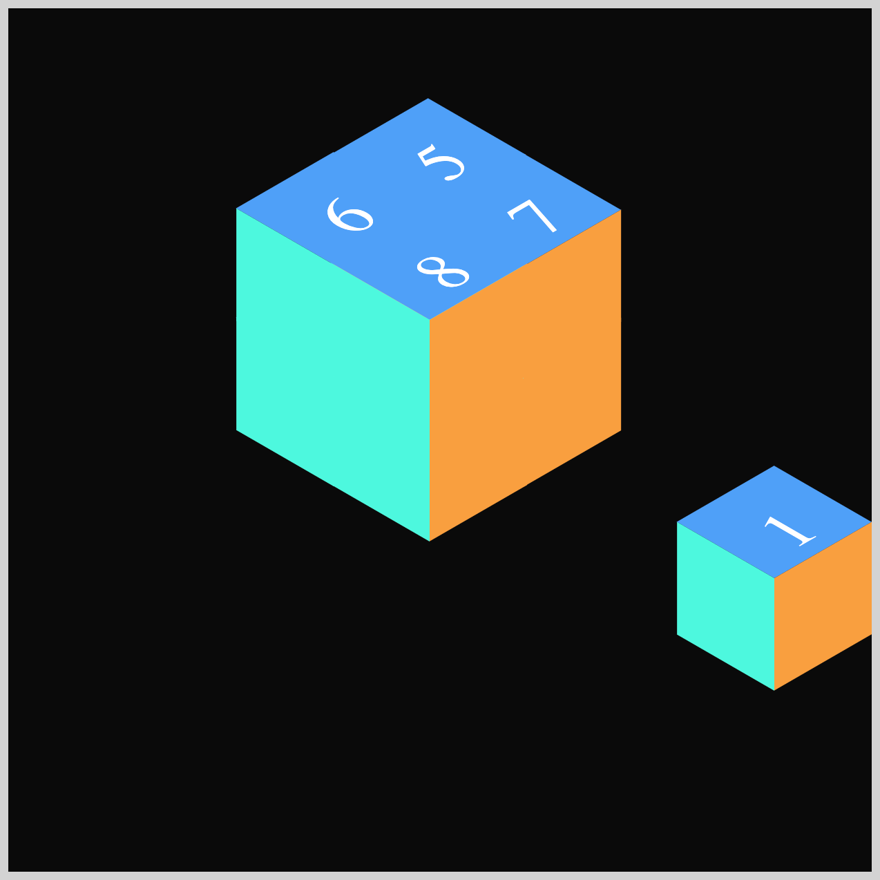
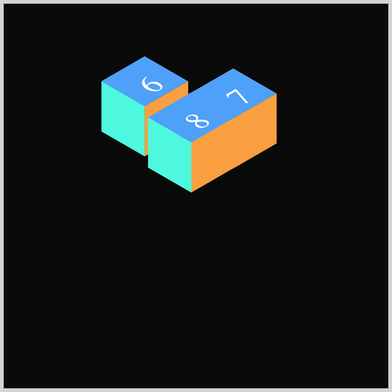
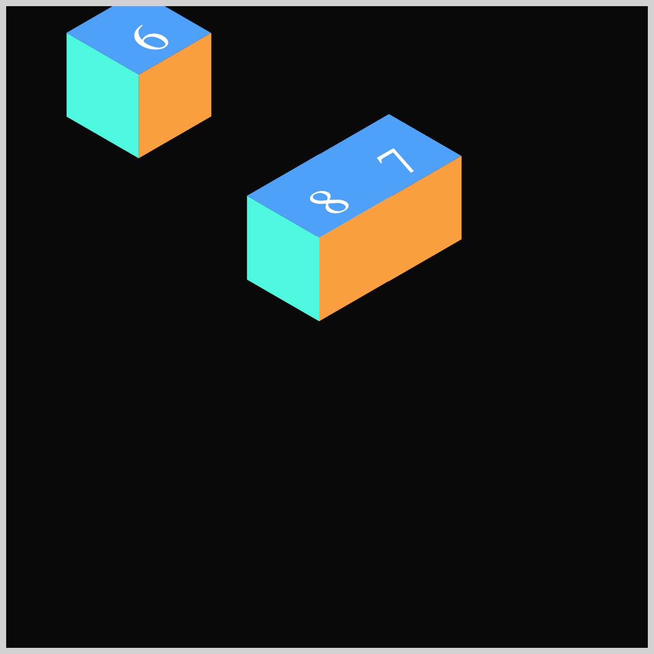
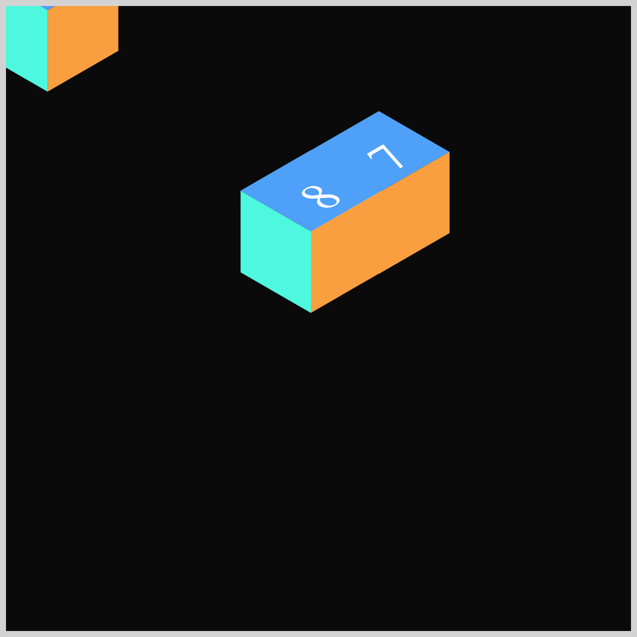
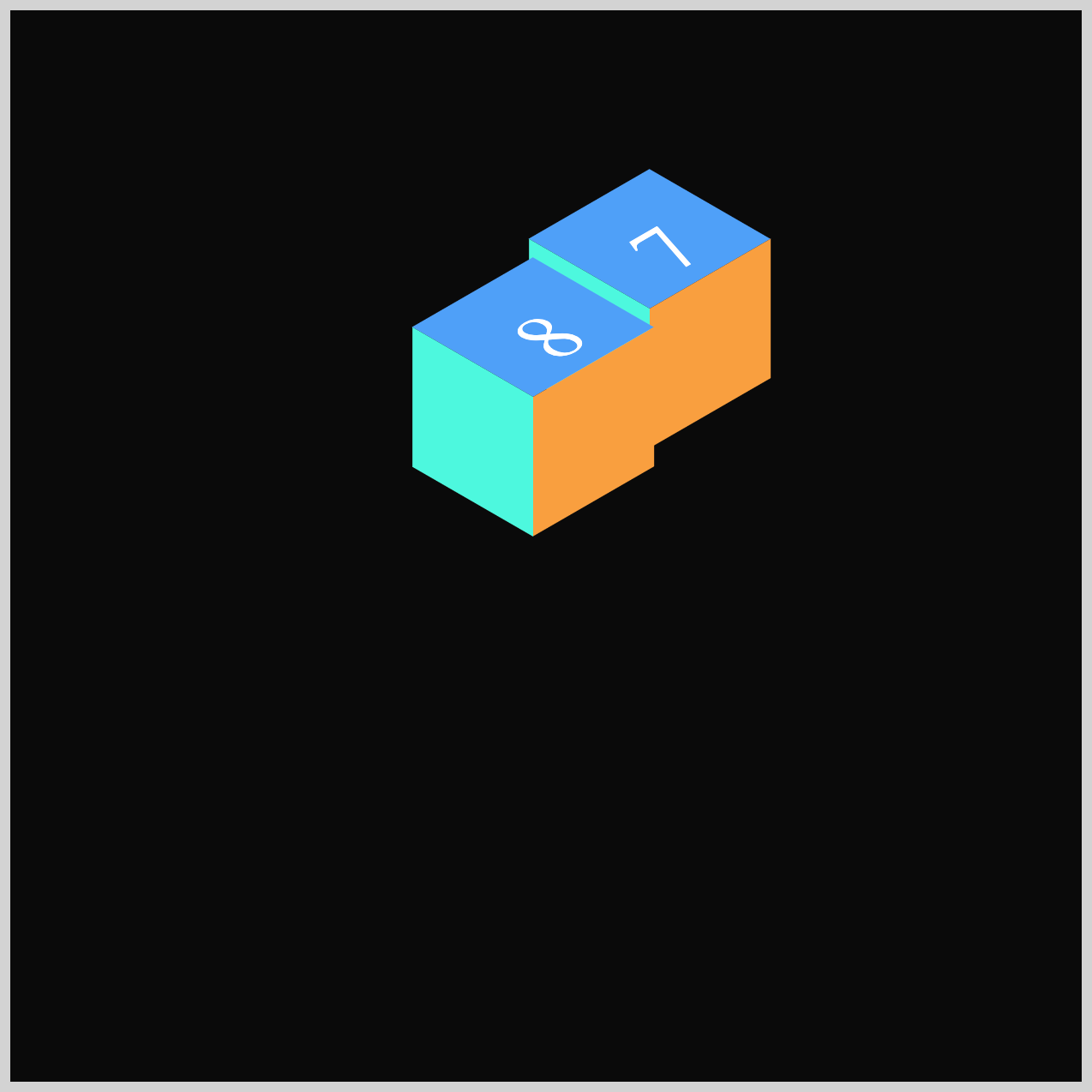
Preview
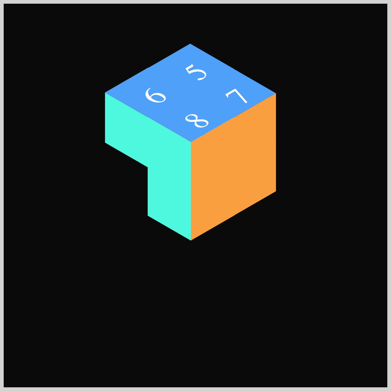
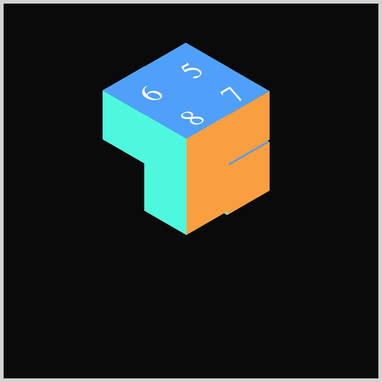
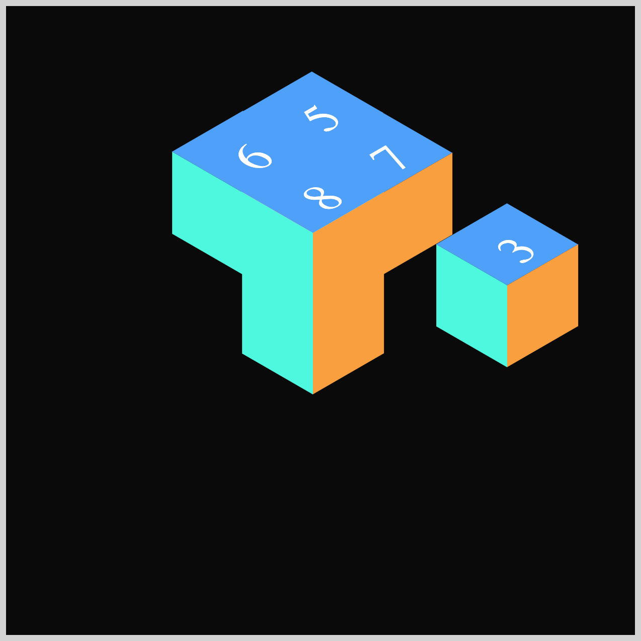
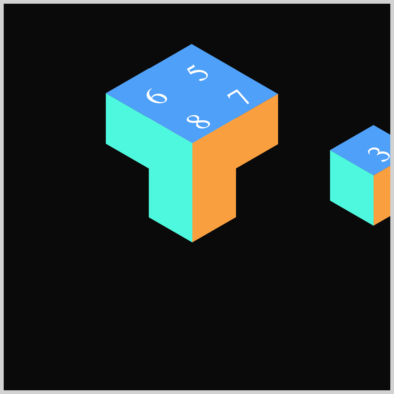
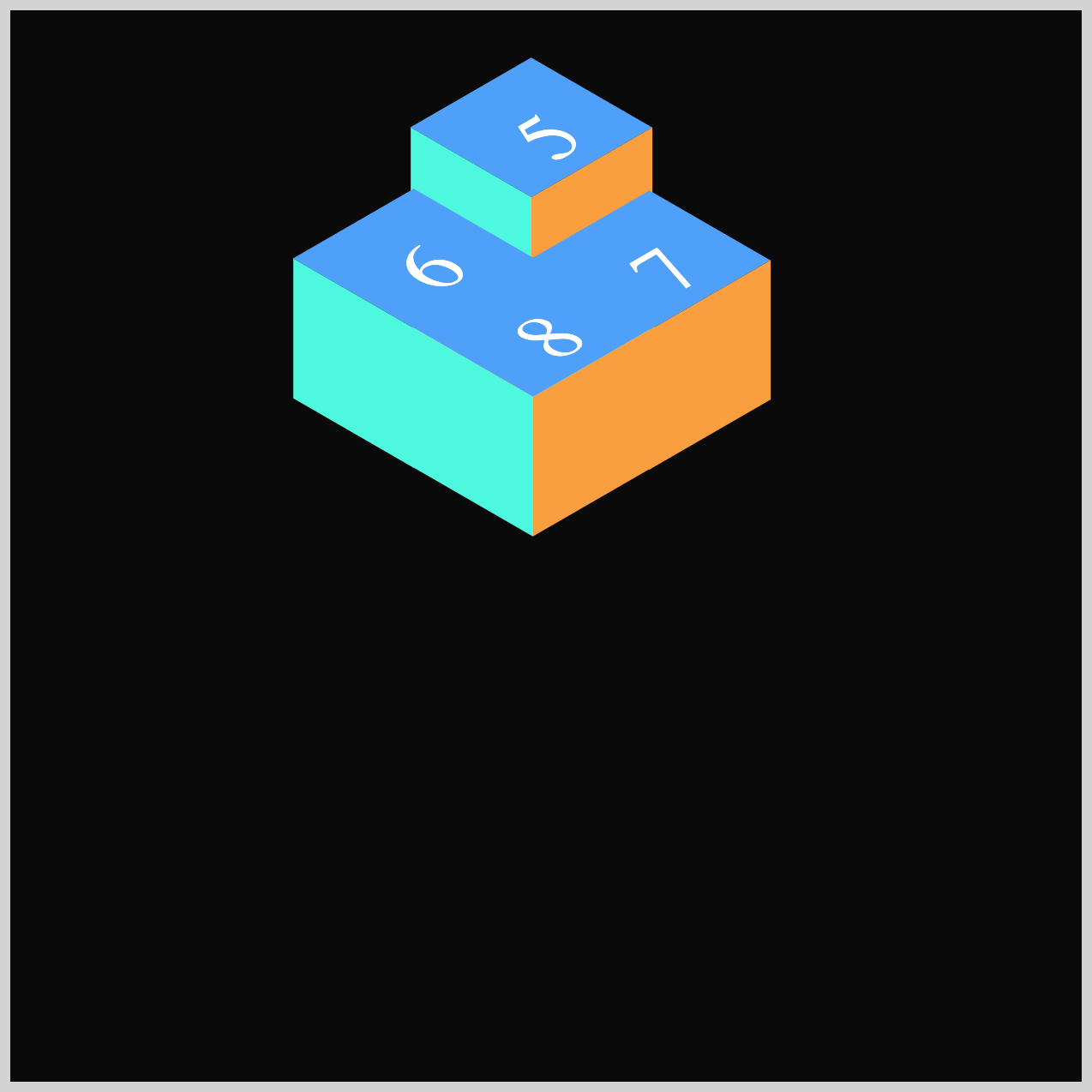
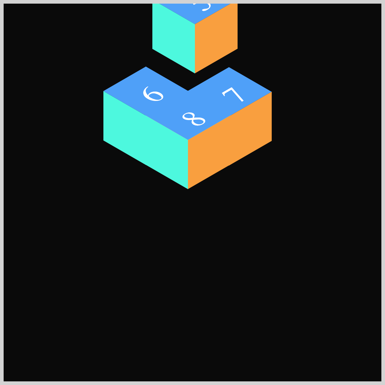
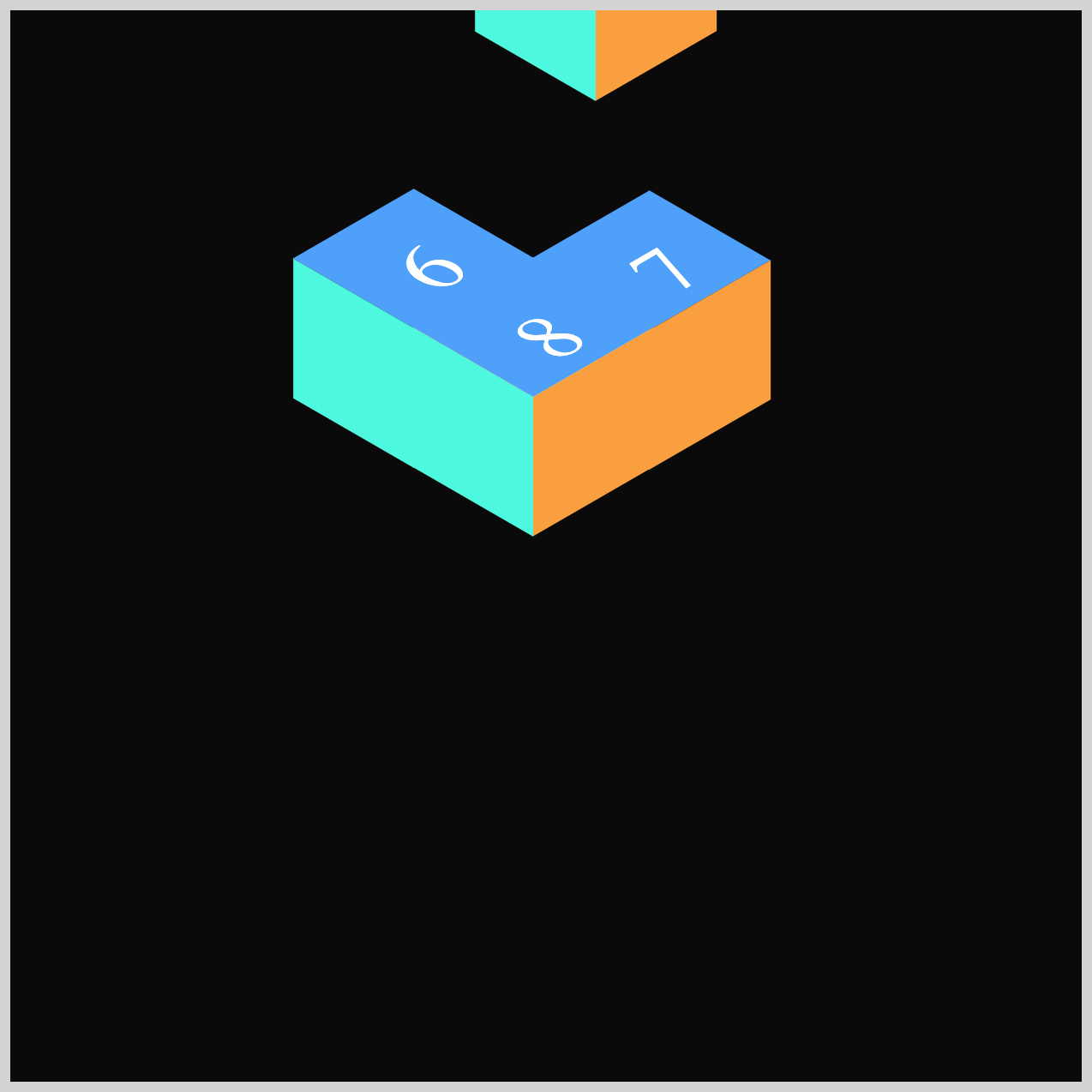
Here’s a quick sneak peek at the burst animation sequence you’ll be creating throughout this two‑part series. By the end, you’ll understand how each piece comes together to form a dynamic, eye‑catching effect.

If you haven’t checked out Part 1 yet, we highly recommend giving it a quick read before diving into Part 2. It covers the core building blocks of the project and gives you the essential foundation you’ll need to follow the animation techniques introduced here easily.
 Pyxofy
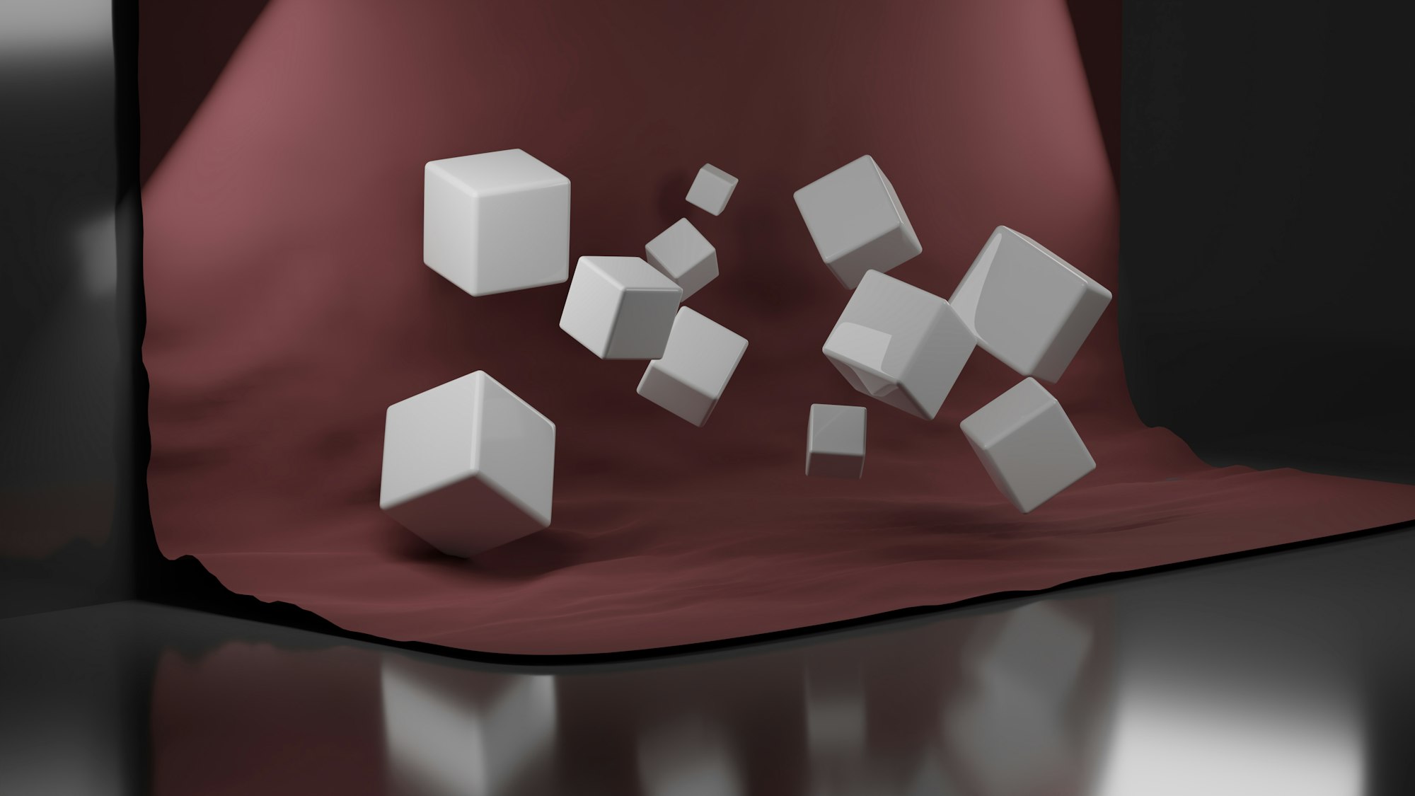
Prerequisites
Essential CSS and HTML knowledge will help you understand the concepts and techniques introduced in this article. Jump over to this article if you require an HTML and CSS primer.
We assume you have configured tools to modify CSS. If not, this article will guide you through the setup process.
Please read this article if you’re unfamiliar with CSS animation and the @keyframes at-rule property.
HTML Structure
<div class="container">
  <div class="floor-opening">
    <div class="opening"></div>
  </div>
  <div class="light-ray-right"></div>
  <div class="light-ray-left"></div>
  <div class="isometric-cubes">
    <div class="isometric-cube-1">
      <div class="isometric-cube-top">1</div>
      <div class="isometric-cube-right"></div>
      <div class="isometric-cube-left"></div>
    </div>
    <div class="isometric-cube-2">
      <div class="isometric-cube-top">2</div>
      <div class="isometric-cube-right"></div>
      <div class="isometric-cube-left"></div>
    </div>
    <div class="isometric-cube-3">
      <div class="isometric-cube-top">3</div>
      <div class="isometric-cube-right"></div>
      <div class="isometric-cube-left"></div>
    </div>
    <div class="isometric-cube-4">
      <div class="isometric-cube-top">4</div>
      <div class="isometric-cube-right"></div>
      <div class="isometric-cube-left"></div>
    </div>
    <div class="isometric-cube-5">
      <div class="isometric-cube-top">5</div>
      <div class="isometric-cube-right"></div>
      <div class="isometric-cube-left"></div>
    </div>
    <div class="isometric-cube-6">
      <div class="isometric-cube-top">6</div>
      <div class="isometric-cube-right"></div>
      <div class="isometric-cube-left"></div>
    </div>
    <div class="isometric-cube-7">
      <div class="isometric-cube-top">7</div>
      <div class="isometric-cube-right"></div>
      <div class="isometric-cube-left"></div>
    </div>
    <div class="isometric-cube-8">
      <div class="isometric-cube-top">8</div>
      <div class="isometric-cube-right"></div>
      <div class="isometric-cube-left"></div>
    </div>
  </div>
</div>
container is the outermost enclosure. It enables the content to be centered and draws a light gray border. The rest of the <div>s represent each animation sequence.
Keep the HTML structure as is for the animation to display correctly.
Body and Container <div> CSS
CSS code for the body and container <div>.
/* Body and Container Settings */
/* Center shapes */
body {
  margin: 0;
  padding: 0;
  height: 100vh;
  display: flex;
  justify-content: center;
  align-items: center;
  flex-wrap: wrap;
}

/* Set background and border color */
.container {
  min-width: 500px;
  height: 500px;
  border: 5px solid lightgray;
  background: #0a0a0a;
  position: relative;
  margin: 5px;
  display: flex;
  justify-content: center;
  align-items: center;
  overflow: hidden;
}
animation-delay
The animation‑delay property in CSS works like a little “waiting timer” for your animation. It tells the browser how long to pause before the animation actually starts. You can write the delay using either seconds (s) or milliseconds (ms).
A positive delay means the animation will wait before it begins.
For example, a delay of 2s means nothing happens for two seconds, and then the animation starts normally. A negative delay, however, works a bit differently. When you use a negative value, the animation begins right away, but it starts as if it has already been running for that amount of time.
If you’d like to dive deeper into how the animation-delay property works, you can check out its page on the Mozilla Developer Network (MDN).
You’ll be using the animation-delay property to create the burst effect for the isometric cubes throughout this article. By giving each cube a slightly different delay, you can make them pop outward one after another, creating a dynamic and visually exciting animation.
Now that you understand the basics, let’s jump into the fun part. In the next section, we’ll start building the Floor Opening animation sequence step by step.
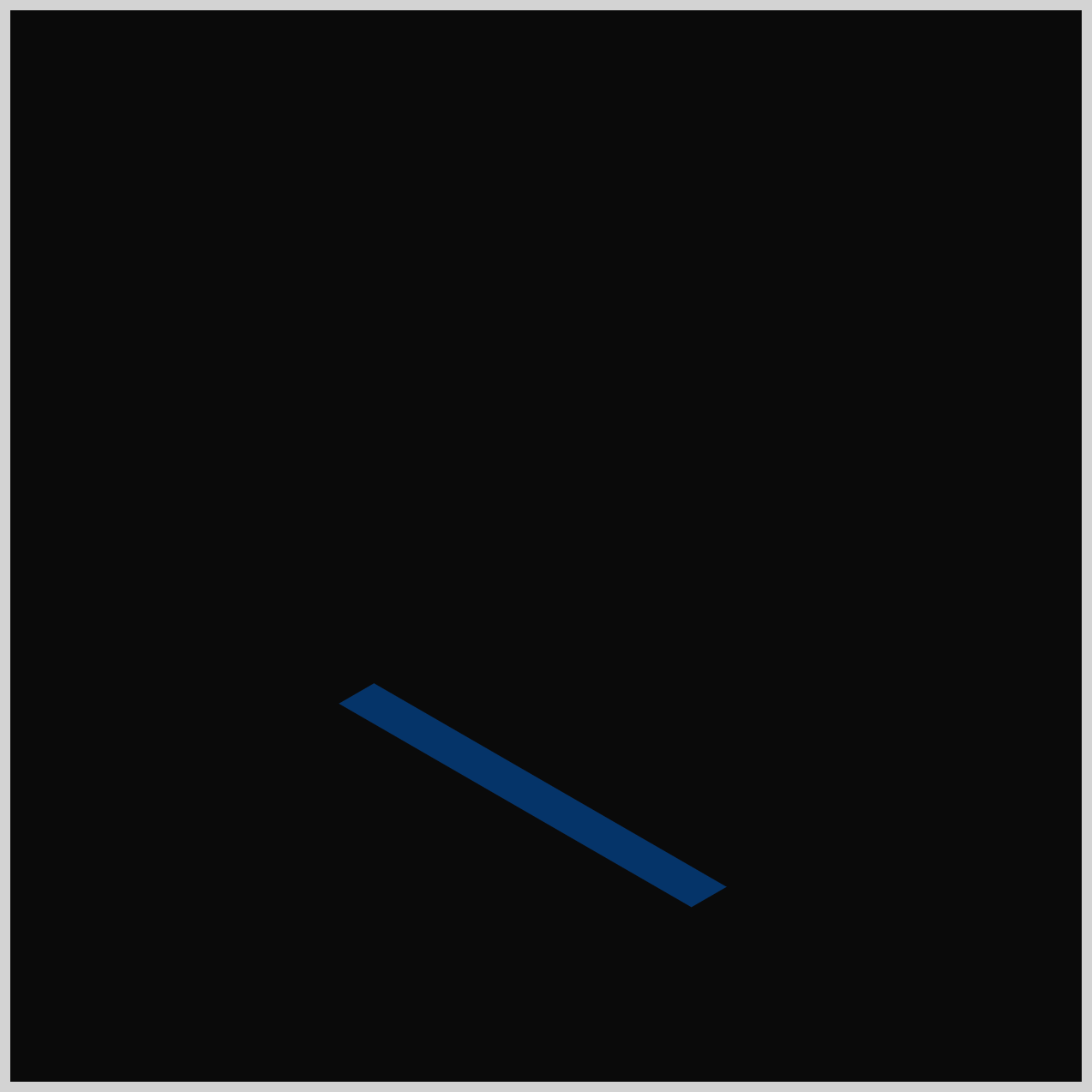
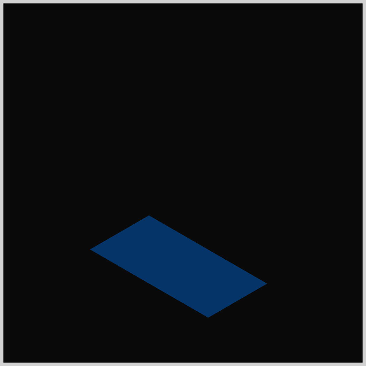
Floor Opening
Before the cubes burst out in all directions, we first need the dramatic entrance. In this section, we’ll create the animated Floor Opening—the portal where all the action begins. Let’s jump in and build it from scratch!
.opening {
  animation: open-close var(--animation-length) ease-in-out
    var(--animation-iteration);
}
- We set the animation name to
open-close, which controls how the Floor Opening behaves. - The animation uses a five‑second duration, defined by
var(--animation-length), and this same timing will be reused for the rest of the animations in this article. - We also apply an
ease-in-outanimation easing so the movement feels smooth at the start and end. - Finally, the animation is set to loop infinitely using
var(--animation-iteration), a value that will also be shared across the other animation sequences.
@keyframes open-close {
  from {
    scale: 1 0;
  }
  10% {
    scale: 1 1;
  }
  15% {
    scale: 1 1;
  }
  50% {
    scale: 1 1;
  }
  70% {
    scale: 1 0;
  }
  to {
    scale: 1 0;
  }
}
scale: 1 0: The width is 100%, but the height is 0. This makes the element completely invisible (like a flat line).scale: 1 1: The width is 100%, and the height is 100%. This makes the element fully visible.
In this animation sequence, the Floor Opening begins completely closed at the from (0%) stage, using scale: 1 0 to make it appear flat and invisible. At the 10% mark, it quickly snaps open to full size with scale: 1 1 and stays open through the halfway point of the animation. Then, starting around 70%, the opening begins to close again, finishing the cycle, fully shut at the to (100%) keyframe.

With the Floor Opening animation in place, it’s time to add a bit of atmosphere. In the next section, we’ll create the Light Rays that shine out from the opening and give the entire scene a dramatic glow. Let’s bring some illumination to the animation!
Light Rays
The Light Rays are made up of two angled panels—one on the right side and one on the left. Each one is slightly transparent, giving the impression of soft light shining upward from deep inside the floor opening.

/* Light Rays */
.light-ray-right {
  animation: light-rays var(--animation-length) ease-in-out
    var(--animation-iteration);
}

.light-ray-left {
  animation: light-rays var(--animation-length) ease-in-out
    var(--animation-iteration);
}
The Light Rays, both the right and left side, use the same animation settings as the Floor Opening component, so their timing, duration, easing, and looping behavior all stay consistent. This keeps the entire scene feeling unified and helps the Light Rays blend naturally into the overall animation sequence.

In the Floor Opening animation, we controlled visibility using the CSS scale property to make the opening stretch open and close. For the Light Rays, we take a different approach. Instead of scaling, we’ll use the opacity property to fade the rays in and out. This gives them a softer, glowing feel—perfect for simulating light shining up from inside the opening.
@keyframes light-rays {
  from {
    opacity: 0;
  }
  20% {
    opacity: 1;
  }
  50% {
    opacity: 1;
  }
  70% {
    opacity: 0;
  }
  to {
    opacity: 0;
  }
}
opacity: 0= The light is completely off (invisible/transparent).opacity: 1= The light is completely on (fully visible).- Any decimal between them (like
0.5) makes it semi-transparent.

from(0%):opacity: 0
The animation starts in complete darkness. The light rays are invisible.20%:opacity: 1
Over the first20%of the time, the light gently fades in until it is at full brightness.50%:opacity: 1
Just like the floor opening, we repeat the value. From20%to50%, we tell the browser, "Keep the lights shining at full brightness! Don't turn them off yet.”70%:opacity: 0
The light slowly fades back into darkness.to(100%):opacity: 0
The light stays off until the 5-second loop starts all over again.

With the Light Rays now complete, your scene is really starting to come alive. Next, we’ll turn our attention to the Isometric Cubes—the stars of the animation. This is where the burst effect truly happens, so let’s jump in and start building the cubes in the following section.
Isometric Cubes
The Isometric Cubes will spring out of the Floor Opening using a combination of the CSS translate and opacity properties. These two together let each cube rise into view and then shoot outward, creating the energetic “jump” effect that brings the animation to life.
/* Isometric Cubes */
.isometric-cubes {
  animation: cubes var(--animation-length) ease-in var(--animation-iteration);
}
For this section, the animation timing function is set to ease-in, giving the cubes a gentle, gradual start as they rise and move outward. All other animation settings match the ones you used earlier for the Floor Opening and Light Rays, keeping the overall motion consistent across the entire scene.
@keyframes cubes {
  from {
    translate: 0 200px;
    opacity: 0;
  }
  15% {
    opacity: 0;
  }
  20% {
    translate: 0 0;
    opacity: 1;
  }
  to {
    translate: 0 0;
    opacity: 1;
  }
}
1.from (0%)
translate: 0 200pxandopacity: 0
The cubes are deep underground and invisible.
2.15%, opacity: 0
- The cubes are still invisible.
3.20%
translate: 0 0andopacity: 1
Between15%and20%, the cubes quickly shoot up to the surface and fade into view.
4.to (100%),
translate: 0 0andopacity: 1
The parent container stays exactly where it is for the rest of the animation.
With the main cube animation in place, it’s time to focus on each individual cube. In the next section, we’ll walk through the specific animation for every cube to complete the full burst effect.
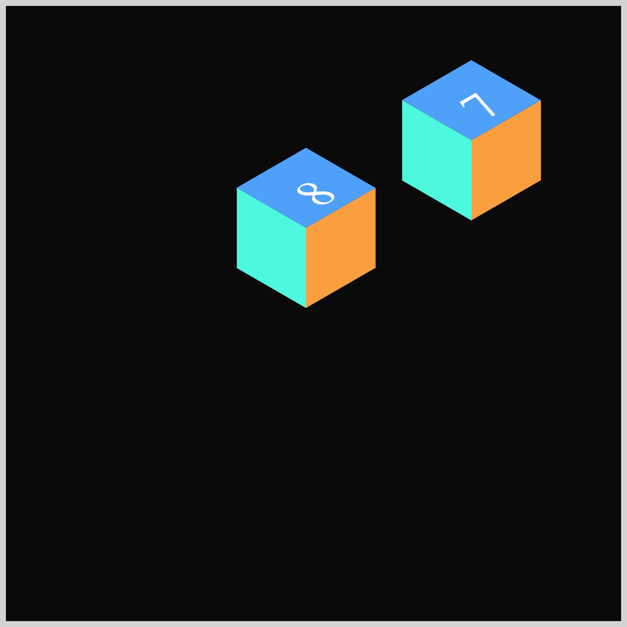
Cube 1
We just saw all the cubes rise together like they were on an elevator. Now, the individual cubes are going to “burst” or fly away from each other. Let’s look at the animation sequence for Cube 1.
.isometric-cube-1 {
  animation: cube-1 var(--animation-length) var(--animation-easing)
    var(--animation-iteration);
}
If you look at the .isometric-cube-1 class, it uses a variable called --animation-easing. That variable equals to cubic-bezier(0.68, -0.11, 0.265, 1).
This is a custom movement Bézier curve. Instead of a simple "start-stop," this specific math makes the cube:
- Pull back slightly (like it's getting ready to jump).
- Shoot forward very fast.
- Slow down gently at the end.
It gives the cube a "bouncy" or "elastic" feeling that looks very professional. This animation easing value will be used for the rest of the individual cubes.
@keyframes cube-1 {
  from {
    translate: 0px 0px;
  }
  60% {
    translate: 0px 0px;
  }
  80% {
    translate: 320px 280px;
  }
  to {
    translate: 320px 280px;
  }
}
from(0%):translate: 0px 0pxand60%:translate: 0px 0px
The values are exactly the same. This is a very important concept in CSS animation called a "Hold." For the first60%of our 5-second movie (which is about 3 seconds), Cube 1 does nothing. It stays exactly at its "home base" (0,0).80%:translate: 320px 280px;
In just 20% of the time (about 1 second), between60%and80%, the cube shoots away. It moves320pxto the right (X-axis) and280pxdown (Y-axis). Because this happens so quickly, it looks like the cube is being pushed or "exploding" out of the center.80%andto(100%):translate: 320px 280px
Again, the values are the same. The cube flies to its new spot and stops there to let the viewer see it before the whole animation restarts from the beginning.
In the next section, we’ll focus on Cube 2, and this is where you’ll learn how to use the CSS animation-delay property in a practical, visual way. By adding a small delay to this cube’s animation, you’ll see how easy it is to make it jump from the Isometric Cube slightly later than the others, helping to create that satisfying staggered burst effect.
Cube 2
Cube 2 will animate toward the lower left‑hand corner, giving the burst sequence a nice sense of motion and direction. To make its movement feel more natural and rhythmic, we’ll use the CSS animation-delay property to start its animation slightly later than the others. This small delay helps the entire burst feel more alive and dynamic.
.isometric-cube-2 {
  animation: cube-2 var(--animation-length) var(--animation-easing)
    var(--animation-iteration) 200ms;
}
To stagger Cube 2’s movement, you simply set its animation-delay to 200ms (0.2 seconds). This tiny delay makes a big difference: Cube 1 bursts out first, and Cube 2 follows just a moment later. The result is a more natural, lively rhythm that enhances the entire burst effect.
@keyframes cube-2 {
  from {
    translate: 0px 0px;
  }
  60% {
    translate: 0px 0px;
  }
  80% {
    translate: -255px 210px;
  }
  to {
    translate: -255px 210px;
  }
}
In Cube 2’s keyframe sequence, the animation begins at the from (0%) stage and stays still through the 60% mark using translate: 0px 0px;, meaning the cube remains in its default position. Between 60% and 80%, the cube finally springs into motion, sliding down toward the lower left corner with translate: -255px 210px;. By the time it reaches the to (100%) keyframe, the cube has arrived at its final resting spot, completing its part of the burst animation.
Cube 2’s animation sequence is now complete, and you’ve seen how timing and delays add life to the burst effect. Up next, we’ll move on to Cube 3 and continue building out the animation in the following section.
Cube 3
Cube 3 will move toward the right‑hand side of the container, giving the burst effect more balance and directional variety. Just like Cube 2, you’ll use the CSS animation-delay property to hold its movement for a moment before it starts. This slight delay helps the animation feel more natural and keeps the overall sequence lively and engaging.
.isometric-cube-3 {
  animation: cube-3 var(--animation-length) var(--animation-easing)
    var(--animation-iteration) 300ms;
}
For Cube 3, the animation-delay is set to 300ms, which means its movement begins even later than Cube 1 and Cube 2. This extra delay adds a nice rhythmic spacing to the burst animation and helps each cube feel like it has its own moment in the sequence.
@keyframes cube-3 {
  from {
    translate: 0px 0px;
  }
  60% {
    translate: 0px 0px;
  }
  80% {
    translate: 270px 10px;
  }
  to {
    translate: 270px 10px;
  }
}
- The animation starts at the
from(0%) stage and stays still all the way through60%, usingtranslate: 0px 0px;to keep the cube in its default position. 60%to80%, the cube finally springs into motion, sliding toward the right‑hand side of the container withtranslate: 270px 10px;.- By the time it reaches the
to(100%) mark, the cube settles into its final position, completing its movement in the burst animation.
Next up is Cube 4, where we’ll continue building out the burst effect and see how another cube adds movement and balance to the animation.
Cube 4
Cube 4 moves straight downward in its animation, helping round out the overall burst and keep the movement feeling balanced. Just like the previous cubes, it uses the CSS animation-delay property to pause briefly before starting, adding a natural rhythm to the sequence.
.isometric-cube-4 {
  animation: cube-4 var(--animation-length) var(--animation-easing)
    var(--animation-iteration) 400ms;
}
For Cube 4, the animation-delay is set to 400ms, giving it a slightly later start than the first three cubes. This additional pause further staggers the animation, adding more rhythm and balance to the overall burst effect.
@keyframes cube-4 {
  from {
    translate: 0px 0px;
  }
  60% {
    translate: 0px 0px;
  }
  80% {
    translate: 10px 330px;
  }
  to {
    translate: 10px 330px;
  }
}
Unlike Cube 3’s sideways motion, Cube 4 travels straight downward using translate: 10px 330px;. The first value (10px) controls the horizontal position along the x‑axis, while the second value (330px) controls the vertical position along the y‑axis. Because the y‑axis value is positive, the cube moves downward, helping add a nice vertical drop to the overall burst effect.
With Cube 4 complete, you’re ready to continue building the burst effect. Let’s move on to Cube 5 in the next section and see how it adds even more motion and variety to the animation.
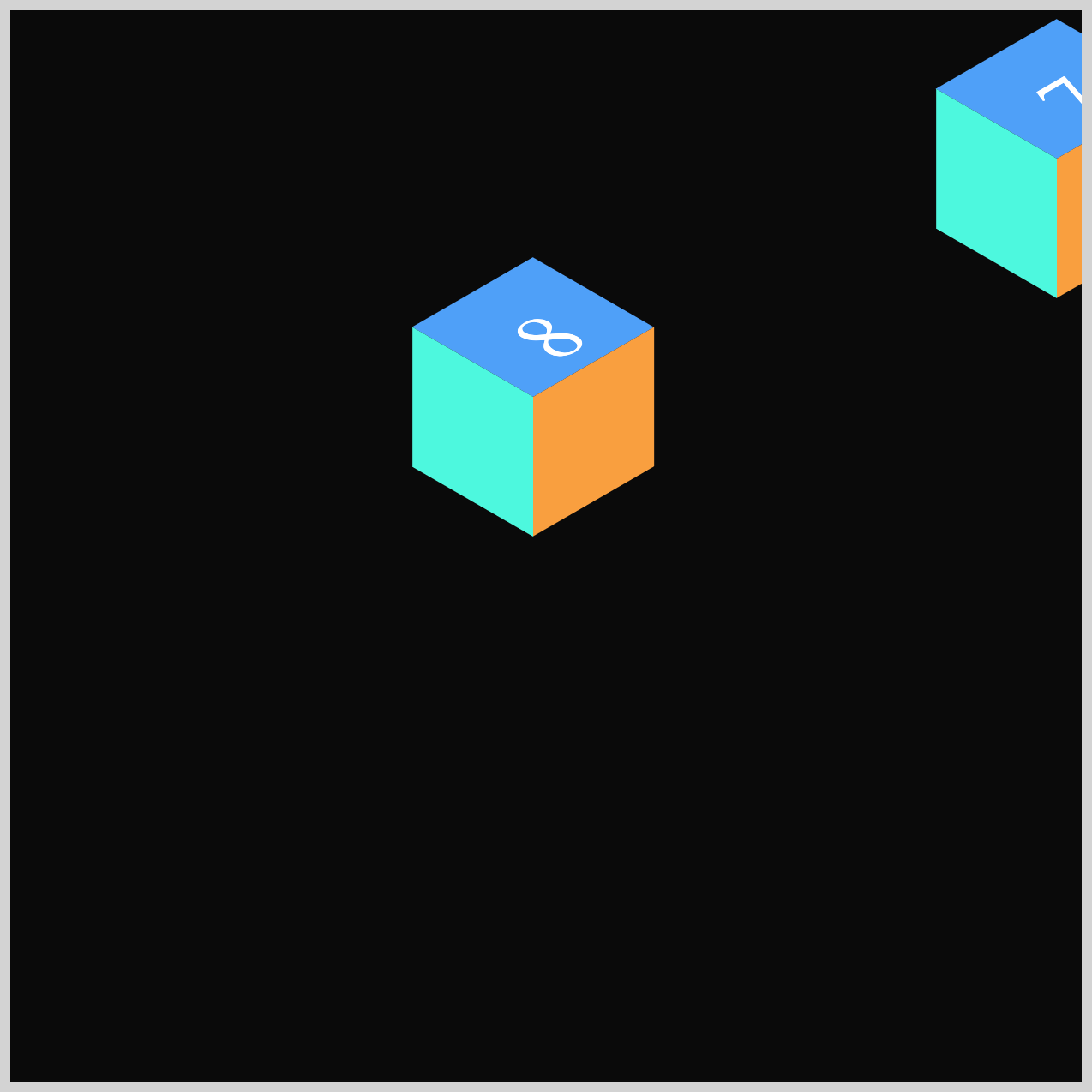
Cube 5
Cube 5 becomes the fifth “pop” in the burst animation sequence, and it takes things in the opposite direction from Cube 4. Instead of dropping downward, Cube 5 shoots upward, adding a nice bit of contrast and helping the overall burst feel more visually diverse.
.isometric-cube-5 {
  animation: cube-5 var(--animation-length) var(--animation-easing)
    var(--animation-iteration) 500ms;
}
For Cube 5, the animation-delay is set to 500ms, meaning it waits a full half‑second before beginning its movement. This brief pause gives the cube a later “pop” in the sequence, helping the burst feel more spaced out and visually exciting.
@keyframes cube-5 {
  from {
    translate: 0px 0px;
  }
  60% {
    translate: 0px 0px;
  }
  80% {
    translate: 30px -190px;
  }
  to {
    translate: 30px -190px;
  }
}
By setting the final position to translate: 30px -190px, Cube 5 moves upward in its animation. The negative value on the y‑axis is what pushes the cube toward the top of the screen. Remember, in web coordinates, the point (0, 0) starts at the top‑left corner of the browser window, so negative y‑values always move elements upward.
Onwards to Cube 6, where we’ll continue expanding the burst effect and add even more variety to the animation. Let’s dive in and see how this next cube contributes to the overall motion of the sequence.
Cube 6
Cube 6 adds a nice sense of symmetry to the burst animation by moving toward the top‑left corner of the container. This direction is the complete opposite of Cube 1, which traveled down to the bottom‑right. The contrast between these two paths helps make the overall burst feel more balanced and visually interesting.
.isometric-cube-6 {
  animation: cube-6 var(--animation-length) var(--animation-easing)
    var(--animation-iteration) 600ms;
}
The burst rhythm keeps building nicely, with each cube firing off in clean 100ms intervals. For Cube 6, the animation-delay is set to 600ms, giving it its own well-timed entrance in the sequence.
@keyframes cube-6 {
  from {
    translate: 0px 0px;
  }
  60% {
    translate: 0px 0px;
  }
  80% {
    translate: -205px -215px;
  }
  to {
    translate: -205px -215px;
  }
}
Cube 6 uses two negative values in its translate property: translate(-205px, -215px). The first value moves the cube left along the x‑axis, and the second value moves it up along the y‑axis. Because both numbers are negative, the cube travels diagonally toward the top‑left corner of the container.
Now that Cube 6 is complete, we’re down to the final two cubes. To keep things concise, we won’t walk through the CSS for Cubes 7 and 8 in detail. Instead, consider them an exciting challenge for you to explore on your own.
Feel free to revisit the explanations for the first six cubes—everything you need to understand Cubes 7 and 8 is already there. Happy decoding!
Cube 7
Cube 7’s animation sends it soaring toward the top‑right corner of the screen, adding even more energy to the outward burst. This movement helps widen the visual spread of the effect, making the overall explosion feel bigger and more dramatic.
.isometric-cube-7 {
  animation: cube-7 var(--animation-length) var(--animation-easing)
    var(--animation-iteration) 700ms;
}
@keyframes cube-7 {
  from {
    translate: 0px 0px;
  }
  60% {
    translate: 0px 0px;
  }
  80% {
    translate: 270px -100px;
  }
  to {
    translate: 270px -100px;
  }
}
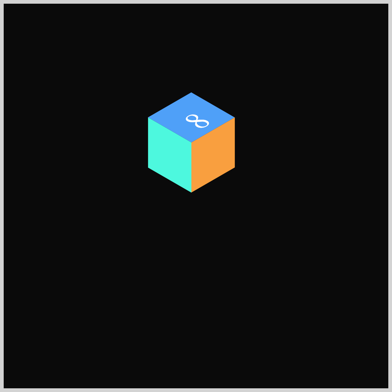
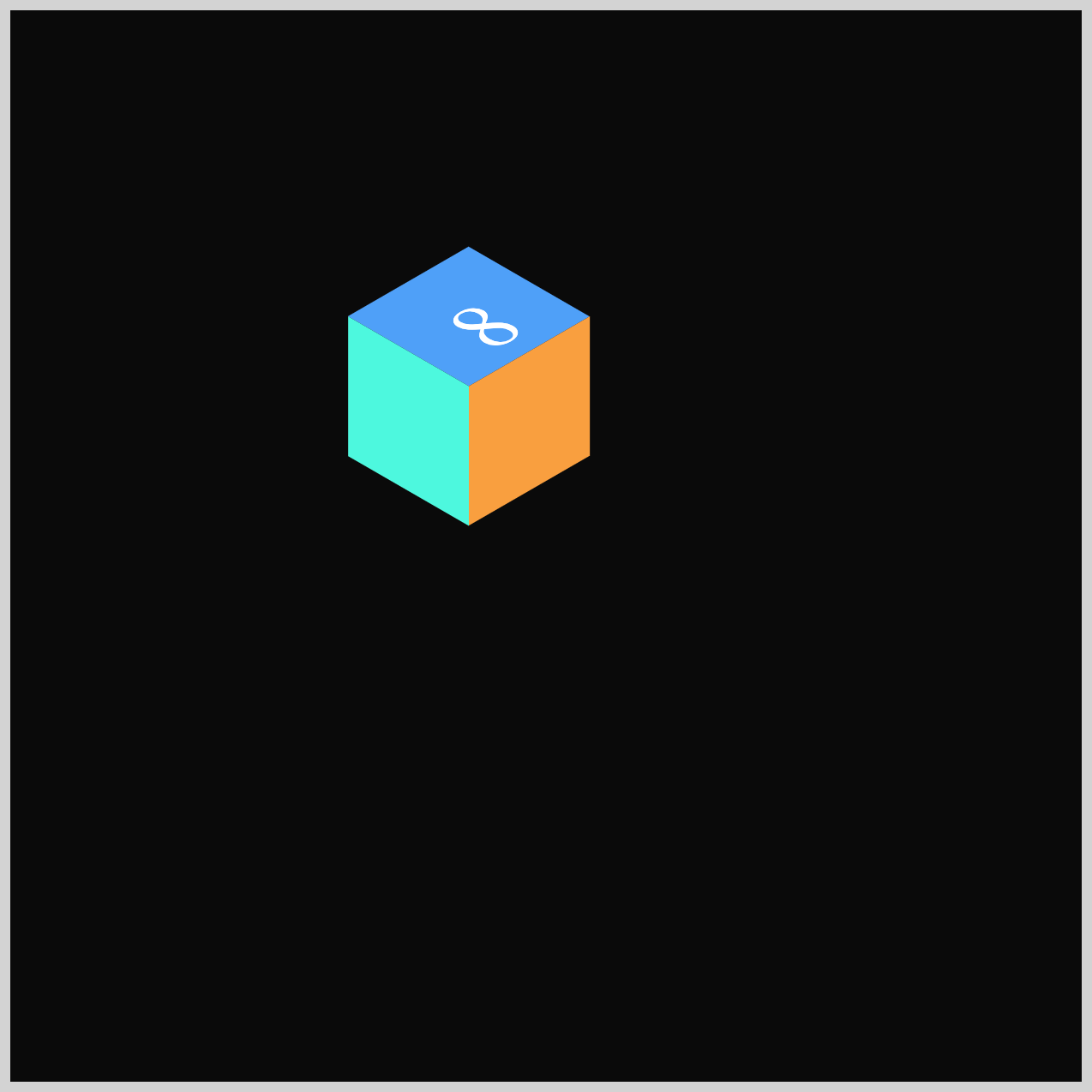
Cube 8
Cube 8 finishes off the burst animation by sliding horizontally to the left. This movement pairs nicely with Cube 3’s motion to the right, creating a clean visual balance and helping the overall burst feel evenly spread across the screen.
.isometric-cube-8 {
  animation: cube-8 var(--animation-length) var(--animation-easing)
    var(--animation-iteration) 800ms;
}
@keyframes cube-8 {
  from {
    translate: 0px 0px;
  }
  60% {
    translate: 0px 0px;
  }
  80% {
    translate: -310px -30px;
  }
  to {
    translate: -310px -30px;
  }
}
You can see and play with the complete code on Pyxofy’s CodePen page.
See the Pen CSS Animation – Burst Effects Using Animation Delays, Transform and Gradients by Pyxofy (@pyxofy) on CodePen.
Conclusion
Throughout this article, you used essential CSS animation tools—translate, opacity, scale, and animation-delay—to create a dynamic and coordinated burst effect.
You also explored how easing functions shape movement and how keyframes define each cube’s journey across the screen. By combining timing, transforms, and repetition, you built a polished isometric animation with clear rhythm and visual balance.
The "secret sauce" is the animation-delay and Cubic-Bézier animation easing, which transitions movements from robotic to natural. Using CSS Variables ensures the timing remains synchronized across multiple elements.
These same techniques can be applied to any interactive or animated scene you create. Share your masterpiece with us on LinkedIn, Threads, Bluesky, Mastodon, X (Twitter) @pyxofy, or Facebook.
We hope you liked this article. Kindly share it with your network. We appreciate it.
Related Articles
 Pyxofy
 Pyxofy
 Pyxofy
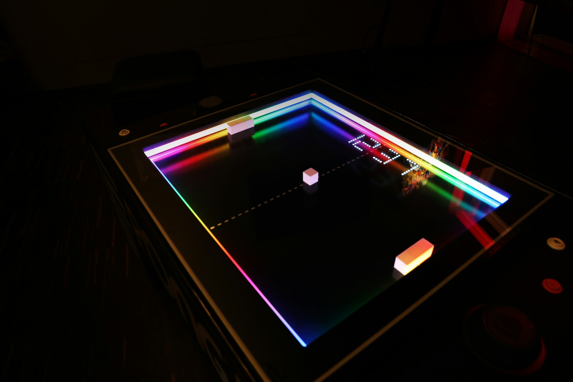
 Pyxofy