CSS Animation – Burst Effects Using Animation Delays, Transform and Gradients - Part 1
Ever wondered how burst animations are made? We break it down step by step so anyone can build one from scratch!

Introduction
Burst effects are exciting, energetic, and instantly eye‑catching—and the great news is that you can create them using only modern CSS. No JavaScript required!
In this two‑part article series, you’ll learn how to create a burst animation using a mix of CSS properties and functions.
- Part 1—this article—walks you through building the base elements: the isometric cubes, the light rays, and the floor opening.
- Part 2 will show you how to bring these pieces to life by adding animation using scale, opacity, and animation delays to simulate a dynamic burst effect.
CSS properties and functions that will be introduced in this article:
- Attribute Selectors
- CSS Custom Properties (Variables)
linear-gradient()transformcubic-bezier()topandleftwriting-mode
Preview
Here’s a quick preview of the burst animation sequence you’ll be creating throughout this two‑part article series.


Prerequisites
Essential CSS and HTML knowledge will help you understand the concepts and techniques introduced in this article. Jump over to this article if you require an HTML and CSS primer.
We assume you have configured tools to modify CSS. If not, this article will guide you through the setup process.
Please read this article if you’re unfamiliar with CSS animation and the @keyframes at-rule property.
HTML Structure
<div class="container">
  <div class="floor-opening">
    <div class="opening"></div>
  </div>
  <div class="light-ray-right"></div>
  <div class="light-ray-left"></div>
  <div class="isometric-cubes">
    <div class="isometric-cube-1">
      <div class="isometric-cube-top">1</div>
      <div class="isometric-cube-right"></div>
      <div class="isometric-cube-left"></div>
    </div>
    <div class="isometric-cube-2">
      <div class="isometric-cube-top">2</div>
      <div class="isometric-cube-right"></div>
      <div class="isometric-cube-left"></div>
    </div>
    <div class="isometric-cube-3">
      <div class="isometric-cube-top">3</div>
      <div class="isometric-cube-right"></div>
      <div class="isometric-cube-left"></div>
    </div>
    <div class="isometric-cube-4">
      <div class="isometric-cube-top">4</div>
      <div class="isometric-cube-right"></div>
      <div class="isometric-cube-left"></div>
    </div>
    <div class="isometric-cube-5">
      <div class="isometric-cube-top">5</div>
      <div class="isometric-cube-right"></div>
      <div class="isometric-cube-left"></div>
    </div>
    <div class="isometric-cube-6">
      <div class="isometric-cube-top">6</div>
      <div class="isometric-cube-right"></div>
      <div class="isometric-cube-left"></div>
    </div>
    <div class="isometric-cube-7">
      <div class="isometric-cube-top">7</div>
      <div class="isometric-cube-right"></div>
      <div class="isometric-cube-left"></div>
    </div>
    <div class="isometric-cube-8">
      <div class="isometric-cube-top">8</div>
      <div class="isometric-cube-right"></div>
      <div class="isometric-cube-left"></div>
    </div>
  </div>
</div>
container is the outermost enclosure. It enables the content to be centered and draws a light gray border. The rest of the <div>s represent each animation sequence.
Keep the HTML structure as is for the animation to display correctly.
Body and Container <div> CSS
CSS code for the body and container <div>.
/* Body and Container Settings */
/* Center shapes */
body {
  margin: 0;
  padding: 0;
  height: 100vh;
  display: flex;
  justify-content: center;
  align-items: center;
  flex-wrap: wrap;
}

/* Set background and border color */
.container {
  min-width: 500px;
  height: 500px;
  border: 5px solid lightgray;
  background: #0a0a0a;
  position: relative;
  margin: 5px;
  display: flex;
  justify-content: center;
  align-items: center;
  overflow: hidden;
}
Common Properties
To keep your code clean and easy to work with, we’re going to group CSS properties that appear often. This helps you avoid repeating the same styles everywhere and makes your CSS much simpler to update later.
/* Common Properties */
.floor-opening,
.opening,
.light-ray-right,
.light-ray-left,
.isometric-cubes,
[class^="isometric-cube"] {
  position: absolute;
}
1.position: absolute;: Lets you place each component precisely within the cube’s container.
2.[class^="isometric-cube"]
- The
[]brackets mean “target elements based on an attribute”. classis the attribute we’re checking.^=means “starts with”."isometric-cube"is the text pattern we’re matching.
The attribute selector above is useful when you want to style several HTML elements at once. In this case, it lets you target elements like isometric-cubes, isometric-cube-1, or isometric-cube-top without repeating your CSS.
Cube Numbers
To make it easy to tell which isometric cube block is which, you’ll add the cube number inside the isometric-cube-top div element. The example below shows how it works for Cube 1. Please repeat the same pattern for all eight cubes.
<div class="isometric-cube-1">
  <div class="isometric-cube-top">1</div>
</div>
The CSS below will make the cube numbers white and set their font size to 30 points, so they’re easy to see.
.isometric-cube-top  {
 /* Isometric Cube Number Properties */
  writing-mode: vertical-lr;
  text-align: center;
  font-size: 30pt;
  color: white;
}
Custom Properties
Just like we did with the common CSS properties above, creating your own color palette with CSS Custom Properties (also called variables) can really speed up your workflow. With this setup, you can change a color or an animation setting in one place instead of searching through your entire stylesheet—making updates faster, easier, and far less frustrating.
/* Custom Properties */
:root {
  /* Colors */
  --cube-top-color: #4fa0f8;
  --cube-right-color: #f99f3e;
  --cube-left-color: #4ff8de;
  --opening-color: #043468;

  /* Cube Animation Properties */
  --animation-length: 5s;
  --animation-easing: cubic-bezier(0.68, -0.11, 0.265, 1);
  --animation-iteration: infinite;
}
Cube colors:
#4fa0f8: light blue.#f99f3e: orange.#4ff8de: teal#043468: dark navy
Cube animation properties:
- Five seconds or
5sis set as the animation length. - The animation easing function is set to
cubic-bezier(0.68, -0.11, 0.265, 1). - The animation loops infinitely with
infiniteset as the animation iteration value.
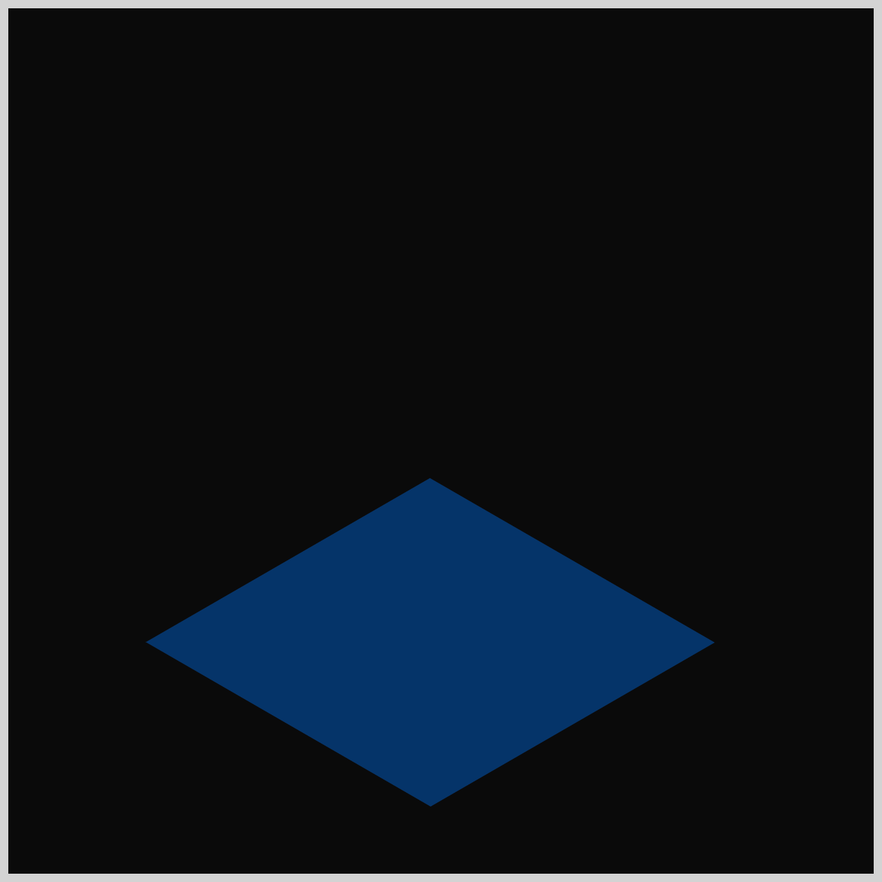
Floor Opening
The Floor Opening component starts as a simple square image. To turn it into a diamond shape, you’ll use the CSS transform property. This lets you rotate the square so it appears as a diamond image.
Make sure to pay attention to the HTML structure: the opening element must sit inside the floor-opening element.
<div class="floor-opening">
  <div class="opening"></div>
</div>
This nesting is important because it ensures that styles and positioning work as they’re supposed to.
/* Floor Opening */
.floor-opening {
  top: 461px;
  left: 244px;
  transform: rotate(210deg) skewX(-30deg) scaleY(0.864);
}
.floor-opening is a container element, and you’ll use it to control both position and the isometric angles. Think of it as the “frame” that helps you place the Floor Opening exactly where it needs to go in your layout.
top: 461px; and left: 244px; properties set the offset position of the element from the top left corner.
Let’s walk through each transform property functions.
1.rotate(210deg)
- Spins the element around the transform origin (center by default).
210degis a clockwise rotation (because CSS uses clockwise positive angles).
2.skewX(-30deg)
- Slants the element horizontally (along the X axis).
- Negative angle skews in the opposite direction.
3.scaleY(0.864)
- Stretches/squashes the element vertically (along the Y axis).
0.864means the height becomes 86.4% of the original (slightly squashed).
.opening {
  width: 190px;
  height: 190px;
  background: var(--opening-color);
}
The .opening element is the actual square image visually shown on the screen. It’s sized at 190px by 190px, and it gets its dark background color from the variable var(--opening-color).
Now that we’ve finished this part, let’s move on and build the Light Ray components in the next section.
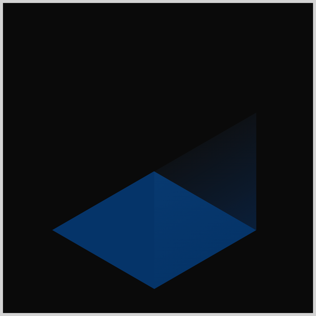
Light Rays
The Light Rays are made up of two parts: one on the right side and one on the left side. To create the glowing effect, you’ll use the CSS linear-gradient() function, which smoothly transitions from a solid base color into full transparency.
/* Light Rays */
.light-ray-right {
  width: 190px;
  height: 190px;
  top: 224px;
  left: 231px;
  background: linear-gradient(0deg, #0434687f, #4fa0f80c);
  transform: rotate(-30deg) skewX(-30deg) scaleY(0.864);
}
- The right light ray is a
190pxby190pxsquare and positioned224pxfrom the top and231pxfrom the left side. - The gradient blends from semi‑transparent navy at the bottom,
#043468,7f= alpha (about 50% opacity), to a very transparent light blue at the top,#4fa0f8,0c= very low opacity (5%).
Let’s break down transform: rotate(-30deg) skewX(-30deg) scaleY(0.864)
1.rotate(-30deg)
- Rotates the square counter-clockwise by 30° (negative values rotate counter-clockwise).
2.skewX(-30deg)
- Slants the shape along the X-axis (horizontal skew).
3.scaleY(0.864)
- Squashes the height to 86.4% of its size.
Together, these produce a “ray” that looks angled and perspective‑like—great for isometric effects or pseudo‑3D scenes.
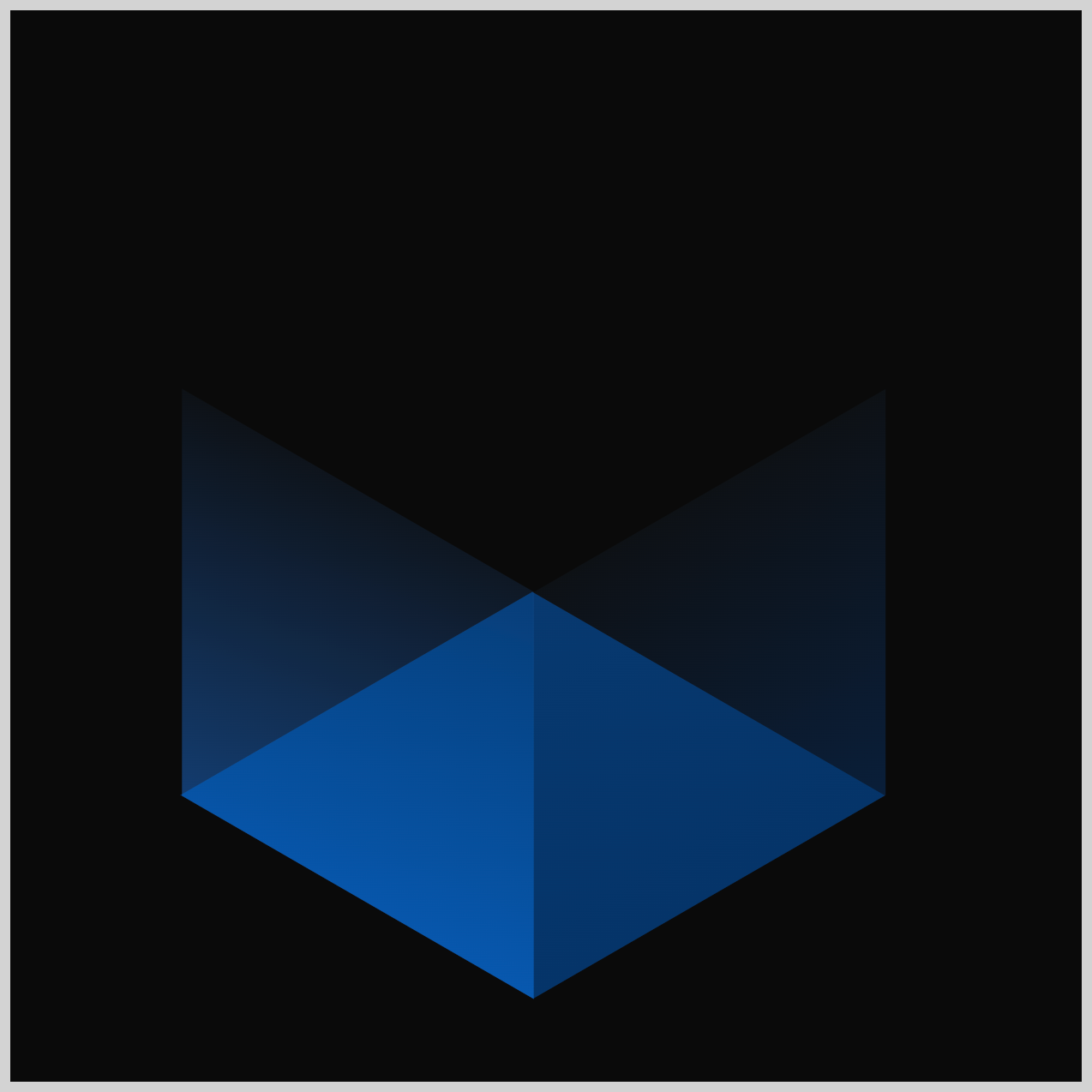
.light-ray-left {
  width: 190px;
  height: 190px;
  top: 224px;
  left: 67px;
  background: linear-gradient(260deg, #0d7df57f, #4fa0f80c);
  transform: rotate(90deg) skewX(-30deg) scaleY(0.864);
}
The left light ray is simply a mirrored version of the right one. Its color gradient starts with #0d7df57f, which is a medium blue at about 50% opacity, and fades into #4fa0f80c, a lighter blue at around 5% opacity. This smooth transition helps create that soft, glowing light effect.
The transform rotation is set to 90deg, and the rest of the values are the same as the ones you used for the right light ray.
Next, we’ll move on to building the Cube Parts.
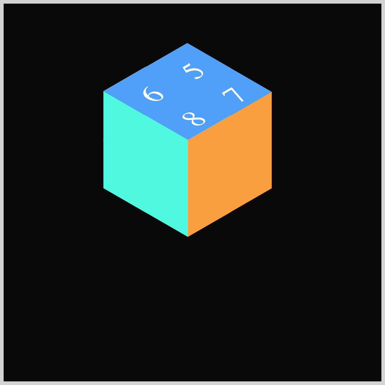
Isometric Cube Parts
In this section, you’ll create three parts (faces) of the isometric cube. First, you’ll build the top surface, and then you’ll add the right and left sides. Keep in mind that this section uses the same transform values you applied earlier in the Floor Opening and the Right/Left Light Rays components. So if those made sense, you’re already familiar with what’s happening with the shape transformations.

/* Isometric Cube Parts */
.isometric-cube-top {
  width: 65px;
  height: 65px;
  background: var(--cube-top-color);
  transform-origin: 0 0;
  transform: rotate(210deg) skewX(-30deg) scaleY(0.864);
}
The Cube Top starts out as a 65px by 65px square with a light blue background set by var(--cube-top-color). Its transform-origin is set to 0 0, which makes the transformations pivot from the top‑left corner.
The remaining cube parts use the same square size and the same transform-origin values as the Cube Top, so you’ll follow the same structure for each one.

.isometric-cube-right {
  width: 65px;
  height: 65px;
  background: var(--cube-right-color);
  transform-origin: 0 0;
  transform: rotate(-30deg) skewX(-30deg) scaleY(0.864);
}
The background color is an orange hue, set using var(--cube-right-color).
.isometric-cube-left {
  width: 65px;
  height: 65px;
  transform-origin: 0 0;
  background: var(--cube-left-color);
  transform: rotate(90deg) skewX(-30deg) scaleY(0.864);
}
A teal color is set as the background with var(--cube-left-color).
Now that all the Cube Parts are finished, we can start arranging them so they come together as a full isometric cube.
Isometric Cubes Layout
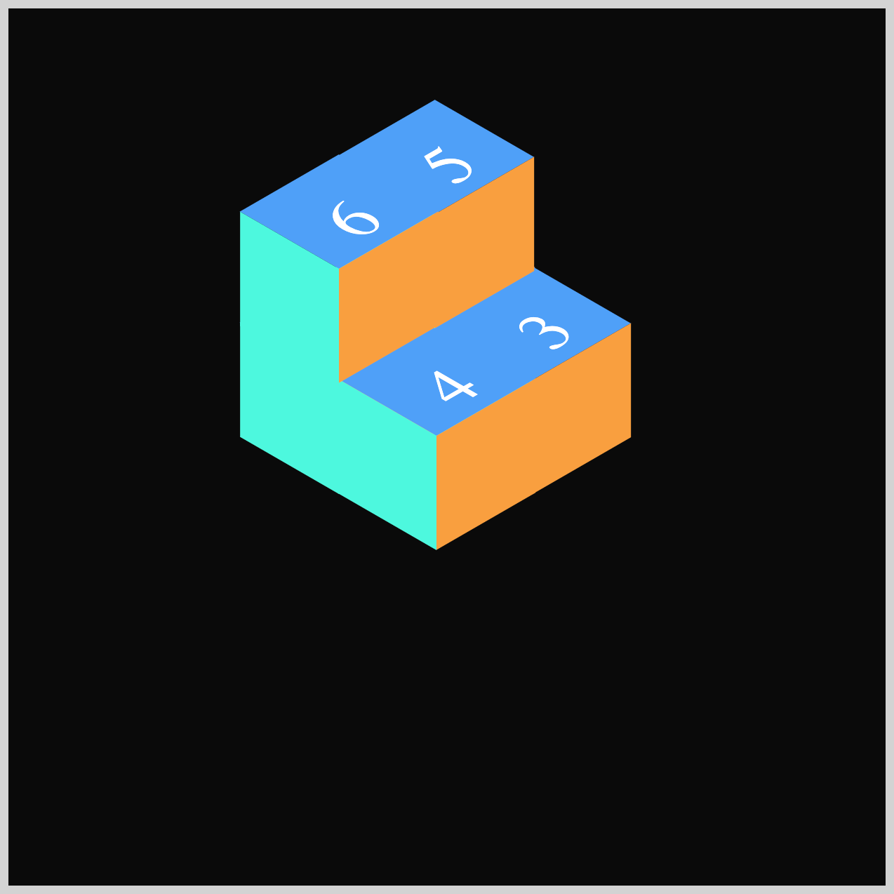
For the final section, you’ll arrange eight mini cubes, so they come together and look like one seamless isometric cube.
You’ll use the HTML structure shown below to position each mini cube correctly and build the full isometric layout.
<div class="isometric-cubes">
  <div class="isometric-cube-1">
    <div class="isometric-cube-top">1</div>
    <div class="isometric-cube-right"></div>
    <div class="isometric-cube-left"></div>
  </div>
</div>
1..isometric-cubes: A container that holds one or more cubes.
2..isometric-cube-1: One cube instance (you can duplicate this for more cubes).
Inside the .isometric-cube-1, three faces:
.isometric-cube-top, the top face (diamond)..isometric-cube-right, the right face..isometric-cube-left, the left face.
/* Isometric Cubes */
.isometric-cubes {
  top: 180px;
  left: 243.5px;
}
The .isometric-cubes container is positioned 180px from the top and 243.5px from the left. This spot becomes the top‑left reference point for placing all the mini cubes that follow, helping everything line up perfectly.
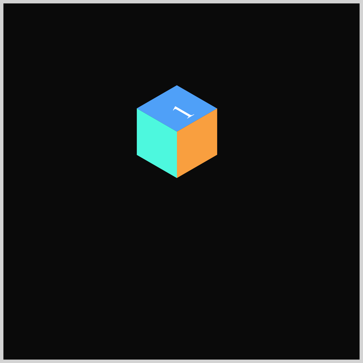
.isometric-cube-1 {
  top: 0px;
  left: 0px;
}
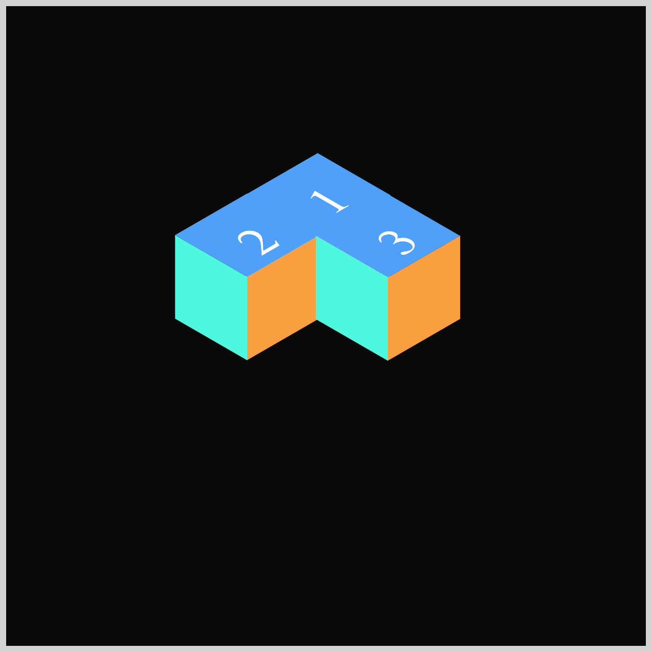
Cube 1 is placed at the starting point, which is 0px from the top and 0px from the left.
.isometric-cube-2 {
  top: 31.5px;
  left: -55px;
}
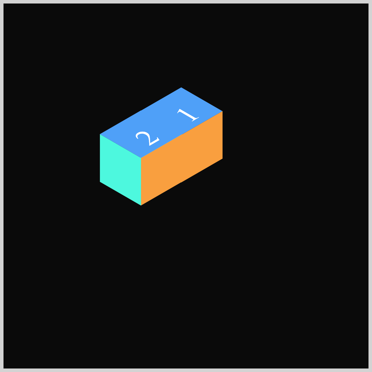
Cube 2 is positioned to the left side of Cube 1 using top: 31.5px; and left: -55px;.
.isometric-cube-3 {
  top: 32px;
  left: 55px;
}
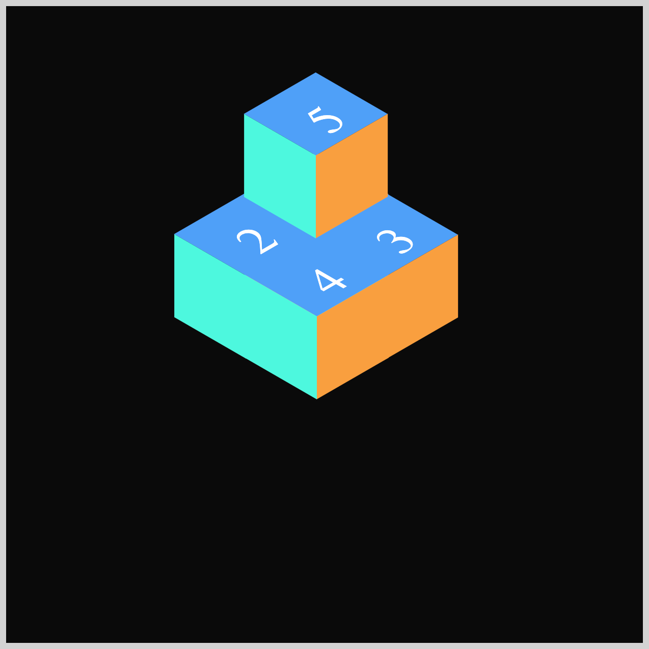
Cube 3 sits to the bottom right side of Cube 1 using top: 32px; and left: 55px;.

.isometric-cube-4 {
  top: 63.5px;
  left: 0.5px;
}
Cube 4 is placed directly below Cube 1, using top: 63.5px and left: 0.5px to position it in the correct spot.
.isometric-cube-5 {
  top: -63px;
  left: -0.5px;
}
Using top: -63px; and left: -0.5px;, Cube 5 is stacked on top of Cube 1.
.isometric-cube-6 {
  top: -31.5px;
  left: -55px;
}
Cube 6 is positioned on top of Cube 2 with top: -31.5px; and left: -55px;.

.isometric-cube-7 {
  top: -31px;
  left: 55px;
}
Cube 7 is placed on the bottom right side of Cube 5 using top: -31px;, left: 55px;.
.isometric-cube-8 {
  top: 0.5px;
  left: 0.5px;
}
With top: 0.5px; and left: 0.5px;, Cube 8 is placed below Cube 5.
All the mini cubes are now arranged in a way that brings them visually together as one cohesive isometric cube.
You can see and play with the complete code on Pyxofy’s CodePen page.
See the Pen CSS Animation – Burst Effects Using Animation Delays, Transform and Gradients by Pyxofy (@pyxofy) on CodePen.
Conclusion
In Part 1 of this two‑part article, you learned how to build the base visuals—like the isometric cubes, the floor opening, and the light rays—by combining several CSS properties and functions.
You used CSS transform to rotate, skew, and squash simple squares into isometric angles, and applied CSS linear gradients to give each piece more depth and a subtle 3D feel. You also discovered how attribute selectors and CSS custom properties (variables) help you reduce repetition and keep your styles cleaner.
In Part 2, you’ll take everything a step further by adding animation delays to create a dynamic burst effect. Until then, keep practicing your CSS skills and share your masterpiece with us on LinkedIn, Threads, Bluesky, Mastodon, X (Twitter) @pyxofy, or Facebook.
We hope you liked this article. Kindly share it with your network. We appreciate it.
Related Articles
 Pyxofy
 Pyxofy
 Pyxofy
 Pyxofy