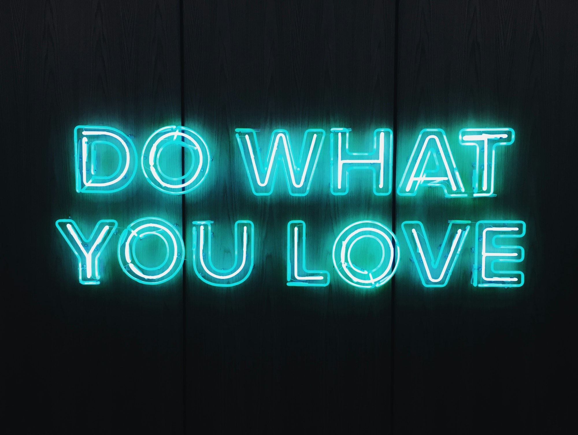
CSS Art – Neon Sign
Once upon a time, before LEDs, gas-powered neon signs illuminated our cityscapes. Join us! Learn how to make one in this step-by-step article.
Introduction
Neon signs are bright, colorful and designed with tons of creativity.
In this article, you will use the CSS box-shadow, drop-shadow(), and text-shadow to make shapes and text glow. You will also learn how to use polygon() and path() functions to make advanced CSS shapes step-by-step.
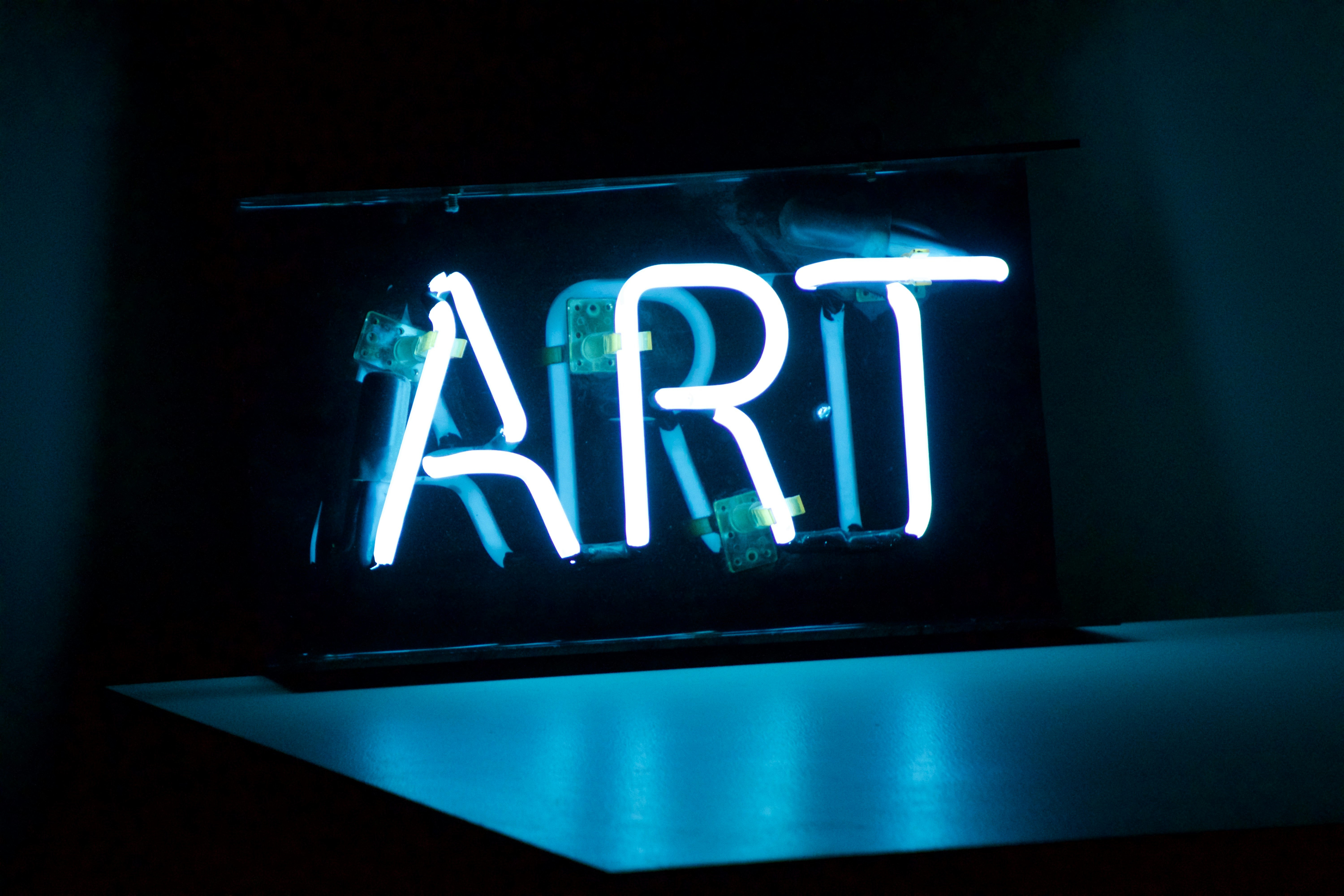
Preview

The neon sign has three components:
- The circle
- Tokyo Tower image
- Tokyo text
Tokyo Tower image inspired by Fuhito Takase.
Prerequisites
Essential CSS and HTML knowledge will help you understand the concepts and techniques introduced in this article. Jump over to this article if you require an HTML and CSS primer.
We assume that you have set up tools to manipulate CSS. If you haven’t, this article will show you how to set them up.
HTML Structure
<div class="container">
  <!-- Neon Sign -->
  <div class="circle"></div>
  <div class="tokyo-tower">
    <div class="antenna"></div>
    <div class="decks"></div>
    <div class="spire-shadow">
      <div class="spire-border"></div>
      <div class="spire-inset"></div>
      <div class="spire"></div>
    </div>
    <div class="base-spire-shadow">
      <div class="base-spire-border"></div>
      <div class="base-spire-inset"></div>
      <div class="base-spire"></div>
    </div>
    <div class="arch"></div>
    <div class="base"></div>
  </div>
  <div class="tokyo-text">
    <span>T</span>
    <span>O</span>
    <span>K</span>
    <span>Y</span>
    <span>O</span>
  </div>
</div>
container is the outermost enclosure. It enables the content to be centered and draws a light gray border. The rest of the divs represent each image component.
Keep the HTML structure as is for the image to display correctly.
Body and Container Div CSS
CSS code for the body and container div.
/* Body and Container Settings */
/* Center shapes */
body {
  margin: 0;
  padding: 0;
  height: 100vh;
  display: flex;
  justify-content: center;
  align-items: center;
  flex-wrap: wrap;
}

/* Set background and border color */
.container {
  min-width: 500px;
  height: 500px;
  border: 5px solid lightgray;
  background: black;
  position: relative;
  margin: 5px;
  display: flex;
  justify-content: center;
  align-items: center;
  overflow: hidden;
}
Circle
First up is the circle. To make the circle and the rest of the components pop, we use a black background.

Let’s make a square with a white border.

/* Circle */
.circle {
  position: absolute;
  width: 450px;
  height: 435px;
  top: 24px;
  left: 20px;
  background: black;
  border: solid 2px white;
}
The square has a width of 450px and a height of 435px. It’s positioned 24px from the top and 20px from the left. It has a black background, and you give it a white border with border: solid 2px white.

You use border-radius: 50% to round up the square borders to a circle.
Now that we have a circle, let’s work on the neon glow effect. You will use multiple box-shadow properties to create the neon glow.
The outer glow
0 0 10px #ff4f00
International orange0 0 15px #f5d8ca
Light beige
The inner glow (inset)
inset 0 0 10px #ff4f00
Inset international orangeinset 0 0 15px #f5d8ca
Inset light beige
The outer and inner glow patterns will be used throughout the image components in this article. You can dive deep into creating shadows with this article.
 Pyxofy

.circle {
  box-shadow: 0 0 10px #ff4f00;
}
You make the first shadow using box-shadow: 0 0 10px #ff4f00, which creates an orange ring around the circle.

.circle {
  box-shadow: 0 0 10px #ff4f00, 0 0 15px #f5d8ca;
}
Next, add the light beige shadow. To add multiple shadows, you use a comma, ,. After the international orange shadow, add the light beige, 0 0 15px #f5d8ca, shadow. Make sure to separate each property value with a comma so they display correctly.
Let’s work on the inset shadow.

.circle {
  box-shadow: 0 0 10px #ff4f00, 0 0 15px #f5d8ca, inset 0 0 10px #ff4f00;
}
Inset shadows are drawn inside the object, in this instance, a circle, instead of outside the object. To switch a shadow to inset mode, you type the keyword inset before the shadow property value. Add the international orange inset shadow using inset 0 0 10px #ff4f00.

.circle {
  box-shadow: 0 0 10px #ff4f00, 0 0 15px #f5d8ca, inset 0 0 10px #ff4f00, inset 0 0 15px #f5d8ca;
}
The last shadow will be an inset light beige shadow. You add it with this CSS property value inset 0 0 15px #f5d8ca.
Full Circle CSS Code
/* Circle */
.circle {
  position: absolute;
  width: 450px;
  height: 435px;
  top: 24px;
  left: 20px;
  background: black;
  border: solid 2px white;
  border-radius: 50%;
  box-shadow: 0 0 10px #ff4f00, 0 0 15px #f5d8ca, inset 0 0 10px #ff4f00, inset 0 0 15px #f5d8ca;
}
We’ve completed the circle. Let’s work on the Tokyo Tower image in the next section.
Tokyo Tower
The Tokyo Tower image will have multiple components:
- Antenna
- Spire
- Decks
- Base Spire
- Arch
- Base

.tokyo-tower {
  position: absolute;
  width: 273px;
  height: 376px;
  top: 38px;
  left: 112px;
}
First, you position the Tokyo Tower 38px from the top and 112px from the left. You give it a width of 273px and a height of 376px.
Antenna
Similar to the previous section’s circle component, the antenna will have an outer and inner shadow (inset).

")
.antenna {
  position: absolute;
  width: 21px;
  height: 15px;
  top: 83px;
  left: 124px;
  background: black;
  border: solid 2px white;
  box-shadow: 0 0 7px #ff4f00, 0 0 12px #f5d8ca, inset 0 0 5px #ff4f00, inset 0 0 6px #f5d8ca;
}
Let’s add the antennal pole next.

.antenna::before {
  content: "";
  position: absolute;
  width: 4px;
  height: 79px;
  top: -83px;
  left: 6px;
  background: black;
  border: solid 2px white;
  box-shadow: 0 0 7px #ff4f00, 0 0 12px #f5d8ca, inset 0 0 5px #ff4f00, inset 0 0 6px #f5d8ca;
}
Using the CSS pseudo-element ::before, you add the antenna pole using the above CSS code.

.antenna::after {
  content: "";
  position: absolute;
  width: 10px;
  height: 33px;
  top: -49px;
  left: 3px;
  background: black;
  border: solid 2px white;
  box-shadow: 0 0 7px #ff4f00, 0 0 12px #f5d8ca, inset 0 0 5px #ff4f00, inset 0 0 6px #f5d8ca;
}
For the last antenna component, the CSS pseudo-element is used again, but this time you use ::after.
In the next section, let’s make the decks.
Decks
The Tokyo Tower has two decks. The Main Deck, at 150 meters (490 ft), and a smaller Top Deck, at 249.6 meters (819 ft).

.decks {
  position: absolute;
  width: 34px;
  height: 34px;
  top: 106px;
  left: 118px;
  background: black;
  border: solid 2px white;
  box-shadow: 0 0 7px #ff4f00, 0 0 12px #f5d8ca, inset 0 0 5px #ff4f00, inset 0 0 6px #f5d8ca;
}
The top deck is a simple square and is located below the antenna.

.decks::before {
  content: "";
  position: absolute;
  width: 93px;
  height: 34px;
  top: 114px;
  left: -32px;
  background: black;
  border: solid 2px white;
  box-shadow: 0 0 7px #ff4f00, 0 0 12px #f5d8ca, inset 0 0 5px #ff4f00, inset 0 0 6px #f5d8ca;
}
The main deck is a horizontally elongated rectangle. Both the top deck and main deck have the outer and inner shadow (inset) applied to make it glow.
In the next section, let’s make the spire.
Spire
The spire is made using the CSS polygon() function. The polygon() function doesn’t support box-shadow.
To work around this, we have to do a couple of things:
- Enclose the spire objects with a separate HTML
divto applydrop-shadow().
HTML Structure
<div class="spire-shadow">
	<div class="spire-border"></div>
    <div class="spire-inset"></div>
    <div class="spire"></div>
</div>
- Make a white “border” shape.
- Make an international orange “inset” shape.
- Make the black “spire” shape.

.spire-border {
  position: absolute;
  width: 51px;
  height: 71px;
  top: 147px;
  left: 111px;
  background: white;
  clip-path: polygon(20% 0%, 80% 0%, 100% 100%, 0% 100%);
}
The spire shape is an elongated trapezoid. Read this article for a detailed explanation of how to make shapes with the polygon() function.
Pyxofy

.spire-inset {
  position: absolute;
  width: 45px;
  height: 67px;
  top: 149px;
  left: 114px;
  background: #dd6840;
  clip-path: polygon(20% 0%, 80% 0%, 100% 100%, 0% 100%);
}
The spire inset shape is a slightly smaller trapezoid compared to the border.

.spire-inset {
  filter: blur(7px);
}
You add a 7px blur to the spire inset shape to simulate a box-shadow inset effect.

.spire {
  position: absolute;
  width: 39px;
  height: 63px;
  top: 151px;
  left: 117px;
  background: black;
  clip-path: polygon(20% 0%, 80% 0%, 100% 100%, 0% 100%);
  filter: blur(10px);
}
The spire is the smallest trapezoid shape. A 10px blur effect is added to make the inset effect more pronounced.

.spire-shadow {
  filter: drop-shadow(0 0 7px #ff4f00) drop-shadow(0 0 12px #f5d8ca);
}
Multiple CSS drop-shadow property values are used to give the spire a glow effect. Read this article to learn the difference between drop-shadow and box-shadow.
PyxofyOk, let’s make the base spire in the following section.
Base Spire
The base spire is made using the CSS path() function. Similar to the CSS polygon() function, it doesn’t support inset shadow. As mentioned in the previous section, we have to make separate border, inset, and base spire shapes.

.base-spire-border {
  position: absolute;
  width: 233px;
  height: 100px;
  top: 263px;
  left: 20px;
  background: white;
  clip-path: path("M 0,100 Q 52,70 77,0 L 156,0 Q 181,70 237,102 Z");
}
If you’re not familiar with making shapes with path(), jump over to this article.
Pyxofy

.base-spire-inset {
  position: absolute;
  width: 233px;
  height: 100px;
  top: 263px;
  left: 20px;
  background: #ad5b43;
  clip-path: path("M 8,98 Q 53,70 79,2 L 154,2 Q 180,70 226,98 Z");
  filter: blur(7px);
}

.base-spire {
  position: absolute;
  width: 233px;
  height: 100px;
  top: 263px;
  left: 20px;
  background: black;
  clip-path: path("M 15,96 Q 55,70 81,5 L 152,5 Q 178,70 218,96 Z");
  filter: blur(15px);
}

.base-spire-shadow {
  filter: drop-shadow(0 0 7px #ff4f00) drop-shadow(0 0 12px #f5d8ca);
}
You’ve completed the base spire. Let’s make the arch in the next section.
Arch
The arch is a rectangle whose upper left and right corner border radius is modified to resemble a semicircle.

.arch {
  position: absolute;
  width: 120px;
  height: 55px;
  top: 317px;
  left: 76px;
  background: black;
  border: solid 2px white;
  border-radius: 60px 60px 0px 0px;
}
You use the CSS border-radius property to make the semicircle shape. You set 60px to both the upper right and left border radius.
 shadows")
.arch {
  box-shadow: 0 0 7px #ff4f00, 0 0 12px #f5d8ca, inset 0 0 5px #ff4f00, inset 0 0 6px #f5d8ca;
}
Similar to the other components, you set an outer and inner (inset) shadow to the arch.
Let’s complete the Tokyo Tower image in the next section.
Base
The base shapes are rectangles positioned on the left and right sides of the arch.

.base {
  position: absolute;
  width: 61px;
  height: 11px;
  top: 361px;
  left: 14px;
  background: black;
  border: solid 2px white;
  box-shadow: 0 0 7px #ff4f00, 0 0 12px #f5d8ca, inset 0 0 5px #ff4f00, inset 0 0 6px #f5d8ca;
}
.base::before {
  content: "";
  position: absolute;
  width: 61px;
  height: 11px;
  top: -2px;
  left: 178px;
  background: black;
  border: solid 2px white;
  box-shadow: 0 0 7px #ff4f00, 0 0 12px #f5d8ca, inset 0 0 5px #ff4f00, inset 0 0 6px #f5d8ca;
}
The Tokyo Tower image is complete. Next, let’s work on the Tokyo text in the last section.
Tokyo Text
This section teaches you how to style Tokyo text to look like a neon sign. Before tackling the Tokyo text CSS, ensure that the HTML code is formatted as follows.
<div class="tokyo-text">
  <span>T</span>
  <span>O</span>
  <span>K</span>
  <span>Y</span>
  <span>O</span>
</div>
Each text should be inside a span element. This makes it easier to style and manipulate.
Let’s import the Tilt Neon Google Font.
/* Google Font Import */
@import url("https://fonts.googleapis.com/css2?family=Tilt+Neon&display=swap");
Put the above CSS code at the very top of your CSS file. This ensures that the font is imported correctly.

/* Tokyo */
.tokyo-text {
  position: absolute;
  width: 276px;
  height: 55px;
  top: 420px;
  left: 112px;
  background: black;
  border-radius: 5px;
}
The above code formats the Tokyo text background. It gives it a black background and rounds all border radius to 5px.

.tokyo-text {
  display: flex;
  align-items: center;
  justify-content: space-between;
  font-family: "Tilt Neon", sans-serif;
  color: white;
  font-size: 56px;
}
To use the imported font, you set font-family to "Tilt Neon" and use sans-serif as a backup. You want each text to be centered and evenly distributed within its container. To achieve this, you use the CSS properties display: flex, align-items: center, and justify-content: space-between. The font color is set to white, and the size is set to 56px.
You will set three shadows to give the text a neon glow.
- Blue
- Orange
- Light blue

.tokyo-text {
  text-shadow: 0 0 20px #2c84fb;
}
The first shadow is a blue shade, #2c84fb.

.tokyo-text {
  text-shadow: 0 0 20px #2c84fb, 0 0 40px #ff4f00;
}
Using #ff4f00, we add the orange shadow.

.tokyo-text {
  text-shadow: 0 0 20px #2c84fb, 0 0 40px #ff4f00, 0 0 100px #85b4f6;
}
The final light blue shadow is added with #85b4f6. Make sure to separate each entry with a comma.
You can see and play with the complete code on Pyxofy’s CodePen page.
See the Pen CSS Art - Neon Sign by Pyxofy (@pyxofy) on CodePen.
Conclusion
In this article, you learned how to combine multiple outer and inner inset shadows to simulate a neon glow effect. You learned the differences between CSS box-shadow and drop-shadow shadow properties.
You made advanced shapes using the polygon() and path() CSS functions. You also learned how to import and use Google Fonts. You used the CSS text-shadow property to make the Tokyo text glow.
We hope this article inspired you to create CSS art. Share your masterpiece with us on LinkedIn, Threads, Mastodon, X (Twitter) @pyxofy or Facebook.
We hope you liked this article. Kindly share it with your network. We appreciate it.
Related Articles
Pyxofy