CSS Art – Using translate, top, and left Properties to Achieve 3D Effects with 2D Positioning
Unlock precise design control. Master CSS positioning using the translate property and grouping HTML elements using classes with us, step by step

Introduction
Learning how to position and group HTML elements is a fundamental skill in web development. In this article, you’ll discover how to group elements using HTML classes and control their layout with CSS positioning. You’ll also explore how to move elements using the translate property, giving you greater control over your designs.
CSS properties and functions you’ll be learning in this article:
transformtopandlefttranslaterotate()skew()scale()- CSS Custom Properties (Variables)
Preview
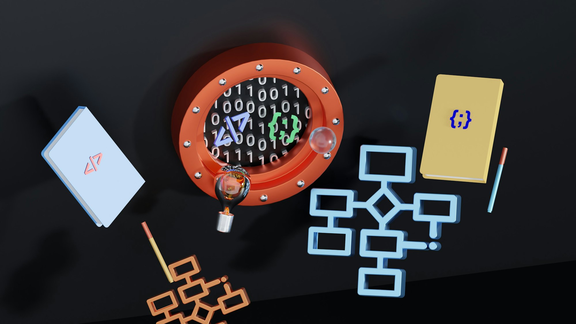
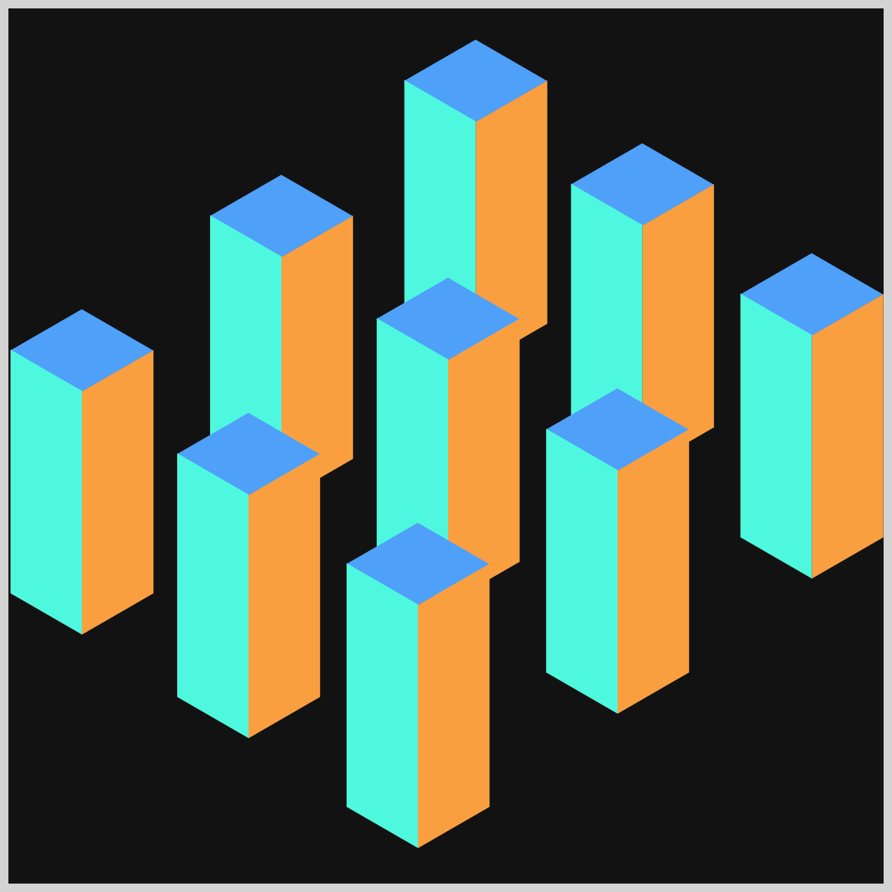
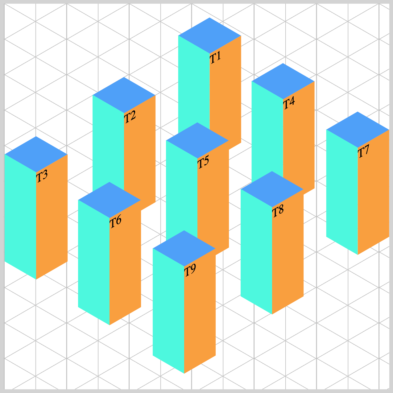
You’ll learn how to make three groups using HTML classes in combination with CSS properties.


Prerequisites
Essential CSS and HTML knowledge will help you understand the concepts and techniques introduced in this article. Jump over to this article if you require an HTML and CSS primer.
We assume you have configured tools to modify CSS. If not, this article will guide you through the setup process.
HTML Structure
<div class="container">
  <div class="group-1">
    <div class="tower-1 split-right">
      <div class="isometric-tower-top"></div>
      <div class="isometric-tower-right"></div>
      <div class="isometric-tower-left"></div>
    </div>
    <div class="tower-2 split-middle">
      <div class="isometric-tower-top"></div>
      <div class="isometric-tower-right"></div>
      <div class="isometric-tower-left"></div>
    </div>
    <div class="tower-3 split-left">
      <div class="isometric-tower-top"></div>
      <div class="isometric-tower-right"></div>
      <div class="isometric-tower-left"></div>
    </div>
  </div>
  <div class="group-2">
    <div class="tower-4 split-right">
      <div class="isometric-tower-top"></div>
      <div class="isometric-tower-right"></div>
      <div class="isometric-tower-left"></div>
    </div>
    <div class="tower-5 split-middle">
      <div class="isometric-tower-top"></div>
      <div class="isometric-tower-right"></div>
      <div class="isometric-tower-left"></div>
    </div>
    <div class="tower-6 split-left">
      <div class="isometric-tower-top"></div>
      <div class="isometric-tower-right"></div>
      <div class="isometric-tower-left"></div>
    </div>
  </div>
  <div class="group-3">
    <div class="tower-7 split-right">
      <div class="isometric-tower-top"></div>
      <div class="isometric-tower-right"></div>
      <div class="isometric-tower-left"></div>
    </div>
    <div class="tower-8 split-middle">
      <div class="isometric-tower-top"></div>
      <div class="isometric-tower-right"></div>
      <div class="isometric-tower-left"></div>
    </div>
    <div class="tower-9 split-left">
      <div class="isometric-tower-top"></div>
      <div class="isometric-tower-right"></div>
      <div class="isometric-tower-left"></div>
    </div>
  </div>
</div>
container is the outermost enclosure. It enables the content to be centered and draws a light gray border. The rest of the <div>s represent each image component.
Keep the HTML structure as is for the image to display correctly.
Body and Container <div> CSS
CSS code for the body and container <div>.
/* Body and Container Settings */
/* Center shapes */
body {
  margin: 0;
  padding: 0;
  height: 100vh;
  display: flex;
  justify-content: center;
  align-items: center;
  flex-wrap: wrap;
}

/* Set background and border color */
.container {
  width: 500px;
  height: 500px;
  border: 5px solid lightgray;
  background: #121212;
  position: relative;
  margin: 5px;
  display: flex;
  justify-content: center;
  align-items: center;
}
Organizing Shared CSS Styles
To keep your code clean and maintainable, we’ll consolidate common CSS properties. This helps reduce repetition and makes it easier to manage your styles as your project grows.
/* Common Properties */
.group-1,
.group-2,
.group-3,
.split-right,
.split-middle,
.split-left,
.isometric-tower-top,
.isometric-tower-right,
.isometric-tower-left {
  position: absolute;
  transform-origin: 0 0;
}
position: absolute;
Lets you place each image element precisely within the container.transform-origin: 0 0;
Sets the transform anchor to the top-left. This makes isometric rotations/translations more predictable because everything pivots from a common corner.
Creating a Custom Color Palette
Just like with common properties, defining a custom color palette using CSS variables (Custom Properties) streamlines your workflow. This makes it easy to update colors—such as those for our isometric towers—without hunting through your code for every instance.
/* Custom Properties */
:root {
  /* Cube Colors */
  --cube-top-color: #4fa0f8;
  --cube-right-color: #f99f3e;
  --cube-left-color: #4ff8de;
}
Tower colors:
#4fa0f8is a vibrant sky blue with a strong, cool tone.#f99f3eis an orange with strong golden undertones.#4ff8deis a bright aqua or turquoise color with a cool, tropical feel.
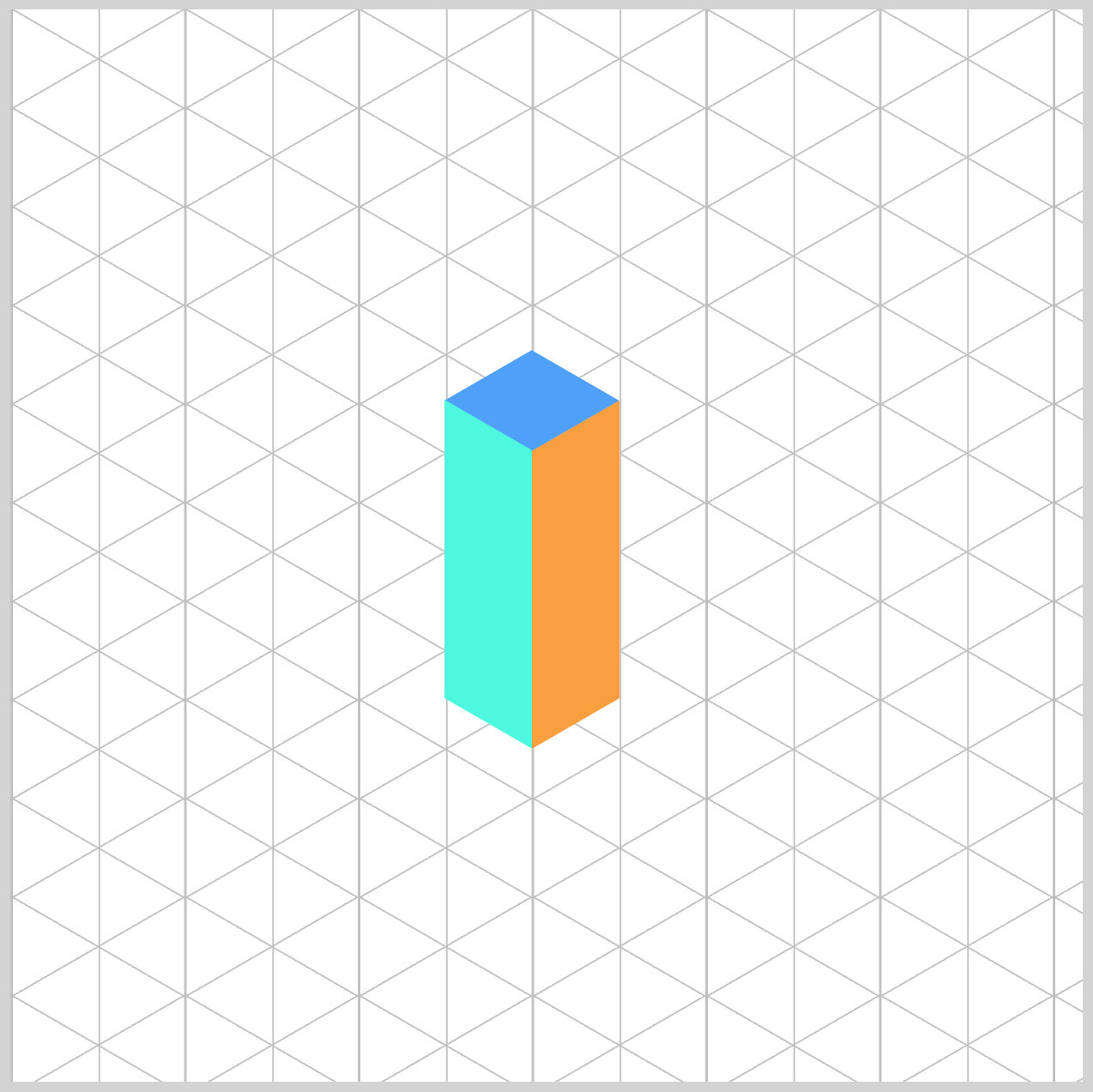
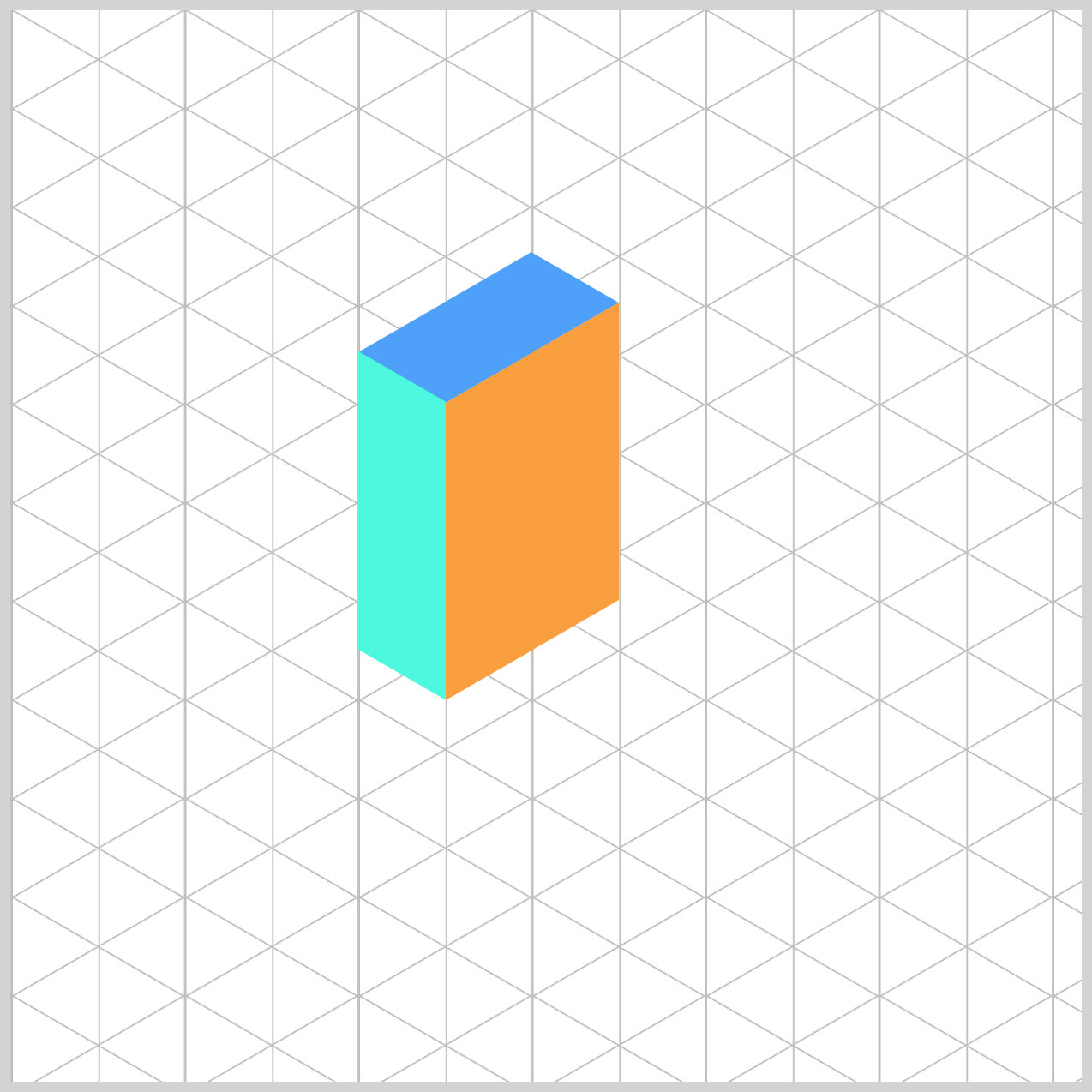
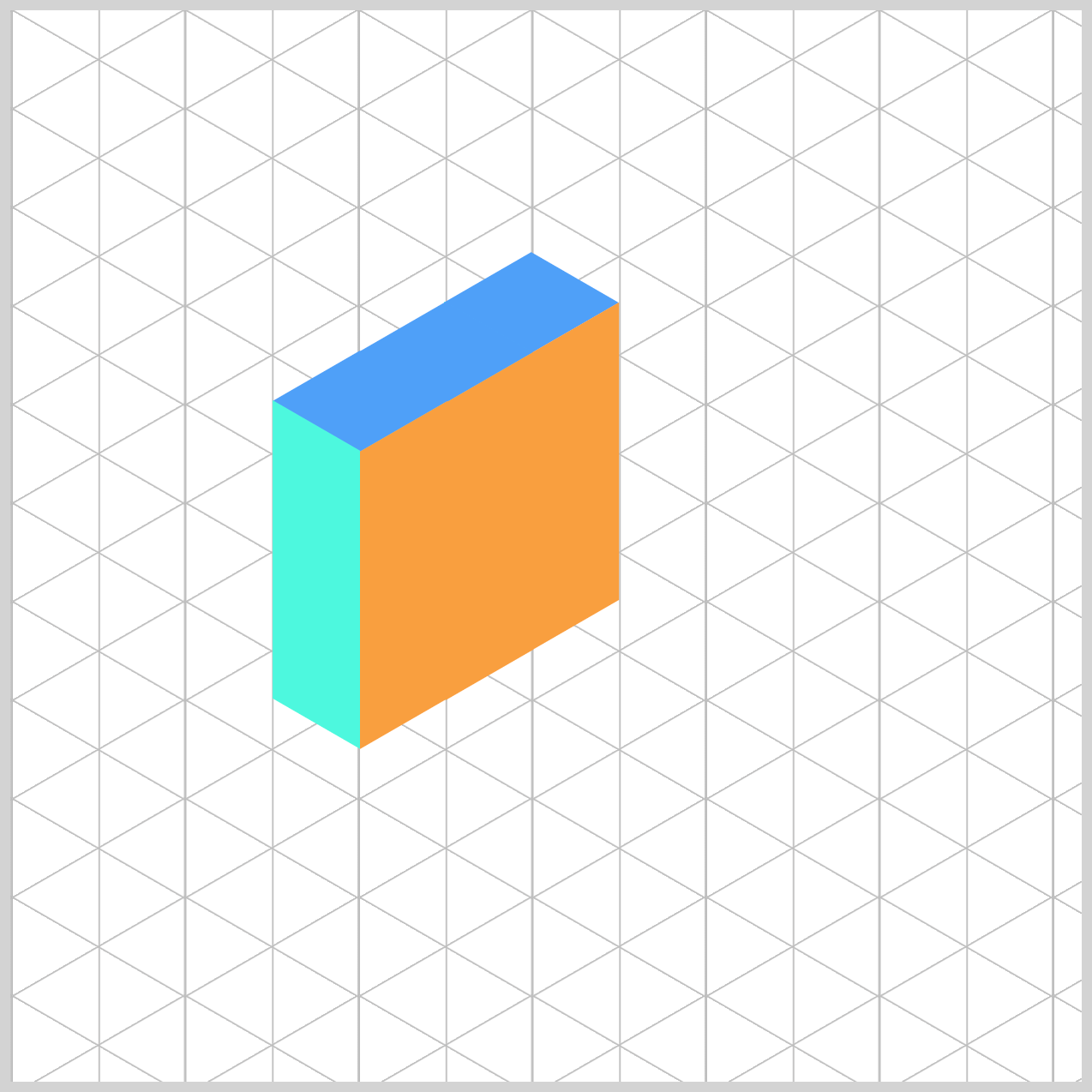
Building the Isometric Tower Components
Let’s start by building the three main components of our isometric tower.
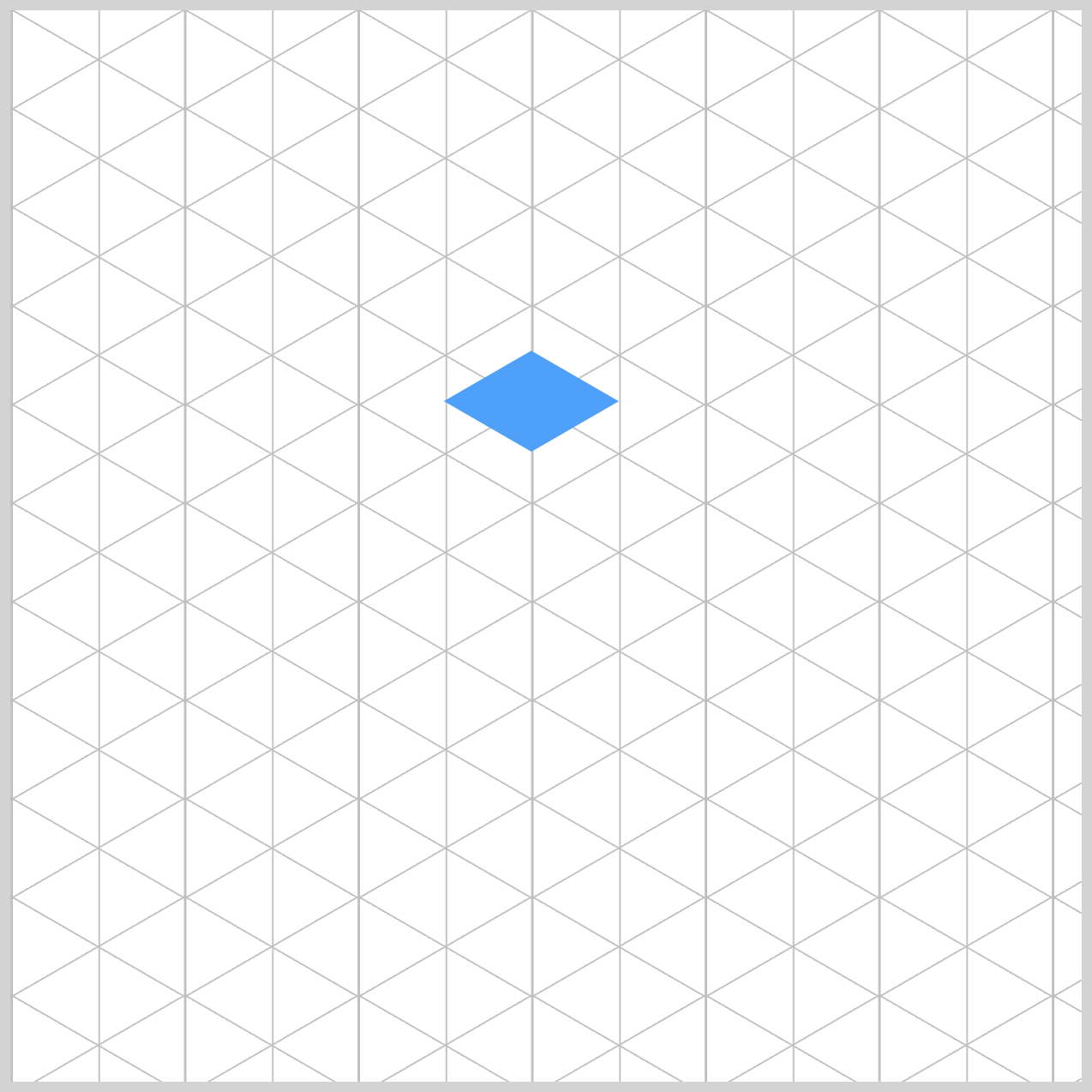
- Top Face
- Left Face
- Right Face
/* Isometric Tower Parts */
.isometric-tower-top {
  width: 47px;
  height: 47px;
  background: var(--tower-top-color);
  transform: rotate(210deg) skewX(-30deg) scaleY(0.864);
}
Top Face: A square (47px by 47px) with a bright sky-blue background.
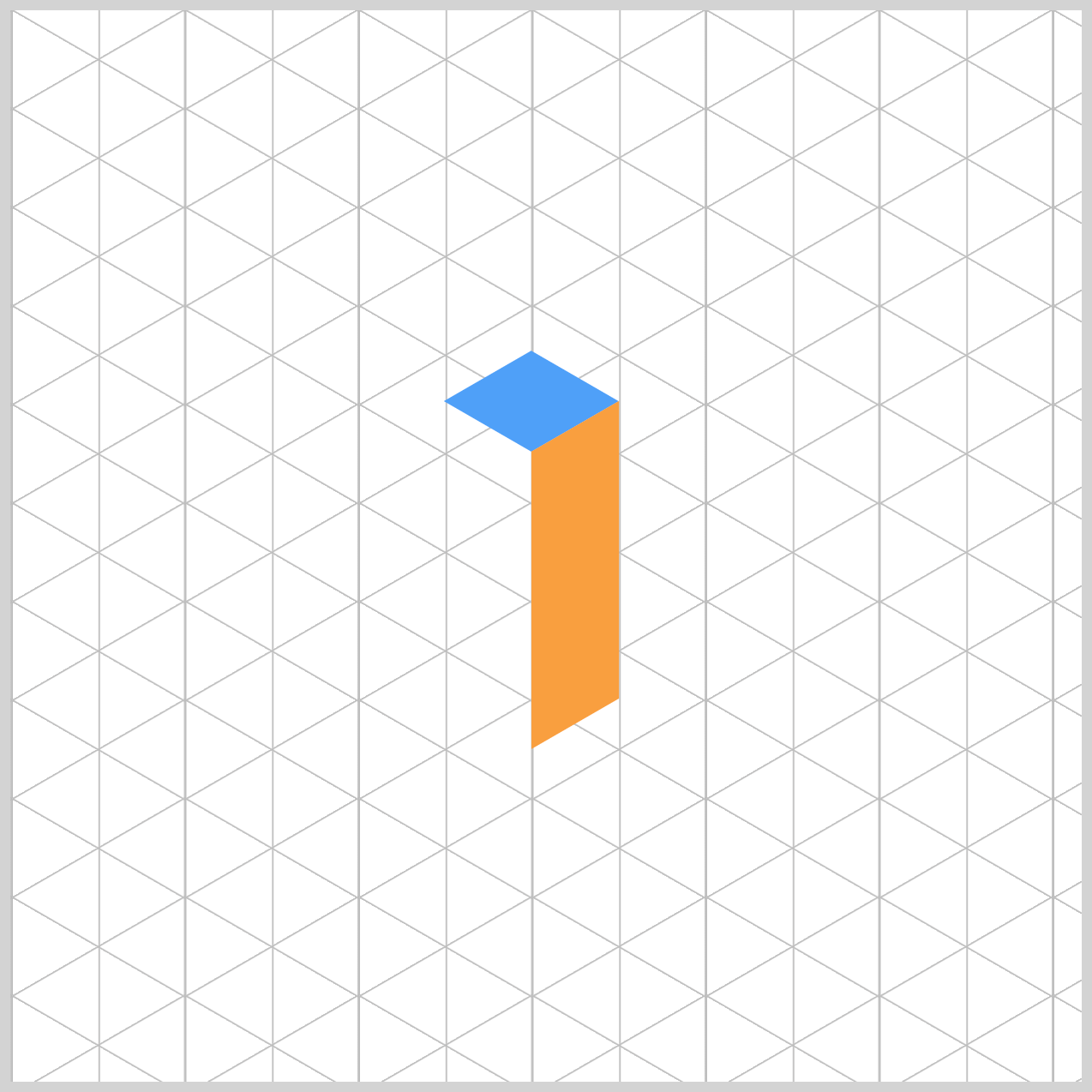
.isometric-tower-right {
  width: 47px;
  height: 139px;
  background: var(--tower-right-color);
  transform: rotate(-30deg) skewX(-30deg) translate(0, -0.1px) scaleY(0.864);
}
Right Face: An orange colored, vertically elongated rectangle. The width property value is set to 47px and the height is set to 139px.
.isometric-tower-left {
  width: 139px;
  height: 47px;
  background: var(--tower-left-color);
  transform: rotate(90deg) skewX(-30deg) scaleY(0.864) translate(-0.5px, 0);
}
Left Face: The tower’s third component has a width of 139px and a height property value of 47px with a turquoise background.
The transform property and how its functions work are described in detail in this article.
 Pyxofy
Let’s learn how to stack the towers in the next section.
Stacking the Isometric Towers
Now that we’ve built the individual components, it’s time to stack them into a 3D-like structure. In this section, you’ll learn to stack the towers, forming an isometric cube and blocks.

Using the CSS top and left properties, you adjust the towers’ positions.
/* Tower Positions */
.tower-1,
.tower-4,
.tower-7 {
  top: -46px;
  left: 80px;
}

.tower-2,
.tower-5,
.tower-8 {
  top: -23px;
  left: 40px;
}

.tower-3,
.tower-6,
.tower-9 {
  top: 0px;
  left: 0px;
}
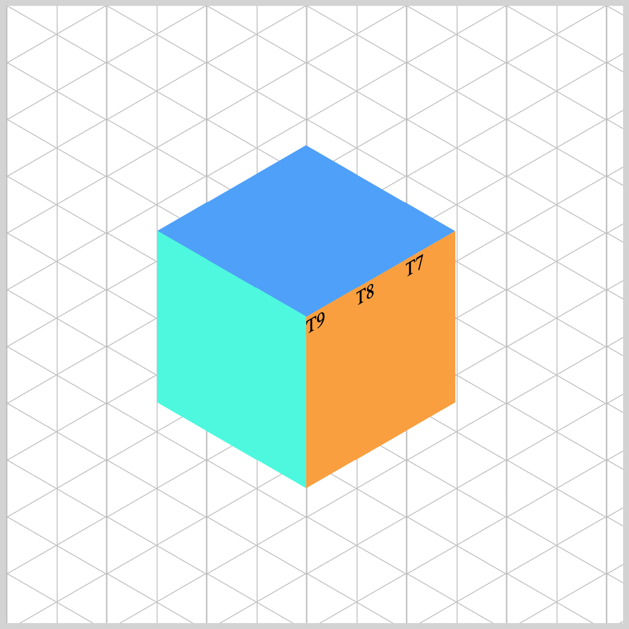
You have a total of nine (9) towers that need to be positioned so they appear as a block or an isometric cube.
- Towers 1, 4, and 7 position is set to
top: -46px;andleft: 80px;. - Towers 2, 5, and 8 are positioned at
top: -23px;andleft: 40px;. - The third set, towers 3, 6, and 9, is set to the default position, in this case,
top: 0pxandleft: 0px.
In the next section, you’ll learn how to group and split the isometric towers.
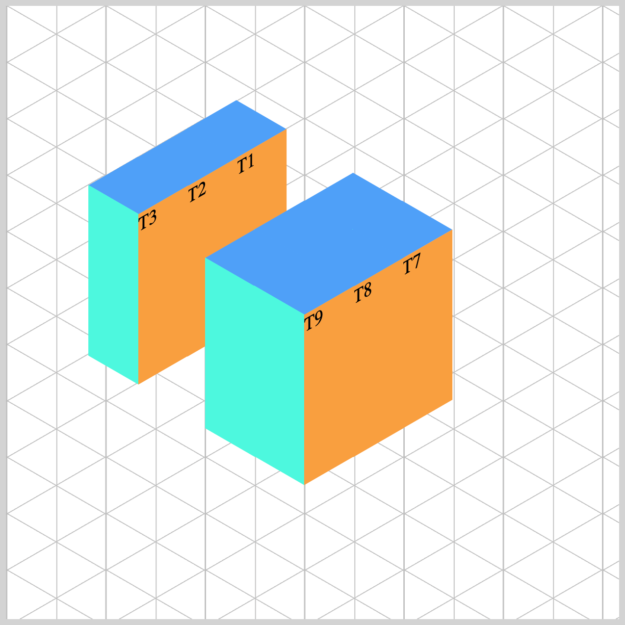
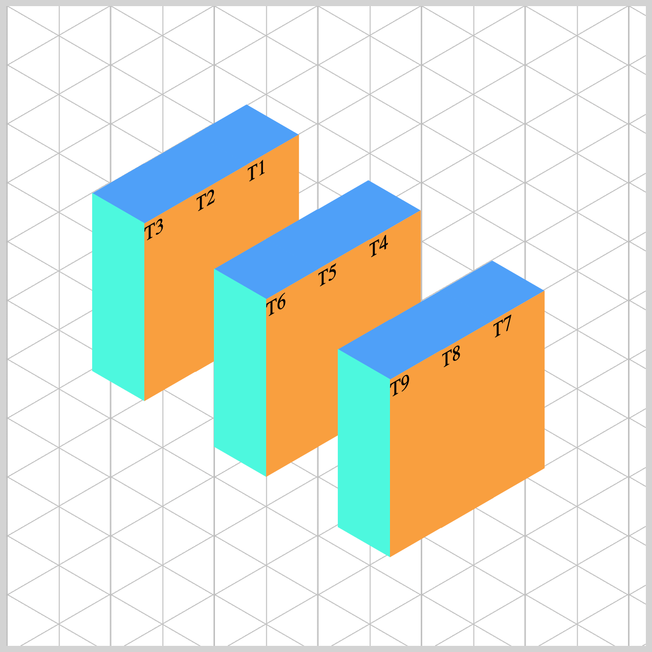
Grouping and Splitting the Isometric Towers
In this section, you’ll learn how to group and split the isometric towers. We’ve assigned tower numbers such as T1 and T2 to make it easier to identify each tower.
For the grouping and splitting to work, the towers need to be consolidated into groups.
<div class="group-1">
  <div class="tower-1 split-right">
    <div class="isometric-tower-top"></div>
    <div class="isometric-tower-right">T1</div>
    <div class="isometric-tower-left"></div>
  </div>
  <div class="tower-2 split-middle">
    <div class="isometric-tower-top"></div>
    <div class="isometric-tower-right">T2</div>
    <div class="isometric-tower-left"></div>
  </div>
  <div class="tower-3 split-left">
    <div class="isometric-tower-top"></div>
    <div class="isometric-tower-right">T3</div>
    <div class="isometric-tower-left"></div>
  </div>
</div>
You have three towers in one group, and you consolidate them by using HTML class names. The class names will be group-1, group-2, and group-3.
<div class="group-1">
The three towers within the group will have a split grouping. For our example, they will be grouped using the class names split-right, split-middle, and split-left.
<div class="tower-1 split-right"><div class="tower-2 split-middle"><div class="tower-3 split-left">
Positioning the Groups
To create the isometric cube layout, you'll assign specific top and left values to each group using CSS. The following code snippets in this section demonstrate how to position each group precisely within the grid container.
/* Tower Groups */
.group-1 {
  top: 206px;
  left: 163px;
}

.group-2 {
  top: 229px;
  left: 203px;
}

.group-3 {
  top: 252px;
  left: 243px;
}
You can move each group by reassigning different values to its top and left CSS properties.
.group-1 {
  top: 170px;
  left: 108px;
}
To move group-1, towers 1 through 3, you assign 170px to top and 108px to left.
.group-3 {
  top: 292px;
  left: 300px;
}
For group-3, you can separate it from group-2 by changing its CSS to top: 292px; and left: 300px;.
This setup allows you to move entire groups as single units, making layout adjustments much easier. Let’s tackle the split grouping in the next section.
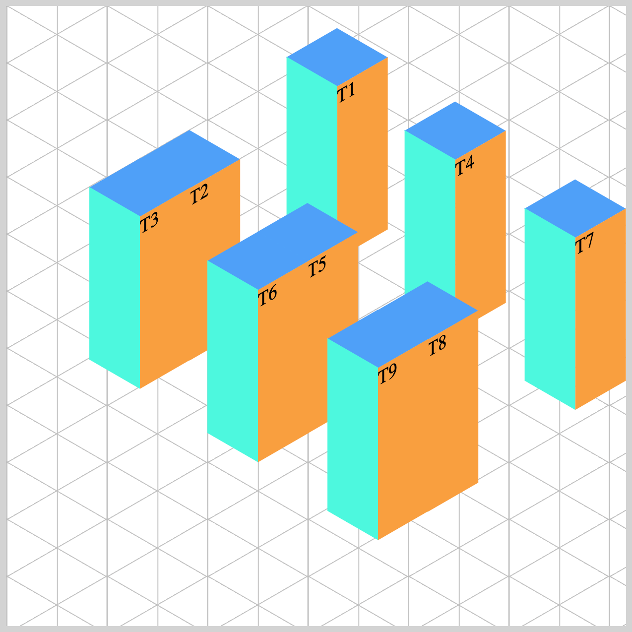
Splitting the Tower Groups
To complete the visual separation of each tower within a group, we’ll use the CSS translate property to shift them horizontally and vertically. This creates the illusion that the towers are moving away from their original positions.
The translate function in CSS allows you to move elements along the X (horizontal), Y (vertical), and optionally the Z (depth) axes. It accepts up to three values:
- The first value moves the element left or right (X-axis).
- The second value moves it up or down (Y-axis).
- The third value (used in 3D transforms) adjusts the depth (Z-axis), though it's less commonly used in 2D layouts.
By applying different translate values to each tower in a group, you can create a dynamic, staggered layout that enhances the isometric effect.
/* Split Groups */
.split-right {
  translate: 79px -59px;
}
.split-right: Moves right and up using translate: 79px -59px;.
.split-middle {
  translate: 8px -5px;
}

.split-left {
  translate: -66px 49px;
}
.split-middle: Slightly adjusts position withtranslate(8px, -5px);..split-right: Moves left and down usingtranslate: -66px 49px;.
These subtle shifts help each tower stand out, giving your layout a more dynamic and layered appearance.
You can see and play with the complete code on Pyxofy’s CodePen page.
See the Pen CSS Art – Using translate, top, and left Properties to Achieve 3D Effects with 2D Positioning by Pyxofy (@pyxofy) on CodePen.
Conclusion
In this article, you learned how to build isometric towers using the CSS transform property. You explored how to group and split the isometric towers with HTML classes, positioning them using top and left CSS properties.
The translate property and its functions are especially useful for fine-tuning the placement of elements, allowing you to move them along the X, Y, and even Z axes for dynamic, layered effects. By combining positioning, grouping, and transformation techniques, you now have the tools to create visually compelling, modular layouts.
So, what will you build next using the translate property and HTML classes? Share your masterpiece with us on LinkedIn, Threads, Bluesky, Mastodon, X (Twitter) @pyxofy, or Facebook.
We hope you liked this article. Kindly share it with your network. We appreciate it.
Related Articles
 Pyxofy
 Pyxofy
 Pyxofy