CSS Art - Radial Gradient Techniques for Realistic Isometric Design - Part 2
Round, transparent, and 3D-like effects can be hard to make for the web. You’ll learn how to make all of the above in this step-by-step article.

Introduction
Creating round, transparent, and three-dimensional visuals can be tricky on the web. This article will teach you how to achieve all of these effects using just CSS and HTML.
- In Part 1, you learned how to create the fundamental shape of the gumball machine.
- In Part 2, this article, you'll discover how to utilize the CSS
radial-gradient()function along with CSS Custom Properties (Variables) to create a custom color palette.
Several CSS properties and functions you’ll learn to use in this article:
radial-gradient()- CSS Custom Properties (Variables)
transform::beforepseudo-elementtopandleft
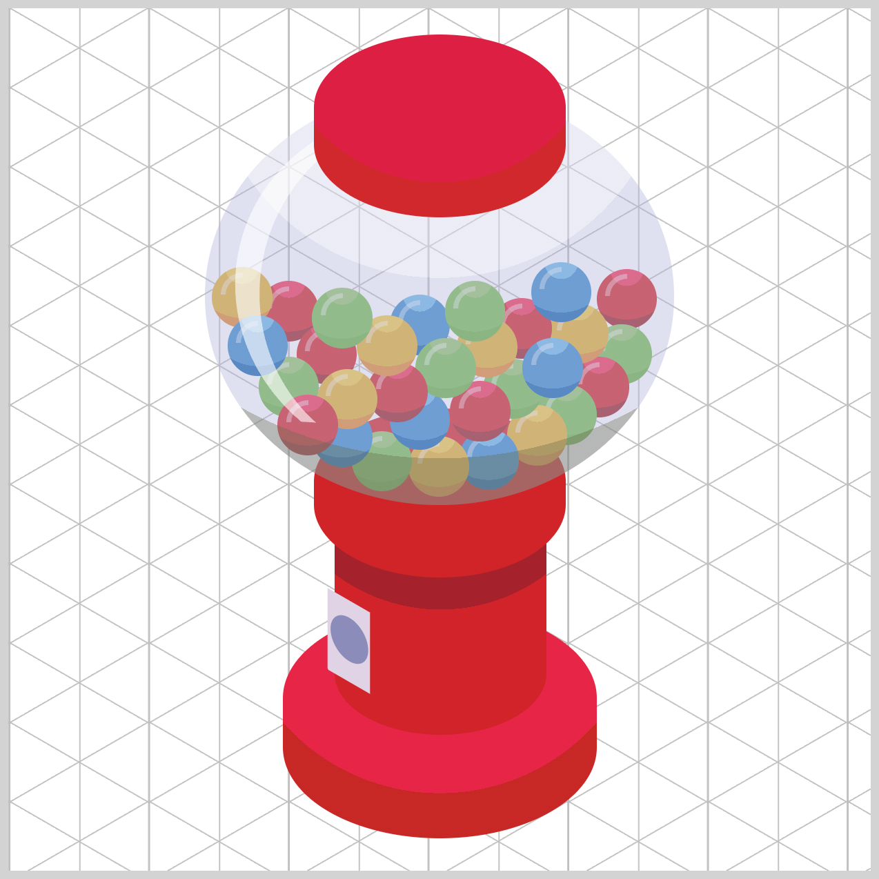
Preview
You will complete the gumball machine by utilizing various CSS properties and functions, including radial-gradient(), the ::before pseudo-element, and Custom Properties (Variables).

Prerequisites
Essential CSS and HTML knowledge will help you understand the concepts and techniques introduced in this article. Jump over to this article if you require an HTML and CSS primer.
We assume you have configured tools to modify CSS. If not, this article will guide you through the setup process.
HTML Structure
<div class="container">
  <div class="base"></div>
  <div class="cylinder"></div>
  <div class="neck"></div>
  <div class="gumball-1 gumball-shape gumball-red">
    <div class="gumball-highlight"></div>
  </div>
  <div class="gumball-2 gumball-shape gumball-green">
    <div class="gumball-highlight"></div>
  </div>
  <div class="gumball-3 gumball-shape gumball-red">
    <div class="gumball-highlight"></div>
  </div>
  <div class="gumball-4 gumball-shape gumball-yellow">
    <div class="gumball-highlight"></div>
  </div>
  <div class="gumball-5 gumball-shape gumball-green">
    <div class="gumball-highlight"></div>
  </div>
  <div class="gumball-6 gumball-shape gumball-red">
    <div class="gumball-highlight"></div>
  </div>
  <div class="gumball-7 gumball-shape gumball-blue">
    <div class="gumball-highlight"></div>
  </div>
  <div class="gumball-8 gumball-shape gumball-yellow">
    <div class="gumball-highlight"></div>
  </div>
  <div class="gumball-9 gumball-shape gumball-green">
    <div class="gumball-highlight"></div>
  </div>
  <div class="gumball-10 gumball-shape gumball-blue">
    <div class="gumball-highlight"></div>
  </div>
  <div class="gumball-11 gumball-shape gumball-red">
    <div class="gumball-highlight"></div>
  </div>
  <div class="gumball-12 gumball-shape gumball-red">
    <div class="gumball-highlight"></div>
  </div>
  <div class="gumball-13 gumball-shape gumball-red">
    <div class="gumball-highlight"></div>
  </div>
  <div class="gumball-14 gumball-shape gumball-yellow">
    <div class="gumball-highlight"></div>
  </div>
  <div class="gumball-15 gumball-shape gumball-blue">
    <div class="gumball-highlight"></div>
  </div>
  <div class="gumball-16 gumball-shape gumball-green">
    <div class="gumball-highlight"></div>
  </div>
  <div class="gumball-17 gumball-shape gumball-yellow">
    <div class="gumball-highlight"></div>
  </div>
  <div class="gumball-18 gumball-shape gumball-blue">
    <div class="gumball-highlight"></div>
  </div>
  <div class="gumball-19 gumball-shape gumball-blue">
    <div class="gumball-highlight"></div>
  </div>
  <div class="gumball-20 gumball-shape gumball-blue">
    <div class="gumball-highlight"></div>
  </div>
  <div class="gumball-21 gumball-shape gumball-yellow">
    <div class="gumball-highlight"></div>
  </div>
  <div class="gumball-22 gumball-shape gumball-green">
    <div class="gumball-highlight"></div>
  </div>
  <div class="gumball-23 gumball-shape gumball-green">
    <div class="gumball-highlight"></div>
  </div>
  <div class="gumball-24 gumball-shape gumball-red">
    <div class="gumball-highlight"></div>
  </div>
  <div class="gumball-25 gumball-shape gumball-yellow">
    <div class="gumball-highlight"></div>
  </div>
  <div class="gumball-26 gumball-shape gumball-green">
    <div class="gumball-highlight"></div>
  </div>
  <div class="gumball-27 gumball-shape gumball-blue">
    <div class="gumball-highlight"></div>
  </div>
  <div class="gumball-28 gumball-shape gumball-yellow">
    <div class="gumball-highlight"></div>
  </div>
  <div class="gumball-29 gumball-shape gumball-green">
    <div class="gumball-highlight"></div>
  </div>
  <div class="gumball-30 gumball-shape gumball-red">
    <div class="gumball-highlight"></div>
  </div>
  <div class="globe">
    <div class="globe-highlight"></div>
  </div>
  <div class="cover"></div>
  <div class="coin-mech-front"></div>
  <div class="coin-mech-side"></div>
  <div class="coin-mech-top"></div>
</div>
container is the outermost enclosure. It enables the content to be centered and draws a light gray border. The rest of the divs represent each image component.
Keep the HTML structure as is for the image to display correctly.
Body and Container Div CSS
CSS code for the body and container div.
/* Body and Container Settings */
/* Center shapes */
body {
  margin: 0;
  padding: 0;
  height: 100vh;
  display: flex;
  justify-content: center;
  align-items: center;
  flex-wrap: wrap;
}

/* Set background and border color */
.container {
  width: 500px;
  height: 500px;
  border: 5px solid lightgray;
  background: transparent;
  position: relative;
  margin: 5px;
  display: flex;
  justify-content: center;
  align-items: center;
}
Common Properties
The image components of the isometric gumball machine share similar CSS properties. To keep the code concise, we are consolidating these properties.
/* Common Properties */
.cover,
.globe,
.neck,
.cylinder,
.coin-mech-front,
.coin-mech-front::before,
.coin-mech-side,
.coin-mech-top,
.base,
.gumball-1,
.gumball-2,
.gumball-3,
.gumball-4,
.gumball-5,
.gumball-6,
.gumball-7,
.gumball-8,
.gumball-9,
.gumball-10,
.gumball-11,
.gumball-12,
.gumball-13,
.gumball-14,
.gumball-15,
.gumball-16,
.gumball-17,
.gumball-18,
.gumball-19,
.gumball-20,
.gumball-21,
.gumball-22,
.gumball-23,
.gumball-24,
.gumball-25,
.gumball-26,
.gumball-27,
.gumball-28,
.gumball-29,
.gumball-30 {
  position: absolute;
  border-radius: 95px/55px;
}
Custom Color Palette
It’s easier to control the gumball machine’s colors using a color palette. The custom color palette is made using CSS custom properties (variables). The gumball candy, highlights, and gumball machine components will all use the custom palette.
/* Color Palette */
:root {
  /* Gumball Colors */
  /* Red */
  --red-1: #9f2629; /* Japanese Carmine */
  --red-2: #d12329; /* Crimson */
  --red-3: #f13557; /* Raspberry */

  /* Blue */
  --blue-1: #036eb3; /* Honolulu Blue */
  --blue-2: #3a91cd; /* Celestial Blue */
  --blue-3: #70bfe8; /* Light Sky Blue */

  /* Green */
  --green-1: #6db843; /* Yellow Green */
  --green-2: #7cc24f; /* Bud Green */
  --green-3: #9ac96f; /* Pistachio */

  /* Yellow */
  --yellow-1: #e48f29; /* Carrot Orange */
  --yellow-2: #e5b41f; /* Goldenrod */
  --yellow-3: #f3ce40; /* Maize */

  /* Gumball Machine Color */
  --gumball-machine-1: #c72825; /* Fire Engine Red */
  --gumball-machine-2: #e72446; /* Red (Crayola) */
  --gumball-machine-3: #d12329; /* Crimson */
  --gumball-machine-4: #a5212c; /* Auburn */
  --gumball-machine-5: #d1272d; /* Amaranth Red */
  --gumball-machine-6: #dc1f42; /* Vivid Red */

  /* Globe */
  --globe-1: #85888699; /* Old Silver 60% Transparent */
  --globe-2: #b0b1da66; /* Blue Purple 40% Transparent  */
  --globe-3: #d9d9ed7f; /* Lavender 50% Transparent  */
  --globe-4: #ffffff99; /* White 60% Transparent */

  /* Coin Mechanism */
  --coin-mech-1: #e0d2e5; /* Thistle */
  --coin-mech-2: #efe6f2; /* Bright Gray */
  --coin-mech-3: #8c8cba; /* Steel Blue */
  --coin-mech-4: #967eaa; /* Plum */

  /* Gumball Highlight */
  --gumball-highlight: #ffffff66; /* White 40% Transparent */
}
A custom color palette allows you to effortlessly adjust the color of each component. If you wish to switch from a yellow gumball to let’s say a purple one, simply update the values of the CSS custom properties (variables), and the change will apply to all the gumballs.
Check this article for step-by-step instructions on how to make a custom color palette.
 Pyxofy
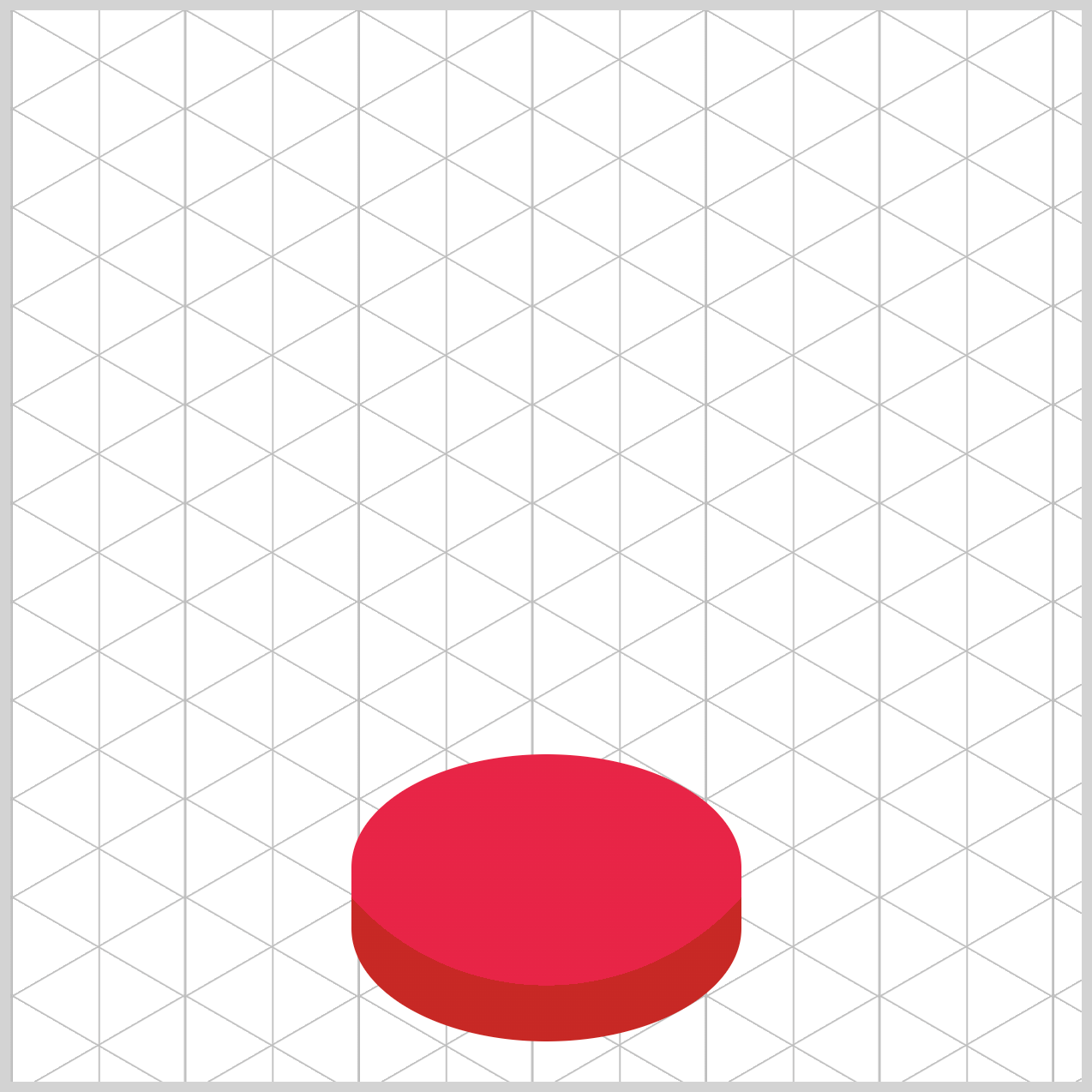
Gumball Machine Base
Only color and radial gradient function explanations will be provided for the gumball machine base and the rest of the image components for brevity.
/* Base */
.base {
  background: radial-gradient(
    circle at 50% -10%,
    var(--gumball-machine-1)
  );
}
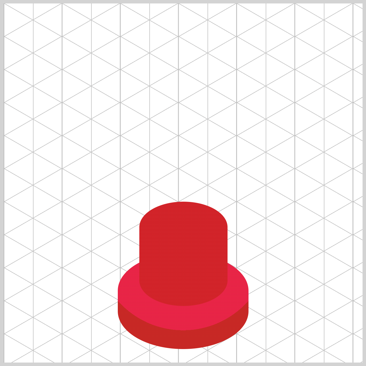
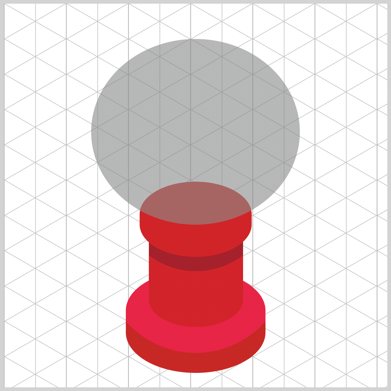
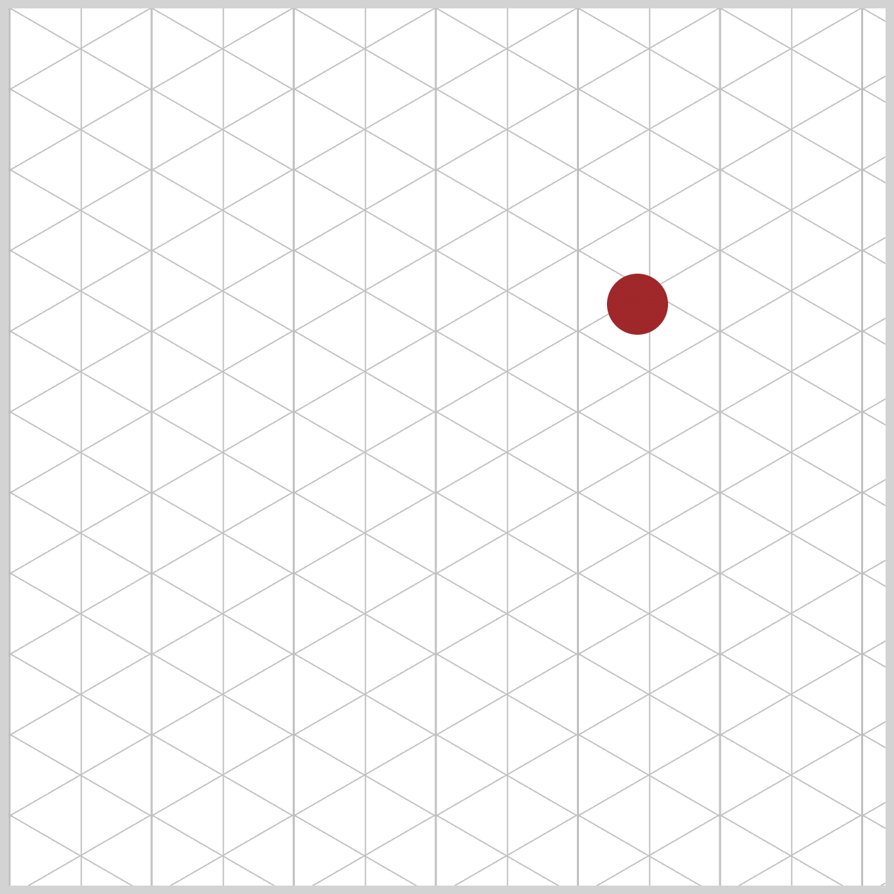
The base features a radial gradient circle positioned at 50% on the horizontal x-axis and -10% on the vertical y-axis. var(--gumball-machine-1) is assigned #c72825, which is a fire engine red color, and serves as the the primary color of the base component.
.base {
  background: radial-gradient(
    circle at 50% -10%,
    var(--gumball-machine-2) 70%,
    var(--gumball-machine-1) 70%
  );
}
To create an isometric effect, #e72446, a red (Crayola) color, is assigned to var(--gumball-machine-2). The contrast between the dark and light red colors creates the impression of a 3D-like image element.
--gumball-machine-2color gradient starts from 0% and expands all the way to70%.--gumball-machine-1is shown from70%onwards.
Check this article for more details about radial gradients.
 Pyxofy
Up next is the gumball machine cylinder component.
Cylinder
The cylinder will showcase a color scheme that contrasts with the base component from the previous section. It features a lighter color at the bottom and a darker shade at the top to create a shadow effect for the neck component.
/* Cylinder */
.cylinder {
  background: radial-gradient(
    circle at 50% -20%,
    var(--gumball-machine-3)
  );
}
A crimson color, #d12329, is designated for --gumball-machine-3. It will be the cylinder’s primary color.
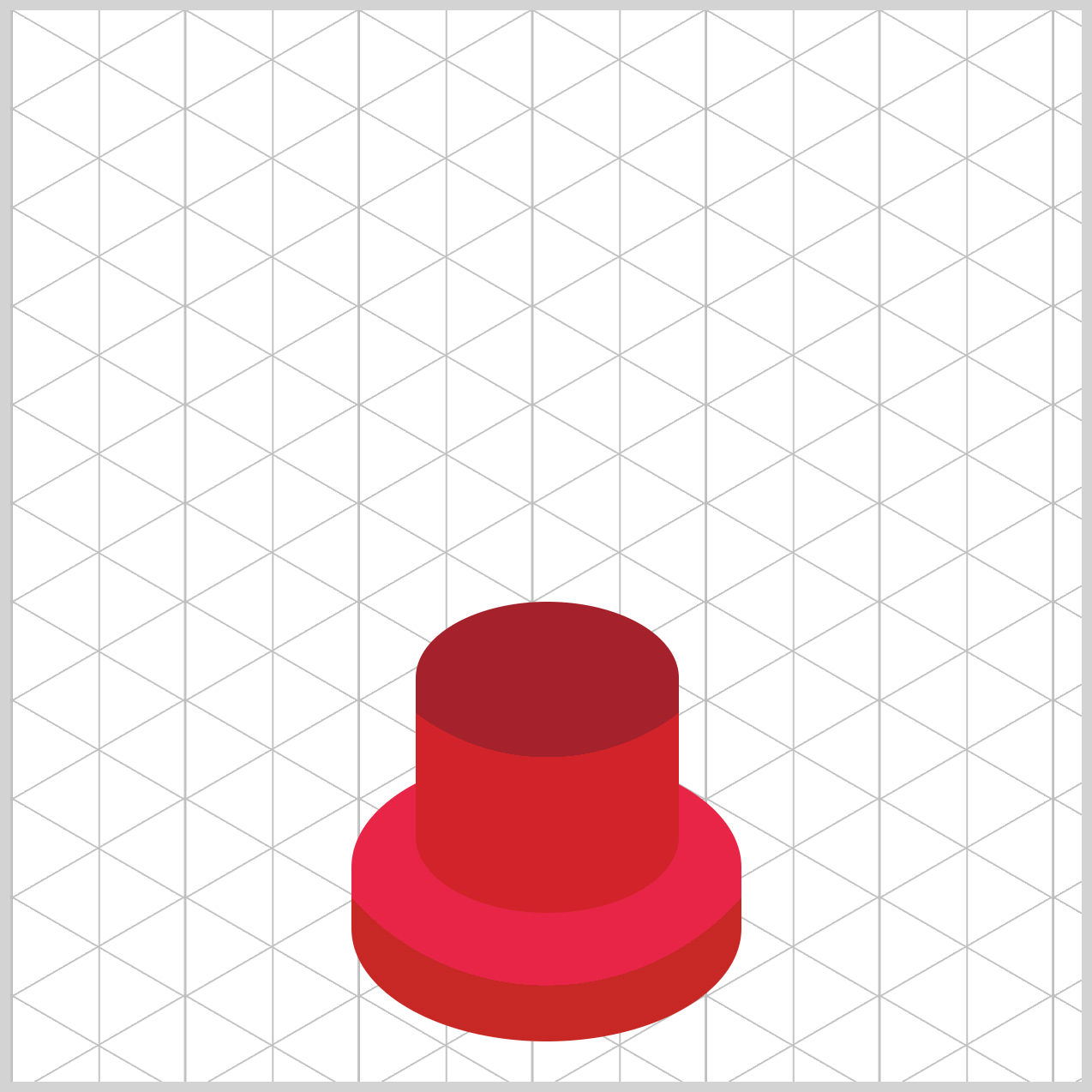
.cylinder {
  background: radial-gradient(
    circle at 50% -20%,
    var(--gumball-machine-4) 55%,
    var(--gumball-machine-3) 55%
  );
}
A darker Auburn, #a5212c, shade serves as the cylinder’s secondary color and is assigned to --gumball-machine-4. The primary color ranges from 0% to 55%, while the secondary color extends from 55% to 100%.
Let’s make the neck image component in the next section.
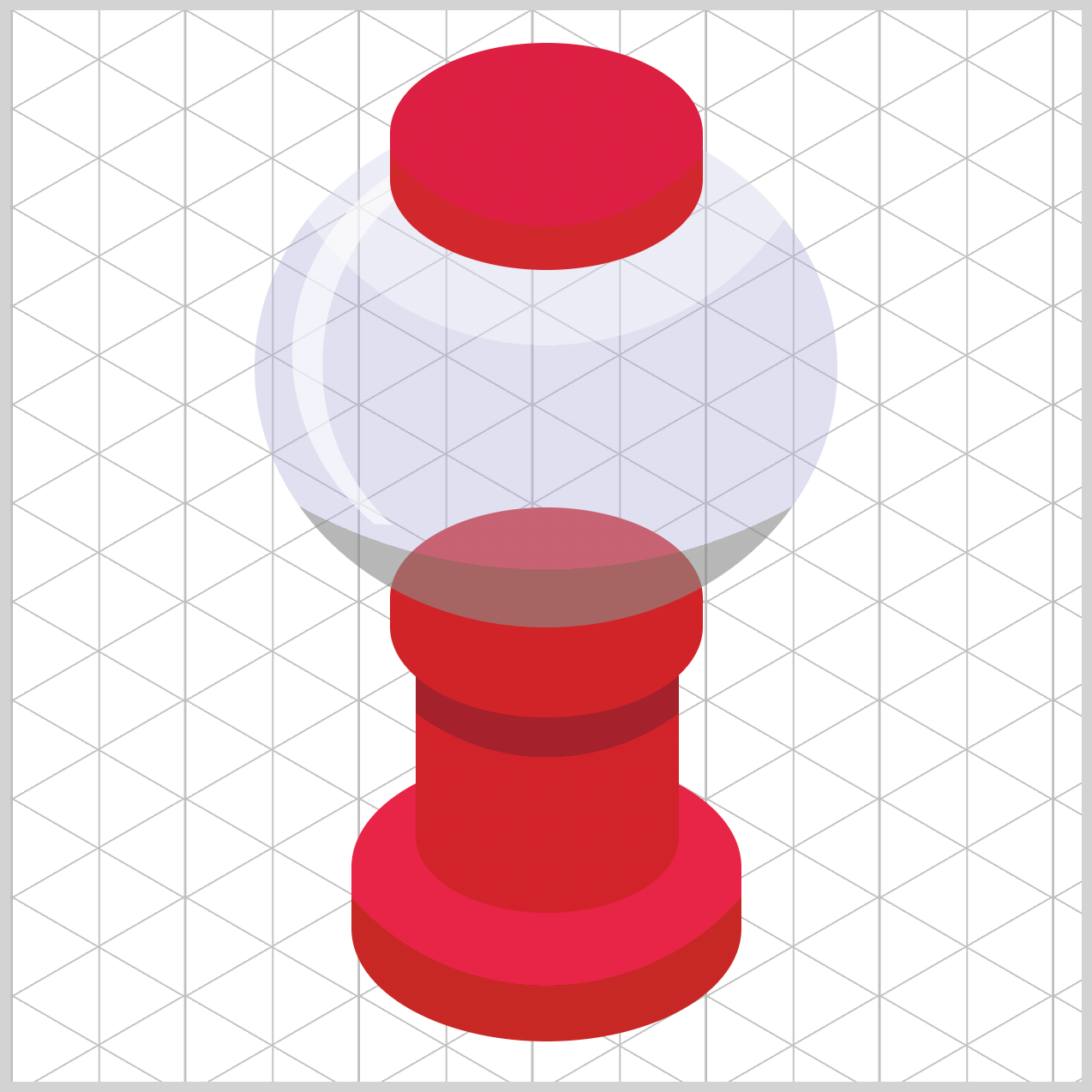
Neck
The neck will only have a single color and serve as the globe’s placeholder.
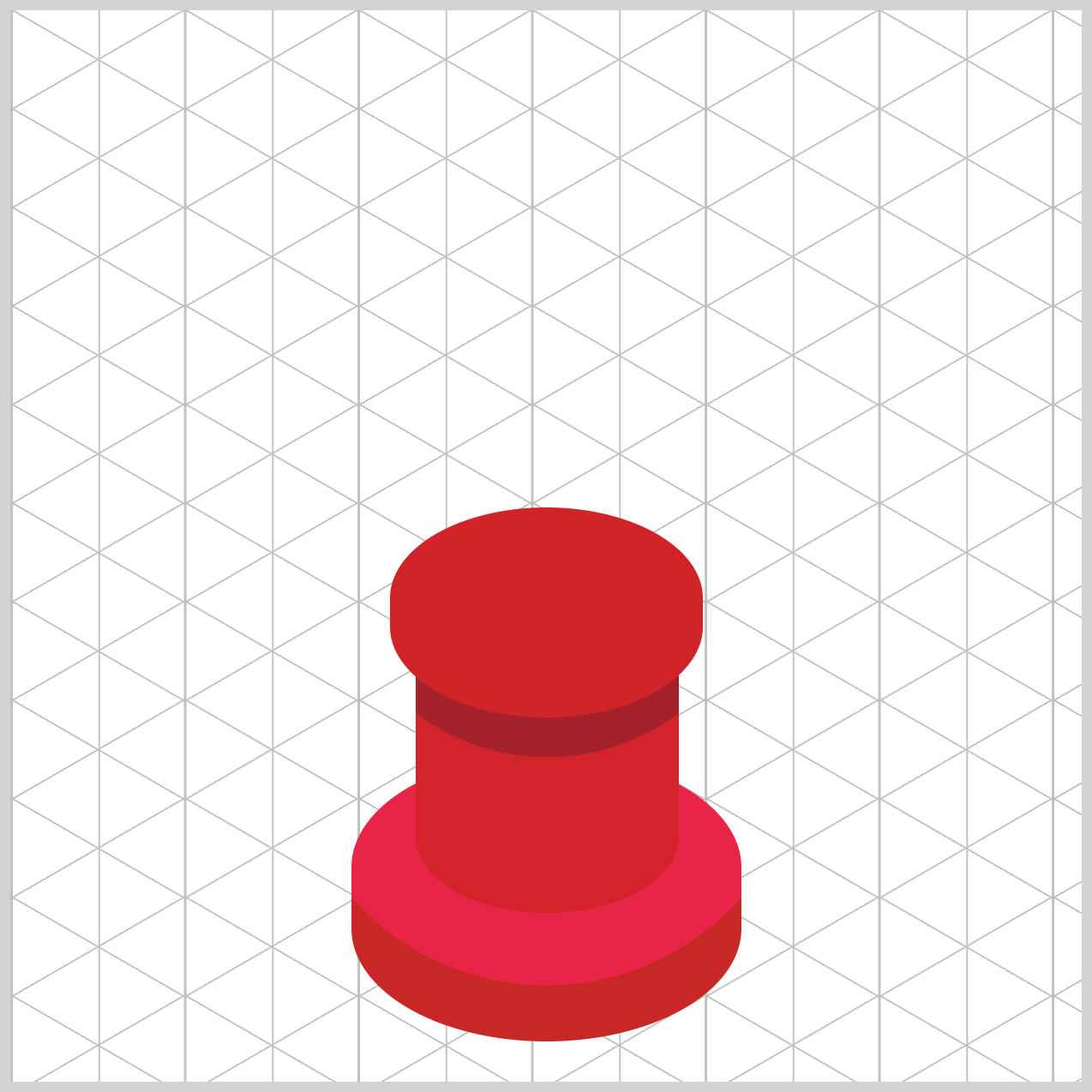
/* Neck */
.neck {
  background: var(--gumball-machine-5);
}
The primary color for the neck component is #d1272d, an Amaranth Red shade, and is designated as --gumball-machine-5.
Globe
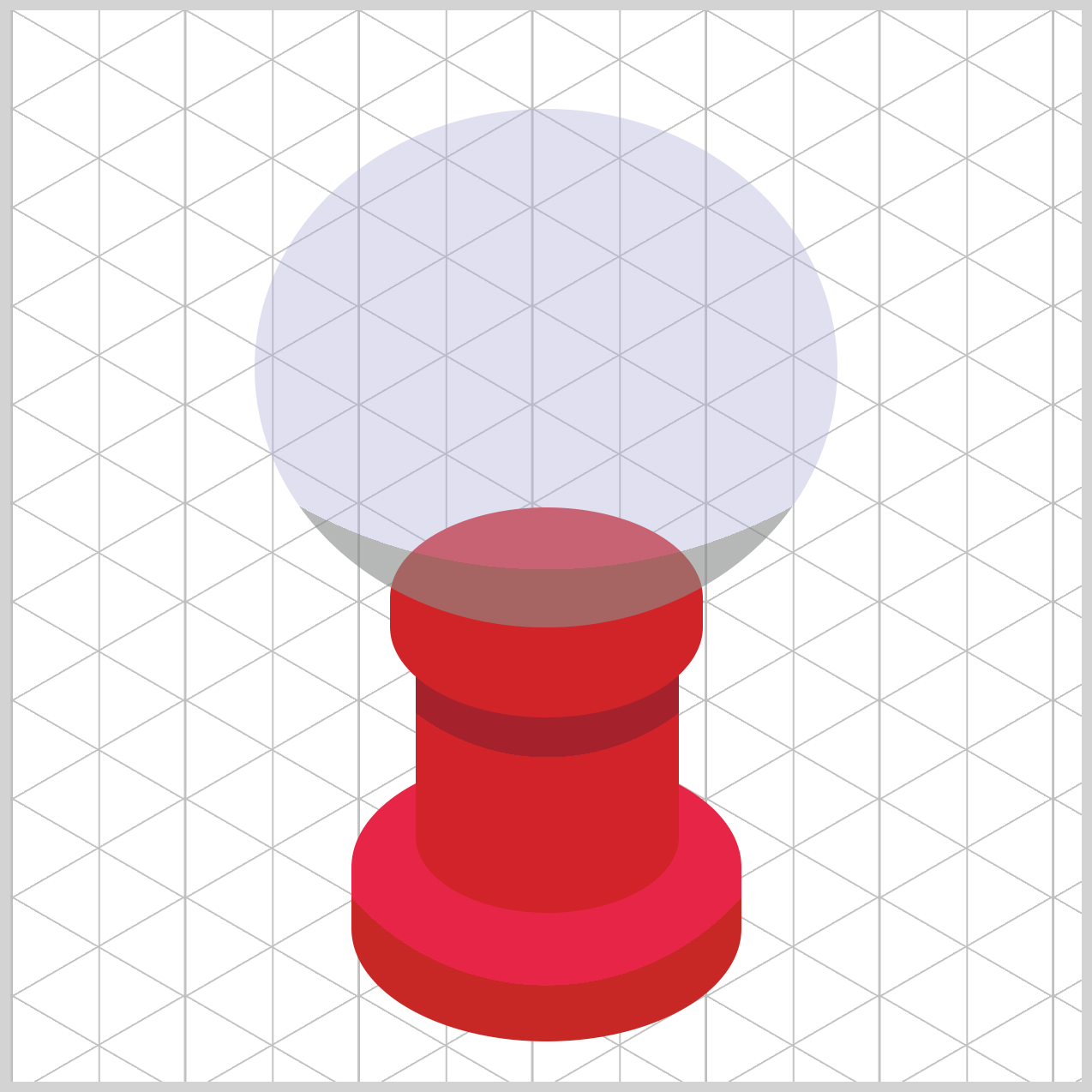
The gumball machine globe is semi-transparent and acts as the enclosure for the multi-colored gumballs. The globe employs three colors with different transparencies to simulate a rounded appearance.
/* Globe */
.globe {
  background: radial-gradient(
    circle at 50% -10%,
    var(--globe-1)
  );
}
--globe-1 is assigned an old silver shade, #85888699 with 60% transparency as its primary color.
.globe {
  background: radial-gradient(
    circle at 50% -10%,
    var(--globe-2) 80%,
    var(--globe-1) 80%
  );
}
A blue purple hue, #b0b1da66, is assigned to --globe-2, and serves as the globe’s secondary color. The blue purple hue stretches up to 80%, and the old silver shade shows from 80% to 100%.

.globe {
  background: radial-gradient(
    circle at 50% -10%,
    var(--globe-3) 45%,
    var(--globe-2) 45% 80%,
    var(--globe-1) 80%
  );
}
The globe’s third color, --globe-3, is lavender with 50% transparency, #d9d9ed7f. The lavender color begins at 0% and ends at 45%.
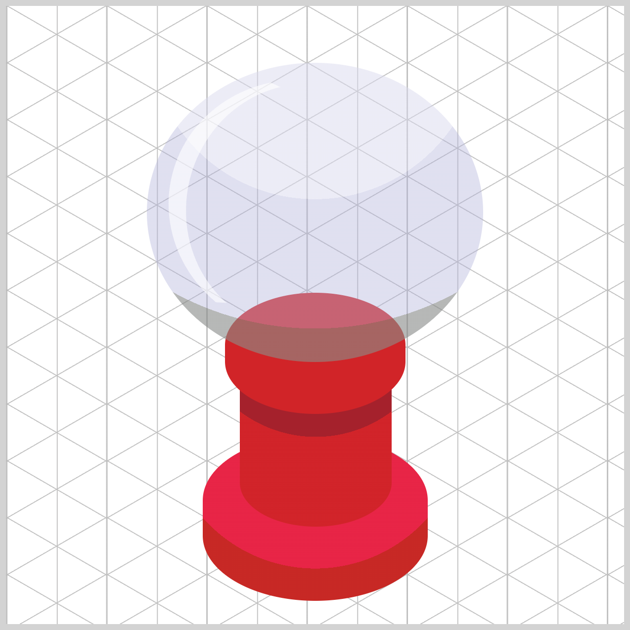
/* Globe Highlight */
.globe-highlight {
  position: relative;
  width: 200px;
  height: 200px;
  top: 14px;
  left: 17px;
  border-radius: 50%;
  border: 3px solid transparent;
  border-left: 15px solid var(--globe-4);
  rotate: 14deg;
}
The globe highlight, --globe-4, is crescent-shaped, white (#ffffff99), and has 60% transparency. It’s a 200px square, positioned 14px from the top and 17px from the left edge. Its border radius is set to 50%. The left border features a 15px solid white border, while the other borders are 3px solid and transparent.
Next up is the cover component.
Cover
The gumball machine cover is similar to the base component, where its color is split between primary and secondary to simulate roundness.

/* Cover */
.cover {
  background: radial-gradient(
    circle at 50% -10%,
    var(--gumball-machine-5)
  );
}
The cover component’s primary color, --gumball-machine-5, is set to an Amaranth red color, #d1272d.
.cover {
  background: radial-gradient(
    circle at 50% -10%,
    var(--gumball-machine-6) 70%,
    var(--gumball-machine-5) 70%
  );
}
Vivid red, #dc1f42, is designated as the cover’s secondary color, --gumball-machine-6. The secondary color begins at 0% and ends at 70%, while the primary color is shown from 70% onward.
Next, let’s address the coin mechanism in the following section of the article.
Coin Mechanism
The coin mechanism consists of three parts: the front, side, and top. The front features the coin insert mechanism, created using the ::before pseudo-element.
/* Coin Mechanism */
.coin-mech-front {
  background: var(--coin-mech-1);
}
The rectangular part is assigned a thistle color, #e0d2e5, as its base color, --coin-mech-1.
.coin-mech-front::before {
  background: var(--coin-mech-3);
}
The base color of the front section’s coin insert, --coin-mech-3, is steel blue, #8c8cba.

.coin-mech-side {
  background: var(--coin-mech-4);
}
The coin mechanism's side section uses a plum color, #967eaa, as its base color, --coin-mech-4.

.coin-mech-top {
  background: var(--coin-mech-2);
}
#efe6f2, a bright gray color, is assigned to the top section’s base color, --coin-mech-2.
The coin mechanism color is complete. Let’s make the gumballs in the final article section.
Gumballs
There are a total of 30 multi-colored gumballs inside the semi-transparent globe container. To make the gumballs easier to customize, their CSS code is separated into four parts:
- Gumball shape
- Gumball position
- Gumball color
- Gumball highlight
Gumball shape
/* Gumball Shape */
.gumball-shape {
  width: 35px;
  height: 35px;
  border-radius: 50%;
}
The basic shape of the gumballs is a 35px square with rounded corners created by border-radius: 50%.
Gumball position
/* Gumball Position */
.gumball-1 {
  top: 151px;
  left: 341px;
}
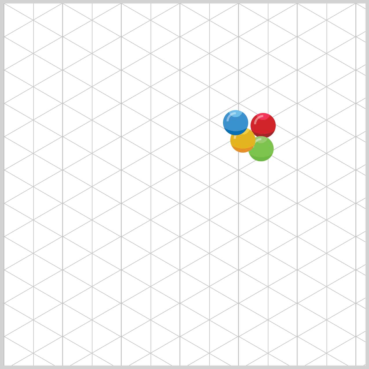
All 30 gumballs will have their respective positions within the globe. For brevity, only the red gumball-1 will be explained. Gumball 1’s top property value is 151px, and the left value is 341px.
Gumball color
/* Gumball Colors */
.gumball-red {
  background: radial-gradient(
    circle at 50% 0%,
    var(--red-1)
  );
}
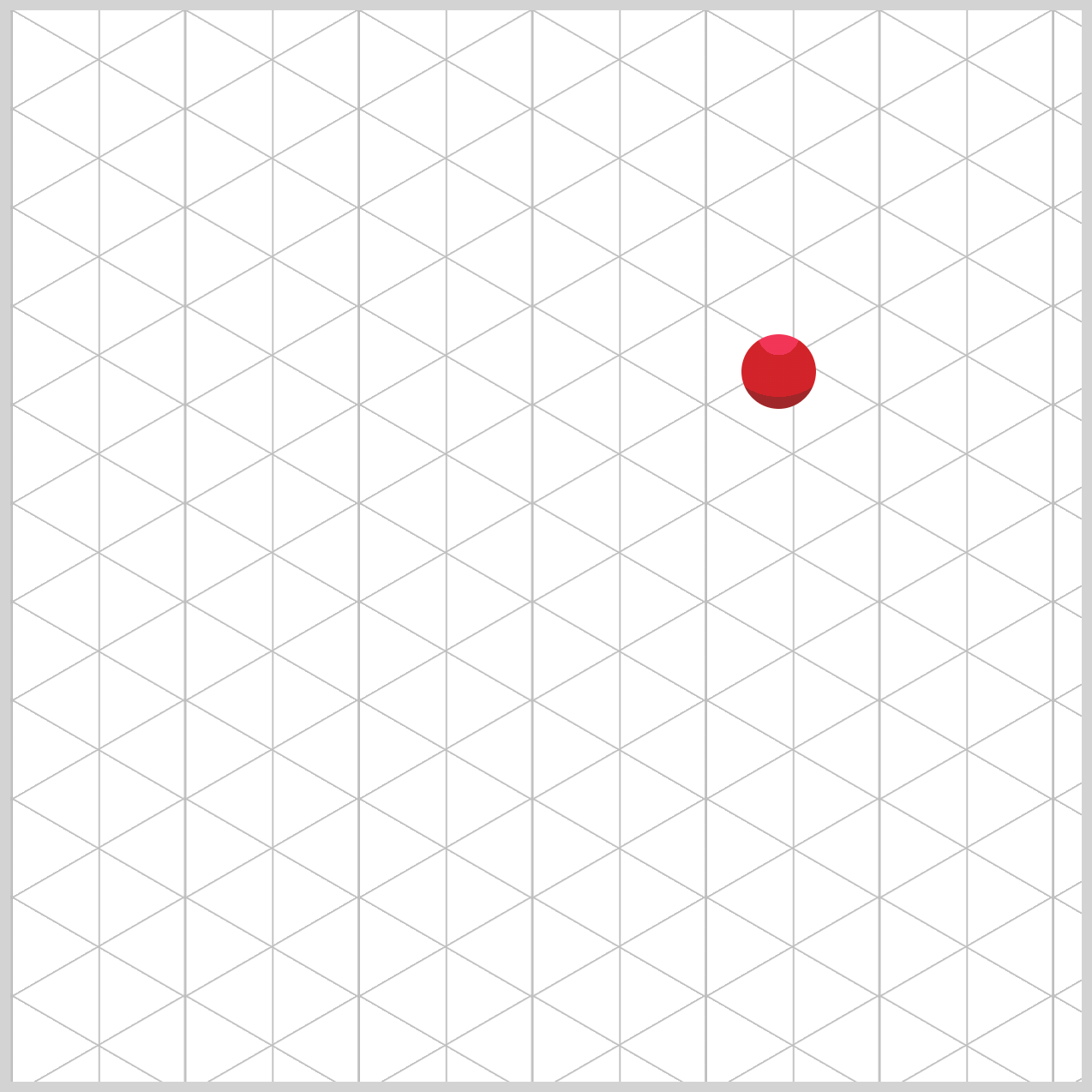
The red gumball and its colored counterparts use the CSS radial-gradient() function to blend their hues. This gradient is a circle, centered at 50% on the horizontal x-axis and 0% on the vertical y-axis. The primary color for the red gumball, labeled --red-1, is #9f2629, a shade of Japanese Carmine.

.gumball-red {
  background: radial-gradient(
    circle at 50% 0%,
    var(--red-2) 75%,
    var(--red-1) 75%
  );
}
Crimson, #d12329, serves as the red gumball’s secondary color, designated as --red-2. It covers 75% of the red ball, while the primary color extends from 75% to 100%.
.gumball-red {
  background: radial-gradient(
    circle at 50% 0%,
    var(--red-3) 25%,
    var(--red-2) 25% 75%,
    var(--red-1) 75%
  );
}
The red gumball’s third color is raspberry, #f13557, and assigned to --red-3. This shade is the lightest among the three and occupies the range between 0% and 25%.
Gumball highlight

/* Gumball Highlight */
.gumball-highlight {
  position: relative;
  width: 20px;
  height: 20px;
  top: 3px;
  left: 5px;
  border-radius: 50%;
  border: 3px solid transparent;
  border-left: 3px solid var(--gumball-highlight);
  rotate: 45deg;
}
The gumball highlight features a semicircular shape. To create this semicircle, set the border radius property value to 50%. The color of the left border, --gumball-highlight, is set to a 3px solid white with 40% transparency, #ffffff66, whereas the remaining border colors are set to transparent.
It is essential to maintain the HTML code in the specified manner for the highlight to display correctly.
<div class="gumball-1 gumball-shape gumball-red">
  <div class="gumball-highlight"></div>
</div>
- Class attributes
gumball-1,gumball-shape, andgumball-redare assigned to the parent div element gumball-highlightis assigned to the child div element's class attribute
Other colors
The CSS code for the green, blue, and yellow gumball colors is listed below. The configuration is the same as that of the red gumball, and additional explanation is omitted for brevity.
/* Green Gumball */
.gumball-green {
  background: radial-gradient(
    circle at 50% 0%,
    var(--green-3) 25%,
    var(--green-2) 25% 75%,
    var(--green-1) 75%
  );
}
/* Blue Gumball */
.gumball-blue {
  background: radial-gradient(
    circle at 50% 0%,
    var(--blue-3) 25%,
    var(--blue-2) 25% 75%,
    var(--blue-1) 75%
  );
}

/* Yellow Gumball */
.gumball-yellow {
  background: radial-gradient(
    circle at 50% 0%,
    var(--yellow-3) 25%,
    var(--yellow-2) 25% 75%,
    var(--yellow-1) 75%
  );
}
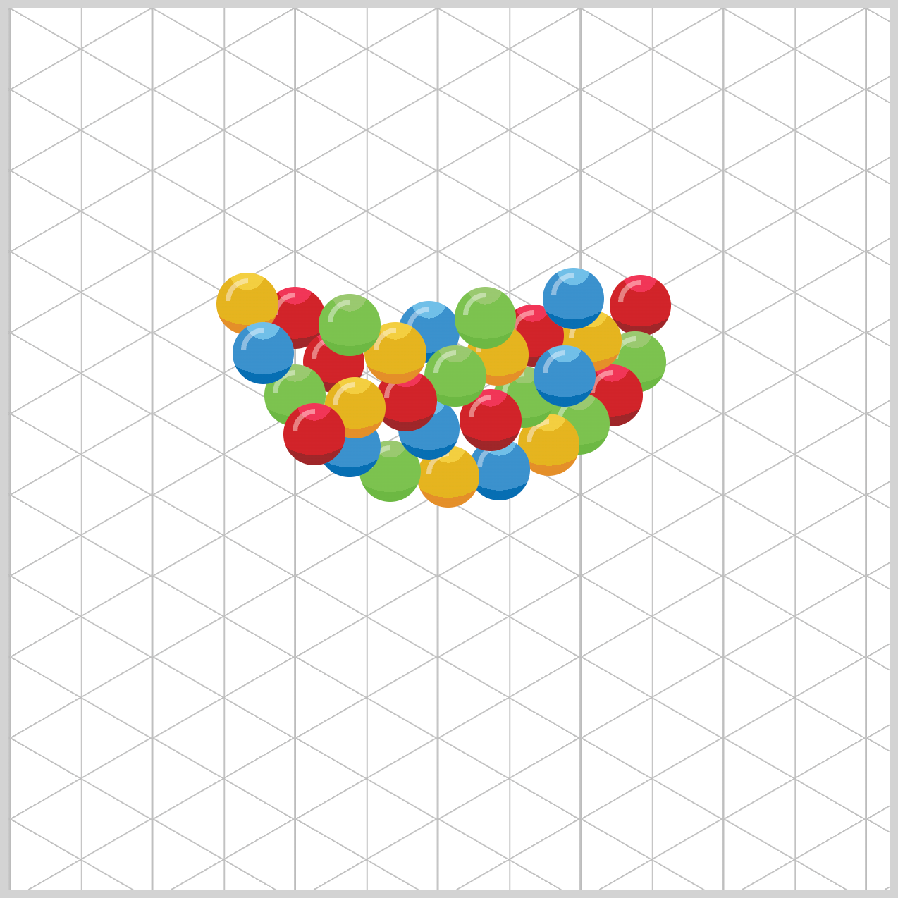
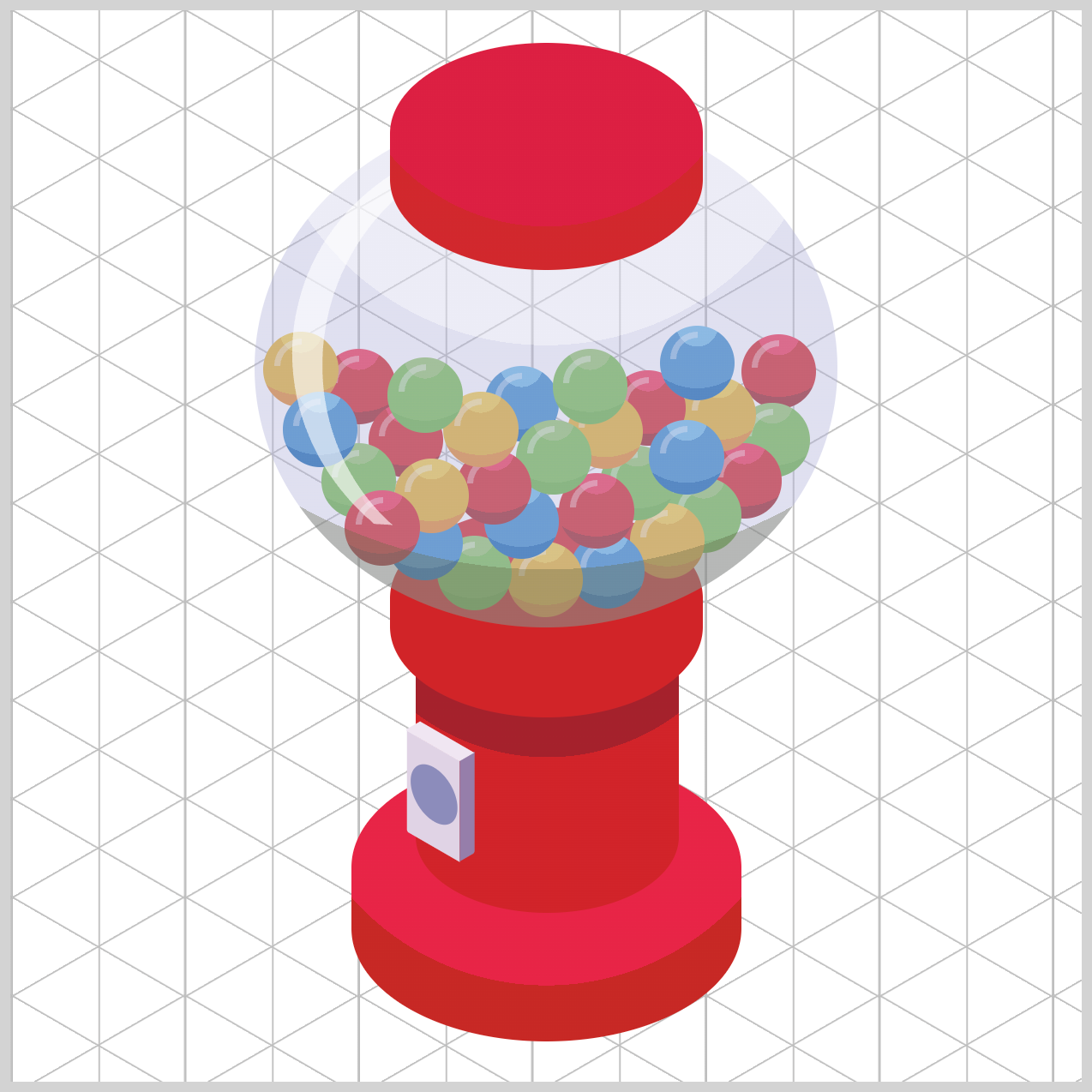
When you finish adding the CSS code, the 30 multi-colored gumballs should resemble the image above. Feel free to play around with the gumballs’ position and arrange them to your liking.
You can see and play with the complete code on Pyxofy’s CodePen page.
See the Pen CSS Art - Radial Gradient Techniques for Realistic Isometric Design - Gumball Machine by Pyxofy (@pyxofy) on CodePen.
Conclusion
This article, Part 2 of a two-part article series, demonstrated how to use the CSS radial-gradient() function to enhance the various gumball machine components with an isometric 3D-like effect. By combining several CSS colors with different levels of transparency, you crafted a semi-transparent globe that showcased the vibrant, multi-colored gumballs.
You discovered how to create a custom color palette and how to apply it to the gumball machine image elements. By using the CSS transform property and its various functions, you successfully made an isometric coin mechanism.
What kind of art will you create using the CSS radial-gradient() and transform? Share your masterpiece with us on LinkedIn, Threads, Bluesky, Mastodon, X (Twitter) @pyxofy, or Facebook.
We hope you liked this article. Kindly share it with your network. We appreciate it.
Related Articles
 Pyxofy
 Pyxofy
