CSS Art – Build an Isometric Hi-Hat with Gradients & Rotate - Part 3
Craft a stunning 3D hi-hat in pure CSS! Master isometric design, metallic gradients, and realistic drum hardware with zero images.


Introduction
Ready to transform a collection of flat HTML <div> elements into a realistic 3D isometric hi-hat cymbals using only CSS?
In this three-part article series, you'll discover how to transform simple HTML and CSS into a detailed hi-hat cymbals illustration. As you build each component, from the cymbals and concentric rings to the clutch and pull rod, you'll learn how techniques such as positioning, layering, and shape styling work together to create realistic drum hardware.
- In Part 1, you focused on building the hi-hat's foundation by creating the tripod stand. This includes the center support column, adjustment hardware, support braces (connectors), and the three legs that give the stand its stability and structure.
- In Part 2, you built the remaining hi-hat components, including the Bottom Hat, Top Hat, Top Hat Rings, Clutch, and Pull Rod. These elements will come together to form the complete hi-hat cymbal assembly.
- In Part 3, the article you're reading now, you'll bring the illustration to life using CSS Custom Properties (variables) and CSS gradients. These techniques will help you add realistic metallic finishes, subtle highlights, shadows, and depth, transforming the basic grayscale shapes into a polished and visually appealing hi-hat cymbal.
CSS properties and functions you’ll be exploring in this article:
- CSS Custom Properties (variables)
linear-gradient()radial-gradient()
Preview
Before diving into the step-by-step sections, take a moment to preview the isometric hi-hat cymbals you'll be building throughout this three-part article series. This quick overview showcases the finished design and highlights the individual components that come together to form the final illustration.
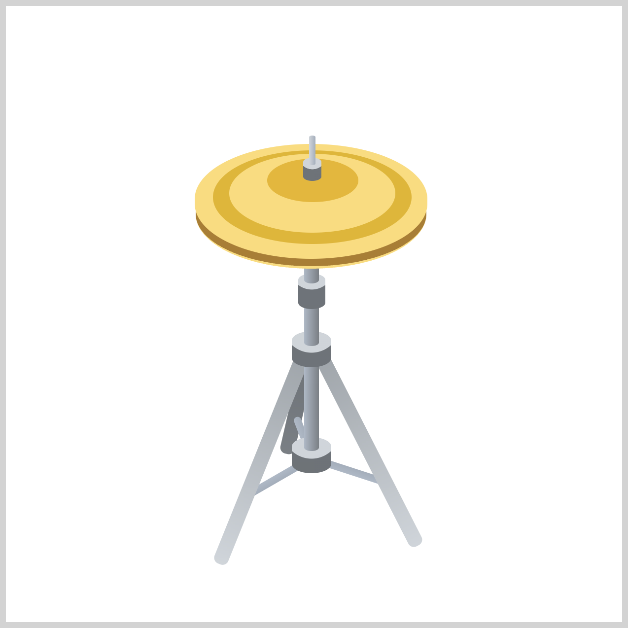
Seeing the completed artwork first will give you a clear understanding of the project and help you follow along as you create each section one step at a time using HTML and CSS.
Prerequisites
Essential CSS and HTML knowledge will help you understand the concepts and techniques introduced in this article. Jump over to this article if you require an HTML and CSS primer.
We assume you have configured tools to modify CSS. If not, this article will guide you through the setup process.
HTML Structure
<div class="container">
  <!-- Stand -->
  <div class="stand-third-leg"></div>
  <div class="third-leg-connector"></div>
  <div class="first-leg-connector"></div>
  <div class="second-leg-connector"></div>
  <div class="stand-first-leg"></div>
  <div class="stand-second-leg"></div>
  <div class="joint-assembly joint-1"></div>
  <div class="base-tube"></div>
  <div class="joint-assembly joint-2"></div>
  <div class="middle-tube"></div>
  <div class="tilter"></div>
  <div class="upper-tube"></div>

  <!-- Hi-Hat -->
  <div class="bottom-hat"></div>
  <div class="top-hat"></div>
  <div class="top-hat-rings"></div>
  <div class="clutch"></div>
  <div class="pull-rod"></div>
</div>
container is the outermost enclosure. It enables the content to be centered and draws a light gray border. The rest of the <div>s represent each image component.
Keep the HTML structure as is for the image to display correctly.
Body and Container <div> CSS
CSS code for the body and container <div>.
/* Body and Container Settings */
/* Center shapes */
body {
  margin: 0;
  padding: 0;
  height: 100vh;
  display: flex;
  justify-content: center;
  align-items: center;
  flex-wrap: wrap;
}

/* Set background and border color */
.container {
  width: 500px;
  height: 500px;
  border: 5px solid lightgray;
  background: transparent;
  position: relative;
  margin: 5px;
  display: flex;
  justify-content: center;
  align-items: center;
}
Color Palette
Using CSS Custom Properties (variables) is a great way to color the isometric hi-hat cymbals while keeping your stylesheet clean, organized, and easy to maintain. By defining your colors once with --variables, you can quickly update the entire design from a single location instead of searching through multiple CSS rules. This not only simplifies color management but also makes experimentation with different cymbal finishes much easier.
/* Color Palette */
:root {
  /* Tripod Stand */
  --stand-1: #d0d5da; /* Light Silver */
  --stand-2: #afb9c6; /* Silver Blue */
  --stand-3: #a4aebb; /* Cadet Gray */
  --stand-4: #a0a6ab; /* Metallic Gray */
  --stand-5: #7b8086; /* Medium Gray */
  --stand-6: #7a7f84; /* Gunmetal Gray */
  --stand-7: #6e7378; /* Charcoal Gray */

  /* Hi-Hat */
  --hi-hat-1: #e3b73d; /* Rich Brass Gold */
  --hi-hat-2: #f9dc81; /* Cymbal Gold */
  --hi-hat-3: #dfb53c; /* Antique Gold */
  --hi-hat-4: #a97e37; /* Aged Bronze */
}
As your artwork grows and you add more details, shadows, or highlights, a well-structured color system will help your CSS stay scalable, consistent, and future-proof with minimal extra effort.
Stand Assembly
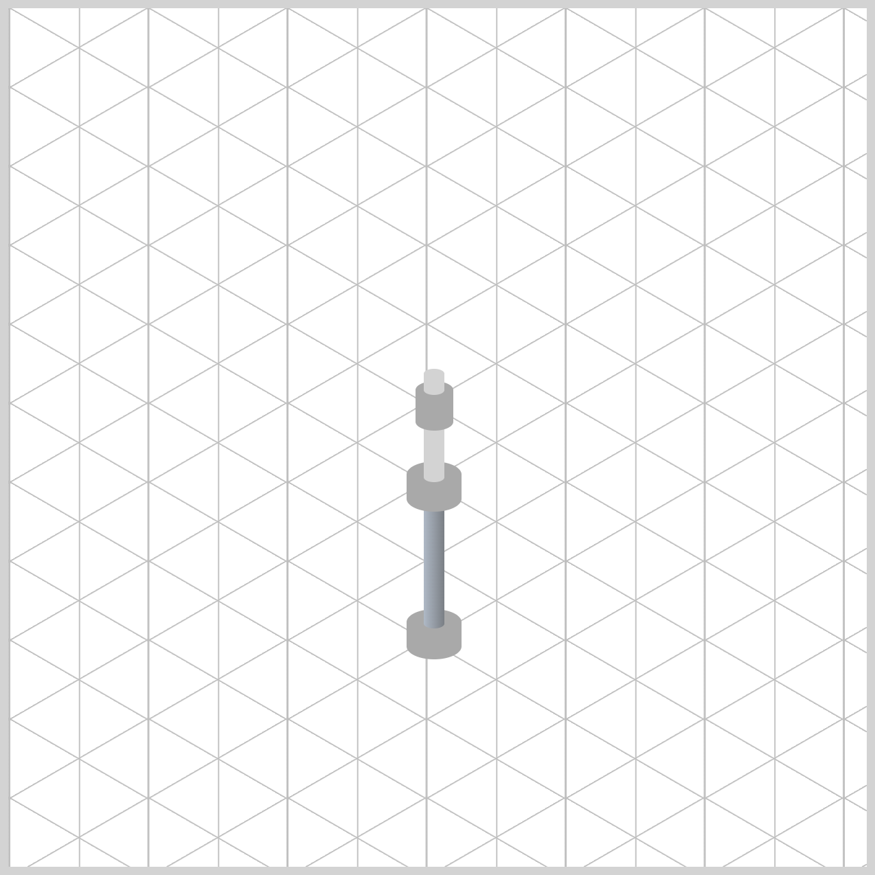
The Stand Assembly forms the structural support of the hi-hat and is built from several individual components, including the base tube, middle tube and upper tube.
/* Stand Assembly */
.base-tube {
  background: linear-gradient(to right, var(--stand-2), var(--stand-6));
}
The linear gradient's to right direction creates the impression that light is hitting the tube from the left side. As the gradient transitions across the element, the surface gradually darkens, mimicking how light naturally wraps around a cylindrical metal object. The same direction is applied for the rest of the tubes.
The linear gradient uses two colors from the custom palette: var(--stand-2) (#afb9c6, Silver Blue) and var(--stand-6) (#7a7f84, Gunmetal Gray). The lighter Silver Blue tone acts as the highlighted area of the chrome finish, while the darker Gunmetal Gray creates shadow and contrast along the opposite edge.
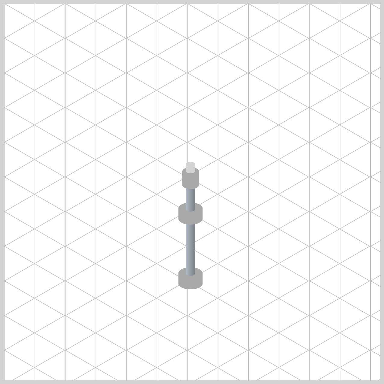
.middle-tube {
  background: linear-gradient(to right, var(--stand-2), var(--stand-6));
}
The .base-tube, .middle-tube, and .upper-tube all use the same linear-gradient(to right, var(--stand-2), var(--stand-6)) rule, hence they appear as a single continuous metal pillar rather than separate sections.
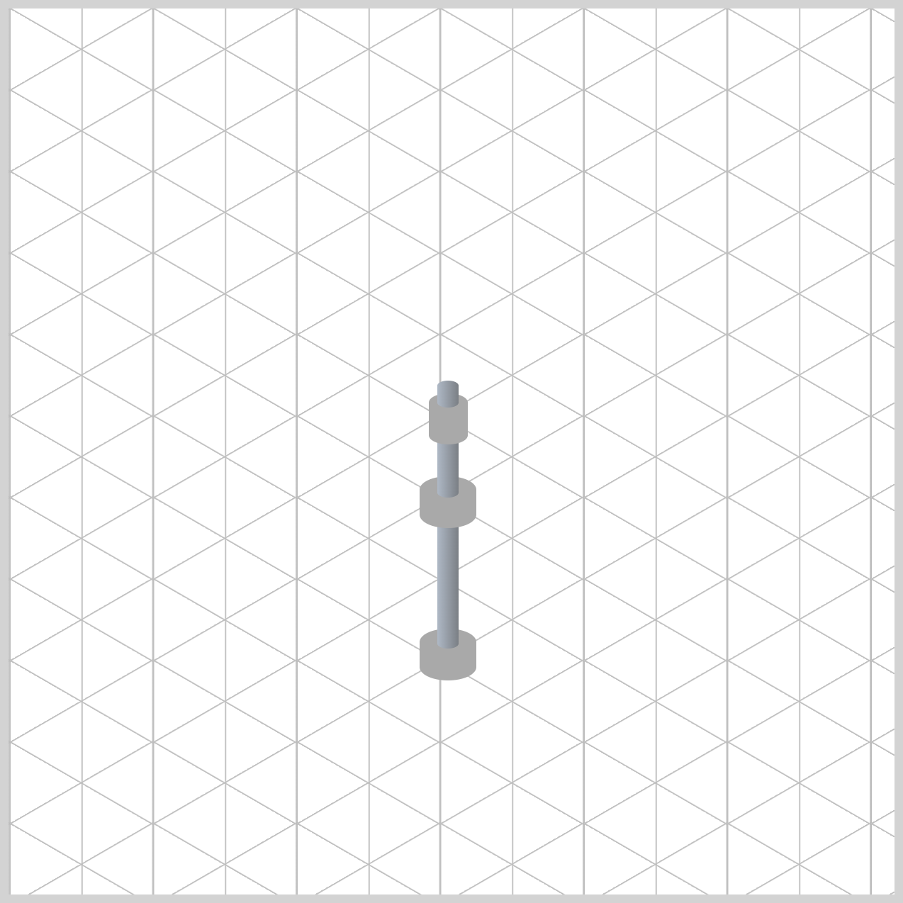
.upper-tube {
  background: linear-gradient(to right, var(--stand-2), var(--stand-6));
}
The consistent highlight and shadow pattern creates an uninterrupted vertical light reflection that runs through the entire stand.
Next, let's work on the Joint Assembly and the Tilter, two important components that connect the stand sections and support the hi-hat cymbals.
Joint Assembly and Tilter
While the tubes create the stand's main structure, the Joint Assembly and Tilter components add the mechanical details that make the hardware look realistic and functional.
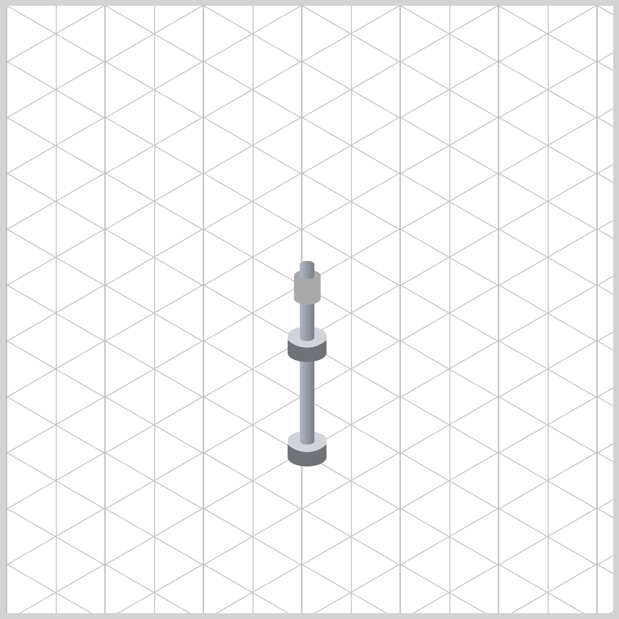
/* Joint Assembly */
.joint-assembly {
  background: radial-gradient(
    circle at 16px -6px,
    var(--stand-1) 0% 60%,
    var(--stand-7) 61% 100%
  );
}
The radial gradient's focal point, circle at 16px -6px, places the virtual light source slightly above the element's center. This creates a bright highlight across the upper portion of the collar while allowing the lower edges to fall into shadow, giving the hardware a more three-dimensional appearance.
The lighter color, var(--stand-1) (#d0d5da, Light Silver), represents the reflective chrome highlight, while var(--stand-7) (#6e7378, Charcoal Gray) adds a darker shadow around the outer edges. The sharp transition between 60% and 61% creates a crisp edge that resembles the beveled surfaces commonly found on machined drum hardware.
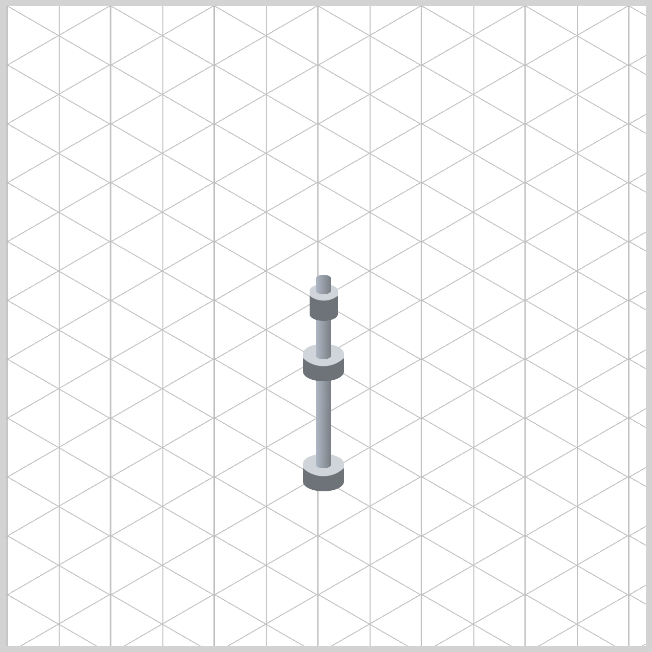
/* Tilter */
.tilter {
  background: radial-gradient(
    circle at 11px -5px,
    var(--stand-1) 0% 50%,
    var(--stand-7) 51% 100%
  );
}
The radial gradient is centered horizontally at 11px, which aligns the highlight with the middle of the 22px wide tilter. By positioning the light source slightly above the element using -5px, the highlight appears to fall naturally across the top surface, creating the illusion of overhead lighting.
The bright silver tone, var(--stand-1), forms the main reflective highlight, while var(--stand-7) provides a darker shadow around the outer edges. The sharp transition between 50% and 51% creates a crisp metallic edge that resembles a machined bevel rather than a soft, blended surface.
Up next are the Leg Connectors, the small but important components that link the center stand assembly to the tripod legs.
Leg Connectors
In this section, you'll apply metallic styling to the first, second, and third leg connectors, helping them blend seamlessly with the rest of the chrome hardware.
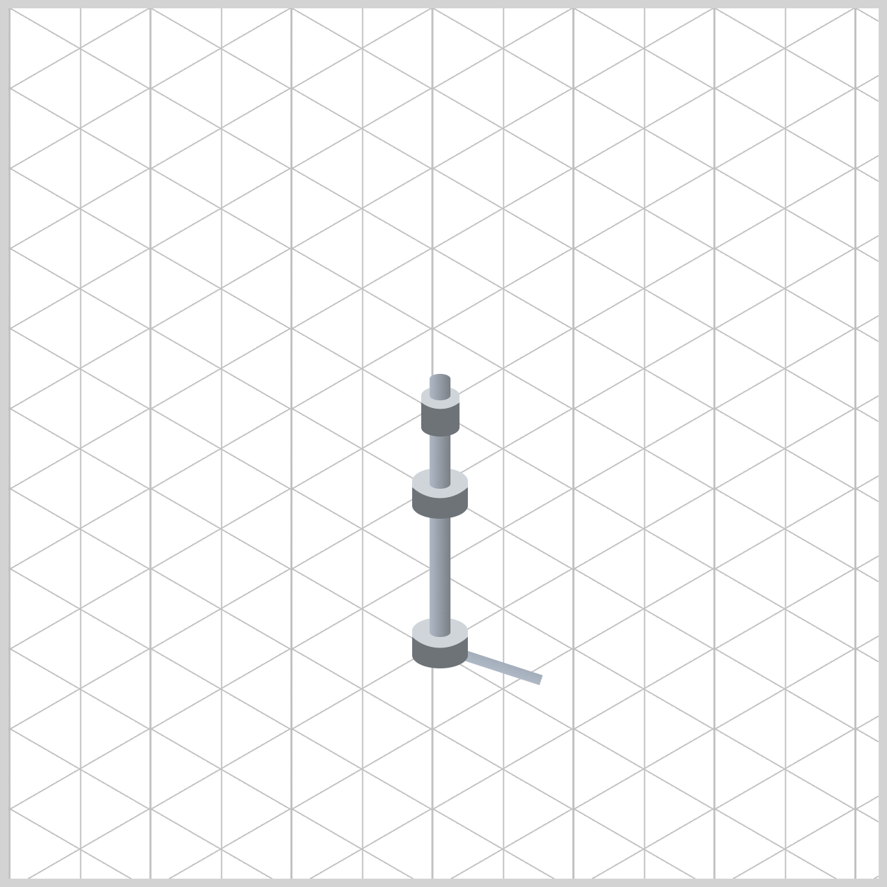
By using subtle gradients and carefully chosen colors from your custom palette, these connecting pieces will reinforce the illusion of a sturdy, professional-grade drum stand.
/* First Leg Connector */
.first-leg-connector {
  background: linear-gradient(
    to bottom,
    var(--stand-3) 0%,
    var(--stand-2) 100%
  );
}
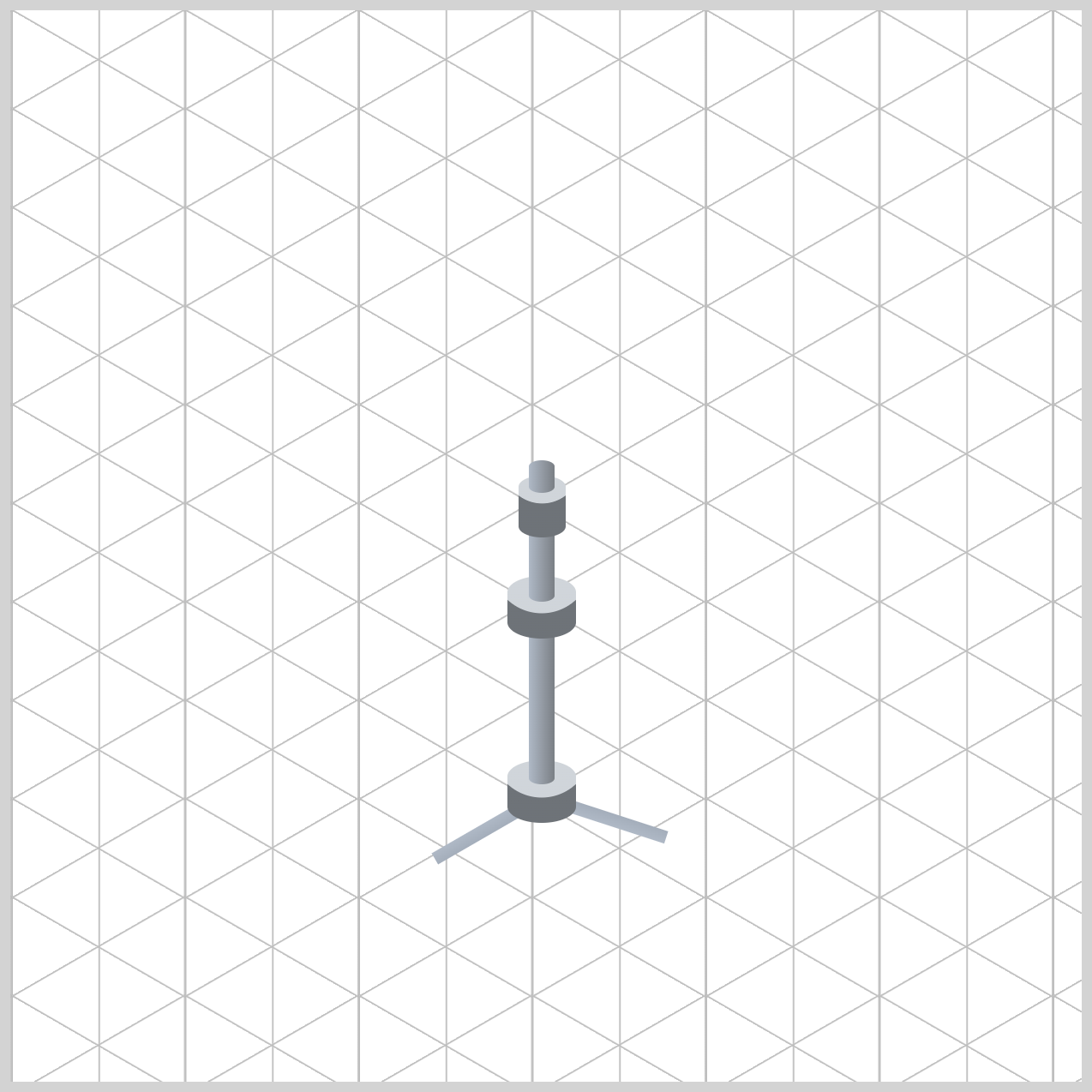
The linear gradient transitions from var(--stand-3) (#a4aebb, Cadet Gray) at the top to var(--stand-2) at the bottom, creating a gentle highlight across the connector's surface. This subtle color variation helps the element appear less flat and more like a polished metal bracket.
The result is a cleaner, more realistic connection between the center stand assembly and the tripod leg, enhancing the overall visual consistency of the hi-hat stand.
/* Second Leg Connector */
.second-leg-connector {
  background: linear-gradient(
    to bottom,
    var(--stand-3) 0%,
    var(--stand-2) 100%
  );
}
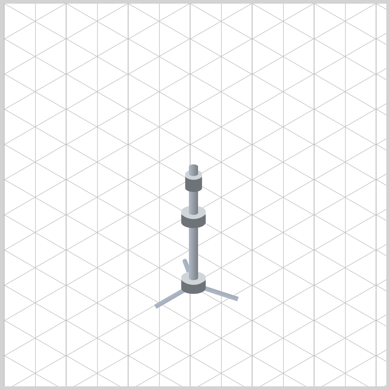
The Second Leg Connector and Third Leg Connector use the same linear-gradient() values applied to the First Leg Connector, ensuring a consistent metallic finish across all three connection points.
/* Third Leg Connector */
.third-leg-connector {
  background: linear-gradient(
    to bottom,
    var(--stand-3) 0%,
    var(--stand-2) 100%
  );
}
By reusing the same color transition from var(--stand-3) to var(--stand-2), each connector shares the same subtle highlight and reflective chrome appearance. This consistency helps the three connectors visually read as parts of the same hardware assembly, creating a more cohesive and realistic tripod stand structure.
With the connectors complete, it's time to move on to the Stand Legs.
Stand Legs
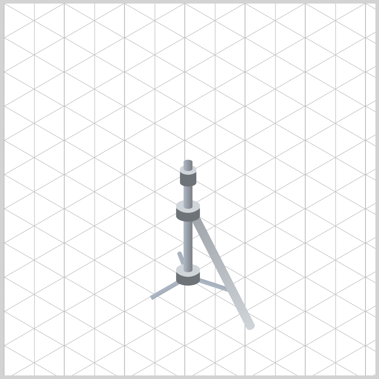
These three leg components form the foundation of the hi-hat stand, providing balance and support while reinforcing the realistic tripod structure.
By applying subtle highlights and shadows, each leg will begin to resemble polished chrome tubing, helping the entire stand feel more solid, dimensional, and true to real-world drum hardware.
/* First Leg */
.stand-first-leg {
  background: linear-gradient(
    to bottom,
    var(--stand-4) 0%,
    var(--stand-1) 100%
  );
}
The linear gradient flows from top to bottom, starting with var(--stand-4) (#a0a6ab, Metallic Gray) and gradually transitioning to the brighter var(--stand-1). This creates a natural highlight that makes the leg appear more dimensional and reflective, similar to polished chrome hardware.
Using a slightly darker tone near the top also helps visually connect the leg to the stand's central assembly, while the brighter silver tone near the bottom adds a subtle reflective sheen. Together, these colors give the tripod leg a solid, metallic appearance that enhances the realism of the hi-hat stand.
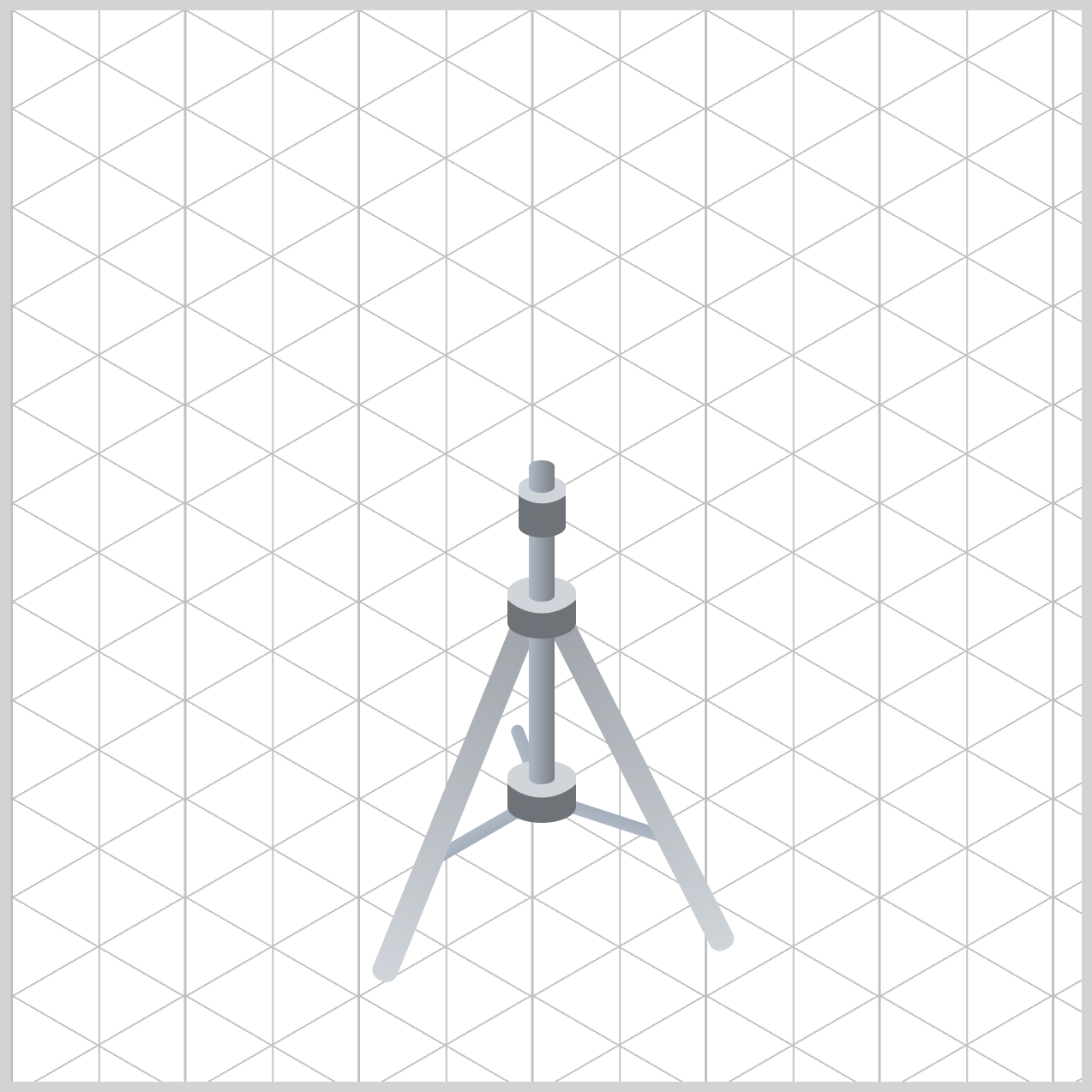
/* Second Leg */
.stand-second-leg {
  background: linear-gradient(
    to bottom,
    var(--stand-4) 0%,
    var(--stand-1) 100%
  );
}
The Second Leg uses the same gradient applied to the First Leg, ensuring both front-facing legs share a consistent finish.
In contrast, the Third Leg uses darker metallic tones, helping it recede into the background and strengthening the illustration's sense of depth and perspective.
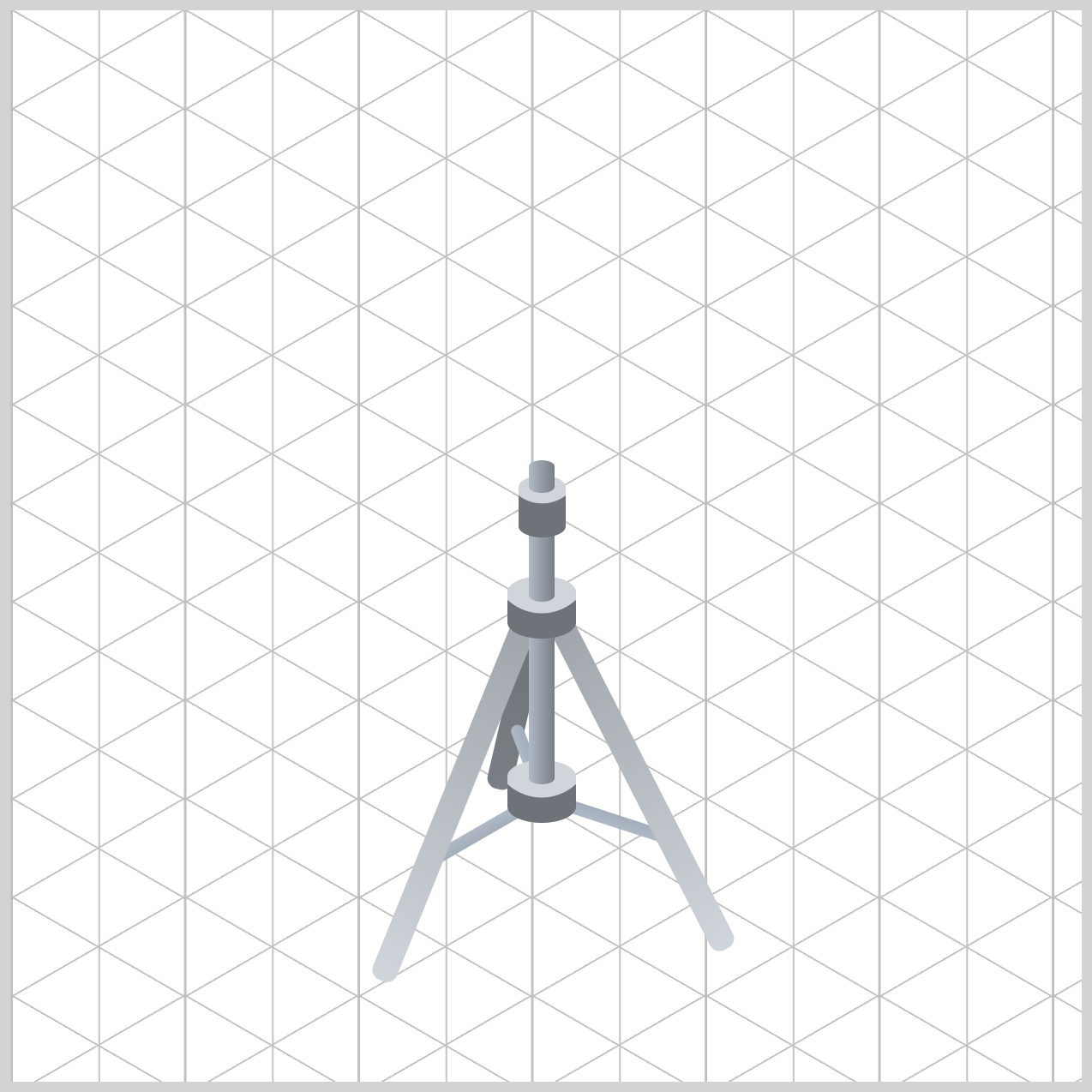
/* Third Leg */
.stand-third-leg {
  background: linear-gradient(
    to bottom,
    var(--stand-7) 0%,
    var(--stand-6) 100%
  );
}
The gradient flows from top to bottom, transitioning from var(--stand-7) to var(--stand-6). The darker tone near the top creates the impression of shadow beneath the overlapping stand hardware, while the slightly lighter tone near the bottom suggests a small amount of reflected ambient light.
Unlike the two front legs, which use brighter silver tones to catch the viewer's attention, the third leg is intentionally shaded with darker colors. This subtle contrast helps push the leg into the background, reinforcing the tripod's three-dimensional structure and creating a stronger sense of perspective.
Next up are the Bottom Hat and Top Hat, the two cymbals that give the hi-hat its distinctive appearance.
Bottom and Top Hat
In this section using carefully selected colors, subtle shading, and layered shapes, you'll create the look of realistic metal cymbals with depth and dimension.
The combination of the Bottom Hat, Top Hat, and their decorative rings will help capture the reflective qualities of polished bronze, bringing the hi-hat assembly much closer to its finished form.
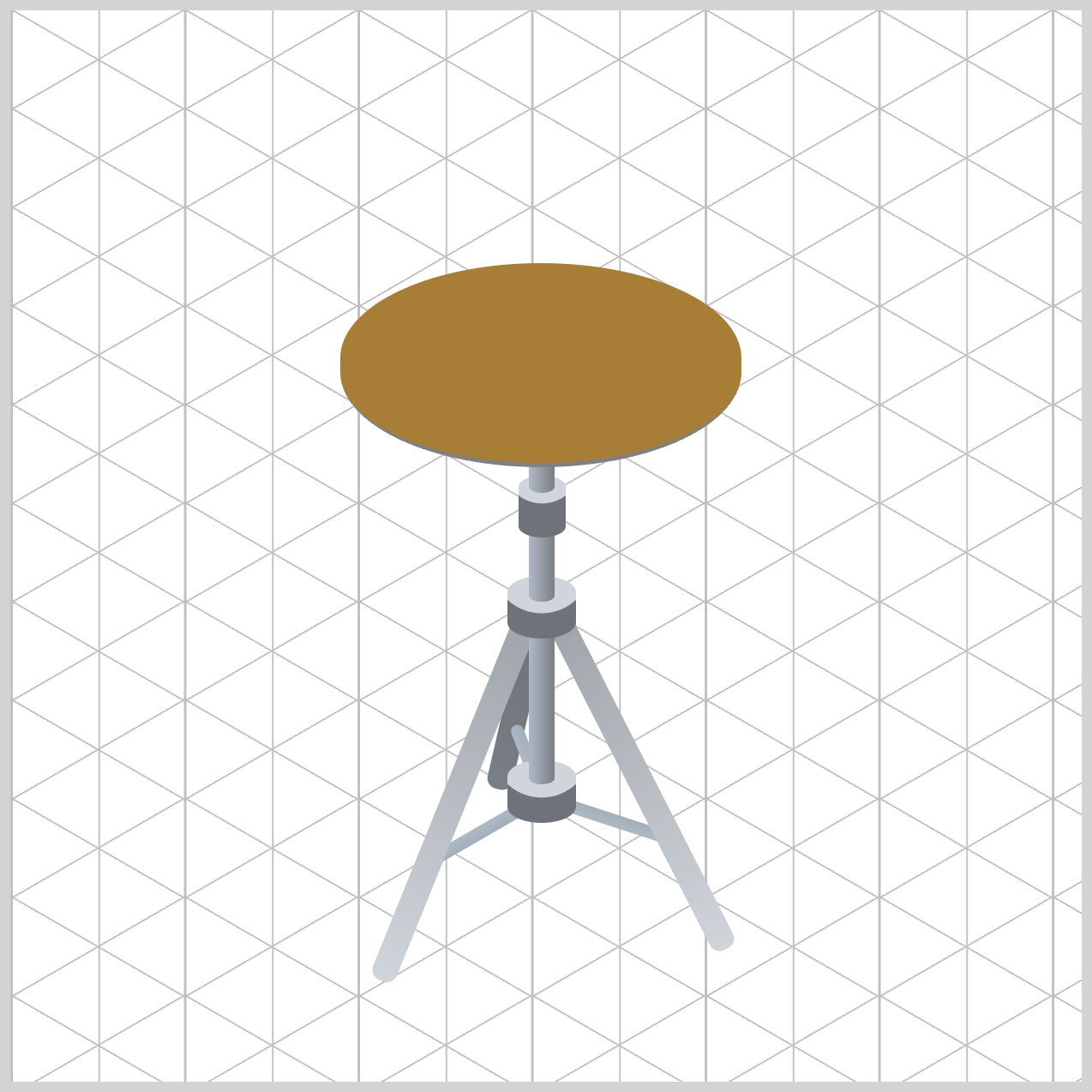
/* Bottom Hat */
.bottom-hat {
  background: var(--hi-hat-4);
}
The Bottom Hat cymbal body uses var(--hi-hat-4) (#a97e37), a rich Aged Bronze color that represents the darker underside of the hi-hat. Since the bottom cymbal sits beneath the top cymbal, this deeper tone helps simulate natural shadow and gives the assembly a more realistic layered appearance.
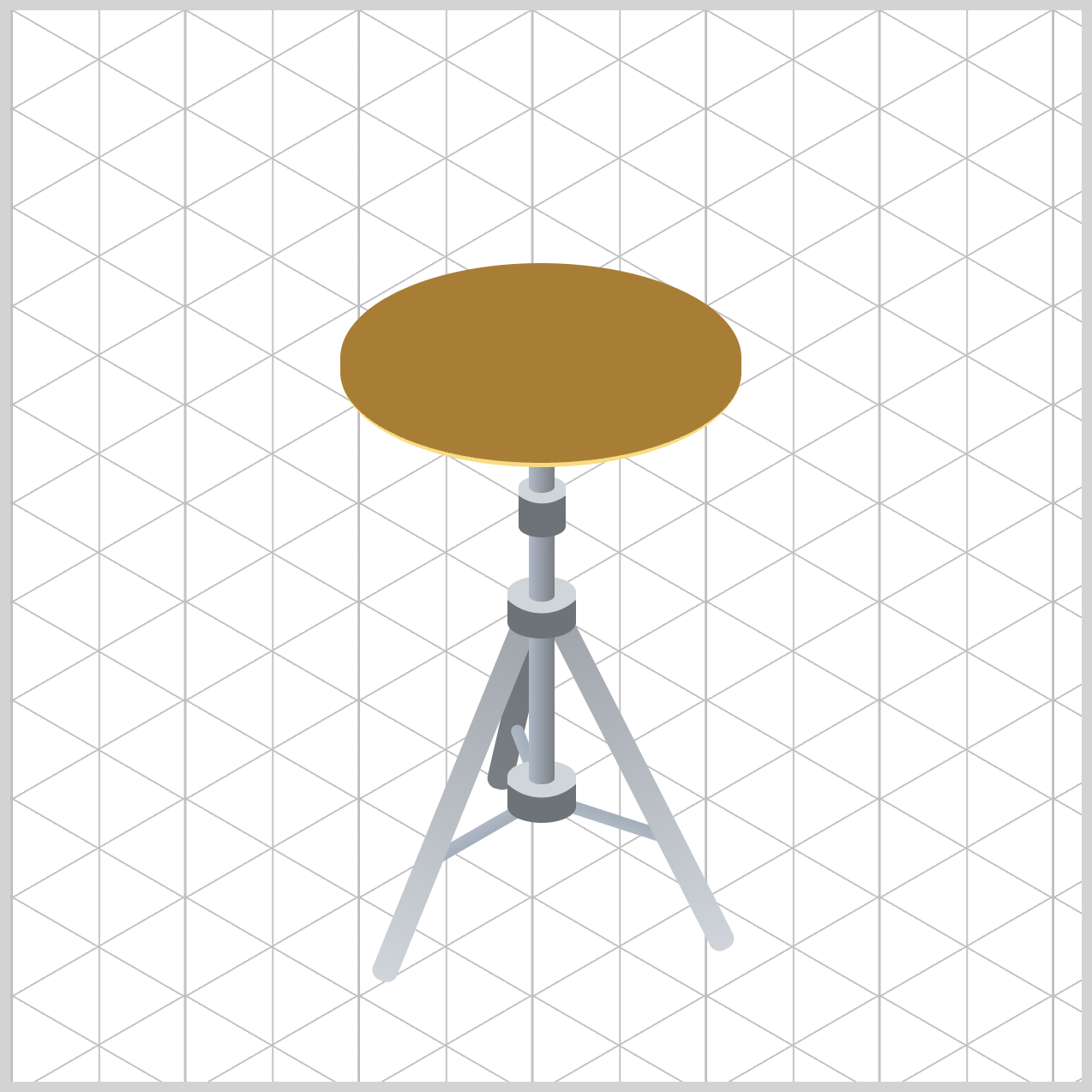
.bottom-hat {
  border-bottom: solid 2px var(--hi-hat-2);
}
To enhance the metallic effect, the border-bottom uses var(--hi-hat-2) (#f9dc81), a bright Cymbal Gold tone. This 2px thin solid highlight, creates the illusion of light catching the cymbal's outer edge, adding subtle contrast and helping define its curved profile.
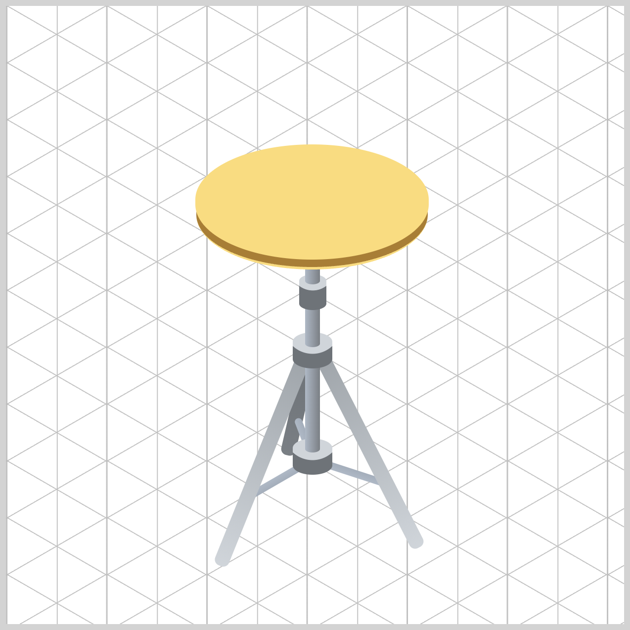
/* Top Hat */
.top-hat {
  background: var(--hi-hat-2);
}
The var(--hi-hat-2) color resolves to #f9dc81 (Cymbal Gold), the brightest shade in the hi-hat palette. Applying this warm metallic tone across the entire cymbal face creates the appearance of polished bronze reflecting overhead light, making the top cymbal feel brighter and more prominent than the lower cymbal.
Let's enhance the Top Hat by adding the decorative rings that give the cymbal its characteristic lathed appearance in the next section.
Top Hat Rings
The layered ring shapes introduce subtle color variation across the cymbal surface, helping it look more like polished bronze rather than a flat gold oval. The rings also add visual depth and realism, making the hi-hat feel closer to an actual drum cymbal.
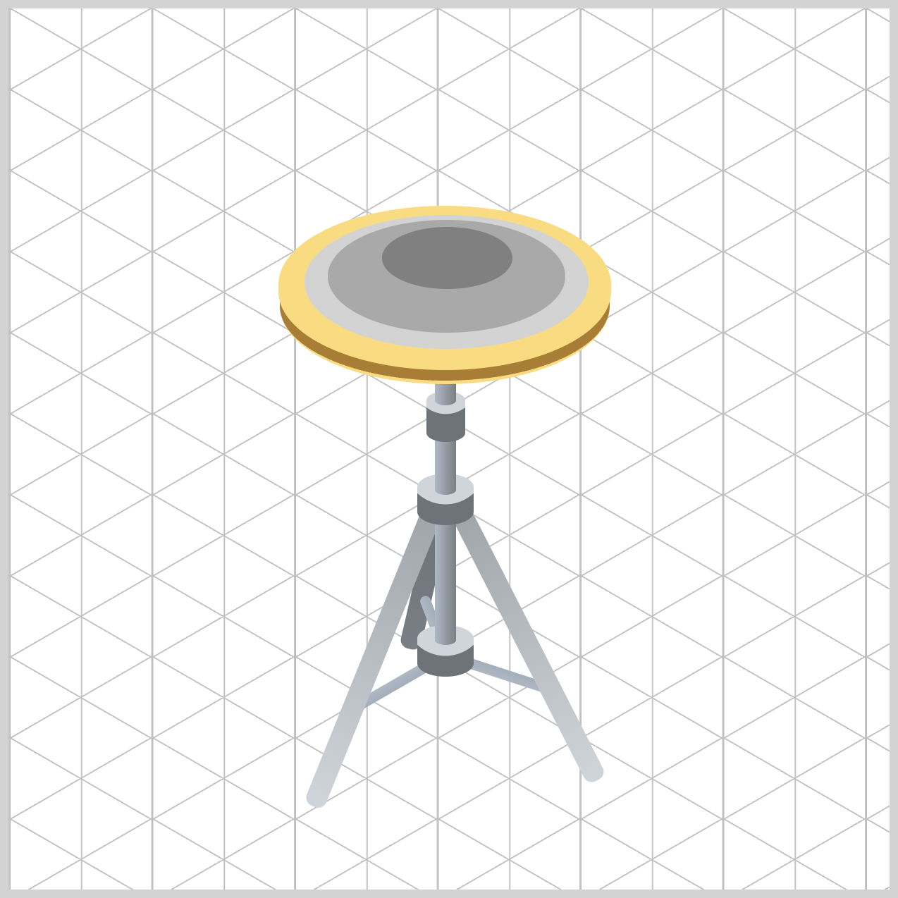
By applying contrasting shades from the hi-hat color palette, you'll create the illusion of concentric machining grooves and reflective metal surfaces. The combination of the First outer ring, Second inner ring, and Third center bell helps break up the large cymbal face while drawing attention to the focal point of the instrument. Together, these details transform the Top Hat from a simple shape into a convincing isometric hi-hat cymbal.
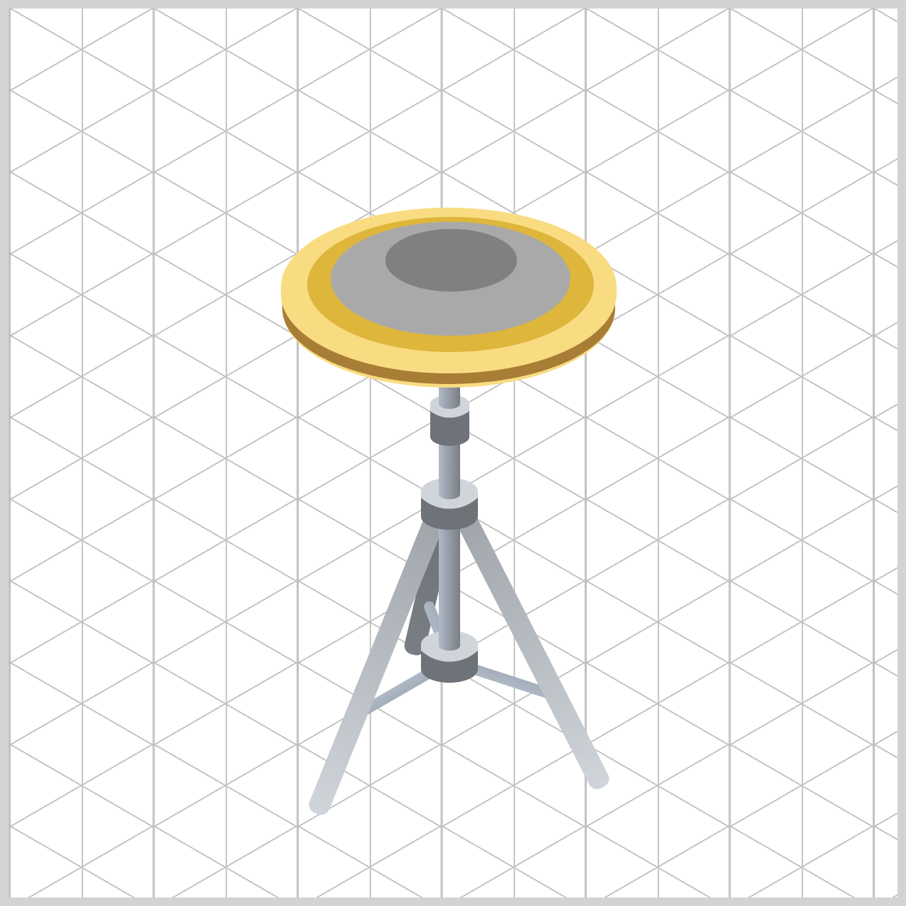
/* Rings */
.top-hat-rings {
  background: var(--hi-hat-3);
}
The First outer ring, uses var(--hi-hat-3) (#dfb53c), a warm Antique Gold tone that represents the main playable surface of the cymbal.
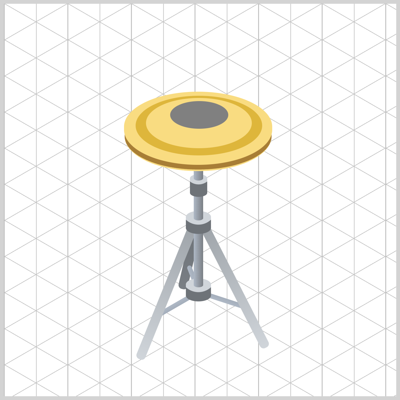
.top-hat-rings::before {
  background: var(--hi-hat-2);
}
The Second inner ring’s ::before pseudo-element uses the brighter var(--hi-hat-2) color to create a reflective ring that mimics light catching the cymbal's lathed grooves.
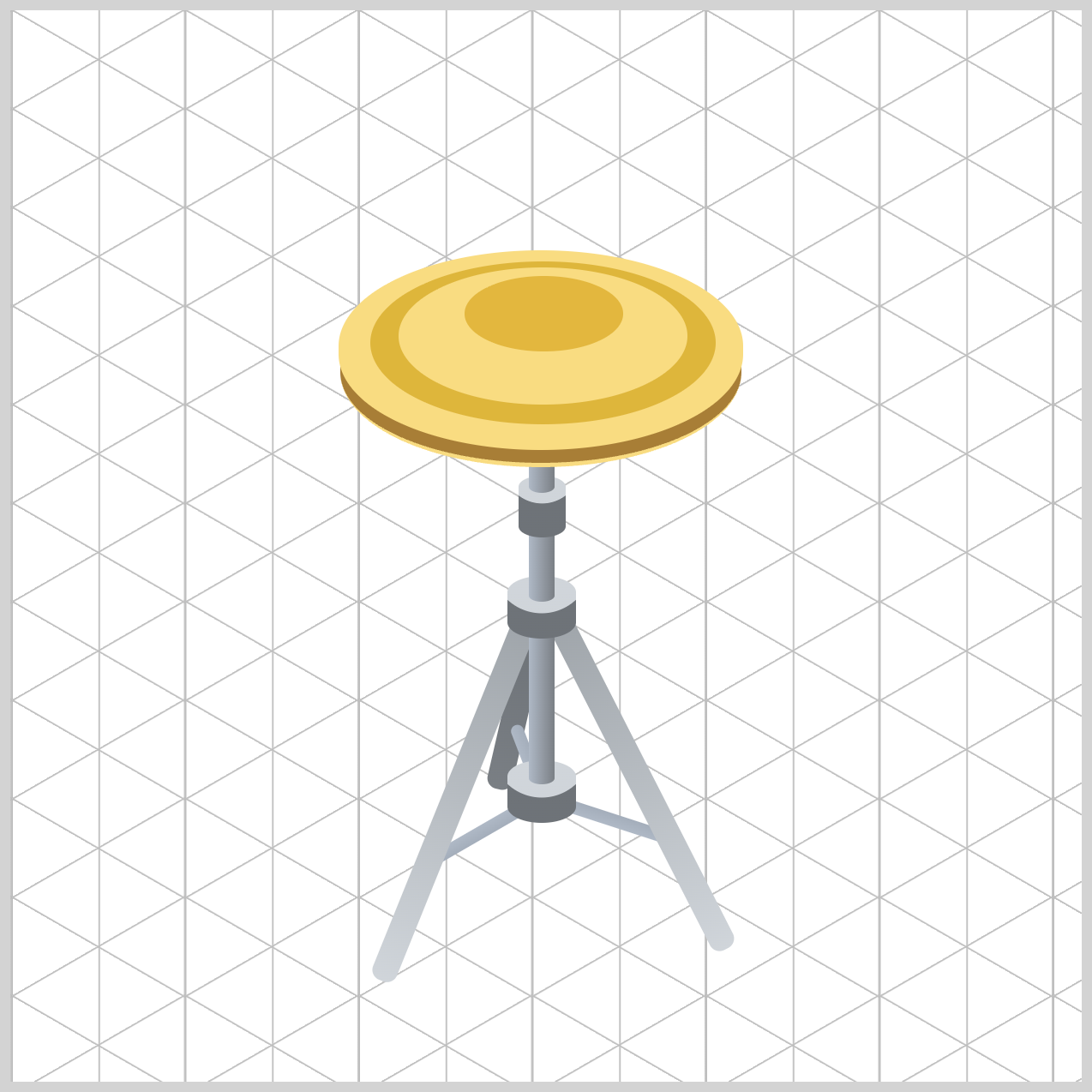
.top-hat-rings::after {
  background: var(--hi-hat-1);
}
Finally, the Third Ring’s (Center Bell) ::after pseudo-element uses var(--hi-hat-1) (#e3b73d), a deeper Rich Brass Gold tone, to form the raised center bell.
Together, these alternating gold and bronze shades create clear visual separation between the cymbal's different surfaces. Even without complex gradients, the layered colors add depth, highlight important details, and make the flat 2D shape feel much more like a realistic bronze hi-hat cymbal.
For the final section, let's work on the Clutch and the Pull Rod.
Clutch and Pull Rod
The Clutch secures the top cymbal to the pull rod. The Pull Rod in turn controls the opening and closing motion of the hi-hat mechanism. By applying the same metallic color palette used throughout the stand, you'll ensure these parts blend seamlessly with the surrounding hardware.
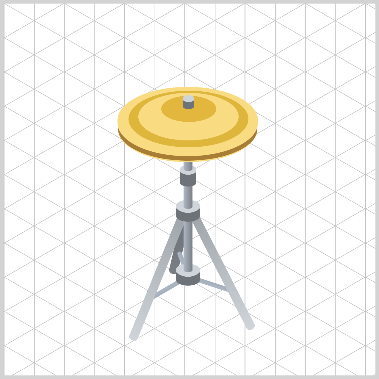
/* Clutch */
.clutch {
  background: radial-gradient(
    circle at 7.5px -2px,
    var(--stand-1) 0% 51%,
    var(--stand-7) 52% 100%
  );
}
Positioning the radial gradient slightly above the element with circle at 7.5px -2px creates the illusion of overhead lighting reflecting off a rounded chrome surface.
The gradient uses var(--stand-1) as the bright metallic highlight and var(--stand-7) as the darker shadow. The sharp transition between 51% and 52% forms a crisp edge that resembles the machined contours commonly found on drum hardware.
/* Pull Rod */
.pull-rod {
  background: linear-gradient(to right, var(--stand-1), var(--stand-3));
}
The linear gradient transitions horizontally from var(--stand-1) to var(--stand-3). The brighter silver tone creates a reflective highlight along one side of the rod, while the slightly darker gray adds subtle shadow. Even across its narrow width, this color shift helps the element appear cylindrical rather than flat.
Because the Pull Rod sits directly above the Clutch and aligns with the stand's central axis, the matching metallic palette creates a seamless connection between all the hardware components and provides the final metallic detail in the illustration.
You can see and play with the complete code on Pyxofy’s CodePen page.
See the Pen CSS Art – Build an Isometric Hi-Hat with Gradients & Rotate by Pyxofy (@pyxofy) on CodePen.
Conclusion
In this article you learned how to use CSS Custom Properties (variables) to create a centralized color system for the stand and cymbals, making the design consistent, scalable, and easy to maintain.
These reusable color tokens were combined with linear-gradient() and radial-gradient() CSS functions to simulate realistic metallic highlights, shadows, reflections, and surface contours. Rather than appearing as flat rectangles and circles, the components gain the illusion of curved metal surfaces, cylindrical tubing, raised hardware collars, and layered bronze cymbals.
When paired with border-radius, position, and rotate CSS properties, these gradients create convincing isometric depth and 3D volume, transforming simple HTML elements into a realistic hi-hat illustration using pure CSS alone.
Put your newly learned CSS skills to the test and share your masterpiece with us on LinkedIn, Threads, Bluesky, Mastodon, X (Twitter) @pyxofy, or Facebook.
We hope you liked this article. Kindly share it with your network. We appreciate it.
Related Articles
 Pyxofy

 Pyxofy
 Pyxofy
 Pyxofy