CSS Art – How to Make Image Masks and Knockout Text
Ever wondered how colorful CSS gradients can be combined with mask and text. Step-by-step article to create CSS mask and knockout text.
Introduction
CSS image mask and background-clip are powerful tools. It enables you to hide an element, partially or fully, by masking or clipping images at specific points.
Using CSS mask and background-clip, we’ll be creating different mask and knockout text (text clipping) effects in this article.
By working with the examples, you’ll be able to create circular mask, stripe mask and knockout text. You can use these techniques on your next CSS art or web design project.
Preview
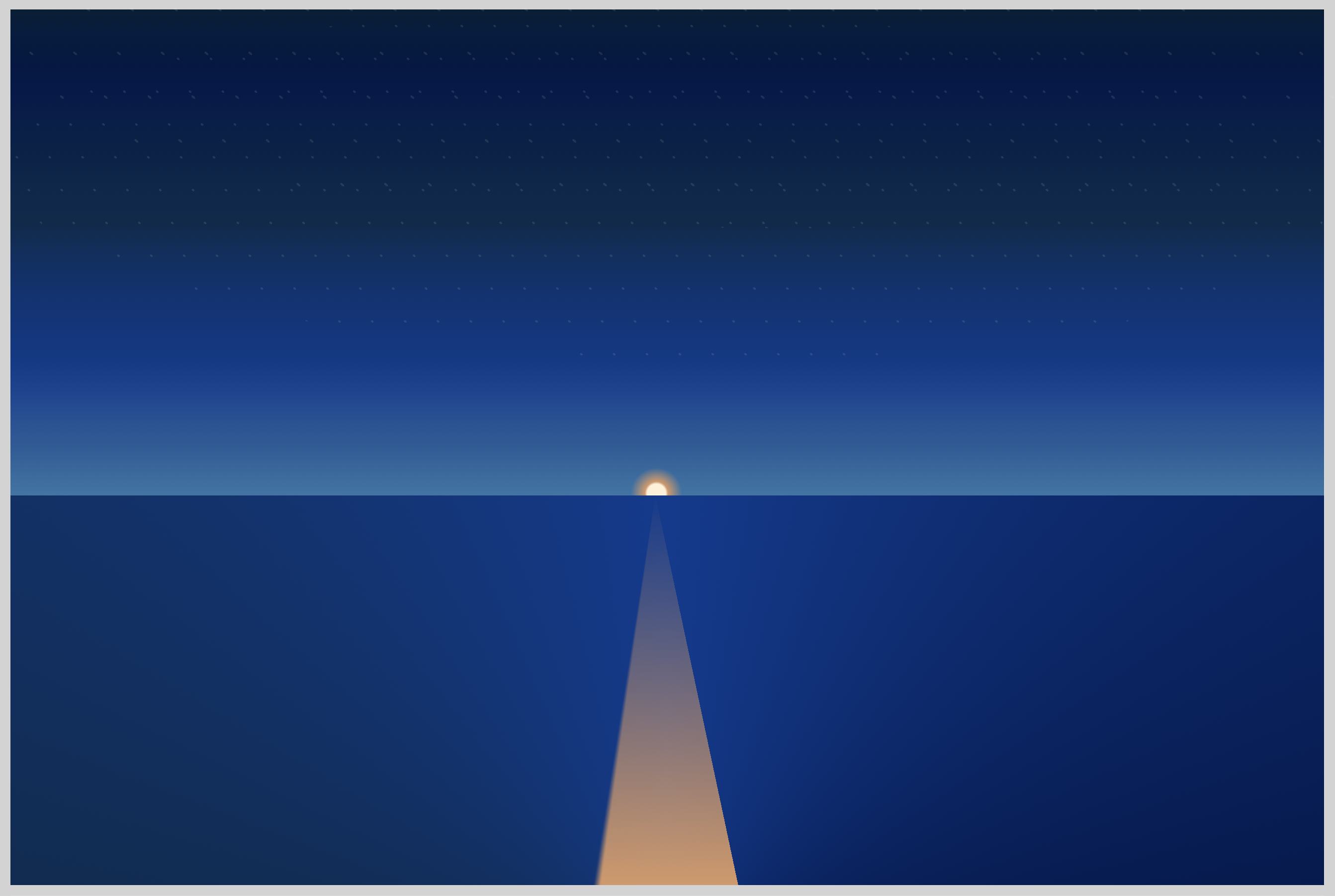
Quick run down of what we’ll be making in this article.
- Circle Mask

Using radial gradient, we will make circle masks. You can arrange them anyway you like, super fun way to highlight different parts of your gradient background. Using different sizes, you can make interesting design patterns and arrangements.
- Stripe Mask

Stripes as background patterns are versatile. You can make them thick or thin to fit your needs. You can change their angle to put captivating twists in your background design.
For this example, we will use a repeating linear gradient combined with a linear gradient to generate the stripe pattern.
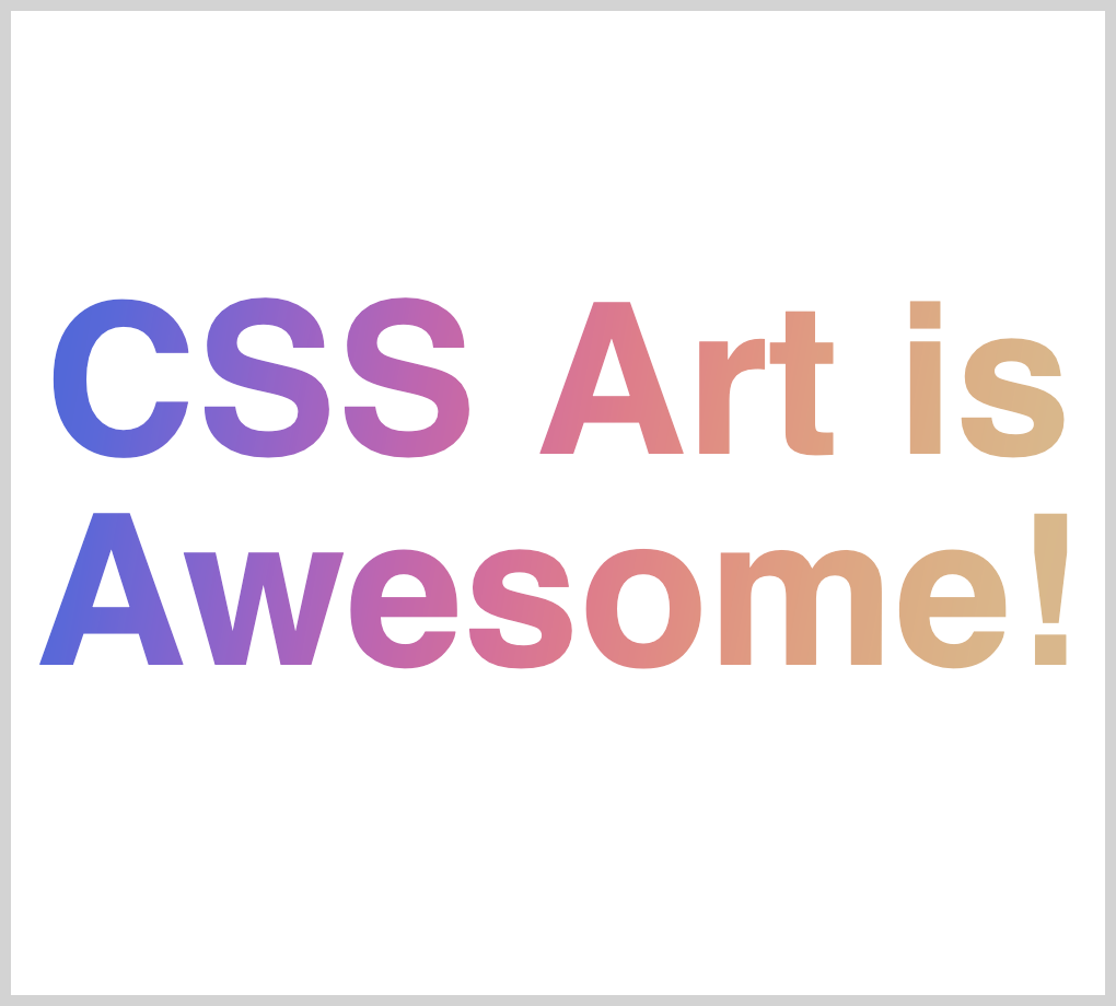
- Knockout Text (Text Clipping)
")
Text with gradient backgrounds are all the rage these days, at least we think so, feel free to disagree.
Top brands are adopting them and we understand why. They’re very exciting to look at and, maybe, more expressive than plain black or white text. Make compelling text effects using different gradients and your favorite font.
By combining background-clip, -webkit-text-fill-color and a gradient background, we will create this text effect.
- Gradient Background

We’ll be using this gradient background throughout the article. It’s a simple linear gradient. Please don't hesitate to modify it to whatever color gradient you like. Let your unique color combination reflect your creativity.
Prerequisites
We don’t assume prior knowledge of CSS or HTML, but it helps if you have some familiarity with how they work. Jump over to this article if you require an HTML and CSS primer.
We assume that you have set up tools to create CSS art. If you haven’t, this article will show you how to set them up.
Difference between Masking and Clipping
Before we create the CSS art examples, let’s make sure that we’re clear on the difference between masking and clipping.
- Masking is created from images.
When using CSS mask, do take note that “black” color will be see-through and other colors will be opaque.
This is confusing at first. But as we go through the examples, this should sink in.
If you want the background image or underlying image to shine through, you need to set the mask to black color. Another important thing to remember is “transparent” color is treated as opaque when used with mask. - Clipping is created from vectors paths.
Anything within the closed vector path will show through or be visible. Anything outside the path is “clipped” or not shown.
We use CSSclip-pathto make clipping path. Take note that an older clipping method,clip, is deprecated. If you want to dive in to clip-path code, try this web app.
For an in-depth explanation of masking and clipping, read this article and check this demo.
Now that we know the difference between masking and clipping, let’s start working on our examples.
HTML Structure
Here’s the HTML code for our examples.
<!-- CSS art code here -->

<!-- radial-gradient to make circles -->
<div class="container">
  <div class="mask-circle"></div>
</div>

<!-- Repeating Pattern Mask -->
<div class="container">
  <div class="mask-pattern"></div>
</div>

<!-- Knockout Text (Text Clipping) -->
<div class="container">
  <div class="knockout-text">
    <p class="gradient-text">CSS Art is Awesome!</p>
  </div>
</div>

<!-- Color gradient background -->
<div class="container">
  <div class="background-gradient"></div>
</div>
- For Knockout Text (Text Clipping) example, the text you input in to
<p class="gradient-text">Input text here</p>will be used as text clipping. The background will show through the input text.
We’ll be using vendor prefix for the CSS examples to work with webkit based browsers (Safari, Chrome, newer versions of Opera, and iOS browsers).
Vendor Prefix Code
 /* webkit vendor prefix start */
Some CSS code
 /* webkit vendor prefix end */
At the time of this writing, Chrome will not display the masks without the webkit vendor prefix. This may change in the future.
Let’s work on the CSS examples.
Using radial-gradient as a Mask
We’ll be using radial-gradient to make circles. These circles will let the underlying color gradient show through. Everything outside the circles will be opaque white and block the background gradient from showing through.
CSS code:
/* radial-gradient to make circles */
.mask-circle {
  width: 500px;
  height: 450px;
  /* Background gradient */
  background: linear-gradient(
    125deg,
	royablue,
    #5768df,
    #8164d7,
    #aa60c8,
    #cc60b3,
    #e3689c,
    #ed7889,
    #ee8c7e,
    #e99e7c,
    #e4ac7f,
    #e0b585,
    burlywood
  );

  /* Mask */
  /* webkit vendor prefix start */
  -webkit-mask: radial-gradient(circle at 50% 50%, black 30%, transparent 0%),
    radial-gradient(circle at 15% 15%, black 10%, transparent 0%),
    radial-gradient(circle at 85% 17%, black 12%, transparent 0%),
    radial-gradient(circle at 12% 85%, black 8%, transparent 0%),
    radial-gradient(circle at 85% 80%, black 12%, transparent 0%),
    radial-gradient(circle at 53% 20%, black 5%, transparent 0%),
    radial-gradient(circle at 77% 50%, black 5%, transparent 0%),
    radial-gradient(circle at 47% 93%, black 6%, transparent 0%),
    radial-gradient(circle at 17% 50%, black 8%, transparent 0%);
  -webkit-mask-repeat: no-repeat;
  /* webkit vendor prefix end */

  mask: radial-gradient(circle at 50% 50%, black 30%, transparent 0%),
    radial-gradient(circle at 15% 15%, black 10%, transparent 0%),
    radial-gradient(circle at 85% 17%, black 12%, transparent 0%),
    radial-gradient(circle at 12% 85%, black 8%, transparent 0%),
    radial-gradient(circle at 85% 80%, black 12%, transparent 0%),
    radial-gradient(circle at 53% 20%, black 5%, transparent 0%),
    radial-gradient(circle at 77% 50%, black 5%, transparent 0%),
    radial-gradient(circle at 47% 93%, black 6%, transparent 0%),
    radial-gradient(circle at 17% 50%, black 8%, transparent 0%);
  mask-repeat: no-repeat;
}
Let’s go through the CSS code in detail.
First, we’ll tackle the code that produces the color background gradient.
/* Background gradient */
background: linear-gradient(
  125deg,
  royalblue,
  #5768df,
  #8164d7,
  #aa60c8,
  #cc60b3,
  #e3689c,
  #ed7889,
  #ee8c7e,
  #e99e7c,
  #e4ac7f,
  #e0b585,
  burlywood
);
We’re using a linear gradient to produce the color background. Total of 12 colors in the gradient. Remember, you have to separate each color with a comma ,. This gives the gradient a smooth transition between “royal blue” to “burlywood” color.
125deg
We rotated the linear gradient 125 degrees from the default 0 degrees. You can change the rotation. Experiment to find out which rotation degree suits your preference.mask: radial-gradientis directly followed by
mask:radial-gradient.
Eachradial-gradientfunction will produce a circle. Take note, you need to separate eachradial-gradientwith a comma,.radial-gradient(circle at 50% 50%, black 30%, transparent 0%)
Each individual circle will be produced with this code.circlekeyword required to produce circle. If you don’t set this, the radial gradient will produce the default ellipse.50% 50%sets the circle’s location on the x-axis and y-axis. Since we want the first circle to be in the center, we set both x-axis and y-axis to50%.black 30%is our first color stop. Remember, black color will be see-through.30%will control the size of the circle. Change it to another number, maybe to 5% or 10%. See how it affects the circle size.
We settransparentcolor to0%, so we don’t get any gradation effect on the circle.mask-repeat: no-repeat;
Don’t forget to include this code. Without this code, the mask will repeat itself on large or wide containers.
We have 9 circles for this example. Play around with their size and location. You can add more circles with radial-gradiant function.
Repeating Pattern Mask
The CSS code for this example is much more simple compared to the circle example above. We combine linear gradient and repeating linear gradient in this example.
CSS code:
/* Repeating Pattern Mask */
.mask-pattern {
  width: 500px;
  height: 450px;
  /* Background gradient */
  background: linear-gradient(
    -120deg,
	royablue,
    #5768df,
    #8164d7,
    #aa60c8,
    #cc60b3,
    #e3689c,
    #ed7889,
    #ee8c7e,
    #e99e7c,
    #e4ac7f,
    #e0b585,
    burlywood
  );
  /* Mask */
  /* webkit vendor prefix start */
  -webkit-mask: repeating-linear-gradient(
    45deg,
    black 5% 10%,
    transparent 10% 15%
  );
  /* webkit vendor prefix end */

  mask: repeating-linear-gradient(45deg, black 5% 10%, transparent 10% 15%);
}
background: linear-gradient(-120deg,
The background gradient for this example is rotated -120 degrees from the default 0 degrees.
You should notice the color location are different compared to the circle example.mask: repeating-linear-gradient(45deg, black 5% 10%, transparent 10% 15%);
We use repeating linear gradient function to produce the stripes. We rotate the repeating linear gradient by45degfrom the default 0 degrees.black 5% 10%controls the size of the see-through stripe.
To produce the white stripes, we set the second colortransparent 10% 15%).
By increasing the percent number, you control the thickness of the white and black see-through stripe.
Let’s work on our last example.
Knockout Text (Text Clipping)
Text with gradient backgrounds are nice CSS art tools. They’re exciting and fun to look at. The color gradients can be as complex or simple as you would like them to be.
CSS code:
/* Knockout Text (Text Clipping) */
.knockout-text {
  width: 500px;
  height: 450px;
  font: 900 6rem sans-serif;
  text-align: center;
  display: flex;
  justify-content: center;
  align-items: center;
}

.gradient-text {
  /* Background gradient */
  background: linear-gradient(
    100deg,
	royablue,
    #5768df,
    #8164d7,
    #aa60c8,
    #cc60b3,
    #e3689c,
    #ed7889,
    #ee8c7e,
    #e99e7c,
    #e4ac7f,
    #e0b585,
    burlywood
  );

  /* Background Clip */
  /* webkit vendor prefix start */
  -webkit-background-clip: text;
  -webkit-text-fill-color: transparent;
  /* webkit vendor prefix end */

  background-clip: text;
}
First, let’s look at the CSS code that styles the text.
font: 900 6em sans-serif;
text-align: center;
display: flex;
justify-content: center;
align-items: center;
font: 900 6rem sans-serif;
We set the font to be sans serif with a font weight of 900 and font size of 6rem.text-align: center;
display: flex;
justify-content: center;
align-items: center;
We use a combination oftext-alignand Flexbox to ensure that the text is centered in the middle of the container.
Play around with these properties. Maybe make the text align to left, right or justified./* webkit vendor prefix start */
-webkit-background-clip: text;
-webkit-text-fill-color: transparent;
/* webkit vendor prefix end */
background-clip: text;
The above code produces the clipped text effect.
Besides thebackground-clip: text;, it is important to include-webkit-text-fill-color: transparent;. Without this code, the background color will not show through, resulting in black text or whatever text color you assign.
We have reached the end of all our examples. If you have read this far, give yourself a big round of applause or a big pat on the back.
You can see and play with the code used in the example at Pyxofy’s CodePen page.
See the Pen CSS Art - Image Mask and Knockout Text by Pyxofy (@pyxofy) on CodePen.
Conclusion
CSS mask and background clip combined with gradients are becoming a staple for modern web design. Top brands are adopting them in their design language.
We used the same linear gradient background throughout our examples. To make it interesting, we slightly changed the rotation degree. Simple modification, but it gives each example a fresh look.
By using masks and background clip, we can control which elements are visually shown or hidden. Combining this with CSS animation techniques, you can provide delightful experiences to your users.
You’re not limited to the color gradients we showed in the example. Make a color gradient you like. Maybe a gradient that is representative of your corporate or brand colors. Instead of circles, perhaps you can mix in squares or ovals.
What will you make with CSS mask and background clip? We’d love to see them. Share your art with us on Twitter @pyxofy, LinkedIn, or Facebook.
We hope you liked this article. Kindly share it with your network. We really appreciate it.
Related Articles
 Pyxofy
 Pyxofy
 Pyxofy