CSS Art – How to Make a Game Character – Goomba
Do you hear the rumbling in the distance? Can you feel the ground shaking? Let’s make Bowser's mushroom foot soldier in this article, step-by-step.
Introduction
Meet Bowser’s infamous mushroom foot soldiers, Goomba!
Let’s create this video game character by combining different CSS and SVG techniques in this article.
We’ll be using below CSS technologies. Visit our CSS Art articles section for more details.
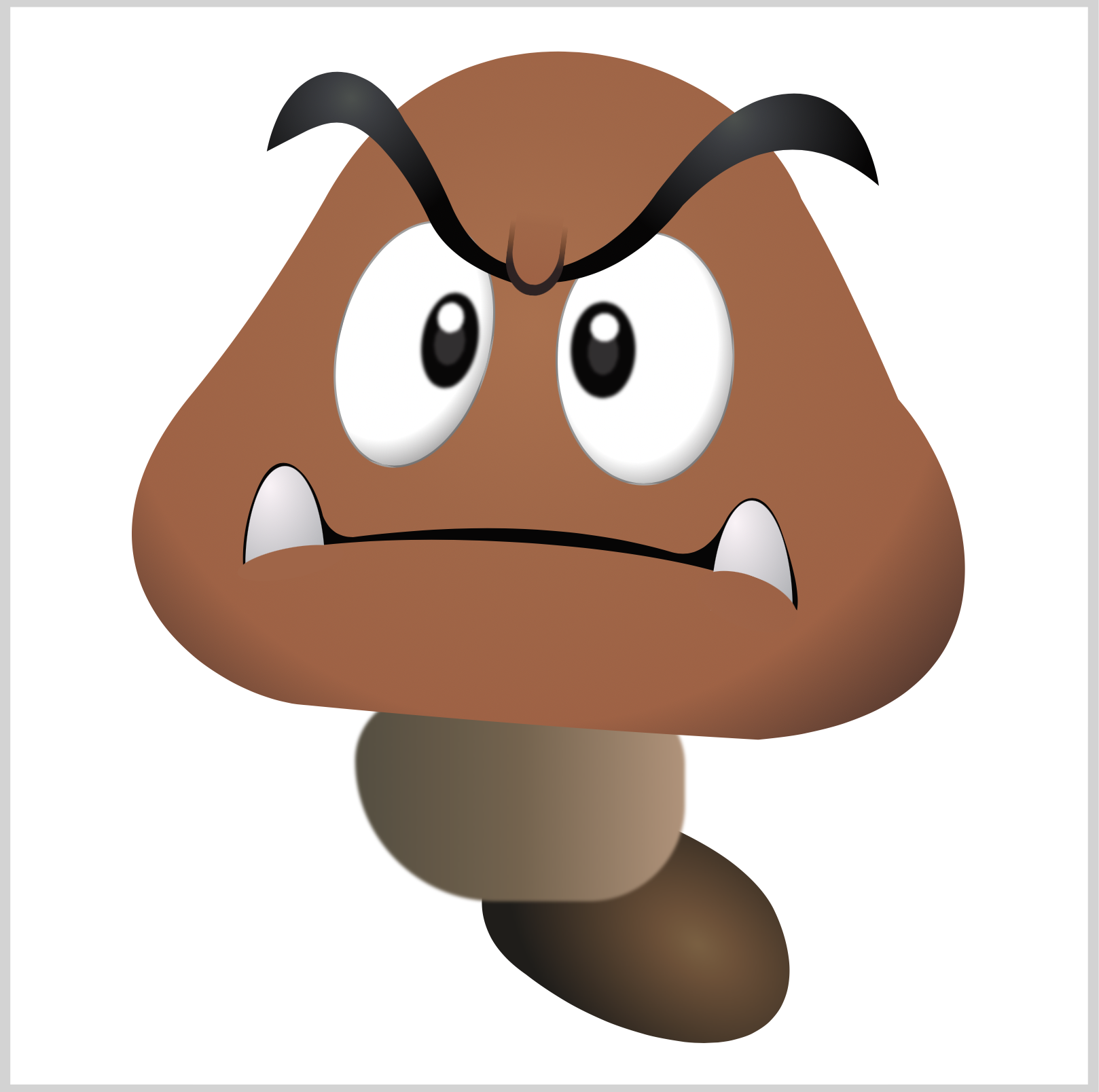
Preview
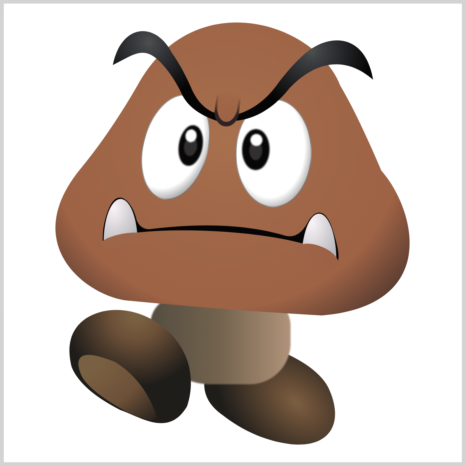
Our image will consist of these different parts:
- Eyes
- Glabella
- Face
- Eyebrows
- Teeth, Lips, and Mouth
- Body
- Left and Right Foot
Prerequisites
We don’t assume prior knowledge of CSS or HTML, but it helps if you have some familiarity with how they work. Jump over to this article if you require an HTML and CSS primer.
We assume that you have set up tools to create CSS art. If you haven’t, this article will show you how to set them up.
HTML Structure
Here’s the HTML code for our image.
<div class="container">
  <div class="right-foot st"></div>
  <div class="body st"></div>
  <div class="face st"></div>
  <div class="right-eye st"></div>
  <div class="left-eye st"></div>
  <div class="eye-brow-right st"></div>
  <div class="eye-brow-left st"></div>
  <div class="glabella st"></div>
  <div class="mouth st"></div>
  <div class="right-tooth st"></div>
  <div class="left-tooth st"></div>
  <div class="lip st"></div>
  <div class="left-foot st"></div>
</div>
container is our outermost enclosure. This enables us to center the art and put a light gray border. The rest of the divs represent each of Goomba’s parts.
It’s important to keep the HTML structure as is for each part to display properly.
Color Palette
Here’s the CSS code for the color palette, body and container div.
/**************************************/
/* Color, Body and Container Settings */
/**************************************/
/* Color palette */
:root {
  /* Transparent */
  --t: transparent;

  /* Goomba Face */
  --face-1: hsla(18, 46%, 45%, 1);
  --face-2: hsla(20, 45%, 46%, 1);
  --face-3: hsla(21, 43%, 49%, 1);
  --face-4: hsla(21, 48%, 33%, 1);
  --face-5: hsla(355, 17%, 16%, 1);

  /* Eyebrows */
  --eyebrow-1: hsla(162, 3%, 30%, 1);
  --eyebrow-2: hsla(214, 5%, 25%, 1);
  --eyebrow-3: hsla(359, 11%, 2%, 1);

  /* Goomba Eyes */
  --eye-1: hsla(300, 0%, 100%, 1);
  --eye-2: hsla(333, 3%, 19%, 1);
  --eye-3: hsla(359, 7%, 3%, 1);

  /* Goomba Tooth */
  --tooth-1: hsla(333, 51%, 97%, 1);
  --tooth-2: hsla(214, 4%, 68%, 1);

  /* Goomba Mouth */
  --mouth-1: hsla(359, 11%, 2%, 1);

  /* Goomba Lip */
  --lip-1: hsla(19, 44%, 46%, 1);
  --lip-2: hsla(18, 45%, 45%, 1);

  /* Goomba Body */
  --body-1: hsla(26, 30%, 59%, 1);
  --body-2: hsla(31, 23%, 38%, 1);
  --body-3: hsla(40, 15%, 29%, 1);

  /* Goomba Feet */
  --feet-1: hsla(31, 35%, 37%, 1);
  --feet-2: rgb(113, 79, 52);
  --feet-3: rgb(31, 29, 26);
  --feet-4: rgb(61, 60, 48);

  /* Shadow */
  --shadow: hsla(240, 0%, 26%, 0.5);
}

/* Center shapes */
body {
  margin: 0;
  padding: 0;
  height: 100vh;
  display: flex;
  justify-content: center;
  align-items: center;
  flex-wrap: wrap;
}

/* Set light gray border */
.container {
  width: 500px;
  height: 500px;
  /*   border: 5px solid lightgray; */
  background: transparent;
  position: relative;
  display: flex;
  justify-content: center;
  align-items: center;
  border-radius: 1px;
  margin: 5px;
  background-size: 80%;
  background-position: center;
  background-repeat: no-repeat;
}
If you haven’t created a color palette before, you can check this article for an in-depth explanation.
Let’s start with Goomba’s right eye.
Right Eye

CSS Code:
.right-eye {
  position: absolute;
  width: 81px;
  height: 116px;
  top: 104px;
  left: 253px;
  background: radial-gradient(at 45% 45%, var(--eye-1) 60%, var(--eye-2));
  border: 1px solid var(--shadow);
  border-radius: 50%;
  transform: rotate(1deg);
}
Goomba’s right eye base is a vertically elongated ellipse.
We give it a thin border with, border: 1px solid var(--shadow);.
This code gives it a more rounded, 3D feel.
background: radial-gradient(at 45% 45%, var(--eye-1) 60%, var(--eye-2));
Let’s work on the Iris, Pupil and Highlight next.

CSS Code:
.right-eye::after {
  content: "";
  position: absolute;
  width: 30px;
  height: 45px;
  top: 32px;
  left: 6px;
  background:
	/* Highlight - White */
	  radial-gradient(100% 100% at 50% 50%,
       var(--eye-1) 49%,
       var(--t) 0%)
       52% 17% / 13px 13px,

    /* Pupil - Grey */
      radial-gradient(100% 100% at 50% 50%,
	   var(--eye-2) 49%,
       var(--t) 50%)
	   50% 55% / 14px 21px,

    /* Iris - Black */
      radial-gradient(100% 100% at 50% 50%,
	   var(--eye-3) 49%,
       var(--t) 50%)
       50% 58% / 35px 45px;
  background-repeat: no-repeat;
  border-radius: 50%;
  filter: blur(0.01px);
}
Let’s break down the background CSS code down in the next sections.
You can learn how to control Gradient Size and Placement technique used in the following sections in this article.

CSS Code:
/* Iris - Black */
radial-gradient(100% 100% at 50% 50%,
 var(--eye-3) 49%,
 var(--t) 50%)
 50% 58% / 35px 45px;
Our Iris consists of a black ellipse.

CSS Code:
/* Pupil - Grey */
radial-gradient(100% 100% at 50% 50%,
 var(--eye-2) 49%,
 var(--t) 50%)
 50% 55% / 14px 21px,
We add a grey ellipse on top of our Iris to simulate a Pupil.
CSS Code:
/* Highlight - White */
radial-gradient(100% 100% at 50% 50%,
 var(--eye-1) 49%,
 var(--t) 0%)
 52% 17% / 13px 13px,
To finish our right eye, we add a white circle Highlight on top of our Pupil.
We use filter: blur(0.01px); to give all three components a slight blur effect.
Left Eye
The Left Eye is almost a mirror image of the Right Eye; hence, we won’t provide an in-depth explanation for this section.

CSS Code:
.left-eye {
  position: absolute;
  width: 69px;
  height: 115px;
  top: 98px;
  left: 152px;
  background: radial-gradient(at 35% 45%, var(--eye-1) 60%, var(--eye-2));
  border: 1px solid var(--shadow);
  border-radius: 50%;
  transform: rotate(15deg);
}

CSS Code:
.left-eye::after {
  content: "";
  position: absolute;
  width: 26px;
  height: 45px;
  top: 29px;
  left: 37px;
  background:
	/* Highlight - White */
	  radial-gradient(100% 100% at 50% 50%,
       var(--eye-1) 49%,
       var(--t) 0%)
       41% 16% / 12px 14px,

    /* Pupil - Grey */
      radial-gradient(100% 100% at 50% 50%,
		var(--eye-2) 49%,
        var(--t) 50%)
        50% 55% / 14px 21px,

    /* Iris - Black */
      radial-gradient(100% 100% at 50% 50%,
		var(--eye-3) 49%,
		var(--t) 50%)
		50% 50% / 35px 45px;
  background-repeat: no-repeat;
  border-radius: 50%;
  transform: rotate(-5deg);
  filter: blur(0.01px);
}
Let’s make the Glabella in the next section.
Glabella

CSS Code:
.glabella {
  position: absolute;
  width: 27px;
  height: 34px;
  top: 100px;
  left: 230px;
  background: linear-gradient(
    to top,
    var(--face-5) 40%,
    var(--face-4),
    var(--t)
  );
  transform: rotate(7deg);
  border-radius: 0% 0% 100% 100%;
  border-bottom: 0;
}
Our glabella is “U” shaped.
We use border-radius: 0% 0% 100% 100%; to make the bottom portion rounded.
We use linear-gradient to give our glabella base a smooth gradient.
  background: linear-gradient(
    to top,
    var(--face-5) 40%,
    var(--face-4),
    var(--t)
  );

CSS Code:
.glabella::after {
  content: "";
  position: absolute;
  width: 22px;
  height: 34px;
  top: -5px;
  left: 2.5px;
  background: linear-gradient(
    to top,
    var(--face-1),
    var(--face-2) 80%,
    var(--t)
  );
  border-radius: 0% 0% 100% 100%;
  border-bottom: 0;
}
We use another “U” shape to finalize our glabella. This shape will fade in nicely to the face we’re creating in the next section.
CSS clip-path and SVG will be used heavily in the follow sections. This article describes how to use clip-path in detail.
Face

CSS Code:
.face {
  position: absolute;
  width: 395px;
  height: 327px;
  top: 17px;
  left: 53px;
  background: radial-gradient(
    at 48% 40%,
    var(--face-3),
    var(--face-2),
    var(--face-1),
    var(--face-5)
  );
  clip-path: path(
    "M 93,72 C 154,-39 287,3 314,72 Q 333,104 359,165 C 396,207 424,312 294,323 Q 189,317 85,307 C 43,305 -39,249 30,164 Q 63,124 93,72"
  );
}
We use clip-path to make our face shape. We use radial-gradient to give our shape its gradient.
The SVG commands within clip-path are easier to parse when you break down each command line by line.
M 93,72
C 154,-39 287,3 314,72
Q 333,104 359,165
C 396,207 424,312 294,323
Q 189,317 85,307
C 43,305 -39,249 30,164
Q 63,124 93,72
Let’s make the right and left eyebrows next.
Eyebrows

CSS Code:
.eye-brow-right {
  position: absolute;
  width: 156px;
  height: 97px;
  top: 37px;
  left: 250px;
  background: radial-gradient(
    circle at 55% 15%,
    var(--eyebrow-1) 1%,
    var(--eyebrow-2) 10%,
    var(--eyebrow-3) 55%
  );
  clip-path: path(
    "M 153,46 C 144,-8 100,-5 74,22 Q 64,31 50,49 Q 30,78 0,85 V 91 Q 35,89 62,55 C 70,47 108,7 153,46"
  );
}
Similar to our face section, we make the eyebrows using clip-path and radial-gradient.
Modify circle at 55% 15%, to control the eyebrow highlight location.

CSS Code:
.eye-brow-left {
  position: absolute;
  width: 118px;
  height: 102px;
  top: 27px;
  left: 117px;
  background: radial-gradient(
    circle at 35% 15%,
    var(--eyebrow-1) 1%,
    var(--eyebrow-2) 10%,
    var(--eyebrow-3) 55%
  );
  clip-path: path(
    "M 2,40 C 11,-5 48,-8 66,26 Q 78,43 88,66 Q 98,88 116,93 V 101 Q 86,91 77,71 Q 68,52 55,38 C 36,18 26,28 2,40"
  );
}
In the next section, let’s make the right and left tooth.
Teeth

CSS Code:
.right-tooth {
  position: absolute;
  width: 38px;
  height: 51px;
  top: 229px;
  left: 325px;
  background: radial-gradient(at 30% 20%, var(--tooth-1), var(--tooth-2));
  border-radius: 50% 50% 0% 0%/ 100% 100% 0% 0%;
}
We use border-radius: 50% 50% 0% 0%/ 100% 100% 0% 0%; to shape our right tooth.
To give our teeth a more rounded shape, we use
background: radial-gradient(at 30% 20%, var(--tooth-1), var(--tooth-2));

CSS Code:
.left-tooth {
  position: absolute;
  width: 37px;
  height: 47px;
  top: 213px;
  left: 109px;
  background: radial-gradient(at 30% 20%, var(--tooth-1), var(--tooth-2));
  border-radius: 50% 50% 0% 0%/ 100% 100% 0% 0%; */
}
The left tooth is almost an identical copy of the right tooth.
In the next section, let’s make Goomba’s lips. Lips will hide the teeth bottom portion.
Lips

CSS Code:
.lip {
  position: absolute;
  width: 50px;
  height: 14px;
  top: 251px;
  left: 105px;
  background: var(--lip-1);
  border-radius: 50%;
  transform: rotate(-11deg);
}
Both our left and right lips are ellipses.

CSS Code:
.lip::after {
  content: "";
  position: absolute;
  width: 49px;
  height: 24px;
  top: 53px;
  left: 205px;
  background: linear-gradient(45deg, var(--lip-1), var(--lip-2));
  border-radius: 50%;
  transform: rotate(32deg);
}
transform: rotate(32deg); is used to control the rotation angle of the ellipse.
Up next is the mouth. We will use clip-path to make this shape.
Mouth

CSS Code:
.mouth {
  position: absolute;
  width: 278px;
  height: 72px;
  top: 211px;
  left: 100px;
  background: var(--mouth-1);
  clip-path: path(
    "M 8,48 C 41,27 233,34 265,69 Q 267,58 257,30 C 250,13 240,13 232,27 Q 222,46 207,42 Q 146,24 59,35 Q 49,35 45,25 C 40,4 24,-12 14,14 Q 7.5,30 8,48"
  );
}
We use clip-path and SVG commands to make our mouth shape. This combination can create just about any shape you can imagine.
Next up, body section.
Body

CSS Code:
.body {
  position: absolute;
  width: 153px;
  height: 96px;
  top: 319px;
  left: 160px;
  background: linear-gradient(
    to right,
    var(--body-3),
    var(--body-2),
    var(--body-1)
  );
  border-radius: 33px 35px 48px 70px;
  filter: blur(0.1px);
}
We use border-radius: 33px 35px 48px 70px; to give our body its unique shape. filter: blur(0.1px); is used to give it a slight blur.
On to our last section!
Right Foot
CSS Code:
.right-foot {
  position: absolute;
  width: 145px;
  height: 105px;
  top: 377px;
  left: 223px;
  background: radial-gradient(
    at 65% 40%,
    var(--feet-1),
    var(--feet-2) 15%,
    var(--feet-3) 75%
  );
  clip-path: path(
    "M 53,7 Q 90,-2 111,7 C 149,25 155,57 118,81 Q 84,102 41,103 Q 14,105 2,87 Z"
  );
  transform: rotate(39deg);
  filter: blur(0.1px);
}
Both right and left foot are made, combining radial-gradient and clip-path.
Left Foot
For the left foot, we make a base shape first, then add the sole shape to complete it.

CSS Code:
.left-foot {
  position: absolute;
  width: 137px;
  height: 127px;
  top: 333px;
  left: 69px;
  background: radial-gradient(
    circle at 55% 5%,
    var(--feet-1) 0% 5%,
    var(--feet-2) 20%,
    var(--feet-3) 55%
  );
  clip-path: path(
    "M 21,10 C 71,-21 155,32 131,106 C 111,140 81,118 58,110 Q 15,88 5,63 Q -4,27 21,10"
  );
}
This code gives our left foot its gradient.
radial-gradient(
  circle at 55% 5%,
  var(--feet-1) 0% 5%,
  var(--feet-2) 20%,
  var(--feet-3) 55%
);
CSS Code:
.left-foot::after {
  content: "";
  position: absolute;
  width: 90px;
  height: 77px;
  top: 47px;
  left: 10px;
  background: radial-gradient(
    at 0% 10%,
    var(--feet-1) 20%,
    var(--feet-2),
    var(--feet-3)
  );
  clip-path: path(
    "M 7,28 C 5,24 -14,-13 43,11 Q 73,30 86,65 C 84,62 100,86 57,66 Q 18,45 7,28"
  );
}
Our left foot is complete!
This concludes our article.
Visit our CSS Art article collection to learn more techniques.
You can see and play with the code at Pyxofy’s CodePen page.
See the Pen CSS Art - Goomba by Pyxofy (@pyxofy) on CodePen.
Conclusion
Through the combination of gradients, linear and radial, we gave Goomba a more 3D look.
We learned how to use CSS clip-path and filter: blur to make unique shapes.
Experiment, modify the different CSS values to suit your needs. This is the best way to learn CSS.
Please share your art with us on Twitter @pyxofy, on LinkedIn, or Facebook.
We hope you liked this article. Kindly share it with your network. We really appreciate it.
Related Articles
 Pyxofy
 Pyxofy